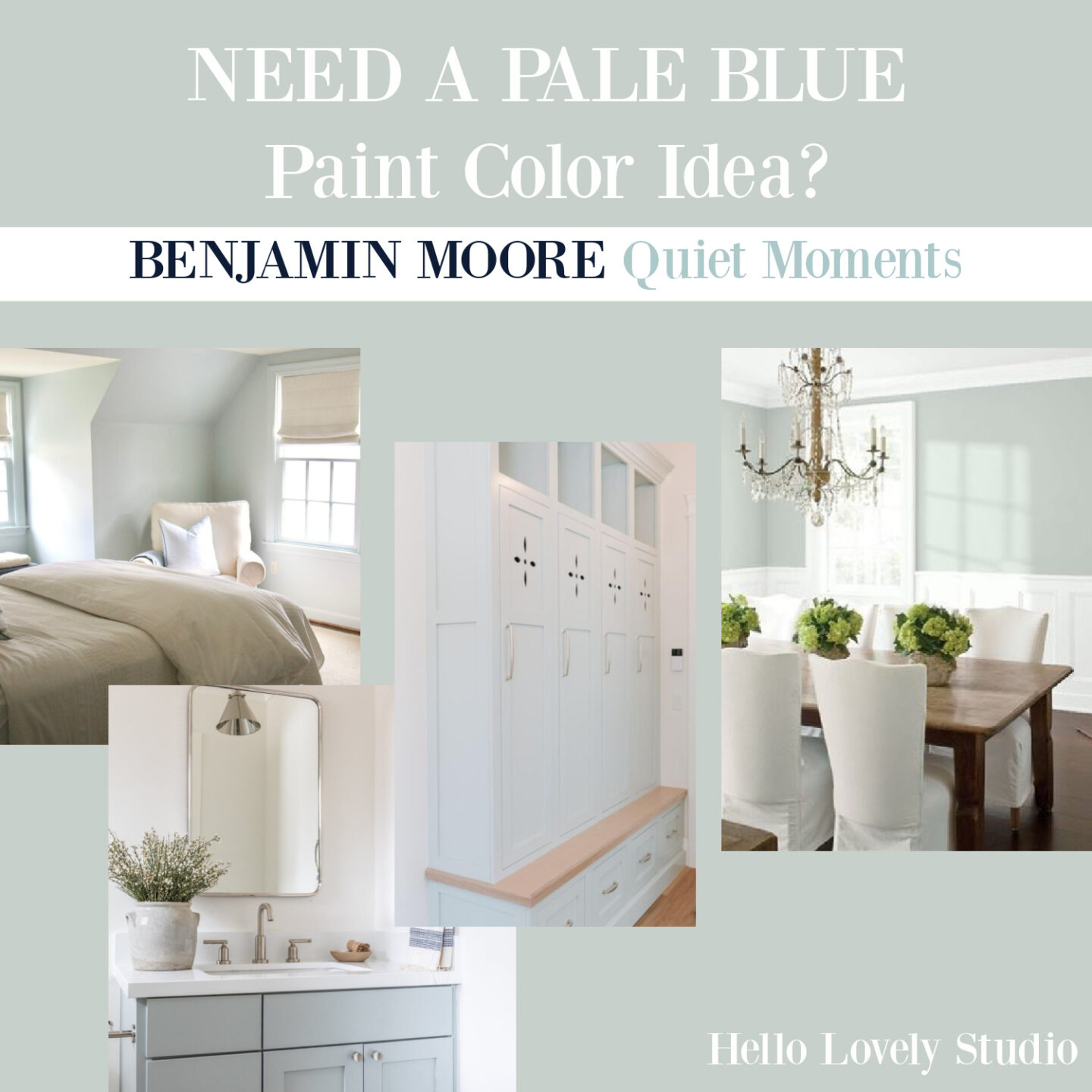
This gorgeous pale blue-grey paint color called Quiet Moments 1563 from Benjamin Moore still ignites my imagination. You already know how important it is to me to help you discover the prettiest paint colors for your interiors, and here’s a keeper! Where could you use it!?!
Quiet Moments Paint Color: Is This Pale Blue Calling?
I can easily imagine it on the walls of a bedroom or bath. But as you will see from this lineup, it also works in laundry rooms and dining rooms too.
Here’s the swatch you’ll want to PIN!
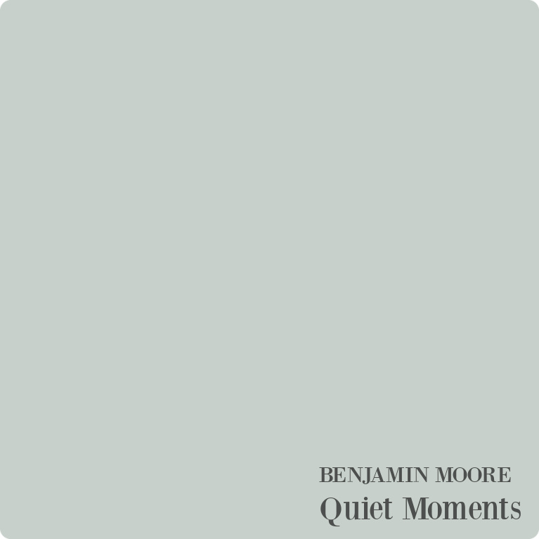
Is Quiet Moments a Blue or Green Color?
It has both green and blue and is muddied with grey. Benjamin Moore says it exudes tranquility and inspires quiet meditation.
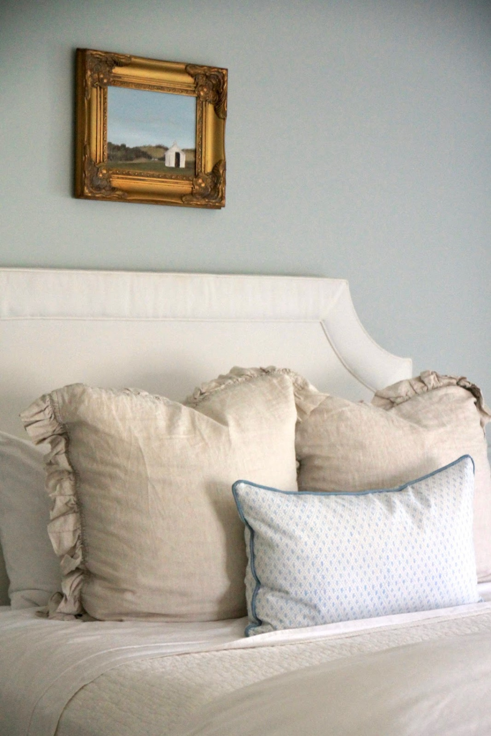
Blue Grey in a French Country Bedroom
Consider this subdued, sophisticated, soothing hue for French country inspired rooms where you want to quiet the mood.
Isn’t it soothing?

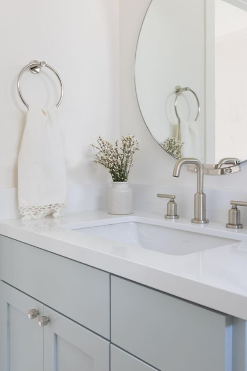
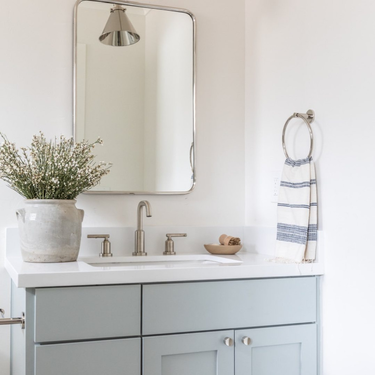
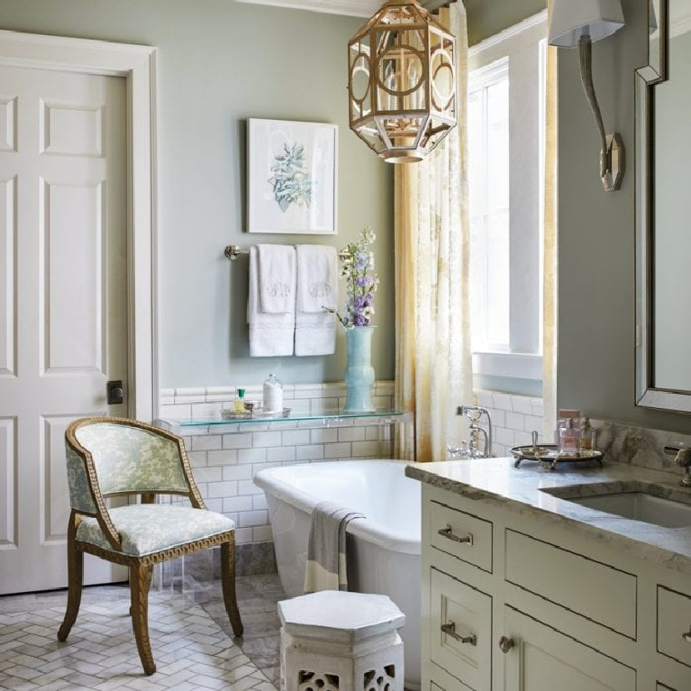
Quiet Moments on a Bathroom Vanity
If you have an existing wood vanity that needs an update, how about brushing on Quiet Moments?
It’s one of those hues that is beautiful with gold toned hardware too.
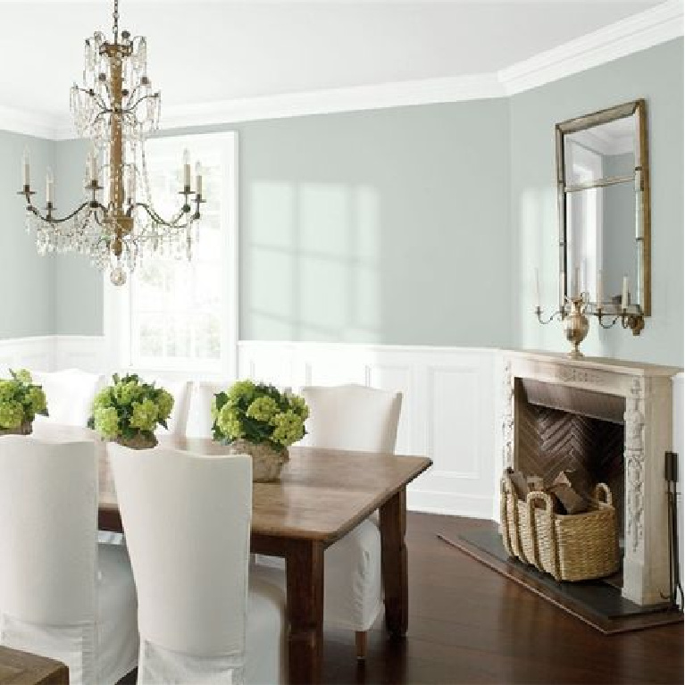
A Lovely Grey Blue Above Panel Moulding
I find it helpful to see a paint color in different environments with various lighting conditions to understand its undertones and nuances.
For a Casual Beachy Chic Living Space
Quiet Moments can certainly look grey.

Yet it can look like a sweet pastel too.
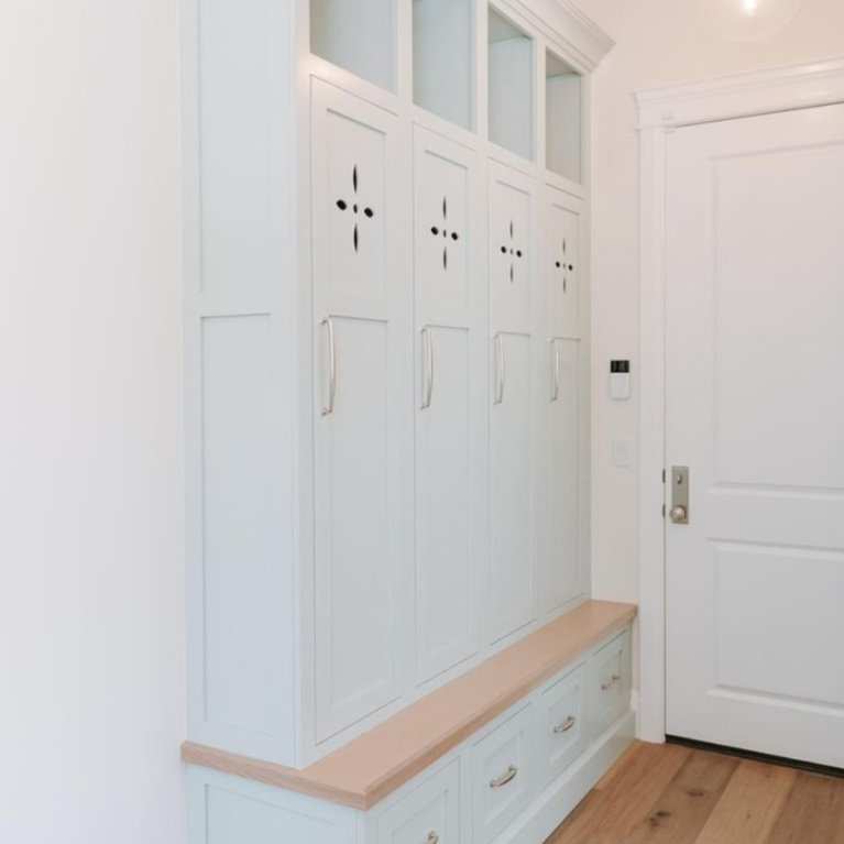
An Atmospheric Pastel for a Mud Room
Right?
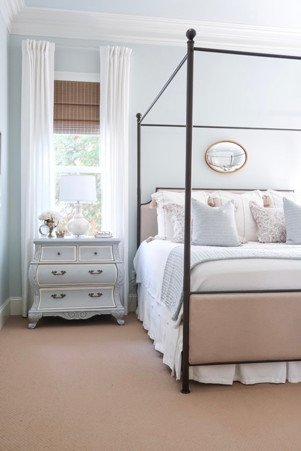
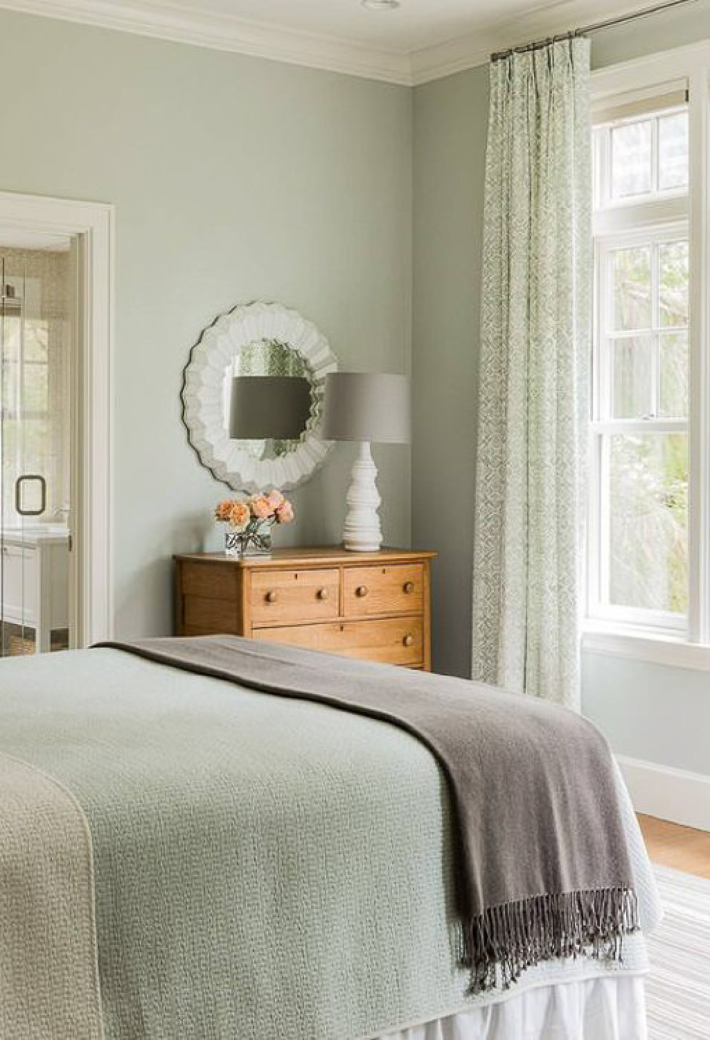
Elegant Simplicity in a Bedroom
A soft backdrop for a tranquil meditative bedroom…
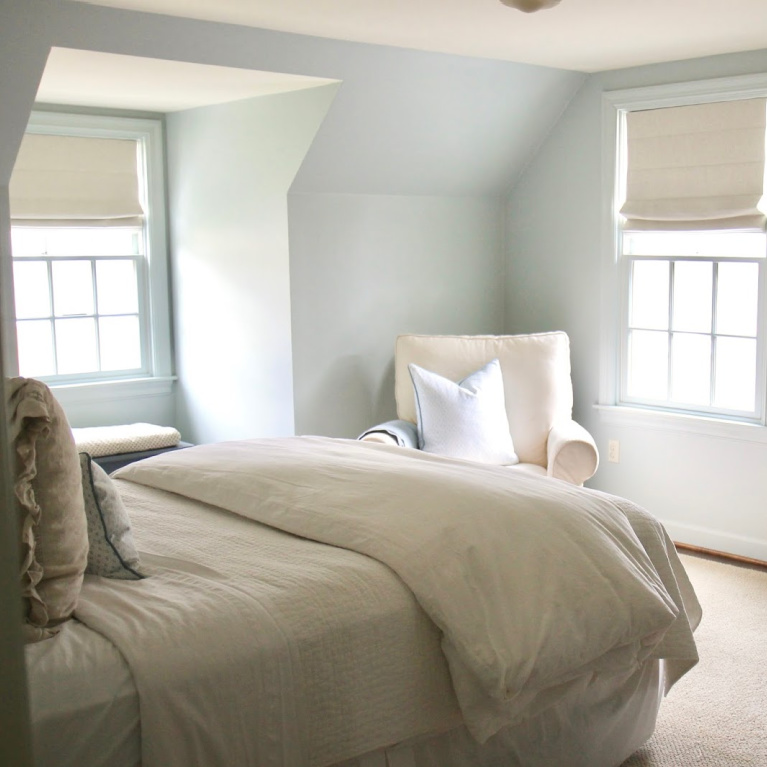
and it seems to be in the sweet spot between warm and cool shades.
Notice how green undertones in this paint color come forward depending on your lighting.
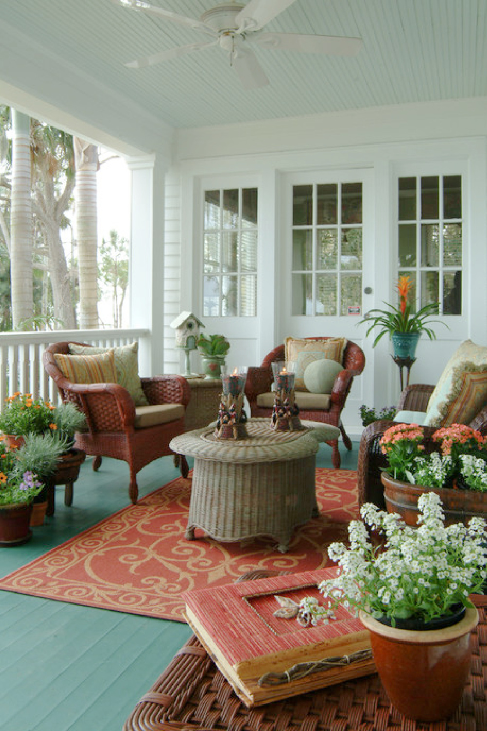
Your Perfect Porch Ceiling Paint
I’m dying to try it on a ceiling…and not just a porch ceiling.
Easiest way to see if a paint color will work? Order samples with Samplize and have them delivered straight to your door.

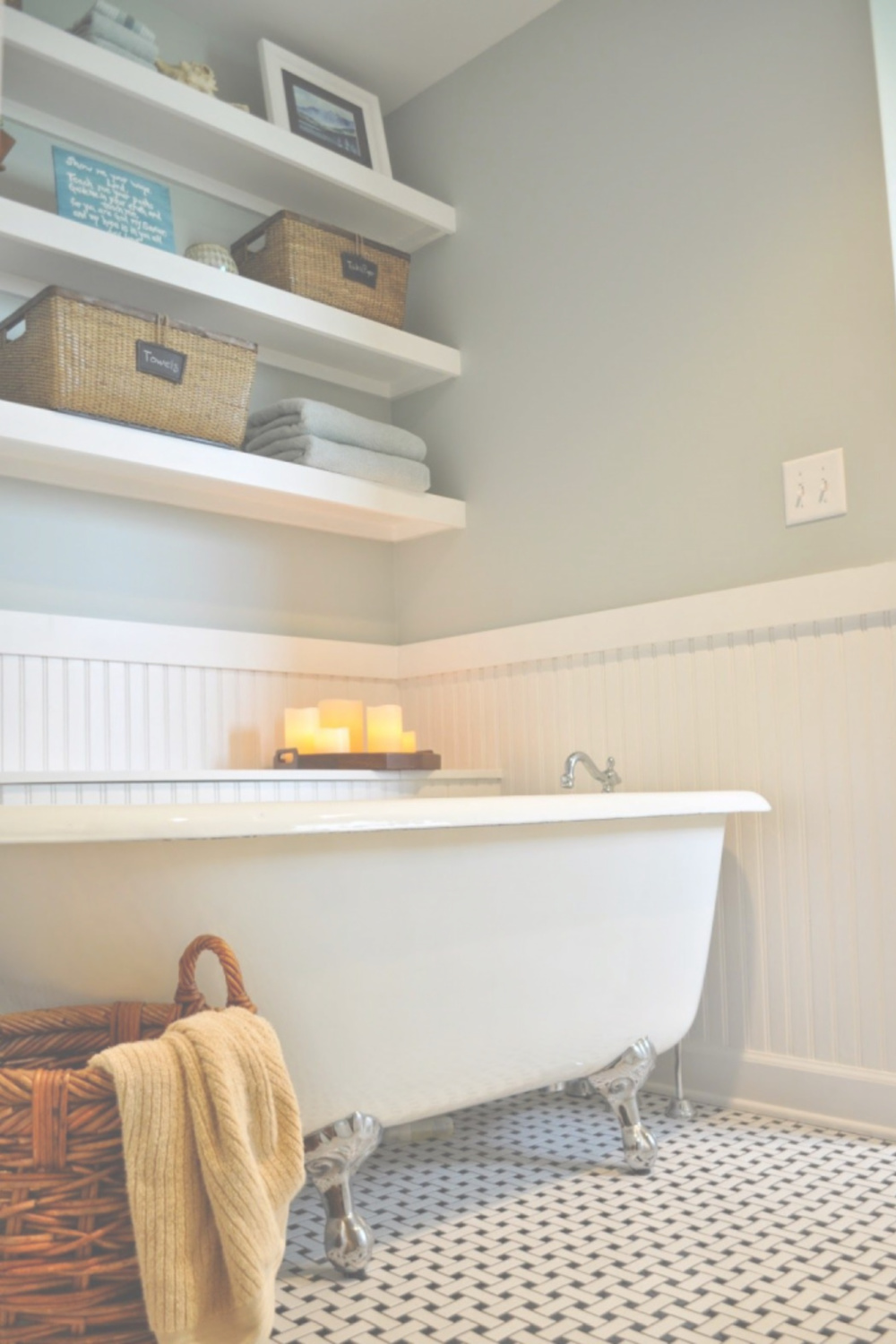
A Lovely Contrast With White Beadboard
This blue-green plays so nice with white, yes?
Bathrooms are great places to try out a new color crush before taking the plunge on a larger space.

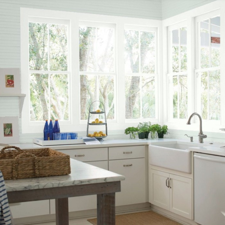
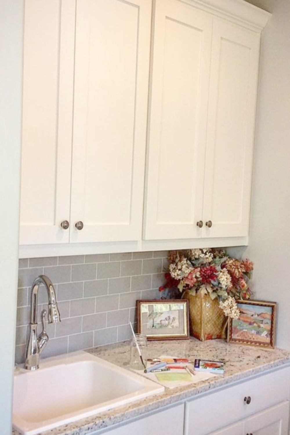
Cottage Style Kitchen Beauty
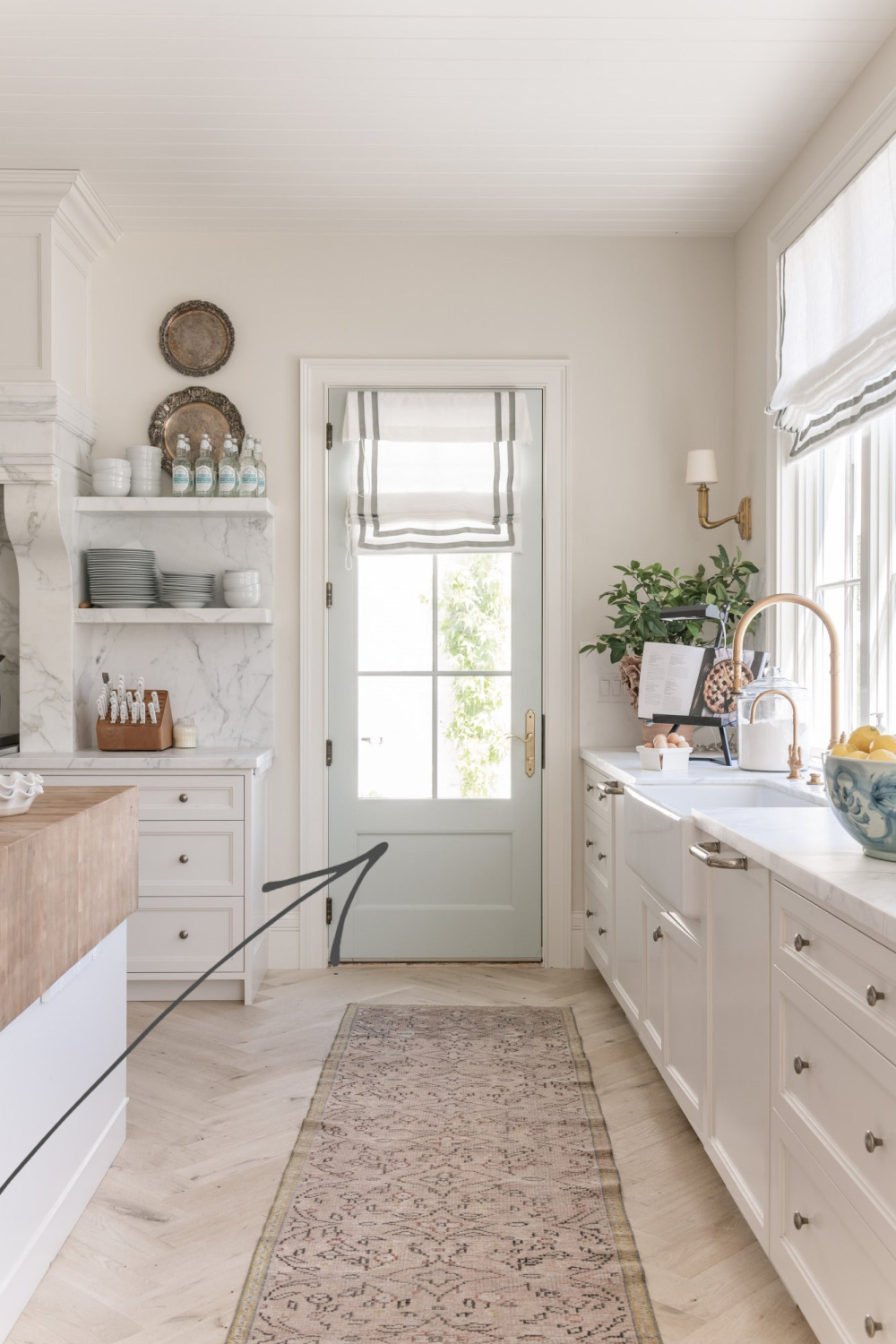
Just Right With White Trim
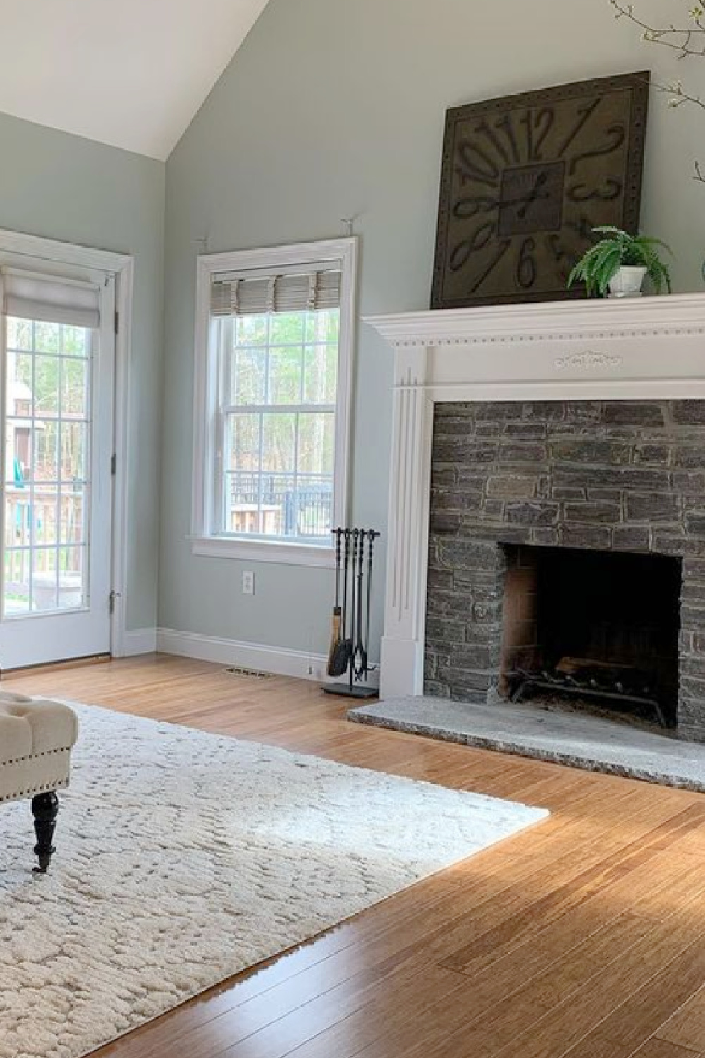
Here’s a peek at the color with a light toned hardwood floor:

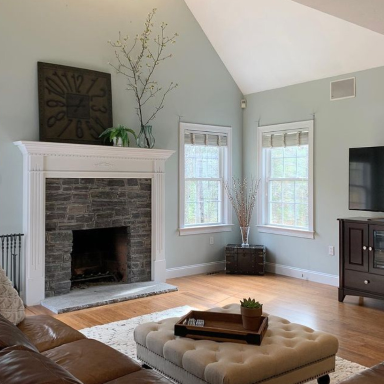
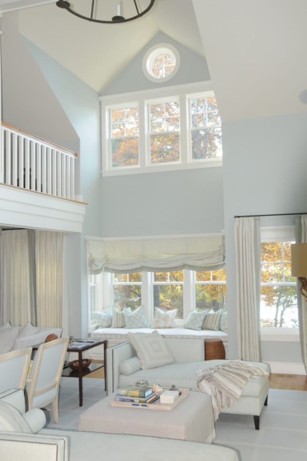
Enhancing Lofty Spaces Too
Choosing a paint color when you have a lofty ceiling is a little more daunting when you’re the one doing the painting…
Try This Paint for a Meditative Mood
How does aqua affect your mood?
By this point in the post, you probably have an indication.
Because for me, it’s awfully quieting. But I love that it’s also playful and just won’t take itself overly seriously.

And even nostalgic.

It has always been one of my favorite colors to wear and reminds me of seeing the ocean on vacations.
Easiest way to see if a paint color will work? Order samples with Samplize and have them delivered straight to your door.
Aqua hues also bring to mind sweetness.
Sweet Dreams Here
But it can be tricky using them in grownup spaces because of that youthful feel.

Thank goodness others graciously share how to mix it into their schemes successfully.
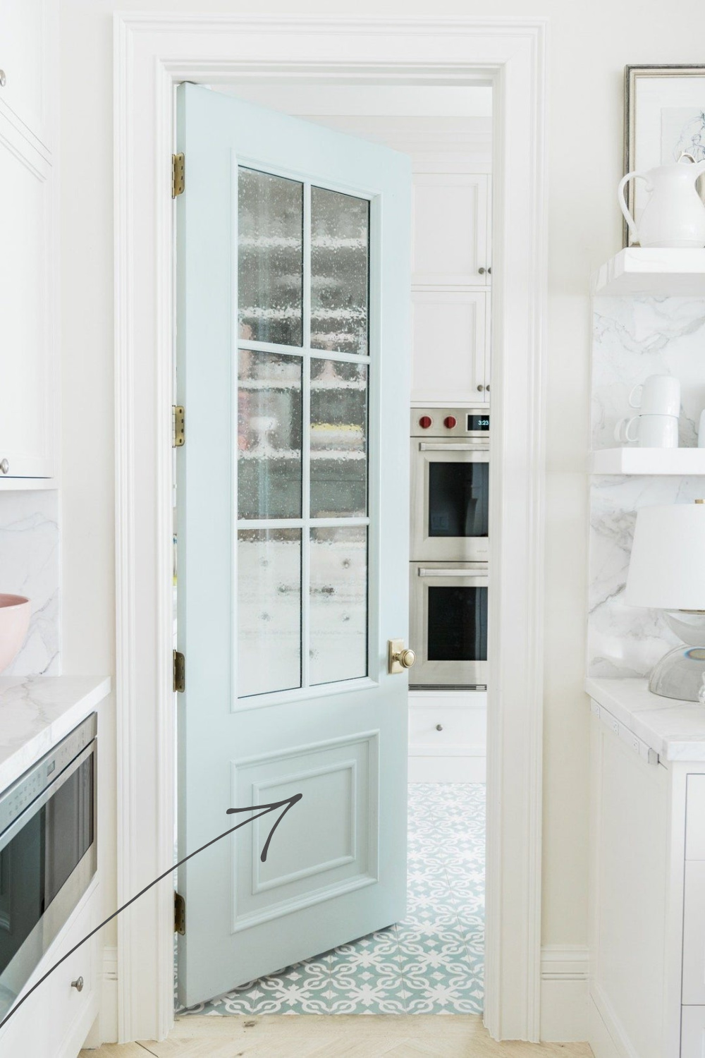
Sample QUIET MOMENTS 1563 RIGHT HERE.
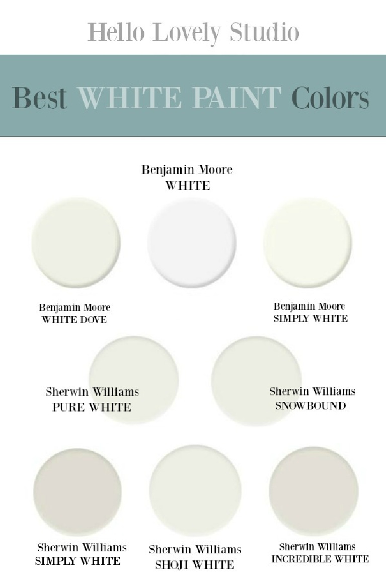
Tap on the image below to discover the best white paint for your rooms too!
I independently selected products in this post—if you buy from one of my links, I may earn a commission.
Peace to you right where you are.
-michele
Shop for items you already intended to buy on Amazon RIGHT HERE, and also find home decor here to keep decor inspiration flowing on Hello Lovely!
Hello Lovely is a participant in the Amazon Services LLC Associates Program, an affiliate advertising program designed to provide a means for sites to earn fees by linking to Amazon.com and affiliated sites.
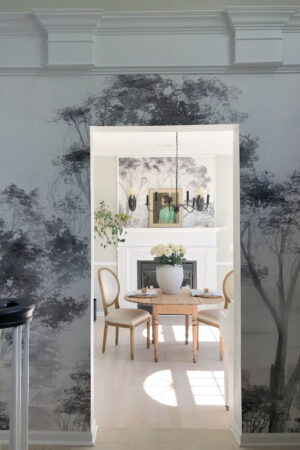




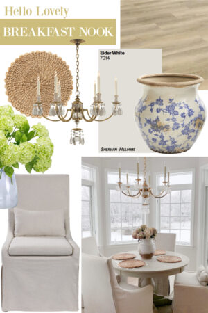

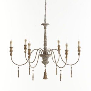


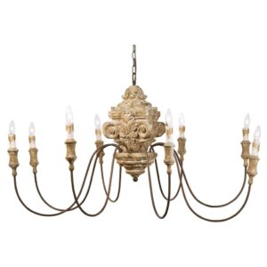
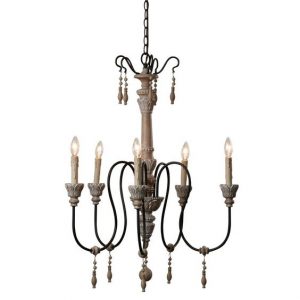
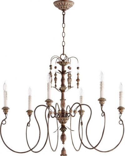


Curious about the chandelier over the farm house table….do you have a source on this photo? Much appreciated!
Author
It is beautiful and reminds me of this one which has less crystal: https://rstyle.me/+T_pbY0cNDEwr2PmMW6UMKw or if you are drawn to the plentiful crystal, then the high end Ralph Lauren (Adrianna) fixture on this page may appeal: https://rstyle.me/+oAekiq5clqx6JgIuSfNUnw
Your heart and your blog are lovely indeed; it is candy for the eye and soul! Thank you!!
I loved seeing your color today, my entire living area used to be Quiet Moments. If there’s a perfect color out there – that would be mine! As an aging paintaholic, – my walls are now all white and I’m committed to keep them. But I will find something small to paint Quiet Moments! Thank you!
Author
Thank you so much for sharing this endorsement of Quiet Moments – I have been dying to try it, and after hearing from you, now I feel the nudge to get to the paint store! I do love my white walls too, and I think it is important to let each space whisper what it wants to be. And I’m all for being a paintaholic because it is far easier than being a move-a-holic like me! I am always in a mode to move and start with a fresh slate – so it’s an accomplishment to have stayed put in this fixer for 5.5 years! 🙂
Love the name as much as the color. 😊 And THESE quotes…love! Will be passing several along to my kids…as they are so timely…thanks!
Author
Isn’t it a winning name? When are these paint brands going to hire me to create color names!?! I’m waiting! 🙂 Thanks so much for sharing the quotes – I learn so much in the process of collecting them. xox
Hi Michele,
My entire home is painted in QM. It looks especially great with my Carrara marble bathroom.
I have different accents colors with it in different rooms. Teal, navy, grey, pale pink & white.
They all look great with QMs
Author
How beautiful! I’m happy to add images of your home to the post if you have any to send! It helps readers see how the same color can vary across different geographical regions and light exposures. Thanks so much for letting us know!
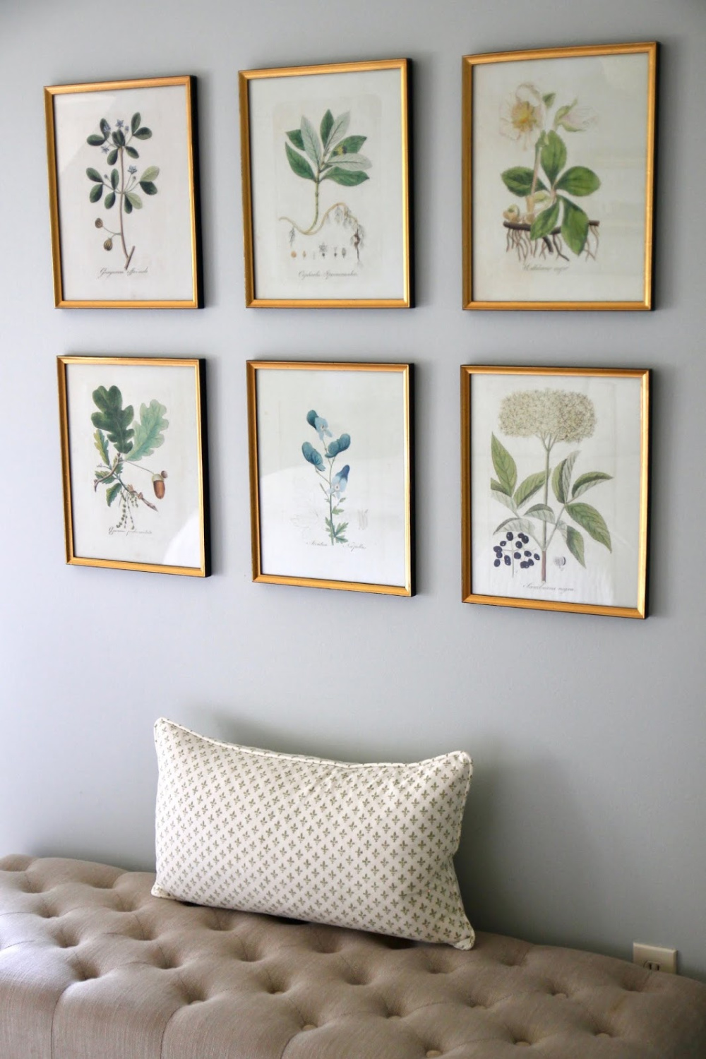
I love the 5 flower/herbal pics at the very top! Where did you find them?
Author
They are so beautiful – I had to go back to the post and see that the link was broken to the source – direct any questions about them to the designer: jsh home essentials. 🙂
I love that color so much. I think that is actually the color we had in the kitchen of our previous house, and I miss it (the color, not the house! Also, at first I mistyped a letter c for the v in the word “previous,” in that last sentence, so it read “our precious house.” It actually was kind of a precious house – and tiny.) Quiet Moments looks so different in different light. The beautiful rooms you post are so inspiring, and they relax me, too. I always love your quotes!
Author
It truly is a restful and timeless color. I am always amazed at how different the same color can read depending on a room’s location. Some of the colors I chose in Arizona look dramatically different in that light! Thanks for reading and for taking the time to share here, Pam. Let’s get this weekend started, and by that I mean, let’s work our tails off moving to the new house! Mercy! 🙂 Hope your plans are more promising. 🙂