No matter what you call it: cottagecore aesthetic, European country charm, modern country chic, farmhouse French rustic or timeless traditional…these European inspired cottage interiors inspire with cozy details and design. They reflect the style of European country cottages rather than actual homes in Europe as proof we need not live in an ancient stone dwelling in the countryside! Find kitchens, bedrooms, living rooms, and beyond in this gallery of beautiful interior design where the palette is gentle and natural.
Cottagecore Aesthetic Interiors & Gentle Palettes
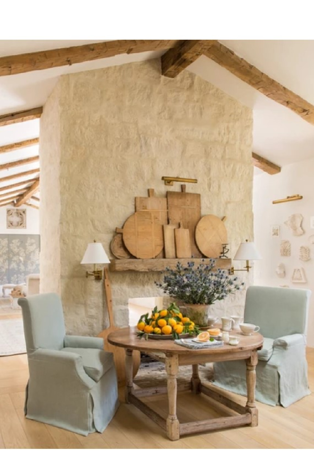
Before diving into cozy charm and paint color names of these gorgeous rooms, did you see this tour of a beyond cozy stone carriage house by Steve Giannetti?
Isn’t it amazing? As we work through our renovation 2.0 at the Georgian (the lower level where we’re adding a bath and finishing multipurpose space), I see commonalities. Not that we are adding stone, character, beams or high end architecture, but the way there are designated zones for living in an open area. I’m at the juncture where I need to pick a paint color for the space, and I’m after a warm white…
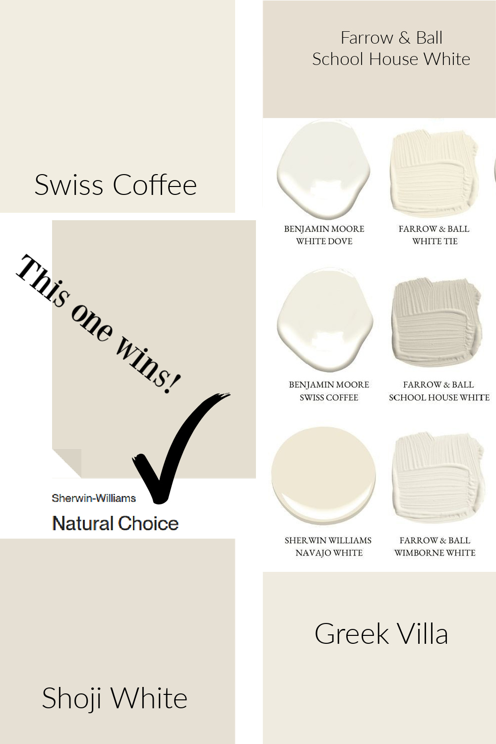
Sometimes it helps to gather a few trustworthy favorites and compare them, noting undertones and how they vary. We used Sherwin-Williams NATURAL CHOICE for our Arizona snowbird house, and it may be the winner for our project here in Illinois. Why?
As my husband was mudding an area at the foot of the stairs, I felt like the color of the dried mud (before sanding) was just about right.
When I sampled Natural Choice next to it, they were nearly identical.
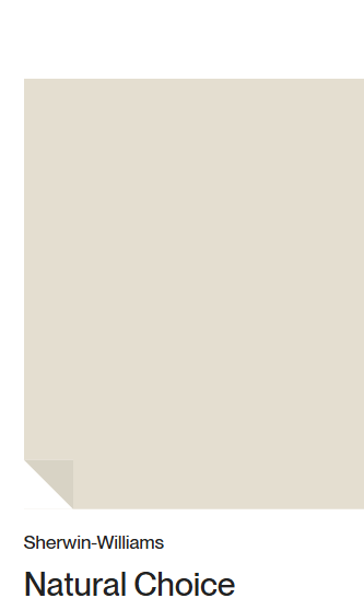
Natural choice has a chalky stone look to my eyes. Since we cannot create stone walls like the Giannettis so beautifully create, a color suggestive of limestone may be the next best thing!
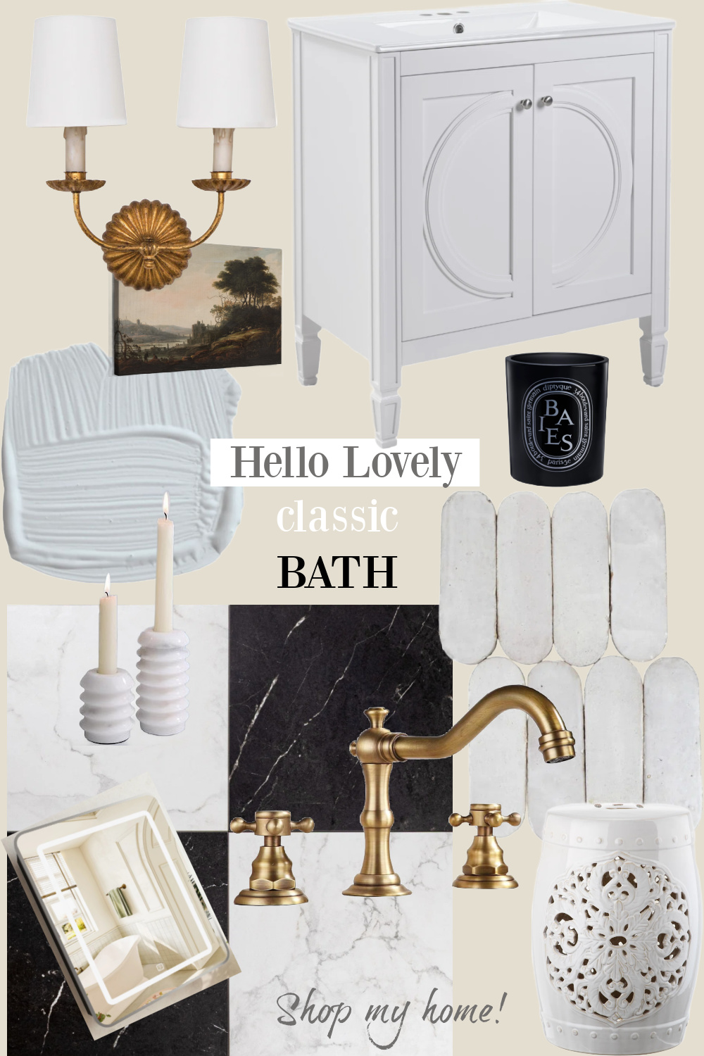
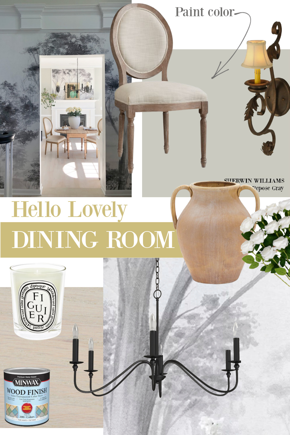
Further, I’m considering continuing this creamy warm ivory on the ceiling to wrap the whole space in it. I have done this before with success…sort of a color drenching. Psst. I went with Sherwin-Williams Repose Gray for the new bath at our house (see mood board above) rather than Borrowed Light. It needed a bit of warmth since there are no windows, and while I love Borrowed Light, its temperature made me shiver in there.
Sherwin-Williams GREEK VILLA
Greek Villa is more subdued yet very similar to Natural Choice, and may have a touch more yellow in it. I am still considering it, but since we have 9 windows in the space (lots of natural light!), we’ll get yellow from the quality of light, and I don’t want the color to read yellow. Greek Villa is a wonderful place to start when you’re ready to sample whites for your walls…
Greek Villa is very close to the color I painted all of our interiors in the Arizona snowbird house. The touch of green in this white worked well with the Southern exposure in that home. Folks are often afraid of dingy whites with grey undertones, but sampling will open your eyes so you need not overthink it.
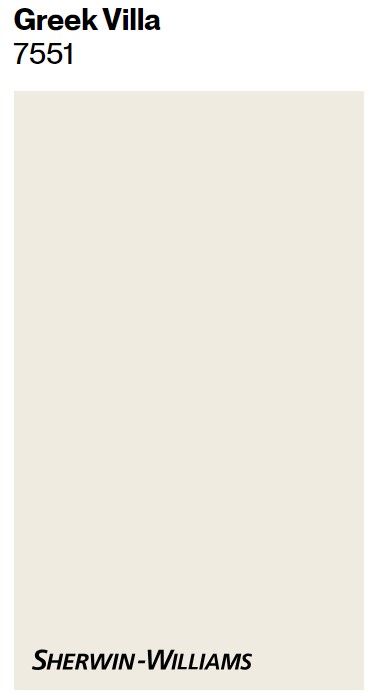
How about you? Have you lived with Greek Villa? Love it?
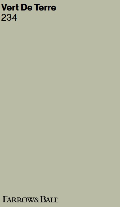
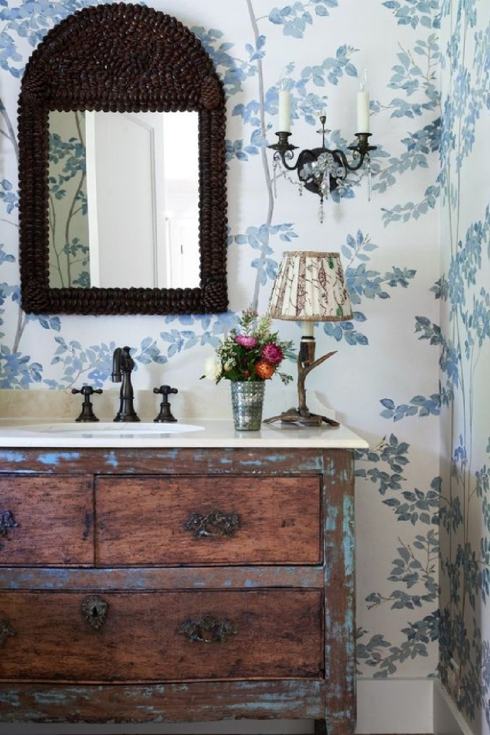
Farrow & Ball VERT DE TERRE
Just the name of this F&B color beckons me to sample it and use it somewhere!
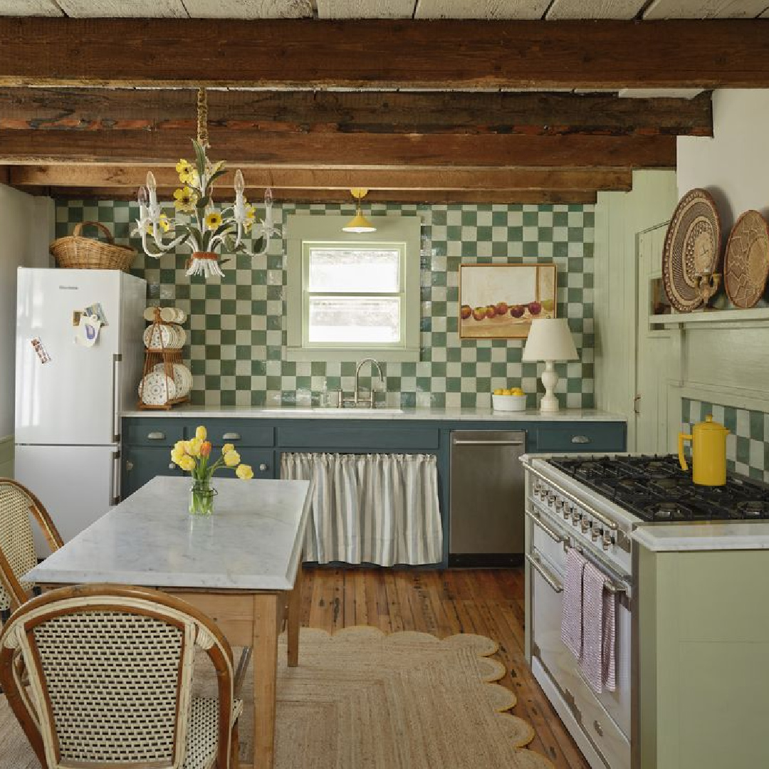
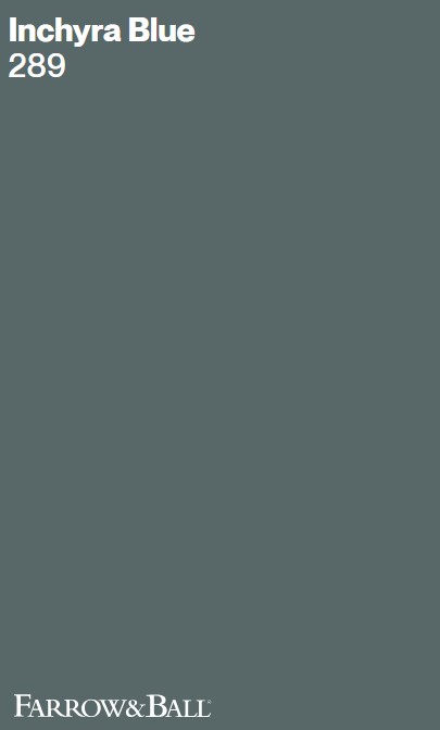
Do you like Vert de Terre with the mid-tone blue?
Here’s the exact blue from this darling kitchen with those irresistible checks pulling at the heartstrings:
Benjamin Moore SIMPLY WHITE
Simply White seems to be ultra versatile as well as memorable. It’s always at the top of the list of the best whites to sample when you’re at the beginning of your search.
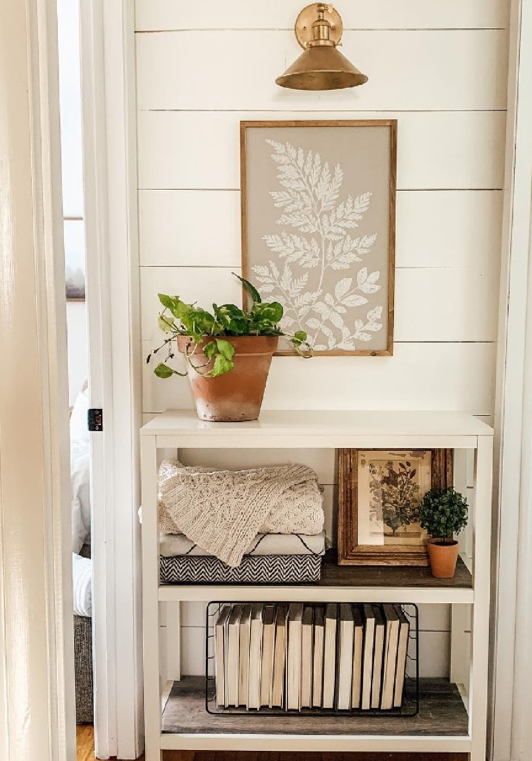
It has a certain cheerful sunny-ness to it, yes?
Who among us couldn’t use a bit more optimism? Try Benjamin Moore Simply White for a similar look to this:
This is also giving me cozy Simply White vibes, although it is likely plaster walls with no paint:
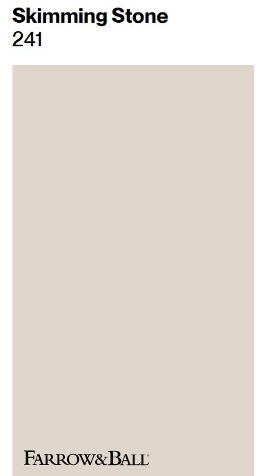
Farrow & Ball French Gray
Bear in mind that for some of these cozy spaces, the paint color is either custom, kept secret, or as yet, is unknown. These are educated guesses and suggestions to sample for a close approximation.
This sophisticated, moody neutral will appear vastly different across different lighting situations.
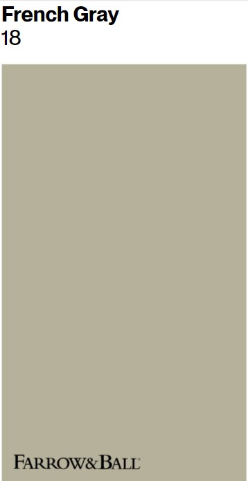
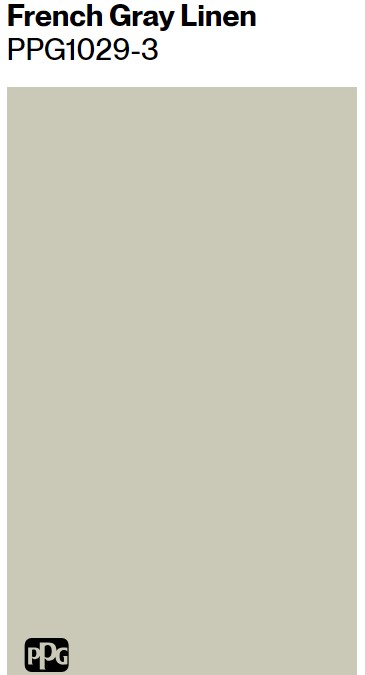
Seeking a similar tone just slightly more muted?
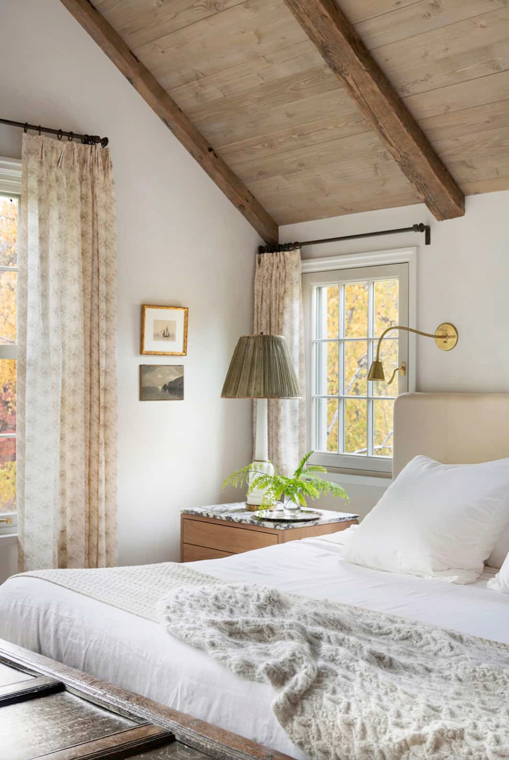
When Cozy Comes From Sources Beyond Paint
I keep gazing at my own bedroom and wondering if I should add pattern with wallpaper or a stencil.
Typically, I steer clear of patterns in the bedroom where I fear I’ll bore of it in no time. But then I see this….
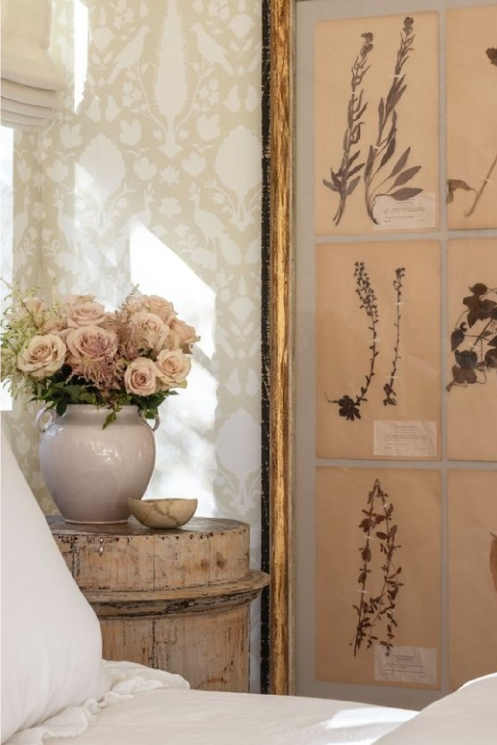
And it doesn’t not seem likely I would grow bored with these birdies and the motif:
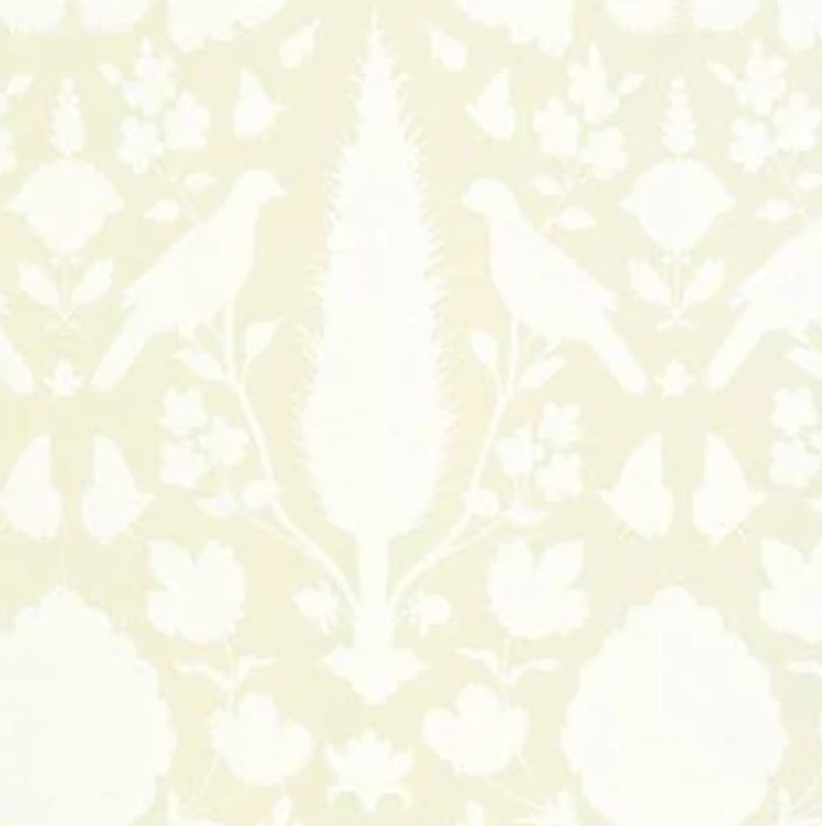
I especially love Chenonceau in the Aquamarine colorway! And here’s more wallpaper magic from Shannon Bowers:
Again, I’m noticing a pattern in this collection of inspiring designs. There’s an optimism that more moody traditional spaces trending on social media seem to lack. Green can be so uplifting and life-giving.
Moody Mid-Tone Grays
I can imagine how more green accents in here could be refreshing:
What do you think about green-gray neutrals? They can look drab in my own home in certain seasons so my heart is divided on the matter. I’m not quite dissatisfied enough to re-paint, but in my mind I’m constantly changing it up!
Here’s the neutral in all of our bedrooms at the moment:
I can’t tell you how much this paint color varies, room to room. In the family room, it looks very beige:
But if you look at the contrast with our white trim, you can clearly see how much warmer this tone is.
Farrow & Ball James White
The walls below remind me of this white from Farrow & Ball:
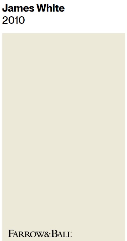
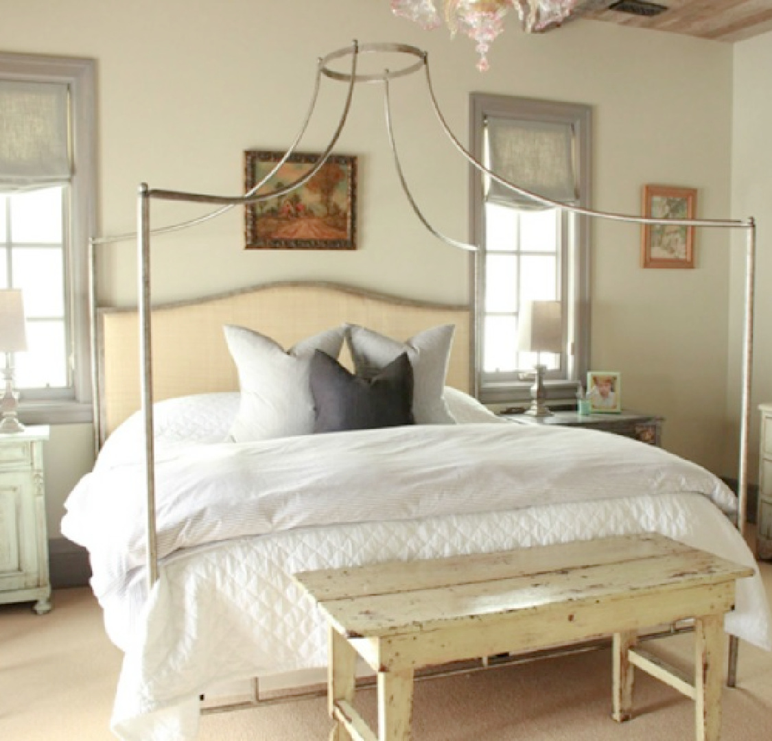
While I’m unsure of the wall color below, James White may impart a similar mood:
James White reminds me of the Sherwin-Williams Eider White in our kitchen and laundry room.
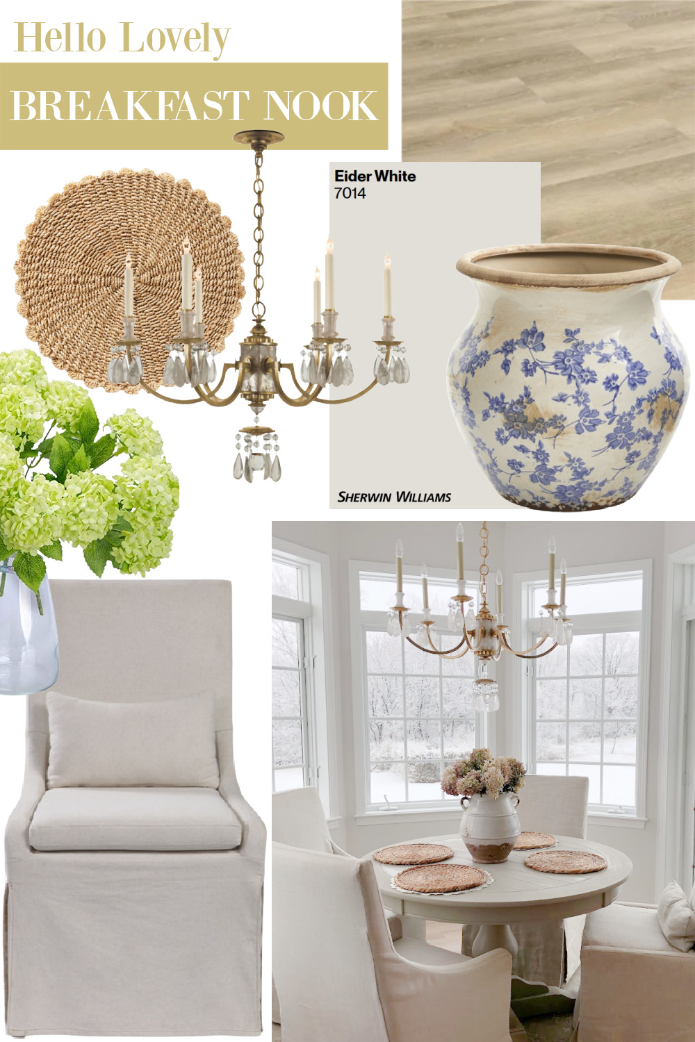
Eider White (on mood board above) is cooler and has a bit of purple/magenta which for me goes a long way…a touch of pink is always welcome here.
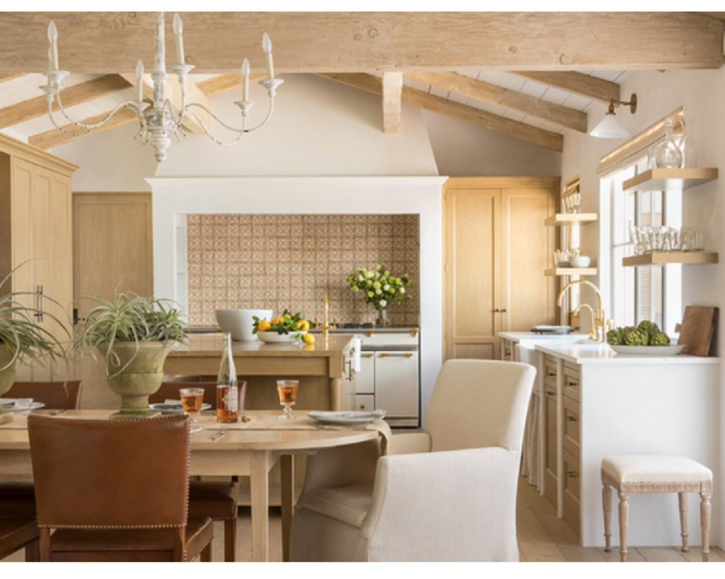
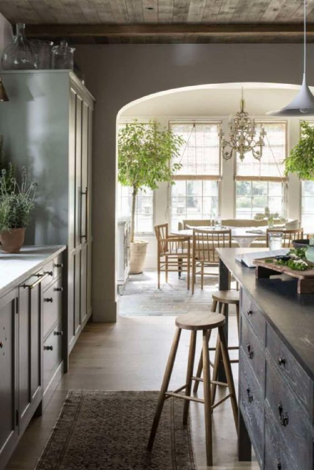
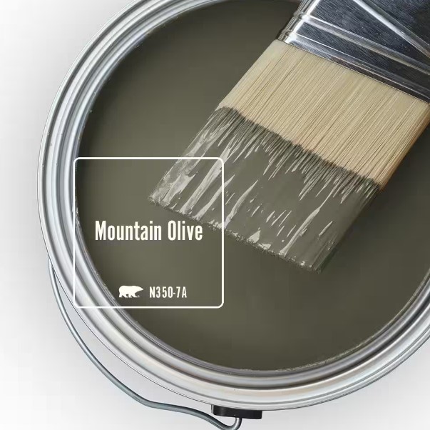
Behr Mountain Olive
Olive greens are still quite popular for kitchens and family rooms, and isn’t it outstanding paired with rustic beams and earthy goodness such as this:
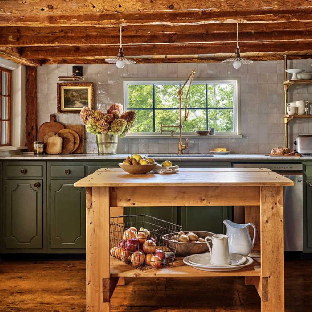
Mountain Olive is the color on the cabinets and actually one of Behr’s trending colors this year:
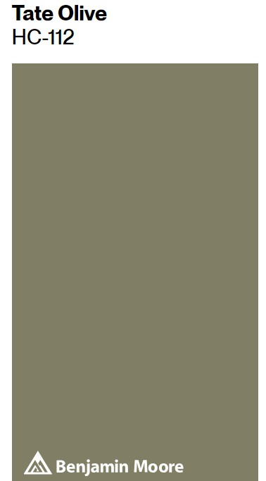
A very similar hue in the Benjamin Moore line is Tate Olive:
Paint Colors to Emulate Creamy Plaster
No paint on these plaster skim coated walls below, but you could try a creamy white to emulate the look.
Will I ever be over each and every project the Giannettis create for themselves and clients? Not likely. They design such livable luxurious spaces that age beautifully.
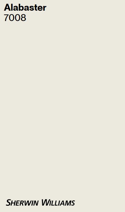
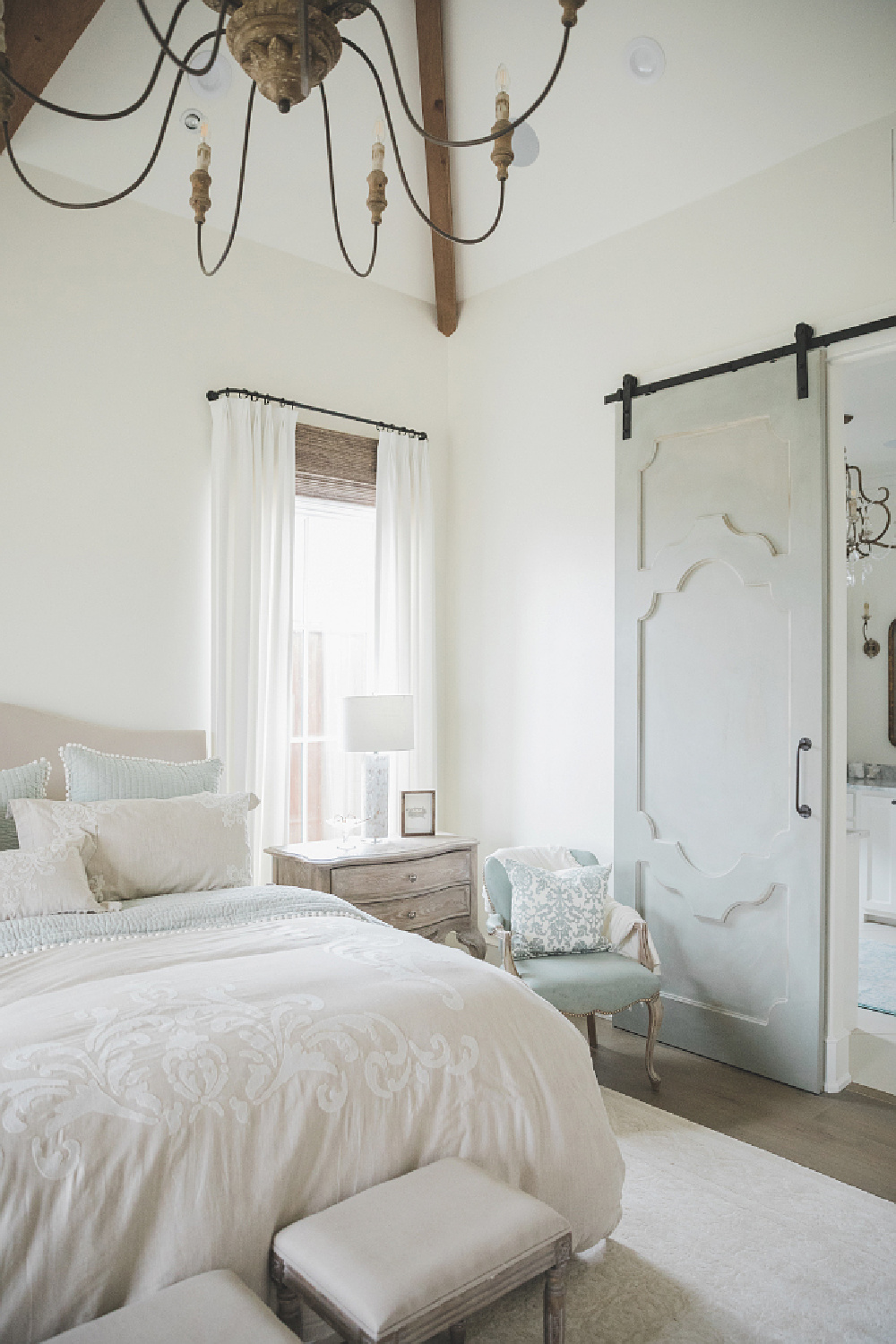
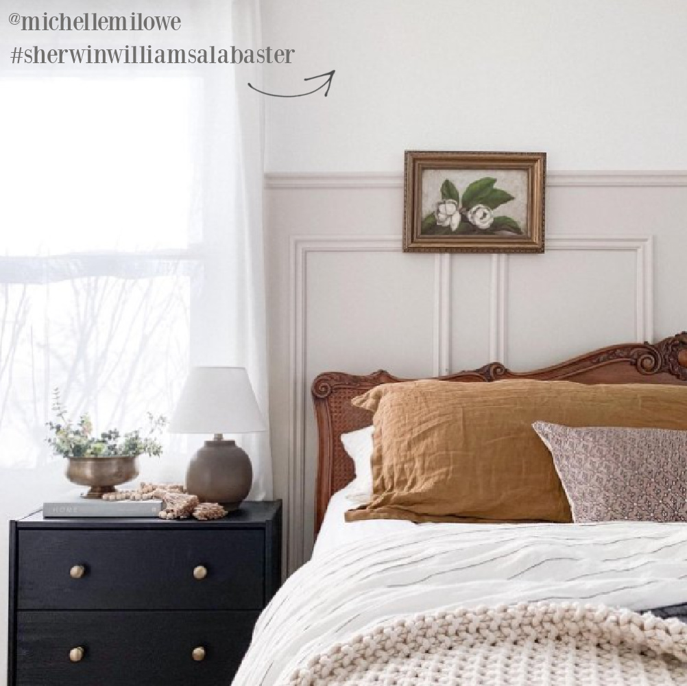
Here’s the look of Alabaster in a cozy French bedroom:
And here’s Alabaster paired with Accessible Beige:
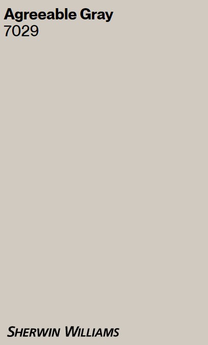
It does remind me of Agreeable Gray.
Benjamin Moore White Dove
Just because you have noticed every other white room on the internet is painted White Dove doesn’t mean you should avoid it. It has proven itself to be trustworthy.
Also, just a reminder to not think too deeply about how these swatches appear as you view them online. Hold all of those judgments loosely since the only way to truly see how the color performs is by sampling.

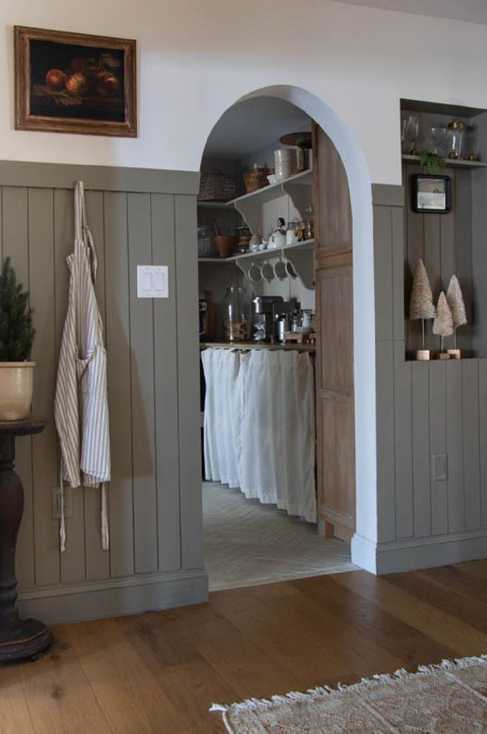
Earthy Greens & Grays for Cozy European Country Interiors
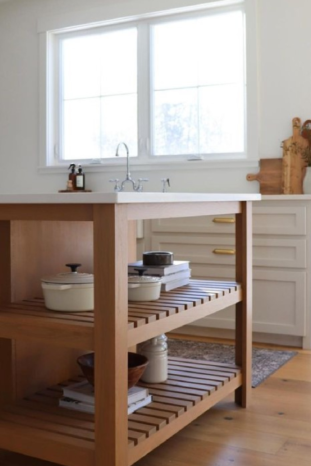
We must be careful to not get tripped up by paint color names either! Just because a color is on a swatch with grey colors or has “gray” in the name, does not mean it is not green!
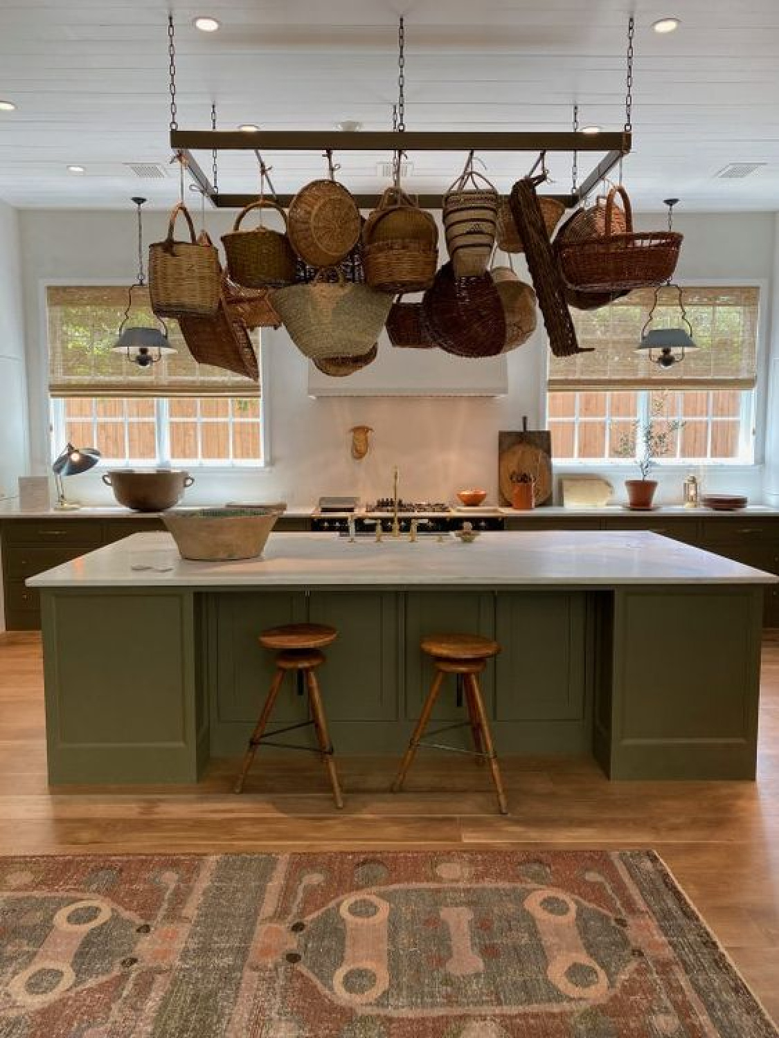
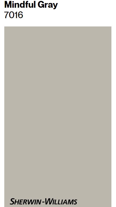
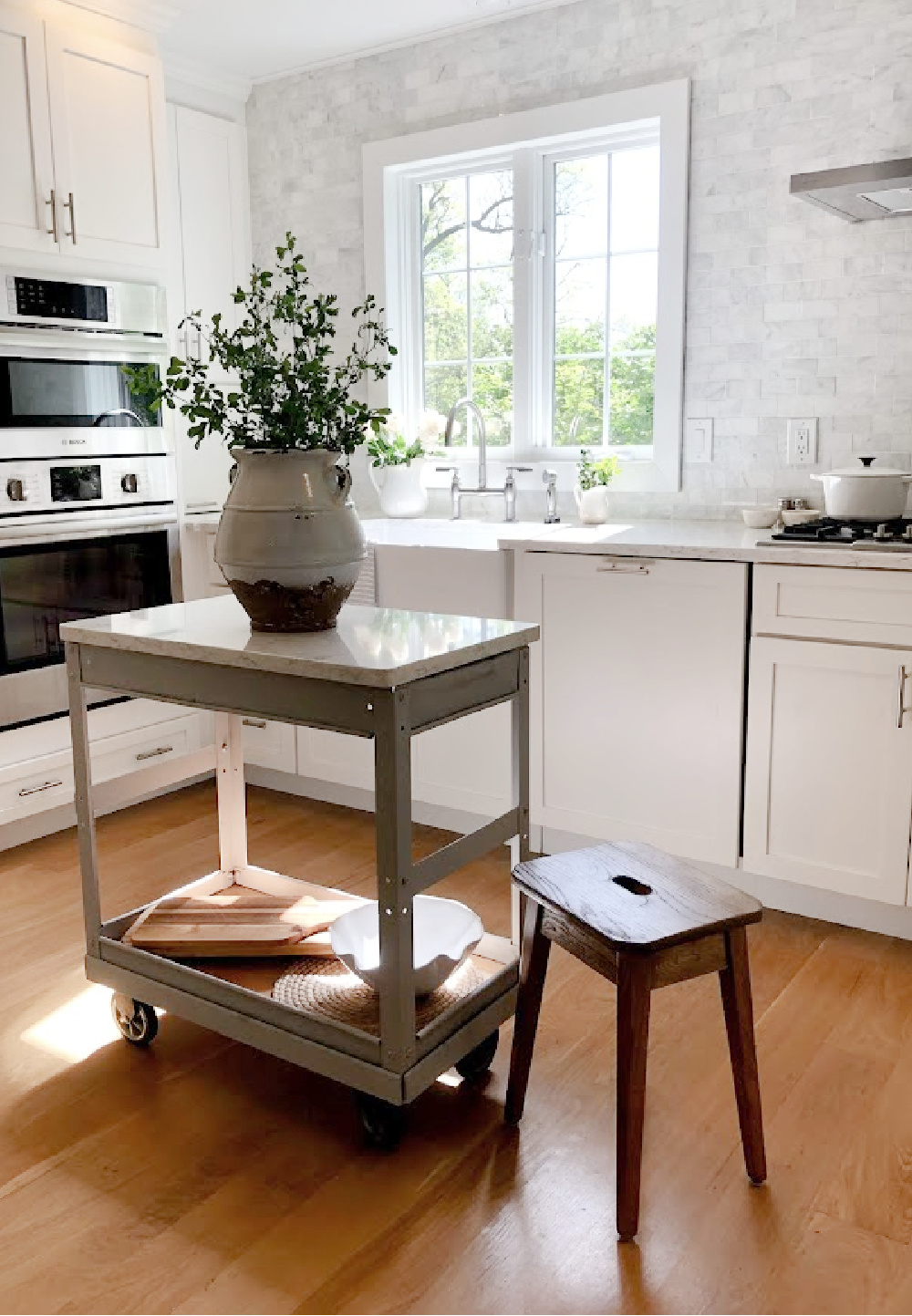
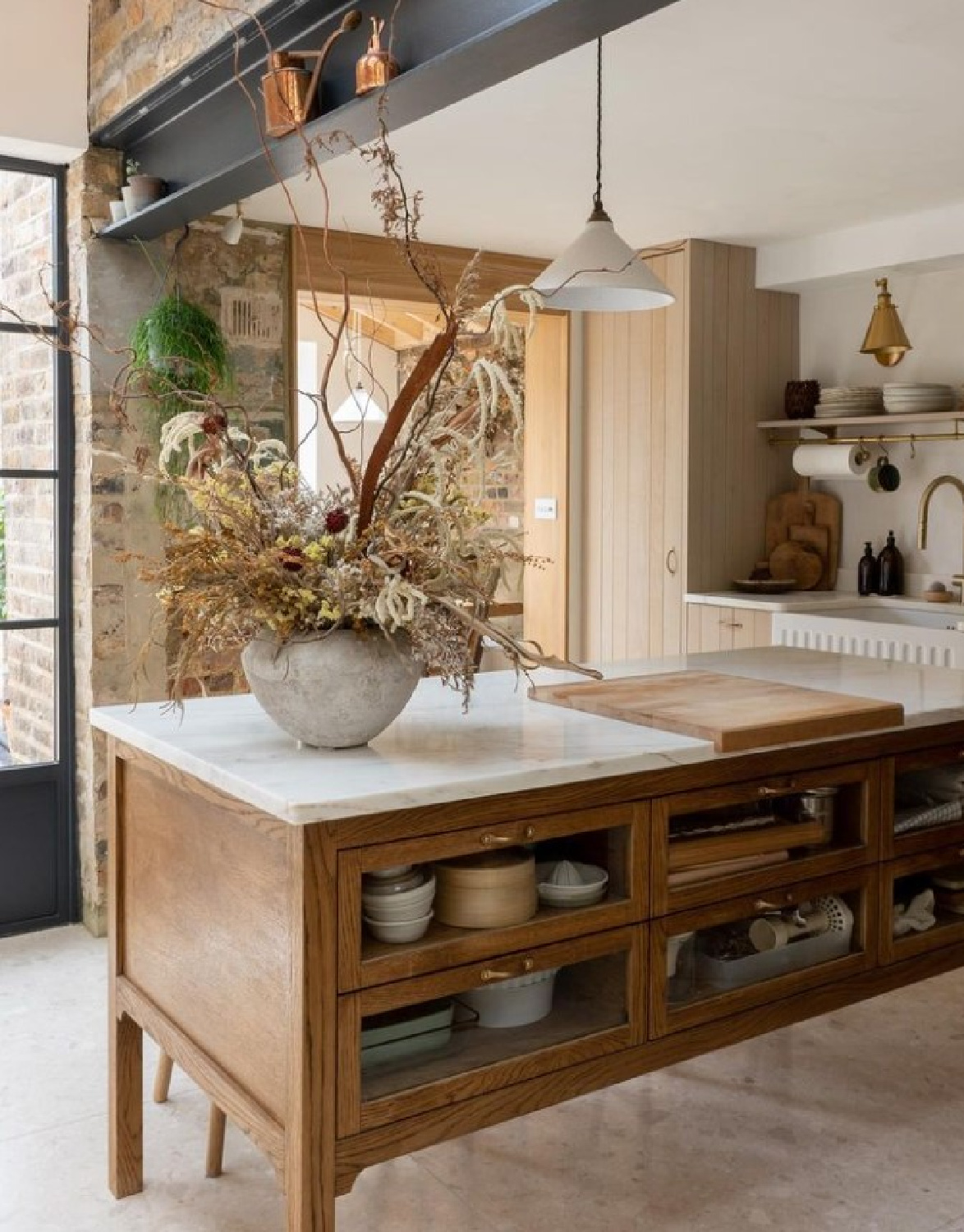
What could the atmospheric green gray neutral on the island above be? Here’s the exact color:
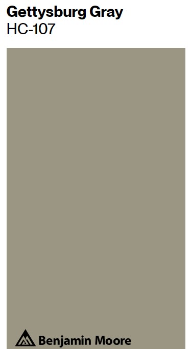
These moody green-grays are so popular right now. Not sure of the paint color on wainscot below, but it is in the same spirit as Gettysburg Gray:
Sometimes it is a grey with green undertones that will do the trick:
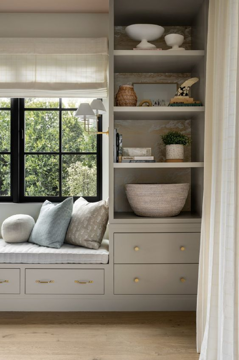
This built-in reminds me of French Gray.
Who can forget how it was used spectacularly by Jessica Helgerson?
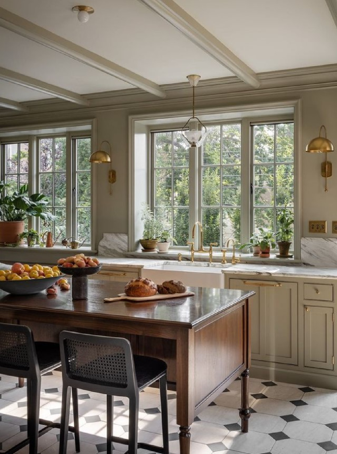
Will I ever recover after seeing this kitchen?
Doubtful! It’s such a pleasing combination with brass, touches of black, and the fine furniture glowing with warmth.
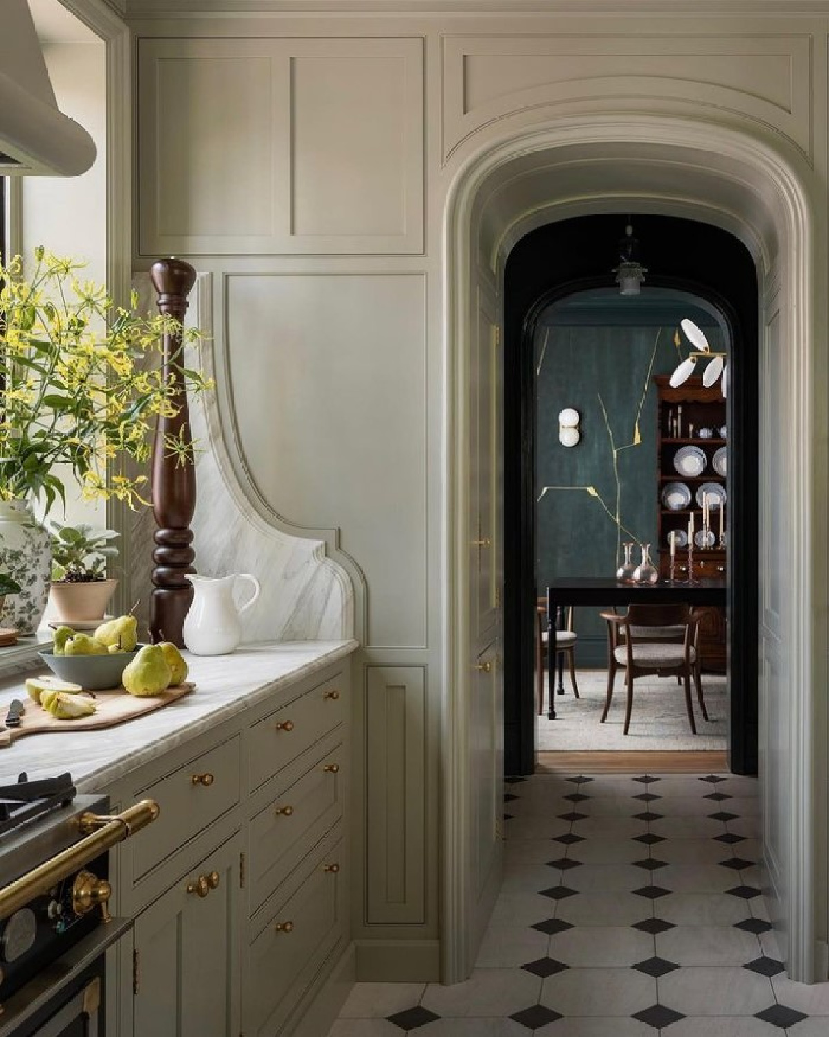
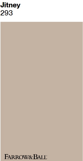
Farrow & Ball Jitney
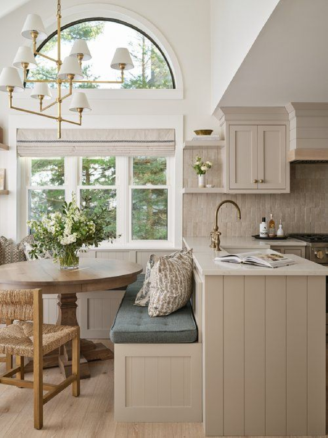
Followers of my Facebook page have been going nuts for this next color which is suggestive of the stone color covering this bespoke kitchen’s backsplash:
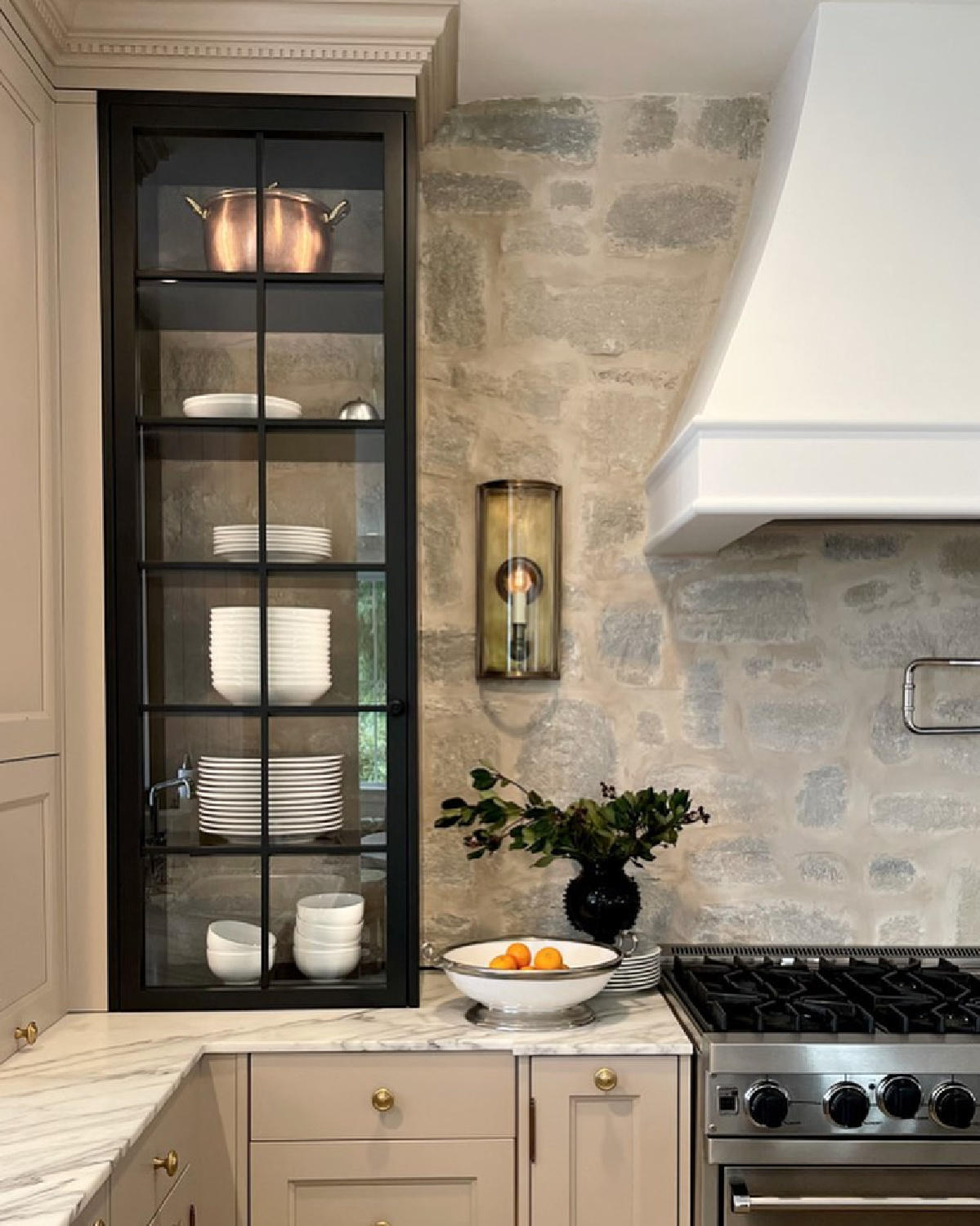
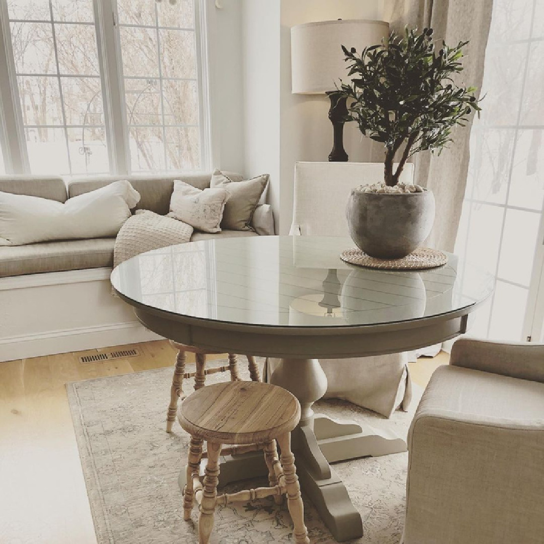
It reminds me of the color I painted our round kitchen table (Behr Garden Wall) when I was going for the feel of rugged natural stone.
Each time I share this kitchen image for inspiration on FB, it fetches excessive engagement due to the placement of the microwave:
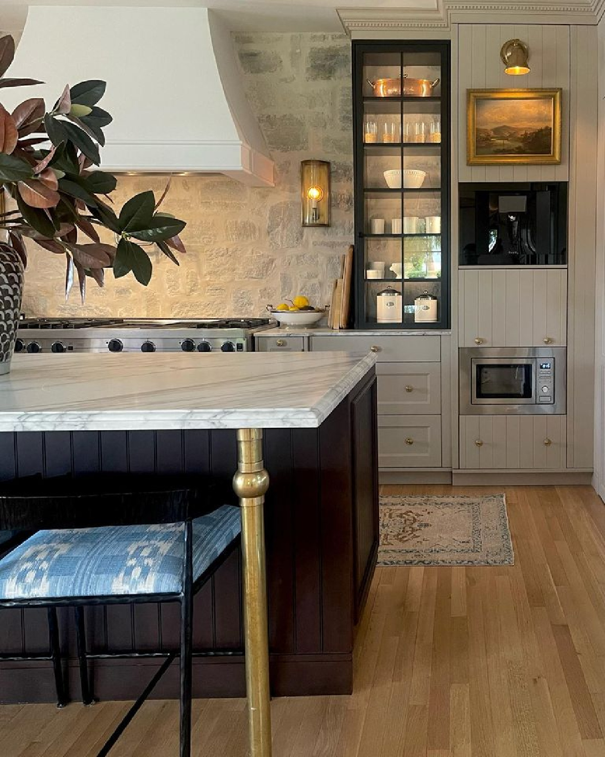
The designer/homeowner told me it is at that level for children to safely use, and I didn’t think it strange at all since our microwave is also at that level (oven level). For some reason, it bothers a certain segment of folks to not see a microwave high above a range!
For a similar look to Jitney, though less fleshy and more grey-taupe similar to this gorgeous cozy moment:
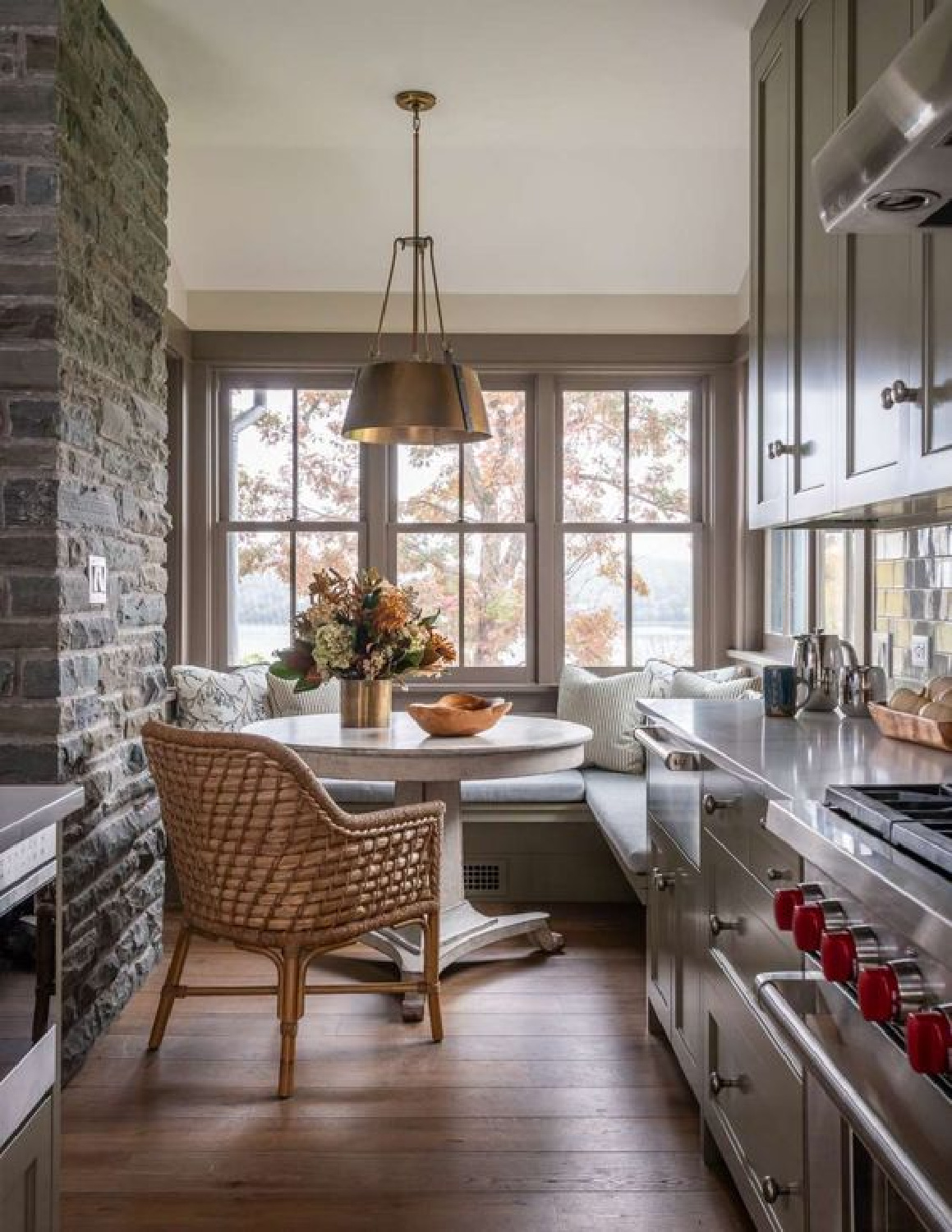
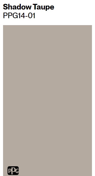
You could peek at PPG Shadow Taupe:
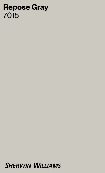
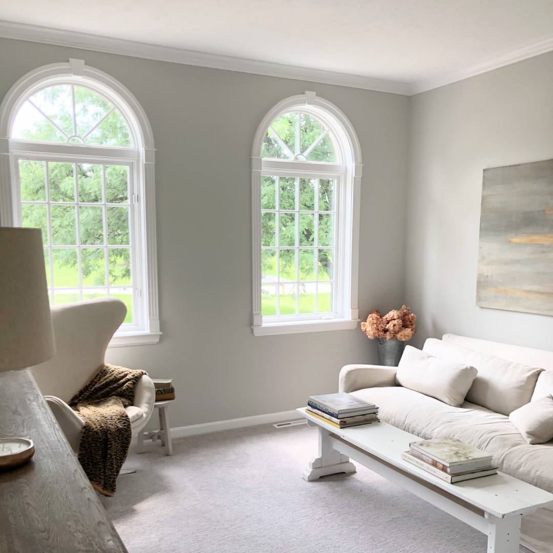
Sherwin-Williams Repose Gray
Please don’t believe that all grays and taupes are interchangeable! They are more different than I can say.
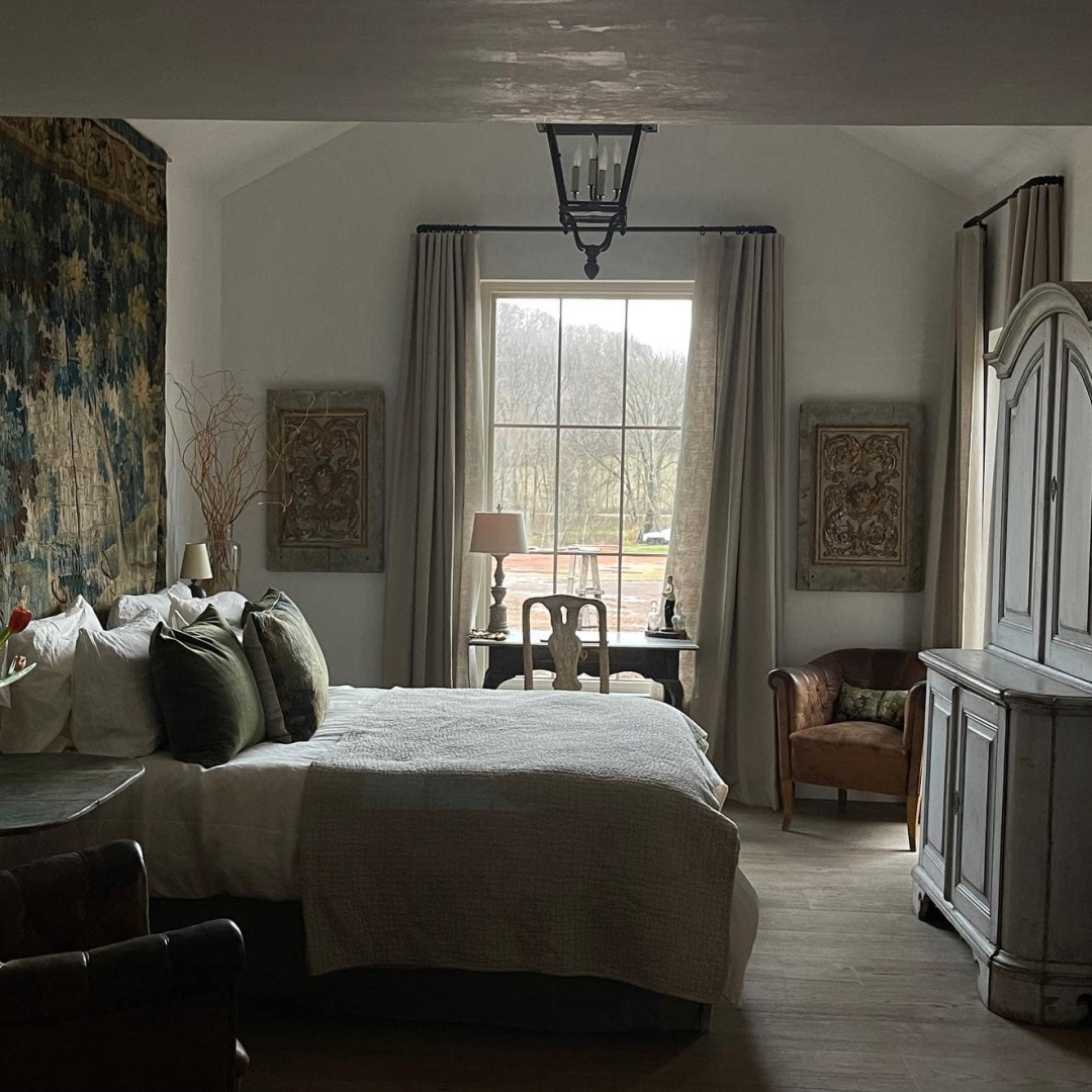
While I’m guessing the walls in the Giannetti’s Tennessee log cabin are plaster or skim-coated with plaster, in this shadowy image above, the walls remind me of SW Repose Gray. I did a thorough review of Repose Gray in this.
Repose Gray is on walls in our Georgian’s dining/music room, living room, and foyer:
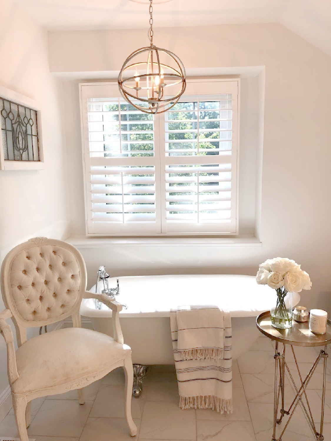
What if you’re after a very cool crisp bright white like the color on my trim above?
You could sample Benjamin Moore Chantilly Lace:
Doesn’t it add a modernity?

Here’s another brighter white to sample if you like Chantilly Lace:
Benjamin Moore White OC-151
I especially love OC-151 from Benjamin Moore. This is the white I covered the interiors of our former fixer with:

One thing it is not? Shy.
Here it is on ceiling and trim in the kitchen:
I went into more detail about BM White OC-151 in THIS STORY.
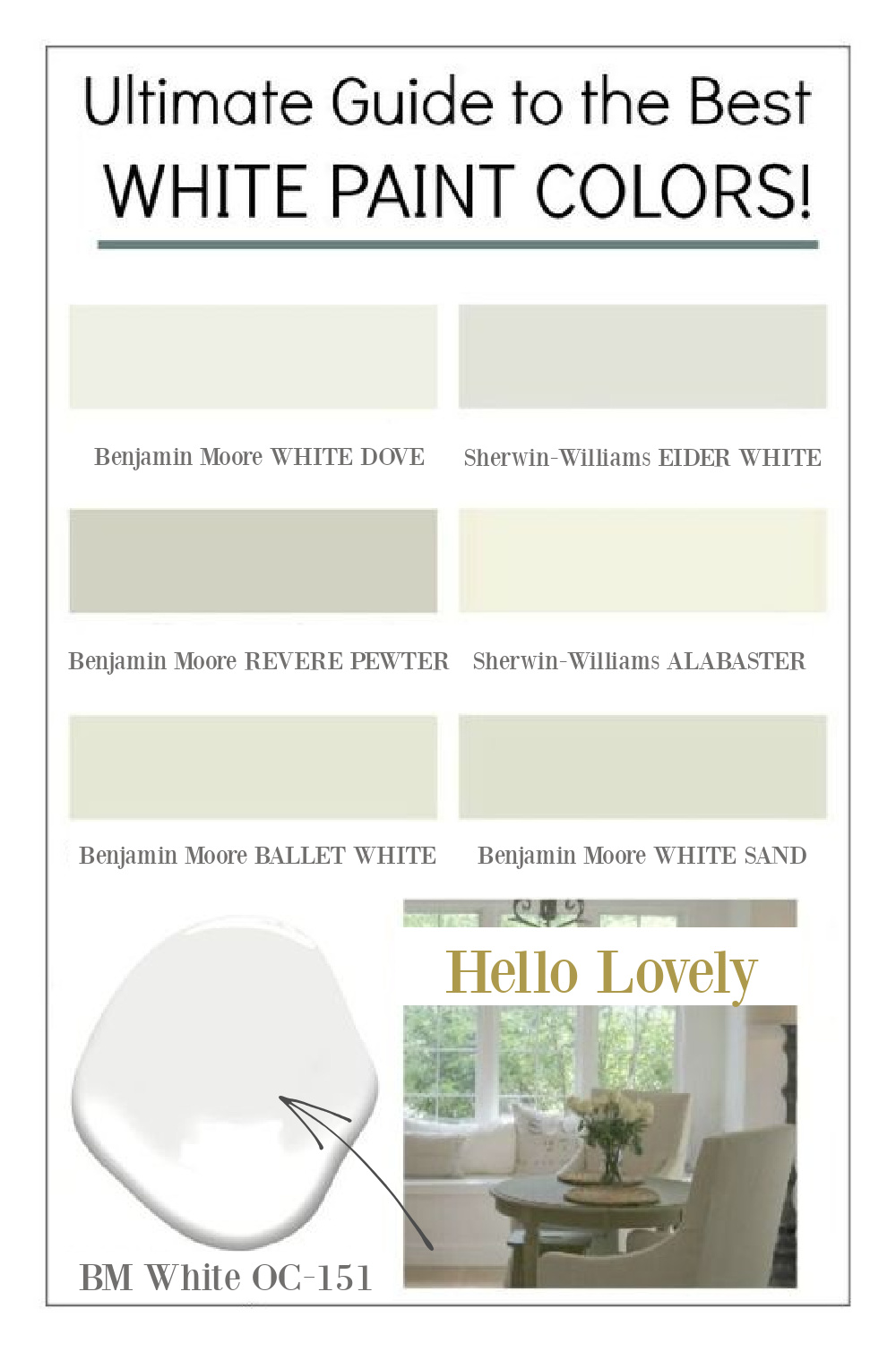
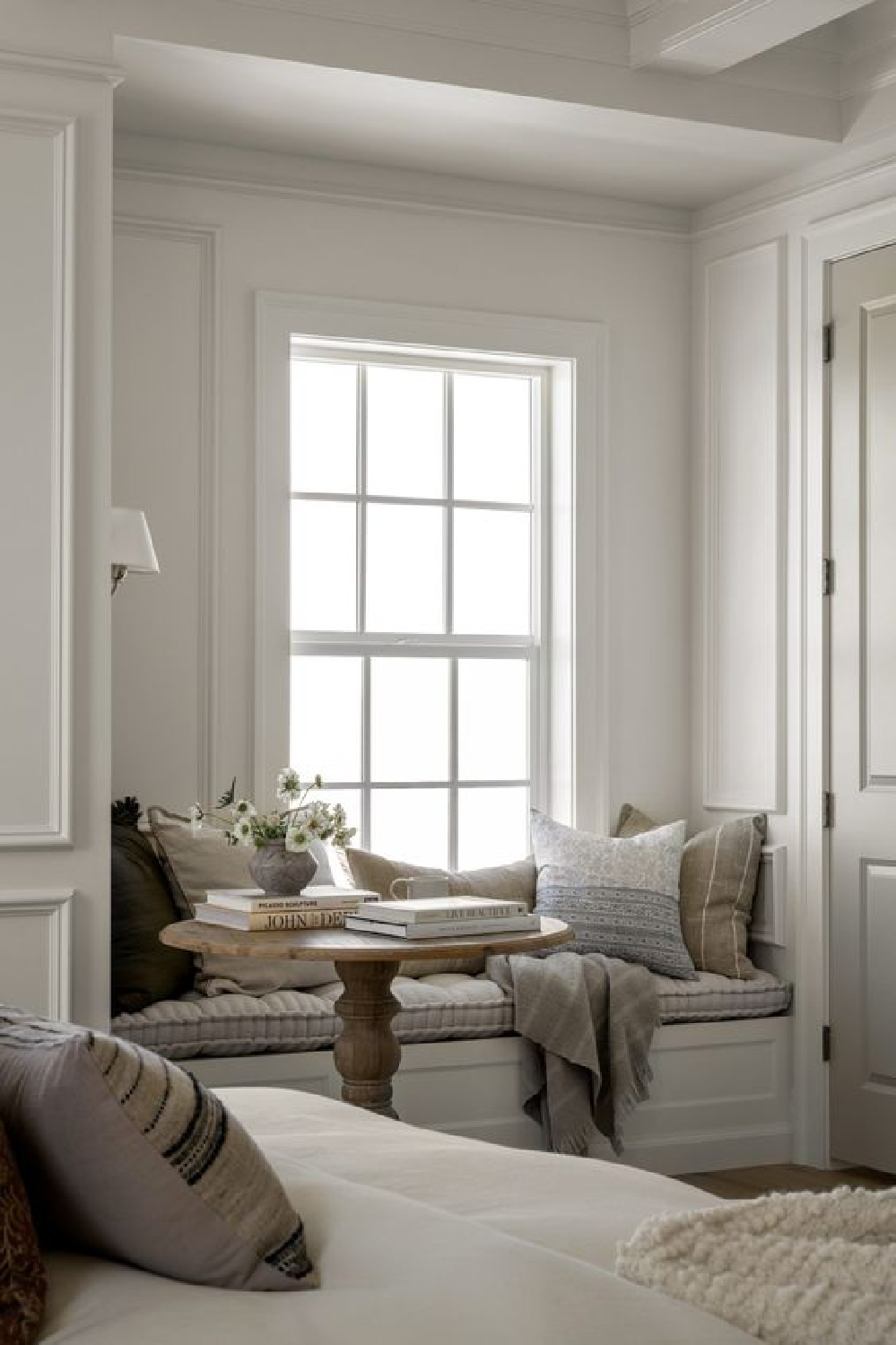
OC-151 is a great choice for cool white painted trim, ceilings, doors, and windows.
Here’s another photo of OC-151 in our former breakfast nook with window seat:
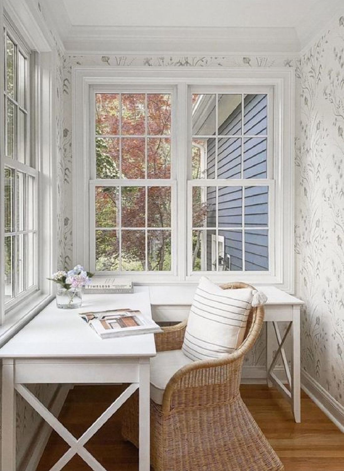
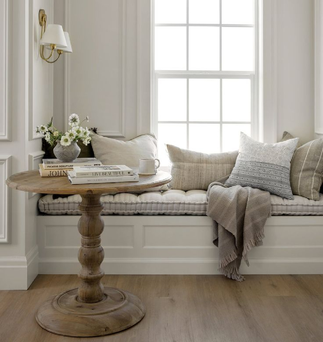
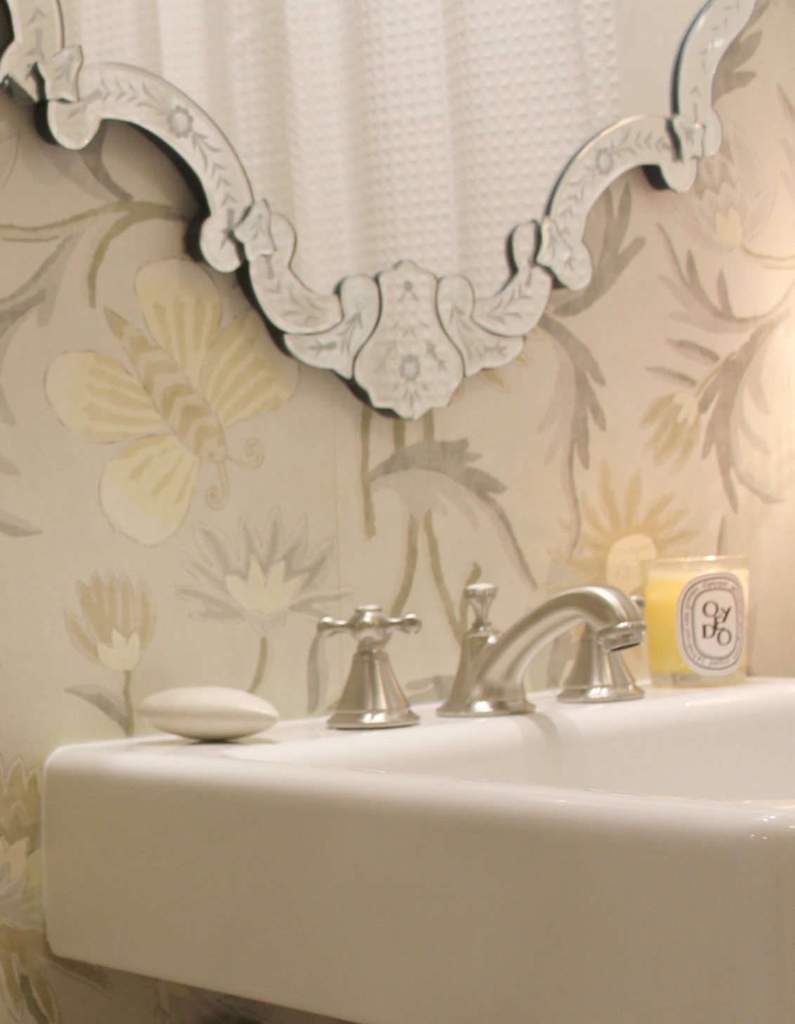
Off White Colors for an Understated Pale Look
White OC-151 may be too cool to get the effect of this plaster:
But here’s an idea to approach that look:
Here is All White on the trim paired with Farrow & Ball Ammonite for walls:
Do you like the sophistication of Ammonite on the walls?
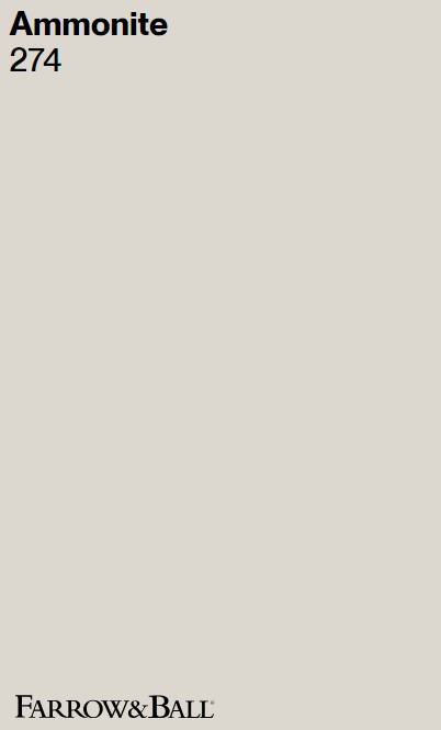
While I’m unsure of the paint color Studio McGee used in this cozy nook, Ammonite would be beautiful for such a moment:
For fans of putty and muted limestone…
Benjamin Moore Pale Oak
Just the sound of this color is intriguing…but somebody smack me…don’t be too wooed by the names of colors!
Isn’t it lovely?
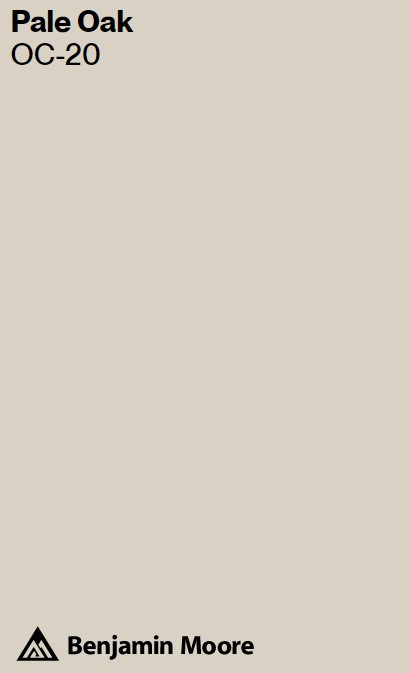
I find that many homeowners are nervous about selecting neutrals to complement wood tones, but earthy neutrals are always right at home with wood.
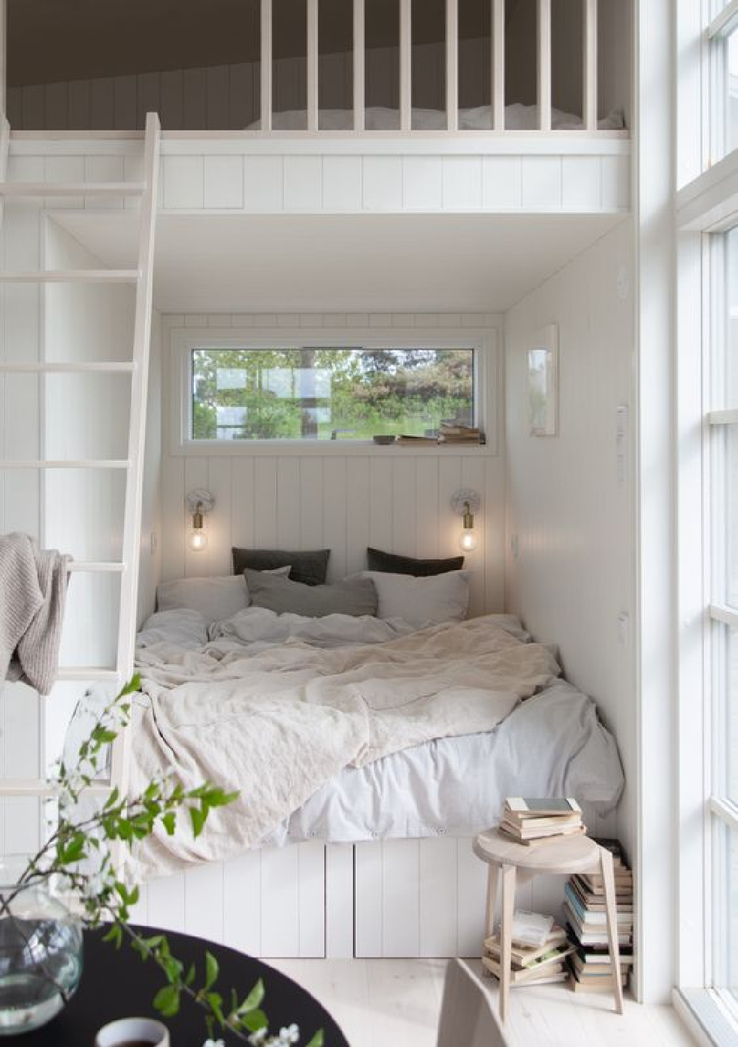
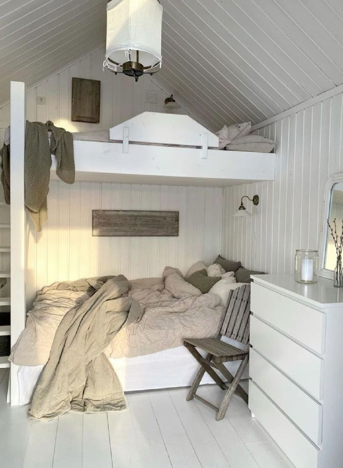
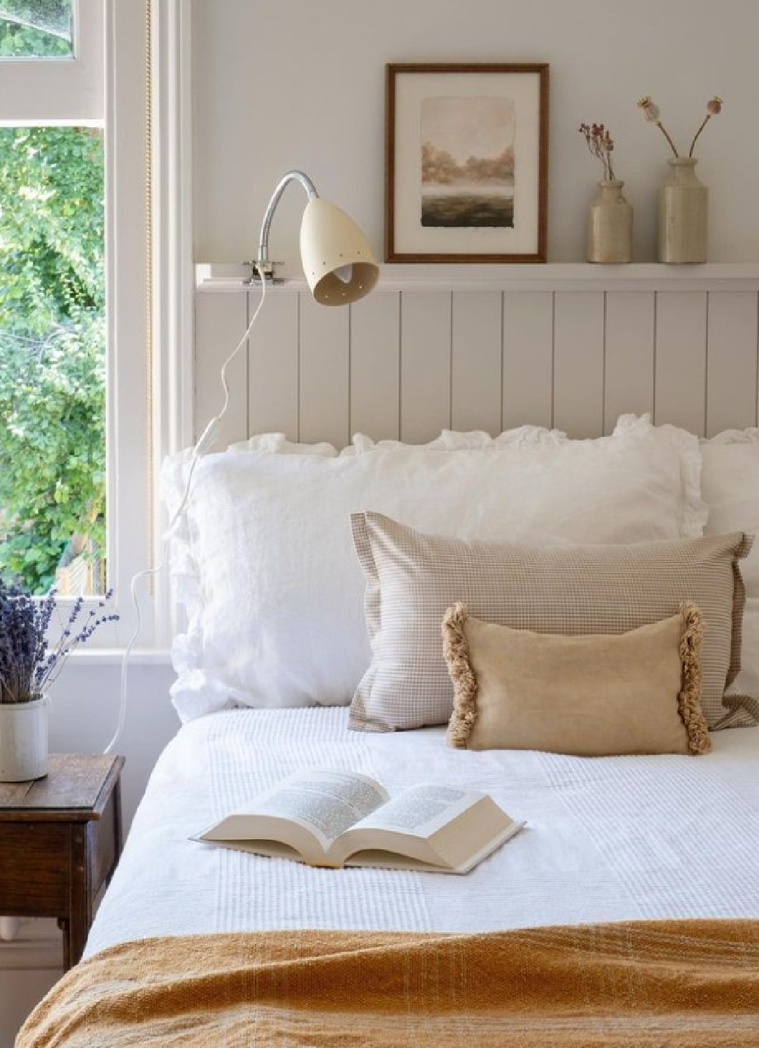
A Cozy Look With Grey & White
Some of my favorite cozy European country interiors use low and subtle contrast. Here’s a bunk area with painted wood floors and paneling:
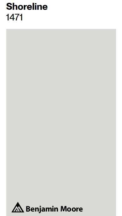
Here’s Shoreline on the floor of a gorgeous kitchen:

Say what you will about the blandness or vanilla-sedative of soft greyed neutrals, but with so much chaos beyond our walls, it can be good medicine.
What a lovely calming hue!
Doesn’t it seem like a beautiful contender to sample? Wouldn’t it be lovely on a front door of an all white house?
Beyond Paint Colors for Getting it Cozy
So often it isn’t the paint colors that grab you when a room strikes you as warm and inviting.
And isn’t this mostly the goal? To create a mood with texture, interest, and comfort that evokes a feeling of tranquil sophistication?
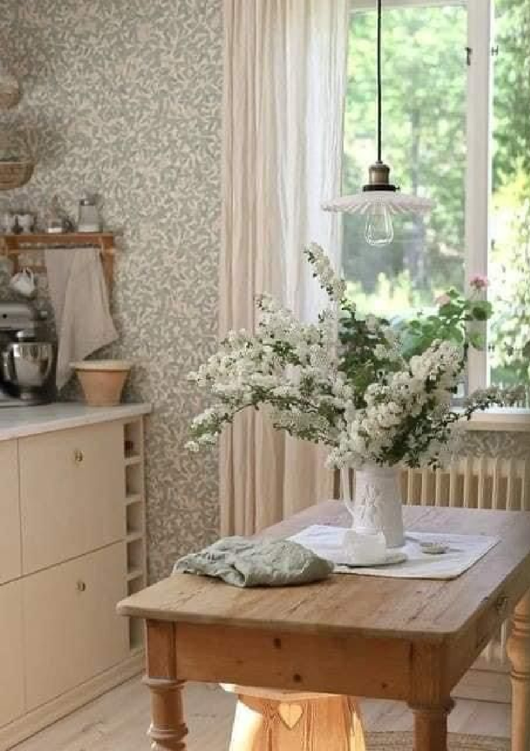
Wallpaper patterns continue to keep things in design interesting and varied these days! Such pattern need not be bold and dramatic – there are so many natural patterns to echo nature these days.
You also can’t miss an increased interest in millwork, applied trim, and fine paneled details.
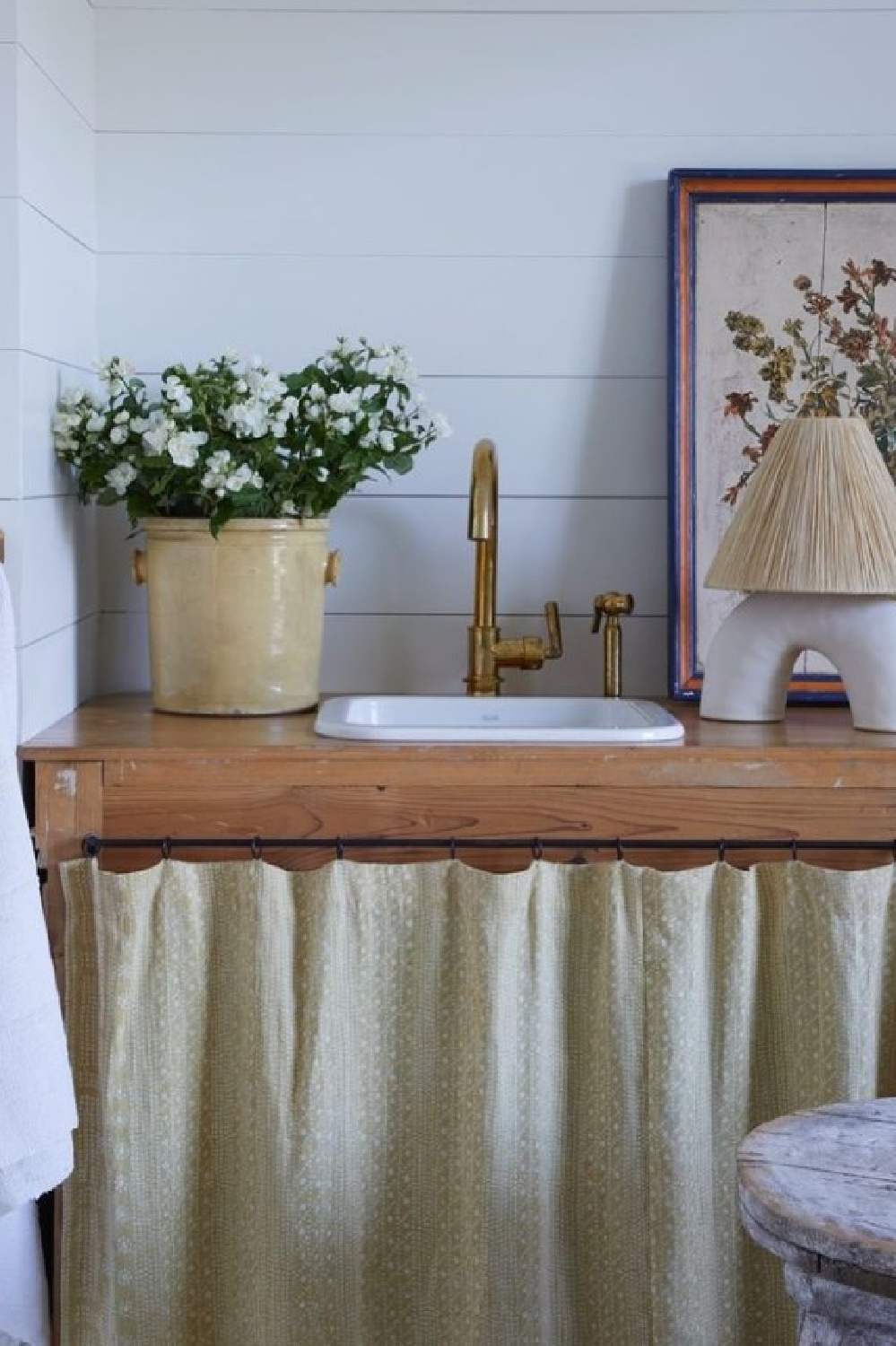
Even the simplicity of old fashioned lace curtain sheers turns up the cozy.
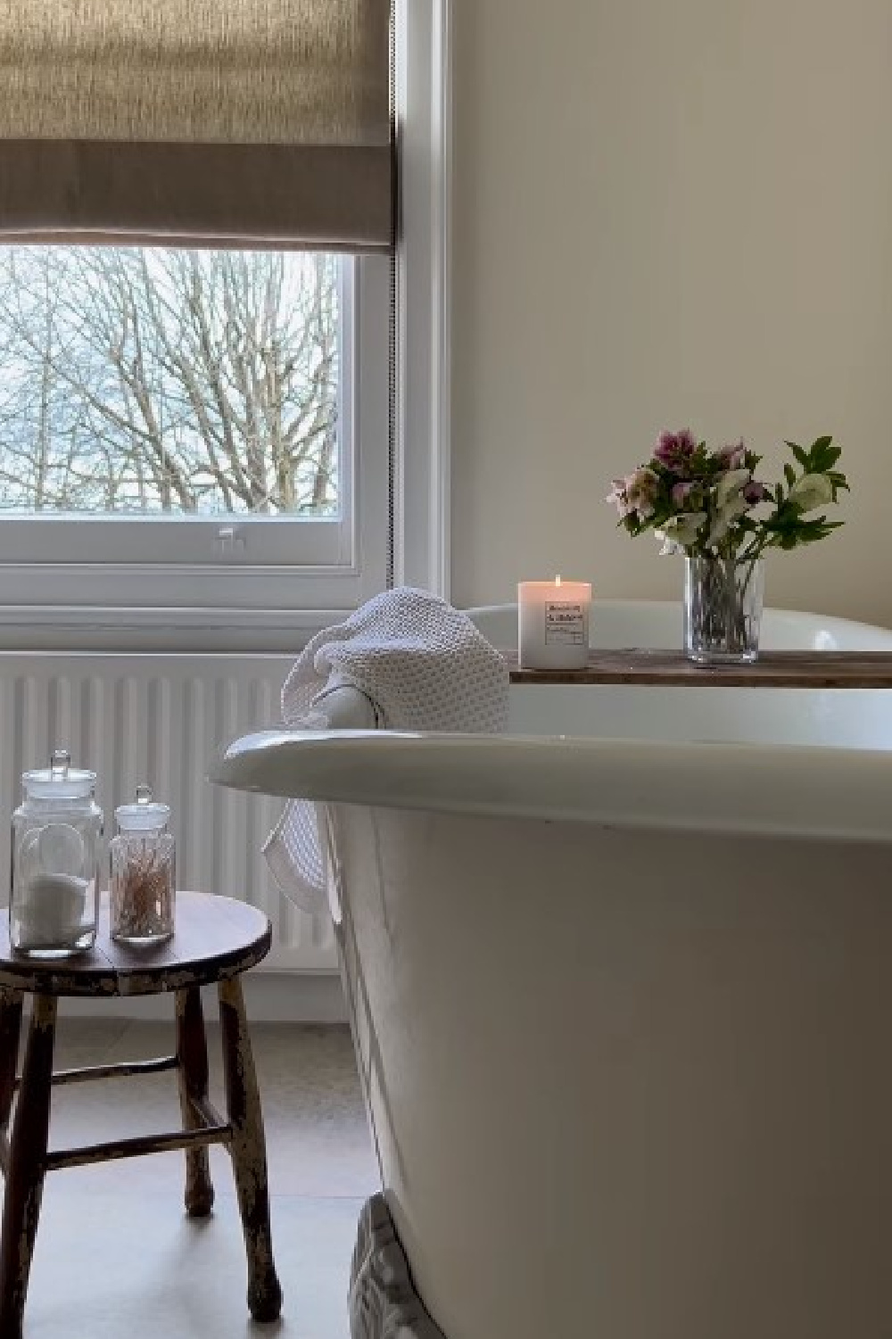
Of course we could devote an entire post to the power of candlelight…
Oh that the one below were lit!
Cozy Details for European Country Charm
What a gift to have access to the portfolios and feeds of so many top designers in the field who pay attention to the smallest of details.
We are treated to glimpses of how to live with our beloved collections and treasures…
And non-professional creative homeowners who have found their calling also show us what a cozy nest can become…
Care to visit a few English inspired Homes? Splendid!
Thanks for being here and joining me as we gather inspiration on the journey.
Peace to you right where you are.
-michele
I independently selected products in this post—if you buy from one of my links, I may earn a commission.
Thanks for shopping RIGHT HERE to keep decor inspiration flowing on Hello Lovely!
Hello Lovely is a participant in the Amazon Services LLC Associates Program, an affiliate advertising program designed to provide a means for sites to earn fees by linking to Amazon.com and affiliated sites.


