We recently peeked inside Maison de Lee–that sweet new build with a facade oozing with storybook charm. This modern French home with interiors by Jenny Martin boasts an inspiring color palette of gentle hues. Today we will note the exact paint colors and traditional style elements (The arches! Those eyebrows!). I won’t soon tire of this nostalgia romance that feels wholesome, livable, yet fairytale-like.
Modern French Paint Colors Revealed
Project: Maison de Lee (in Victoria’s South Oak Bay neighborhood); Builder: M. Knight Construction; Home Design: Zebra Group; Interiors: Jenny Martin Design
What’s this storybook charmer’s story?
Maison de Lee is the name of this beautiful home which won seven awards including Project of the Year.
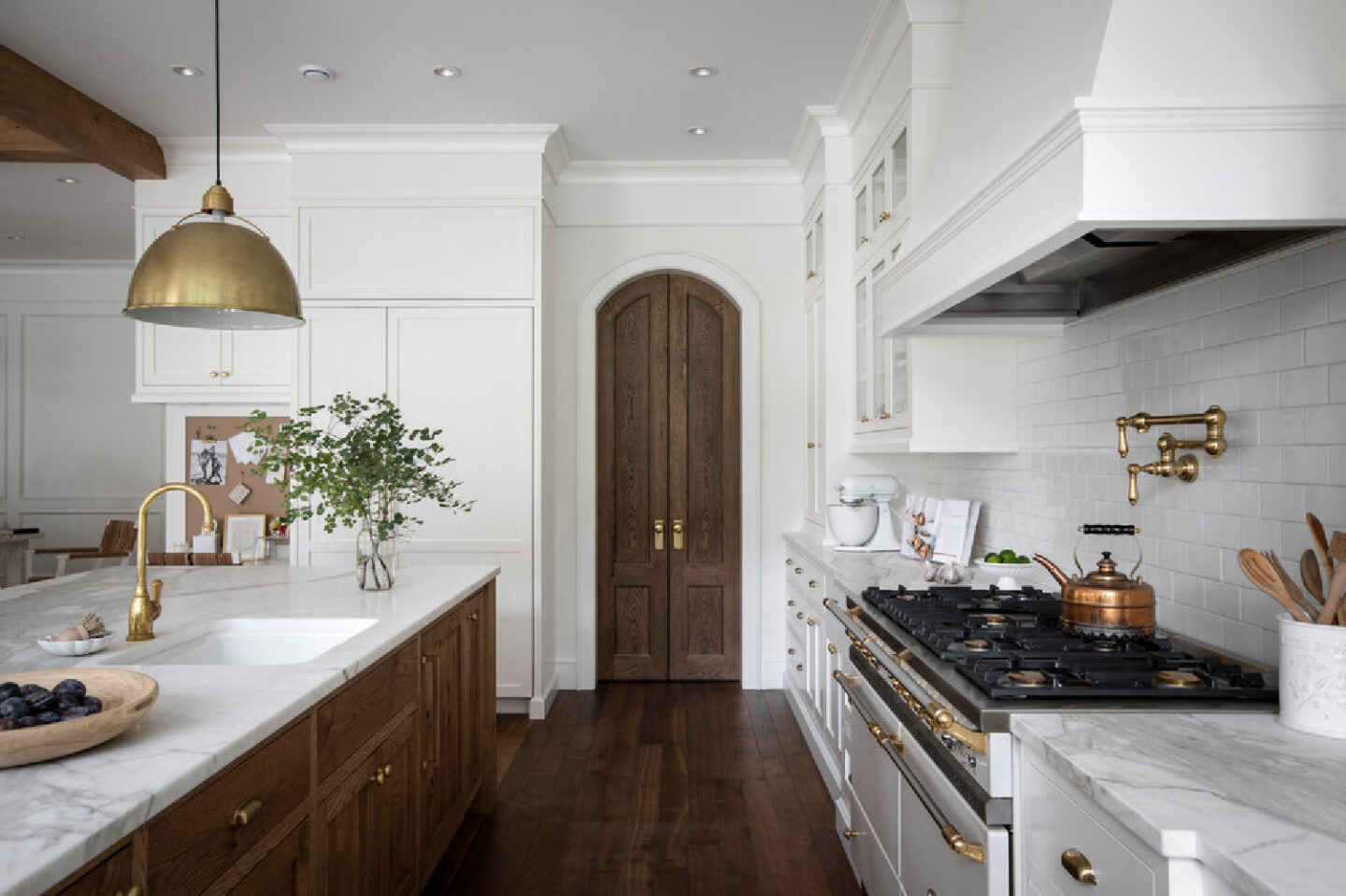
“Aiming to incorporate traditional elements with an aged vintage quality, this project integrates detailed mouldings, rustic white-oak beams and soft arches, pairing them with unlacquered brass and natural marble specifically selected to age gracefully over time. The aesthetic was elevated with a restrained palette of natural tones.” – Jenny Martin
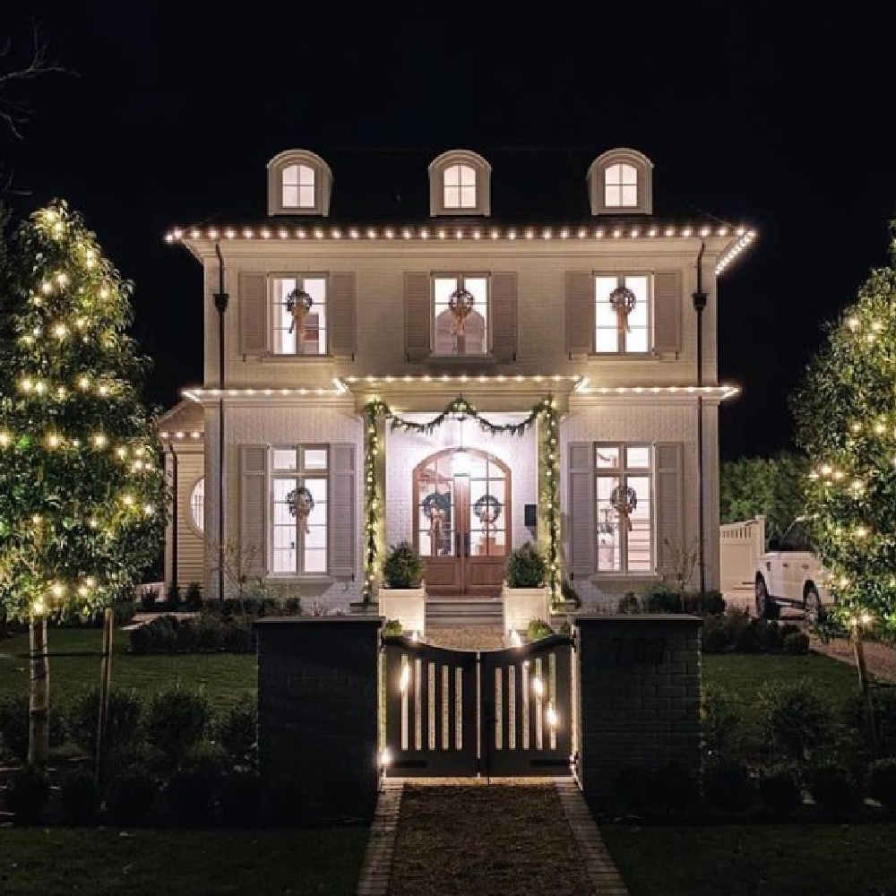
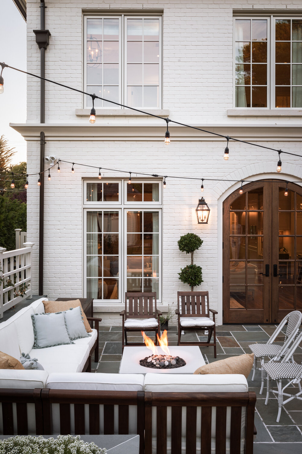
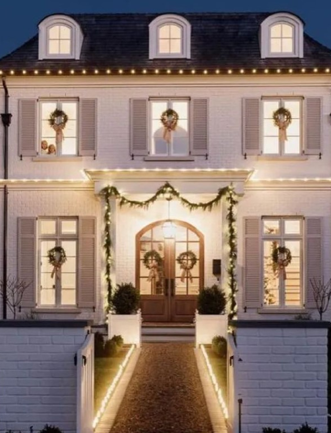
Care to see it lit up at night during the holidays?
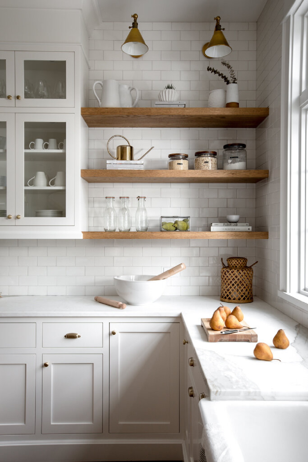
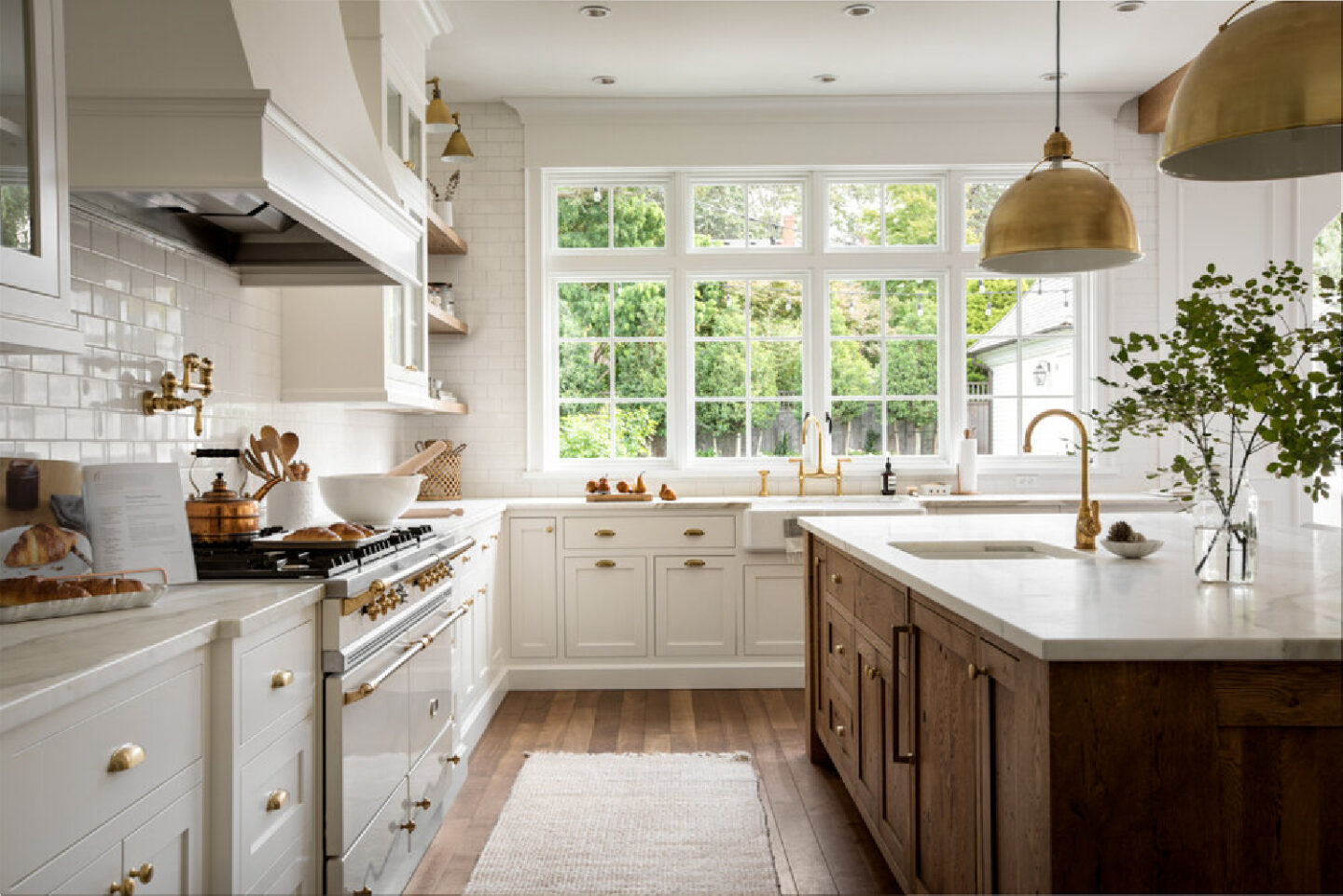
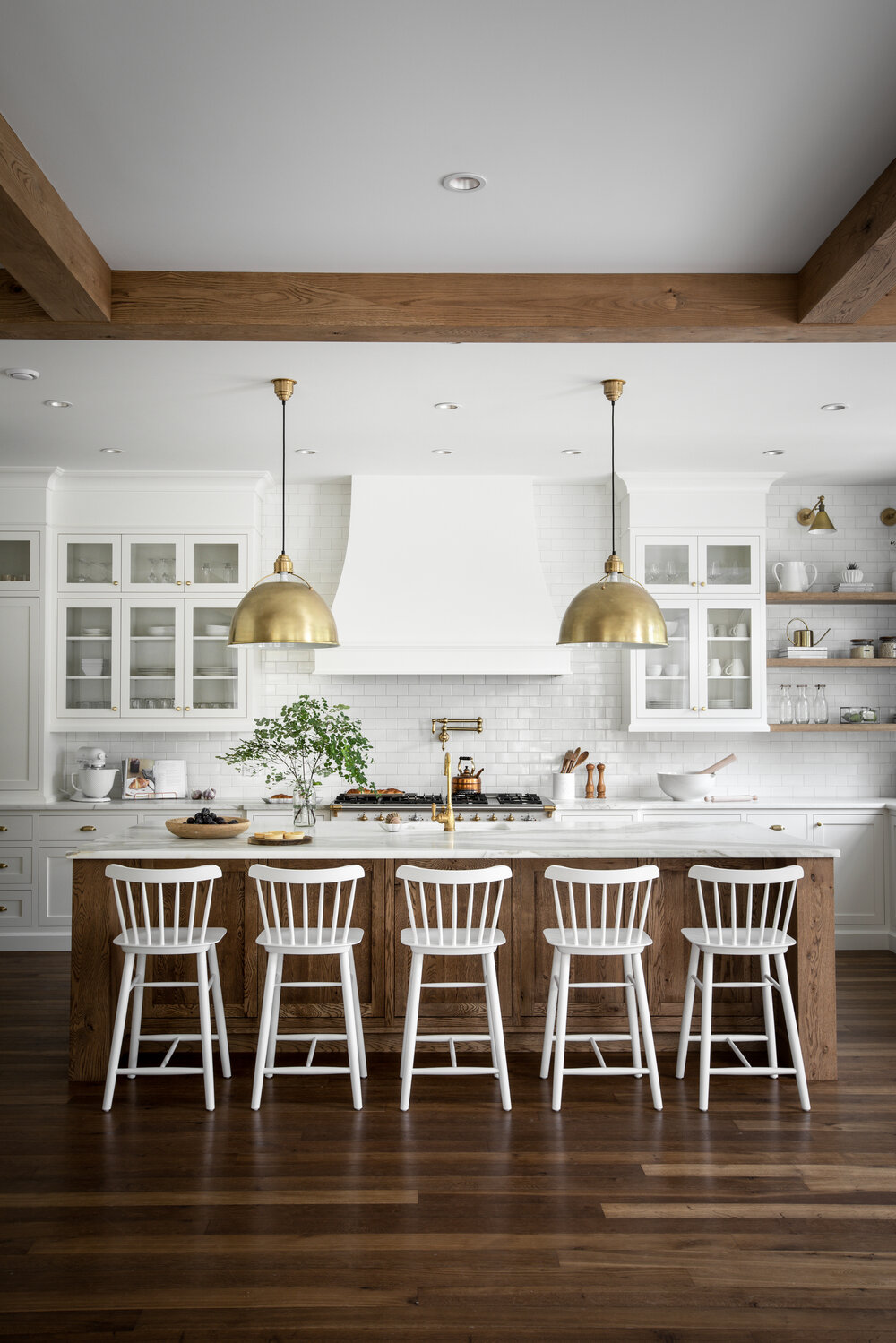
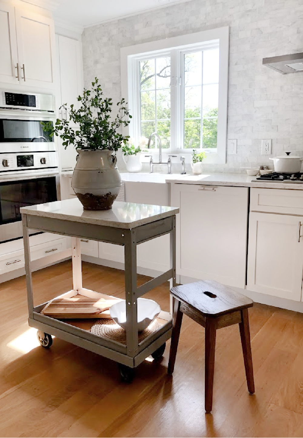
Atmospheric Paint Colors in a Modern French Country Kitchen
If you love this look, turn to Benjamin Moore White Dove. The reason so many designers have sworn by this white for decades (oh goodness, I have used it since the early 90s) is it has traditional feel and doesn’t seem to change throughout the day when the light does. I love painting vintage castoff furniture this white since it feels harmonious with older things.
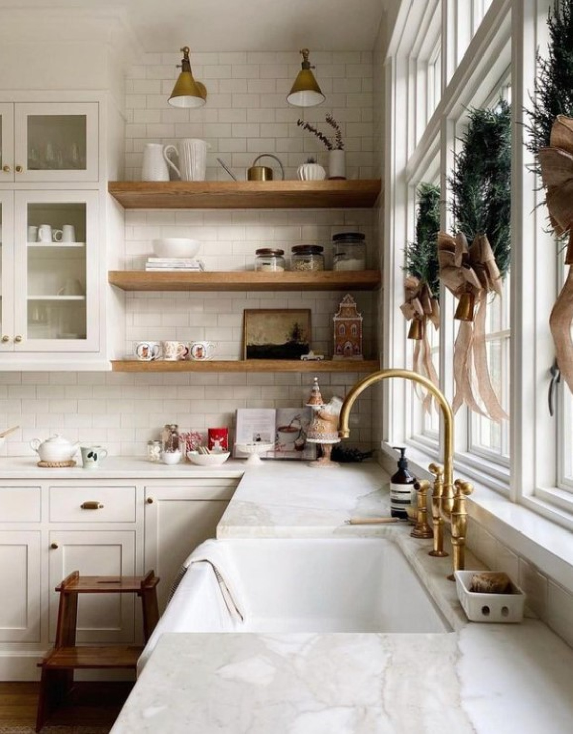
If you’re not bandwagon-y, maybe this project will incentivize you to choose white subway tile for a backsplash in spite of its virality. When you’re after an understated atmospheric calm look, sub-way adds a sub-tle flavor. In addition, it adds a certain amount of nostalgia and timelessness.
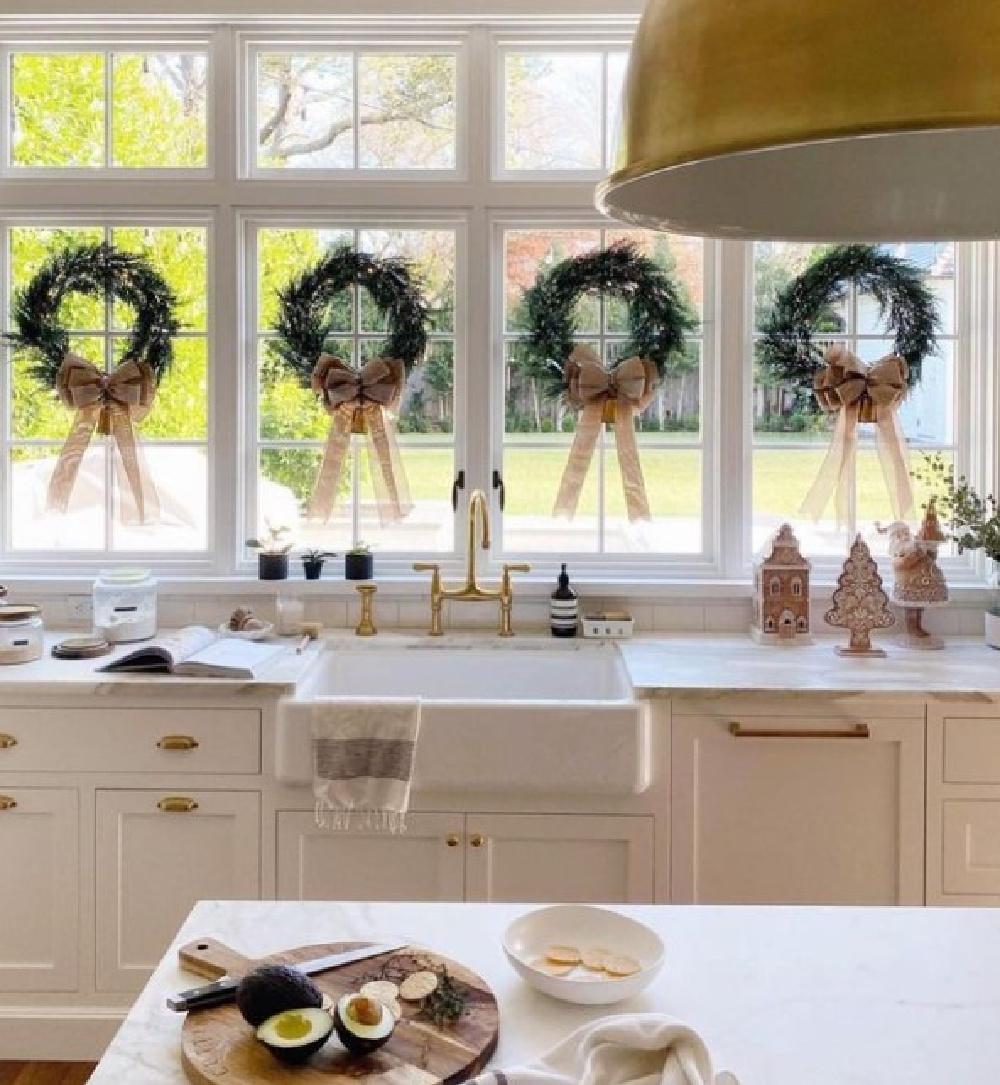
Are you a fan of beautiful holiday wreaths lined up across the windows as in this kitchen? So many lovely choices now when you want the look of real greenery but without the messy needle drama!
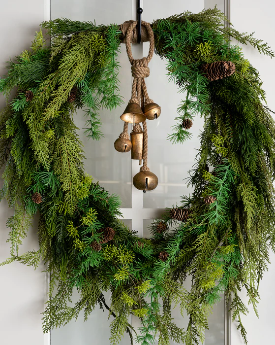
An investment for sure, but I have no regrets about the high quality fresh looking artificial arrangements in my collection that keep looking fabulous for years.

Will a single color for walls and millwork create an atmospheric mood?
You can choose a single color for cabinets and walls, and they will appear slightly different if you vary the sheen (flat or satin for walls, satin or semigloss for cabinets).
For example, if all the trim and doors in your home are painted White Dove, it may be okay to stick with that paint color in the kitchen areas.
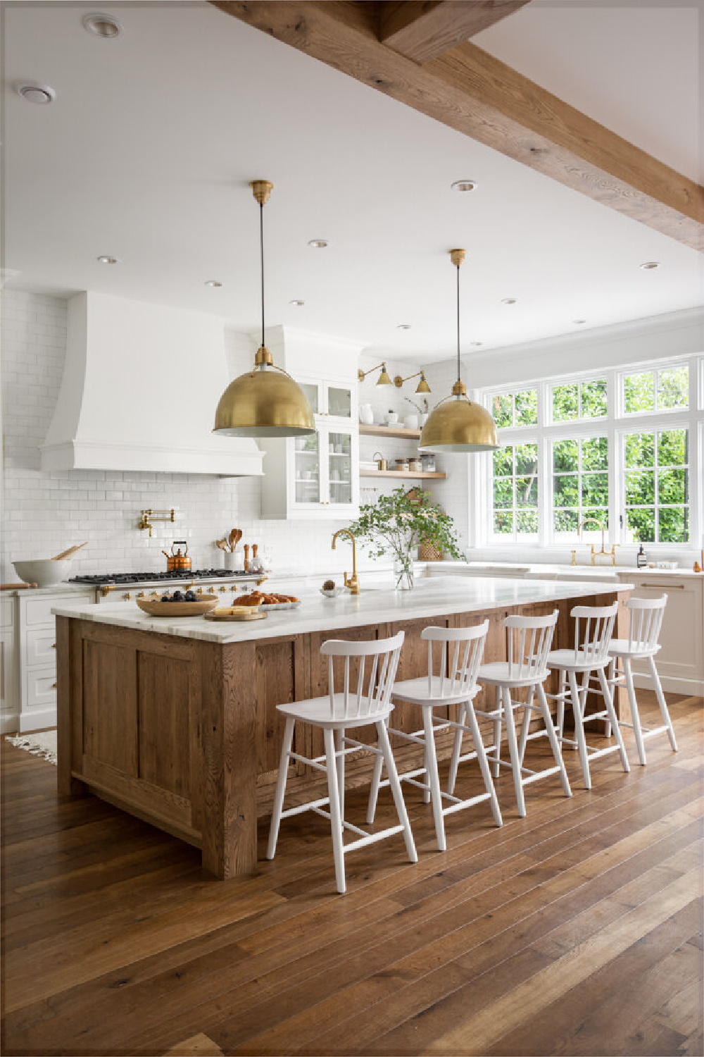
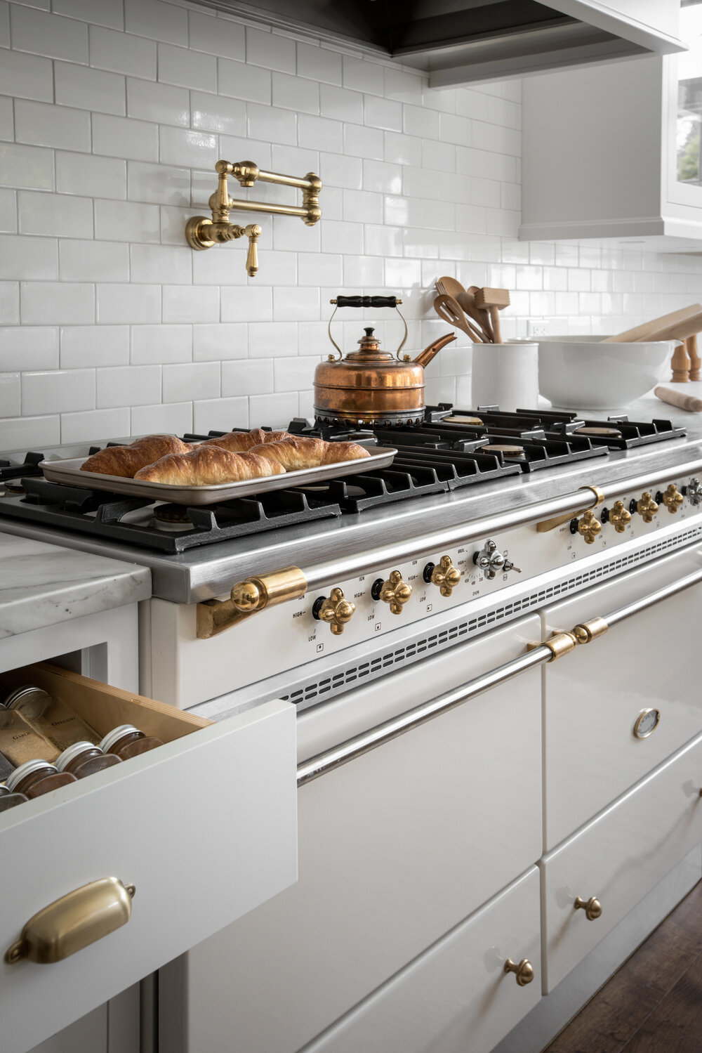
What contributes to an “atmospheric” mood? In this newly built kitchen, the finishes, color choices and design elements combine to create a feeling of romance. A sense of history, age, and context prevail. White Shaker cabinets and warm brass hardware contribute to a traditional yet fresh vibe. Best of all, the timeless choices here will remain relevant.
Bonus Paint Color Tip from a Real Life Renovator (moi): Make the oh so important choice for your countertop material first. THEN you’ll decide on the backsplash. With those decisions out of the way, your moment arrives to sample paint colors. Sample at least three and choose your favorite that works well with all those other finishes in the kitchen design.
Idea for an Atmospheric Color for Kitchen Cabinets?
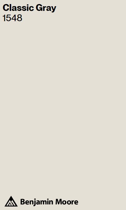
You have endless options for off-white colors for cabinets. Should you need a place to start, stick to whites with grey undertones rather than brown or yellow for this serene, atmospheric look. There are plenty of off-white paint colors beyond White Dove. Classic Gray above, for example. While it sounds like a gray, I have used it plenty of times as white.
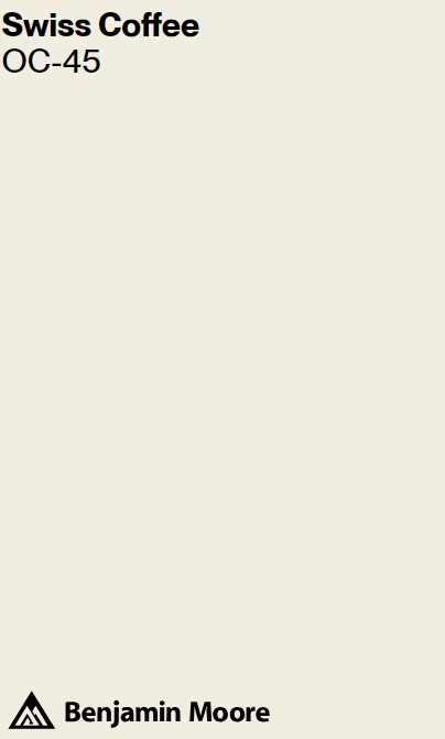
F&B Blackened No. 2011, Valspar Swiss Coffee 7005-16, or Benjamin Moore Classic Gray (yes, plenty of whites don’t have “white” in the name!) are beautiful contenders.
What I’m calling atmospheric or serene here is not the same as sterile. The warmth of wood, metal, and natural materials creates cozy atmosphere and feels inviting. Ever heard of guests lingering longer at a dinner party when the walls are a particular color? So interesting to consider.
Still haven’t picked up this watering can which is similar to the one above. Sometimes those small touches can be big moves.
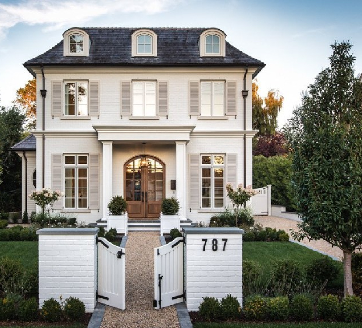
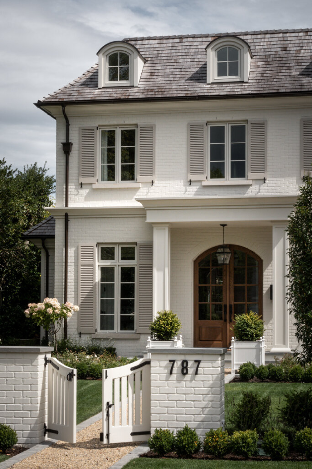
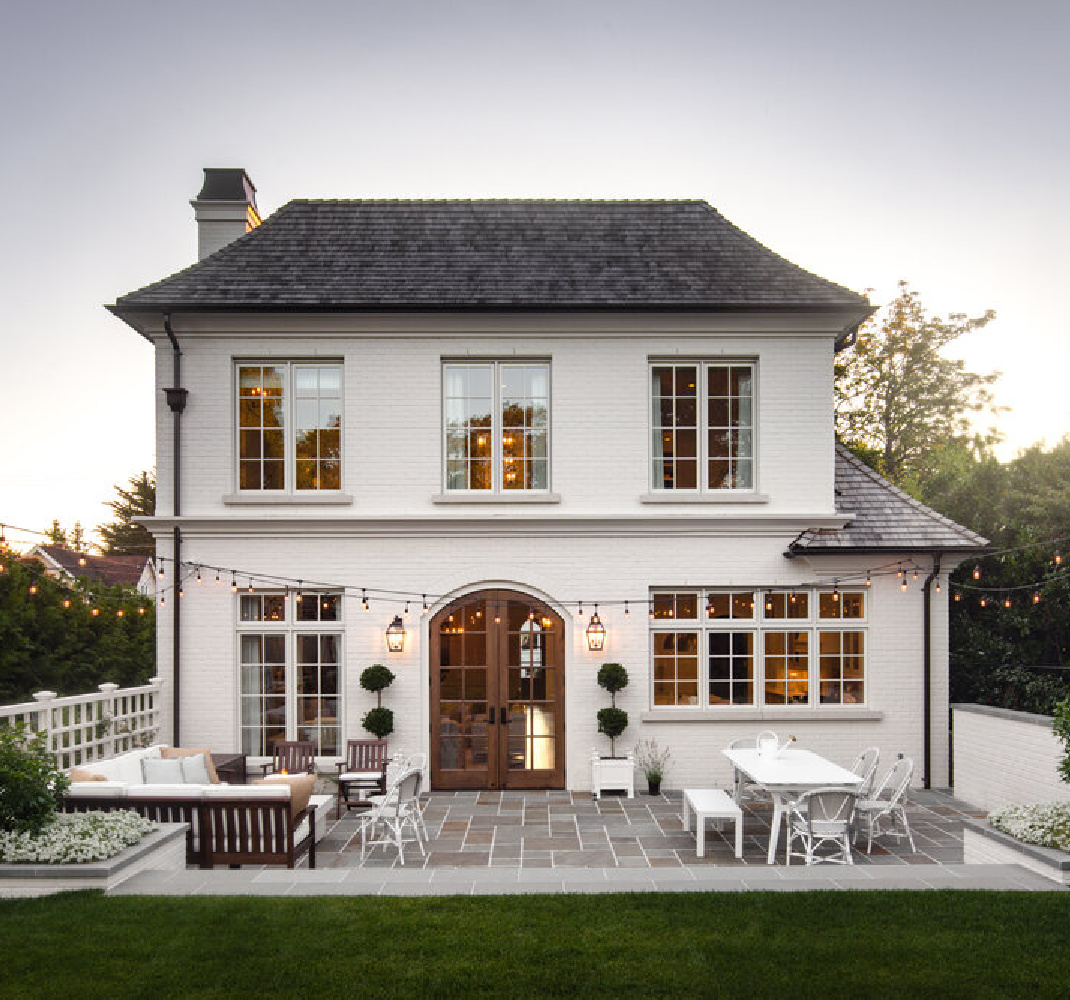
Lovely Colors for This Storybook Facade
It is often frustrating to choose paint colors seen in photos online. There may have been post-production editing or the home may be in an entirely different region of the globe than yours. Add to this that the time of day an image is snapped matters!
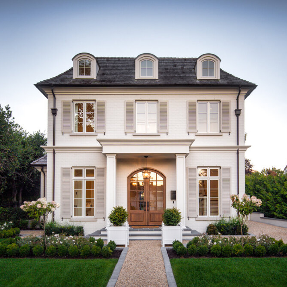
Hence, it is wise to buy samples of a few different whites in the family of whites (warm or bright or cool, etc.). The exact exterior color on this beautiful house is:
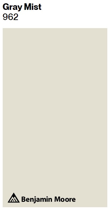
For whites close to Gray Mist that you may want to sample (because your paint color mama is telling you she knows they all look the same online but it’ll be a different story when you see them in YOUR space side by side)…consider Sherwin Williams Snowbound, Benjamin Moore Calm, and Farrow & Ball Strong White. Bear in mind that the perfect white for your atmospheric space may have “gray” in the name, and that perfect gray you’ve been hunting down? The paint color name may have “white” in it.

The exact atmospheric paint color on this home’s trim and shutters?
You may want to test several similar atmospheric light grays to be sure you find the one that works well with your particular exposure. Another one to sample? Farrow & Ball Ammonite No. 274.
To increase contrast between the siding and trim colors, you could consider:
I have enjoyed oodles of positive experiences with Repose Gray and included a bunch of inspiration photos here. It is quite similar to Farrow & Ball Pavilion Gray No. 242 which is why I created this graphic:
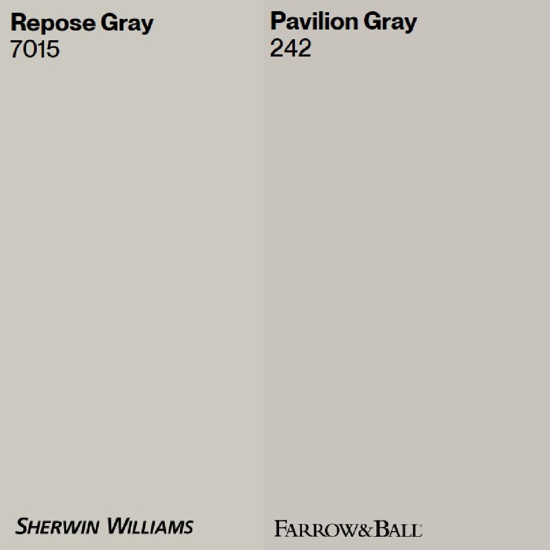
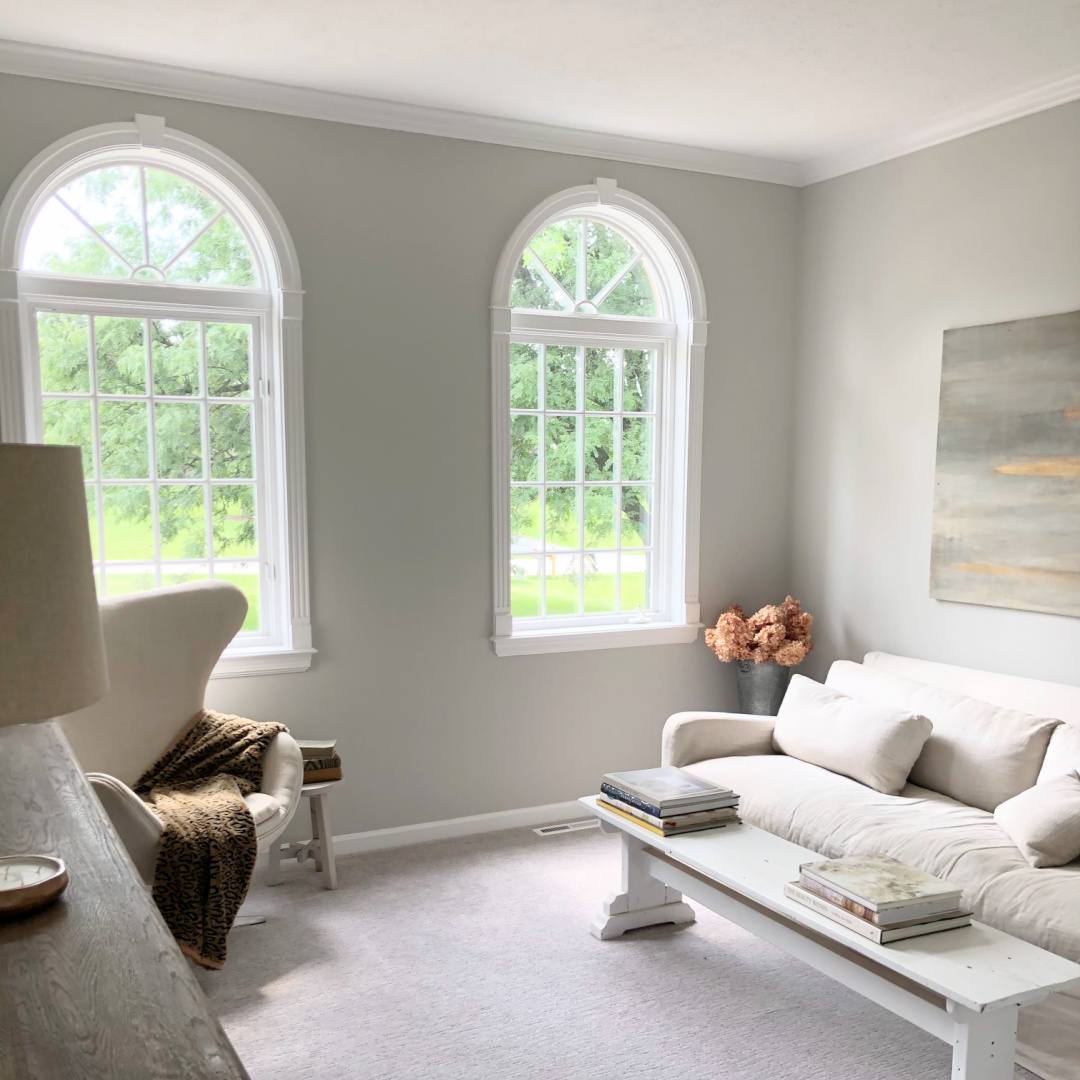
I find Farrow & Ball Pavilion Gray to have more blue undertones so it reads cooler than Repose Gray in my own home. Here’s Repose Gray on walls:
And here is Pavilion Gray (at 66% saturation) on my kitchen cabinets.
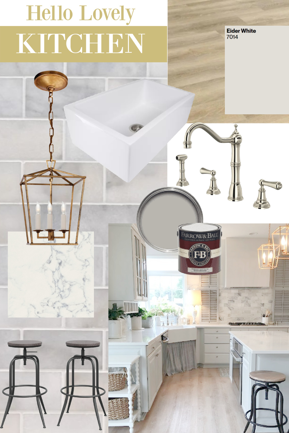
While we’re on the topic of atmospheric paint colors, don’t count out SW Eider White (on walls above in our kitchen).
It’s a different sort of off-white, light grey-white that I learned about when we bought our home two years ago.

Traditional Architectural & Design Details for Atmospheric Interiors
Airy & Open Shelves
I love how the shelves look in this gorgeous kitchen design. They are an opportunity to show off pretty kitchenware, but more importantly, they keep essentials at the ready. I am *this close* to FINALLY adding shelves to flank our range hood. What’s the delay? When the kitchen is finished, it’ll be tempting to move, and that is WORK…hahahaha.
One way to decide whether you’re the type who would like living with open shelving? Simply clear an area of your countertop beneath an existing wall cabinet. Place dishes, mugs, or essentials there right on the counter that you plan to place on shelves. Live with this system to see if it agrees!
How Bright Whites, Neutrals & Warm Oak Interact
If you are responding favorably to this inspiration kitchen, it may be that the lighter toned wood feels fresh and not dated. European country style tends to rely on pale tones including light stained or natural wood.
Do you like the absence of black in our former kitchen? I didn’t paint the window muntins black or incorporate much contrast at all since I love a serene, subdued, ethereal mood.
You have probably noticed how popular black and white modern farmhouse interiors and exteriors grew in recent years. Such high contrast with black and white is not for everyone, and it isn’t necessarily the “atmospheric” feel we’re exploring in this post. However…
Introducing Black to a Gentle Color Story
There are no design rules, kittens. You can give yourself all the rules you want for your decorating plans and then wake up one morning and say NOPE. Breaking my own rules. Did you even know you can do this with every aspect of your one precious life? You totally can. It’s what living freely is all about and is where all of the fruit lies.
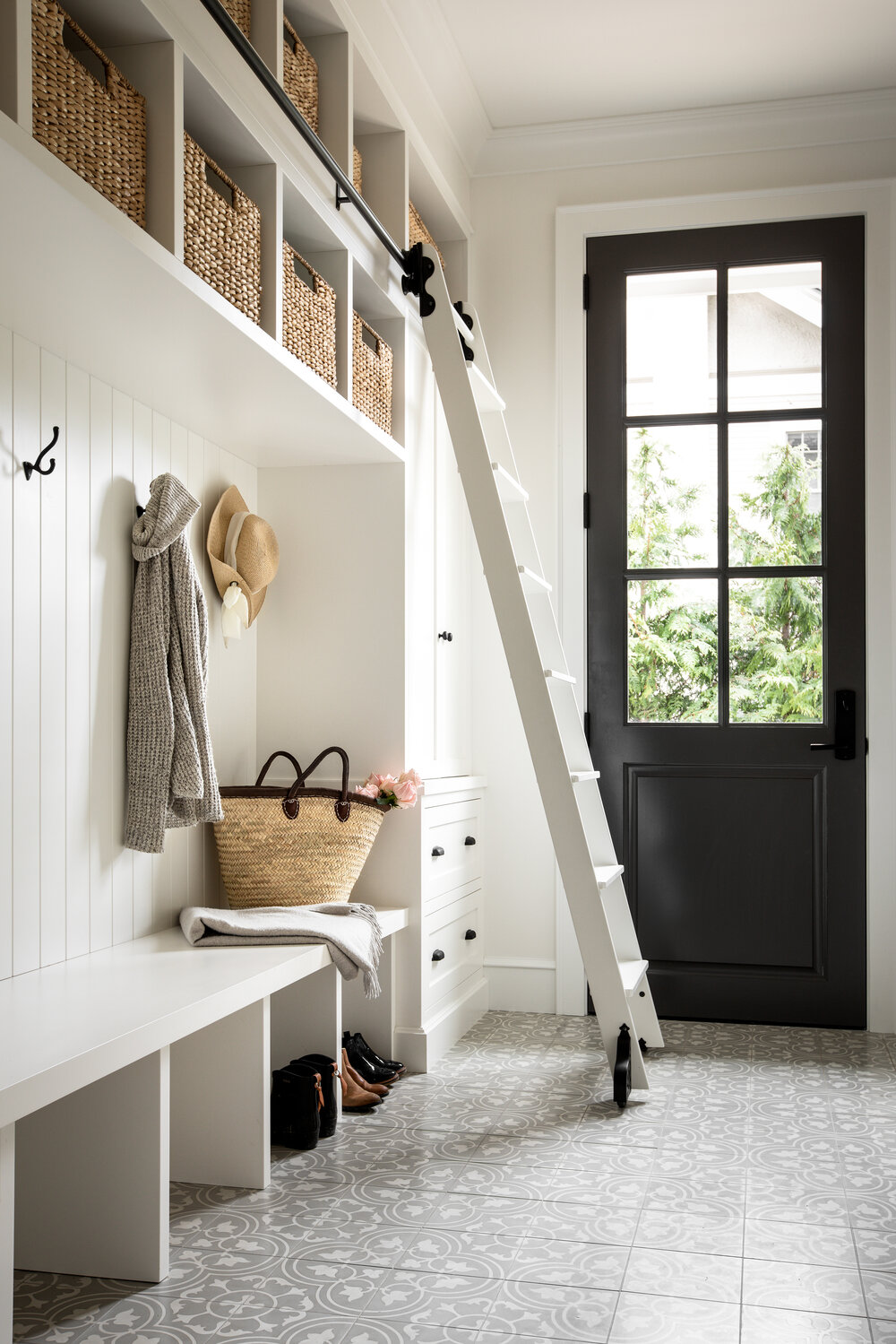
Yes, you could design your utility room or mud room with neutrals but color outside of the lines.
Unexpected Design Choices in a Serene Inspiration Home
It does seem as though little dens and sitting rooms are unpopular now unless they are used as a home office. Rather, newer homes have fewer rooms but more open plans with spacious dimensions for each space. I think that’s why the music room in this newly built home caught me by surprise.
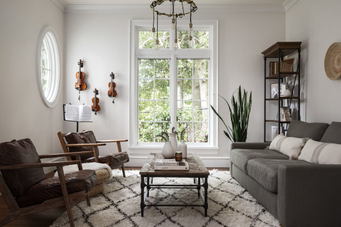
Similar to my own living room here in the Georgian, it’s the perfect sized sitting room. Instead of furniture that is formal and hands-off, a California influenced spare style keep it very flexible and inviting.
You’ll also note from that music room and even this home’s living room (above), that there are some curves added to keep things balanced and not boxy.

Gentle Entry
A sense of grandiosity in an entry is hardly a disadvantage, but there are elements that could hinder the gentle mood for which you’re after. A singular color on walls and trim is relaxing for the eye, and a restrained palette (just a few woven natural accents which echo the hand rail) keep all rather quiet.
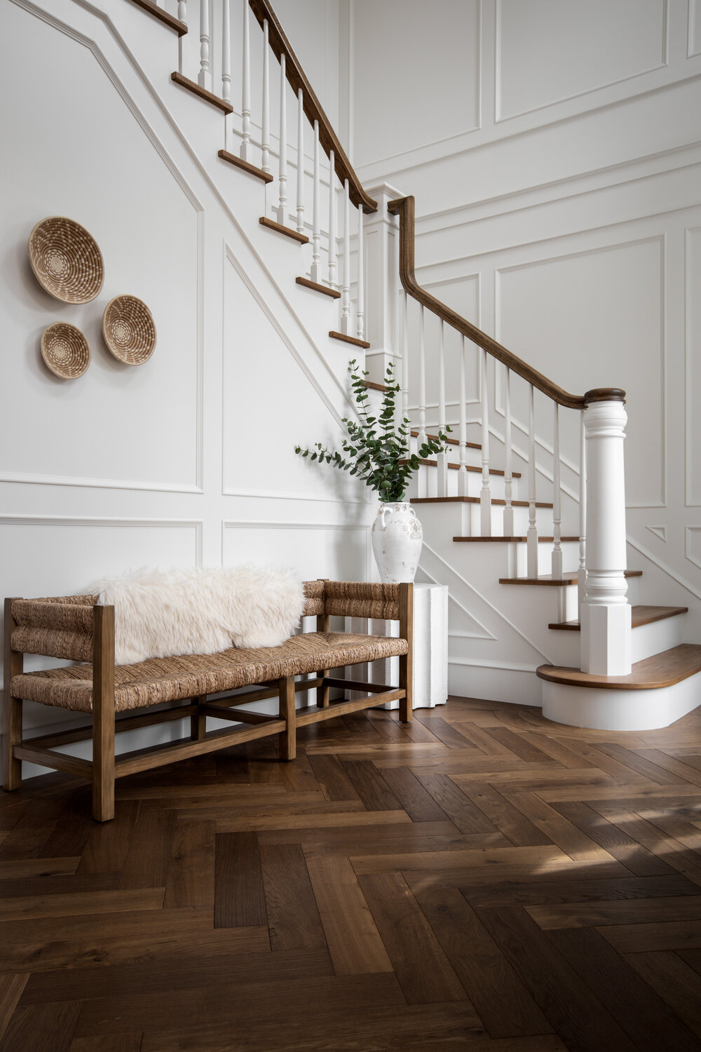
If you’re seeking white paint colors to sample to approach the look of this space, peek at Benjamin Moore Chantilly Lace, Sherwin-Williams Alabaster, and Farrow & Ball All White.
Easiest way to see if a color is right? Order samples with Samplize and have them delivered straight to your door.
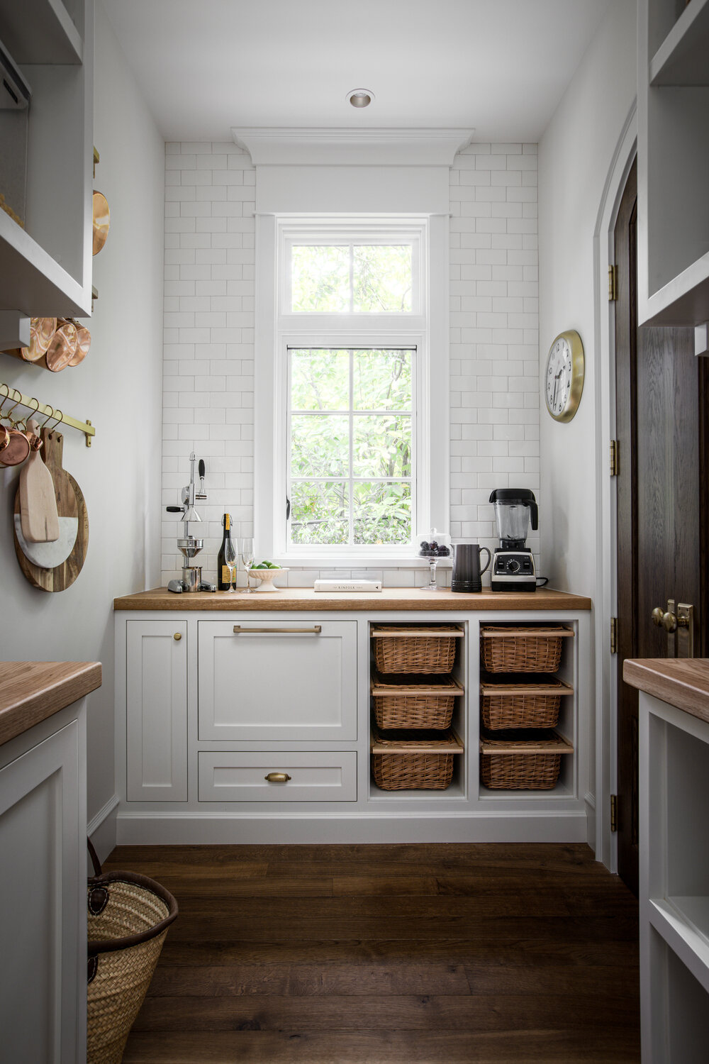
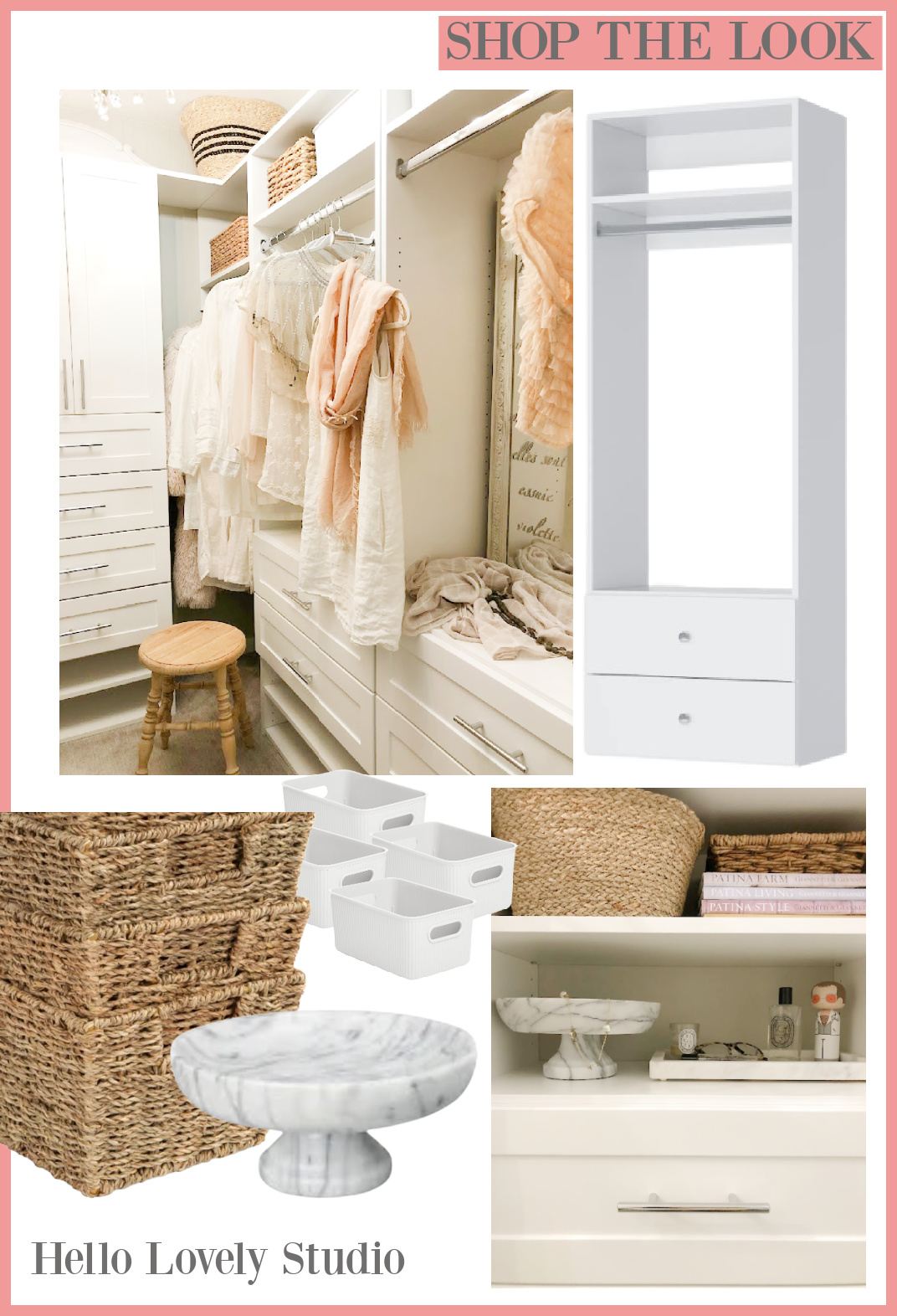
Can a Closet Feel Tranquil or Atmospheric?
Closets are so often chaotic! Apparently a closet totally can! Historic homes are wonderful, but they aren’t going to have modern amenities like this:
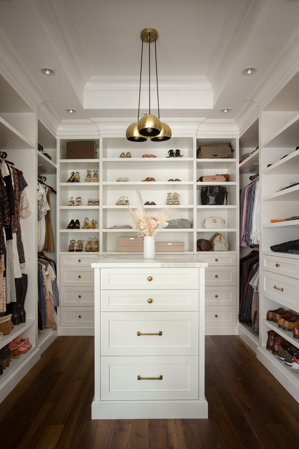
Of course you need not build from scratch. Occasionally we can carve out a closet with clever design choices for a renovation. In our current home, we turned a small unused and terribly awkward bedroom into a dressing room/closet. It can easily become a bedroom once again since my design left plenty of room for a bed. Certainly not luxurious like the custom dream closet above, but my semi-custom DIY closet serves me well.
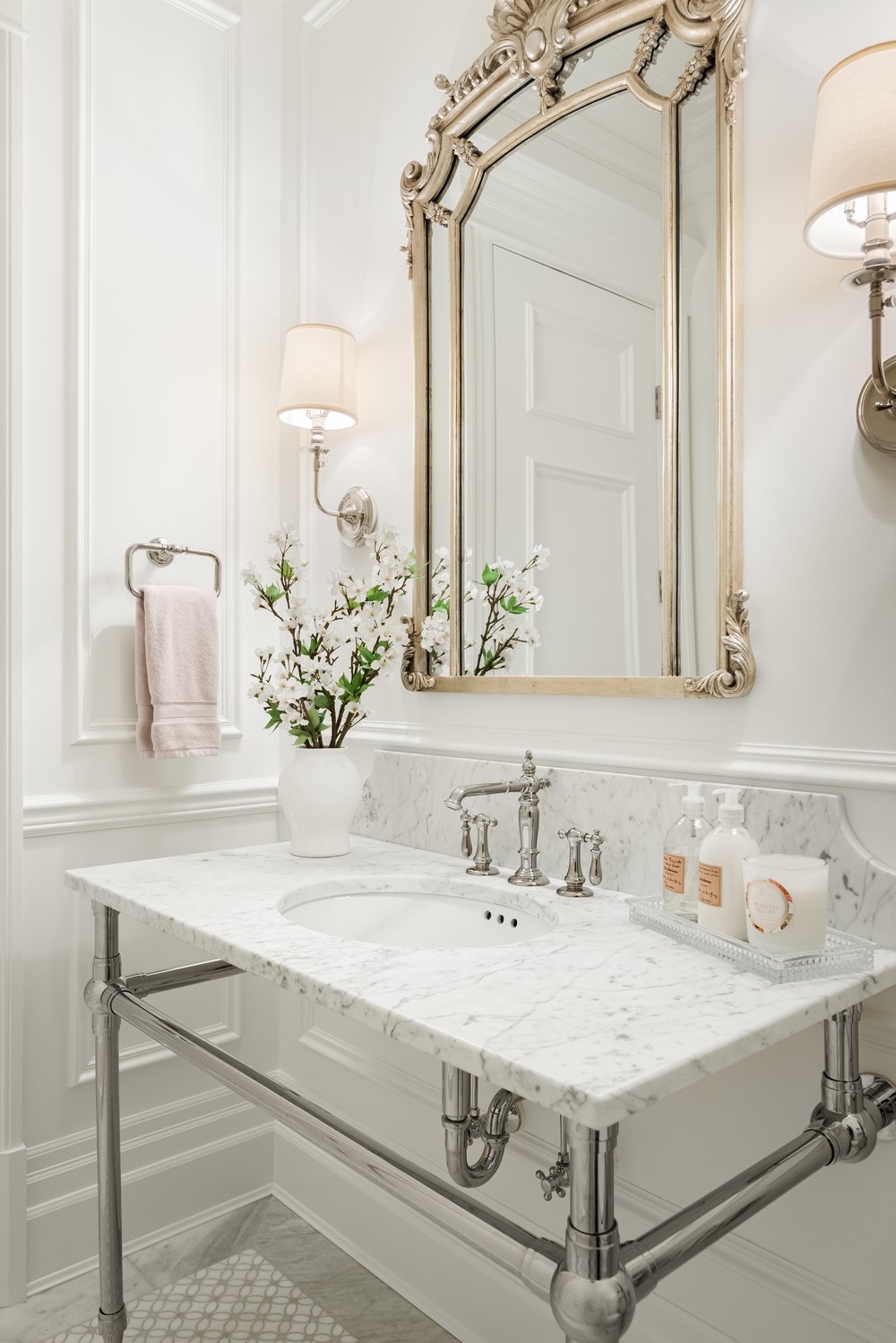
Calm Country French Bath
What I noticed first about this bath is the lofty feel. High ceilings and abundant natural light are both so unusual for a bath!
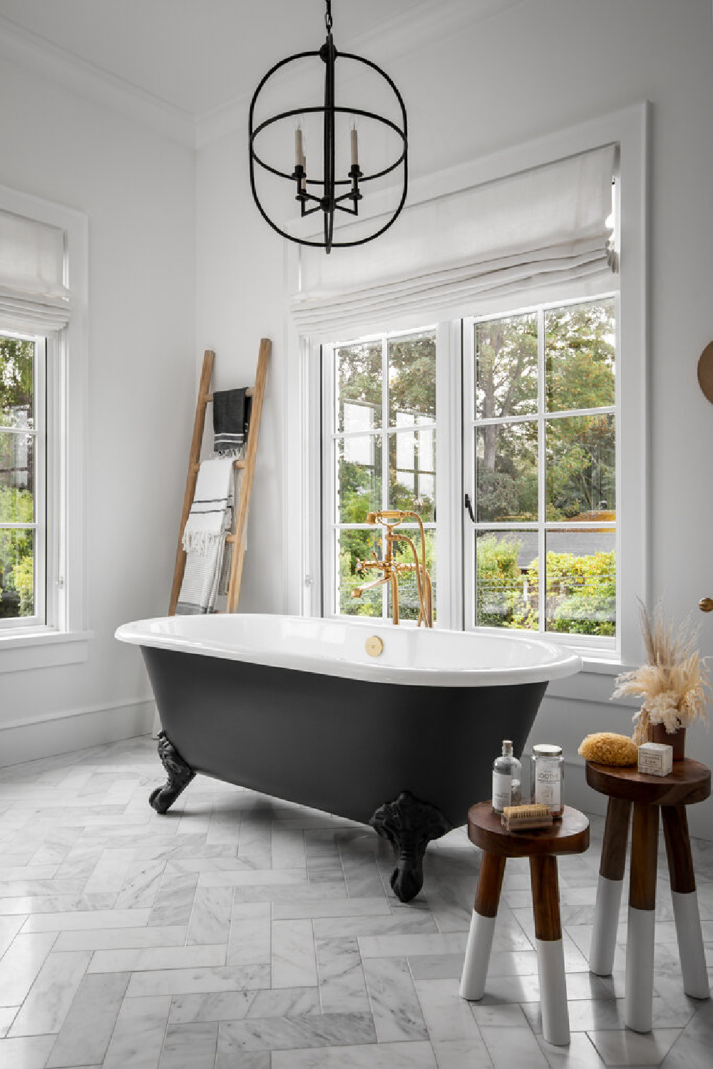
As you can see, carrera marble is installed in a herringbone pattern on the floor and staggered on shower surround. Subway inside the shower has a fresh more casually relaxed mood.
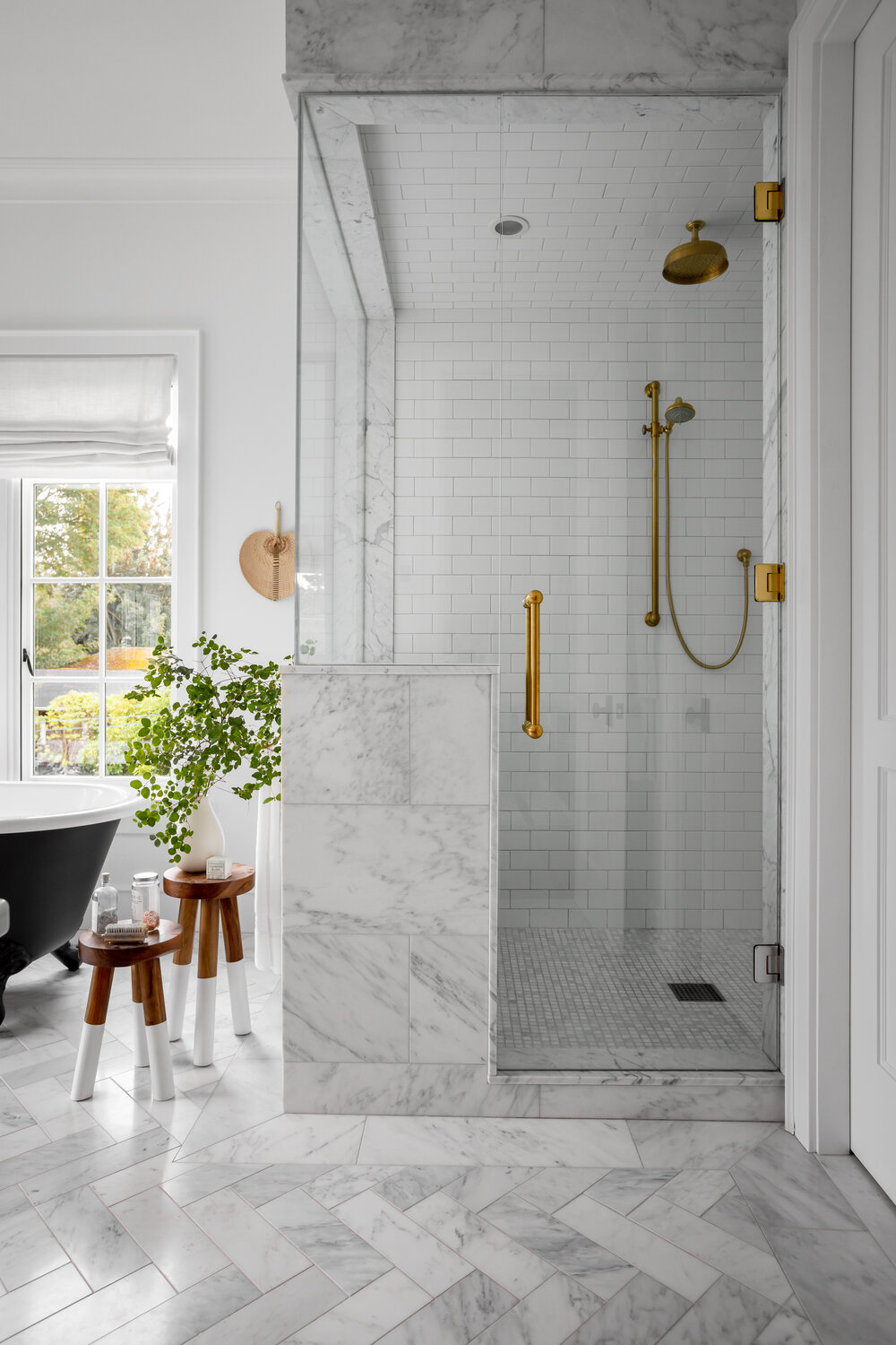
A classic white bath is always a good idea.
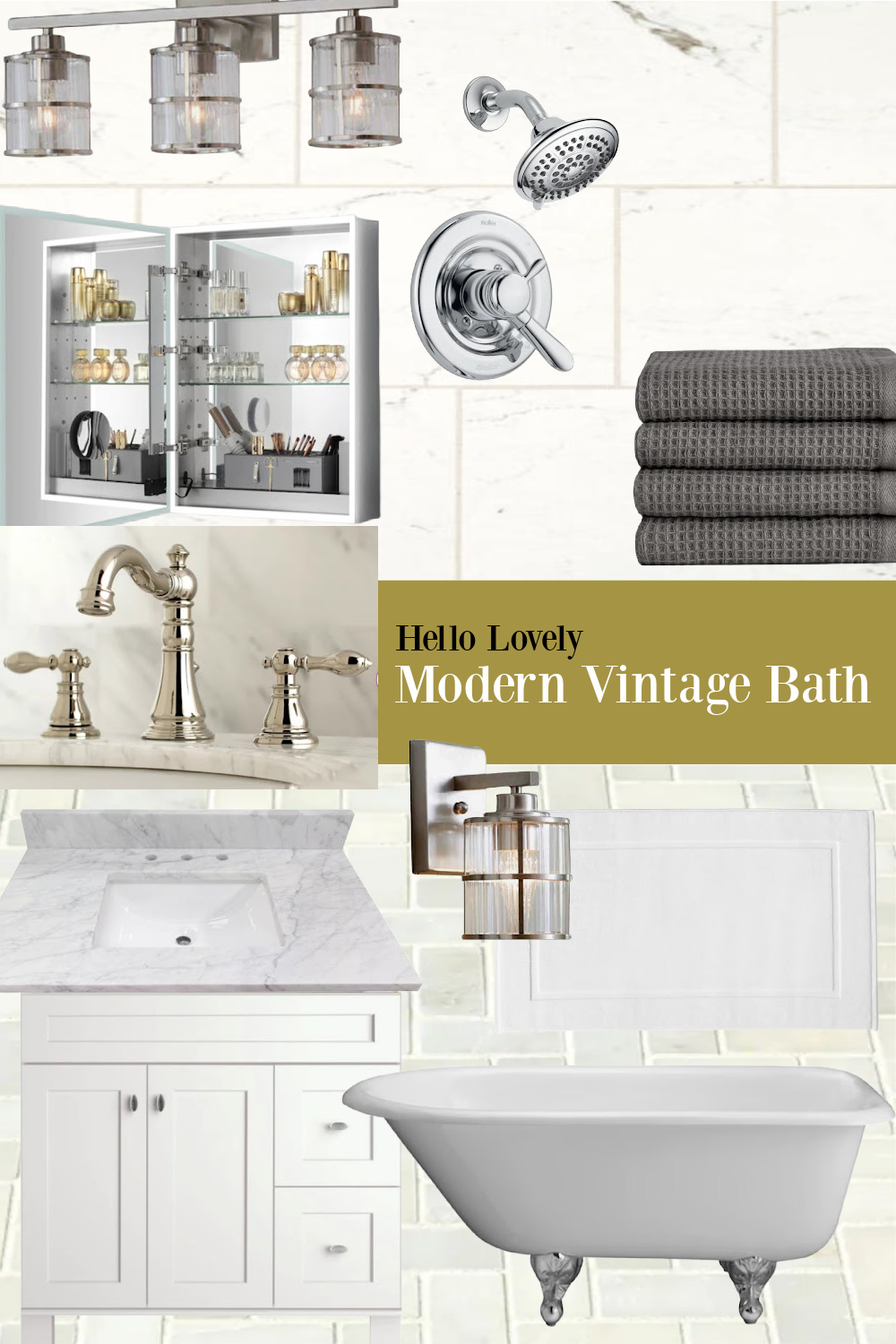
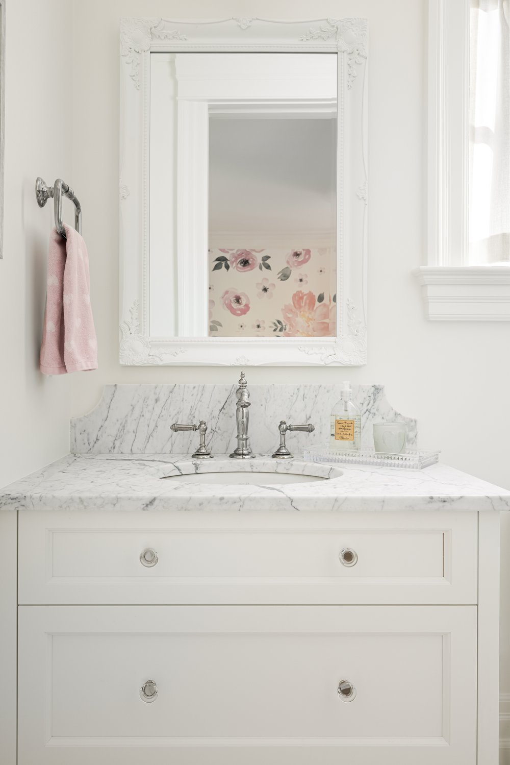
Applied moldings in the bath, anyone?
More of my favs here:
Thanks so much for reading, and let me know if you have favorite atmospheric colors that work well in your own home.
Visit Jenny Martin Design for more info!
I independently selected products in this post—if you buy from one of my links, I may earn a commission.
Peace to you right where you are.
-michele
Thanks for shopping RIGHT HERE to keep decor inspiration flowing on Hello Lovely!
Hello Lovely is a participant in the Amazon Services LLC Associates Program, an affiliate advertising program designed to provide a means for sites to earn fees by linking to Amazon.com and affiliated sites.


