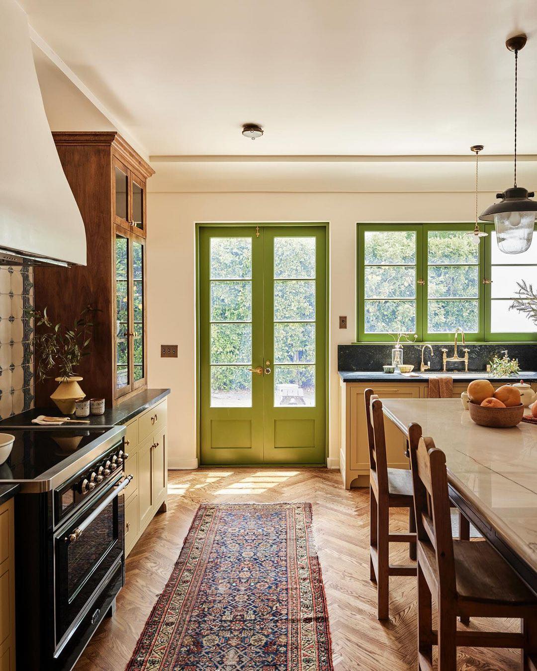
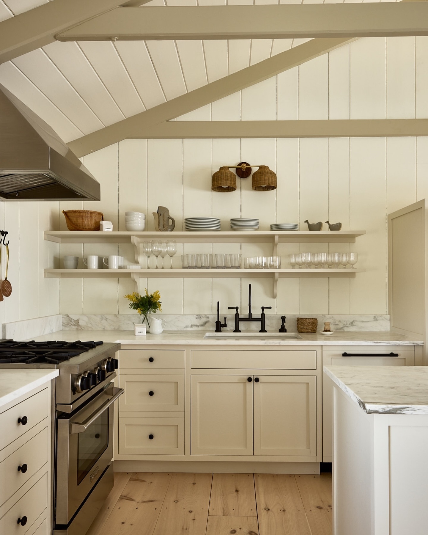
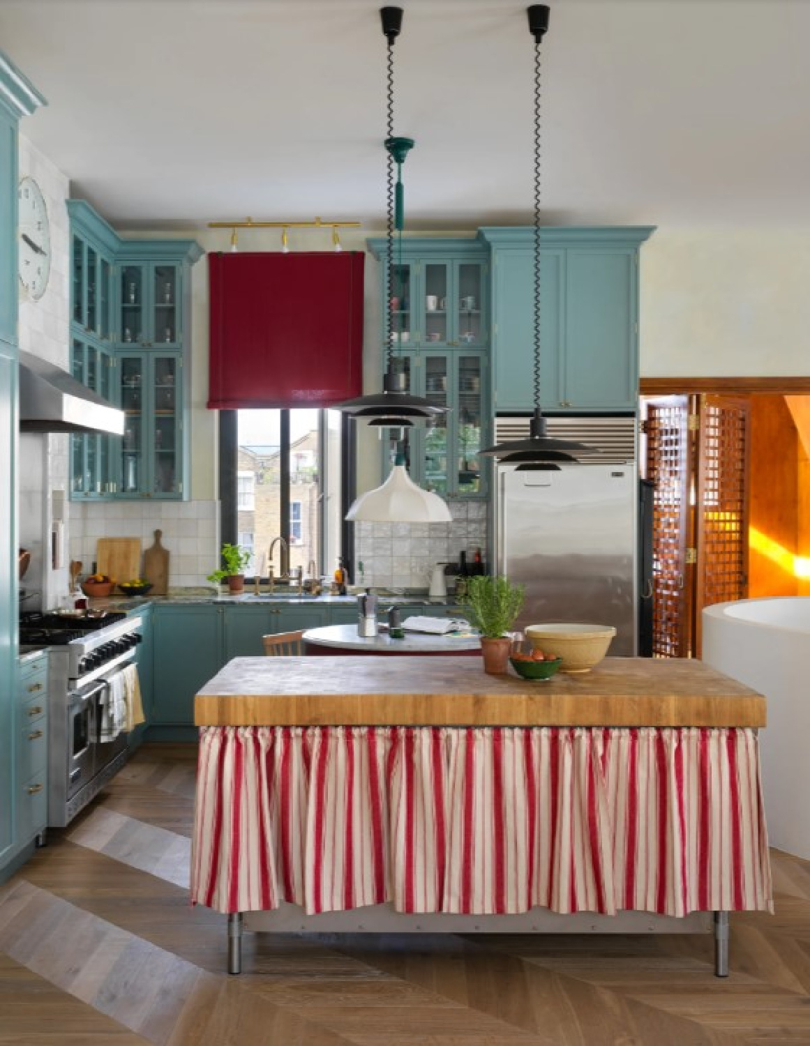
So many takeaways inspired by this amazing European-inspired and timeless bespoke kitchen by Jamie Haller. From the paint color story to the commitment to craftsmanship, the design and choices seem destined to stand the test of time. See more of it along with resources and Jenna Peffley’s beautiful photography in the AD article here.
If you’re seeking smart kitchen design ideas and paint colors, make sure you also see this lovely roundup.
Jamie Haller Timeless Kitchen: Paint Scheme
I independently selected products in this post—if you buy from one of my links, I may earn a commission.
A Sophisticated Mix of Unexpected Colors
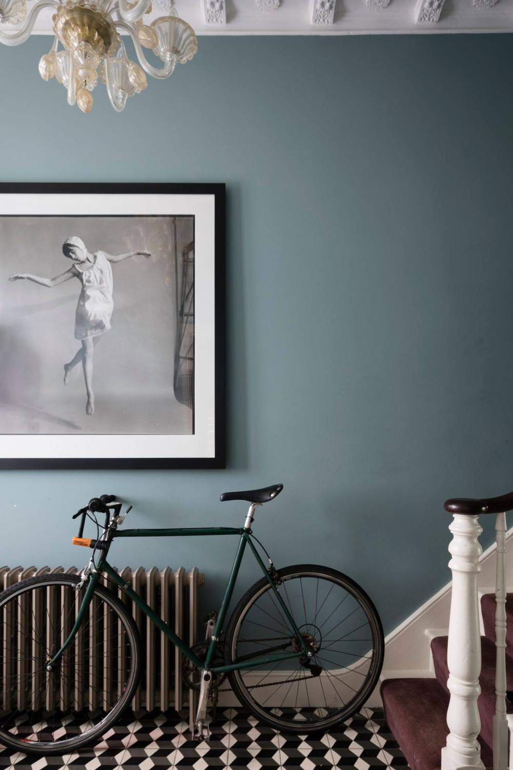
While this kitchen in a Spanish Colonial by Jamie Haller may not initially strike you as “colorful,” the mix is sophisticated and quite memorable.
Mixing a tried and true traditional neutral color with the warmth of wood tones and surprises of cool blue and fresh green? Would you, could you imagine combining these tones for an evolved, nostalgic, classic European-inspired look?
What is the Paint Color on Kitchen Walls?
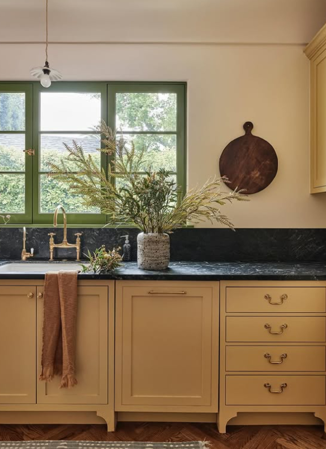
Walls are painted Farrow & Ball Slipper Satin.
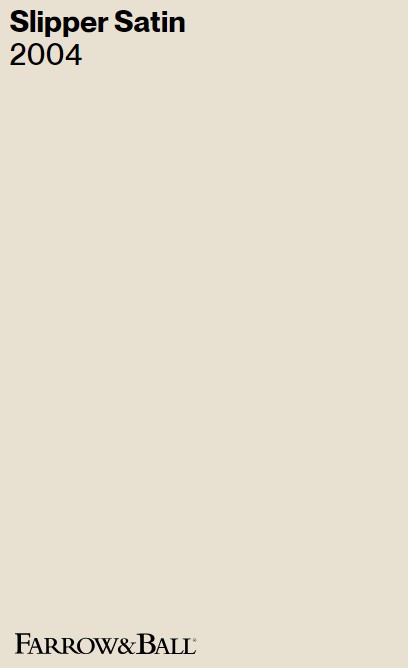
Inspired by the silk often associated with traditional ballet slippers, this soft, creamy off-white has warm, stone-like undertones. The color may be perceived as pale grey chalk in certain lighting conditions, but without stark blue or cool tones.
Haller wanted a color to mimic creamy plaster walls for the Spanish Colonial home, and Slipper Satin creates a light, airy, serene mood. I love how the tone works with the wood tones and plays nicely with the cooler greens and blue in the space. In another kitchen, Slipper Satin contrasts with Wimborne White walls:
It’s helpful to see the color across different lighting contexts, and obviously the time of day these images were shot affects our perception of the color as well. In this moment, the tone feels more yellow than gray:
Other neutral colors to consider similar in atmosphere and versatility to Slipper Satin? Peek at Benjamin Moore colors such as White Dove, Swiss Coffee and Classic Gray or even Sherwin-Williams Alabaster. Here is an example of Slipper Satin on walls, ceiling and trim:
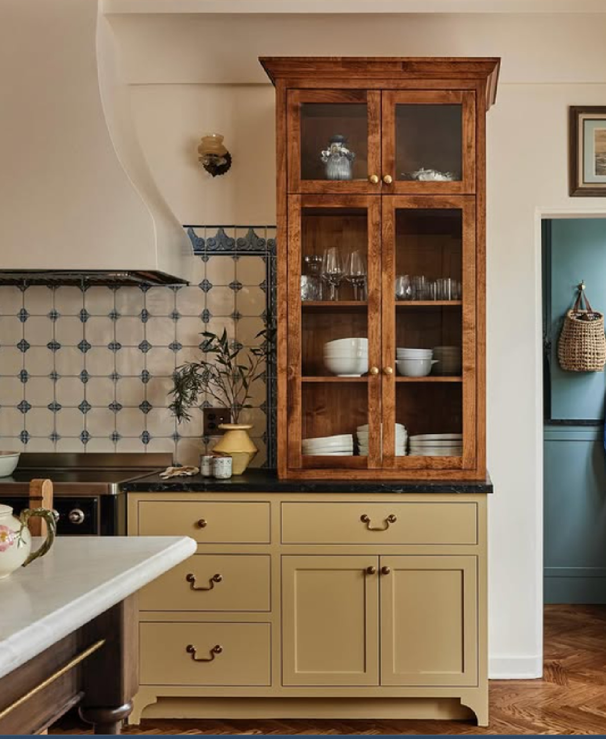
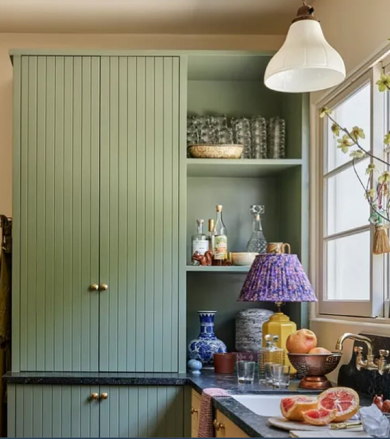
What is Color on Cabinets?
I suppose some folks will take one look at the cabinetry and declare it yellow. But when you are choosing a yellow for a paint scheme, which yellow is going to suit you?
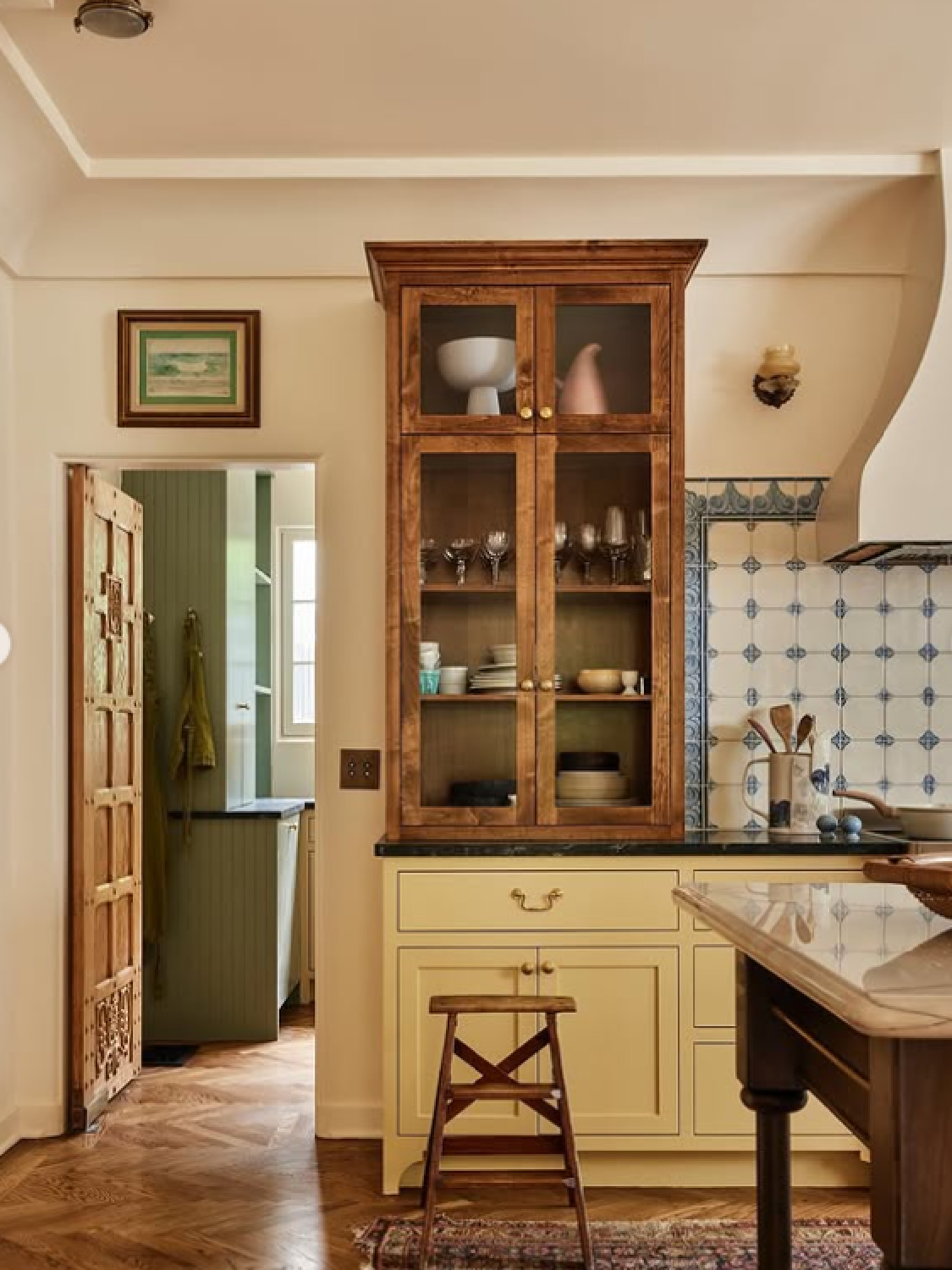
The color on the cabinets is Farrow & Ball Hay.
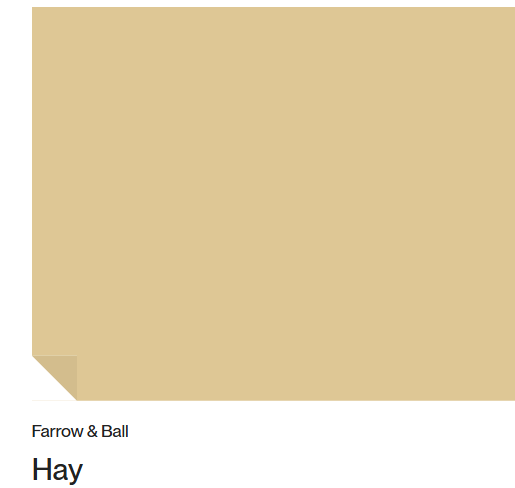
Isn’t it lovely? Farrow & Ball’s Hay (No. 37) is characterized as a warm, dusty, and modest yellow with distinct green undertones. It is used in peaceful, established spaces to feel less intense than brighter yellows. To my eyes, it has a very earthy and natural look reminiscent of prairie grass and the outdoors. Additionally, it looks more appetizing than a number of other yellows.
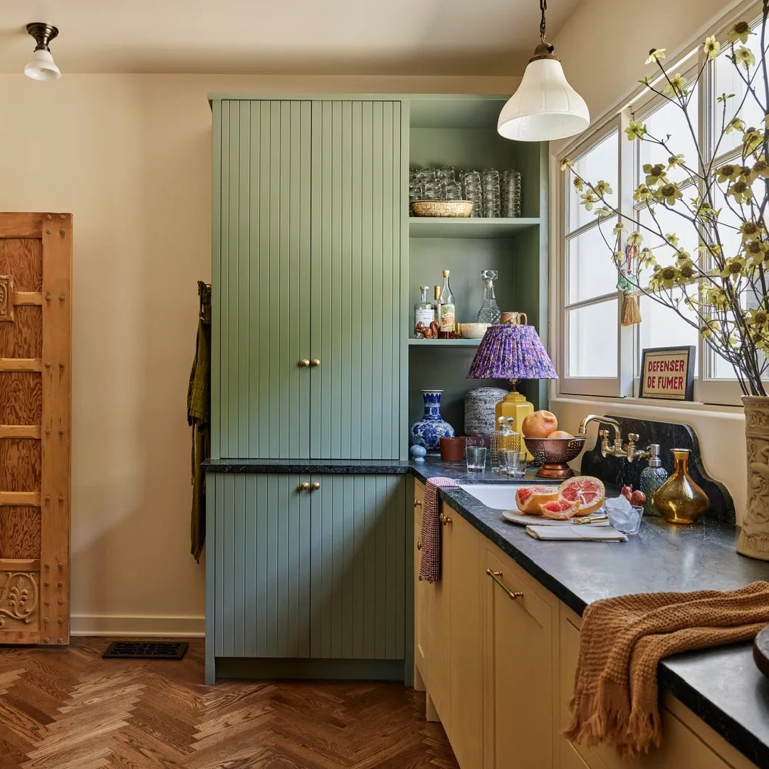
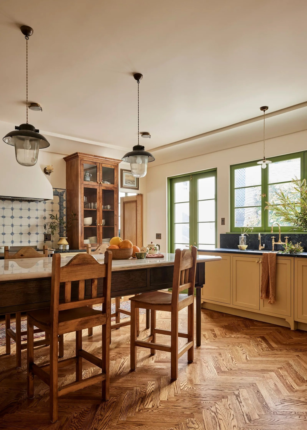
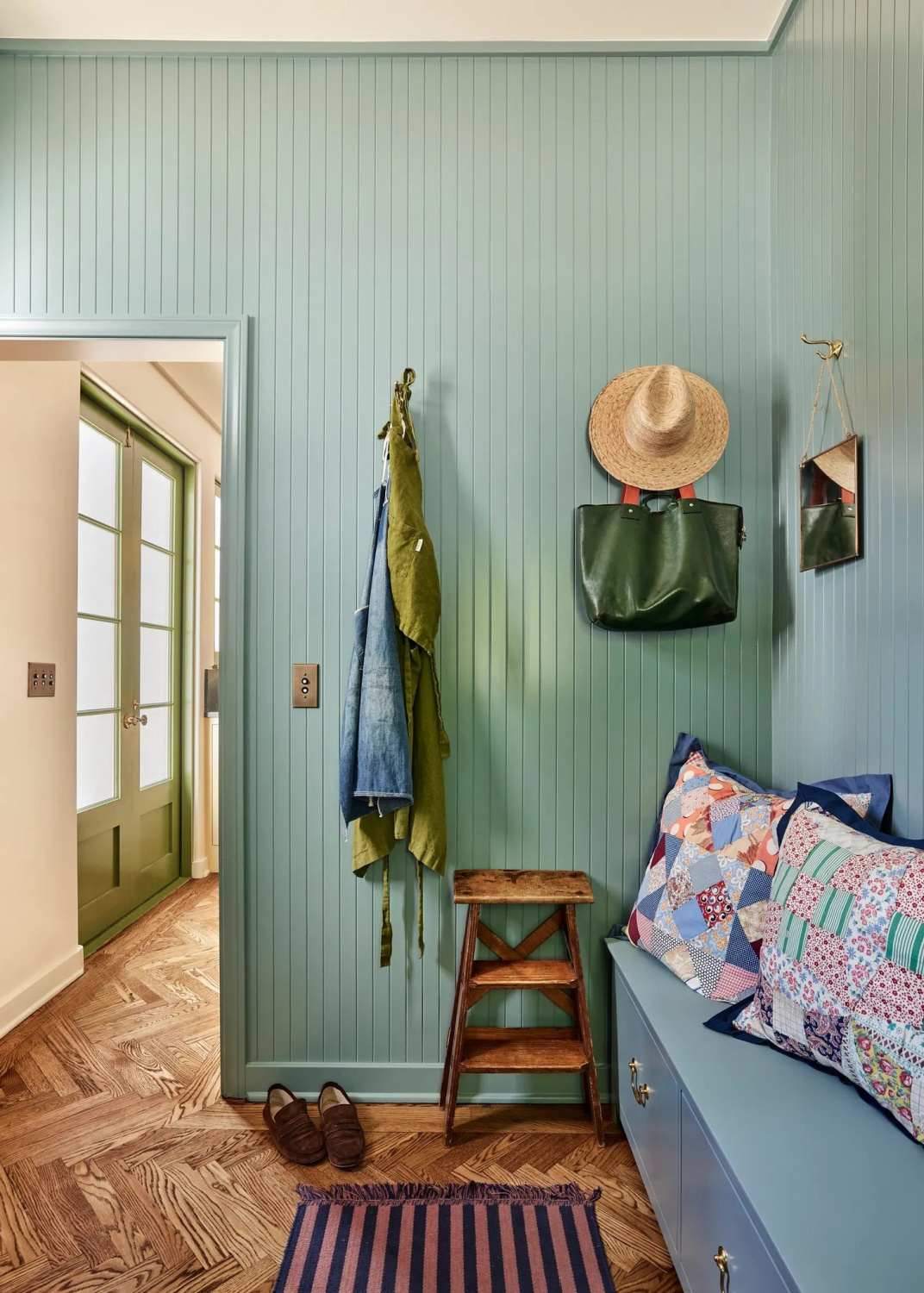
Blue & Green Paint Colors in Jamie Haller Kitchen
I recall the first time I shared this bespoke kitchen for inspiration on my FB channel, and followers went bonkers for the green window and door trim which appears citrine in photos. We were all speculating about the exact paint color and were dead wrong. Lighting is everything because it turns out the designer used Card Room Green.
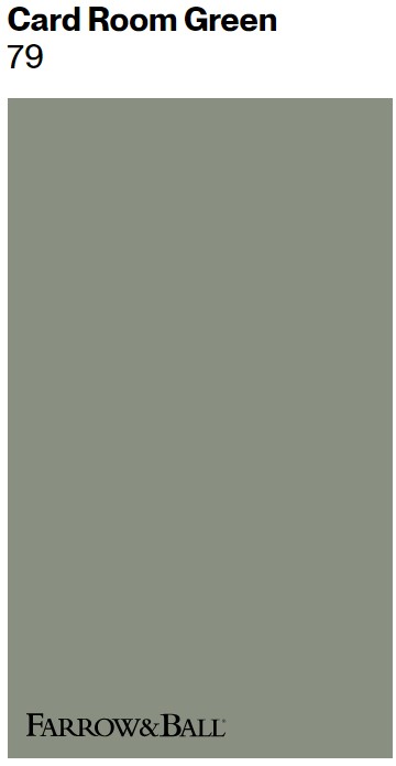
The window trim appears lime and even electric green in some photos but is Farrow & Ball Card Room Green.
She also used a beautiful blue in the laundry/mud room. Which blue?
This blue is described as the “most blackened” of Farrow & Ball’s blues. You can’t miss its dramatic shift in different lighting, moving from bright teal to a shadowy, near-black. Farrow & Ball says this hue embues rooms with a subtly aged, lived-in, and cozy feel. They recommend it for hallways, darker family rooms, bedrooms, and even kitchen cabinets, pairing well with greys and earthy tones.
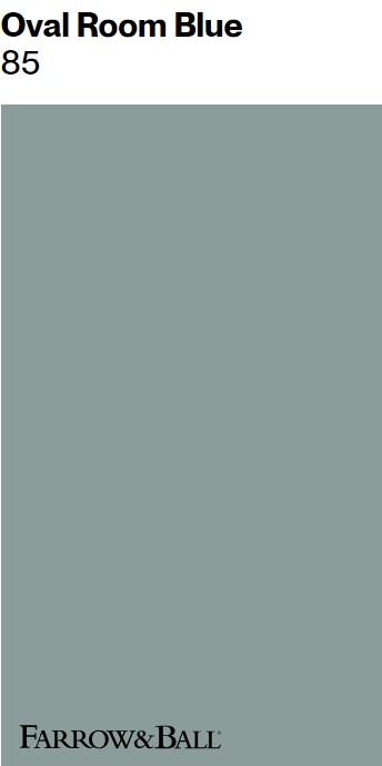
Similar to Oval Room Blue
If you like this tone, you could also consider similar options from Sherwin-Williams including Stardew and Moody Blue. Here’s Oval Room Blue on cabinets in a kitchen by Beata Heuman:
So cheerful and welcoming! The overall effect of using these sophisticated neutrals with unexpected blues and greens (and can we even call them “accents” when they place such prominent roles in the design?) is rich with character and feels EVOLVED.
Don’t forget to sample! In another design with Oval Room Blue below, you don’t sense green undertones or the teal feel:
I hope this inspiring project with paint color ideas provides help for your own paint schemes and kitchen designs. Easiest way to see if a color is right? Order samples with Samplize and have them delivered straight to your door.
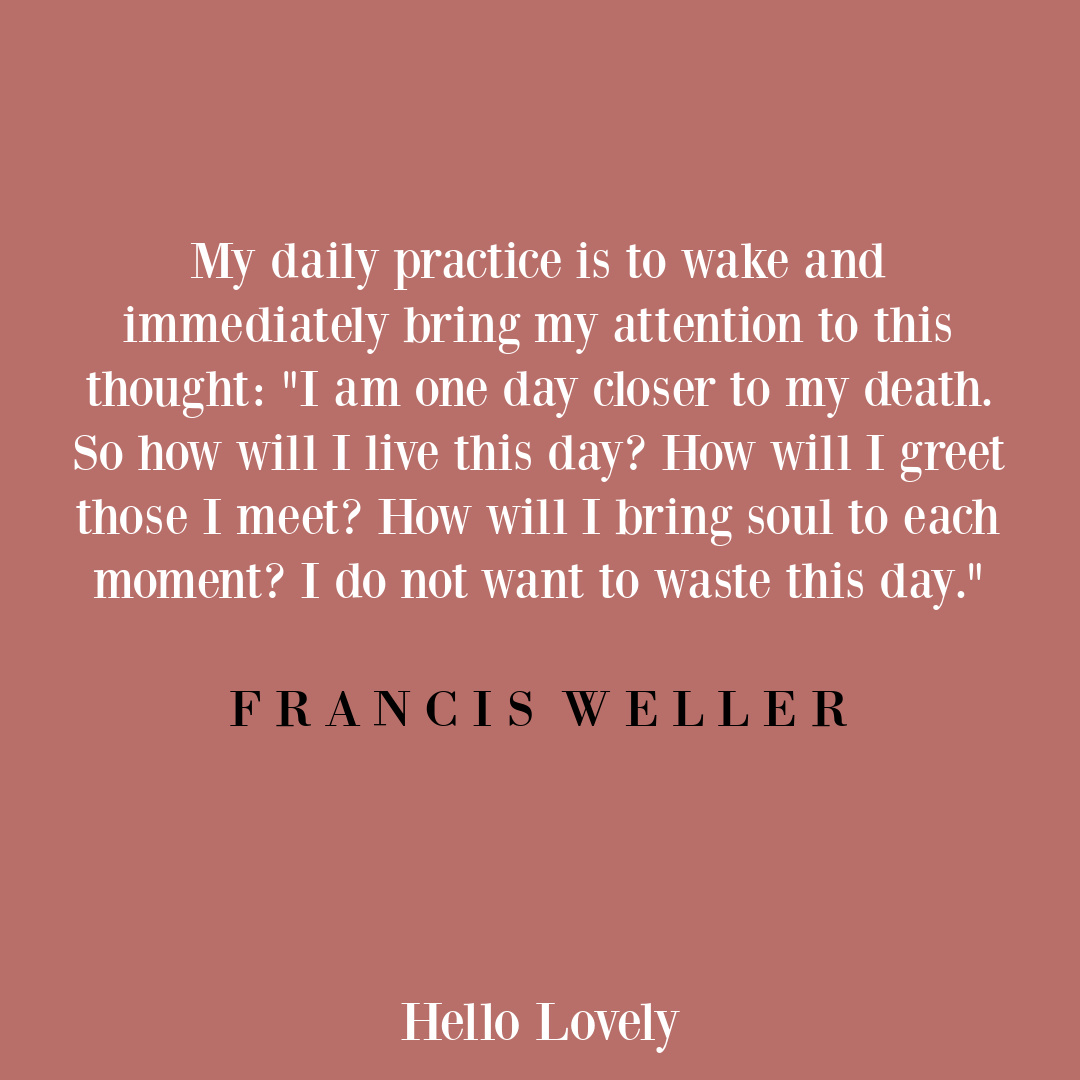
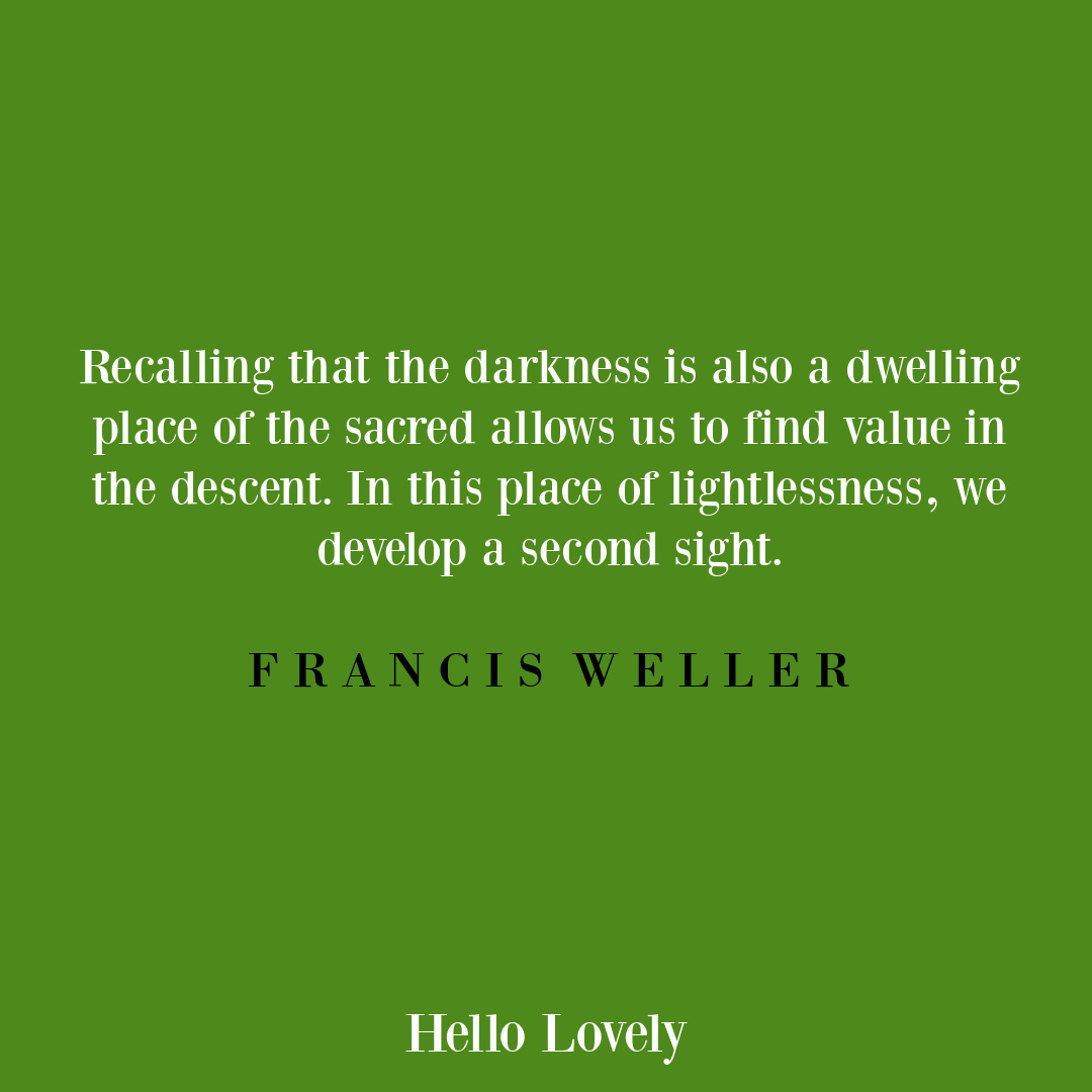
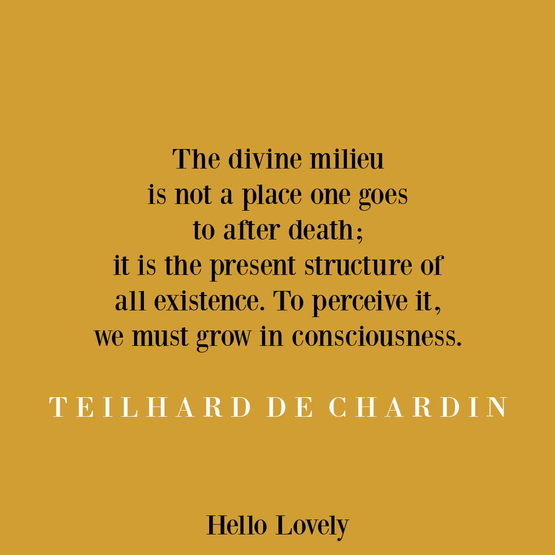
Quotes to Pin


Peace to you right where you are.
-michele
Thanks for shopping RIGHT HERE to keep decor inspiration flowing on Hello Lovely!
Hello Lovely is a participant in the Amazon Services LLC Associates Program, an affiliate advertising program designed to provide a means for sites to earn fees by linking to Amazon.com and affiliated sites.


