Yes, indeed. Plenty of paint color themed posts comin’ in hot for good reason. As a consultant for paint colors, I can tell you there’s a fair amount of DIY and home improvement plans heating up in winter. When interior designers share the names of uncommon neutrals in their projects (especially showhouses), we’re given a brilliant starting point for paint colors to sample. Let’s consider a few.
Uncommon Neutrals Designers Choose
How Do You Distinguish Neutrals from Non-Neutrals?
While uncommon neutrals are a common topic on this blog, let’s consider what makes them neutral in the first place. These are the tones that work with a wide range of other colors. A neutral paint color is typically muted, with both cool and warm undertones. There’s a pleasing balance happening. Neutrals can be chamelon-like depending on how they interact with light. They are typically described as gray, beige, white, cream, tan, putty, greige, black, and brown.
Are neutrals always pale? Blacks and browns in our wardrobes are also considered neutral since they complement a wide range of other colors. Consider this beautiful idea home from Southern Living and an incredible design and color story in the basement.
Uncommon Neutrals: Sherwin-Williams NOCTURNE
Designer Laura Hodges chose Nocturne for the walls in this Leipers Fork home imagined for a family, and it instantly turns up the sophisticated warmth.
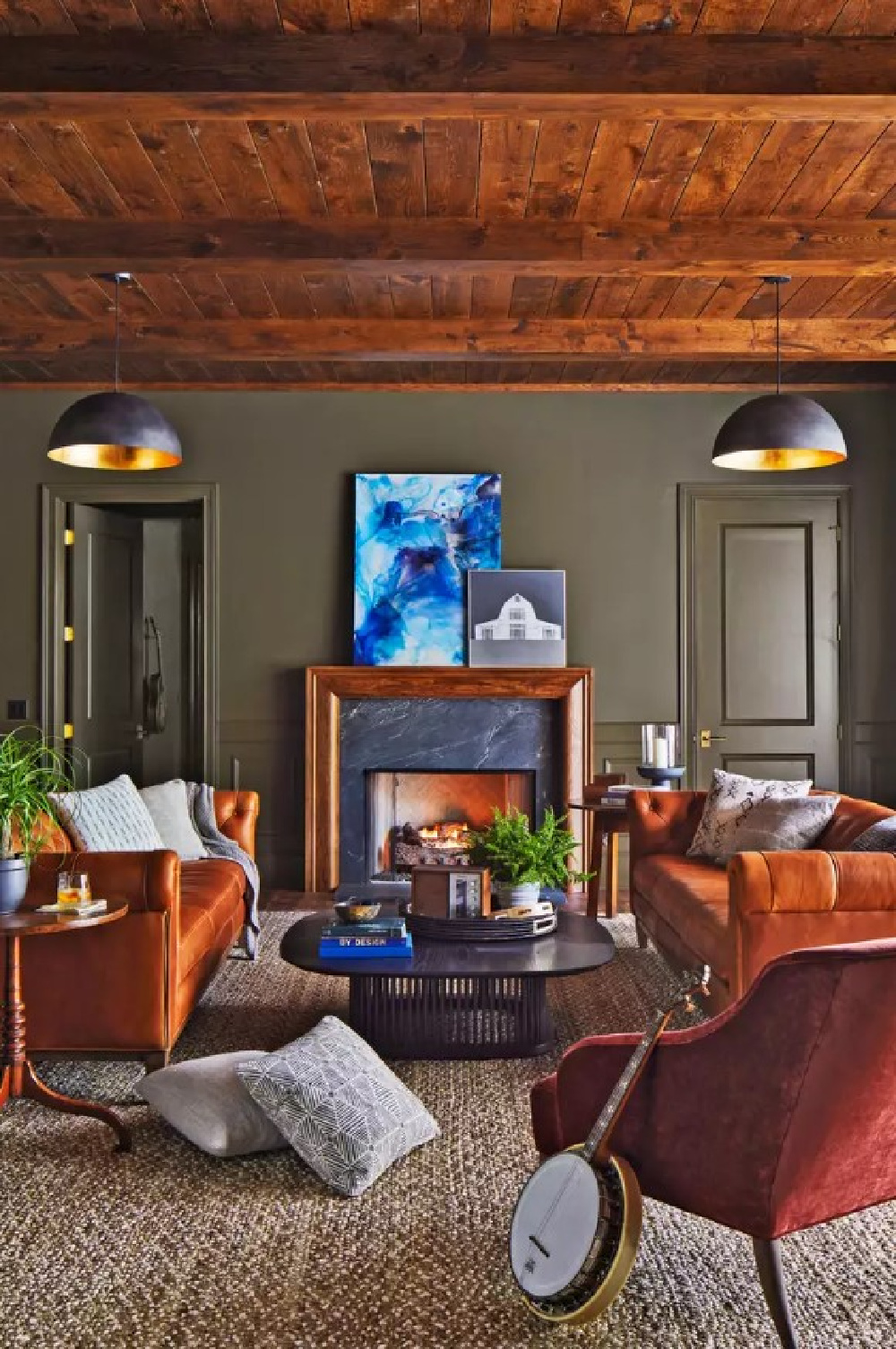
Too deep and moody to be considered neutral? I’m seeing more homeowners choose such uncommon neutrals for studies, offices, home libraries, and media rooms where the point is to be enveloped in velvety richness.
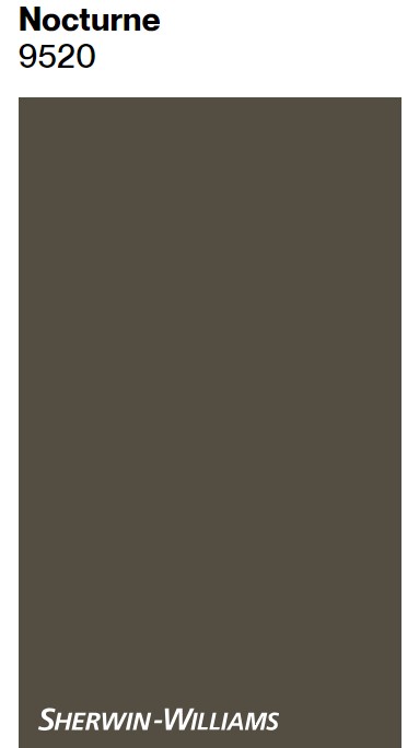
Is Nocturne reminiscent of Sherwin-Williams Iron Ore and Urbane Bronze? You can see the green undertones within Nocturne. Similar to Nocturne…
Sherwin-Williams FORGED STEEL
Forged Steel is strong and complements natural wood tones, yes?
This uncommon neutral is similar to Benjamin Moore Iron Ore and also SW Shade-Grown. Its LRV is 10. Not one of those shy neutrals we tend to imagine when we hear “neutral” or even “natural!”
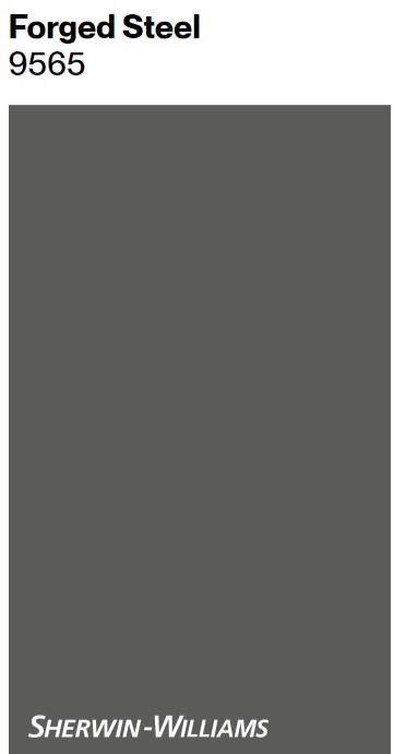
Forged Steel is lovely when you care to create a story with pleasing contrasts. It will make a statement without breaking the bank.

Sherwin-Williams WHITETAIL 7103
For the living and dining rooms of 2023’s Idea House, a warm off-white with yellow undertones covers walls. Bright and sunny, its light reflectance value (LRV) is 86.
It seems yellow tones continue to grow in popularity. Will antique white replace all those lingering cool modern farmhouse whites chosen to contrast with black trimmed windows? Similar to Benjamin Moore’s Swiss Coffee and White Dove (and even SW Alabaster), you clearly perceive yellow in this neutral.
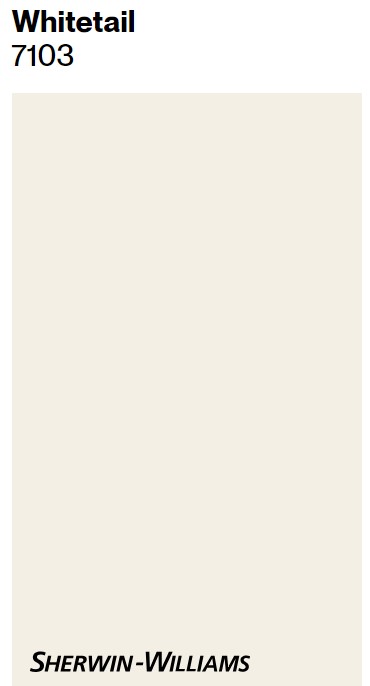
Coordinating colors for Whitetail? Sherwin-Williams recommends Cocoa Whip and Touch of Sand. Still wishing SW would hire me to name (and maybe re-name?) their colors and watch them fly off the shelves.
This white reminds me of…
Benjamin Moore MARITIME WHITE
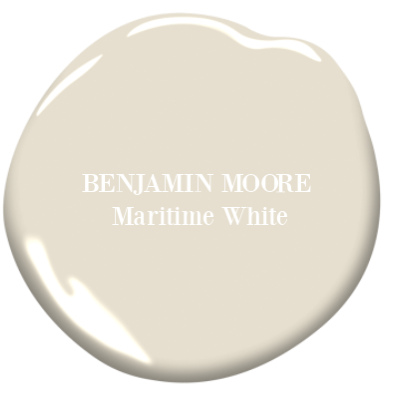

Next up? Three gorgeous contenders to consider sampling.
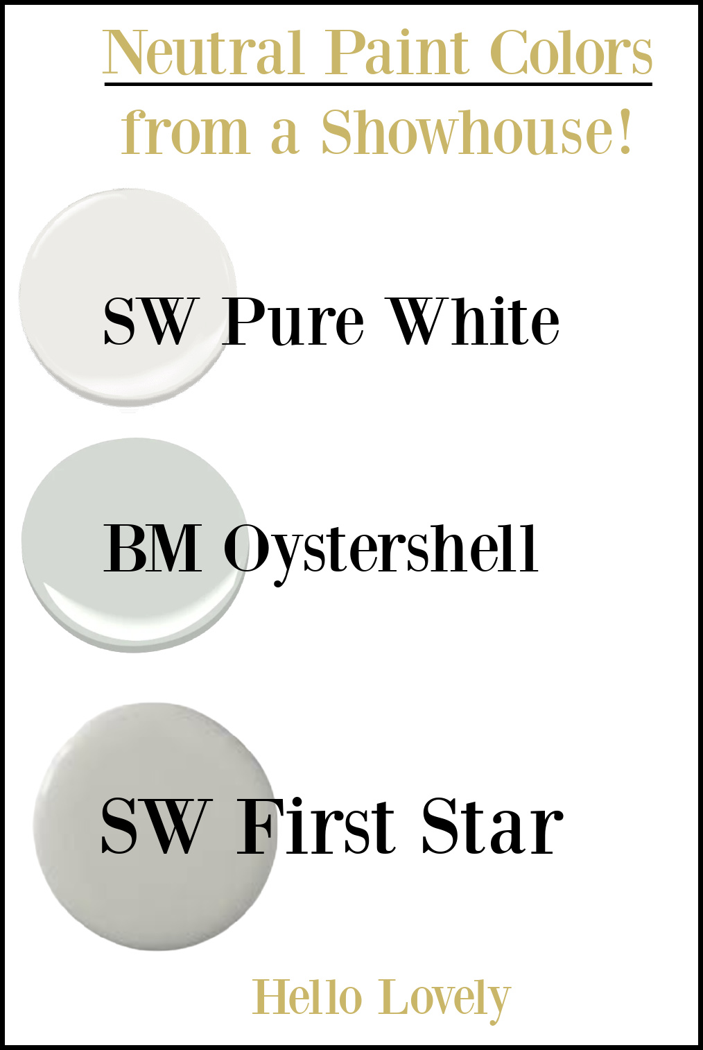
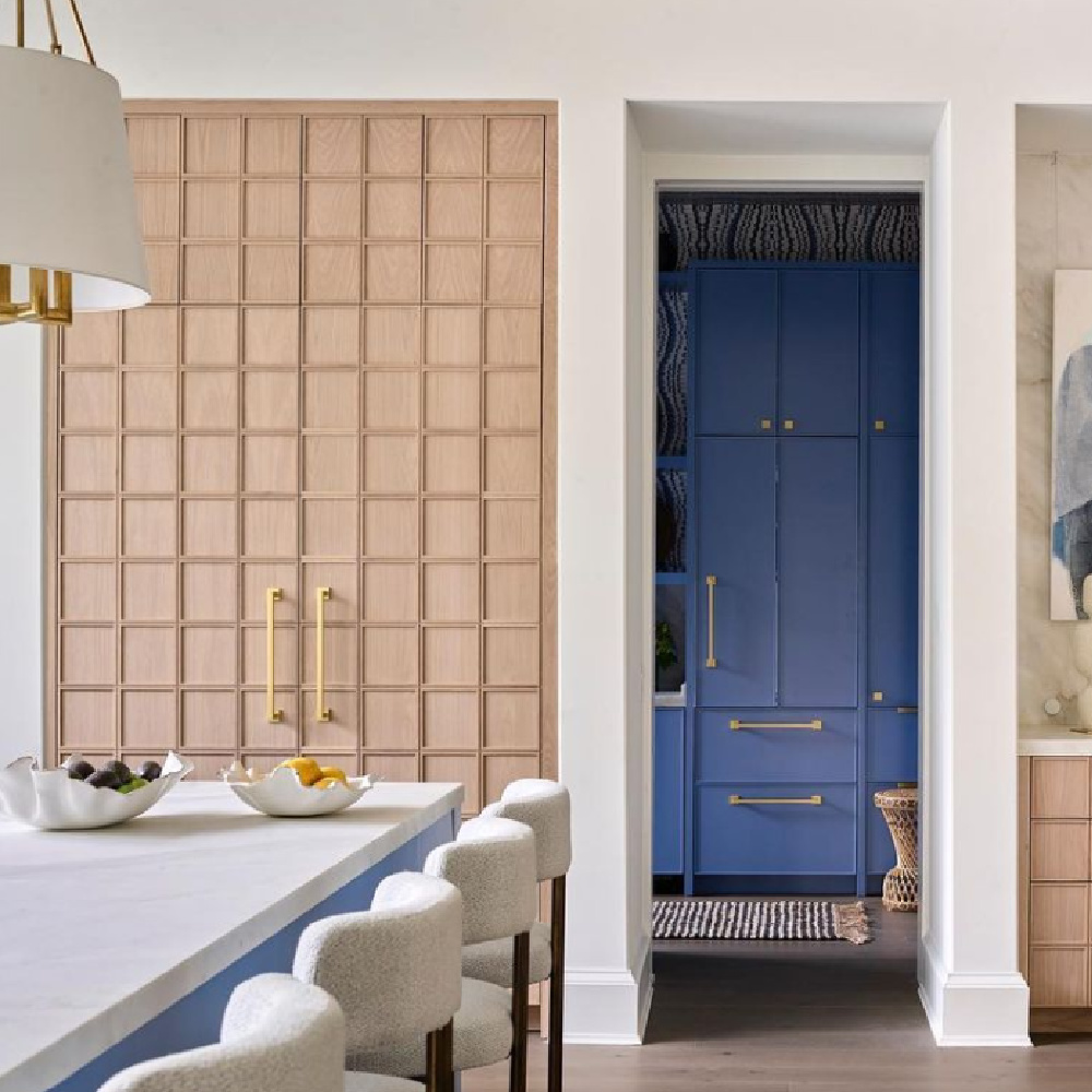
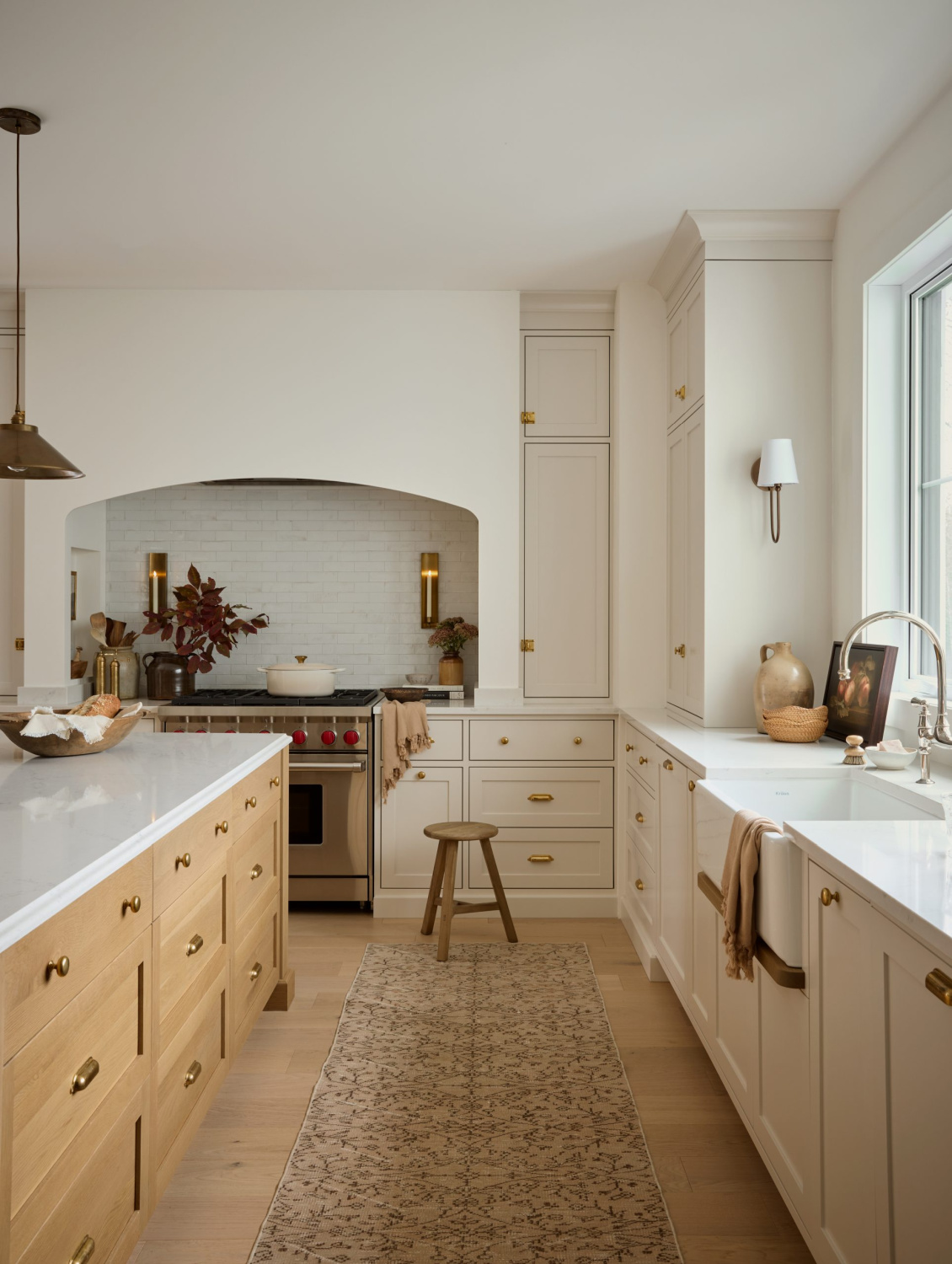
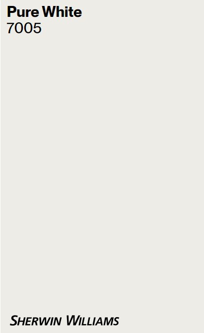
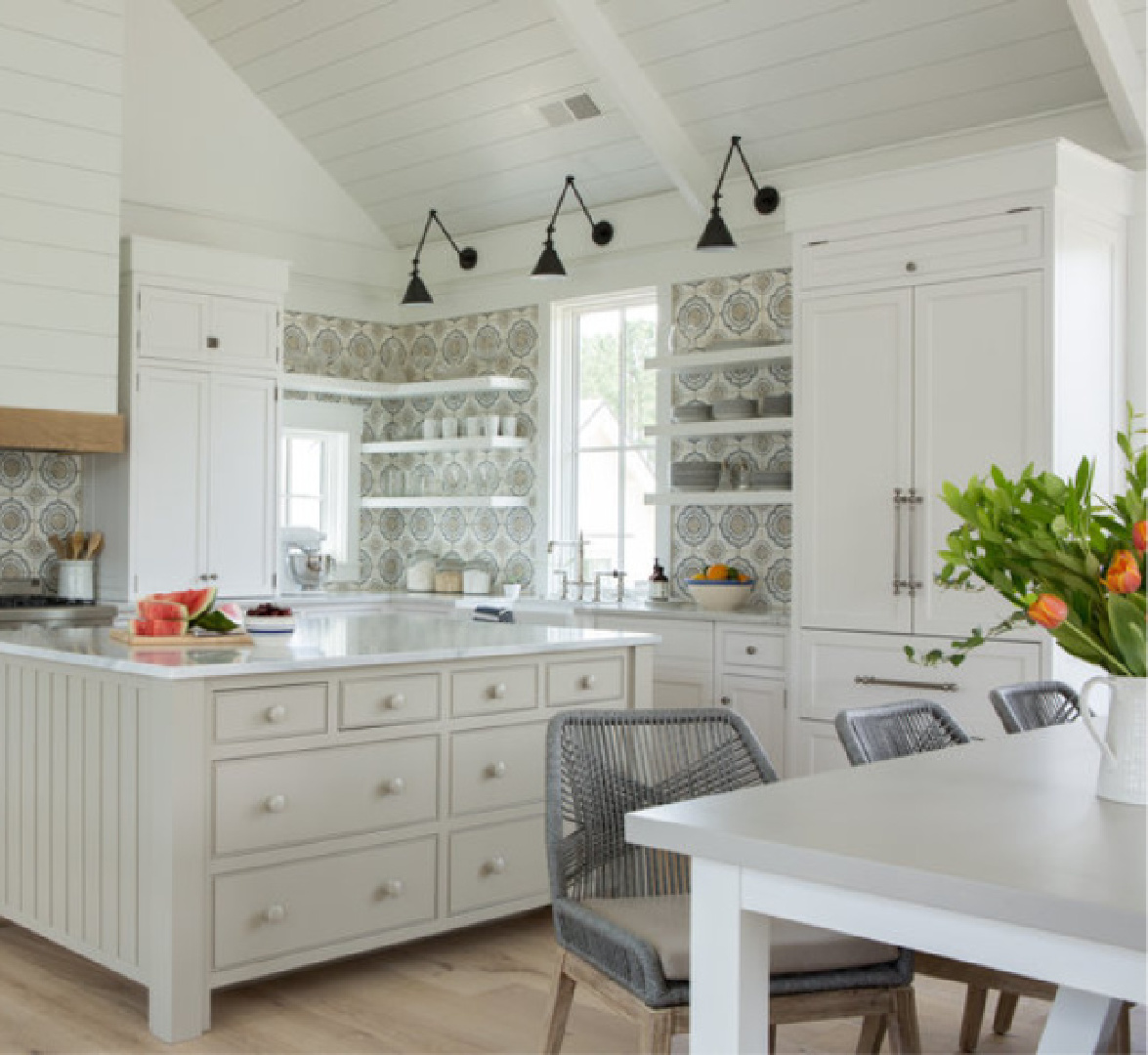
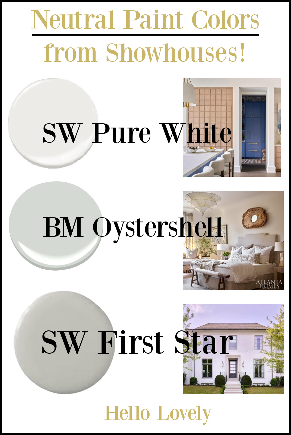
Sherwin-Williams PURE WHITE 7005
This reflective white was covered in more detail HERE, and is not uncommon since it is a bestseller at Sherwin-Williams. In this showhouse kitchen, it feels freshly modern, warmed by wood cabinetry and relief from a vibrant blue…
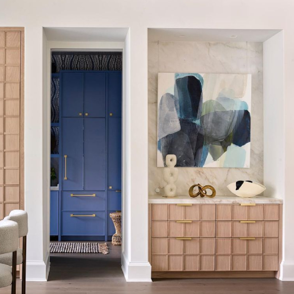
This Atlanta kitchen design is a prime example of how one neutral is an important foundation in an elegant yet exciting plan with drama and interest!
A vivid blue pops and brings energetic zing thanks to understated walls with what SW calls a versatile bright white with the slightest yellow undertone.
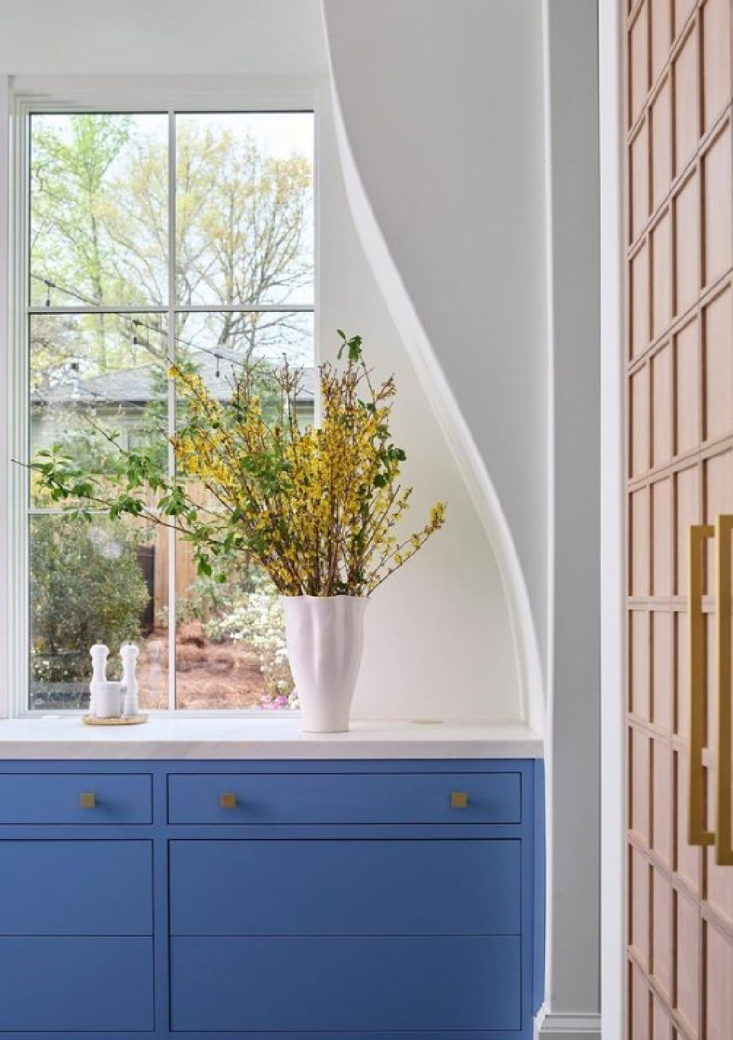
This kitchen’s magnificent architecture makes quite the statement too. Sometimes a paint color sets the mood, and sometimes as a neutral, it is there to recede so other elements may speak.

More PURE WHITE Examples for Inspiration
The LRV for Pure White is 84…it will reflect beaucoup light.
Even though we’re focusing on wall colors, if you’re searching for house exterior paint colors, these ideas may be equally helpful.
Curious about coordinating colors? Look at March Wind and Perle Noir for ideas. Don’t forget if you’re after a white exterior paint, the color’s name may not contain “white.”
Ooooooh, I almost forgot about the uncommon beauty of PASHMINA:

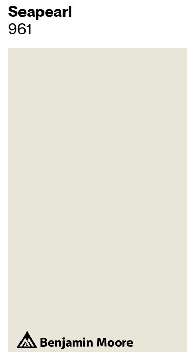
Here’s the neutral wall color Seapearl in a bedroom:
Easiest way to know whether a particular paint color is right for YOUR interior? Order samples to be delivered to your door with Samplize.

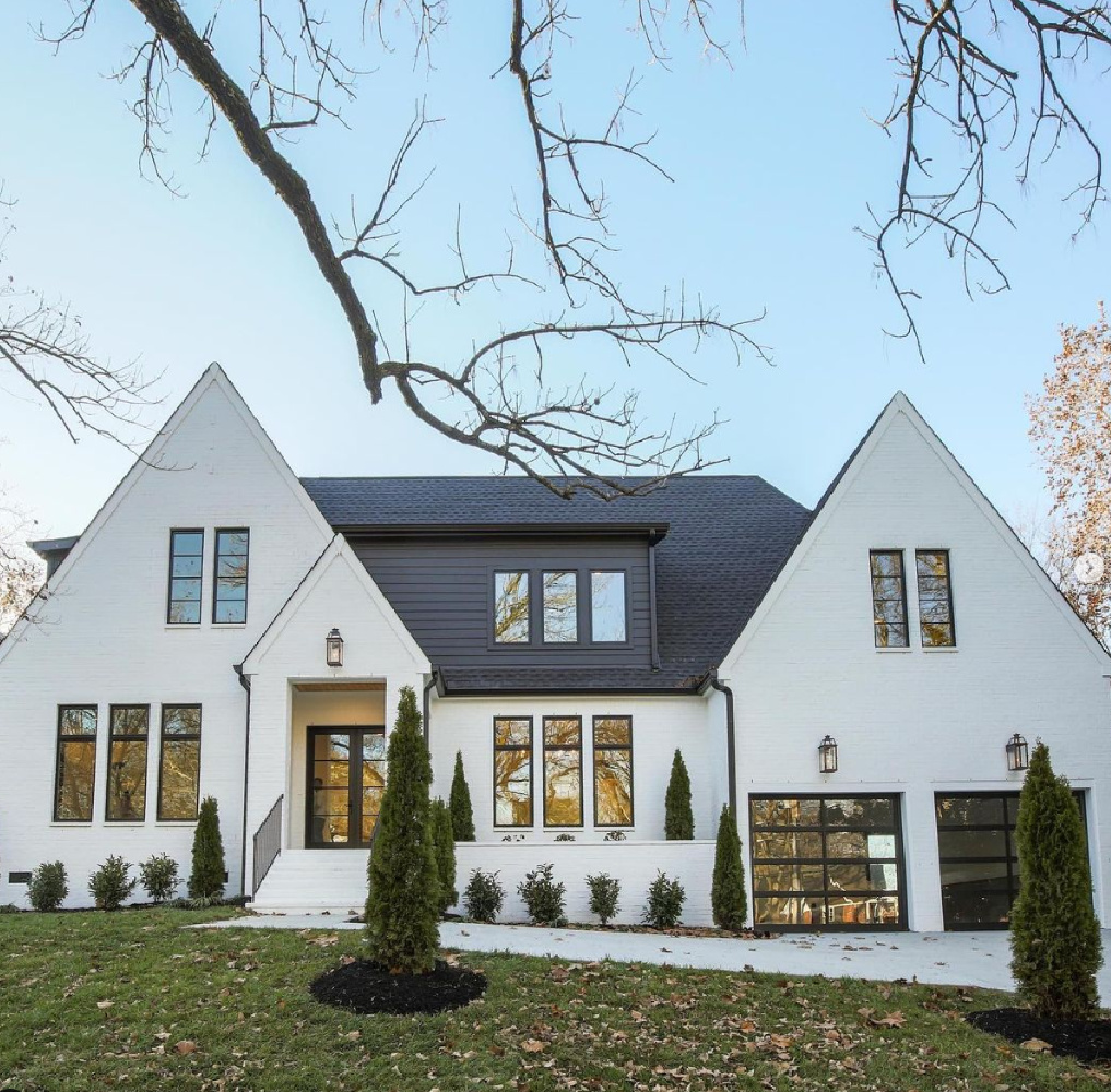
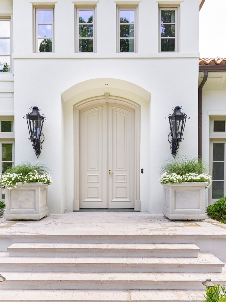
Sherwin-Williams FIRST STAR
The new home built for Southeastern’s Showhouse in 2021 (steps from Buckhead’s Chastain Park) has a breathtaking facade!
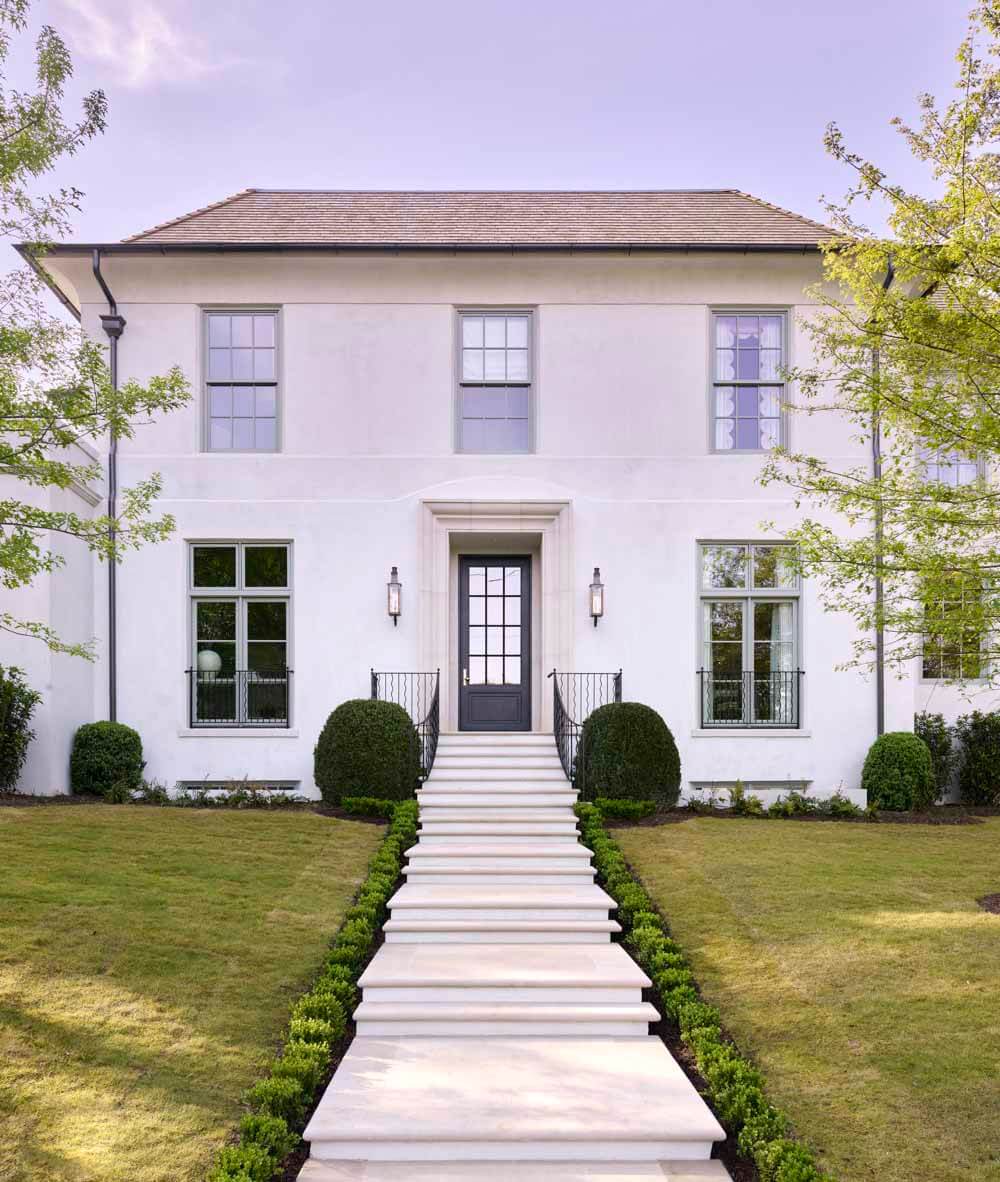
Love the color selected for the exterior? SW First Star has a light reflectance value (LRV) of 69. A value higher than that may begin to feel too bright depending on the exposure.
Pacific Fog, Solstice and Winter Walk are similar colors from Sherwin-Williams to peek at if you like First Star. Colors to coordinate with FIRST STAR include Ellie Gray, Deep Forest Brown, and Extra White. What’s wonderful about knowing these coordinating paints is how they may help you develop an exterior color story for siding, trim, doors, shutters, etc.
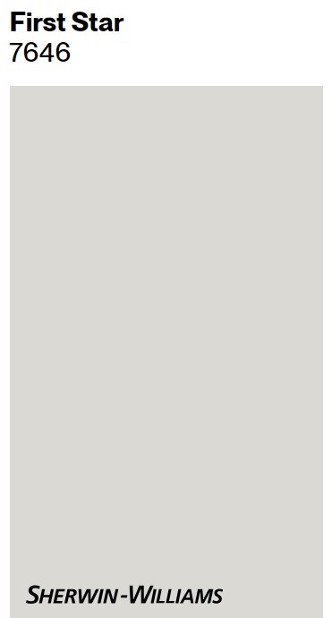
Some designers stick with the rule that the LRV for an exterior should be below 80. Care to see more peeks inside this Tuxedo Park home?
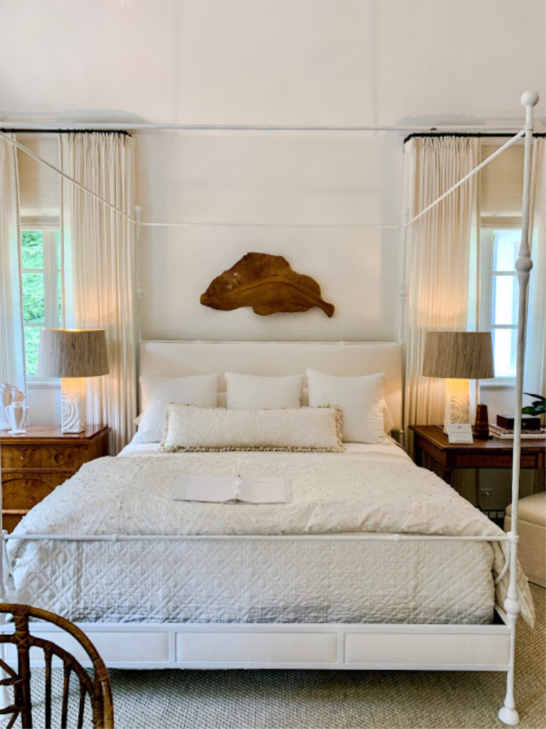
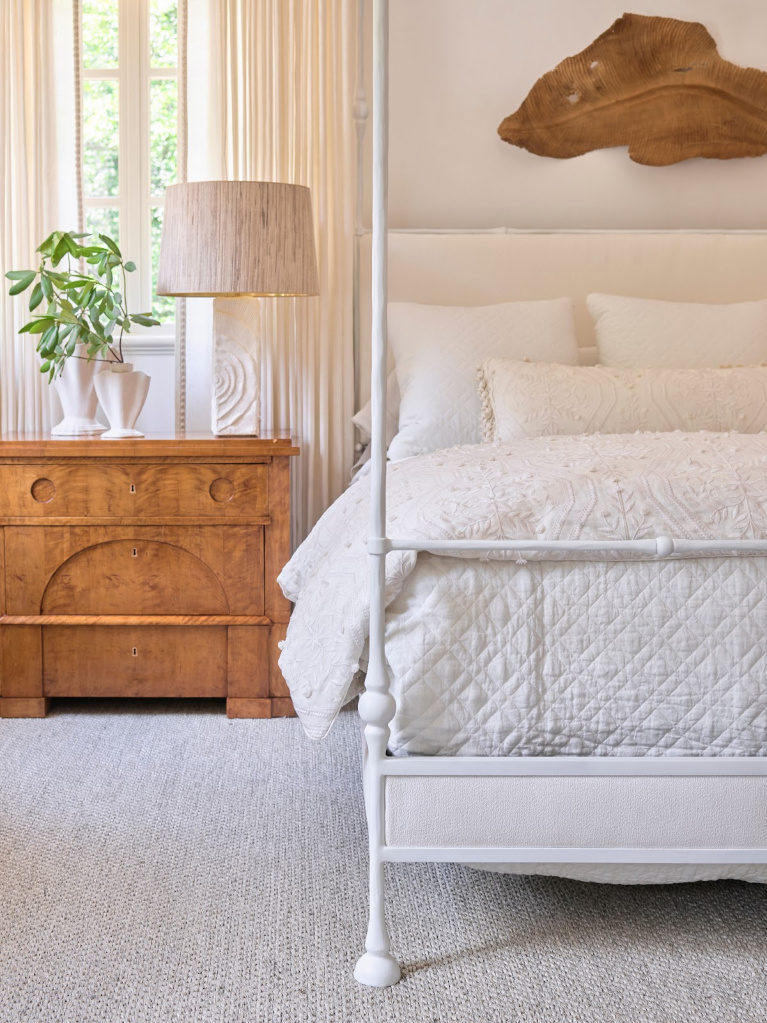
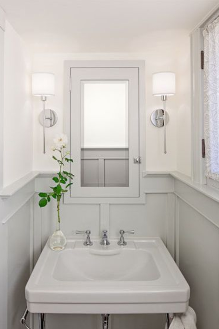
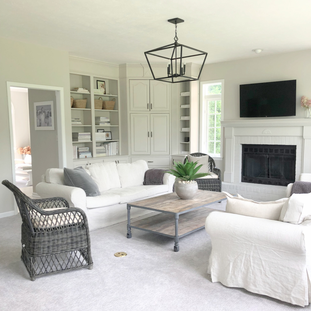
Neutral Wall Paint Color: Benjamin Moore OYSTERSHELL
Here’s an example of a neutral (LRV is 67.87) bringing serenity to a tone on tone bedroom from a 2021 showhouse:

Sometimes a neutral is tricky to pin down in terms of its coolness or warmth. This may be one of those chameleon-like colors. In the room above, it conveys rather warm and beige, but here’s the swatch:
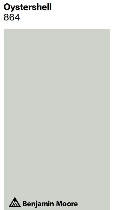
SW calls it an eye pleasing gray with buoyant blue undertones. I’m currently living with chameleon greige colors, and they’re quite mysterious. Here’s SW Agreeable Gray downstairs:
And then upstairs in a bedroom (below).
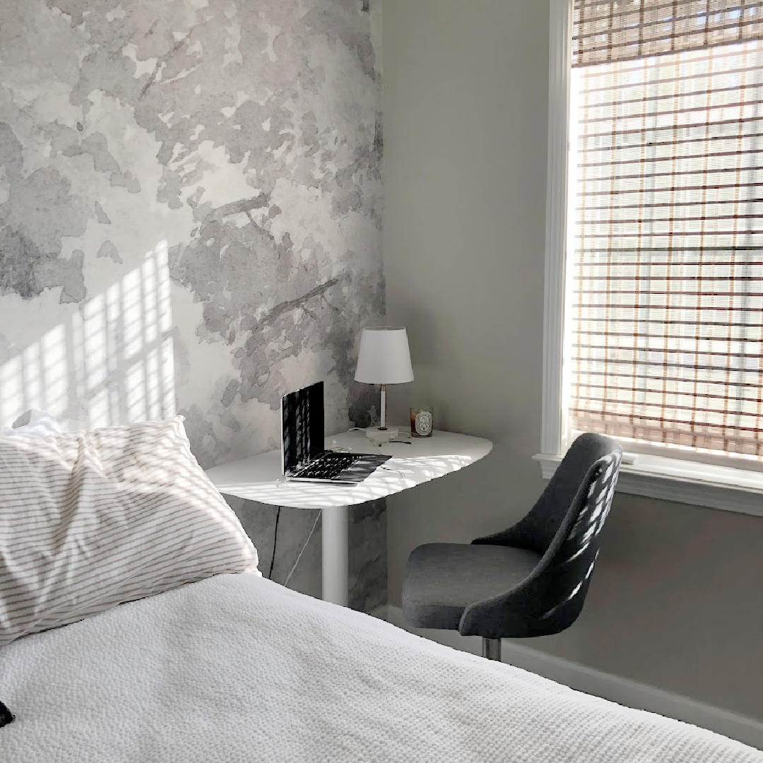
It looks so much cooler in certain light (yet still warm next to the cool greys in the grisaille wallpaper mural).
Why All the Fuss About Neutrals…Shouldn’t This Be Easier?
With the seriousness of global affairs, choosing paint is at the opposite end of the spectrum, but it’s okay to be mindful and strategic about it. Think of the hours you spend at home now. We are all spending more time at home. Many of us work remotely. Our homes are evolving as multi-generational living spaces, studios, offices, schools, and spas.

In small ways I hope to bring ease to home improvement and cozying rooms. Small gestures less serious than peace in the Middle East, yes. But timeless and tranquil interiors make muddling through with great love a bit more comforting.
Get Inspired By These Showhouses
Peace to you right where you are.
-michele
I independently selected products in this post—if you buy from one of my links, I may earn a commission.
Thanks for shopping RIGHT HERE to keep decor inspiration flowing on Hello Lovely!
Hello Lovely is a participant in the Amazon Services LLC Associates Program, an affiliate advertising program designed to provide a means for sites to earn fees by linking to Amazon.com and affiliated sites.


