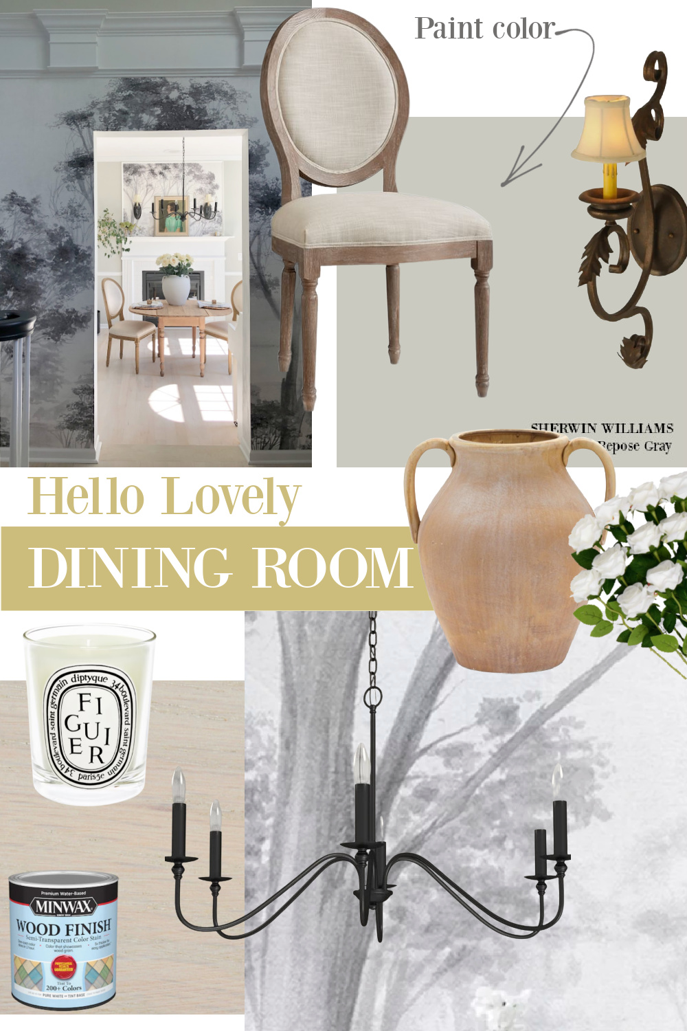
If you love a just right, elegant, dreamy silvery grey paint color as I do, then you may fall for Sherwin-Williams Repose Gray or Farrow & Ball Pavilion Gray. I’m pairing these two in a single post to save you a little time and confusion. Ready to see these colors across different contexts? Let’s dig in.
Silvery Grey Paint Color: Sherwin-Williams Repose Gray or Pavilion Gray?
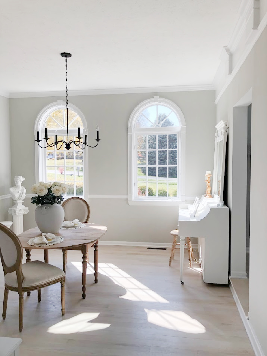
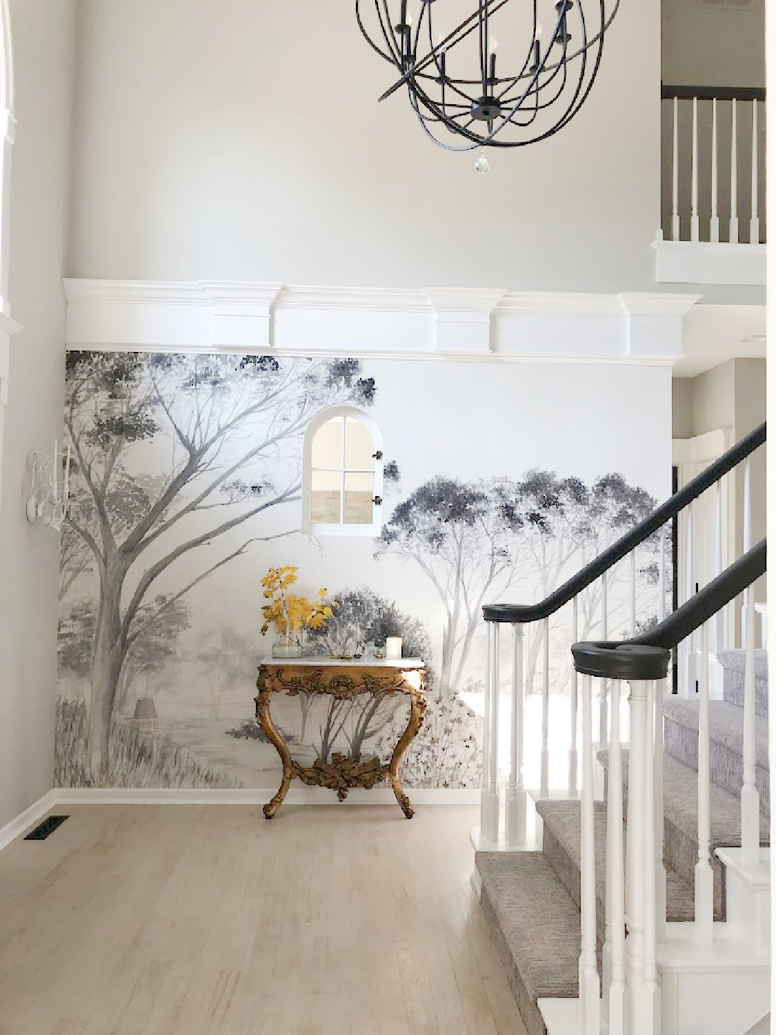
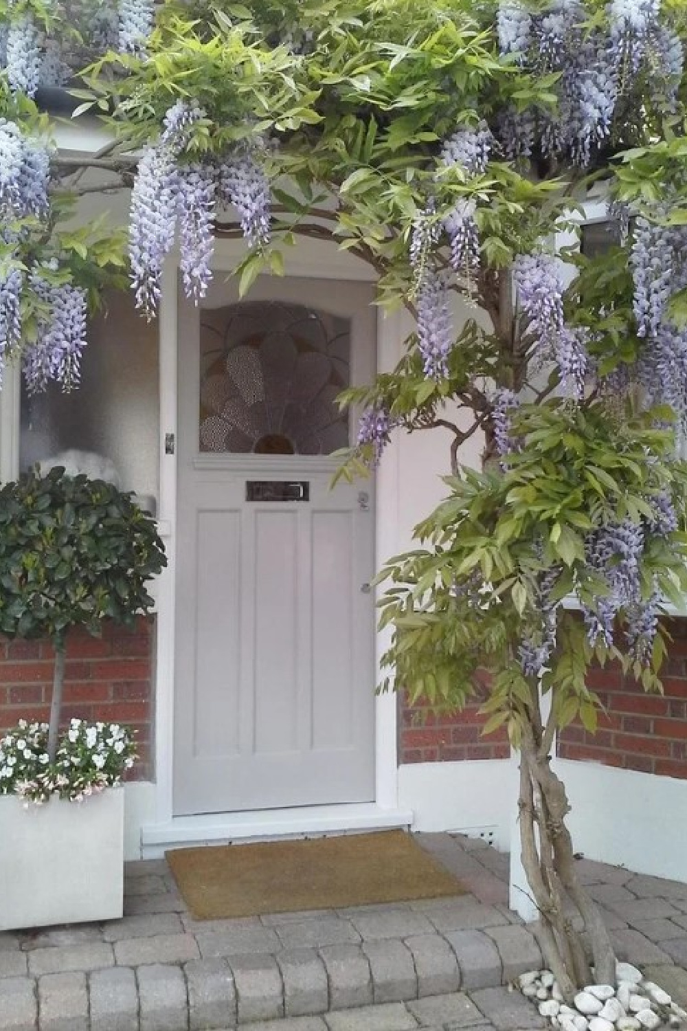
Let’s start by considering Repose Gray – a color to which I was introduced when we bought our Georgian style home in 2021. This color was existing in the entry, dining, and living rooms.
What Sort of Gray is Repose Gray?
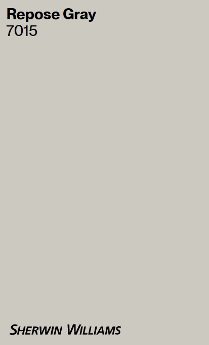
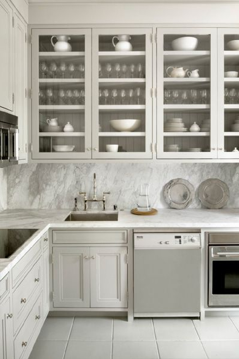
SW says “Tranquil tones and soothing warmth make this light gray a great choice in almost any space. For a complementary trim, pair with Eider White.” And I have to say I agree about how nice it is with Eider White. Our kitchen walls are Eider White, and it is a lovely transition. The LRV (light reflectance value) of Repose Gray is 58 on a scale of 0 to 100.
I liked the neutrality and atmospheric serenity of Repose Gray walls enough that I decided to leave it and live with it. (Also, there were enough decisions to make with all the renovation projects happening simultaneously…the thought of bringing in scaffolding to paint two story walls in cold weather just didn’t appeal!)
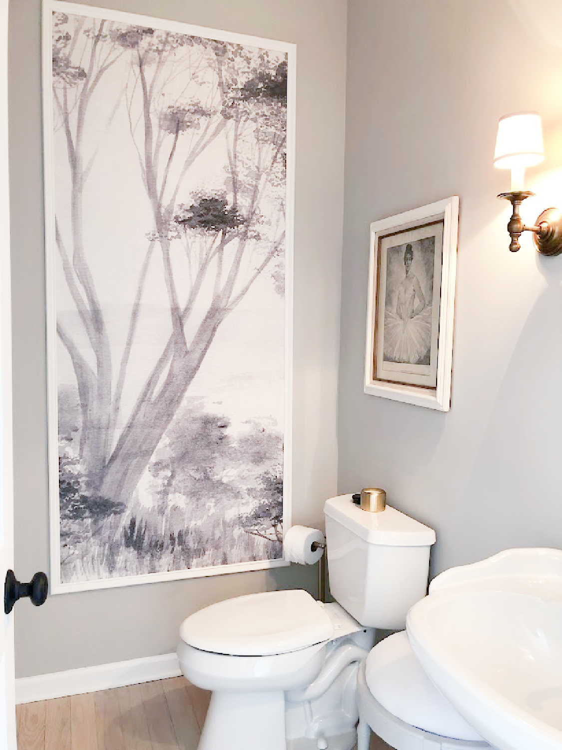
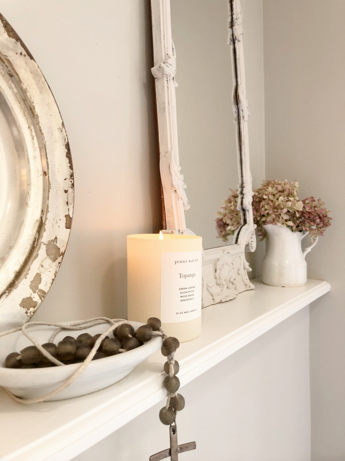
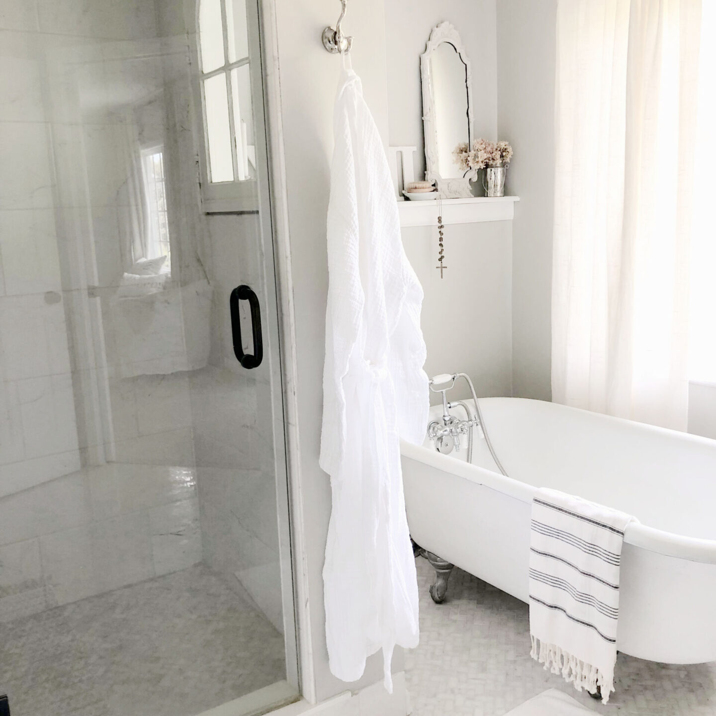
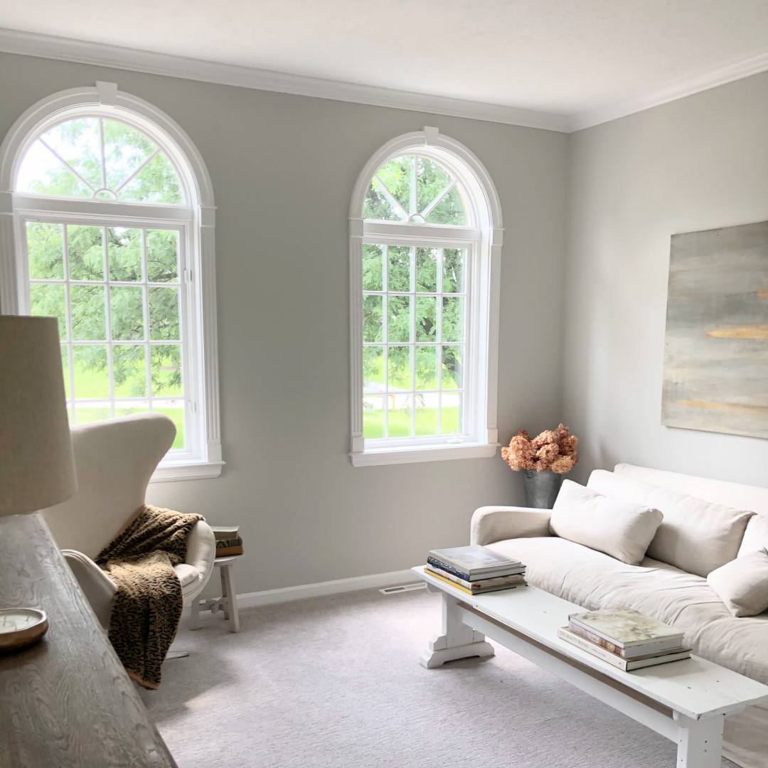
So glad I decided to test living with the color since it is wonderful across the seasons. It’s one of Sherwin-Williams top sellers because of its versatility. It isn’t too cool, but not too warm. With lots of sunshine on it in our primary bath, Repose Gray looks like this:
But how does it vary from Pavilion Gray?
I was shocked when I brought home a sample of Pavilion Gray No. 242, and it was so similar!
Repose Gray & Pavilion Gray Side by Side
While they are close to the same gray color, they vary with slightly different undertones.
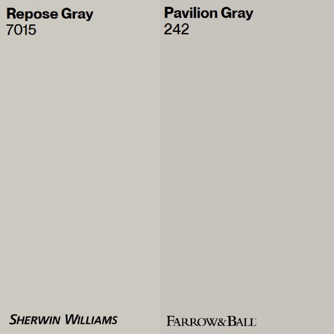
Repose Gray is a little lighter and more greige-y. Pavilion Gray’s blue undertones are a bit more perceivable when you see it side by side with Repose Gray.
And undertones matter! That’s why it’s so important to sample multiple colors HERE.
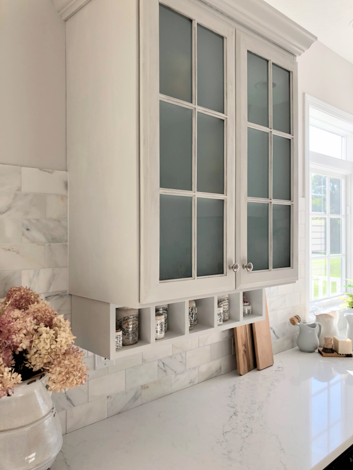
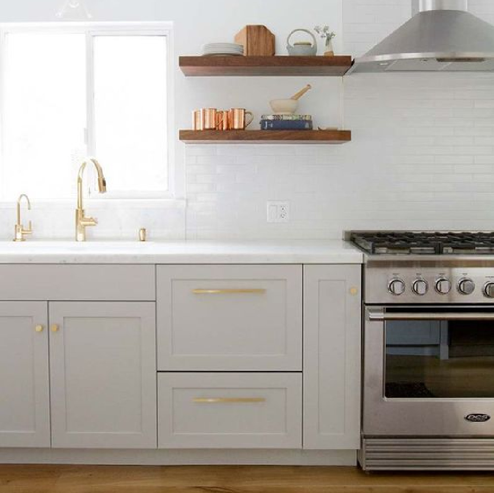
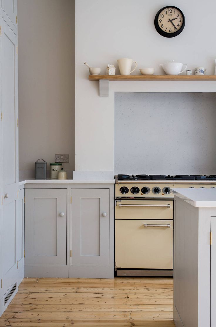
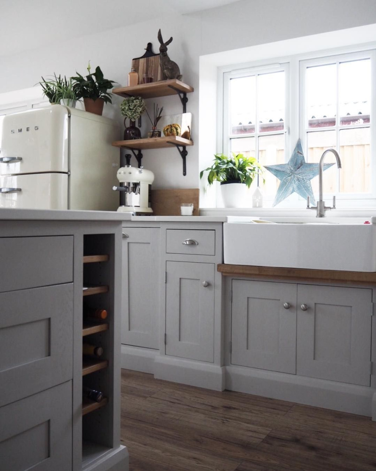
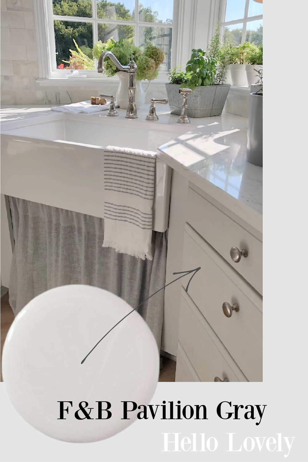
For example, I painted our kitchen cabinets Pavilion Gray (at 66%) to arrive at a pale, blue-gray that sometimes appears blue when washed with sunlight. (All that means is I mixed 2/3 Pavilion Gray with 1/3 pure white to get a lighter version of this gray. If you choose to have them do this for you at the paint counter, I recommend trying a sample that way first…I wanted total control and experimented at home.)
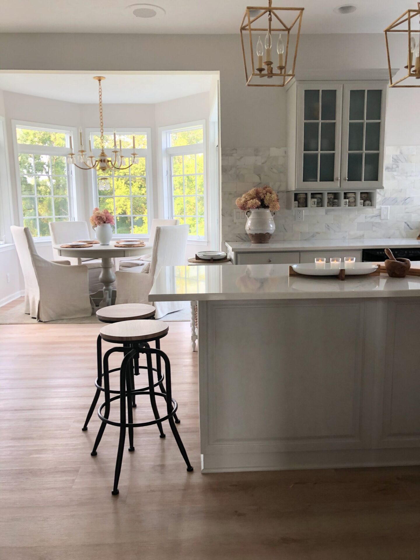
Pavilion Gray at 66% in My Kitchen
In the evening without natural light, the cabinets look more gray. If I had painted them Repose Gray, the color may not have been as suggestive of the blue-grey I was after. My favorite blue is a very gentle greyed-blue that feels muted and not too precious.
BOTH of these grays are going to be beautiful straight from the can (like on my entry, dining, living room walls) or tweaked as I did for the kitchen cabinets.
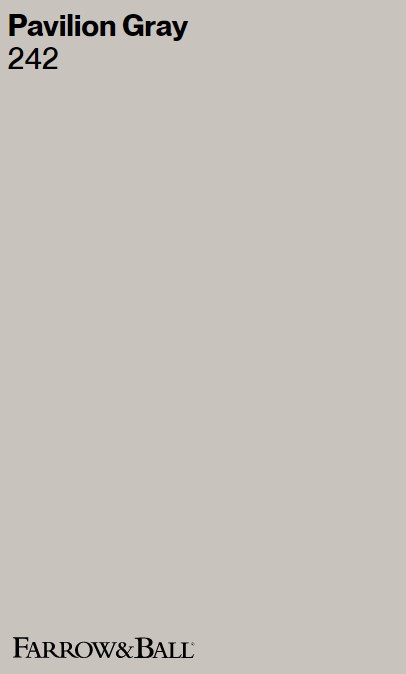
What is the Color Pavilion Gray Like?
“This classic mid grey was originally created for a bespoke pavilion, but is also reminiscent of an elegant 18th century Swedish colour. One of the Architectural Neutrals, the subtle blue undertones of Pavilion Gray add a contemporary touch and sense of spaciousness. Combine with Dimpse, Blackened or Manor House Gray in any combination for a scheme that is perfect for the modern family home.” – FARROW & BALL
As I mentioned above, I found the full strength of Pavilion Gray too dark for my taste so I mixed 2/3 of it with the white paint color used on all of the trim (Sherwin-Williams Emerald Urethane Trim Enamel in Satin). Sort of a custom HELLO LOVELY SWEDISH GREY-BLUE.
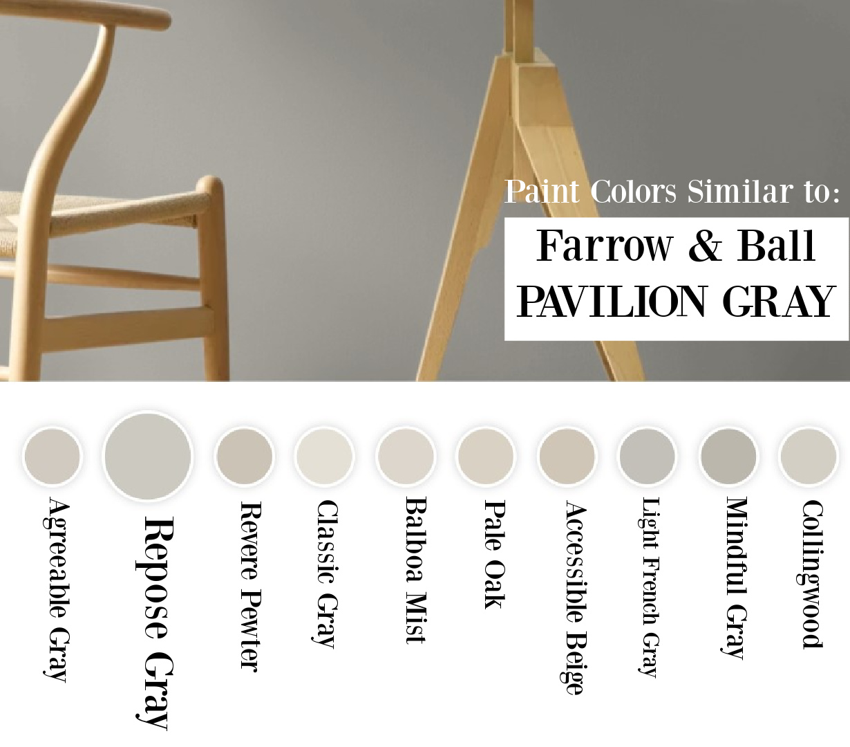
So do keep in mind you can customize your gray as you wish because it is going to vary according to your room’s light. Here are more possibilities from Sherwin-Williams and Benjamin Moore for colors similar to Pavilion Gray:
What’s interesting is I can’t really recognize blue undertones in the color in this photo at all:
Sometimes a paint color will look different than what you expect because of how photos are edited or the time of day a photo is shot. But there’s also the interplay with natural light and even the geographical location of the interior. In Glennon and Abby’s home above, the color feels a bit taupe and more Parisian-like to me.
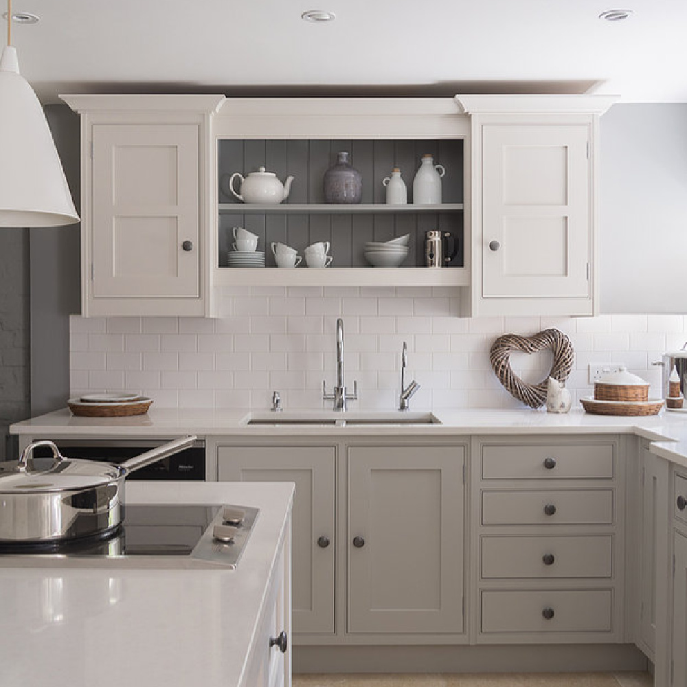
In the kitchen above, Pavilion Gray appears warm and more stone-like.
Which Grey is the Right Grey Paint for Your Needs?
You can find the proper color, and you simply have to sample a few different contenders and take your time. When you see multiple colors together that are similar, their differences will be clearer. As you watch the light change across the day, you’ll also notice how they vary.
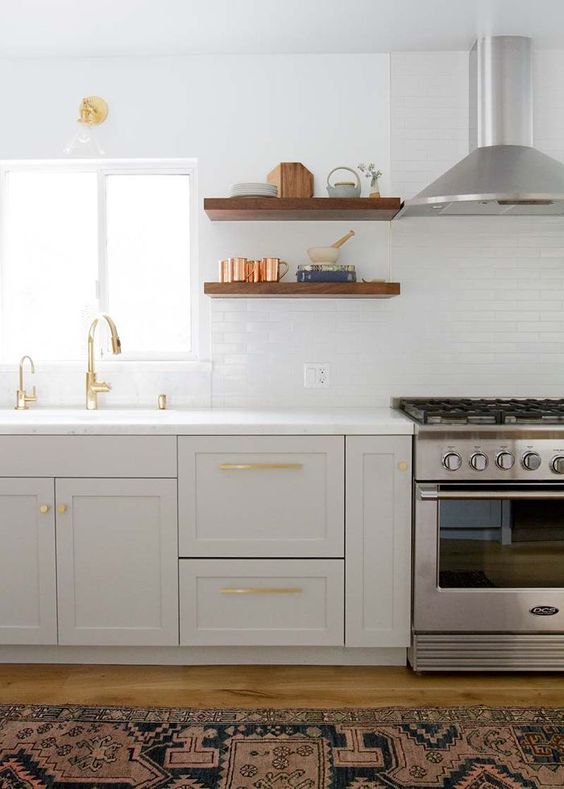
I love how Gemma used this hue in her kitchen (above) with Downpipe. The light floors blend so harmoniously with Pavilion Gray!
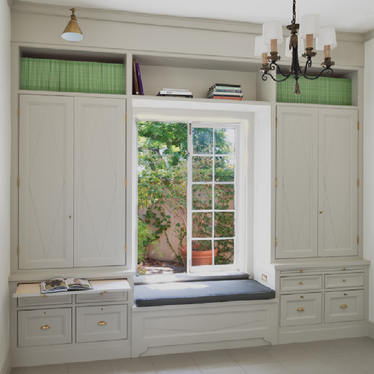
Inspiration for Pavilion Gray on Walls
Depending on the time of day and exposure, this grey can vary…
This give us a an idea of how cozy the color can be:
and here it is in the sunshine…
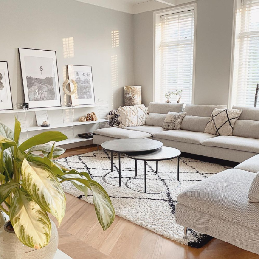
reminding me very much of my own living room painted in the similar Repose Gray!
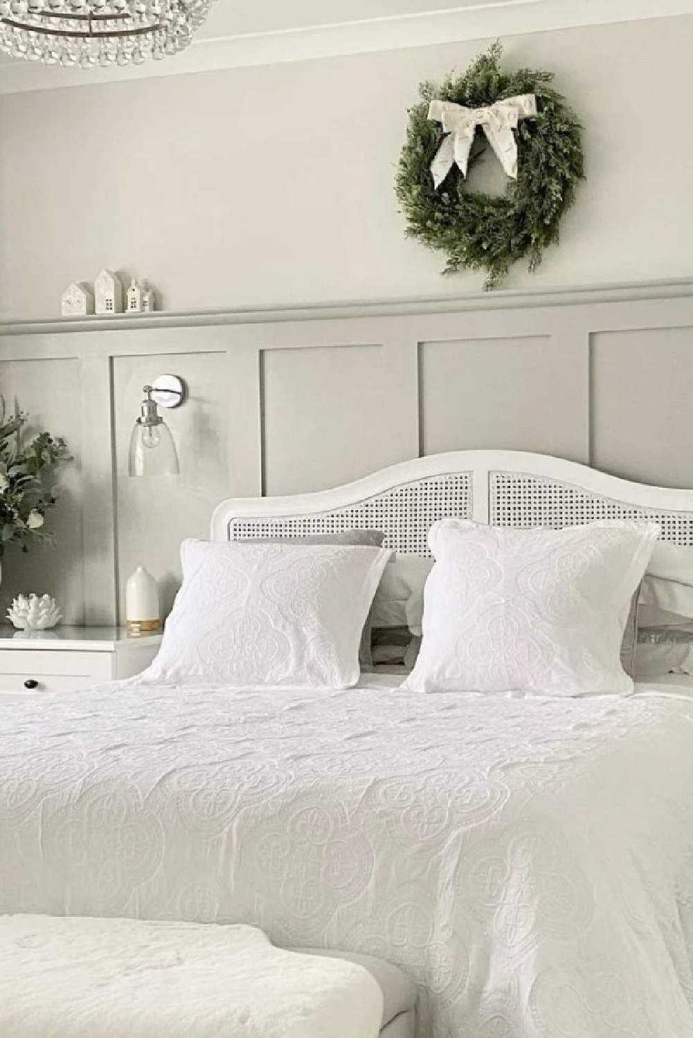
What Mood Does Repose Gray Create?
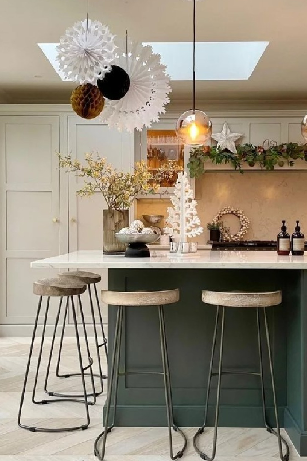
I have a rather unique vantage point since I am living with a handful of grays which are all quite similar: Repose Gray (entry, dining, living, two baths, closet), Agreeable Gray (bedrooms, family room), Eider White (which is sort of a light grey on our kitchen walls, laundry room walls and cabinetry), and Pavilion Gray (kitchen cabinetry).
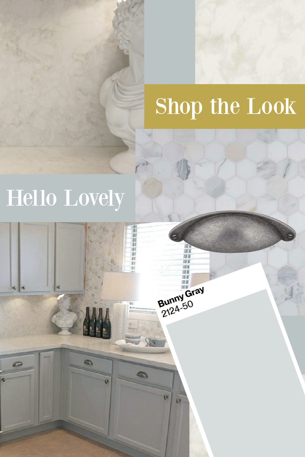
It is cooler and less beige than Agreeable Gray so it feels slightly more formal, serene, and elegant to my senses. But it’s not as blue-grey as Bunny Gray (above). Compared to Pavilion Gray? I would describe Repose Gray’s mood as “friendlier” since it is a bit warmer and cozier.
What Mood Will Pavilion Gray Create?
If you’re after a calm and serene mood, bet you’ll find it swell.
Why is that? Wondering why some grey paint colors can feel dingy or cold or ewwwww and others feel elegant, serene, and fresh?
In a word, undertones. A top notch firm with a rich history like Farrow & Ball went to great lengths to get it right. What makes a grey like this so utterly successful is how it magically looks beautiful across a range of different spaces.
I think the reason I am drawn to this grey is because it reminds me of:
sterling silver,
my favorite timeless rooms,
winter trees,
and the Giannettis and Patina Farm! Wait. A farm? Yep. The farm where I first learned about this grey paint color.
A Winning Gray Designers Love
When Brooke and Steve Giannetti were building their modern farmhouse in Ojai years ago, they used a custom grey they mentioned was similar to Pavilion Gray. The Giannettis used that light grey color on steel doors and windows (above) and for exterior elements as well.
The color makes perfect sense given their passion for Swedish antiques and was enough of an endorsement for me!
Pavilion Gray:
or Repose Gray for you?
I independently selected products in this post—if you buy from one of my links, I may earn a commission.
Peace to you right where you are.
-michele
Thanks for shopping RIGHT HERE to keep decor inspiration flowing on Hello Lovely!
Hello Lovely is a participant in the Amazon Services LLC Associates Program, an affiliate advertising program designed to provide a means for sites to earn fees by linking to Amazon.com and affiliated sites.


