Wait. Kitchen paint colors beyond white on this blog? Yes! But I may slip in a few neutrals just to cleanse the palate now and again. 🙂 Specifically, we’ll explore paint in the green, blue-gray, and blue color range in a variety of gorgeous country kitchens sure to inspire. For more stunning ideas, see these gorgeous country kitchens. And subscribe like I do (for old school ogling!) to Country Living!
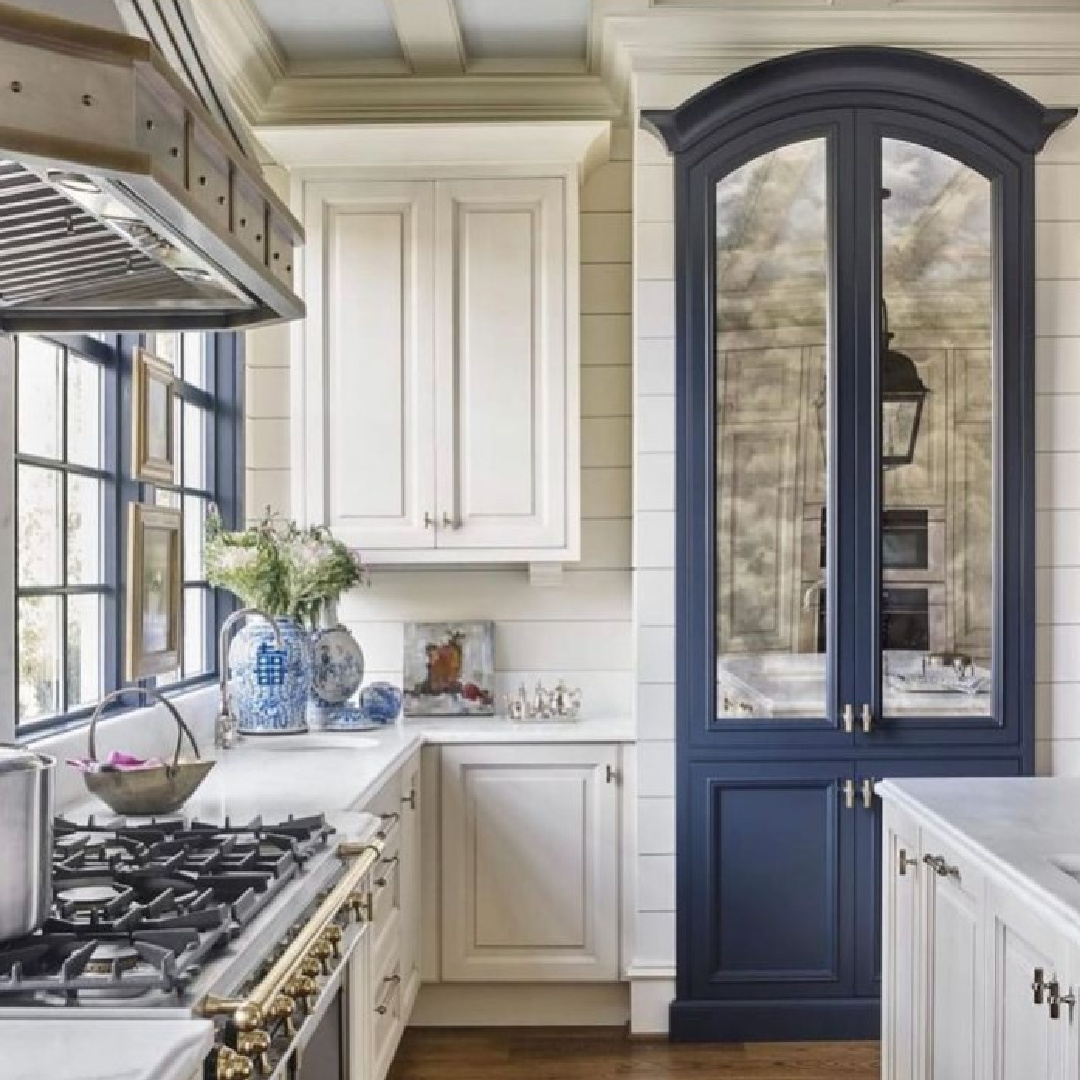
Why does this kitchen above feel so revolutionary? A mirrored pantry or china cabinet painted in a contrasting shade? Yes, please! So keep this idea in mind as you’re browsing paint colors. Maybe paint a vintage cupboard, cart, or table in a favorite to energize your own kitchen.
Kitchen Paint Colors in Blues & Greens
I independently selected products in this post—if you buy from one of my links, I may earn a commission.
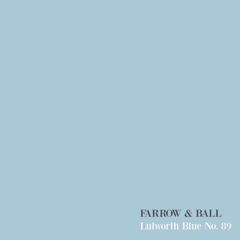
F&B Lulworth Blue
Omg, this is a happy color.
Are you dying? Loving how the more rugged work table and unexpected oversized pendants work with this boldly painted blue kitchen:
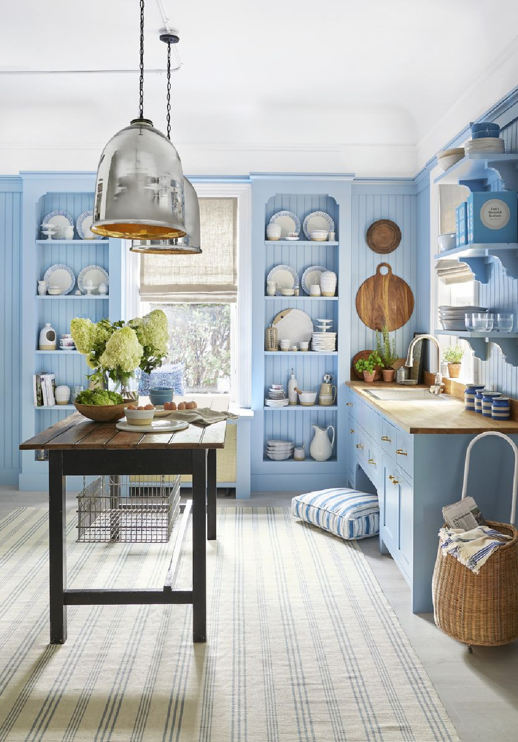
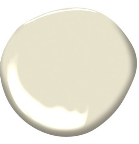
Benjamin Moore Light Breeze
Think neutral colors can’t play a role in a space with personality plus?
Ahem…
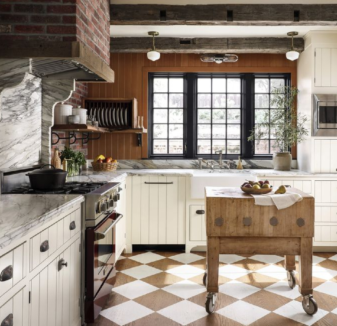
Isn’t it energetic yet cozy and chic and whimsical too?
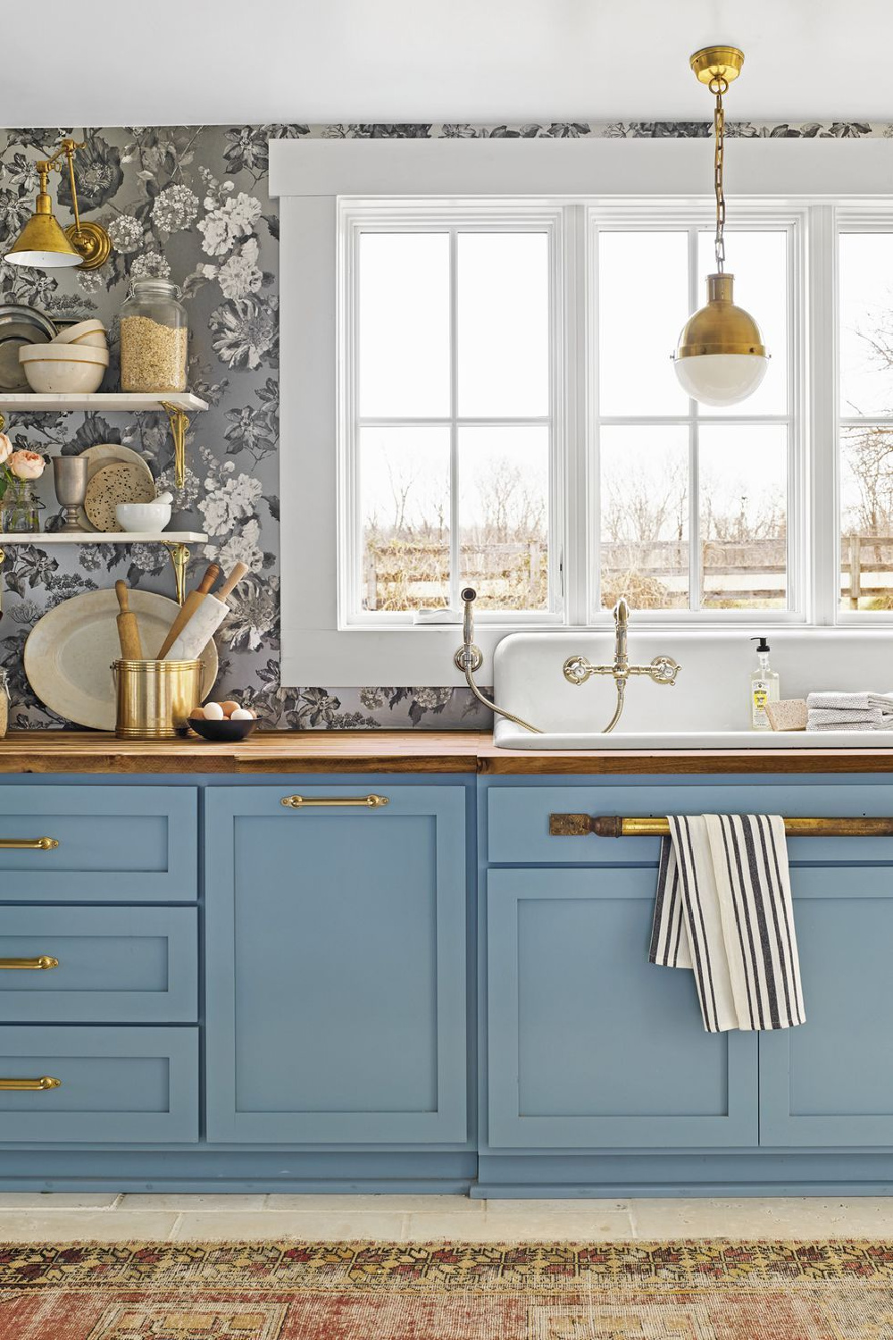
Benjamin Moore Blue Daisy 2062-40
What happens when a happy teal blue meets a sophisticated grey wallpaper and warm brass hardware?
No need to wonder!
Psst. When I popped into Holly Williams’ shop in Franklin a couple visits ago, I was hoping I might catch a glimpse of her, and there she was!
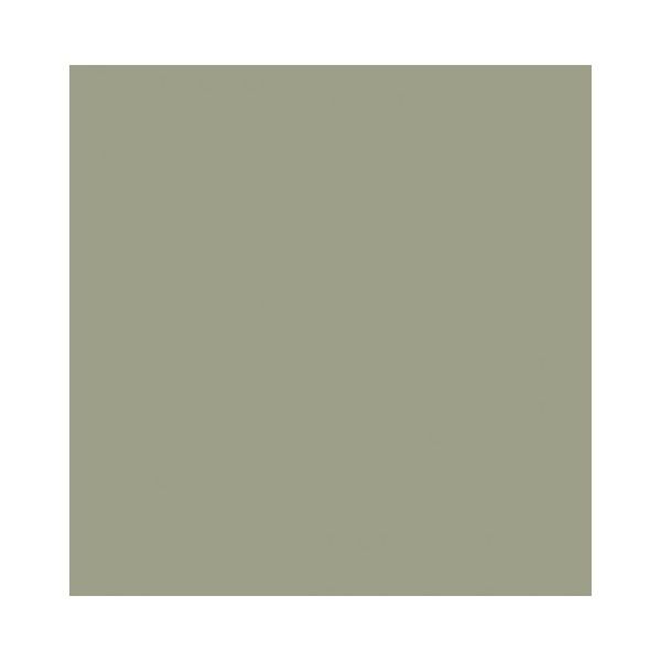
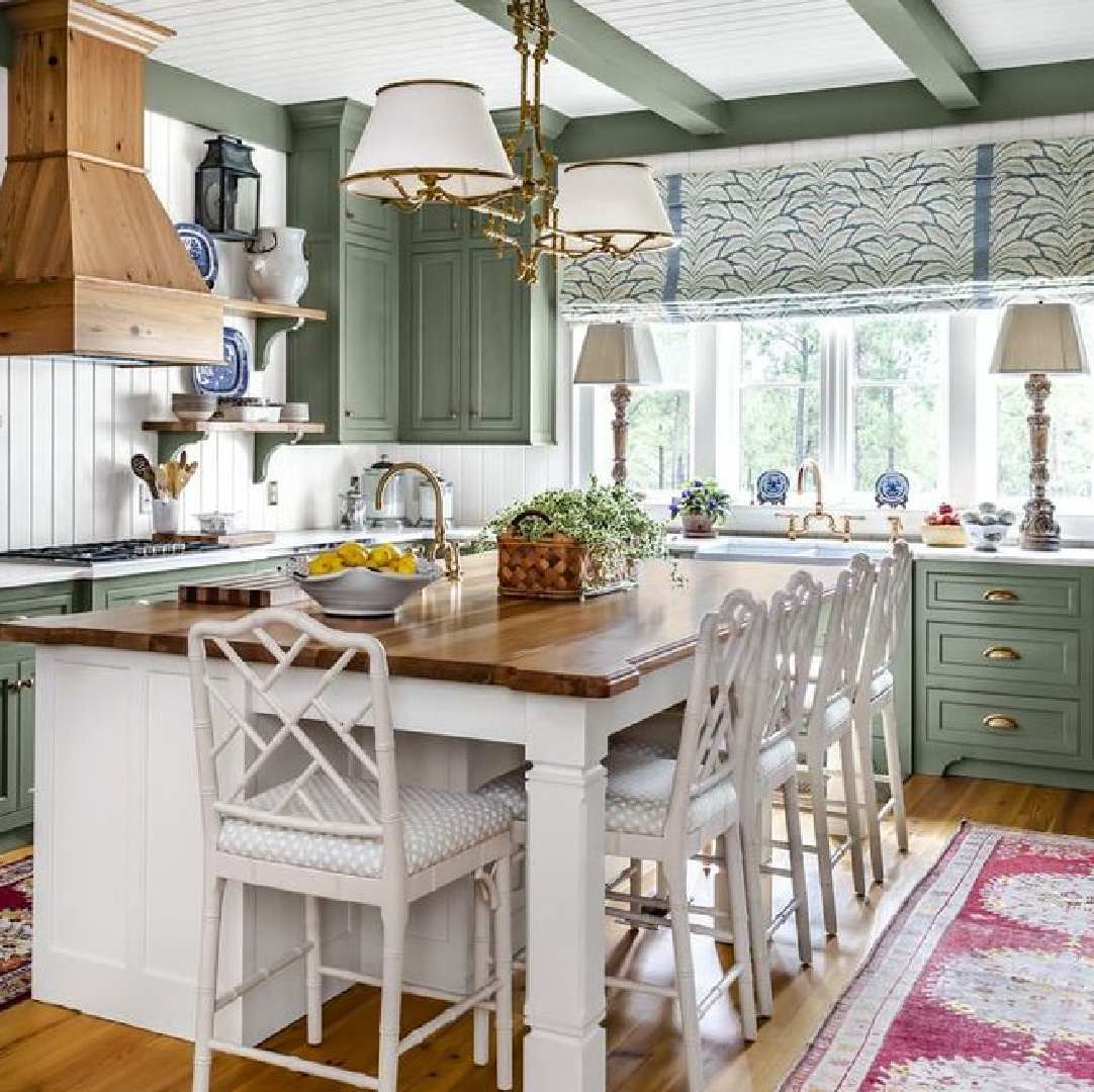
BM Louisburg Green HC-113
So many folks have been warming up to the idea of a green kitchen in recent years, and here’s a muddy one to consider:
This is one of those colors I love to wear–it feels so neutral for clothing, and it’s straight from nature, so why not?
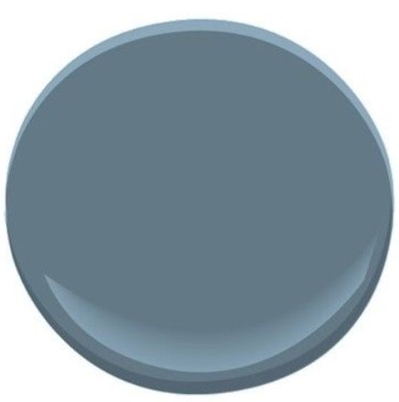
BM French Toile
Blue-greys are tricky to get right, right?
Typically if you’re after the perfect blue, it’s wise to limit your search to the grey swatches. But there are plenty of exceptions, and the key is trying a sample in YOUR space.
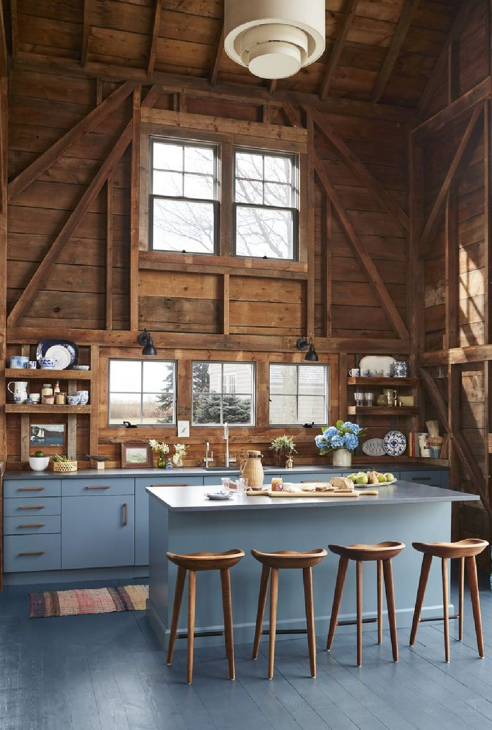
Mohegan Sage 2138-30
Here’s a deep, moody tone when you’re after a vibe.
It feels smoky, handsome, and sophisticated, yet it seems to be right at home in a country setting with beadboard:
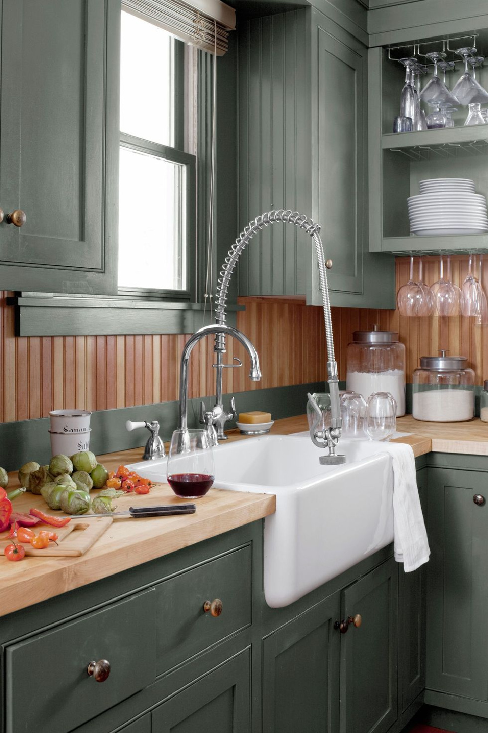
Farrow & Ball Arsenic
Bold flooring in the kitchen gets a lot of attention on social media, and sometimes I wonder if regular folks are following suit. Would you could you paint your floors a bold green?
I can imagine how this hue could lift spirits when skies are grey like they were today here!
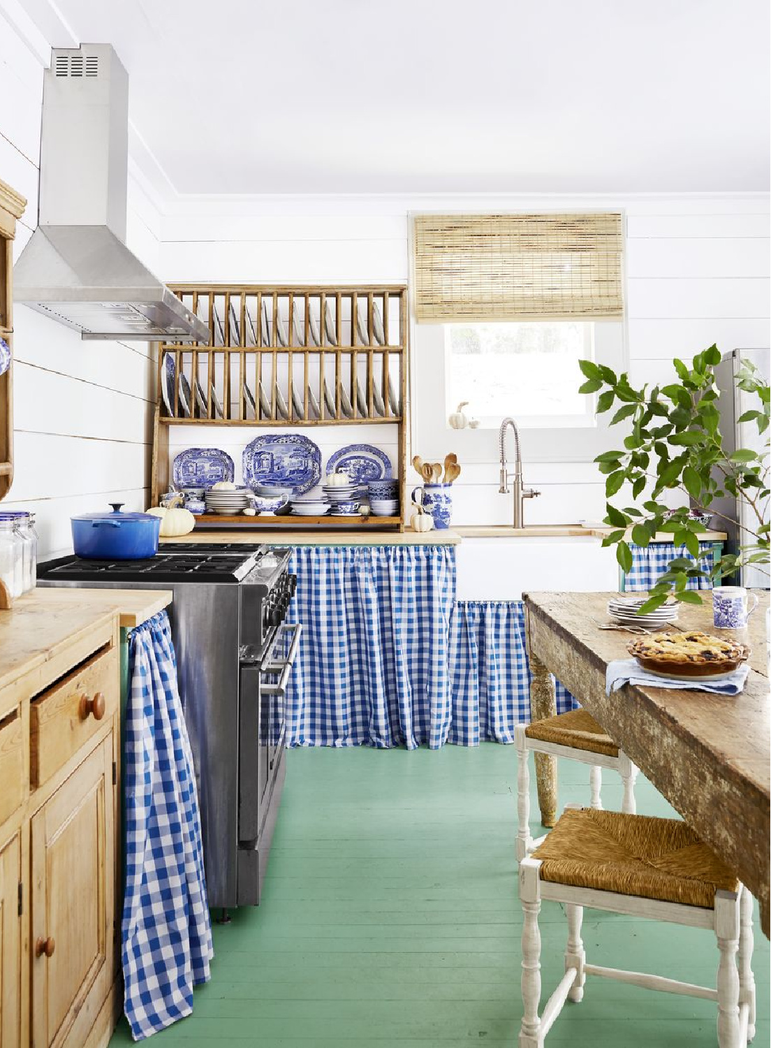
Not unlike a spring meadow underfoot through the seasons.
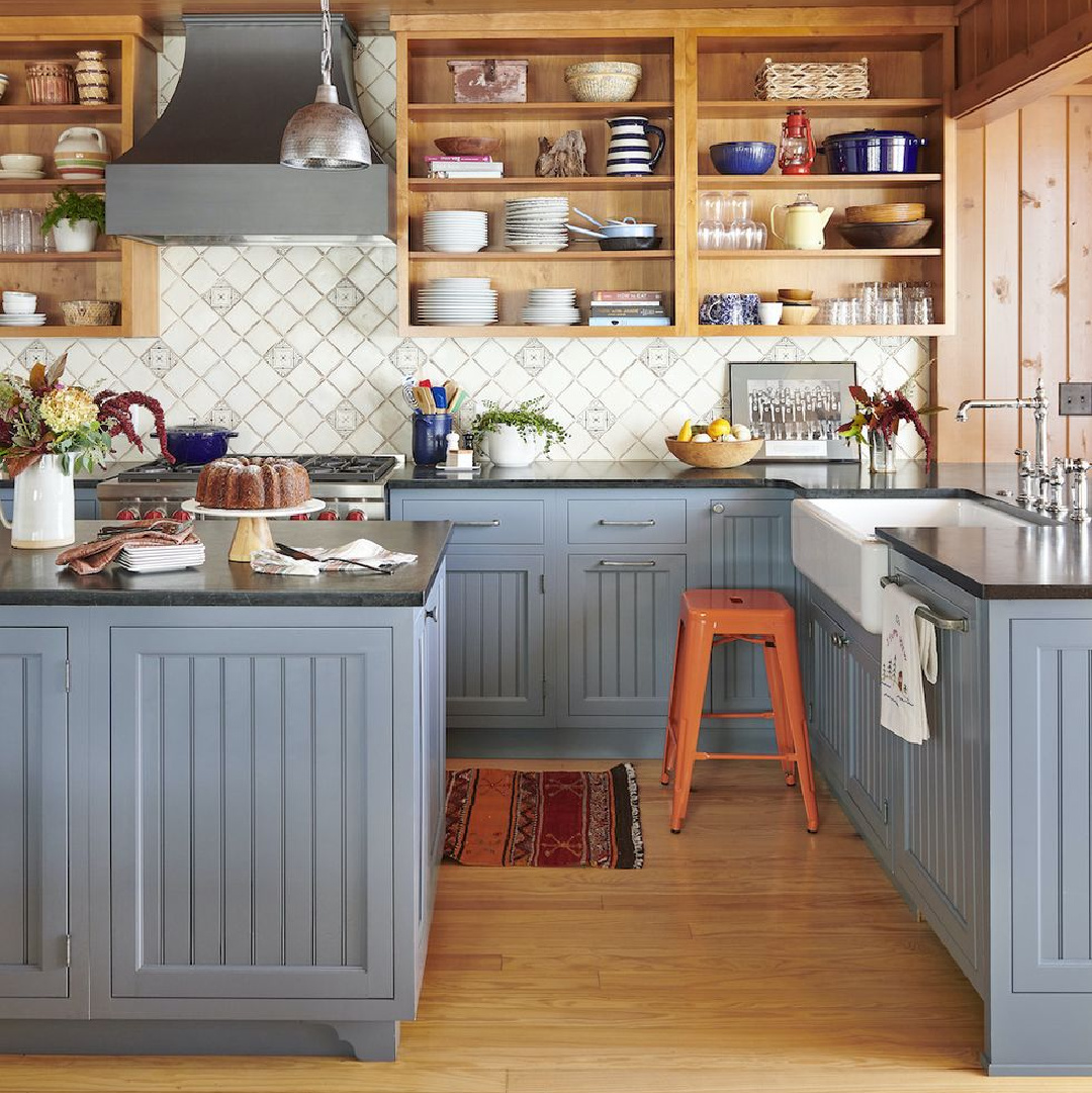
Benjamin Moore Philipsburg Blue
I admire how this particular blue was paired with wood cabinets (without the doors) in the design below.
It’s an unusual and pleasing combination that feels cozy as well as cool.
Coastal Plain
There’s a timelessness about this green that strikes all the right chords in the kitchen below.
While the swatch above appears darker, it’s a great example of how natural light washes out color and affects undertones.
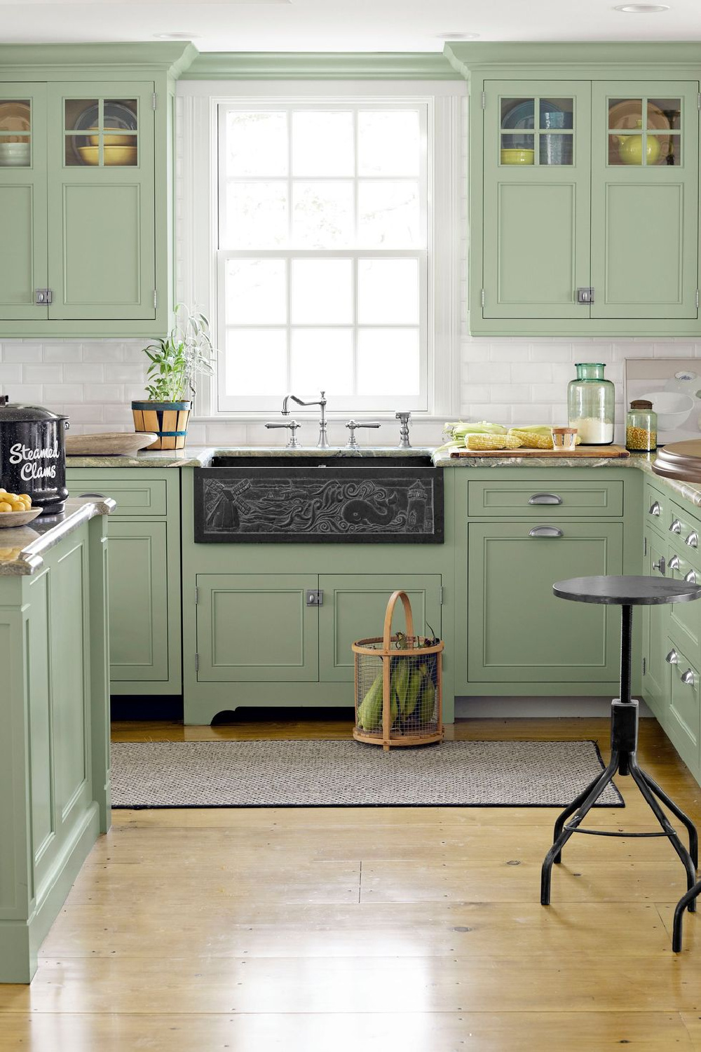
And the black accents! Speaking of black…let’s pause for another neutral.
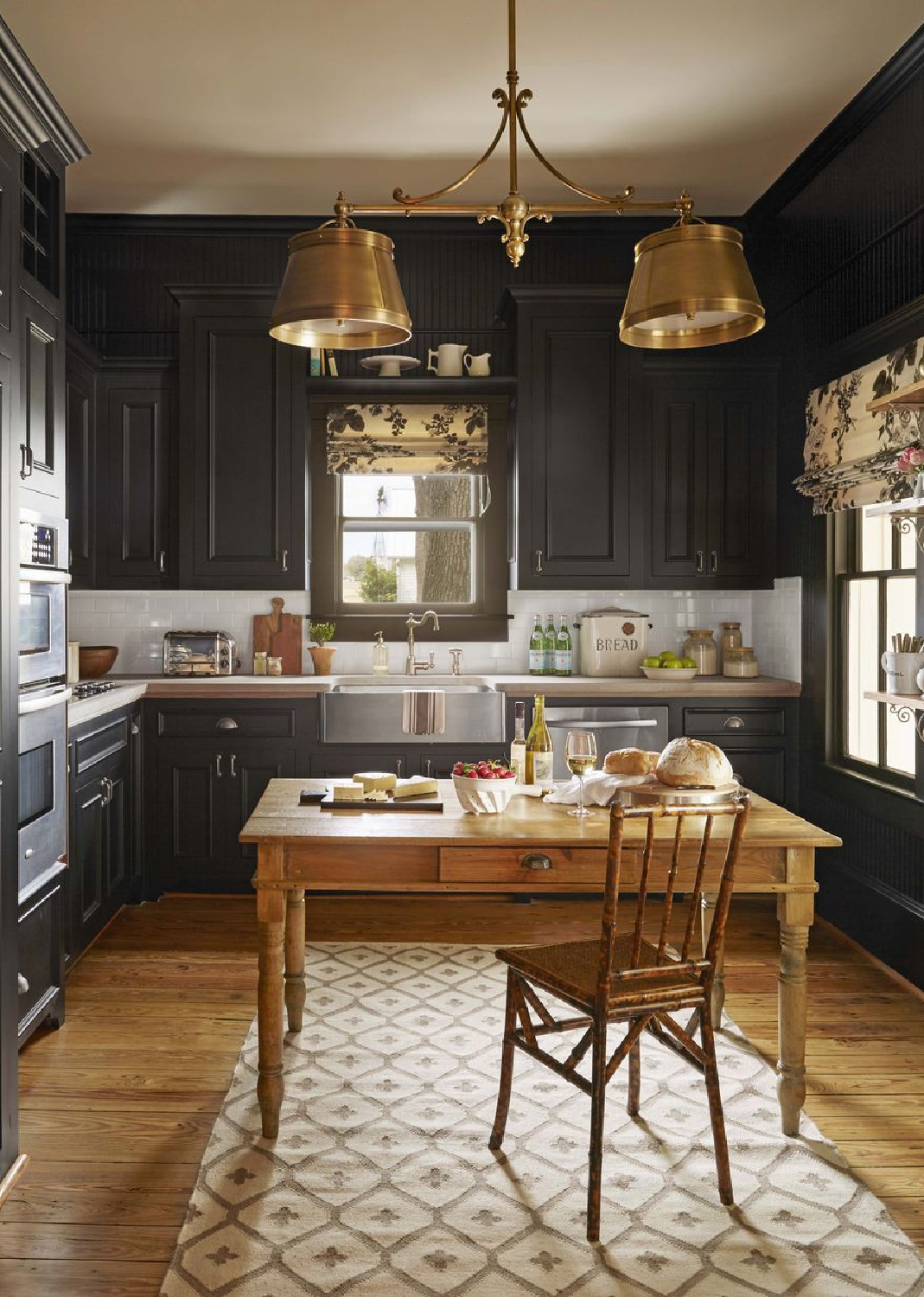
Farrow & Ball Pitch Black
We’re seeing many more black country kitchens these days. I feel like it was reserved for urban or industrial kitchens, yet it feels so European country and traditional when paired with the right design elements.
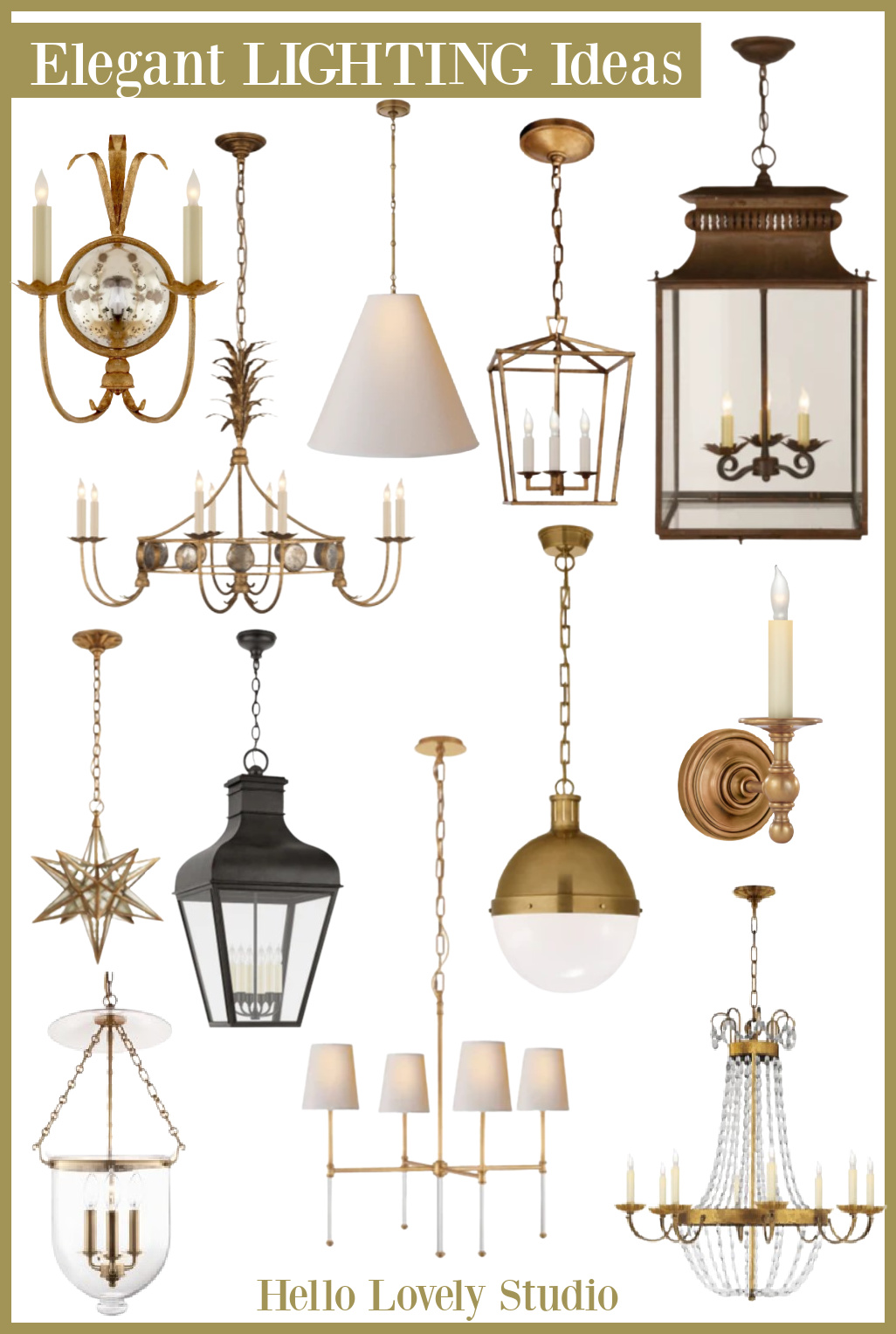
With gold-toned lighting…WOW!
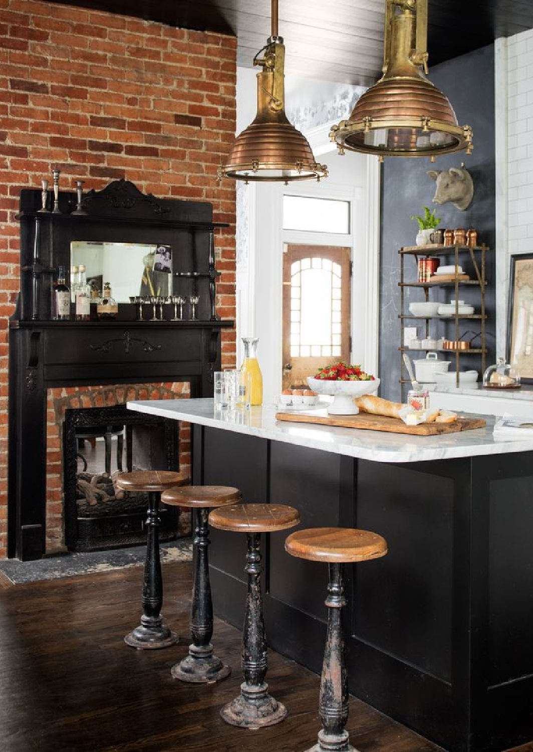
It’s common to see kitchen islands painted black, and here’s another design from Holly Williams:
I independently selected products in this post—if you buy from one of my links, I may earn a commission.
Blue Ground No. 210
To draw the eye up, a blue ceiling suggestive of clear skies is a heavenly possibility in the right kitchen.
Look at those beams, and that lantern!
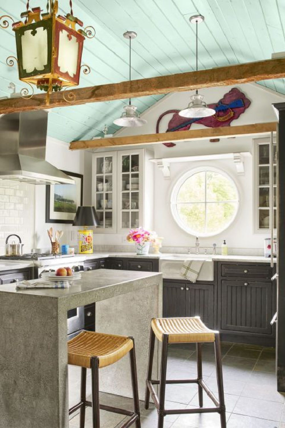
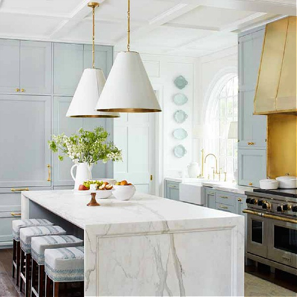
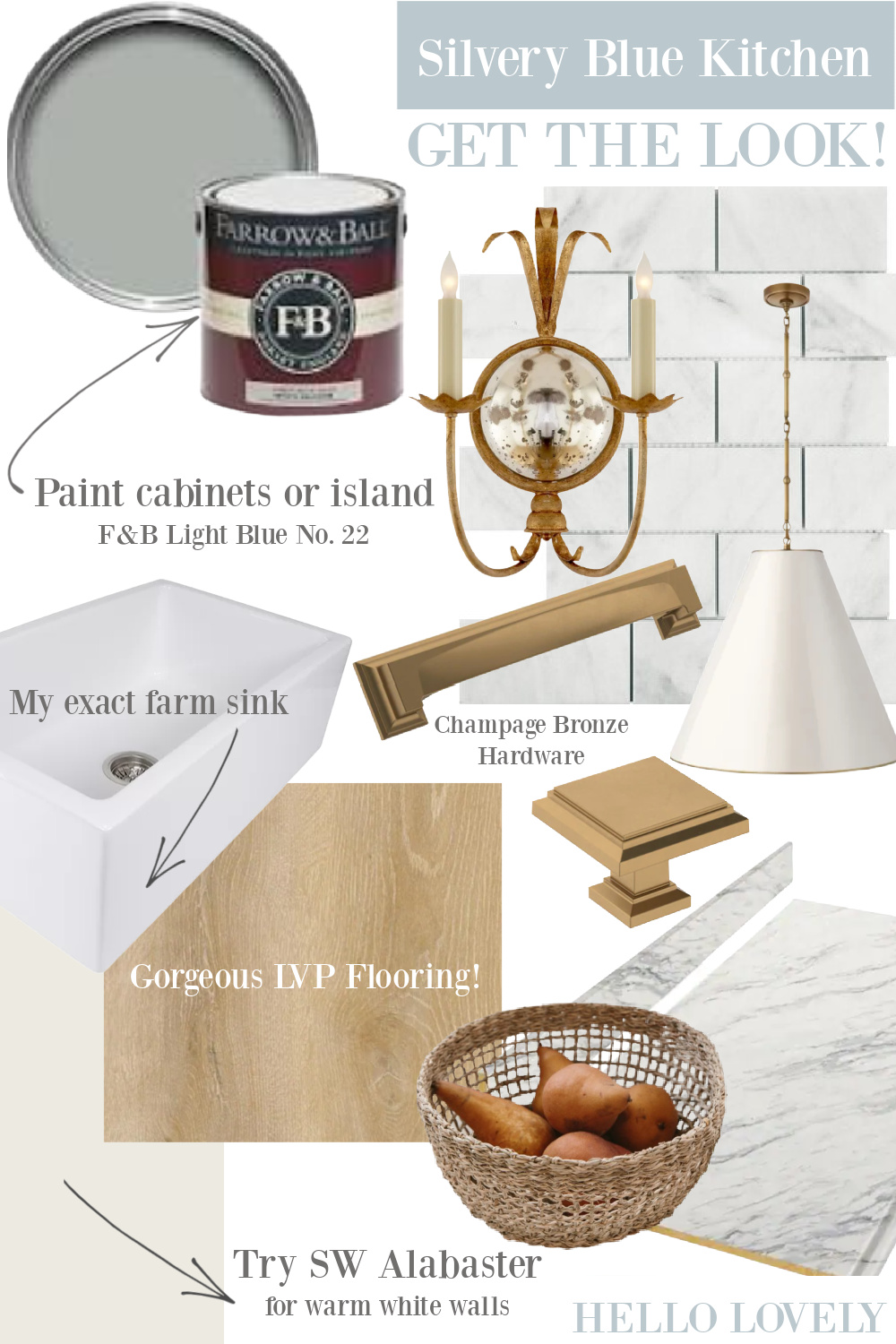
Does Blue Ground bring to mind Farrow & Ball’s Light Blue which played a starring role in my favorite blue kitchen from 2017:
Farrow & Ball Elephants Breath
Here’s another hard to describe neutral from Farrow & Ball. Don’t you love those understated, complex, sophisticated colors that refuse to be pinned down?
It feels Parisian to me and so elegant with gold:
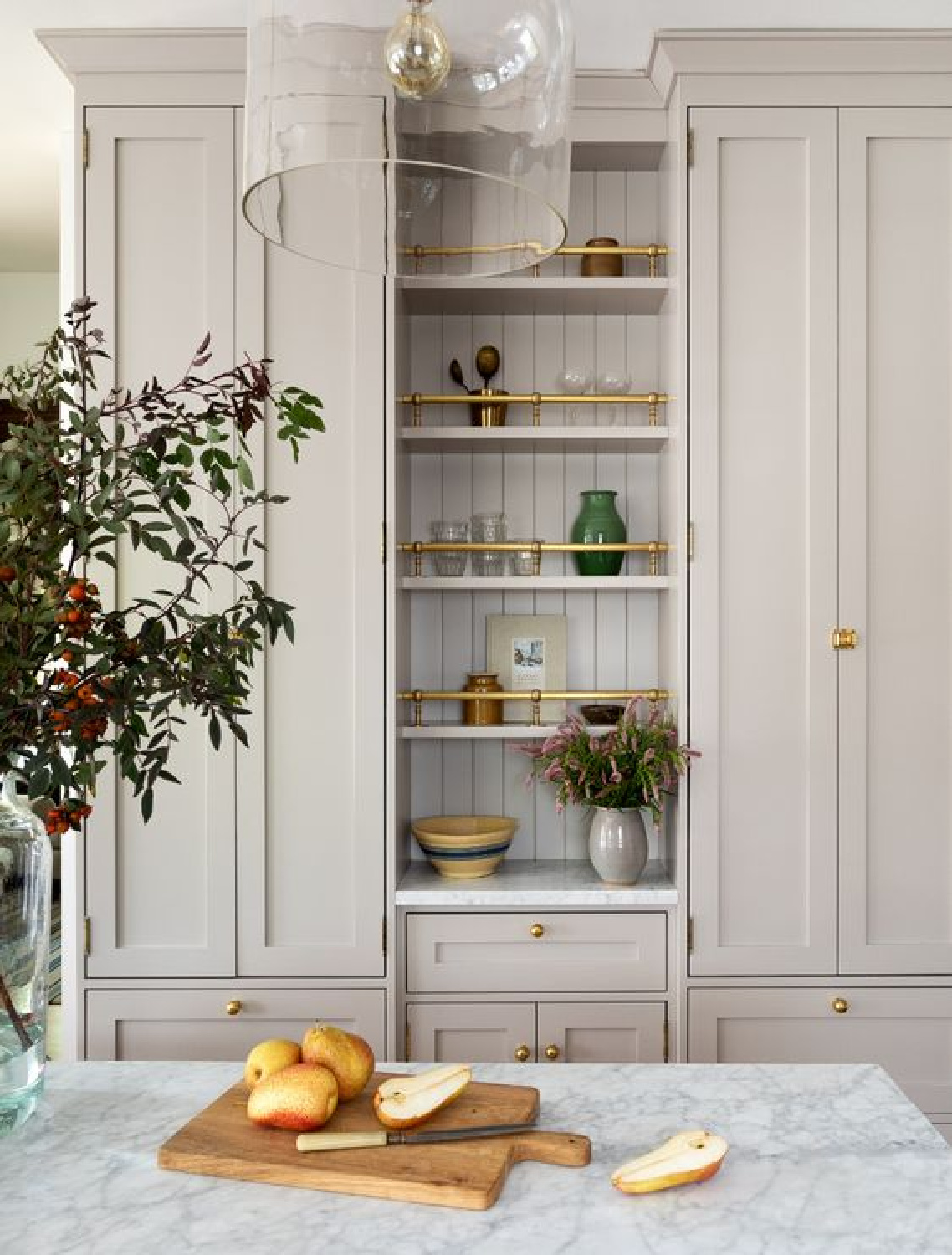
The color reminds me a little of this one in case you are seeking more neutrals to sample:
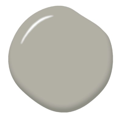
BEHR Opera Glasses
English country kitchens are some of the loveliest, and what drama when a color like this is used for cabinets AND backsplash:
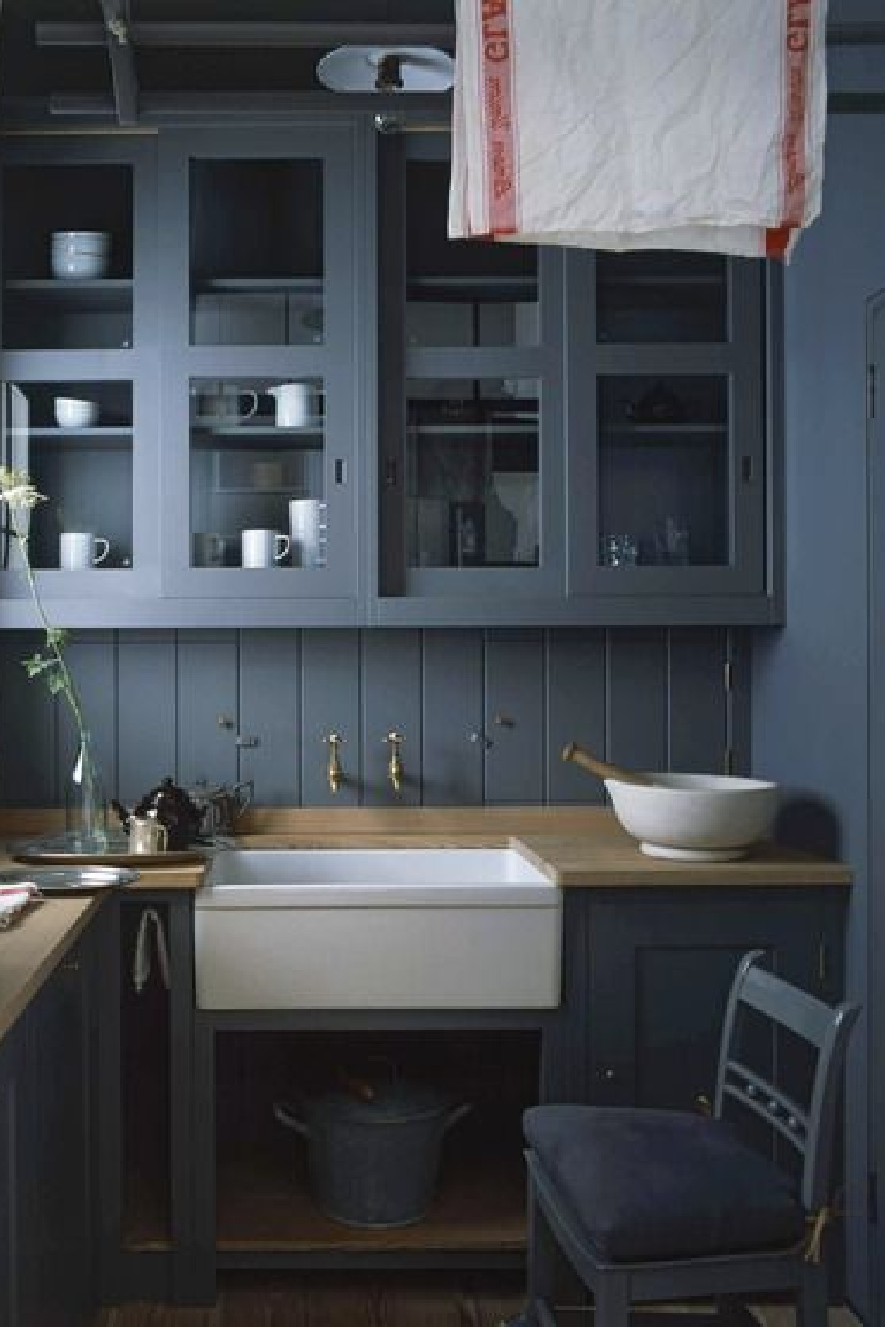
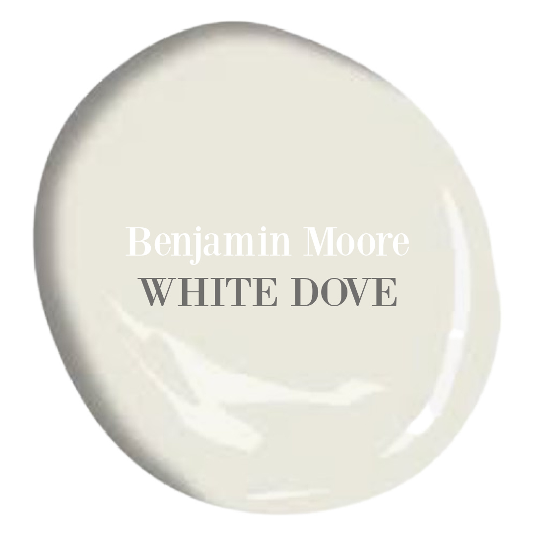
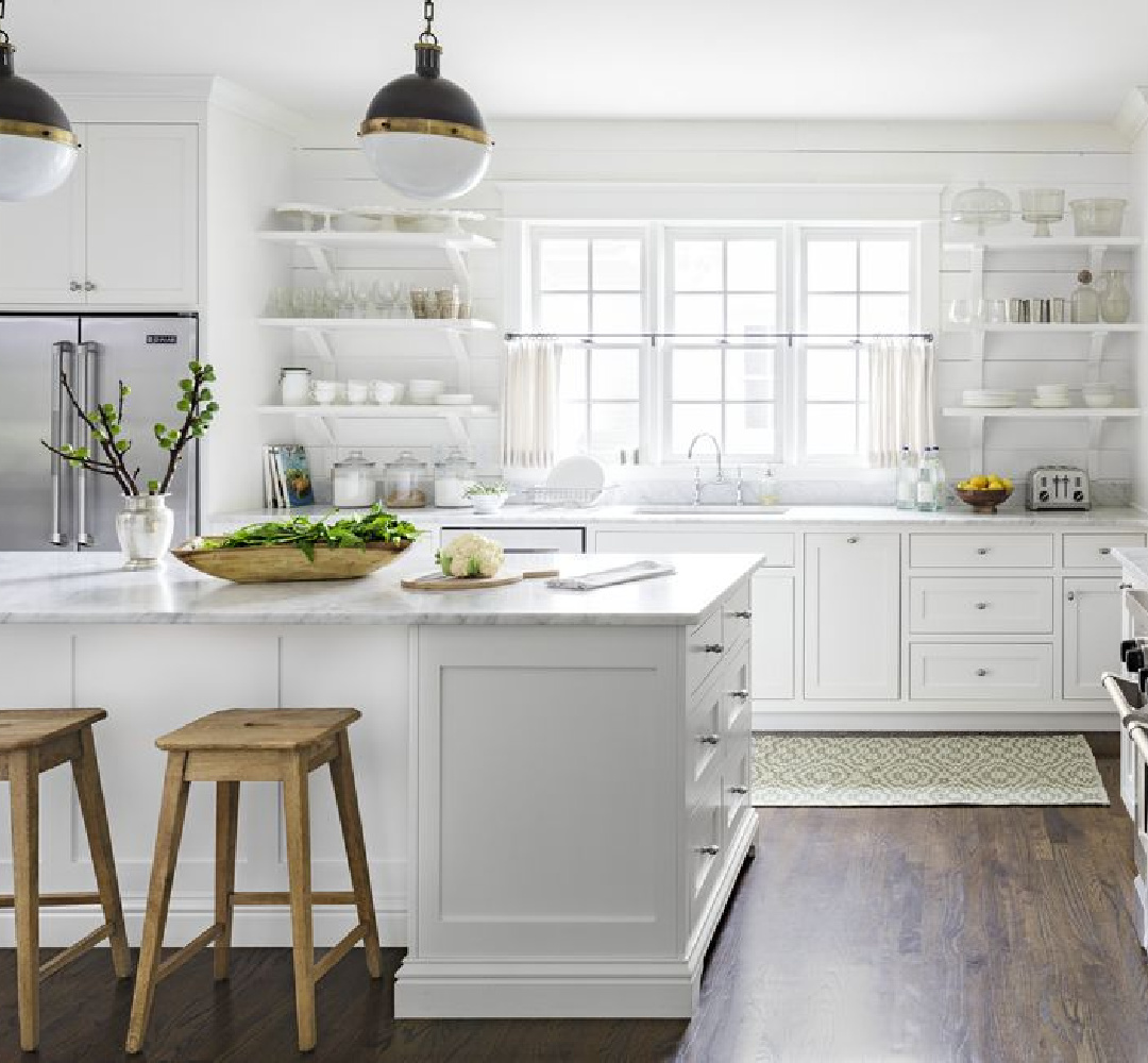
White Dove
Is this maybe the most used white in kitchens of all? There’s a good reason it’s so!
Just a gorgeous white that feels timeless and clean.
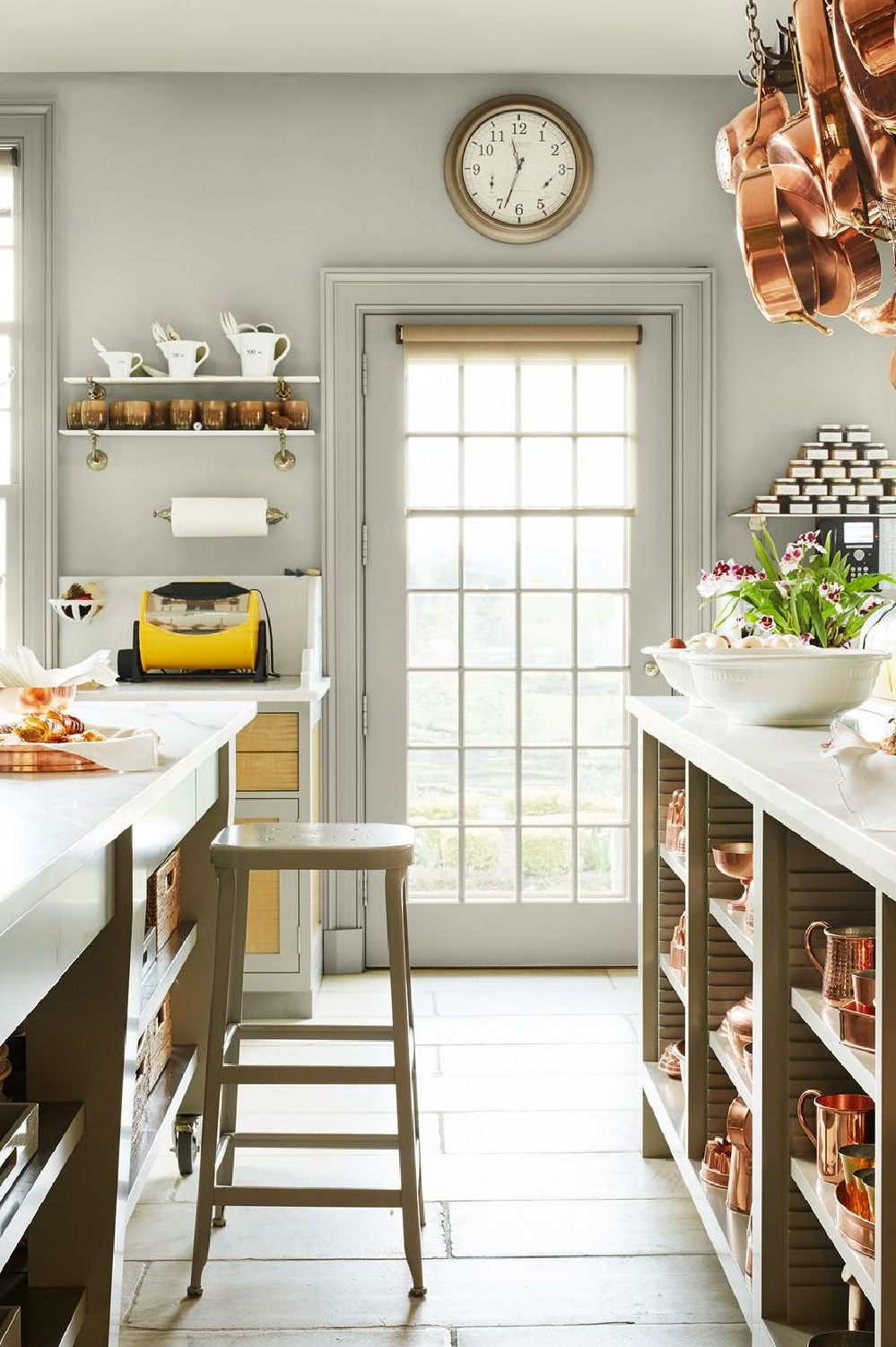
Stormy Monday
I love how Martha Stewart used Stormy Monday.
If you read anywhere that grey interiors are over and should be avoided, look away! Greys are timeless and natural and can be just the right backdrop for a rich, sophisticated look.
BM Night Train 1567
There are great paint color names, and then there’s NIGHT TRAIN.
Right? Don’t you love how it is paired with all this sweetness?
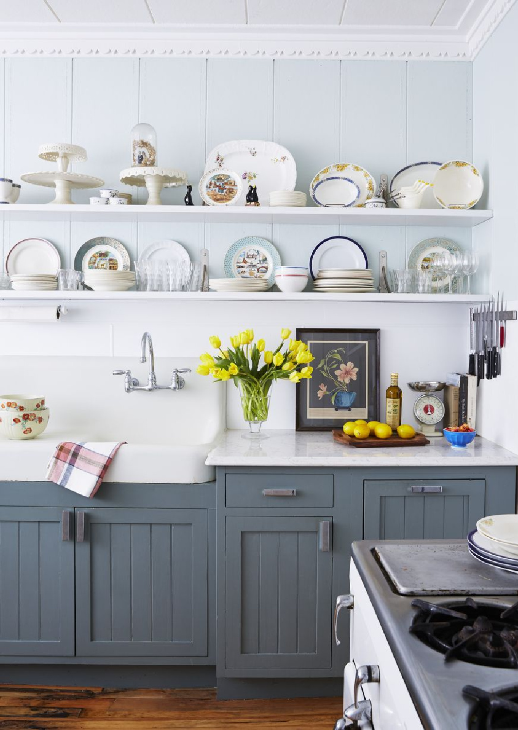
BM Varsity Blues 756
What if you’re feelin’ saucy?
I mean, I can think of plenty of worn out, forlorn kitchens that might be energized or resurrected with buckets of color.
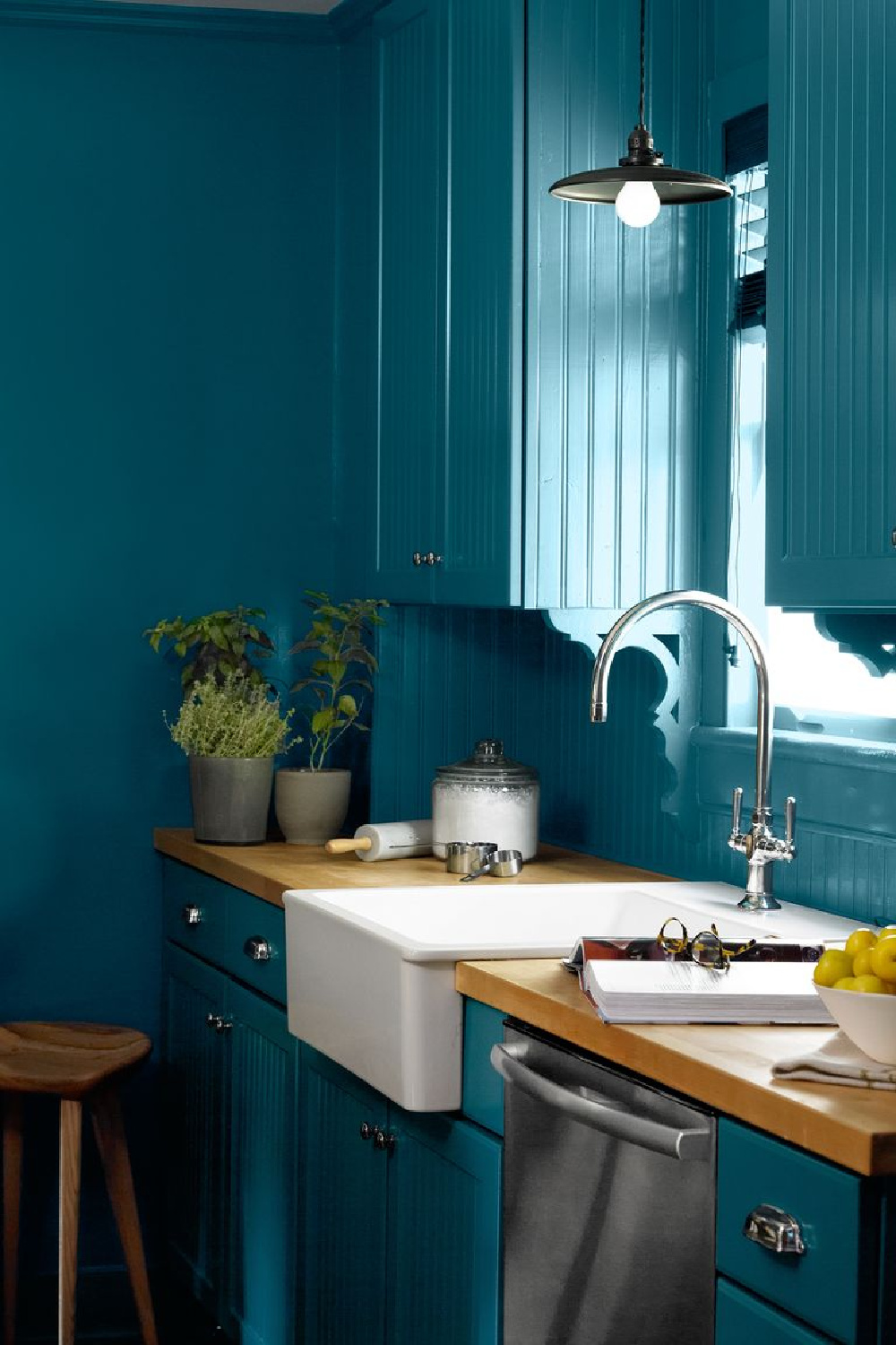
Paddington Blue
Here’s a different sort of bold blue that appears to be best friends with white.
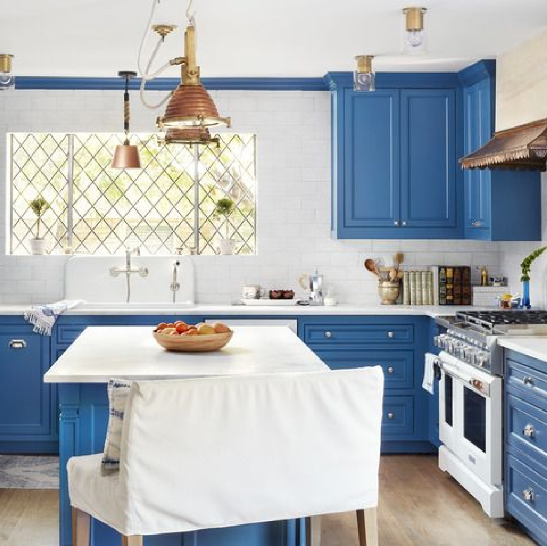
Oil Cloth
Wait until you see how this color interacts with terracotta.
Ready or not!
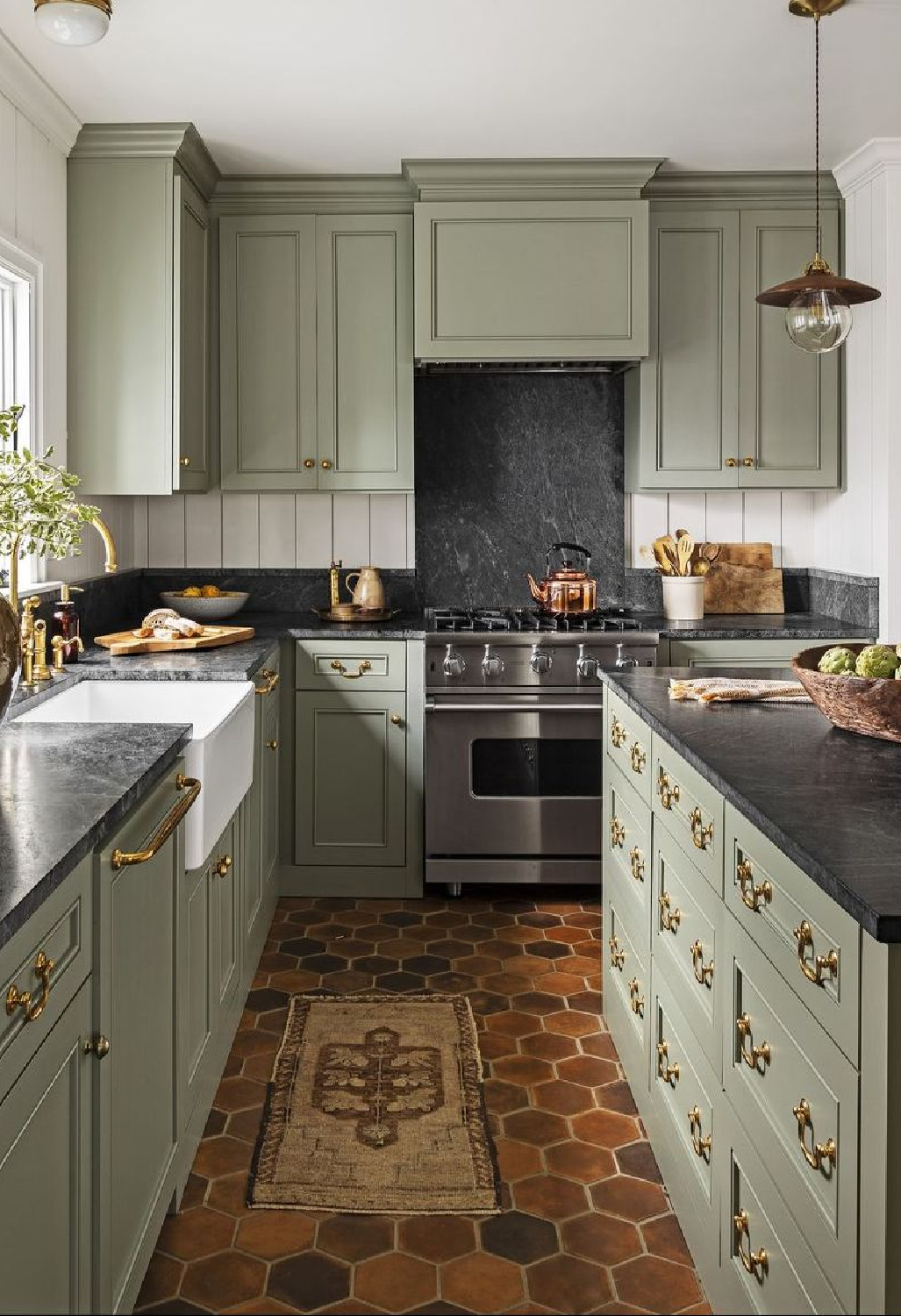
Are you dazzled too?
Mint Chocolate Chip + Hancock Green
If an appetizing green is on the menu…
you could try the formula created for this kitchen: 1 part Mint Chocolate Chip plus 2 parts Hancock Green:
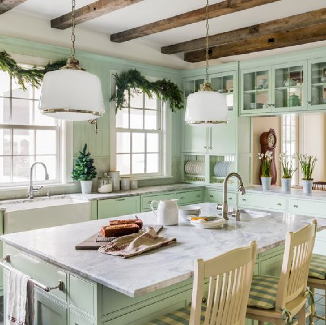
I hope these inspiring photos and ideas for walls, floors, and cabinets have given you delicious food for thought. Easiest way to see if a color is right? Order samples with Samplize and have them delivered straight to your door.
Here’s a bonus bit of inspiration from a neutral kitchen with a glorious burst of color from blue platters and dishes placed high on the wall:
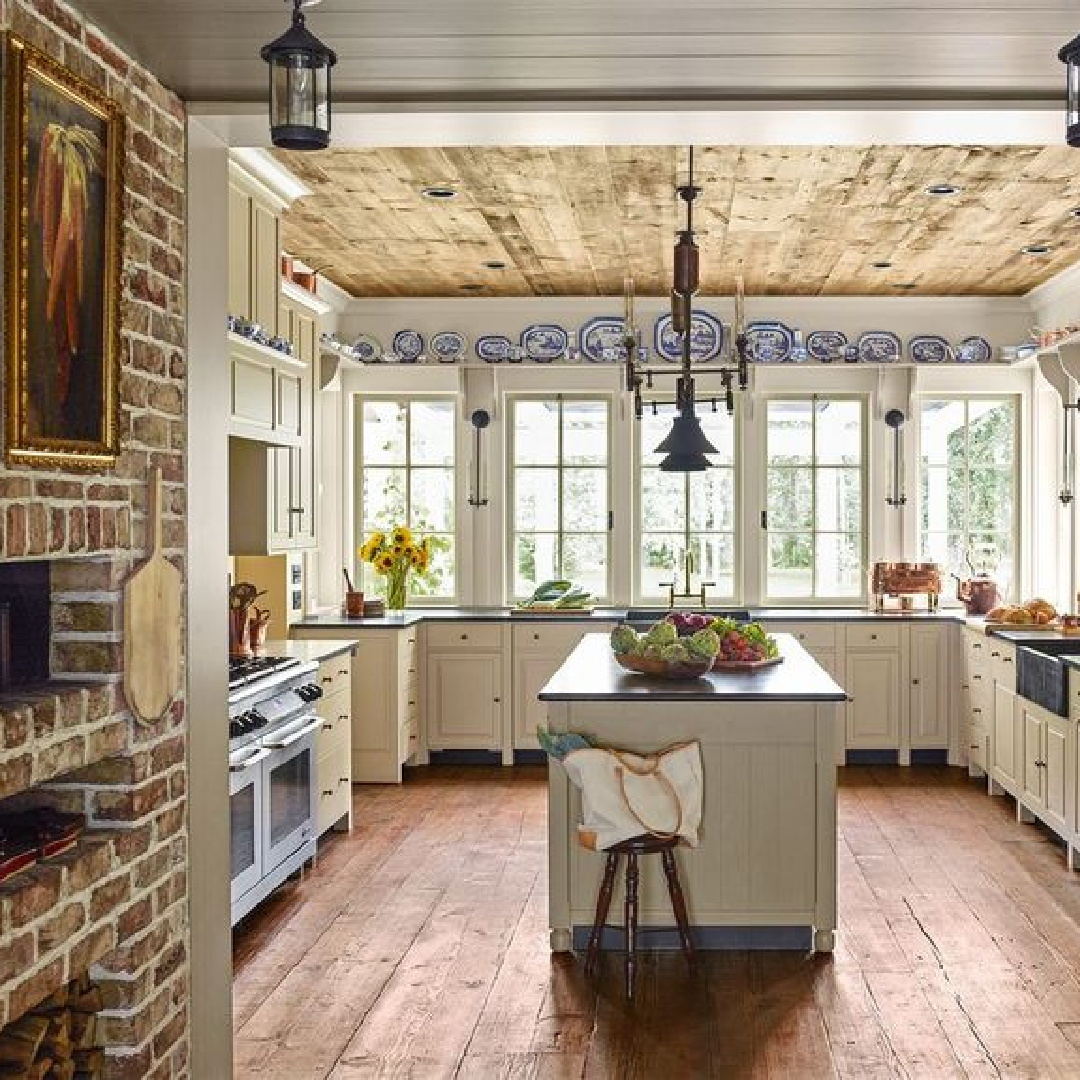
Isn’t it divine?
Peace to you right where you are.
-michele
Thanks for shopping RIGHT HERE to keep decor inspiration flowing on Hello Lovely!
Hello Lovely is a participant in the Amazon Services LLC Associates Program, an affiliate advertising program designed to provide a means for sites to earn fees by linking to Amazon.com and affiliated sites.
