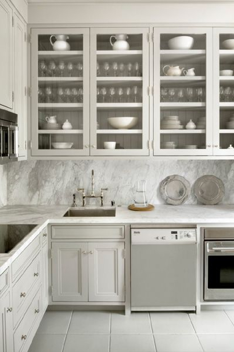
There’s a good reason so many designers turn to the sophistication and richness of the lovely colors imagined by Farrow & Ball. We’ll explore Farrow & Ball Light Gray & Gray-White Paint Colors to Transform Your Walls with inspiration photos in case you are looking for sophisticated, atmospheric neutral paint color possibilities.
I independently selected products in this post—if you buy from one of my links, I may earn a commission.
Farrow & Ball Light Gray & Gray-White Paint Colors
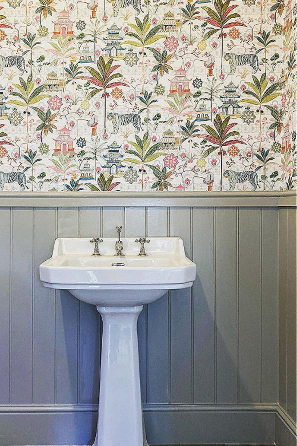
You may be surprised by some of these “light gray” or “greyed-white paint colors” since they may appear light grey, mid grey, putty or even tan.
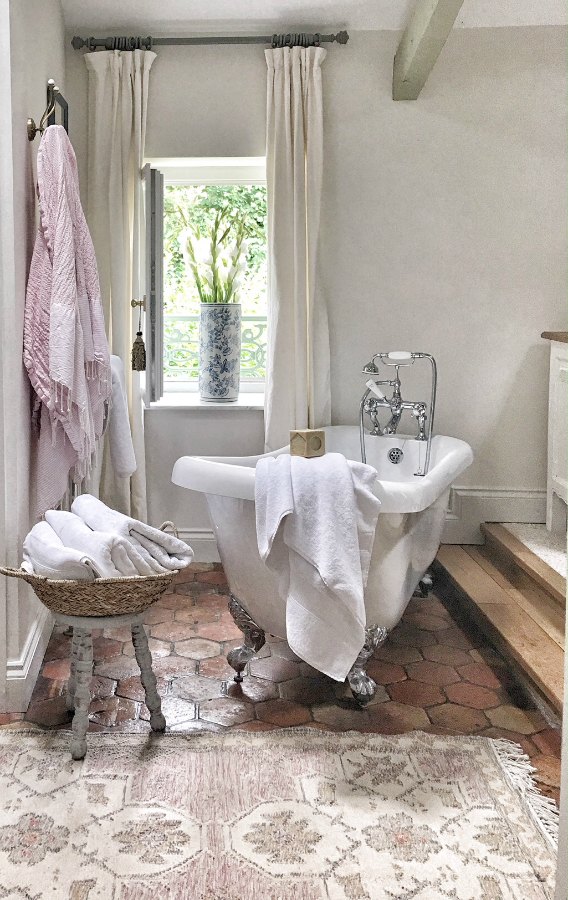
Perhaps NEUTRAL is a better descriptive term, but let’s yield to the names chosen by Farrow & Ball since these ARE their colors!
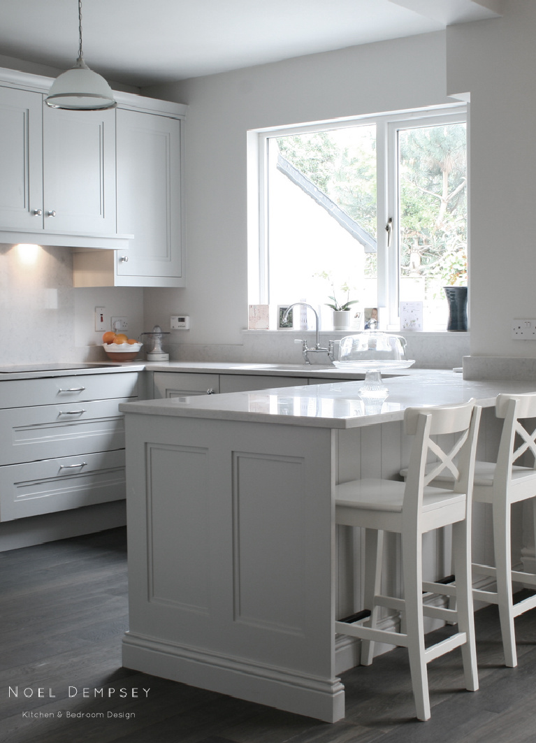
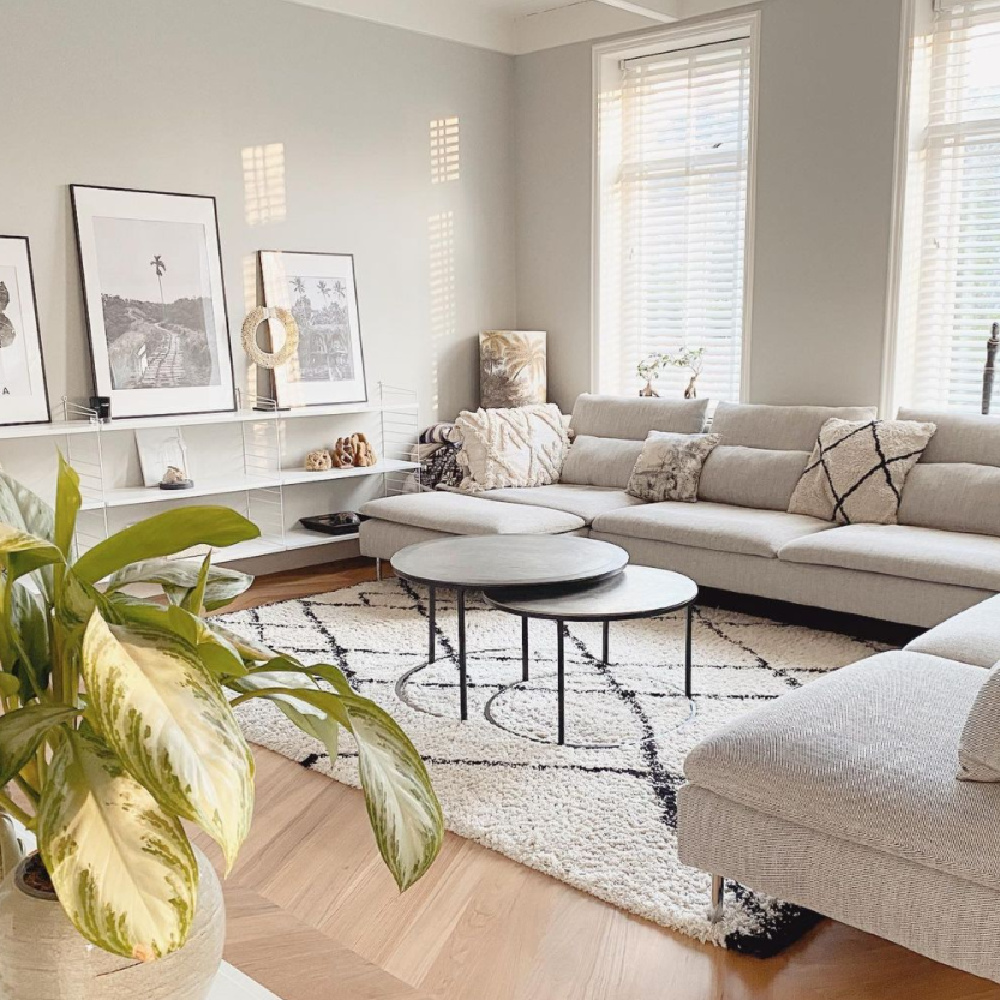
What’s helpful about perusing inspiration photos and images of paint swatches is you’ll be able to compare the variation of colors. A paint color’s ultimate appearance in your space is impacted by the room’s exposure and other factors.
While Farrow & Ball paints were difficult to find in the USA a few years back, you can now order sample pots here!
The topic is discussed in more depth RIGHT HERE. It always pays to take the time to test samples and live with those swaths on the wall for a little while before moving forward!
Let’s Ease Into a Timelessly Tranquil Mood
1. F&B Paint Color: All White
“All White is exactly what it says! Unusually, it contains no other pigment except for white, creating the softest most sympathetic colour without the colder blue undertones of a brilliant white. One of our Contemporary Neutrals, All White pairs seamlessly with Skimming Stone and Strong White for a warm scheme with a slight edge. For a clean and almost graphic finish, contrast with fresh, strong tones like Pitch Black and St Giles Blue.”


2. Cornforth White
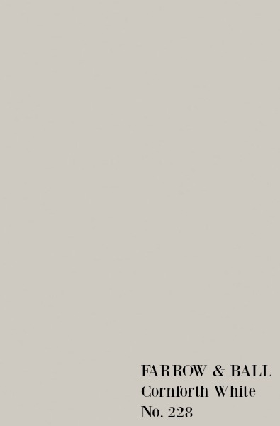
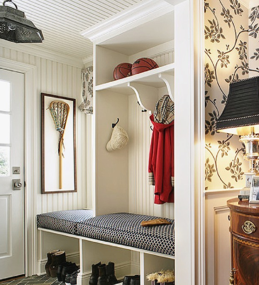
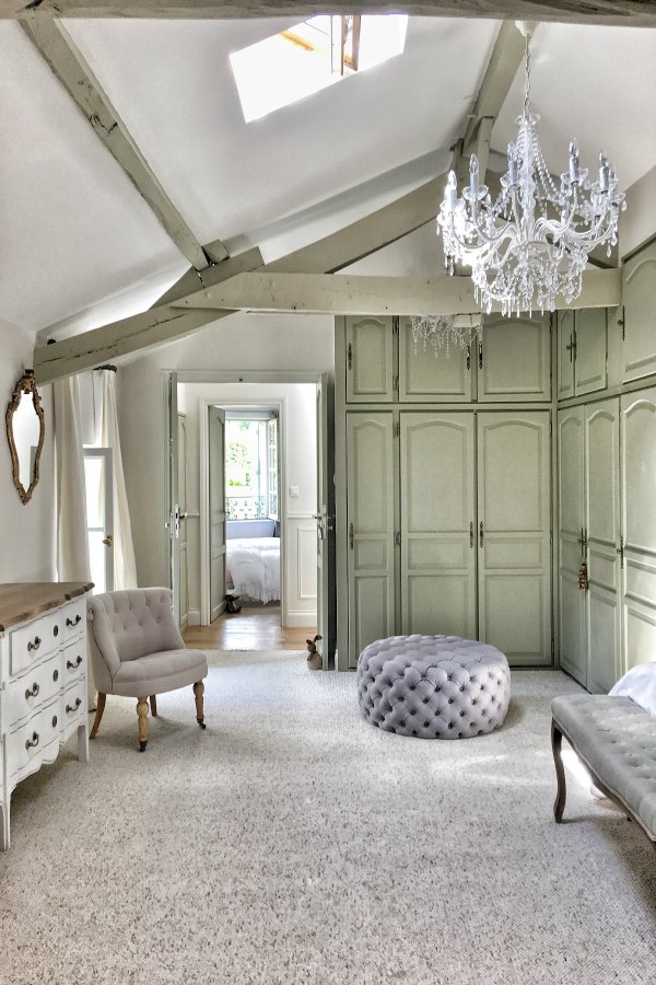
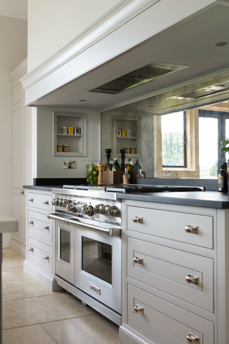
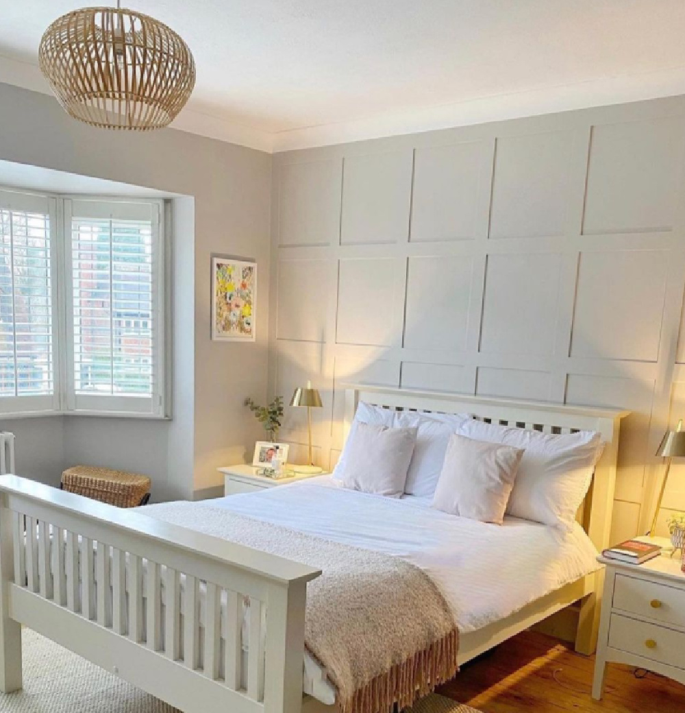
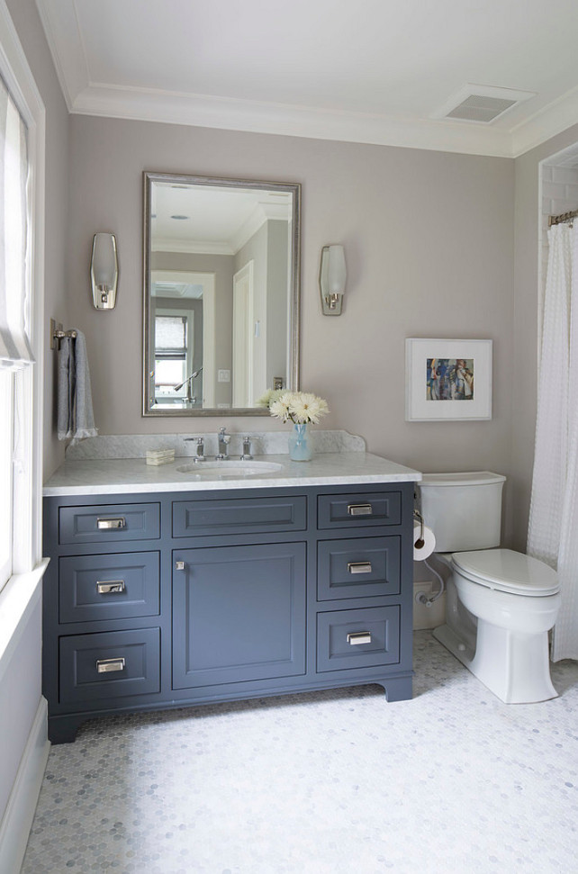
“Cornforth White is the mid tone in the group of Easy Neutrals which are totally understated and extremely versatile. Neither too warm nor too cool, Cornforth White sits contentedly between Ammonite and Purbeck Stone to create a hushed and calming retreat. Named in memory of John Cornforth, the revered architectural historian, contrast with Wevet to enhance its grey qualities.”

3. Hardwick White
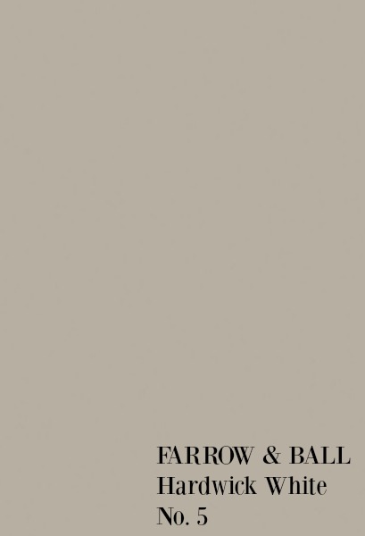
“This traditional grey was originally created to touch up the old limewash at Hardwick Hall and doesn’t look very white to most, unless contrasted with strong shades like Off-Black. Less blue than Lamp Room Gray and with an unsurpassed depth of colour, Hardwick White’s rich and chalky hue sits just as well in a contemporary room as it does in a historic house.”
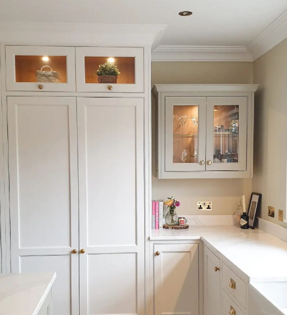
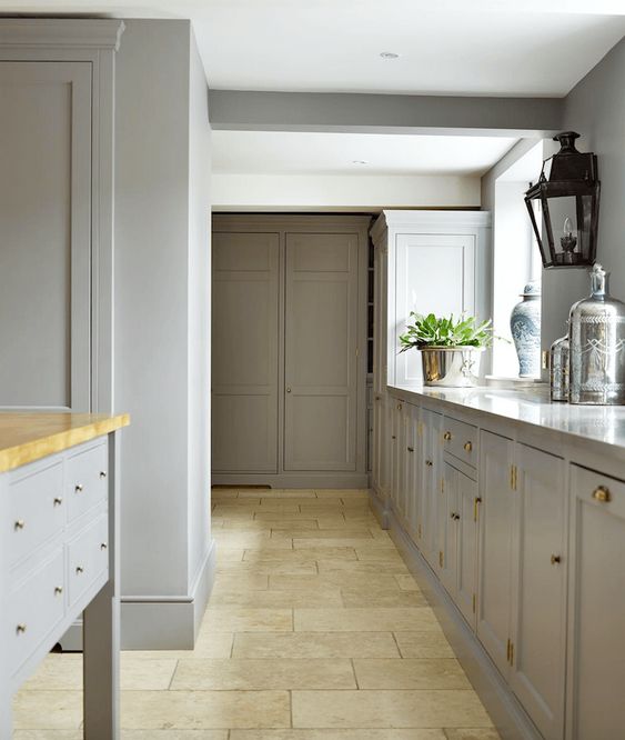
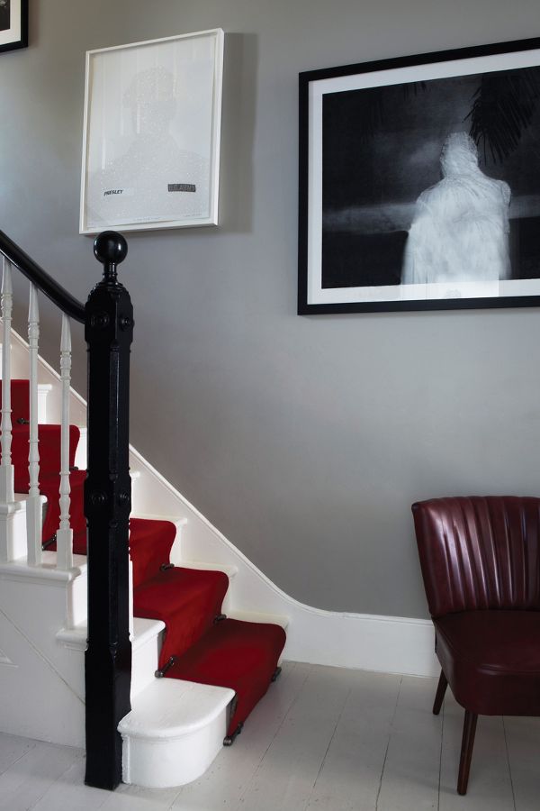
4. Strong White
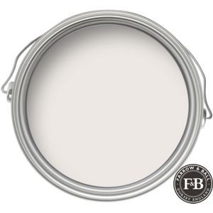
“This cool white is both strong by name and strong by nature. One of our Contemporary Neutrals, the subtle urban feel of its light grey undertones add a contemporary twist to period homes, while staying in keeping with modern properties. Pair with Skimming Stone, Elephant’s Breath and All White in any combination for an effortlessly cohesive scheme.”

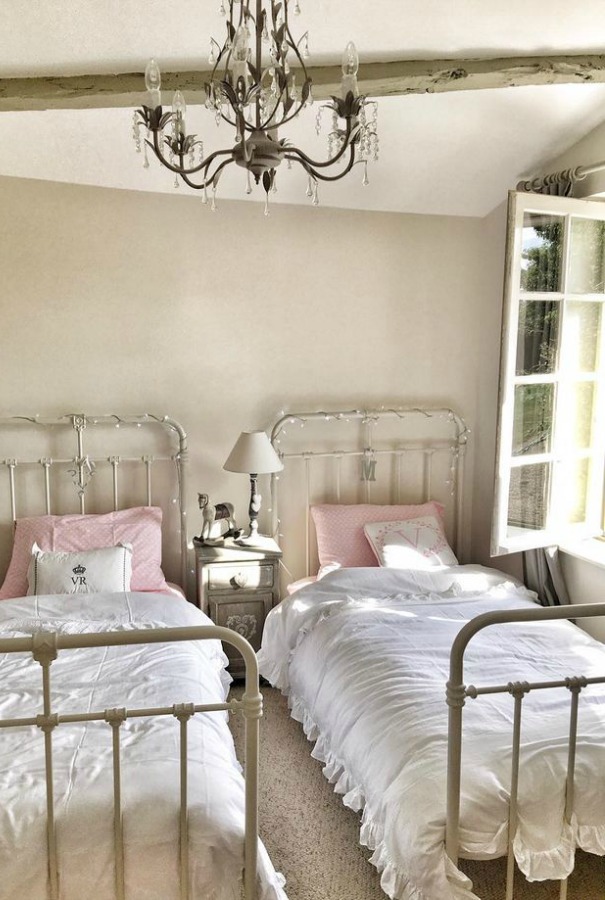

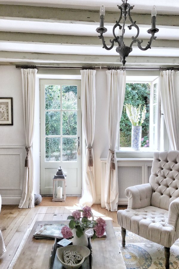
5. Pavilion Gray: A Cool Mid Grey

“This classic mid grey was originally created for a bespoke pavilion, but is also reminiscent of an elegant 18th century Swedish colour. One of the Architectural Neutrals, the subtle blue undertones of Pavilion Gray add a contemporary touch and sense of spaciousness. Combine with Dimpse, Blackened or Manor House Gray in any combination for a scheme that is perfect for the modern family home.”
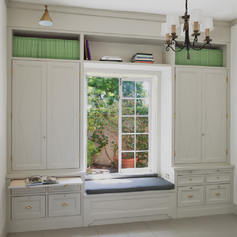
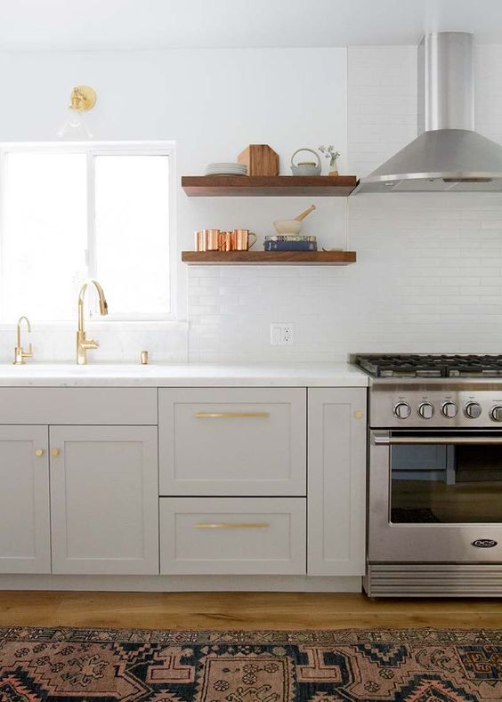
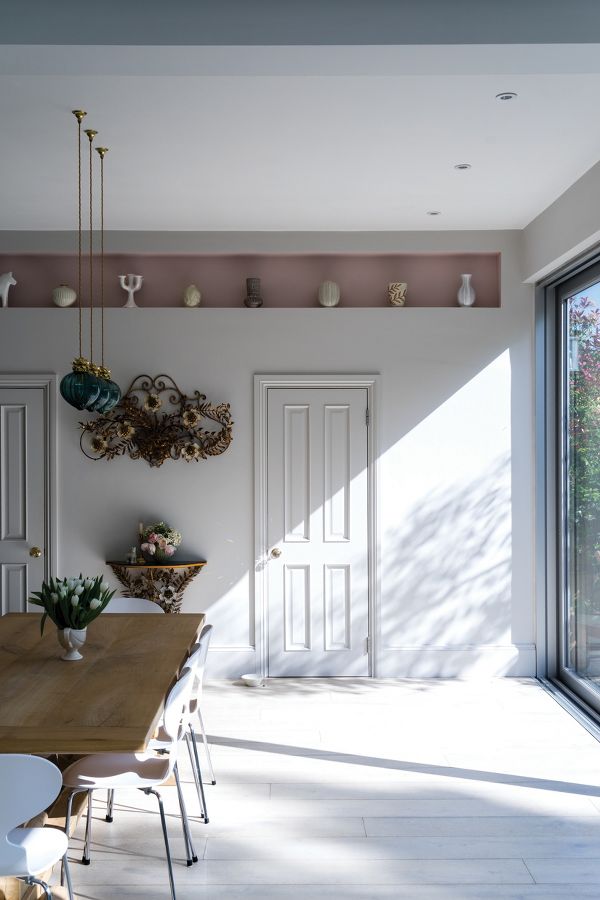
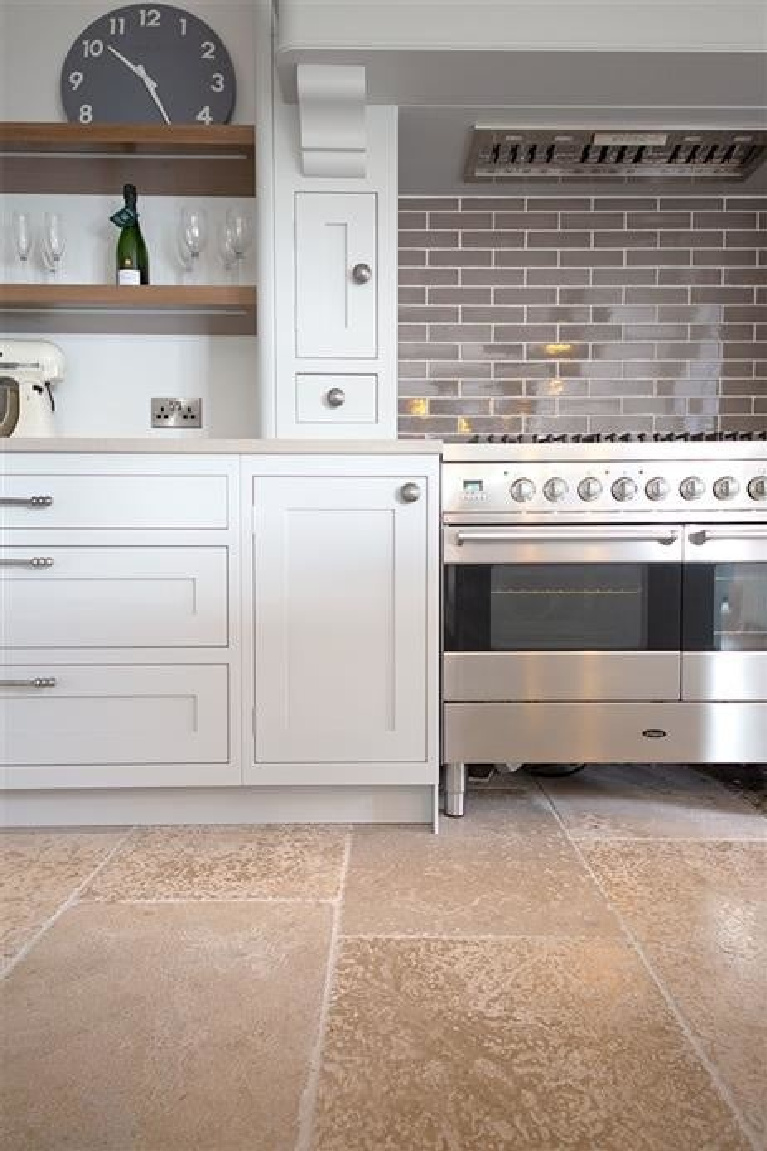
This custom color on the trim and windows at Patina Farm (Giannetti Home) is similar to Pavilion Gray.
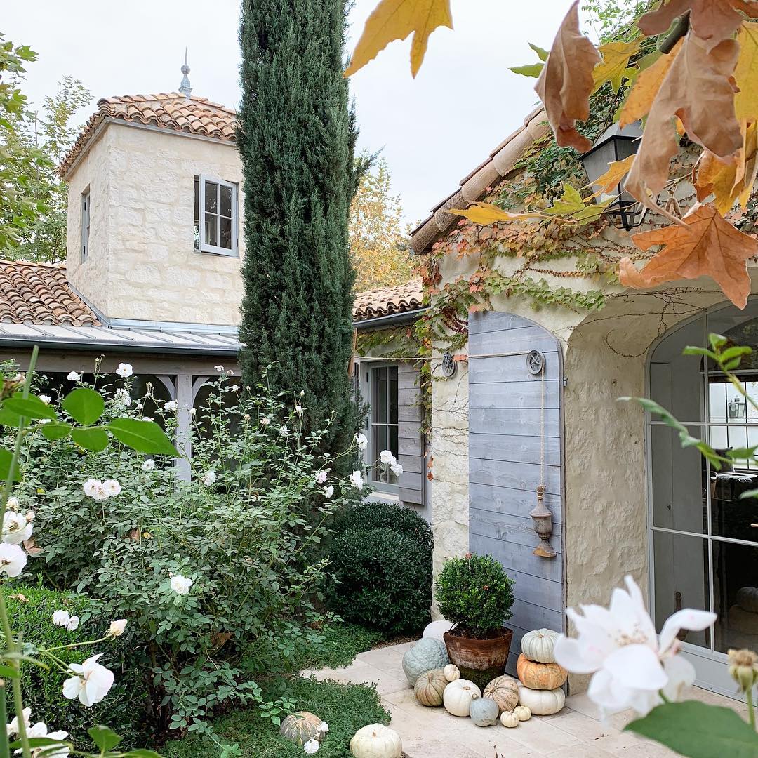
In case you need more evidence that the exact same paint color with a different source of light will look vastly different…

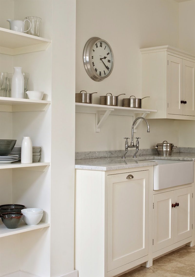
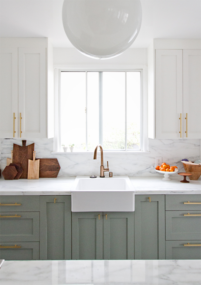
6. Wimborne White
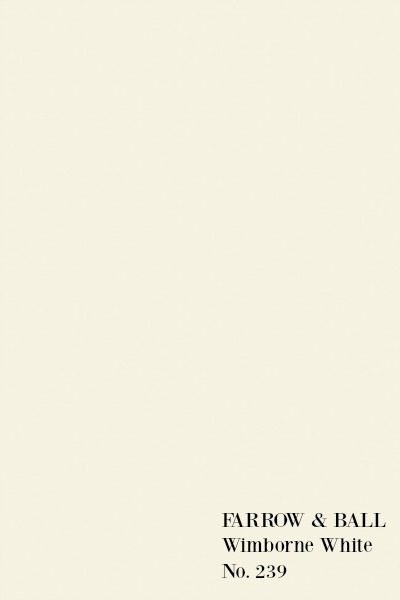
“This just off white is named after the market town of Wimborne in Dorset and home to Farrow & Ball. Only a shade away from a pure white, the addition of the smallest amount of warm yellow pigment creates a very versatile shade which is just a little softer than All White.”

Mix Two Farrow & Ball Favorites!
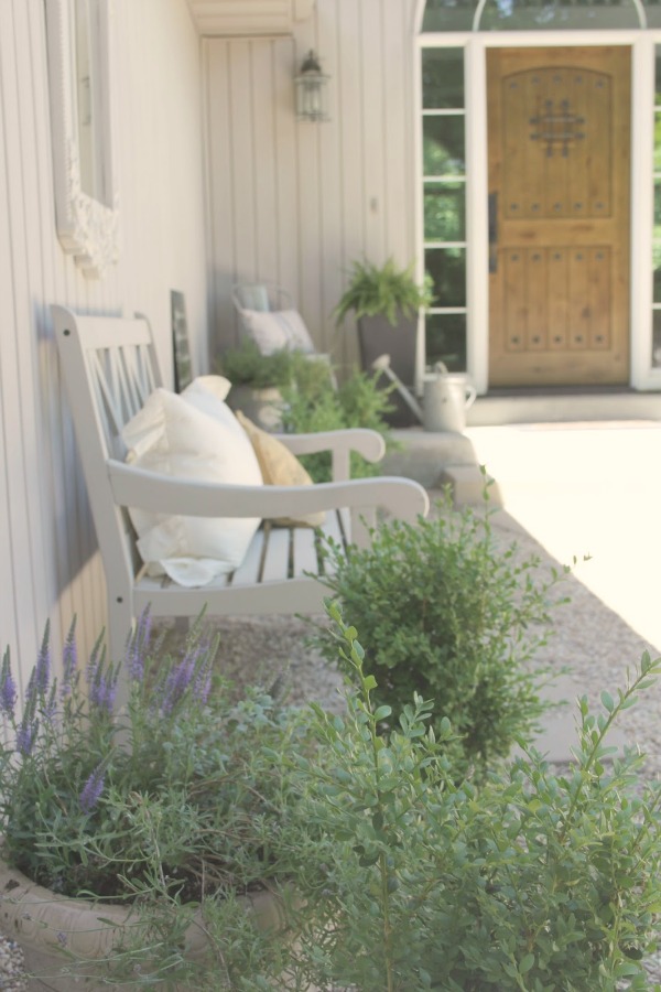
When we bought our fixer upper in 2015 and tackled the front entrance courtyard (the wildest jungle you ever did see!), I needed quick easy fixes since there was only a shoestring budget.
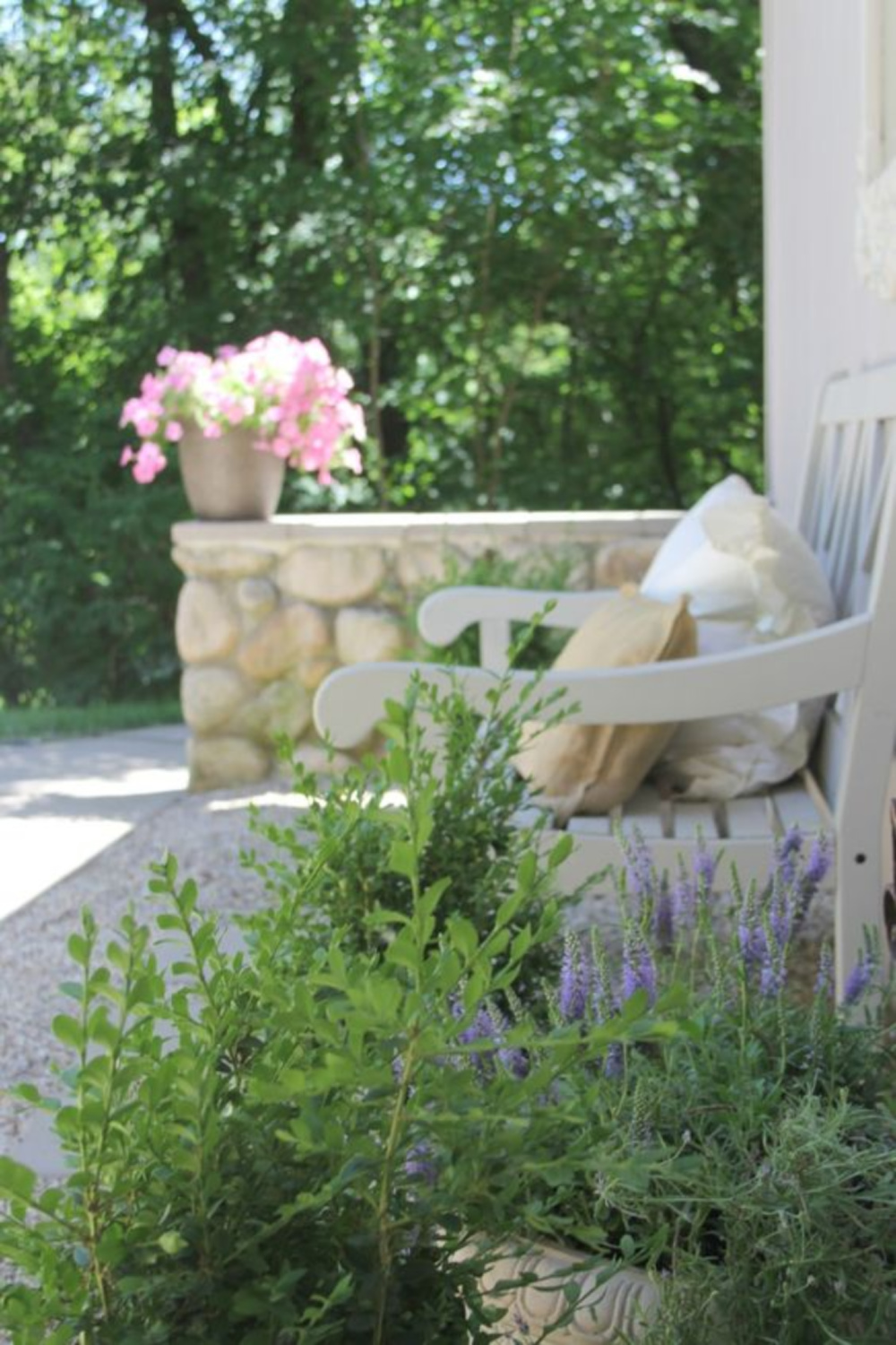
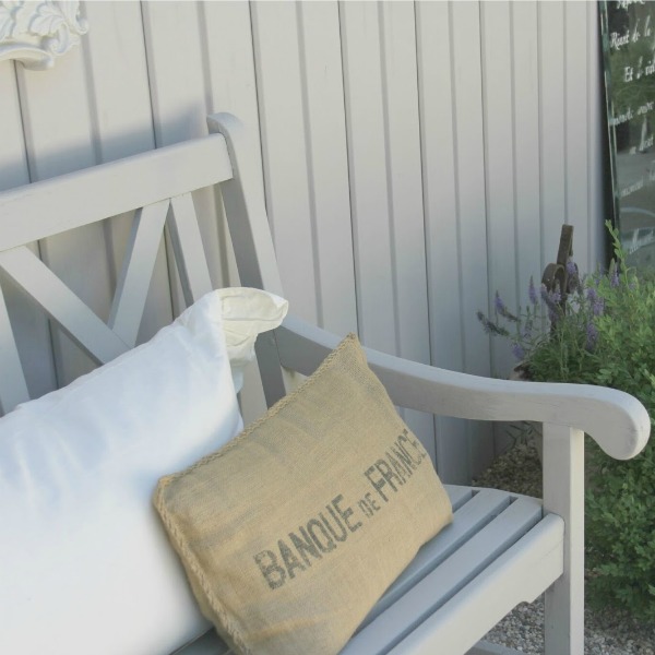
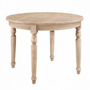
After clearing weeds and all but one perennial, I brought in pea gravel and acacia wood furniture snagged at a garage sale which I painted a combination of two colors mentioned above: 50% Farrow & Ball Cornforth White and 50% Farrow & Ball Hardwick White.
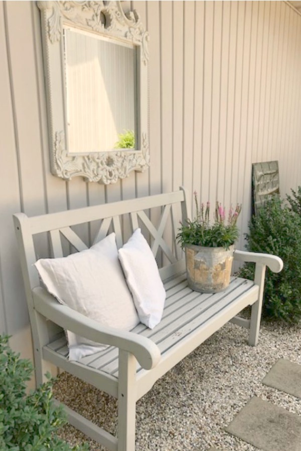
How did I decide on this winning combo?
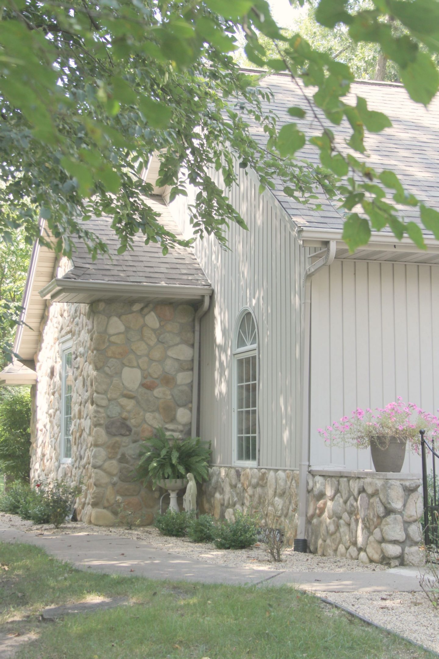
I looked to our home’s siding which is a gentle stone-like greyish white hue which falls somewhere between those two colors.
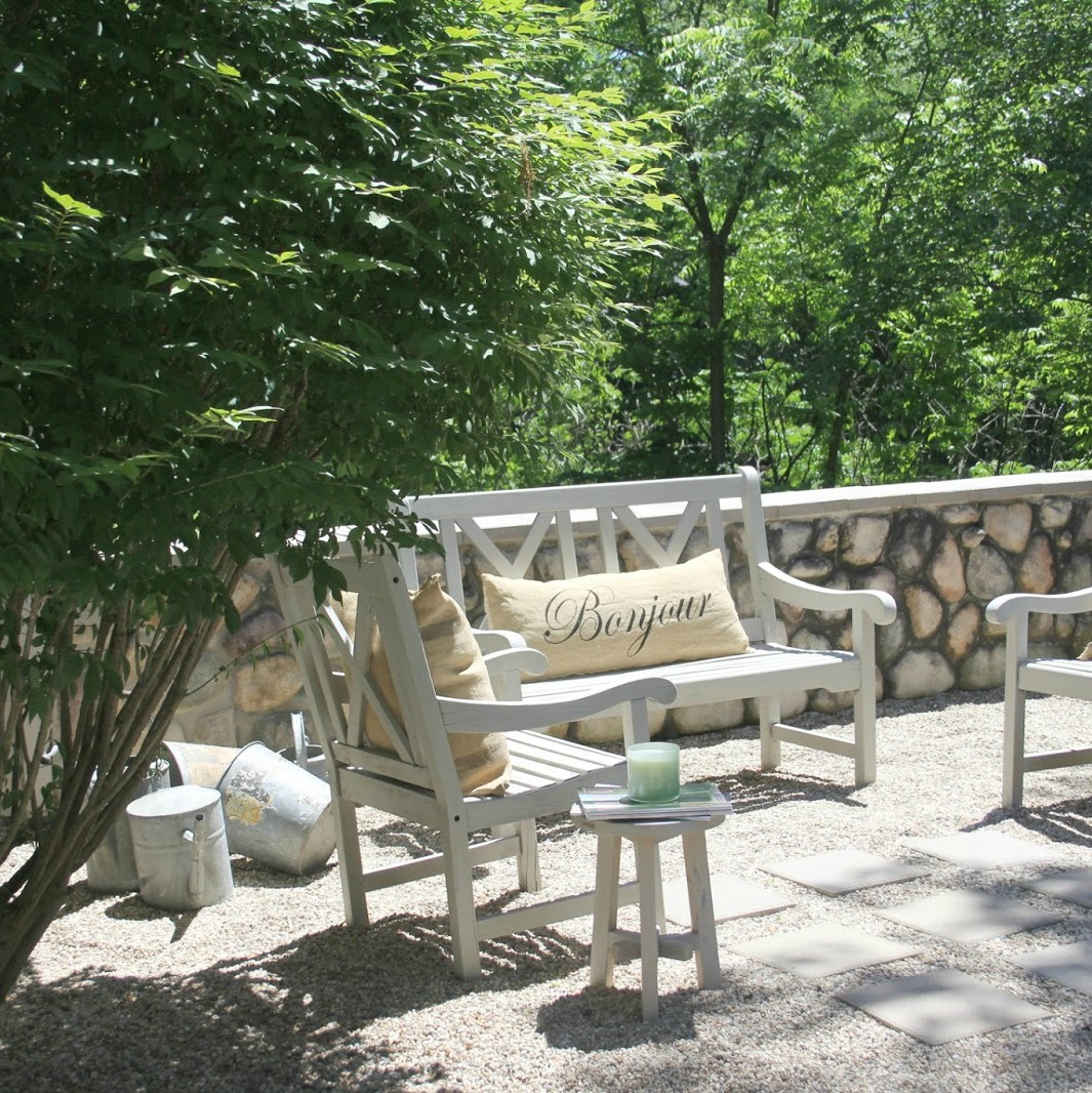
Pleasing Yet Not a Perfect Match
By combining them, it was a pleasing (not perfect – I wasn’t going for that) result.
I liked it so much, we used that same formula for our garage doors.
Also…just in case you’re ready for lovely paint color ideas beyond white and light grey…GO HERE, and then repin these ideas on a Pinterest board you create with your favorite paints to try!

Easiest way to see if a paint color will work? Order samples with Samplize and have them delivered straight to your door.
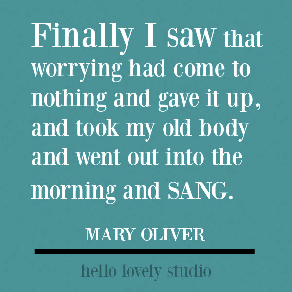
Inspirational Quotes to Pin
If you’re in the mood to pin lovely inspirational quotes, do visit THIS TREASURE TROVE of quotes…and maybe re-pin them to your own Pinterest board devoted to quotes!









I independently selected products in this post—if you buy from one of my links, I may earn a commission.
Peace to you right where you are.
-michele
Thanks for shopping RIGHT HERE to keep decor inspiration flowing on Hello Lovely!
Hello Lovely is a participant in the Amazon Services LLC Associates Program, an affiliate advertising program designed to provide a means for sites to earn fees by linking to Amazon.com and affiliated sites.



I am starting to fall in love with the Farrow & Ball colors, especially the whites & soft grays. But since there is no stockist anywhere near here I would need to have the colors mixed into another paint brand…which I know, isn’t a perfect idea but do-able.
Did you use Farrow & Ball paint or just mix your custom colors (from F&B) into another brand? It certainly looks lovely indeed on your furniture! 🙂
Author
Easy to fall in love for sure! Color matched in a Behr exterior paint for the furniture. Of course the only way to get the true quality and color is from the source. I’ll try to put together a post about the high quality of Farrow & Ball paint – I have some F&B here waiting to kiss a surface. 🙂
I’ve thought of getting the F &B actual floor paint because I’ve heard it is so durable. But the price plus the shipping for what I’d need would not be so lovely. 😉 I suspect I’ll choose one of their colours and have it mixed in the floor paint I normally use.
Author
It is pricey, and I hear you about accessiblity. The Merchandise Mart in downtown Chicago has a showroom so I can get there with some effort, and I haven’t checked into shipping costs. Thanks for this great feedback!
Just FYI, Sherwin Williams has the formulas for many Farrow & Ball colors. Just be sure and order the free F & B color card online as it provides each color’s number along with the name.
Author
Thanks so much. 🙂
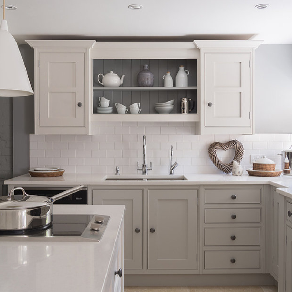
F & B colors are scrumptious…love All White & also Pigeon on those lower kitchen cabinets. The only color I considered for my kitchen cabinets other than a neutral was some shade of green & that shade IS beautiful. Glad to know how to order samples for the future …I did get tickled at the color called “dead salmon” …could they not come up with any other name than THAT?! Haha! Love the 50/50 neutral shade you mixed together for your home…I forget about mixing colors and doing different strengths of a color…you are SO good @ creative things like that! So enjoyed the soothing music video!
Author
I have no clue why ‘dead salmon’ made the cut – don’t you think the brand should hire me to name colors? I love all their muddied colors and will be using Ammonite soon here. Hope you aer relaxing and staying sane and safe, friend. xox
I meant *Strong white & I love Ammonite too! It has that stone like look which I such a fan of.😊
Author
Yes! I need a sample of Strong White after all these posts about it! Hahahaha