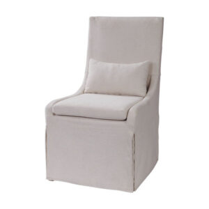
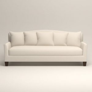
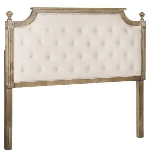
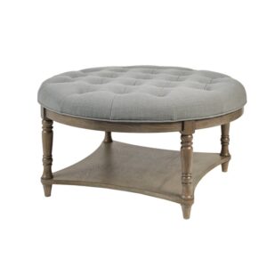
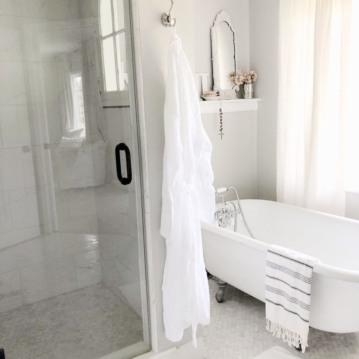
It’s chaotic out there; come on inside our home. We haven’t always lived within the serenity of pale interiors with a rainbow of whites at home. As newlyweds, we lived in a patterned paradise of French country teals and mauve. Classic florals and lattice-themed wallpapers wrapped our walls. Periwinkle stripes of blue once boldly brightened our bath. Blush bouquets brought a cheerful rosy glow to our kitchen and dining room. When babies moved into our bungalow, blue, green, and sunny yellow captured their imaginations. The calm mix of whites seem to stick once those wild independent-minded man children reached adolescence. It calms the chaos and comforts us still.
This post contains affiliate links which if used for purchases may earn me a small commission and won’t cost you extra.
Serenity of Pale Interiors
It’s too bad really that my comfort with bold color, high contrast, and frequent decorating refreshes went the way of my estrogen and six-pack abs…I can only imagine the increased blog traffic to this site!
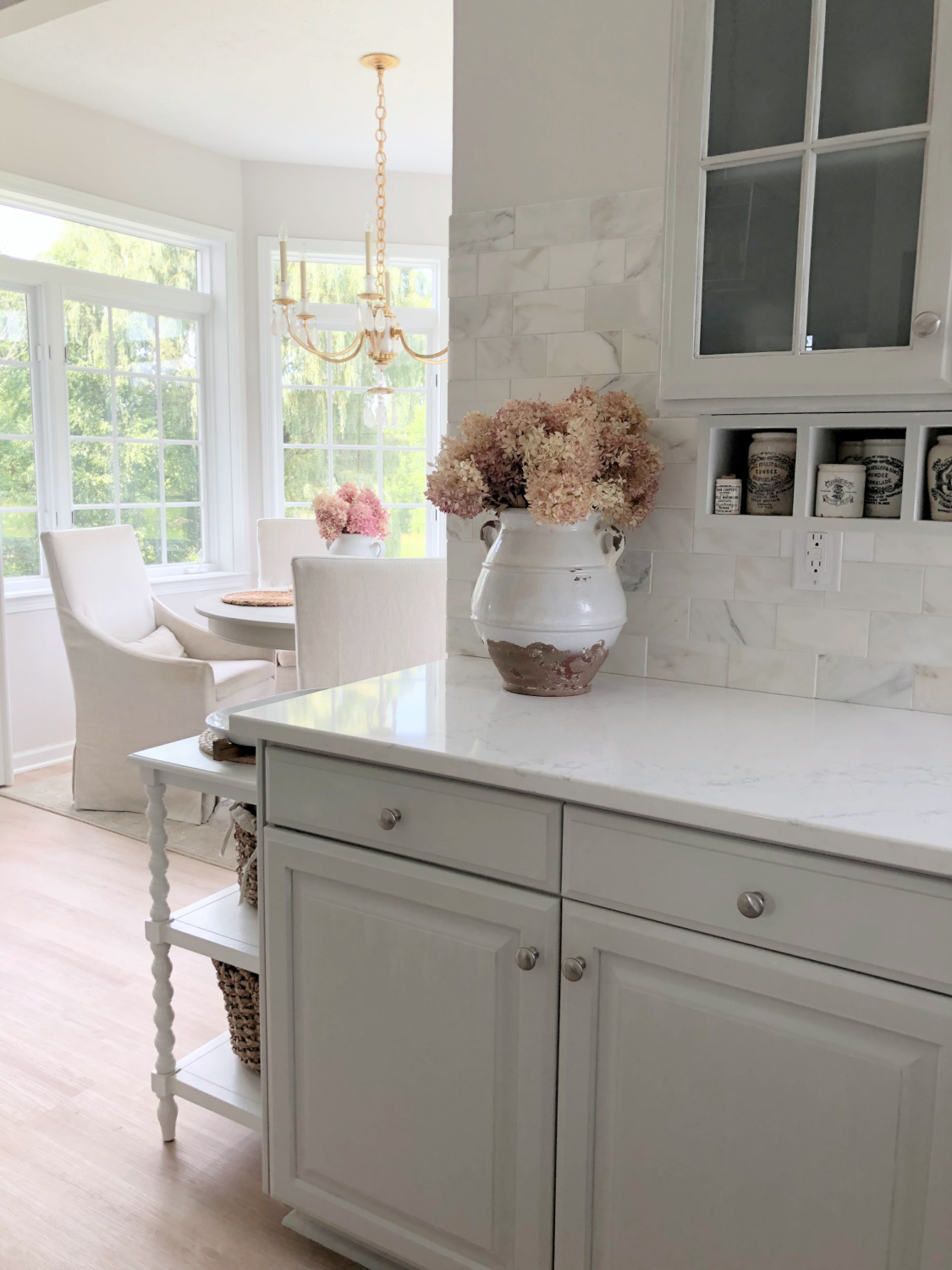
But I can only be me. And girlfriend aint about to fake it for profits or popularity. Authenticity makes life better as I stick with color stories that mirror where I am on this leg of the journey.
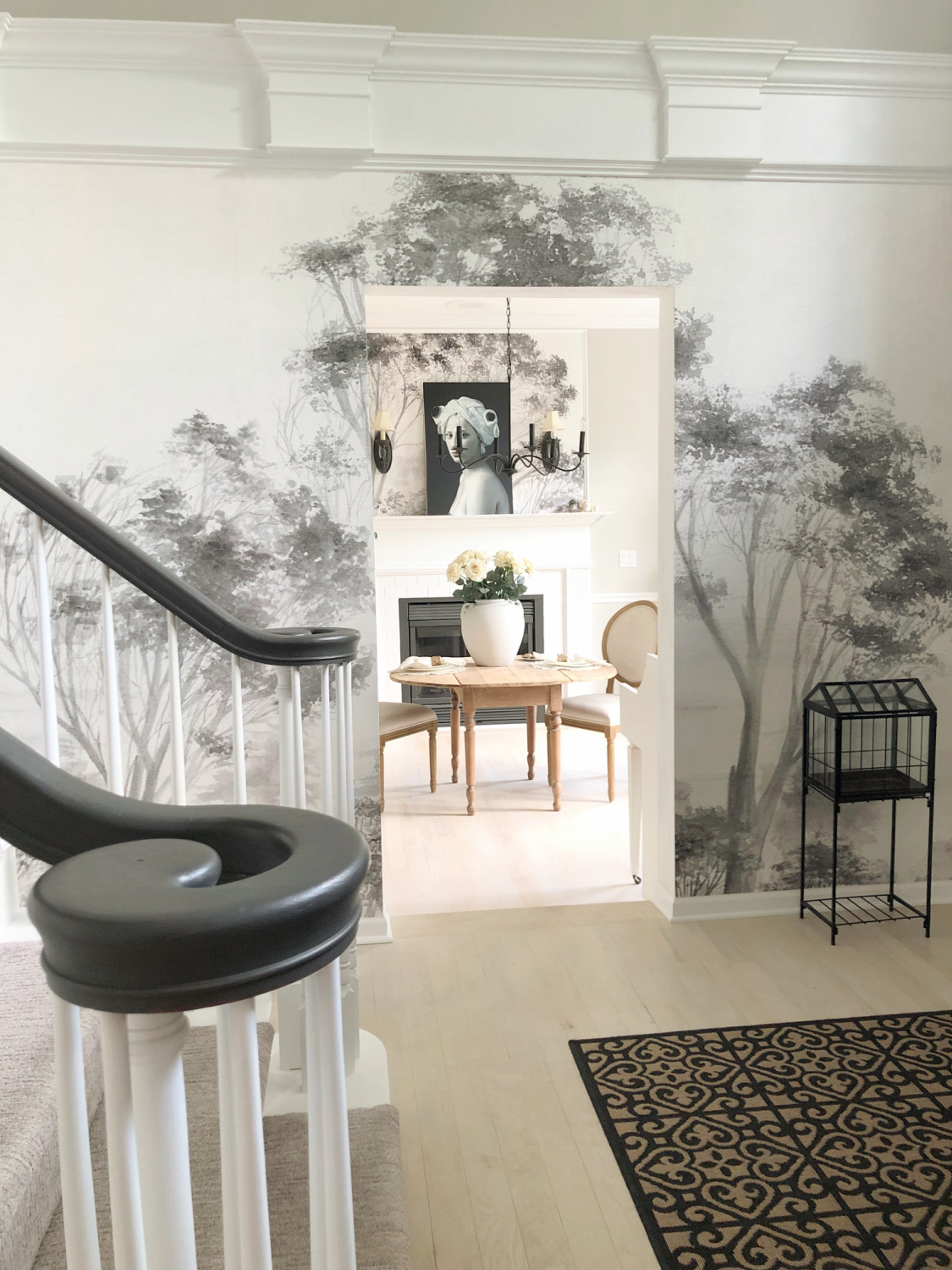
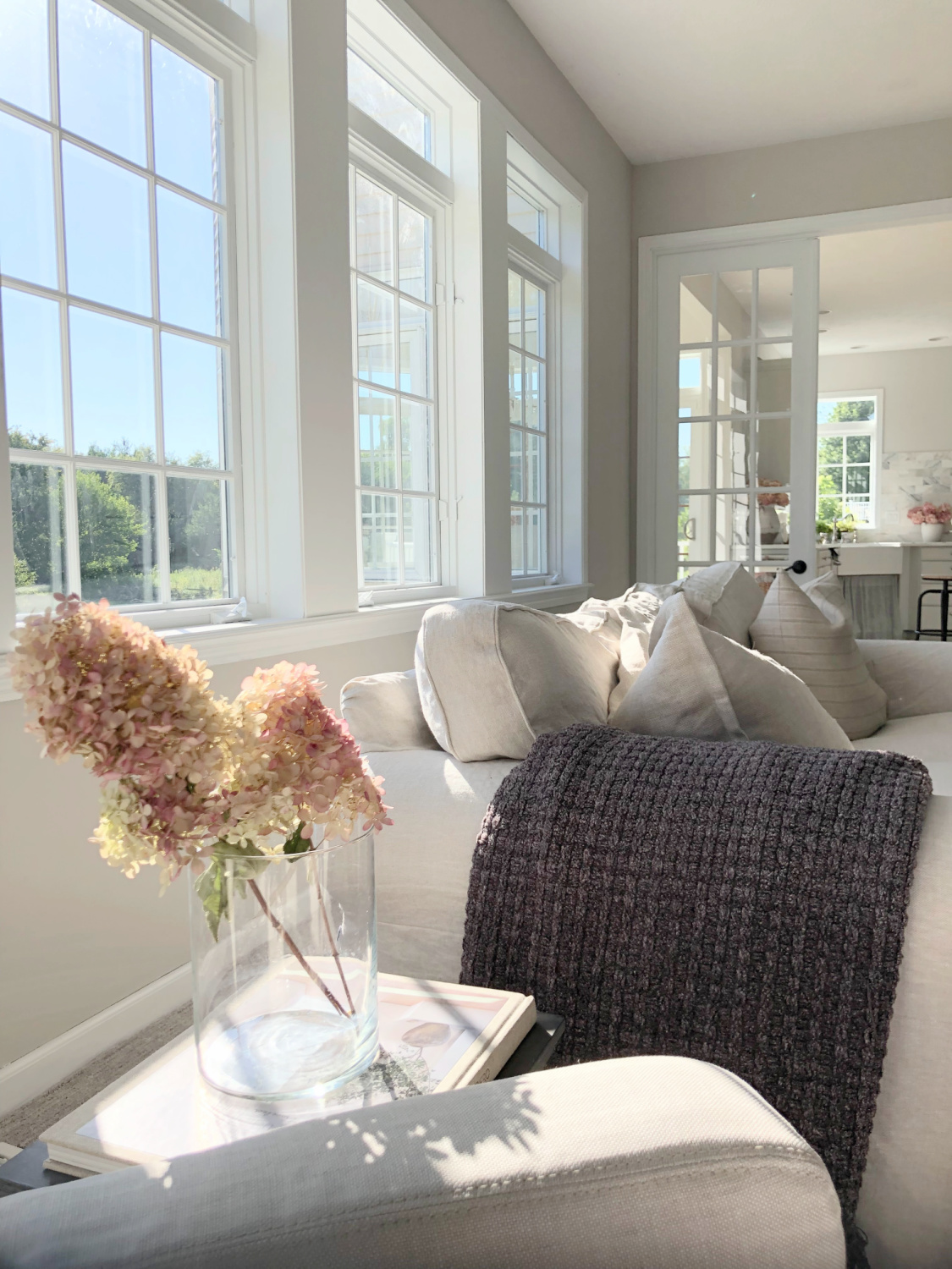
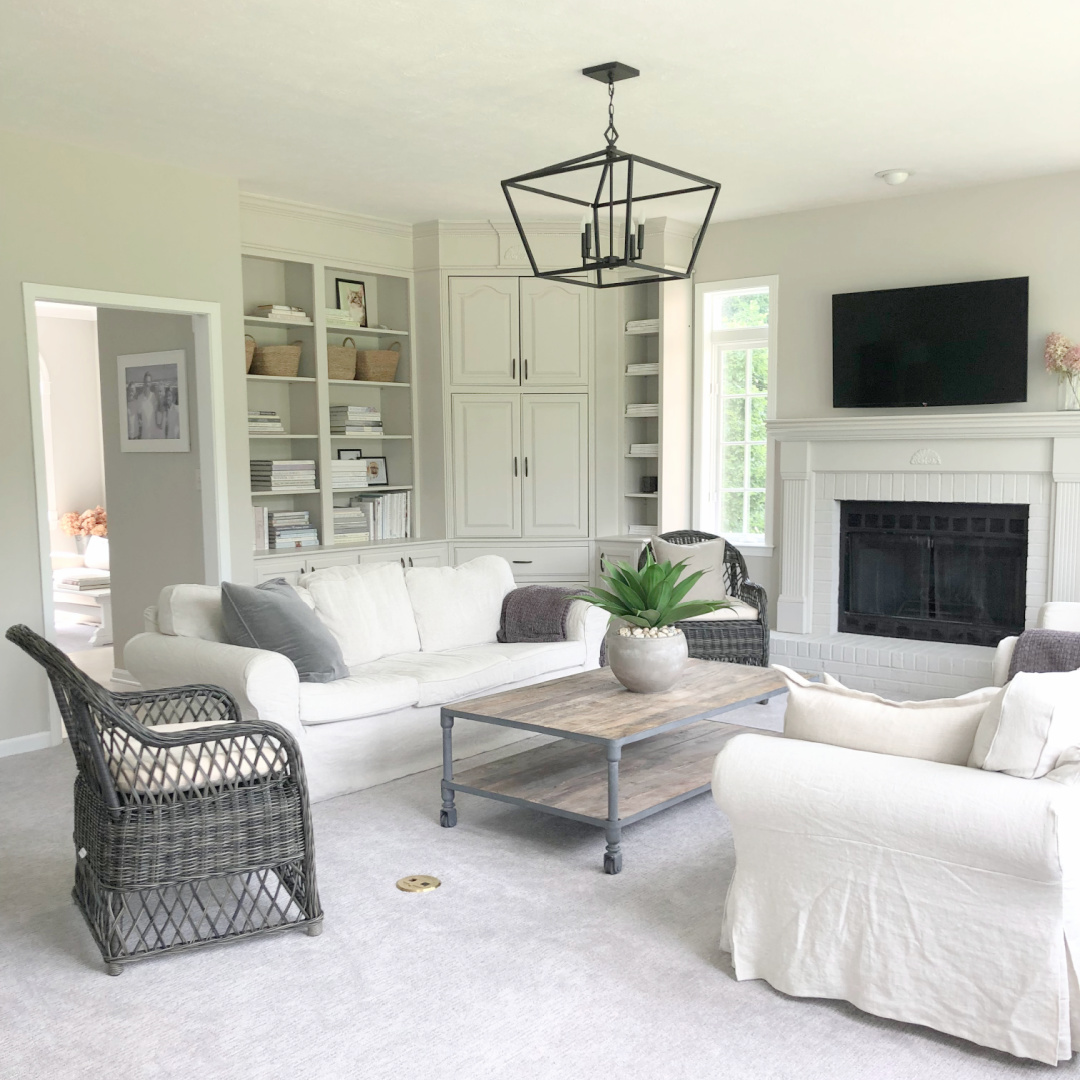
Inside the Georgian, walls are varying shades of greige, some warm, some neutral. The trim is bright white in contrast. When we moved here I had no idea I would stick with the scheme in place since I have only ever lived with white and limestone hues for decades. I painted every surface crisp white in our previous home which changed the entire mood.
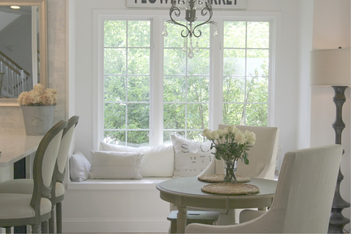
White works so well when cloud living is your thing, when monastery vibes feel right, when a whispered look suits you.
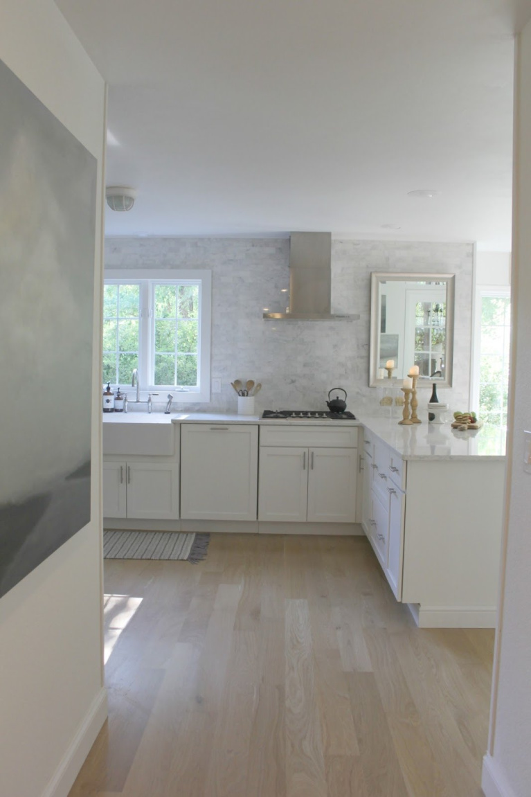
But there are a million whites.

So many folks want the best one for their project so I field questions every day. The answer hinges on a variety of factors. Pssst. If you SUBSCRIBE, you get VIP access to my experience and help. When you hit “reply” to the email arriving daily, you are free to ask specific design questions!
Interiors With White Paint Colors
If you have read me for long, you know white paint and decor are always on the radar. As long as someone googles “which white paint” I suppose my virtual legacy will endure.
But a just right white at my house may be all wrong for yours. When we built new walls in our entry, I was certain a trustworthy white would work on them.
Nope. It was soooooo wrong it felt institutional. Just an instant mistake. It soon became clear patterned wallpaper and a moodier paint to break up the expanse of those two-story walls was the answer.
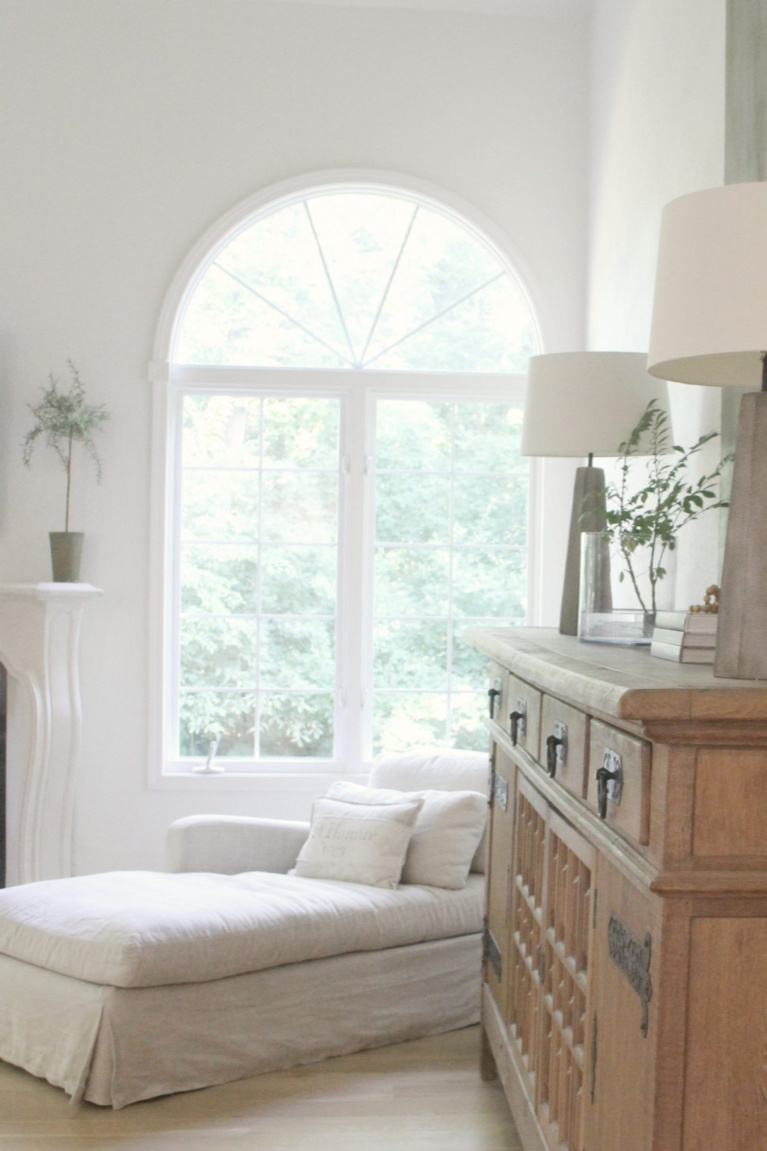
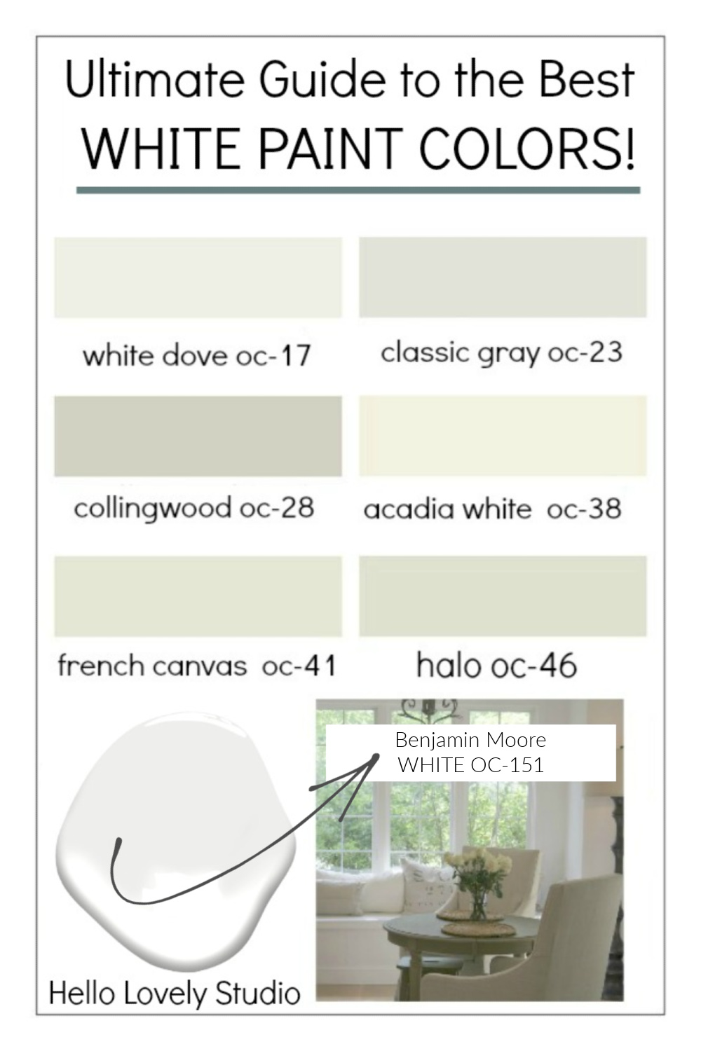
Above: In our prior home, OC-151 refreshed walls, trim, and ceiling. The existing architecture felt fresh and new.

No matter how confident you are in a particular white (because it has worked for you in other homes), do be sure to sample several similar contenders.
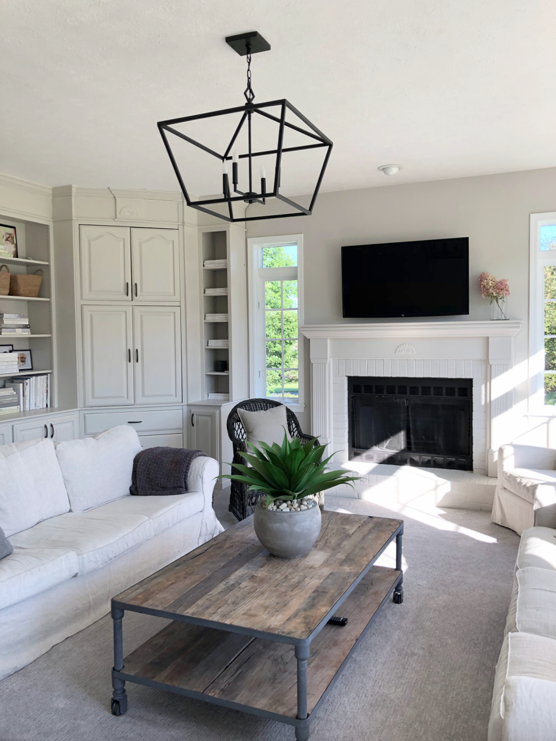
And don’t limit yourself to white paint color that contain “white” in the color’s name. Benjamin Moore Classic Gray is a wonderful greyed-white.
Agreeable Gray may sound like THE most boring bestseller from Sherwin-Williams, but don’t count it out. It has earned its popularity since it reads warm, moody or atmospheric depending on the environment. Chameleon-like colors are worth exploring so get over your pride if your sister-in-law just painted the whole house a color the masses buy.
See this for more advice choosing white paint colors.
Layering, Texture & The Mix
I recommend growing a backbone when it comes to sifting through various online opinions and “experts” weighing in on white decor as too safe. Getting the mix of whites right is not as simple as inexperienced influencers and critics imagine. Working with light takes a skill set and patience. Layering properly tempered neutrals, mixing vintage and new, and injecting texture demands an artful eye.
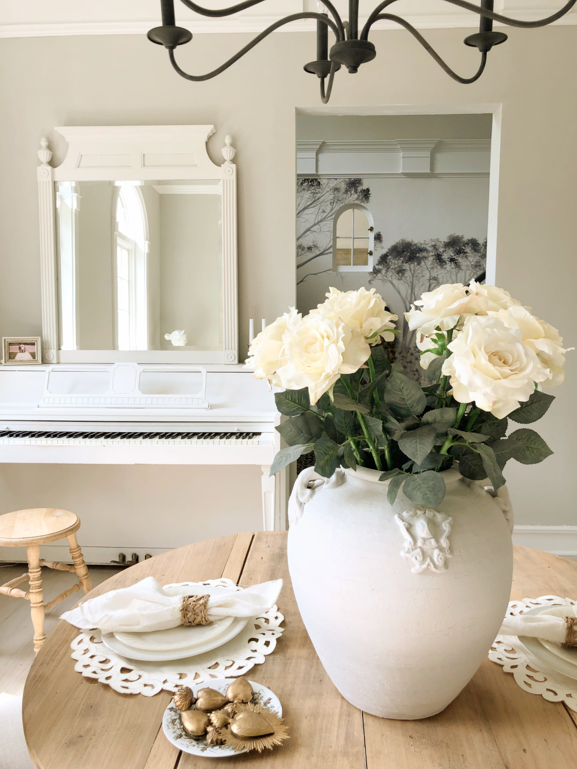

And also an open mind. Texture isn’t limited to objects and decor. It can be introduced by uncovering the windows in come settings. The outdoors may certainly have a point of view and function as a layer.
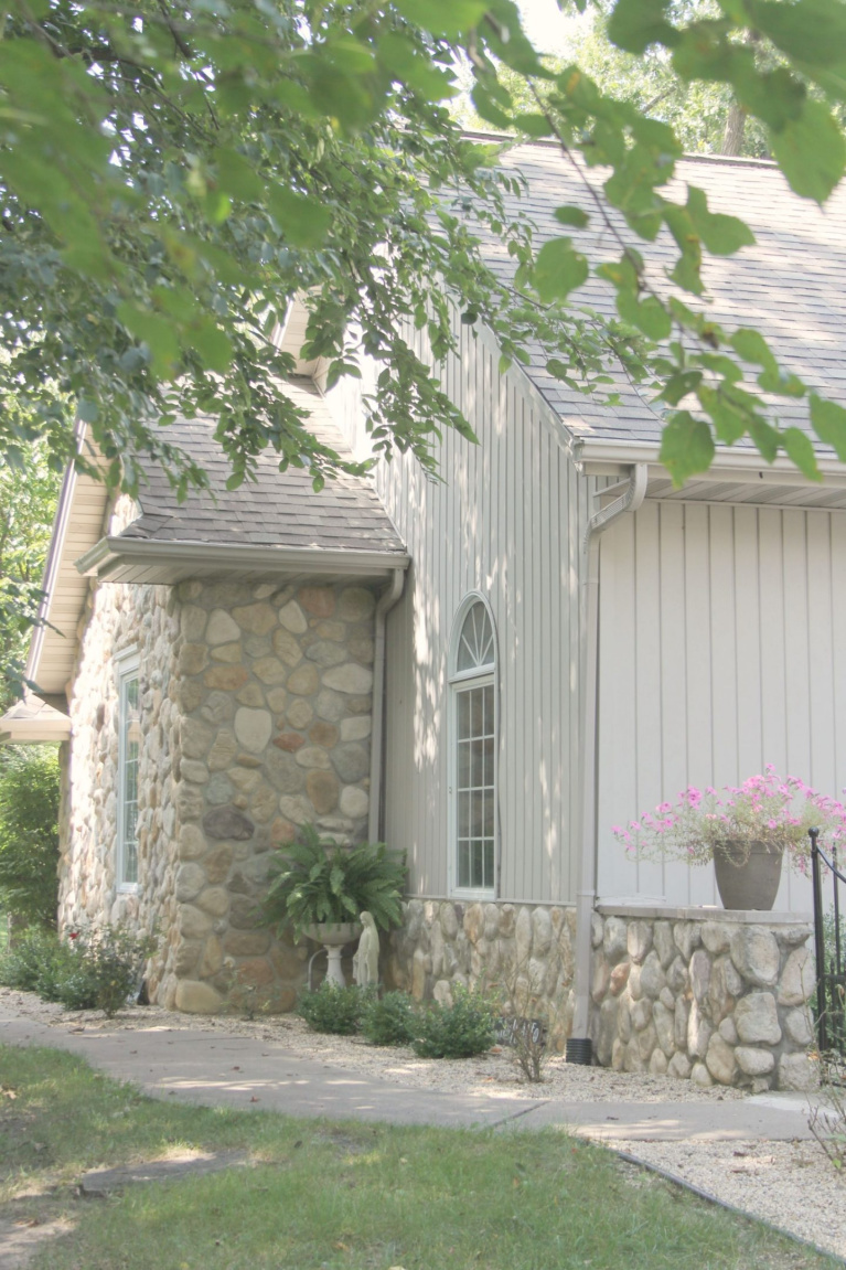
(Admire the siding color above? Mix 50% of Cornforth White No. 228 with 50% of Hardwick White No. 5 for a custom Hello Lovely creamy neutral!)
Texture With a Low Contrast White Palette
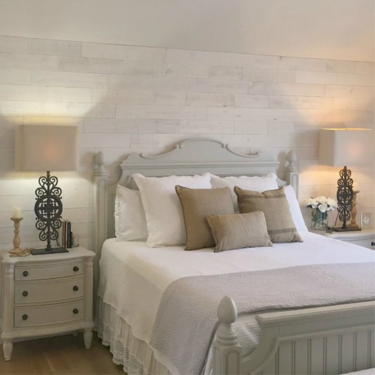
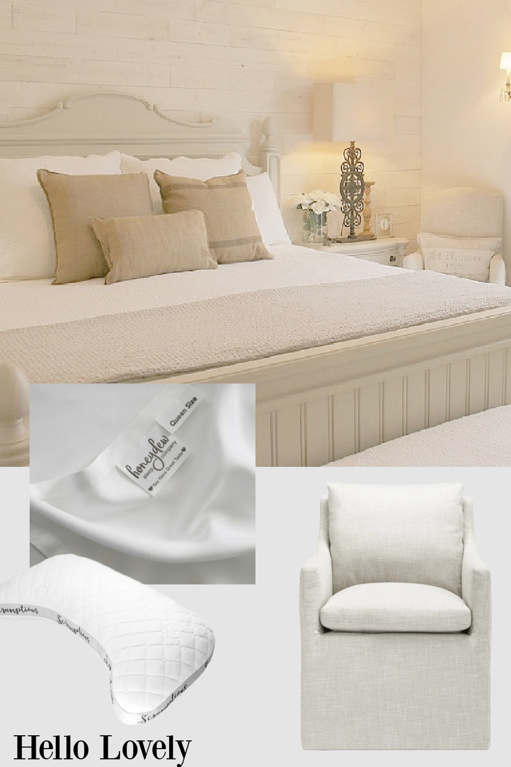
In our former bedroom, an accent wall with Stikwood (Hamptons White) introduced texture to a Northern exposure woodsy environment. The last thing I wanted to add back in 2015 was shiplap. I was just over it since the decor sphere was saturated with the stuff. I also wasn’t thinking rusticity. But I listened and allowed the house to whisper.
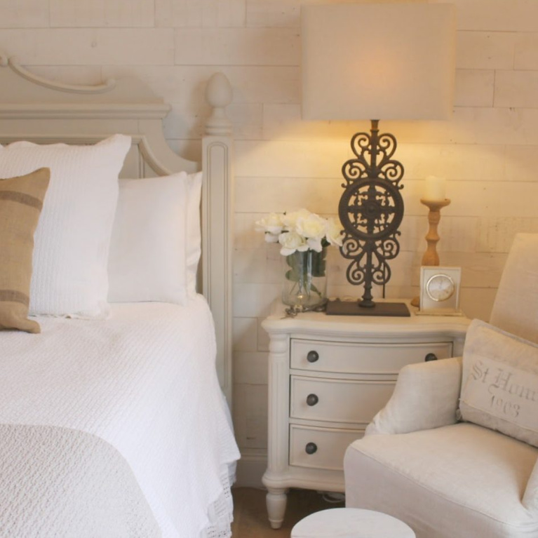
White has an elegance all its own. Adding that reclaimed pine to walls was purposeful for so many reasons. We needed a source of tension with the more refined elements. Frou frou and precious is not our style. And the wall behind those planks was ugly as all get out…just lumpy and orange peel faux-gly. I’m not sure I would have been as happy with fake planks. There’s something about sticking with natural materials that breathe.
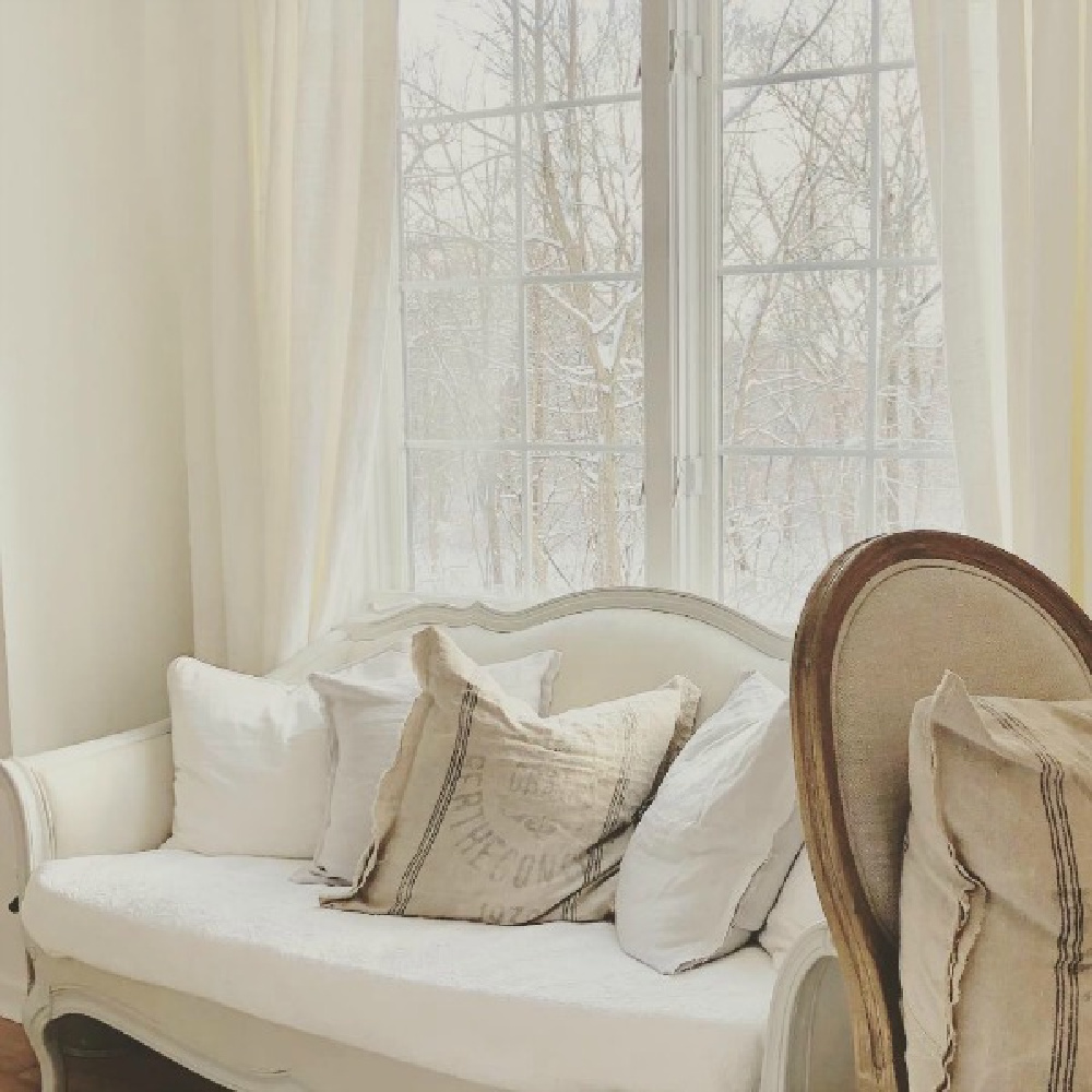
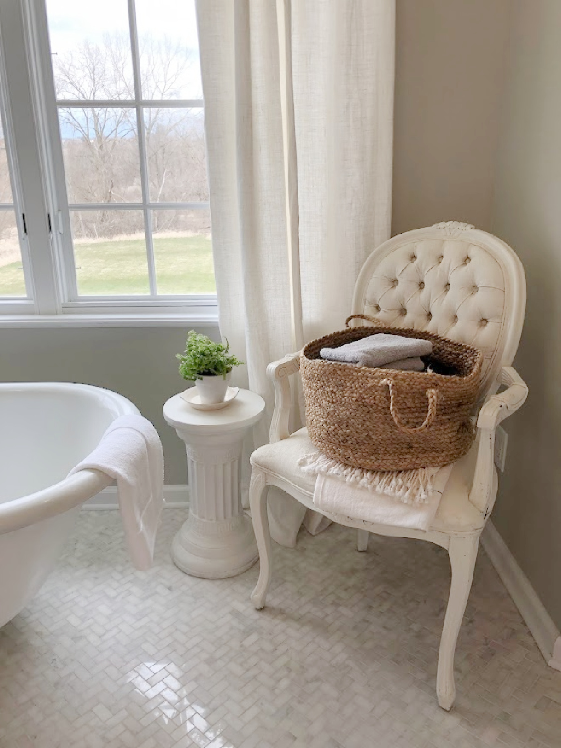
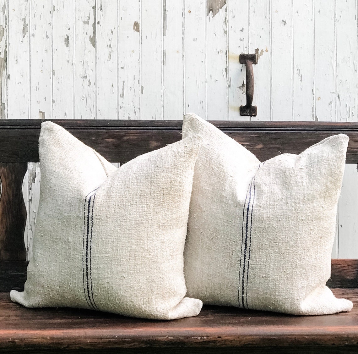
Even antique linens and vintage grainsack can bring a pleasant tension. That mix of eras and the contrast of nubby with smooth…you don’t even need to overthink it as much as try a bunch of combinations until you land on the balance for YOU.

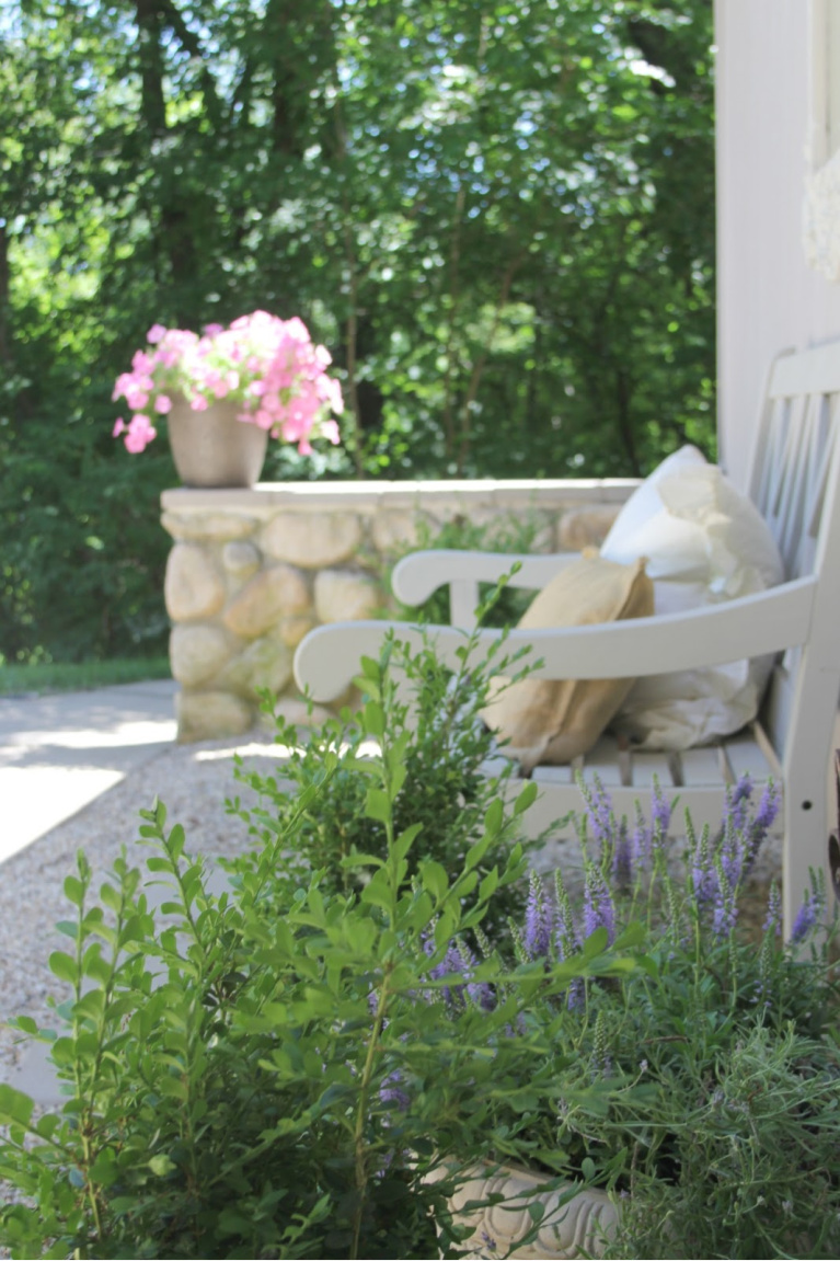
If you’re stumped, gaze outdoors for inspiration. Nature can’t be beat as masterful compositions of rustic textures, shadow, light, and velvety preciousness.
Mostly Low Contrast?
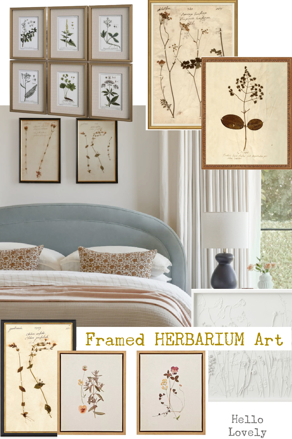
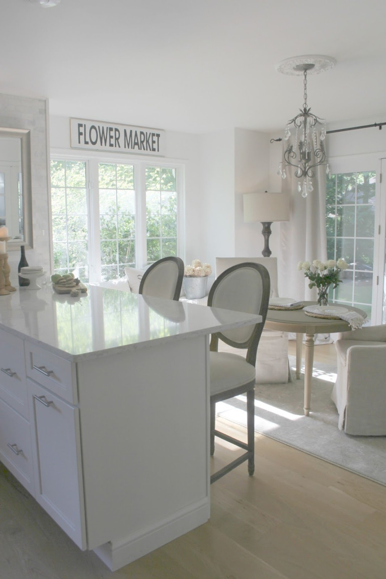
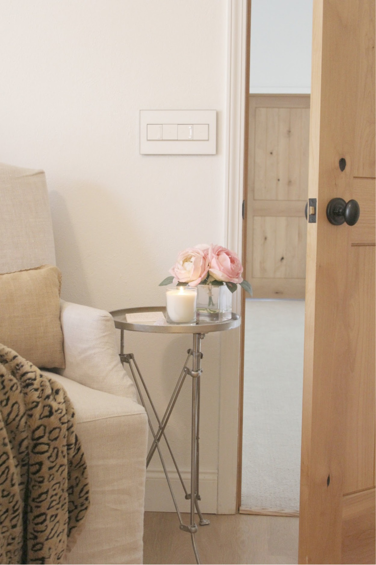
While you’ll find a few moments with deep charcoal and black, I’m mostly drawn to low contrast.
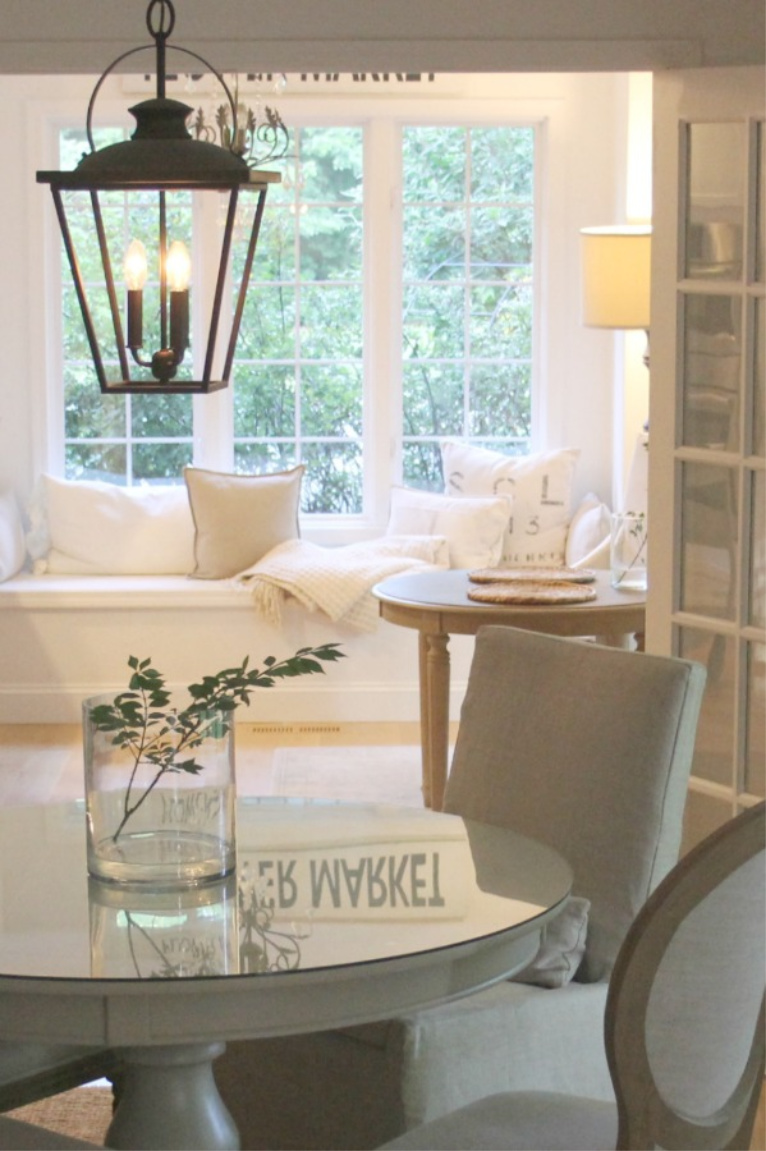
Those gentle transitions often feature understated, faded, or subtle tones.
How Practical is White for Daily Living?
I’m a boy mama with sons who loved the tidy atmosphere but were mostly uninterested in white or feminine touches around the house.
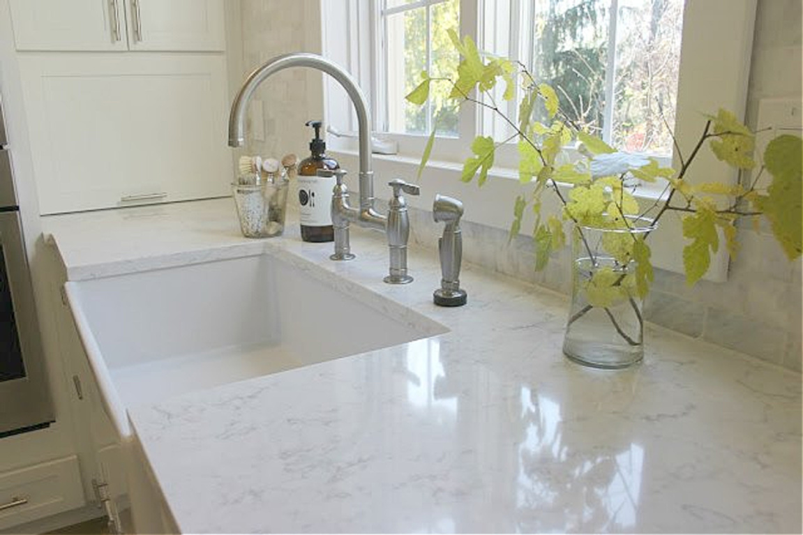
Is daily living eased or complicated with colorful rooms?
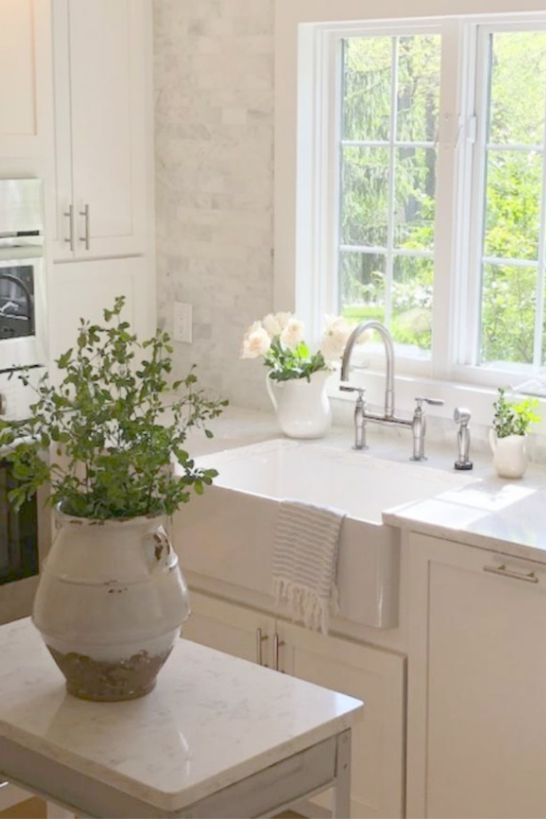
As far as my experience, there is no avoiding daily dust, smudges, streaks, and staining happening in spite of the decor. I prefer addressing the mess immediately. You?

Glimpses of 2013 Me & Warm Whites Just After Prophylactic BRCA Surgeries
While it is still October and BC awareness month, here’s a blast from the past filmed after my mastectomy. If you missed secrets revealed about my genetic mutation in THIS, read that too.
Breast and ovarian cancers are deadly on both sides of my family. I’m happy to be cancer-free and to report my mom remains in remission. We thank God for the prayer and tender mercies flowing our way.

p.s.
i love you. i just do.
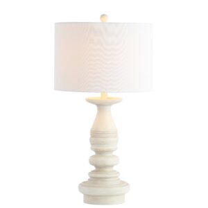
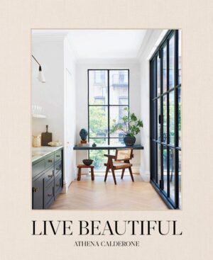
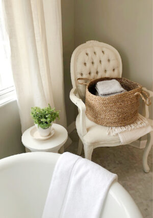
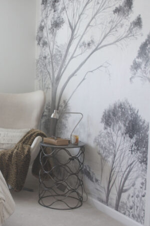
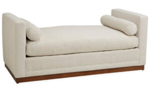
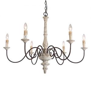
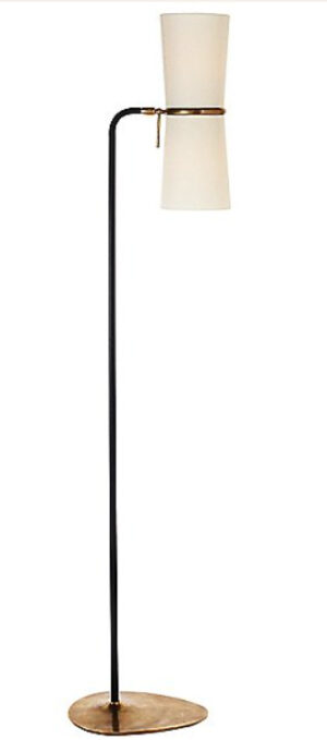
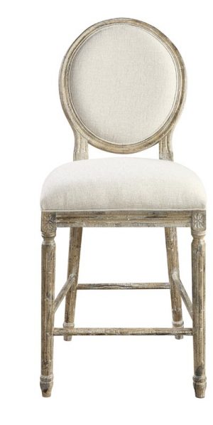
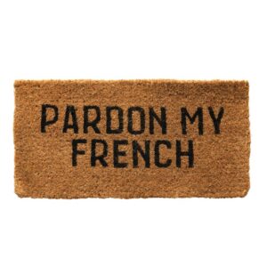
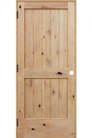
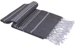
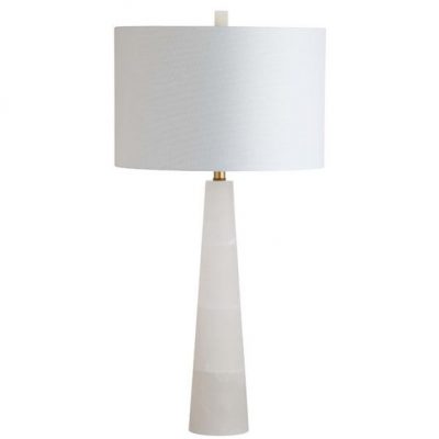
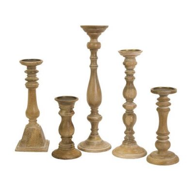
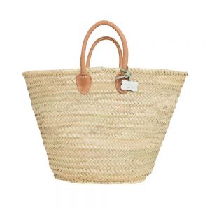
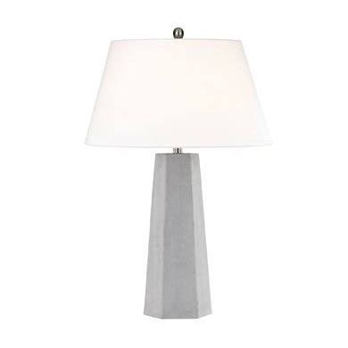
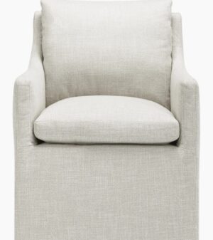
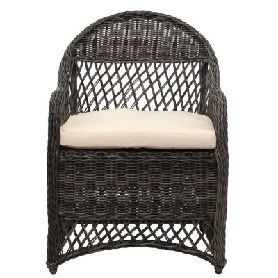
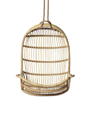
Shop my Home!






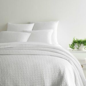
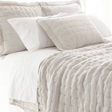
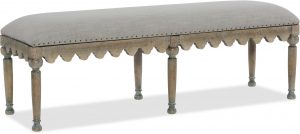
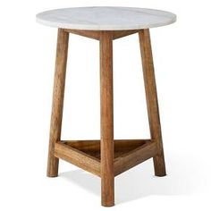
Peace to you right where you are.
-michele
Thanks for shopping RIGHT HERE to keep decor inspiration flowing on Hello Lovely!
Hello Lovely is a participant in the Amazon Services LLC Associates Program, an affiliate advertising program designed to provide a means for sites to earn fees by linking to Amazon.com and affiliated sites.