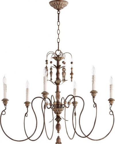
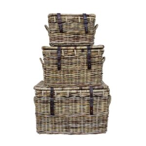
We peeked at sophisticated blue paint colors and room inspo in THIS, and today’s exploration leans toward quiet cool green and green-blue ideas. Psst. When you’re after the perfect quiet green, the paint color may have “blue” in the name. Find paint color and accent suggestions along with a tour of an amazing cottage where rustic design elements balance the gentle color story. It’s a uniquely timeless, tranquil, optimistic mix.
Quiet Cool Green and Green-Blue Tones
Frosty Green-Blue Paint to Sample
If you have ever been on a quest to find that just right duck egg blue or green-blue, then you know, it can be a headache. Sometimes the color in your space will feel too cloying. Another color will come off too sage. The lesson? Sample a bunch of options!
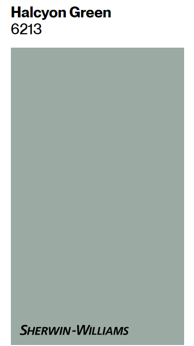
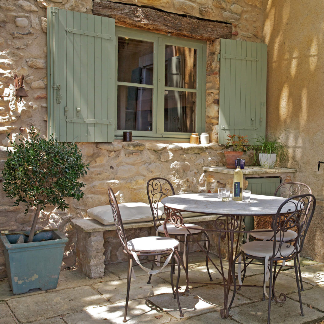
If you were after a pretty French-y green like the shutters on the villa above, these too colors above and below are a place to start.
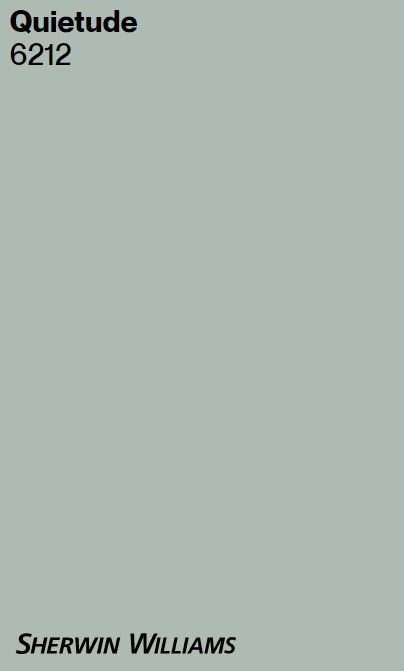
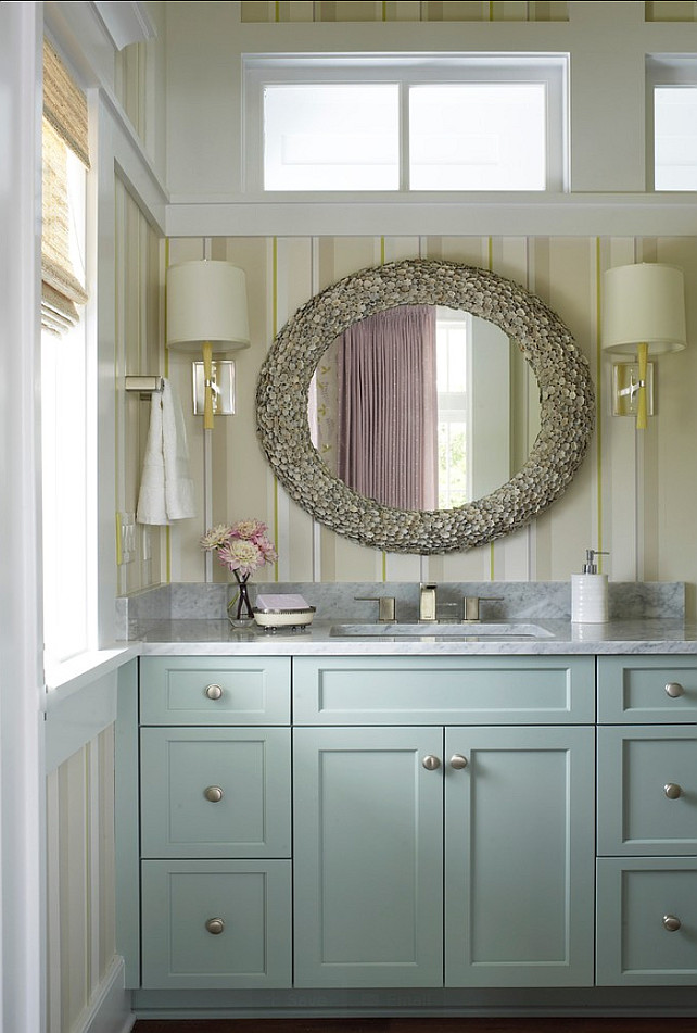
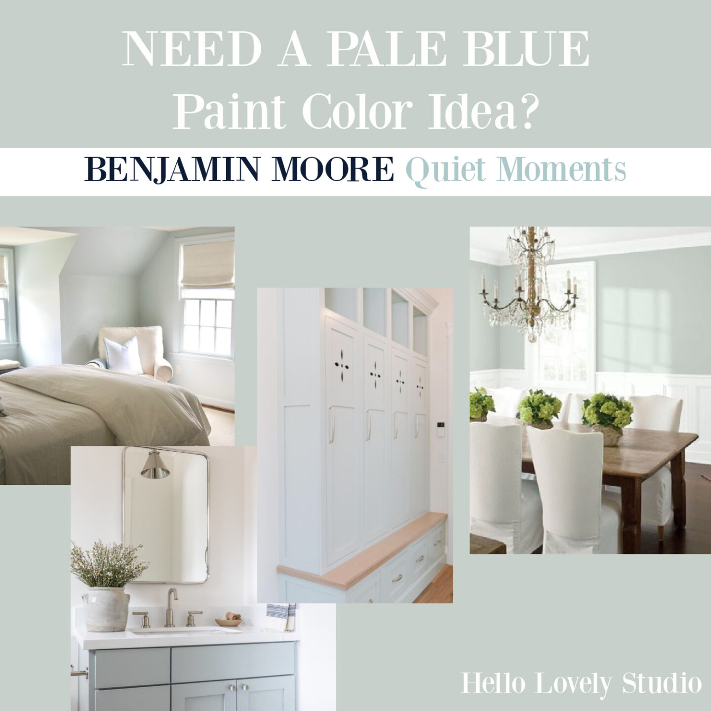
Quietude should not be confused with the more subdued Benjamin Moore’s QUIET MOMENTS which is quite popular with many designers for bedrooms:
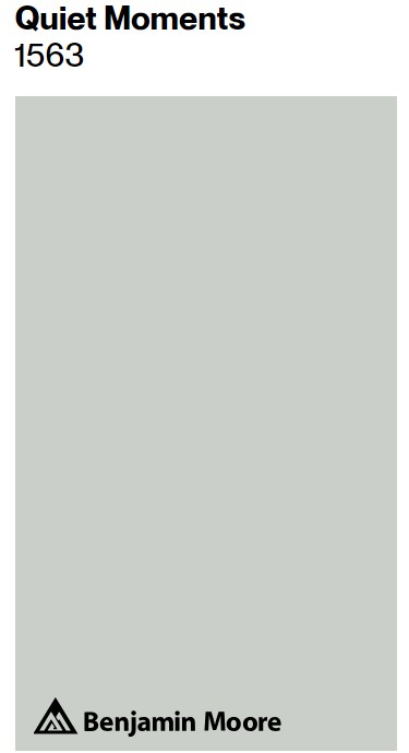
It’s tricky to decide if a color will read more blue or more green simply by reviewing images on the screen.
Duck Egg Blue Paint Possibility
While it’s a custom mix of Annie Sloan chalk paint colors on this beautiful custom barn door in a French country bedroom below…
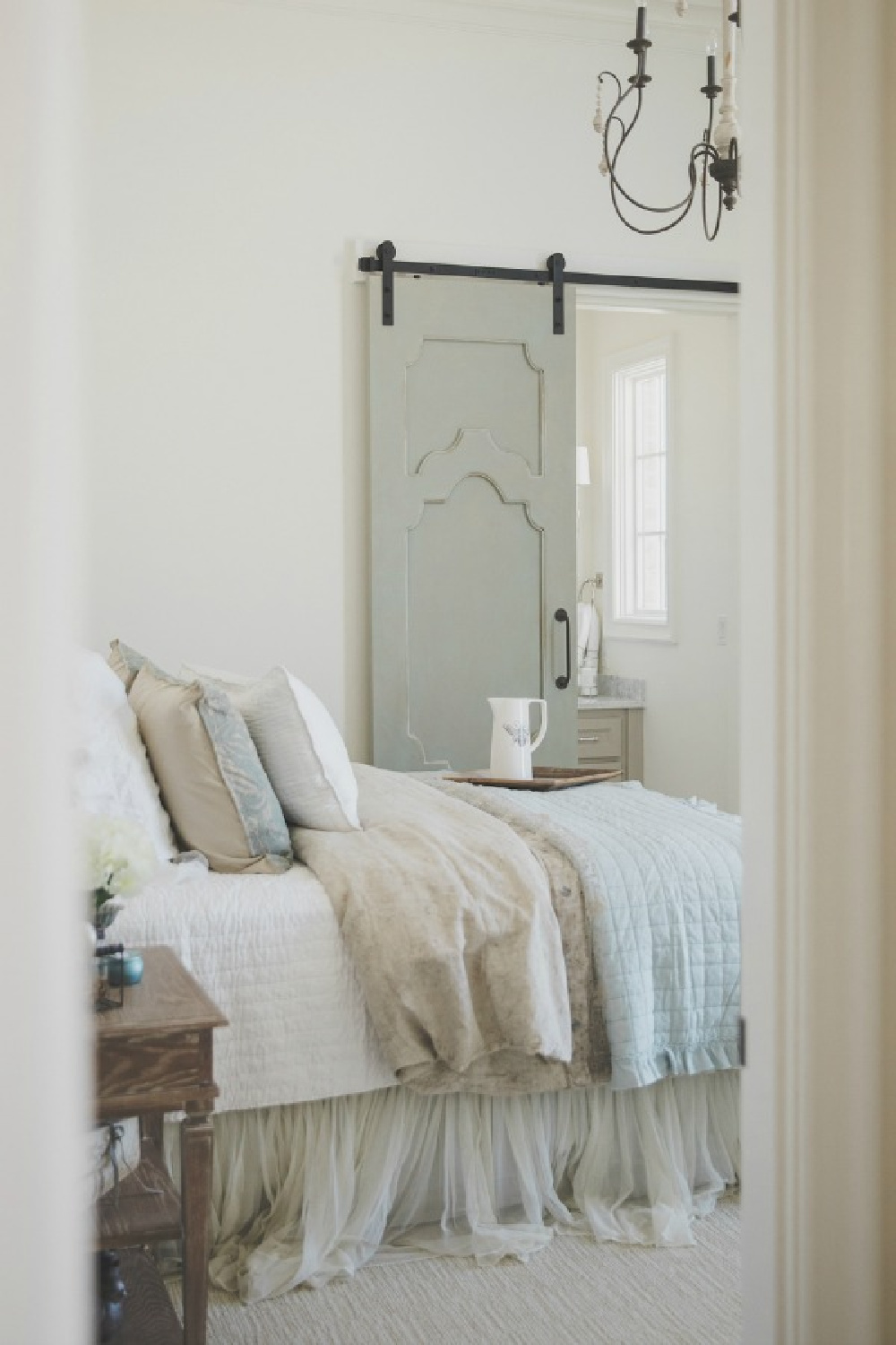
This elegant blue-green may provide a similar effect:
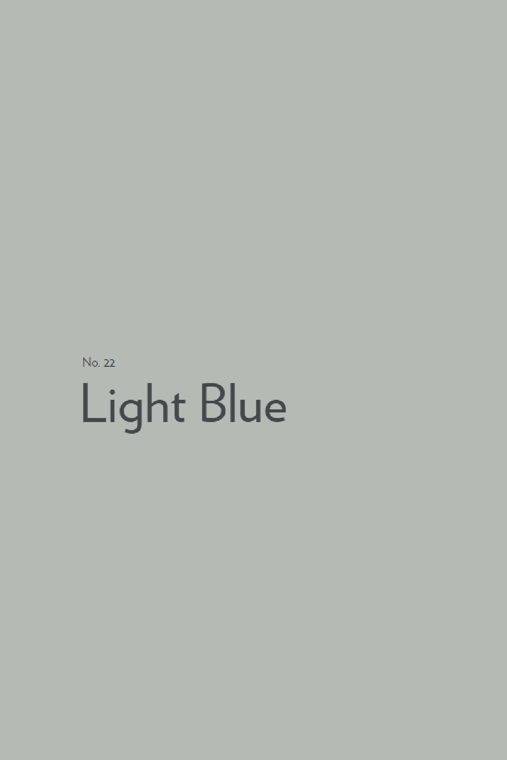
In my own home, Light Blue reads much brighter and more green than blue.
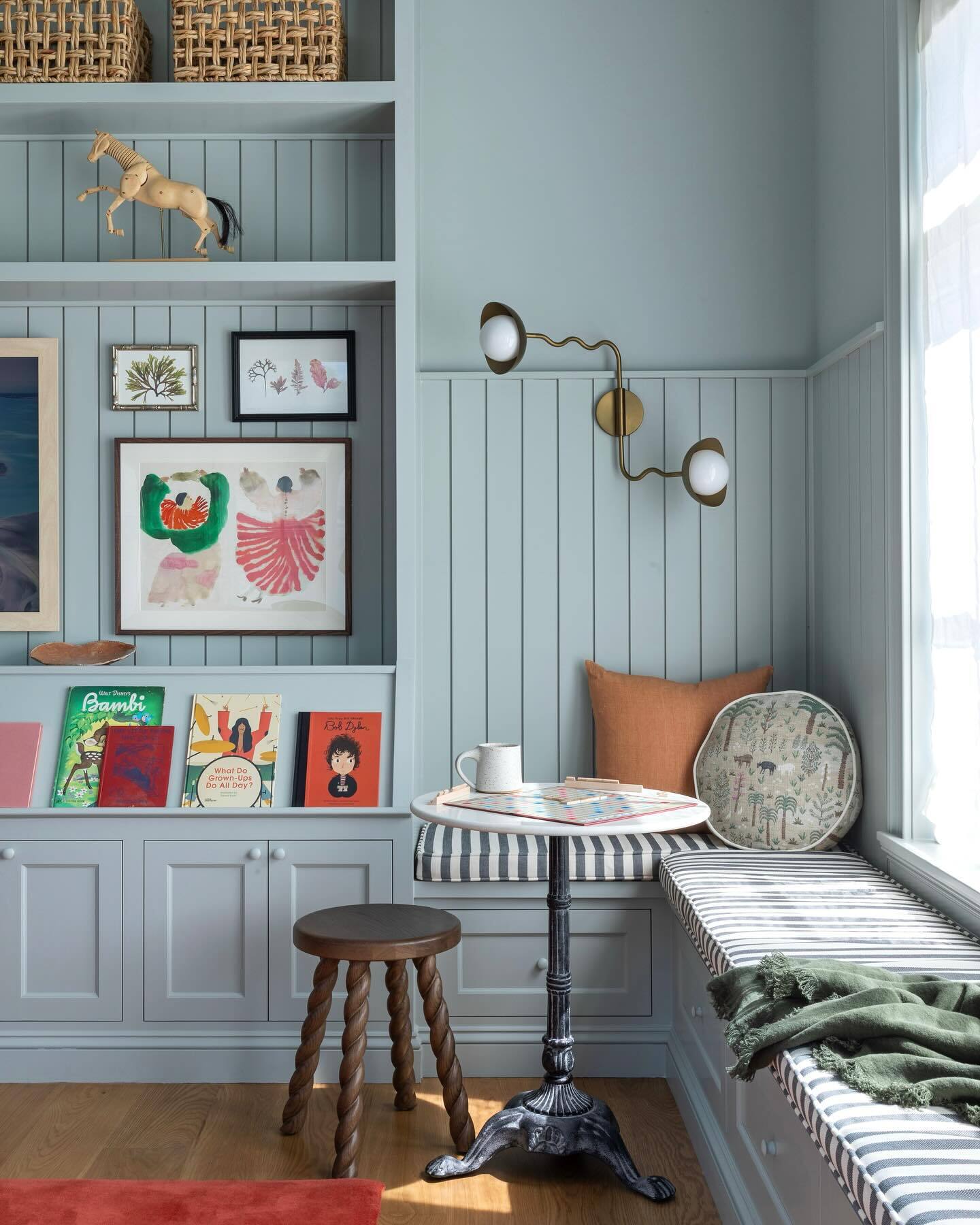
These examples across different lighting situations may help you see how the same color takes on different qualities depending on the context.
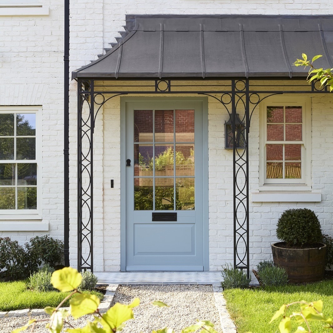
Wow – on the door above, Light Blue seems very cool blue, leaning toward periwinkle.
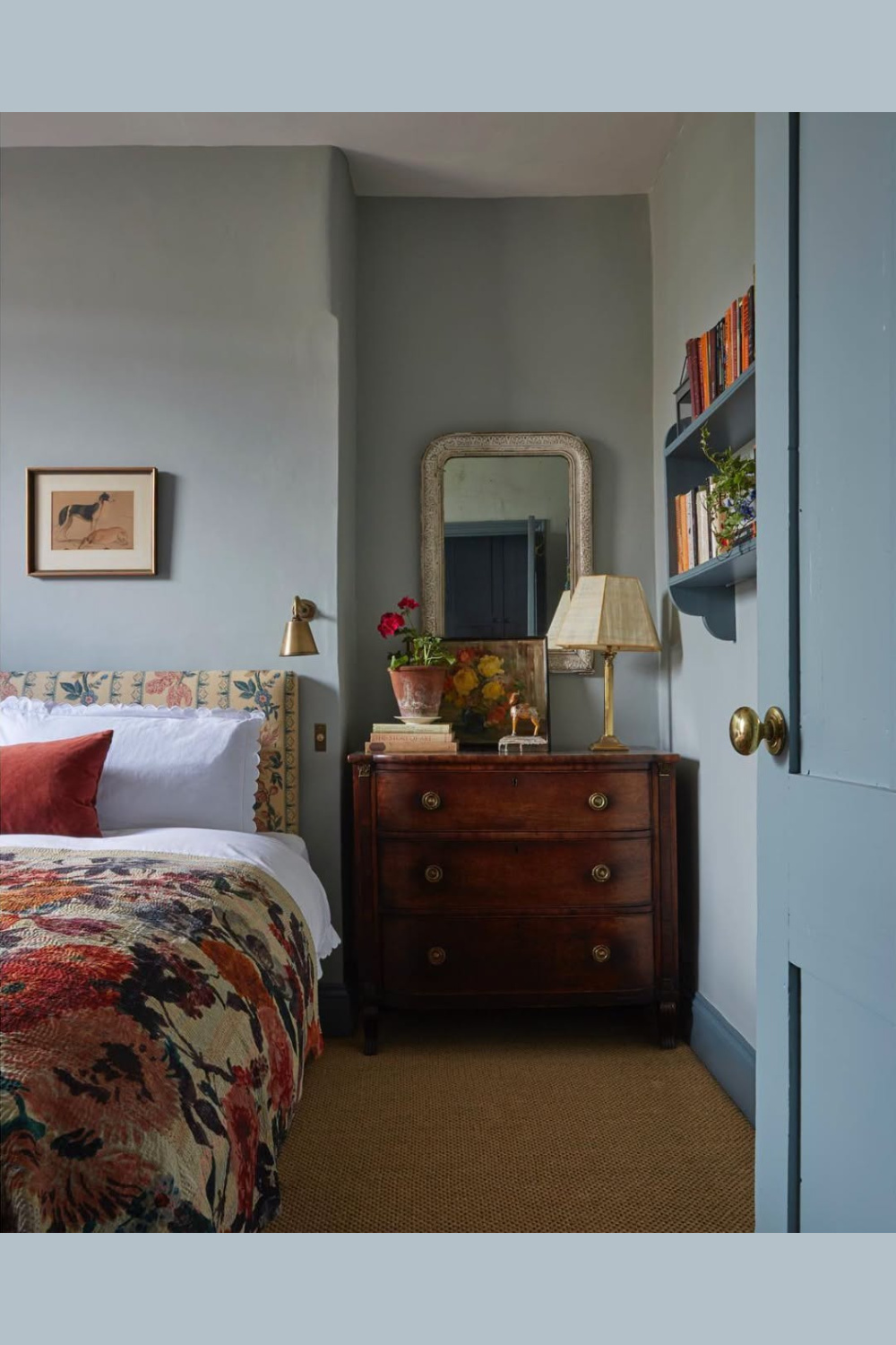
In a bedroom (above), the effect is more greyed.

I’d love to try it on a ceiling for a tranquil mood in the spirit of this gorgeous bath above.
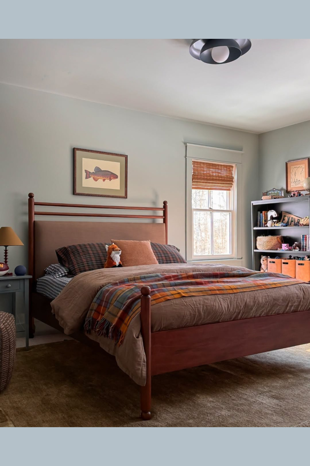
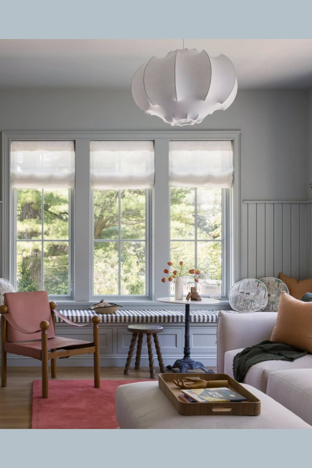
What do you think? Isn’t it a chamelon-like hue that interacts with natural light in surprising ways?
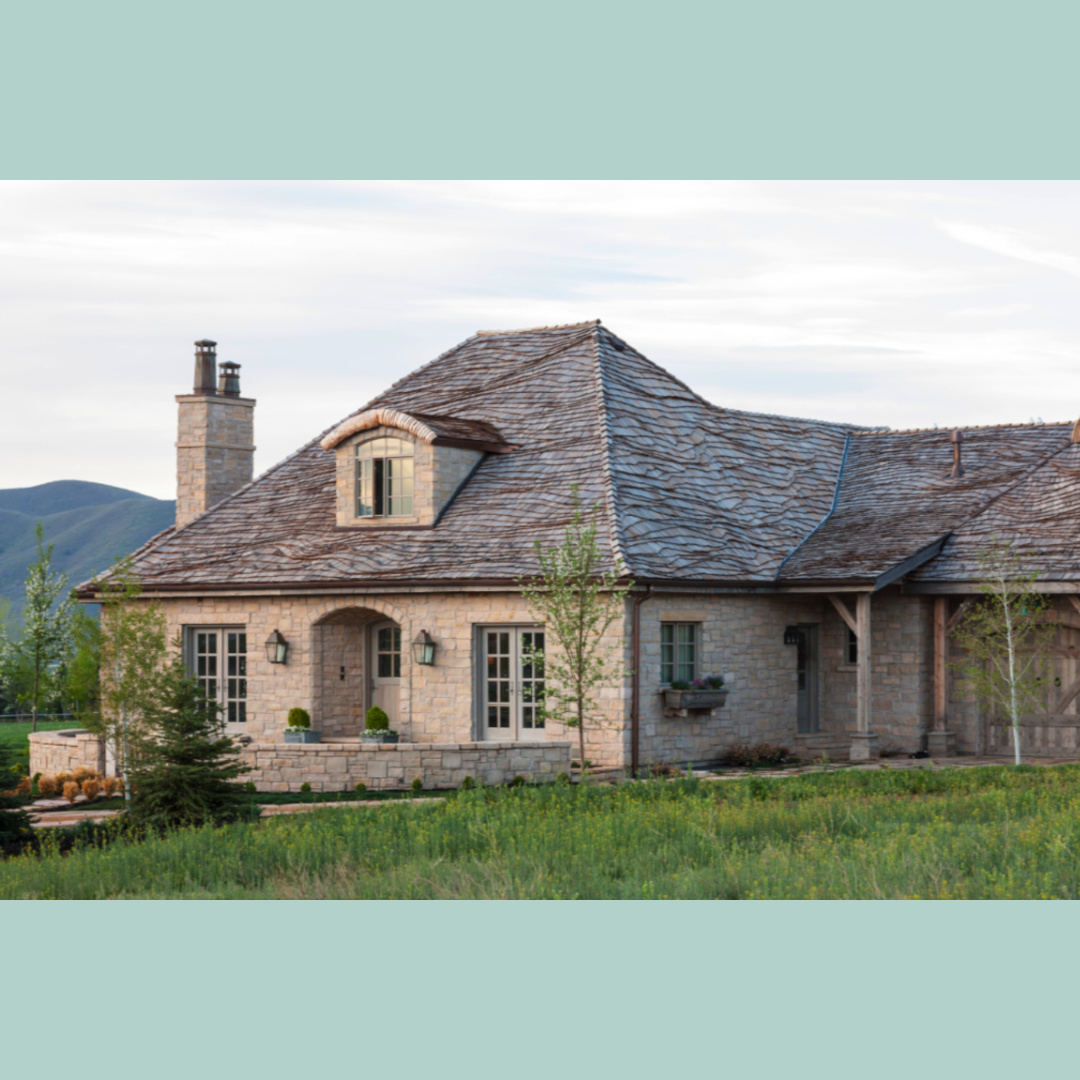
Desiree’s Gustavian Utah Cottage With Soft Green-Blues
Source: Decor de Provence and Country French Magazine Styling: Bonnie Broten
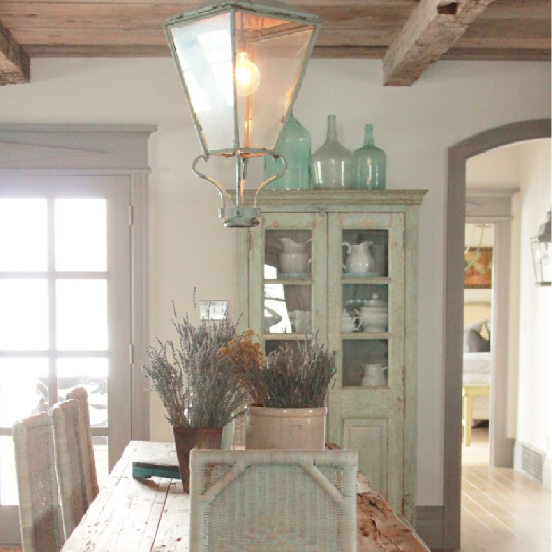
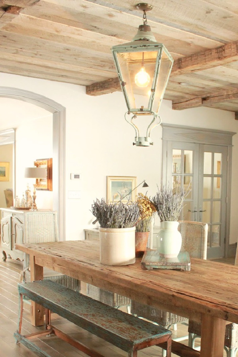
Those reclaimed wood ceilings and all of the atmospheric grey-green-aqua tones!
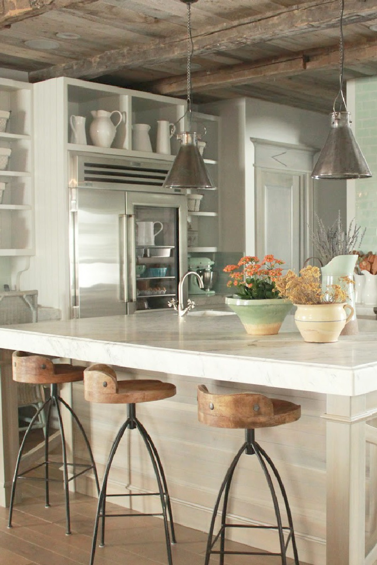
(Find the designer at Beljar Home, where they may be able to help you create your own dream space!).
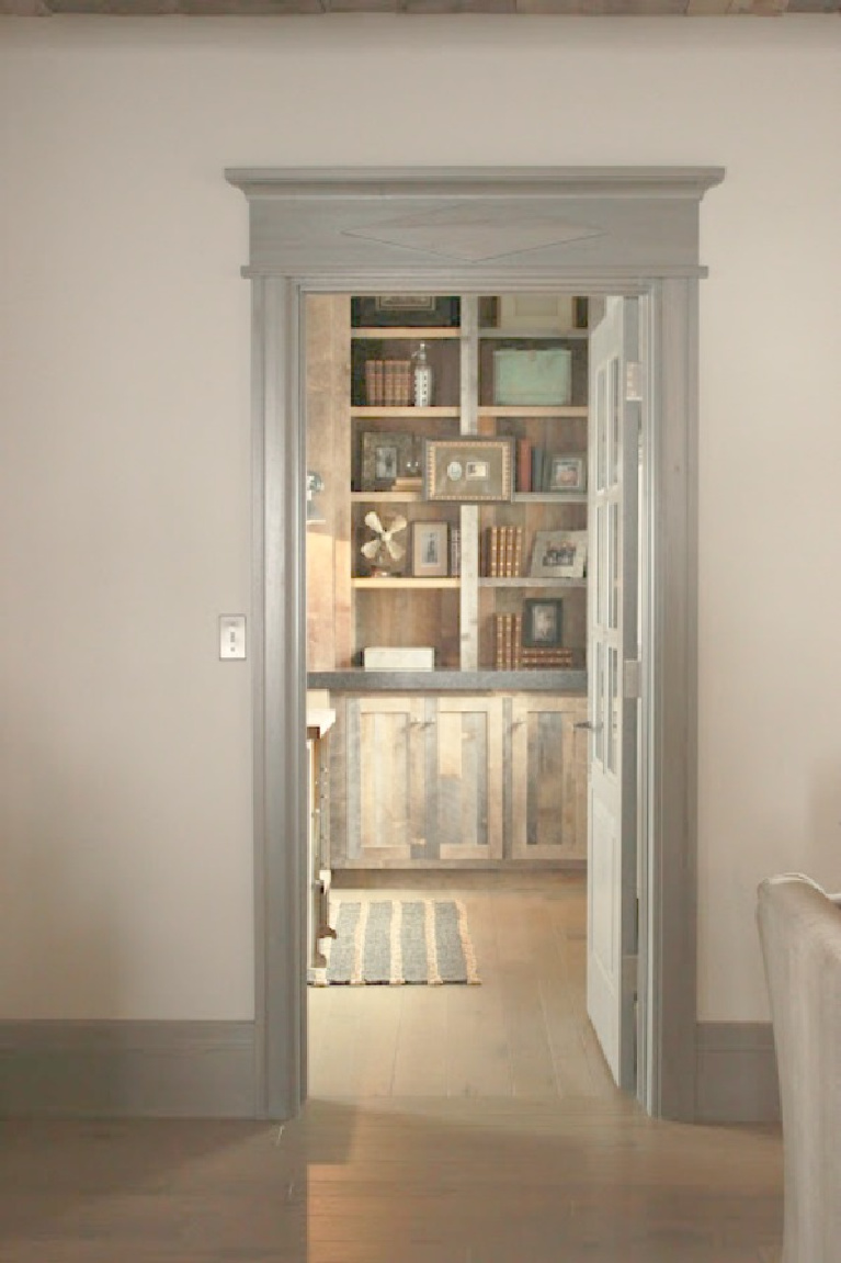
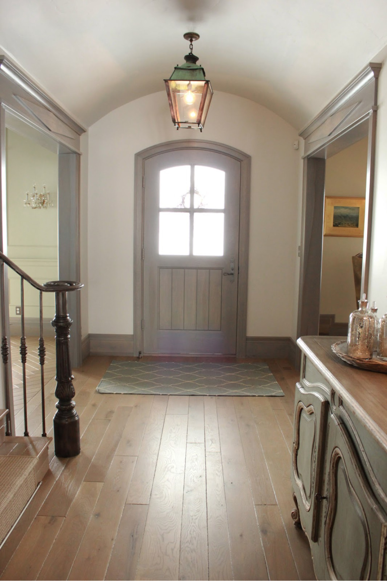
The greyish trim color throughout the Gustavian-French cottage is custom, and with a color decision as important as the one for trim, take your time formulating the proper one!
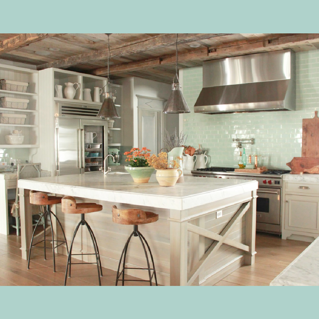
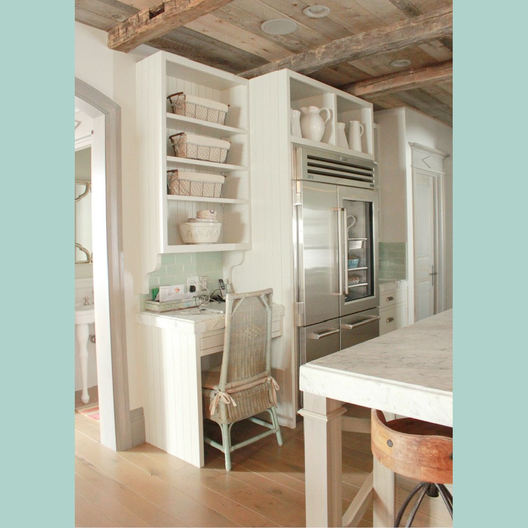
French-Belgian Kitchen With Quiet Green-Gray
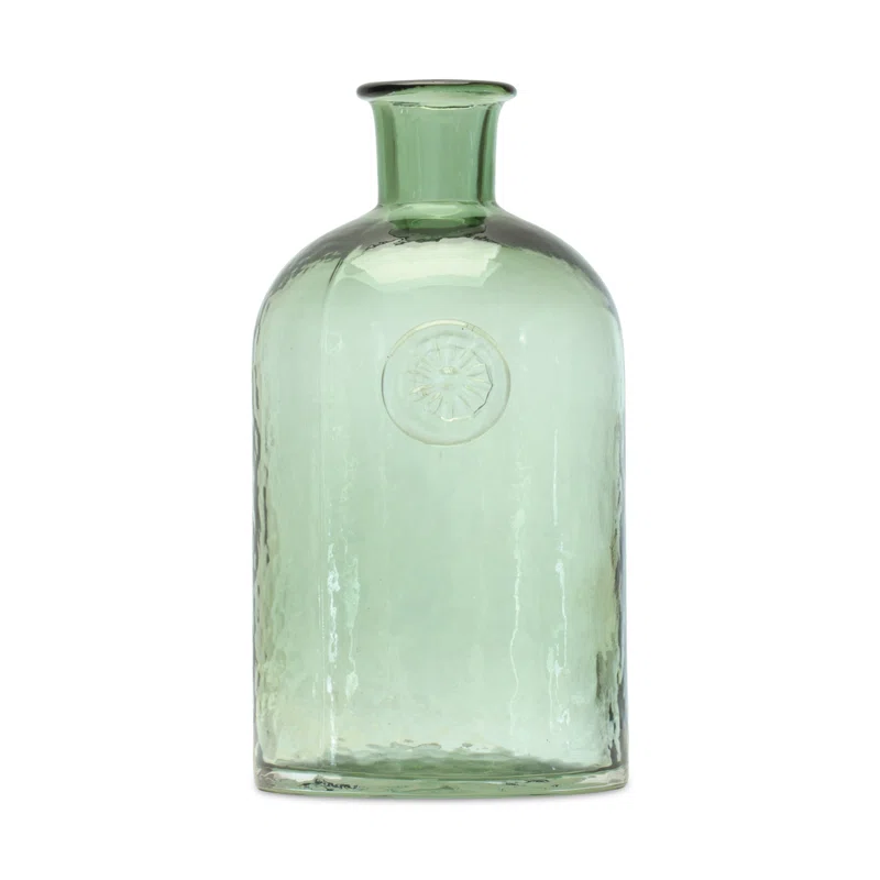
Something special happens when you introduce sea glass references to a space thath isn’t near the beach.
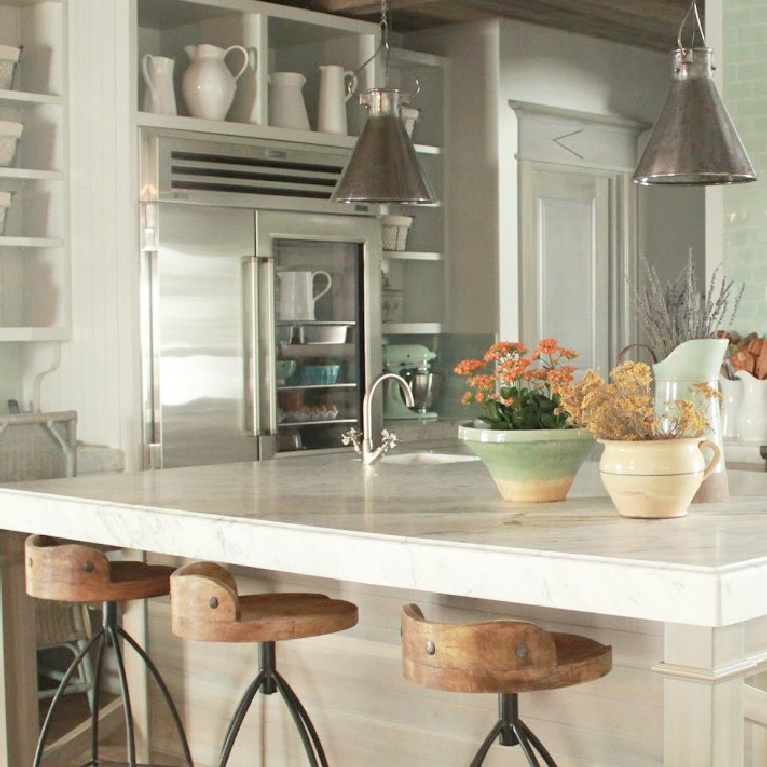
There’s a softened, fresh, more gentle mood created within a shell that feels rugged and timeworn.
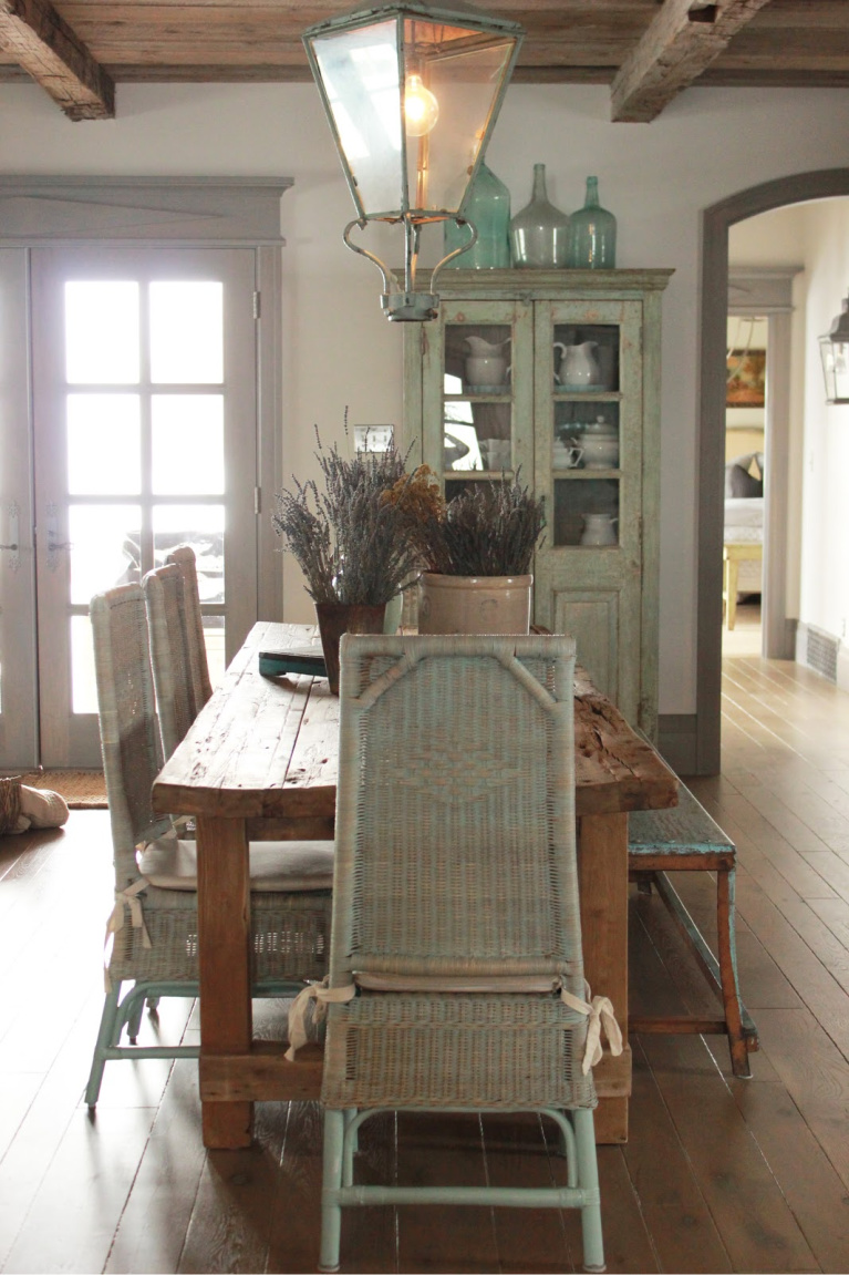
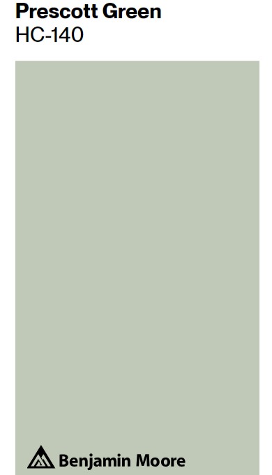
For green accents, here’s a color that may help you achieve a similar look:
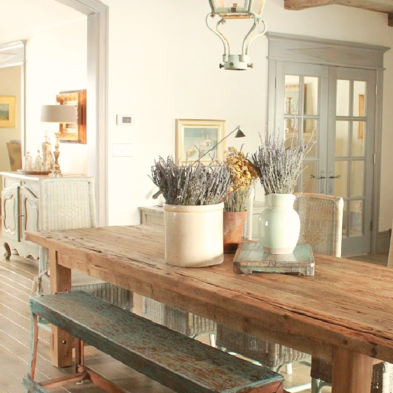
Notice how the wall color stays neutral and light – the greys and greens as an expanse on walls may become too moody.
Decor Accents With Green & Blue
I independently selected products in this post—if you buy from one of my links, I may earn a commission.
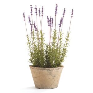
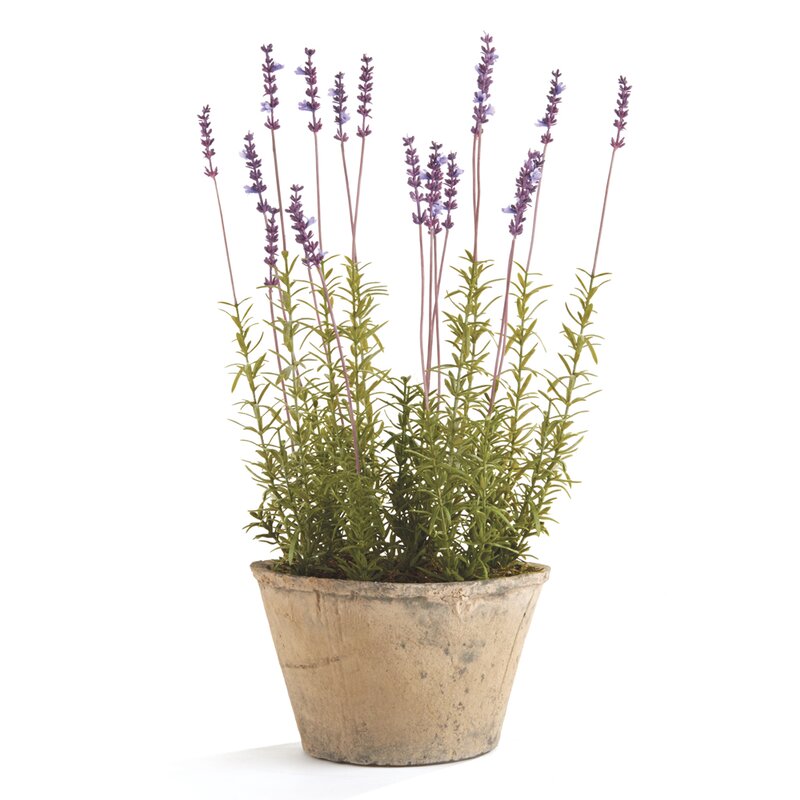
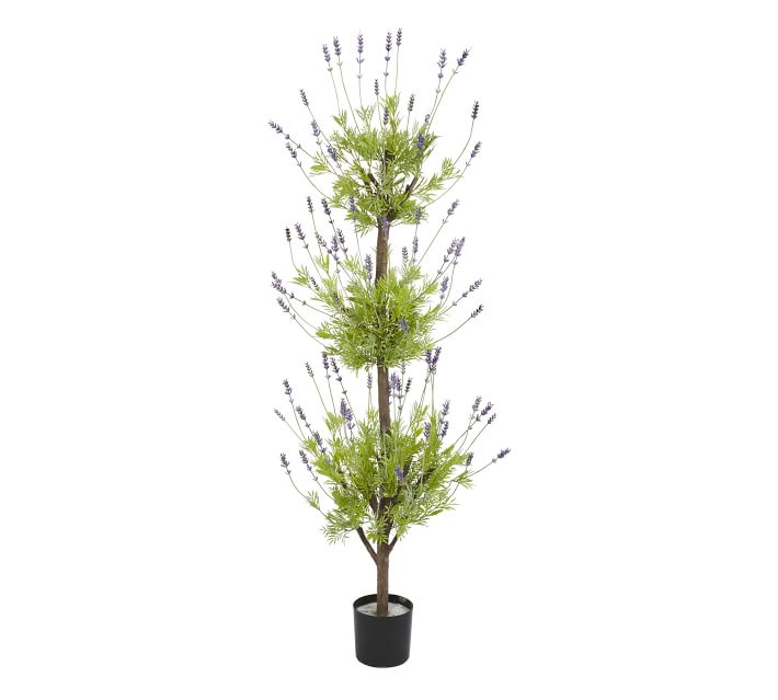
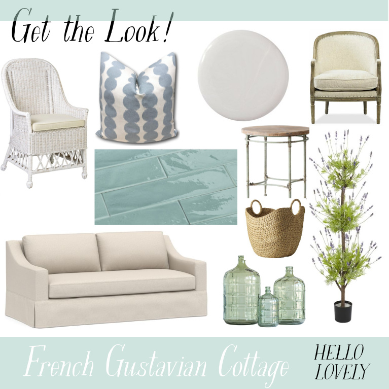
1. French Lavender
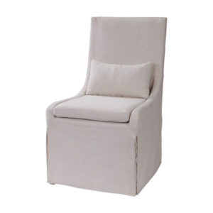
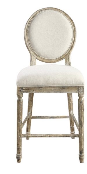
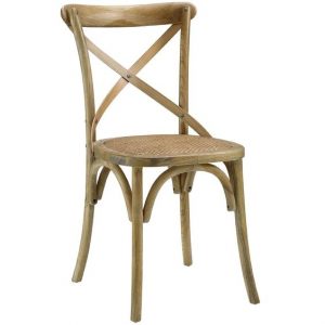
2. Dining Chairs
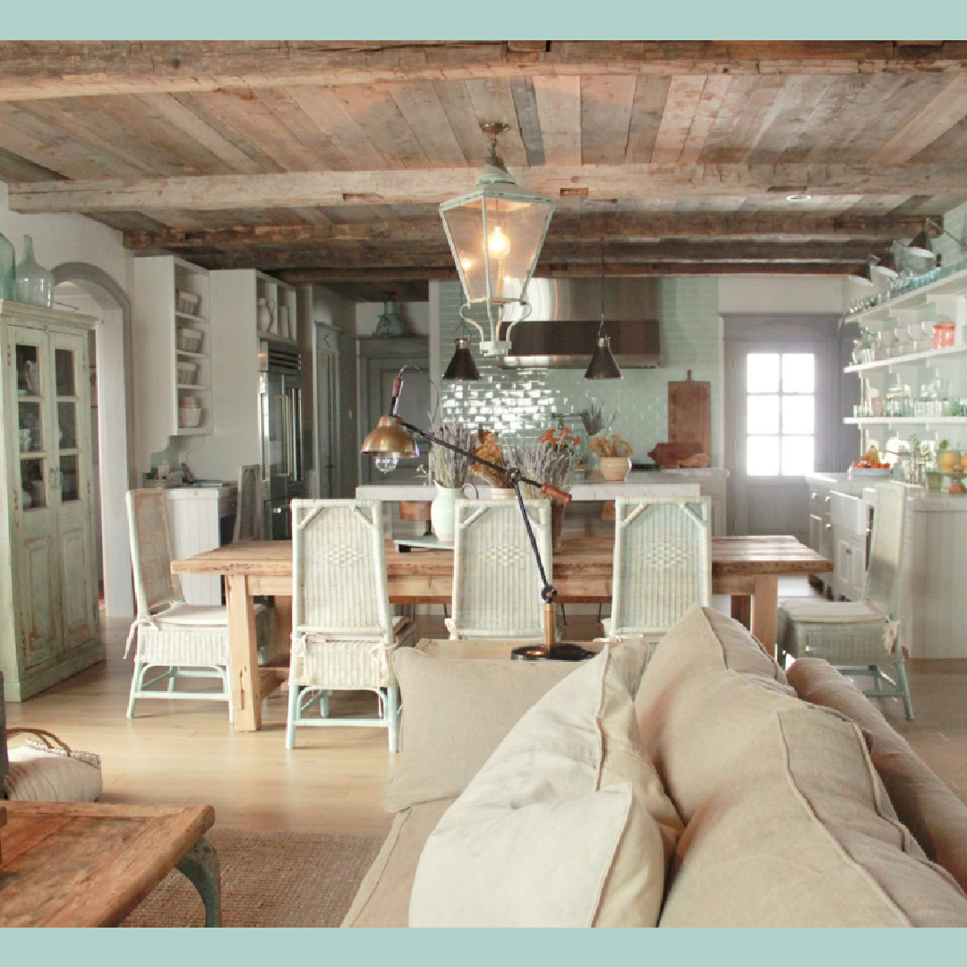
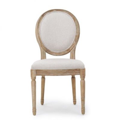
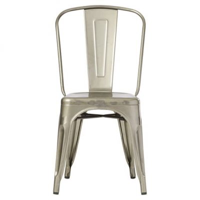
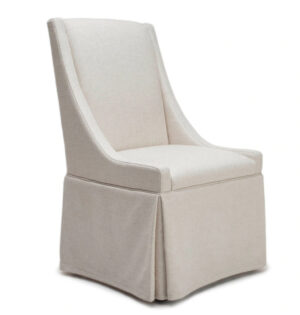
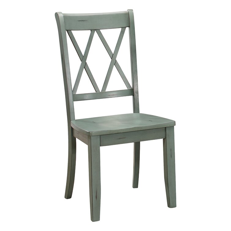
You could hunt down vintage chairs or turn my favorite Belgian (Greet!) who designed these exquisite Mimi chairs with Defleure:
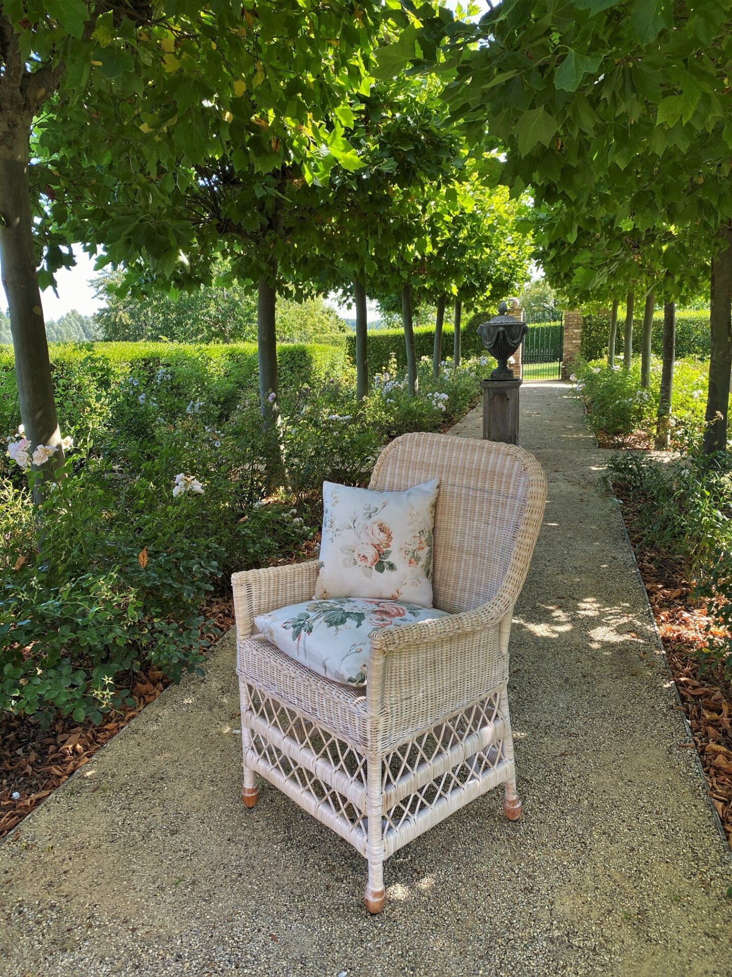
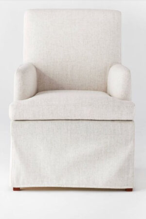
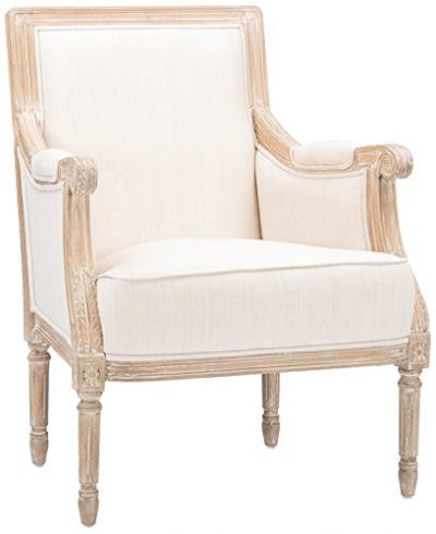
Tap the image above for buying info. For a frosty green dining chair that may work in a casual setting…
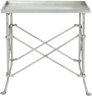
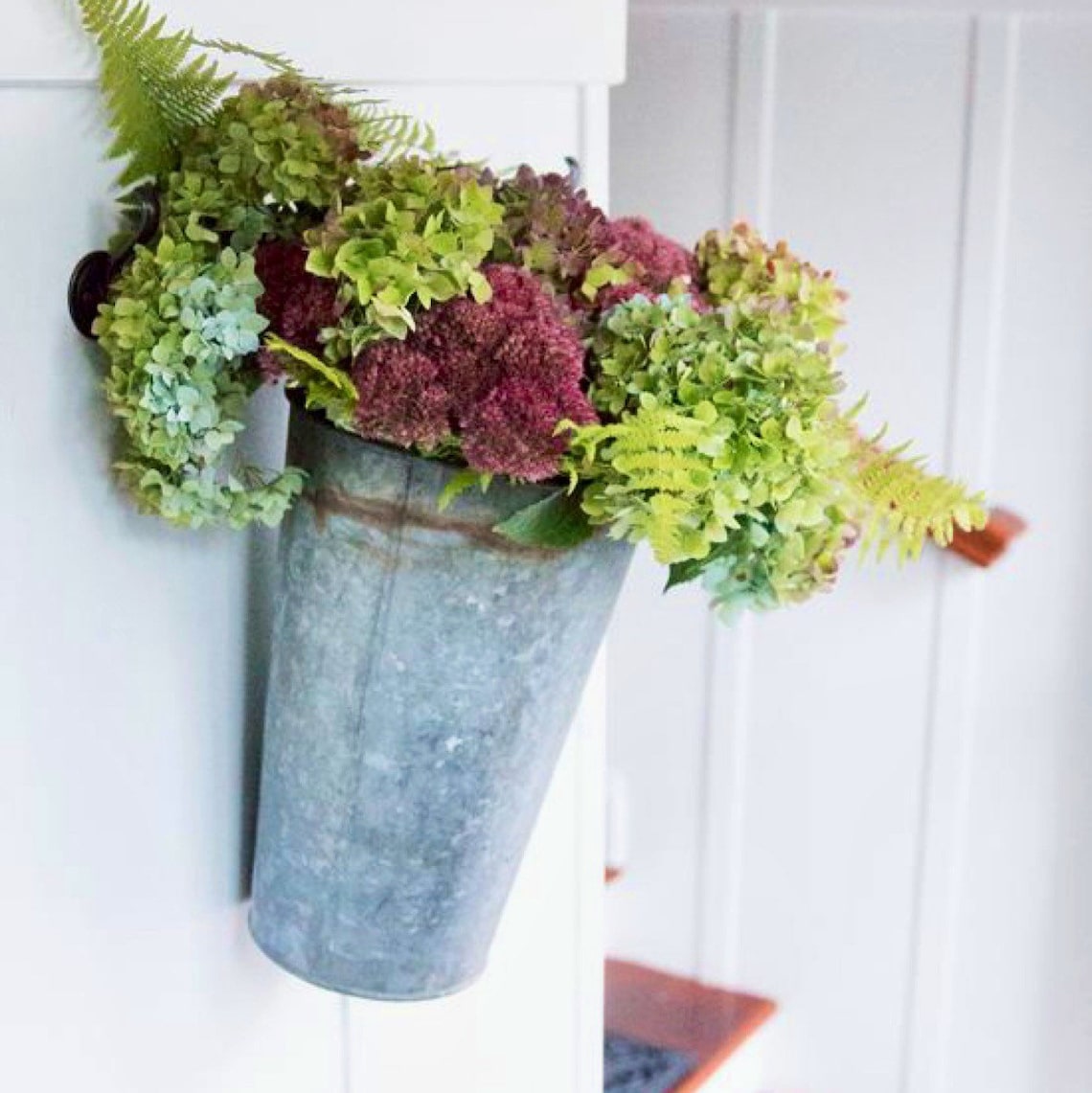
3. Zinc Finishes to Harmonize With Blue-Green
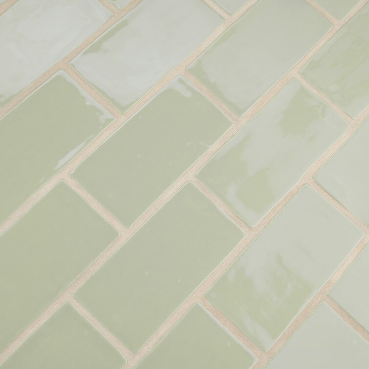
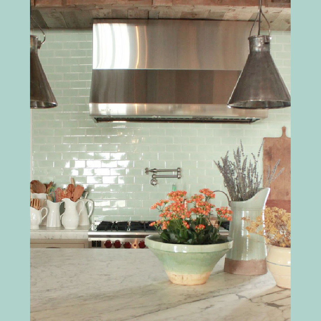
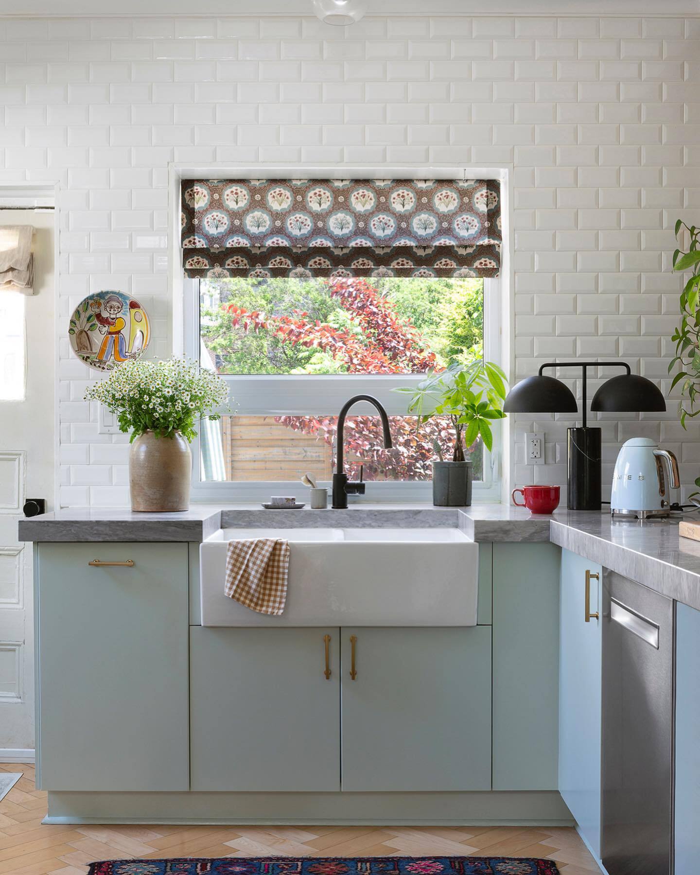
4. Soft Green Backsplash Tile
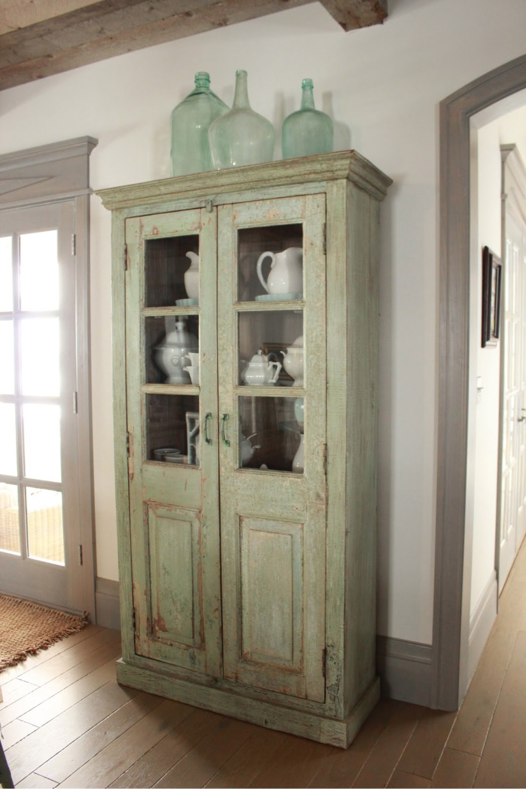
5. Green Glass Bottles
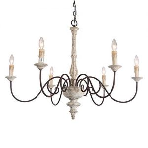
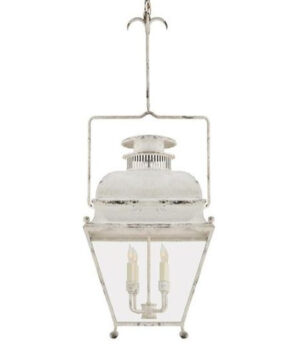
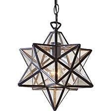
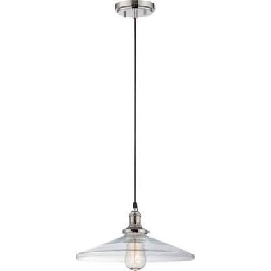
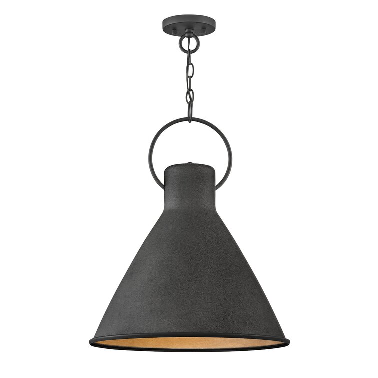
6. Lantern Pendant
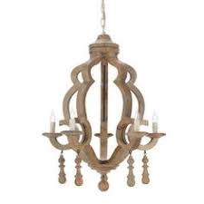
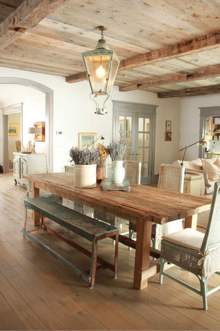
Even if you can’t hunt down the perfect vintage pendant for your space, you may be able to tweak the finish of a new one to give it an aged look with a custom color. Here’s another paint color option to sample:

While this chippy painted pendant may show its authentic age, wouldn’t it be fun to replicate something with a new fixture?
7. Charming Jadeite & Green Accents
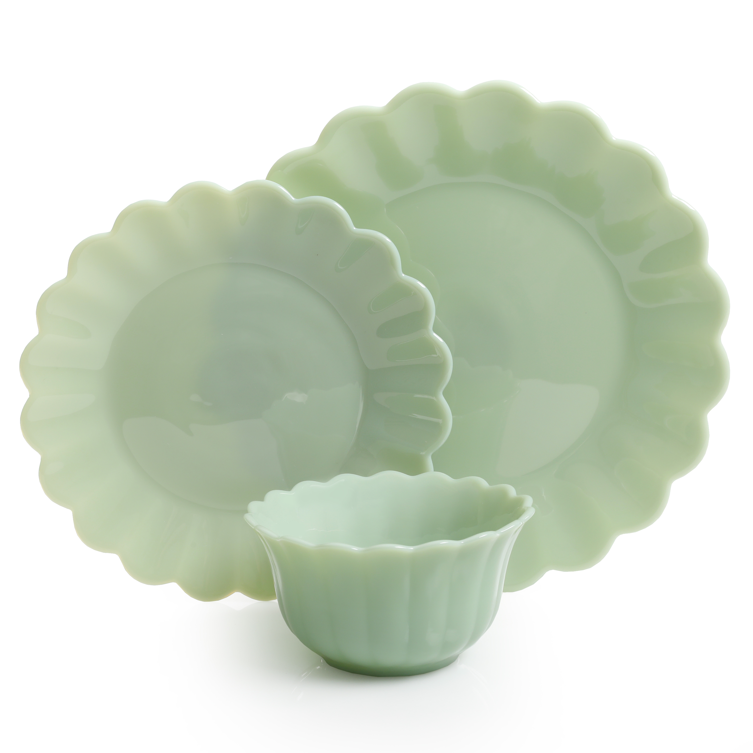
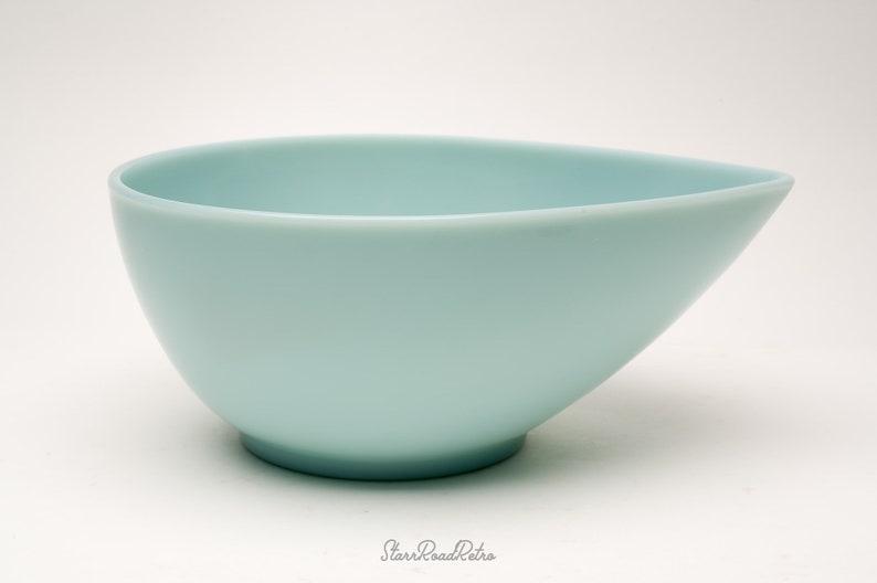
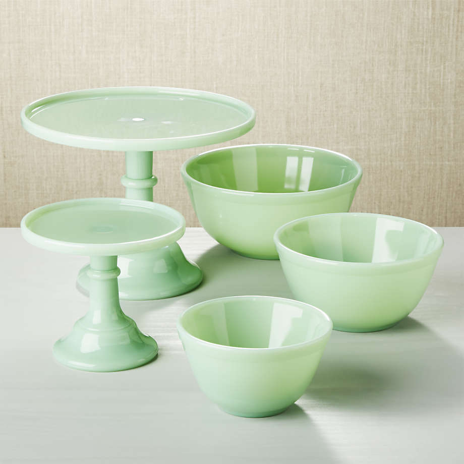
What if we didn’t have to tuck away our treasures and instead could view them everyday?
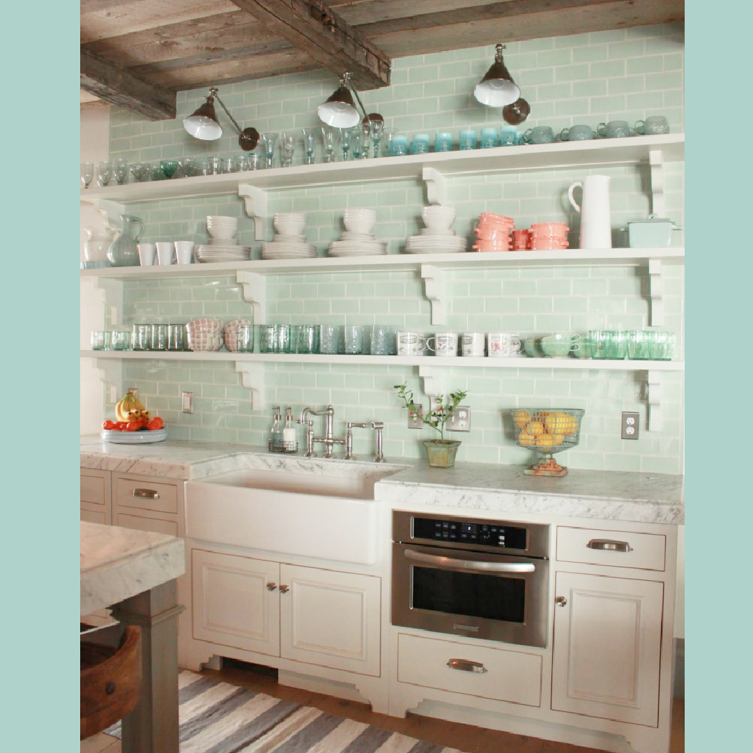
Yes. Dust would inevitably appear…trade-offs I suppose.
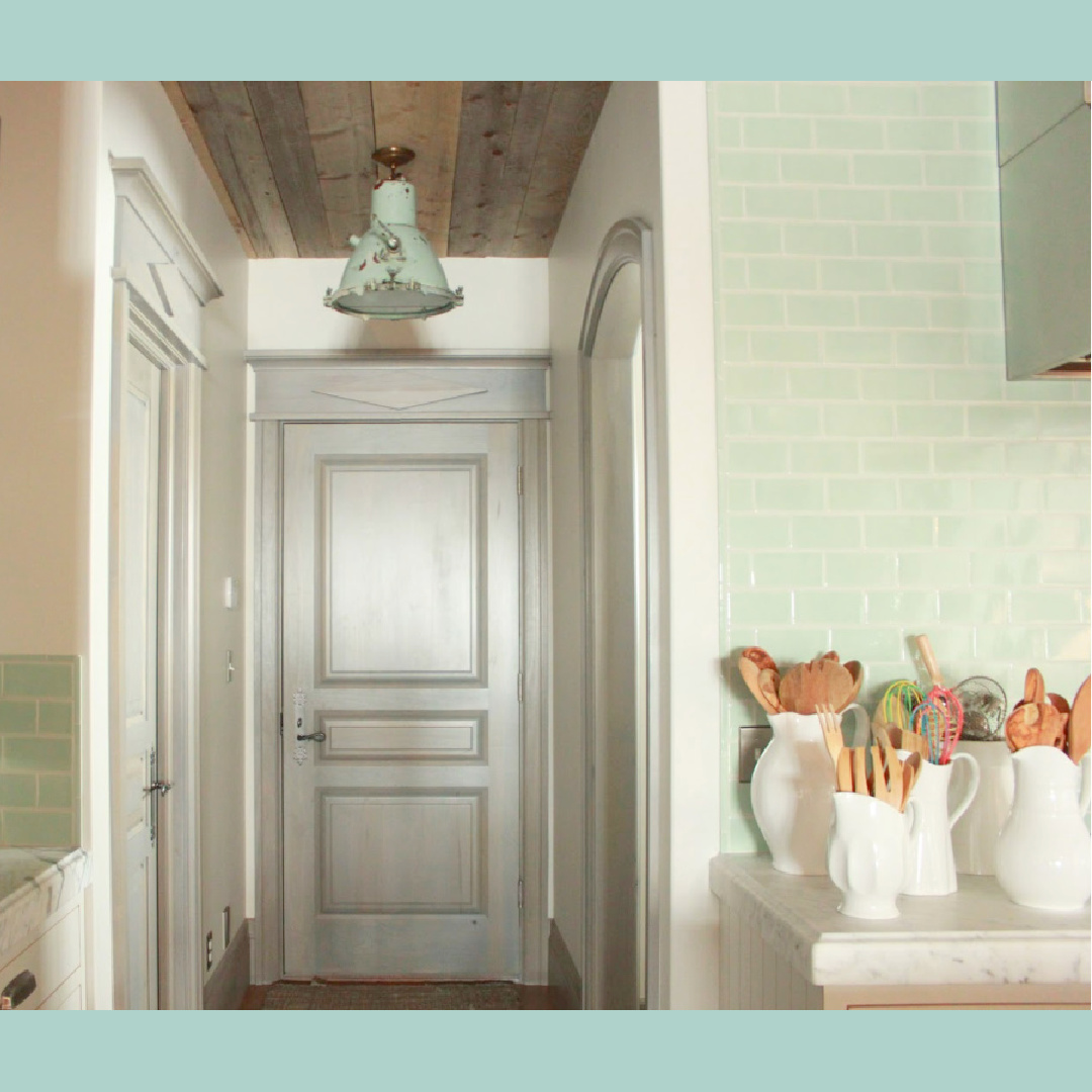
8. Beyond White for Trim
I love how Desiree chose to stain the trim and doors in a unique matte greyed blue-green. She also chose this option in a prior home. The decision reinforces the Gustavian French feel and is so soothing with creamy walls. (The custom shade is reminiscent to Farrow & Ball’s Pavilion Gray which I chose for our kitchen cabinets.

I independently selected products in this post—if you buy from one of my links, I may earn a commission.
Peace to you right where you are.
-michele
Thanks for shopping RIGHT HERE to keep decor inspiration flowing on Hello Lovely!
Hello Lovely is a participant in the Amazon Services LLC Associates Program, an affiliate advertising program designed to provide a means for sites to earn fees by linking to Amazon.com and affiliated sites.