These blue-grey colors may inspire your next project! There’s something irresistibly tranquil, timeless and gentle about using a paint color in this spirit. It can be oh so elegant yet approachable even in more casual settings such as a laundry room. Need ideas to sample?
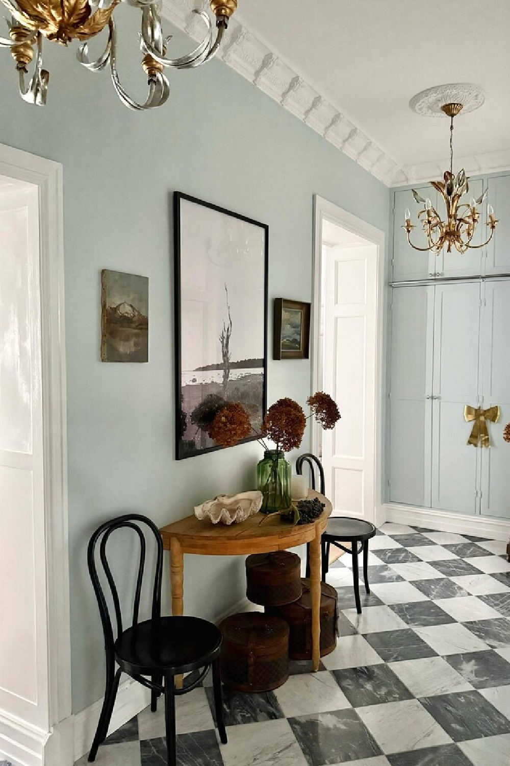
Blue-Grey Colors to Inspire Your Interiors
One of the best tips I know when you find a pretty color but still feel shy about pulling the trigger and painting a whole wall? Paint a castoff chair or a found object so you can live with the color. Find links to Samplize samples for these colors – a smart way to see how a color looks in your unique lighting with a mess-free peel and stick (and move around!) color sample.
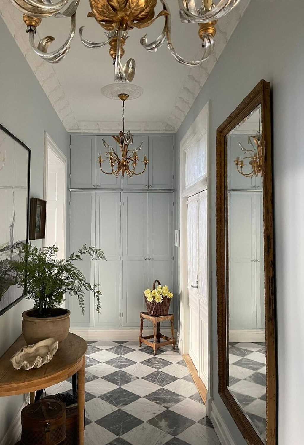
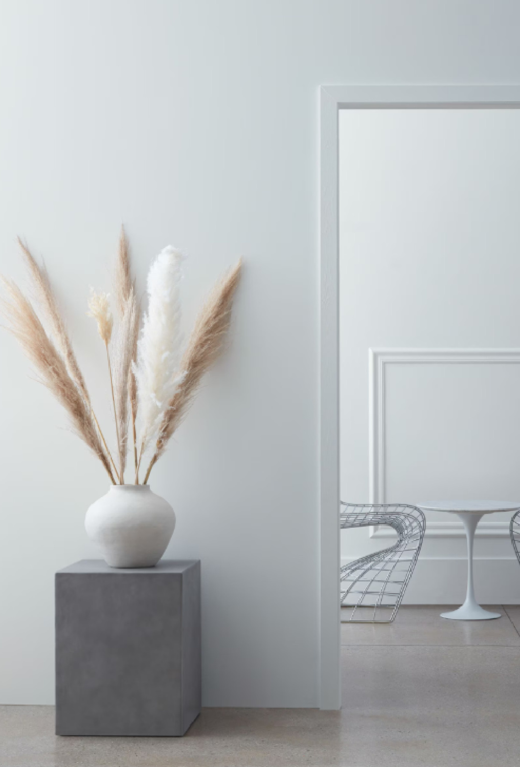
Farrow & Ball BORROWED LIGHT 235
I’m anxious to get a sample of this to see how it looks in the light here in Northern Illinois.
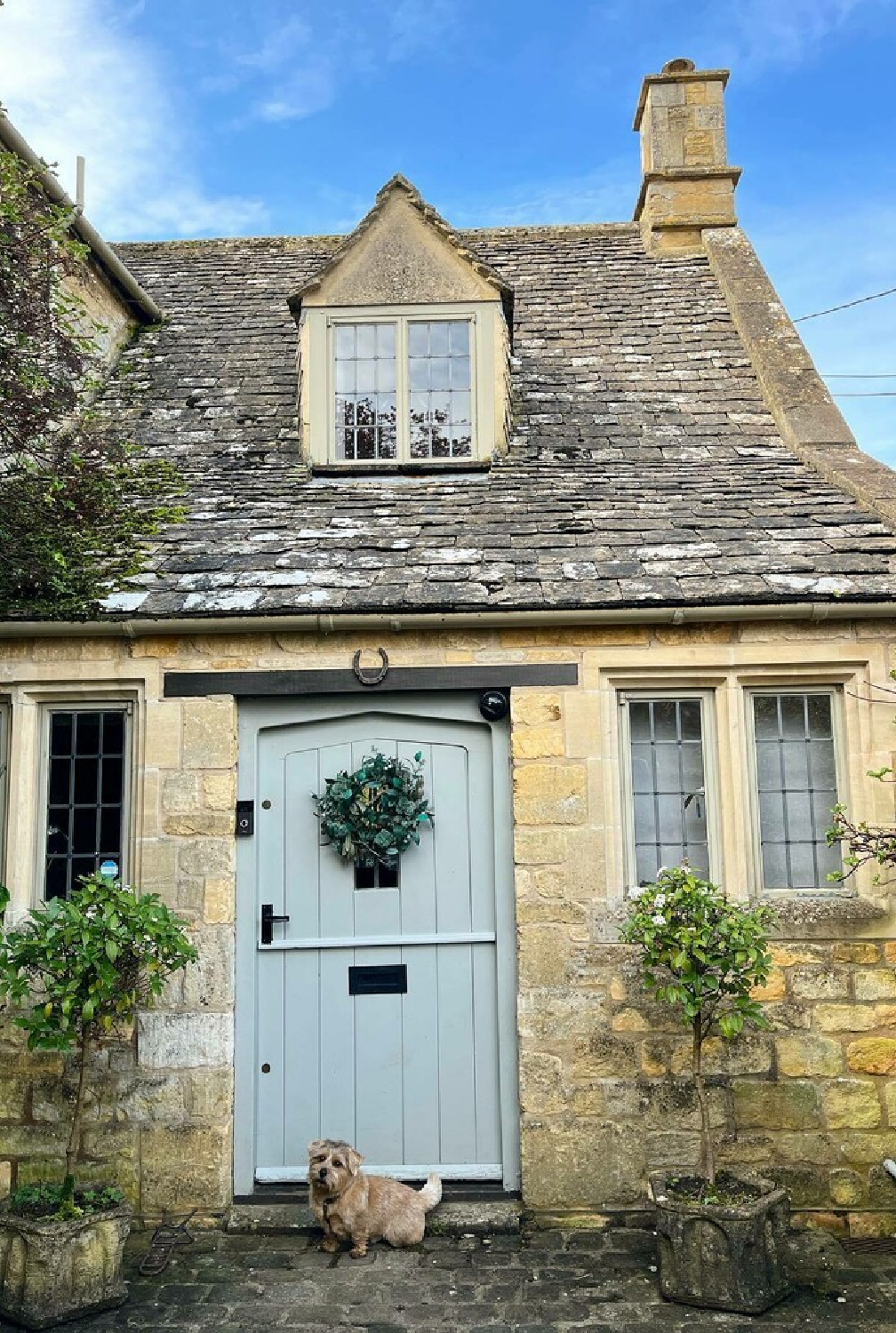
I’m pretty sure this blue-grey would be too blue or too green in the Arizona house since the yellow sunlight warms every color I try there in a big way.
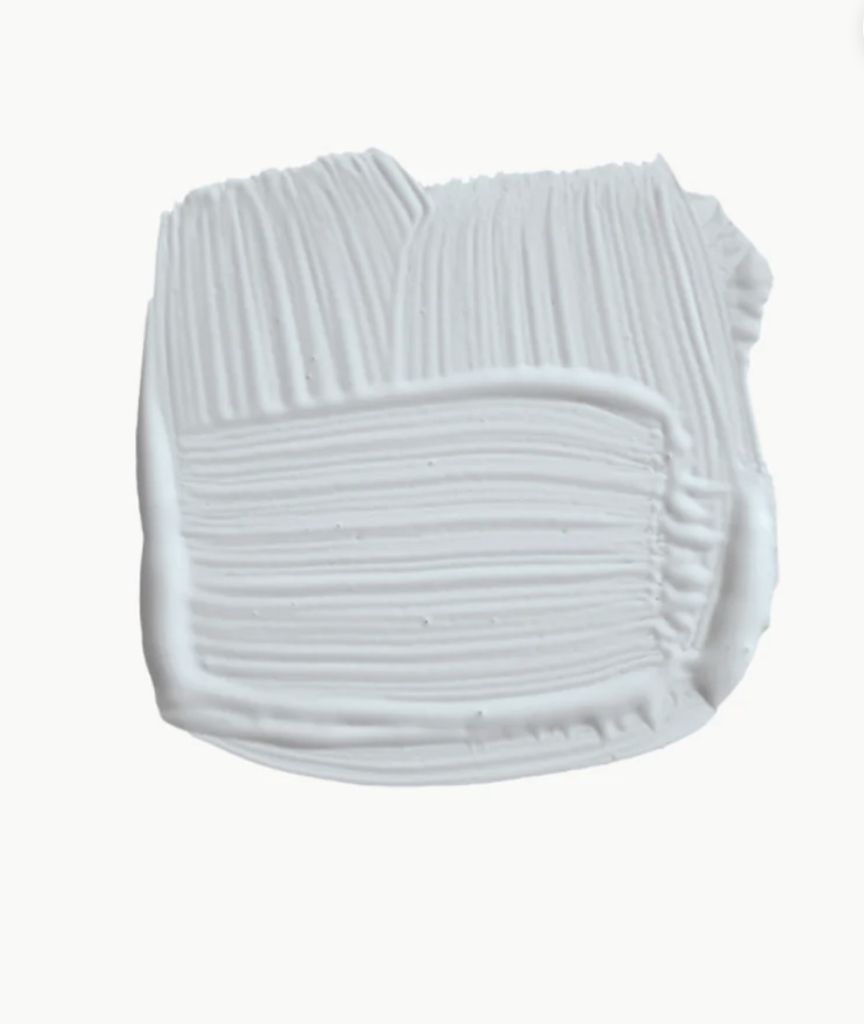
I’m also curious about whether Borrowed Light will read too light in my situations. After all, when I have used Boothbay Gray (keep scrolling for more of that hue), it is VERY light compared to the swatches you see online.
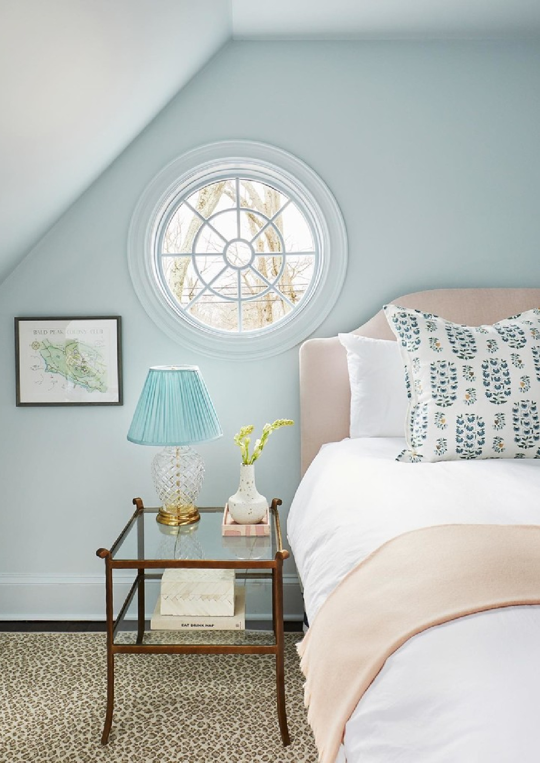
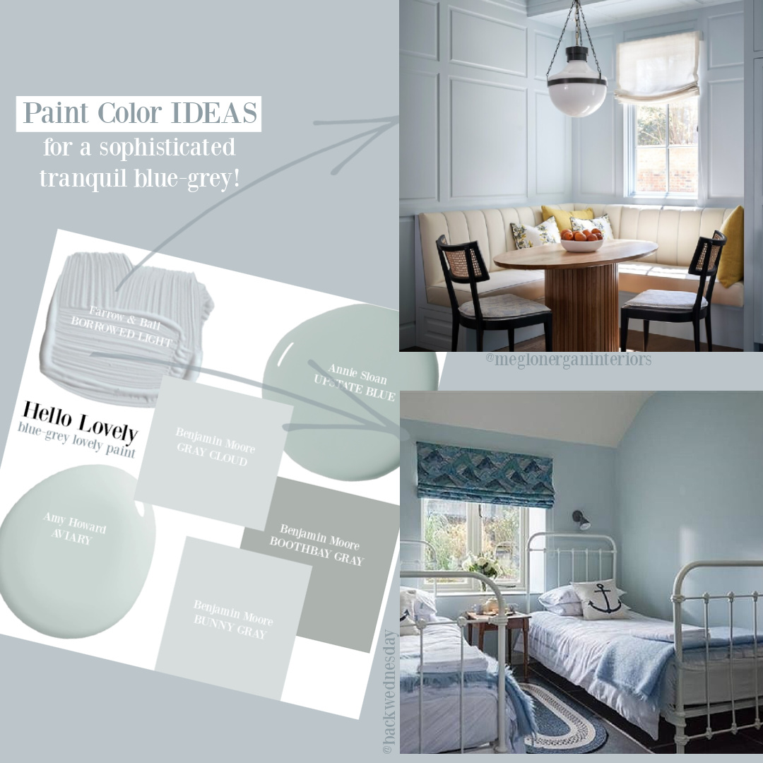
Notice how blue it appears in this bedroom above? Wow.
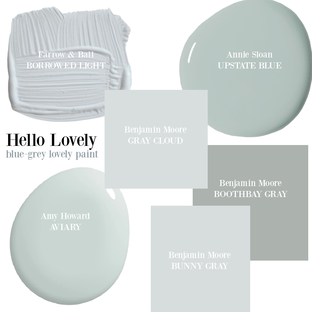
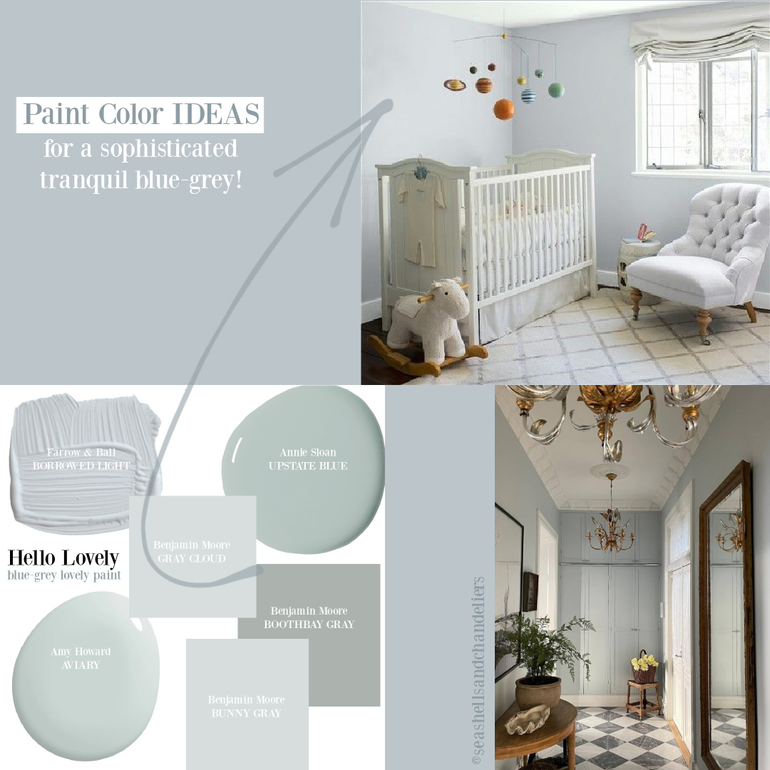
The mood board above features a collection of pretty, serene, elegant blue-grey colors which appear very similar. When you sample them together, you see their differences as undertones vary in each.
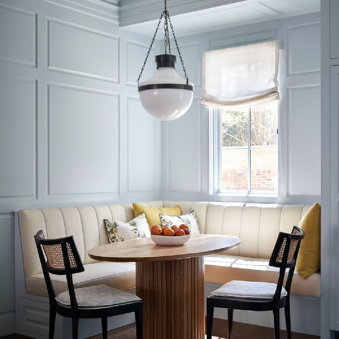
Doesn’t it feel fresh and cheerful in this breakfast nook? With little natural light (below), the same paint color takes on a different sort of character.
Benjamin Moore GRAY CLOUD
I love the gentleness of Gray Cloud, and isn’t it perfect for a nursery?

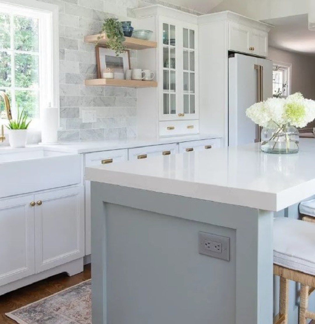
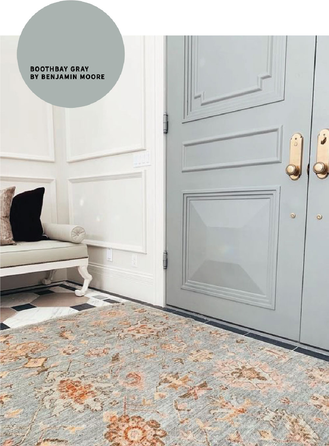
Benjamin Moore BOOTHBAY GRAY
We own a tiny house (576 square feet!) across town which we painted a crisp white with Boothbay Gray for the trim and doors. Sometimes the blue-grey looks aqua and other times a cool true gray.
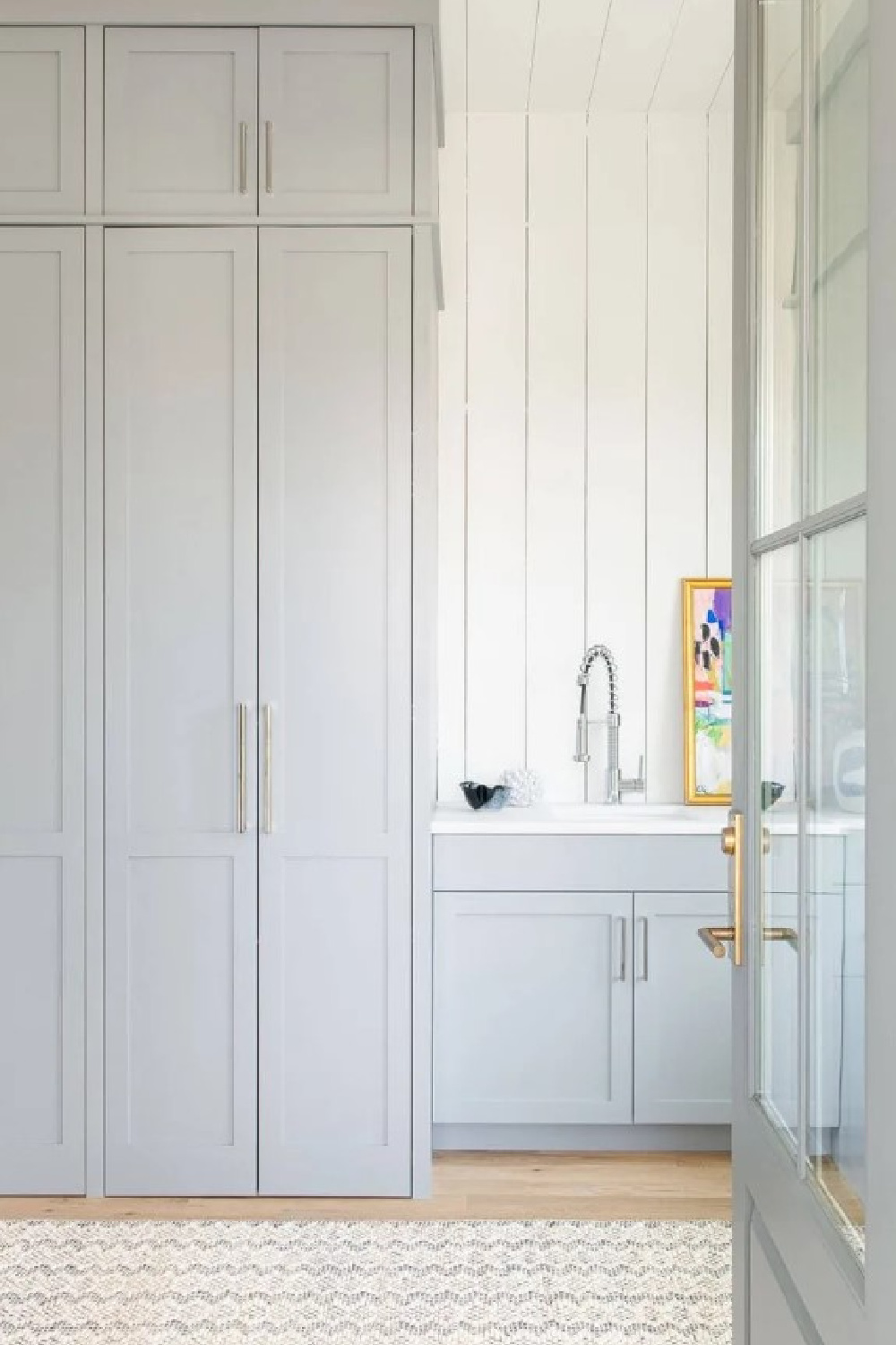
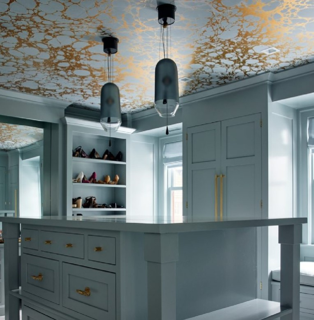
Here’s a luxurious custom closet with Boothbay Gray that feels more blue-green:
I adore how Chris Loves Julia used it on their ceiling and panels!
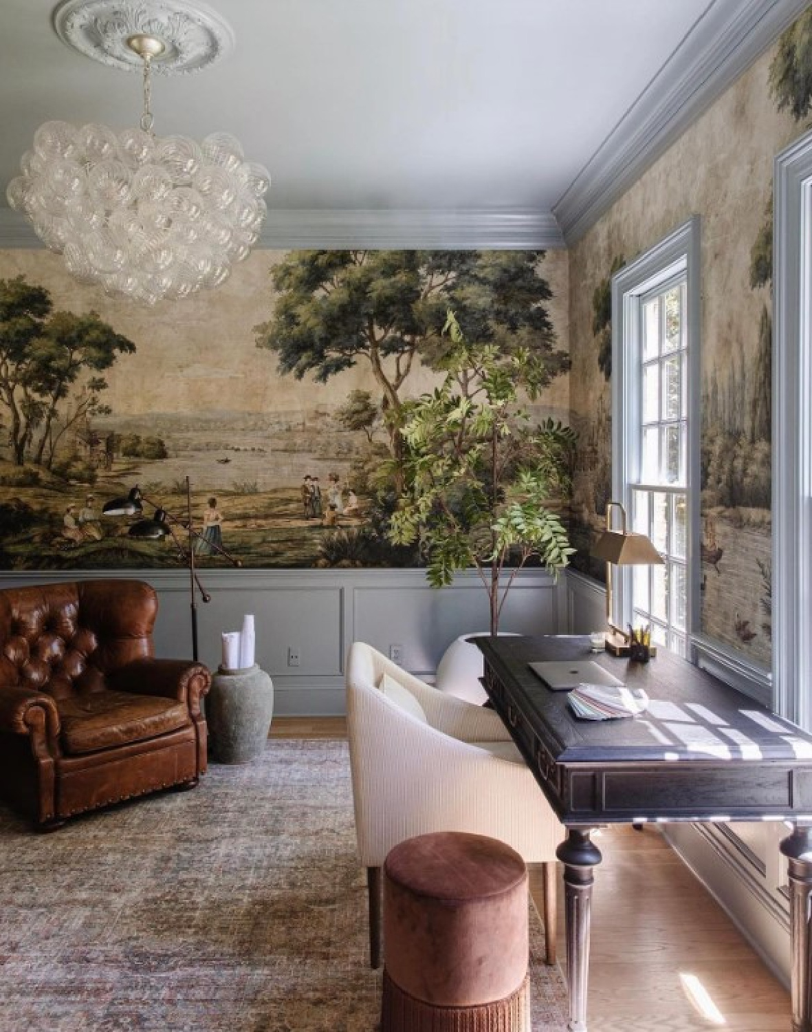
One of the reasons it’s important to sample in your space first is that all sorts of factors will influence how a particular color looks in online photos.
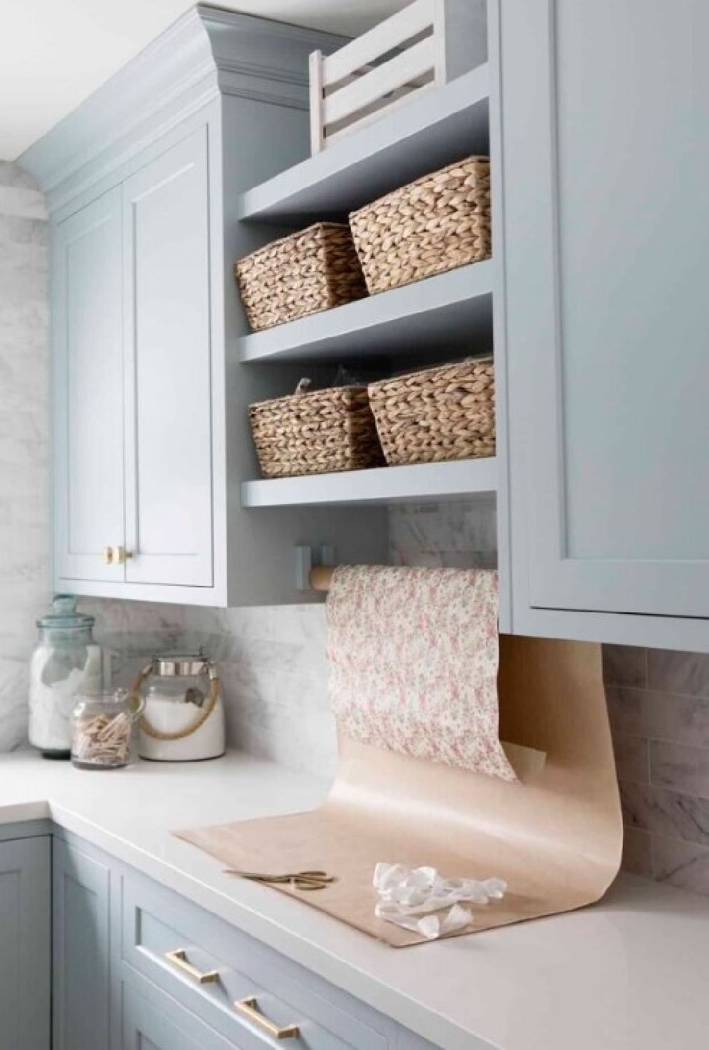
The time of day the photo was shot, the unique lighting exposure in the room, and post-photography edits all impact how the color is perceived. Notice how much greener the same paint color appears in this office area vs. the utility room above.
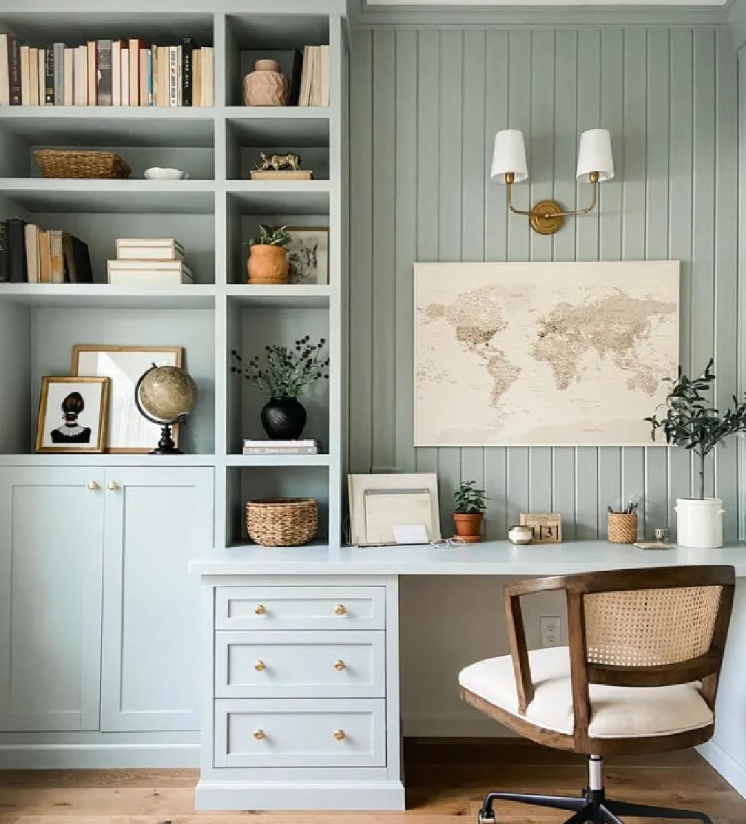
If you sample it and it’s close to perfect but still too bright or too blue or too something, you can always tweak it. Have it mixed at a lower saturation for a custom version that’s all yours.
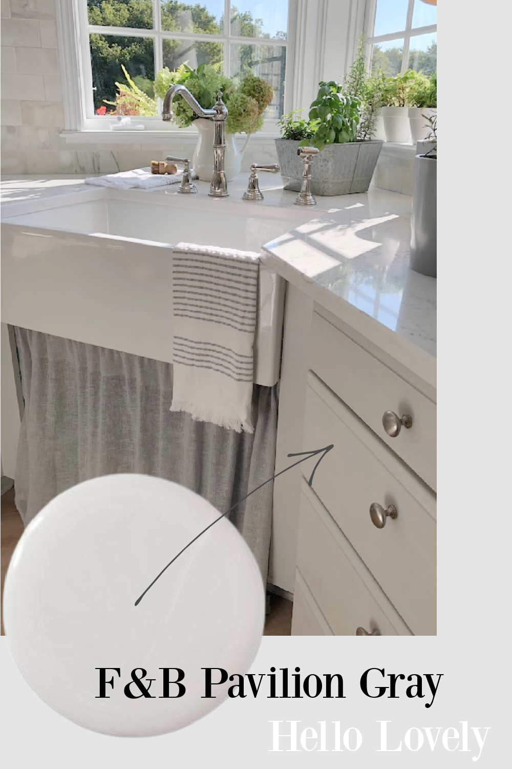
Farrow & Ball PAVILION GRAY
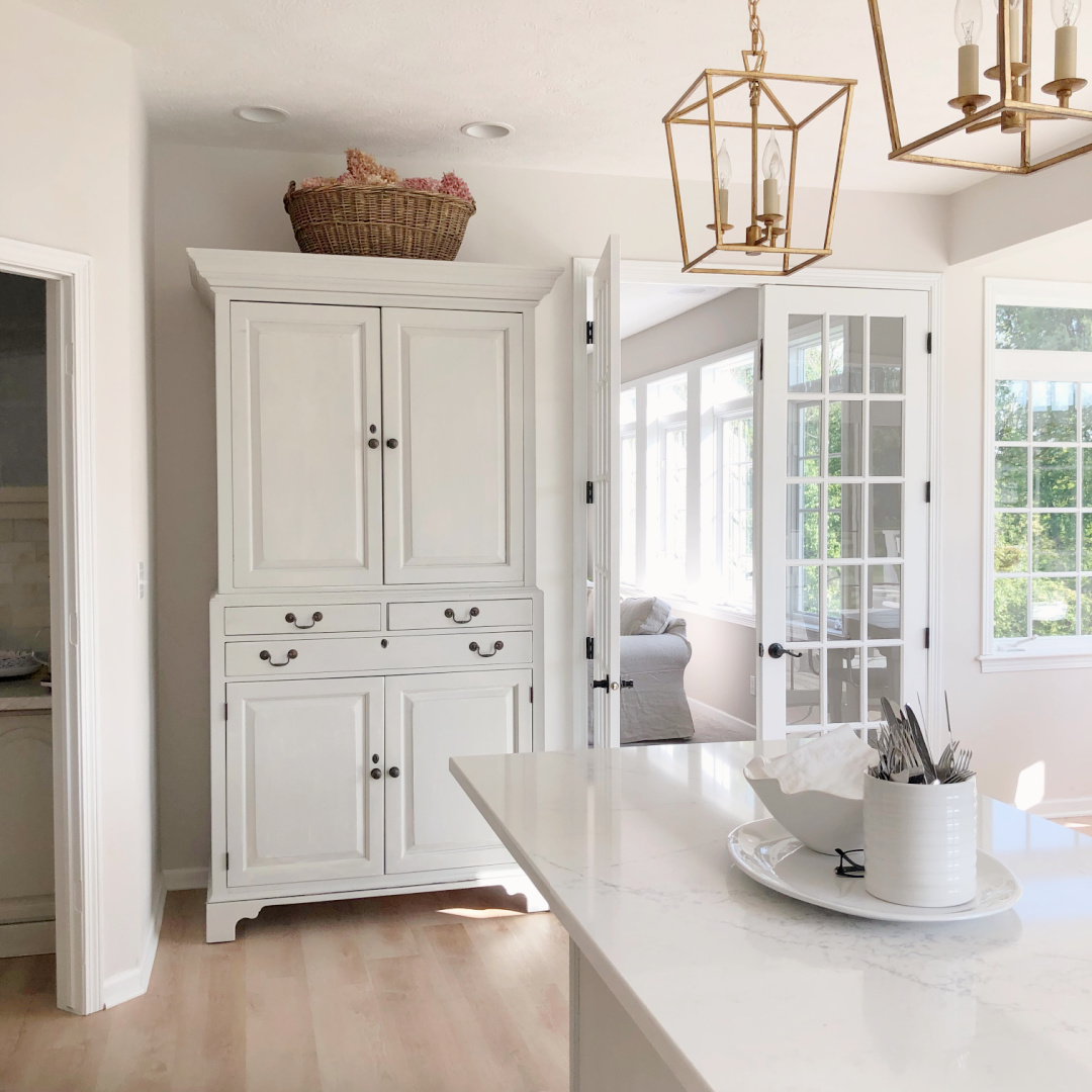
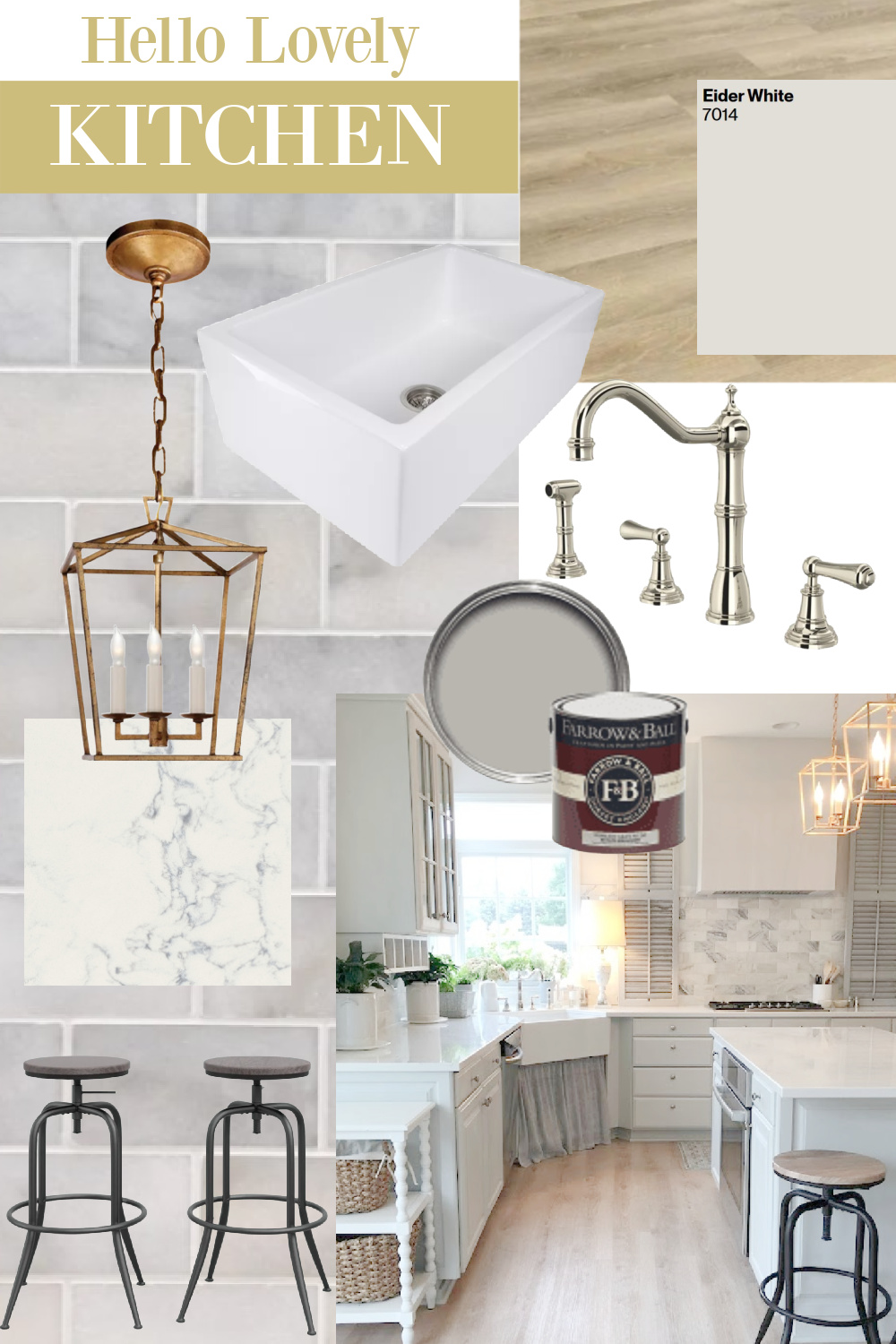
Huge fan of Pavilion Gray for many years, and for our renovated kitchen here at the Georgian, I handpainted the cabinets with the color mixed at 66%.
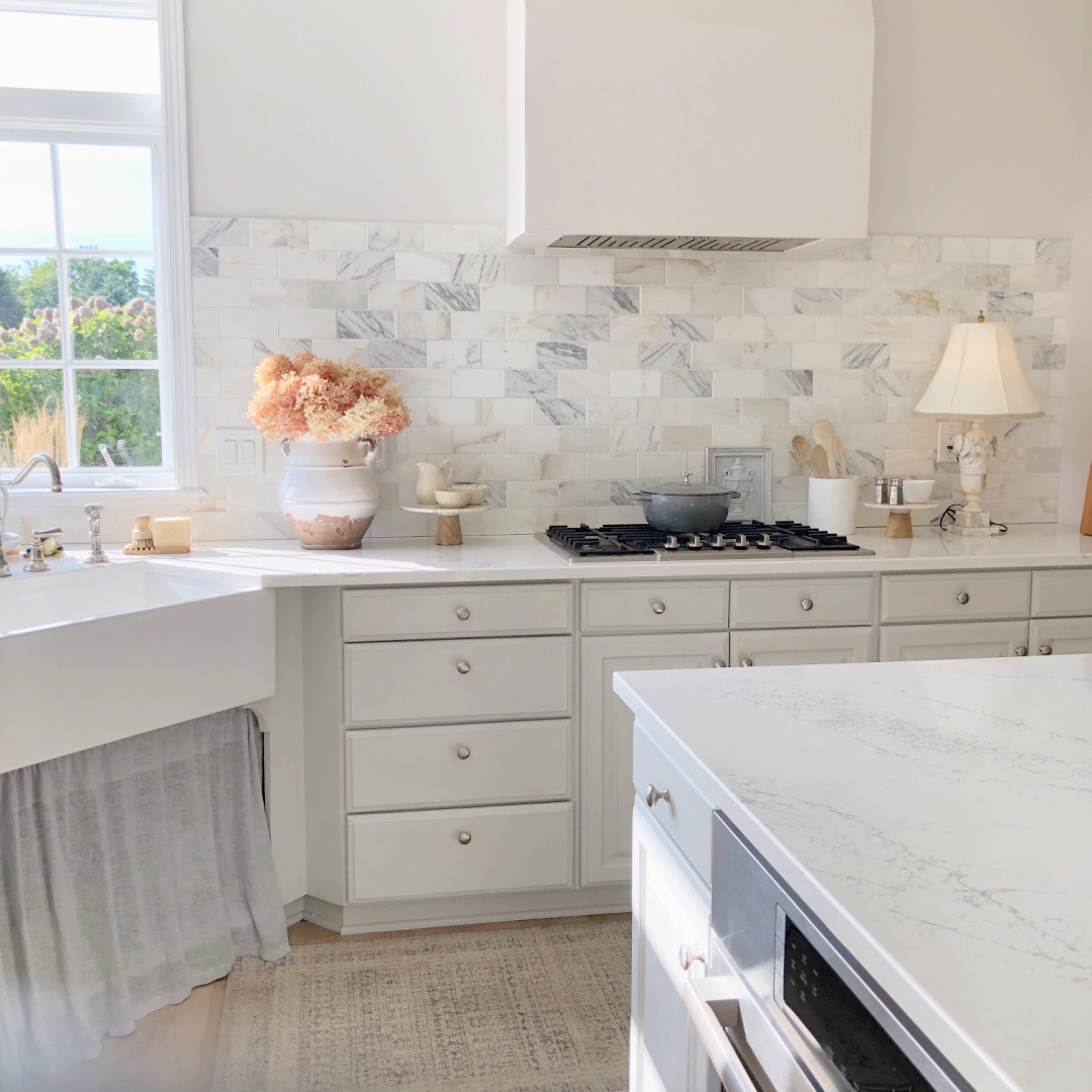
I haven’t tired of it yet, and I love how it works with the calacatta gold marble we installed for the extra high backsplash.
I placed this freestanding huge wardrobe cabinet near the French doors where there was a built-in desk and cabinets. A lot of kitchens done in the 1990s featured such desks, but it wasn’t something we wanted to retain.

More BLUE-GREY Interior Inspiration
While I don’t have exact paint colors for the inspo below, I can offer educated suggestions.
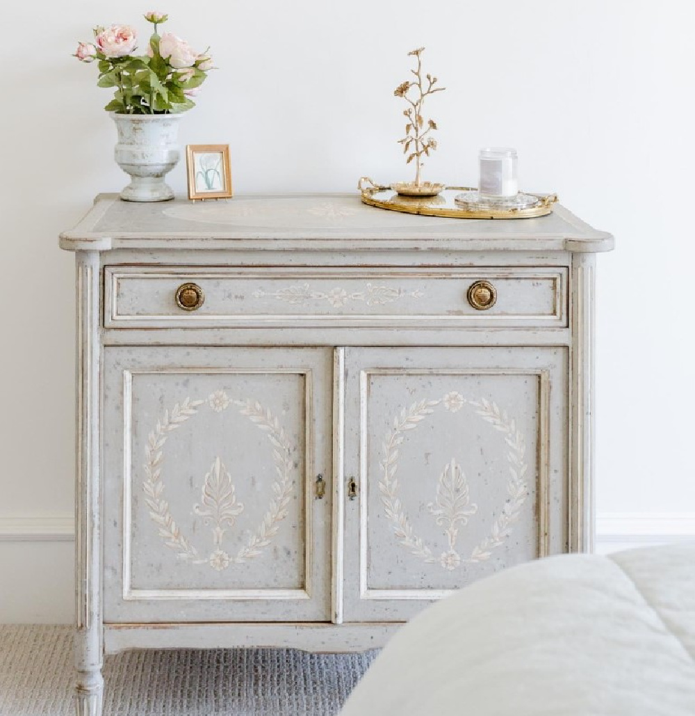
What a gorgeous distressed, chalky cool Gustavian blue-grey on the piece above! I would experiment with Boothbay Gray and a warm white to custom mix something that approaches the look.
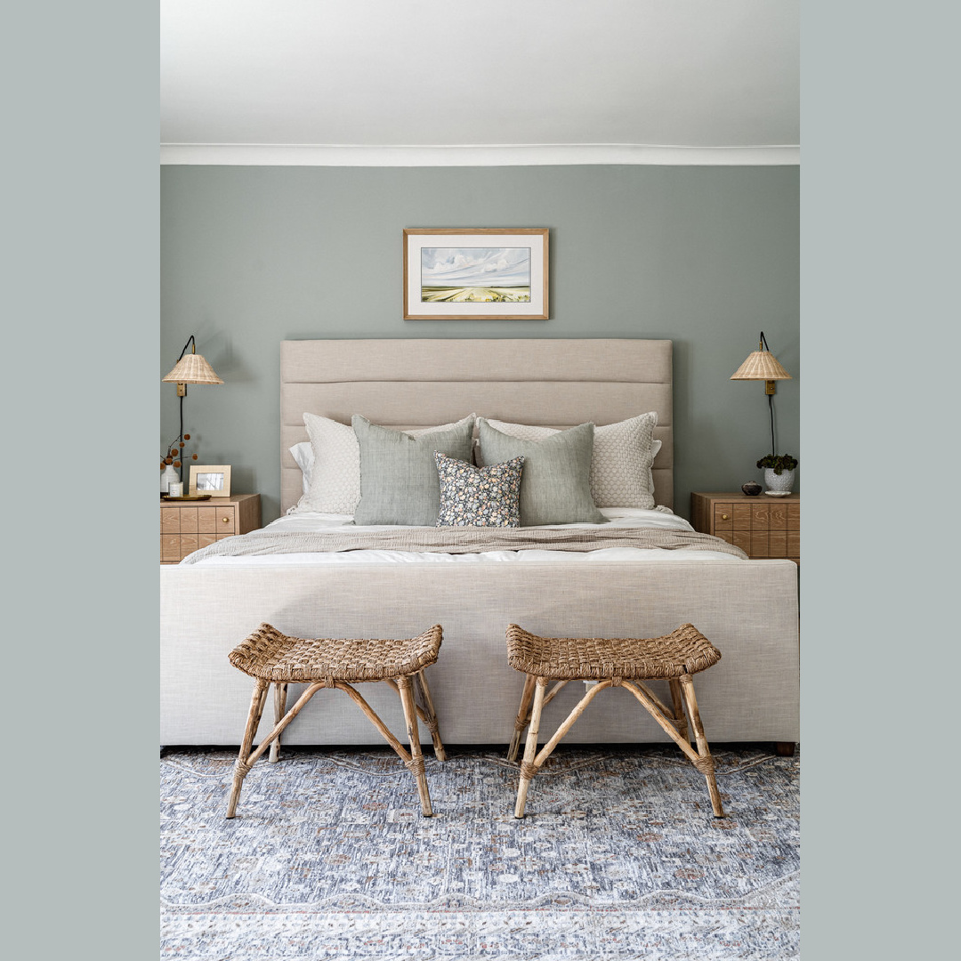
If you love green-blues, you could peek at Farrow & Ball’s color 84 above.
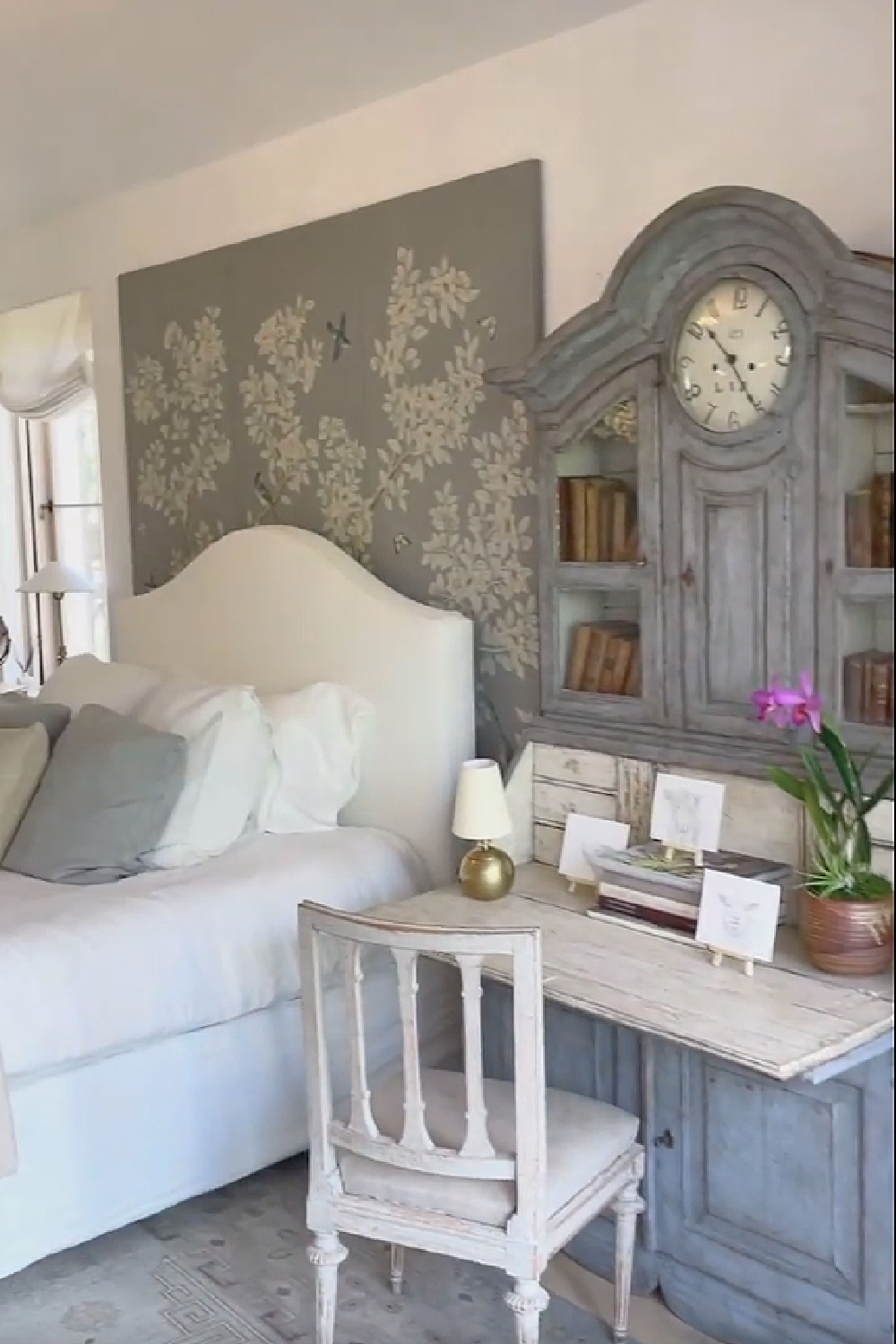
The panels (Gracie Studio) in the Giannettis’ Patina Farm bedroom capture the tranquil blue-grey elegance we all seem to find timeless and sanctuary-like.

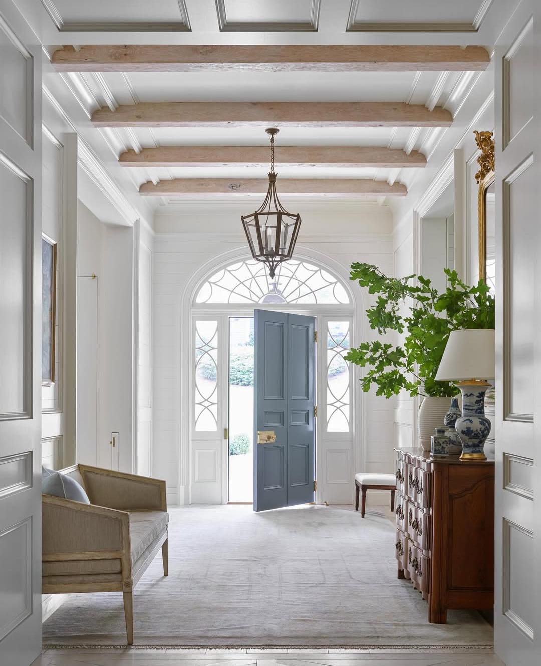
Suzanne Kasler knows her way around a Limoges blue like nobody’s business. Here’s a French blue she used in a stunning entry for the front door:
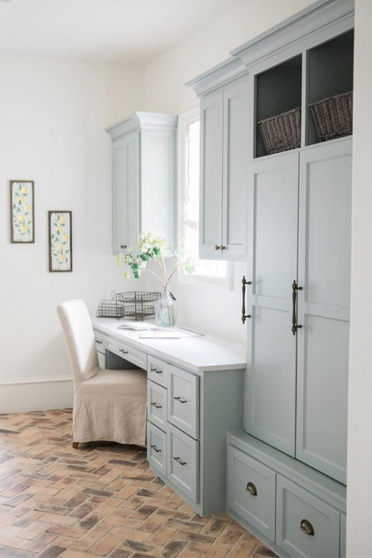
Bear in mind that many of the paint color names that begin with “silver” may offer promise for a blue-grey that isn’t too grey or too blue.
Thinking About Adding Blue-Grey Accents?
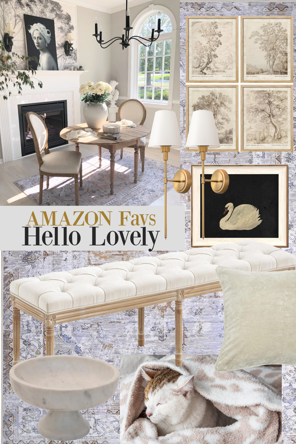
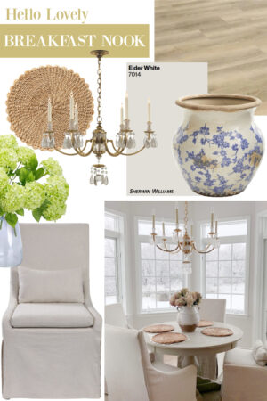
One last tip – if you are toying with the idea of adding pretty blue-grey, try living with a small rug or runner in that colorway to see if it suits you. I placed a washable area rug with grey-blue in our dining room (see the board below) for a period of time…I tired of it and now that rug is in our Arizona bedroom.
Peace to you right where you are.
-michele
I independently selected products in this post—if you buy from one of my links, I may earn a commission.
Thanks for leaving me a tip HERE and shopping HERE to keep free interiors inspiration, lifestyle, and real life renovation flowing.
Hello Lovely is a participant in the Amazon Services LLC Associates Program, an affiliate advertising program designed to provide a means for sites to earn fees by linking to Amazon.com and affiliated sites.








I just painted my main bathroom in Borrowed Light! It’s lovely and reacts well in the strong morning light we get without going too grey in the later afternoon/evening. Thank you for posting a lovely series of pictures, will be of great use as I have some decor decisions to make!
Author
Thanks for letting us know! So helpful to hear the particulars about your experience of this color. Now I want to paint our bedroom!