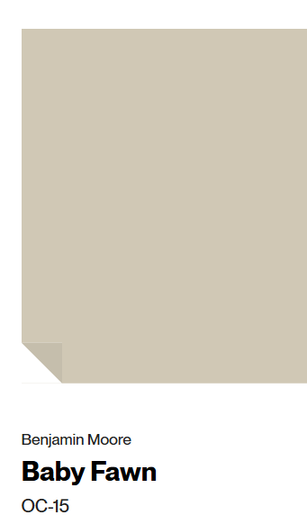
These lovely hues of mushroom, beige, putty, and limestone kitchen cabinet colors will help if you’re considering a warm white neutral color story. It can be confusing to know which paint colors to sample, and you really must SAMPLE FIRST! How else will you know if the color agrees in your particular kitchen with its unique exposure and light?
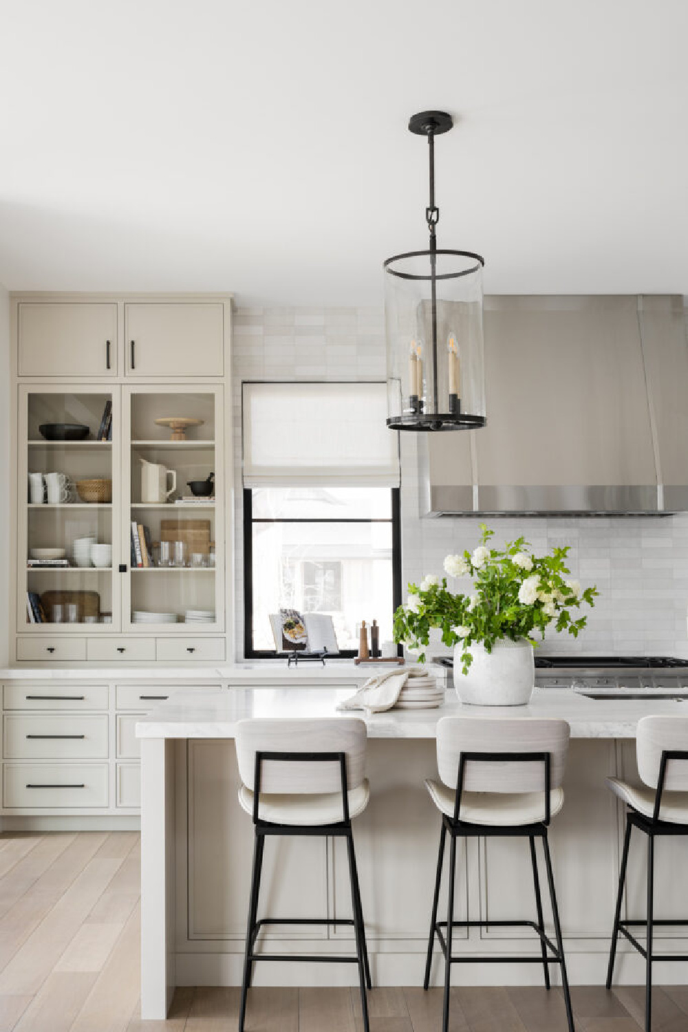
Limestone Kitchen Cabinet Colors: Try These Paints
I independently selected products in this post—if you buy from one of my links, I may earn a commission.
Limestone Paint Colors Ideas
Take your own sweet time. As you consider these neutral color possibilities to sample, keep an open mind when you note the paint color’s name or how the swatch appears on screen.
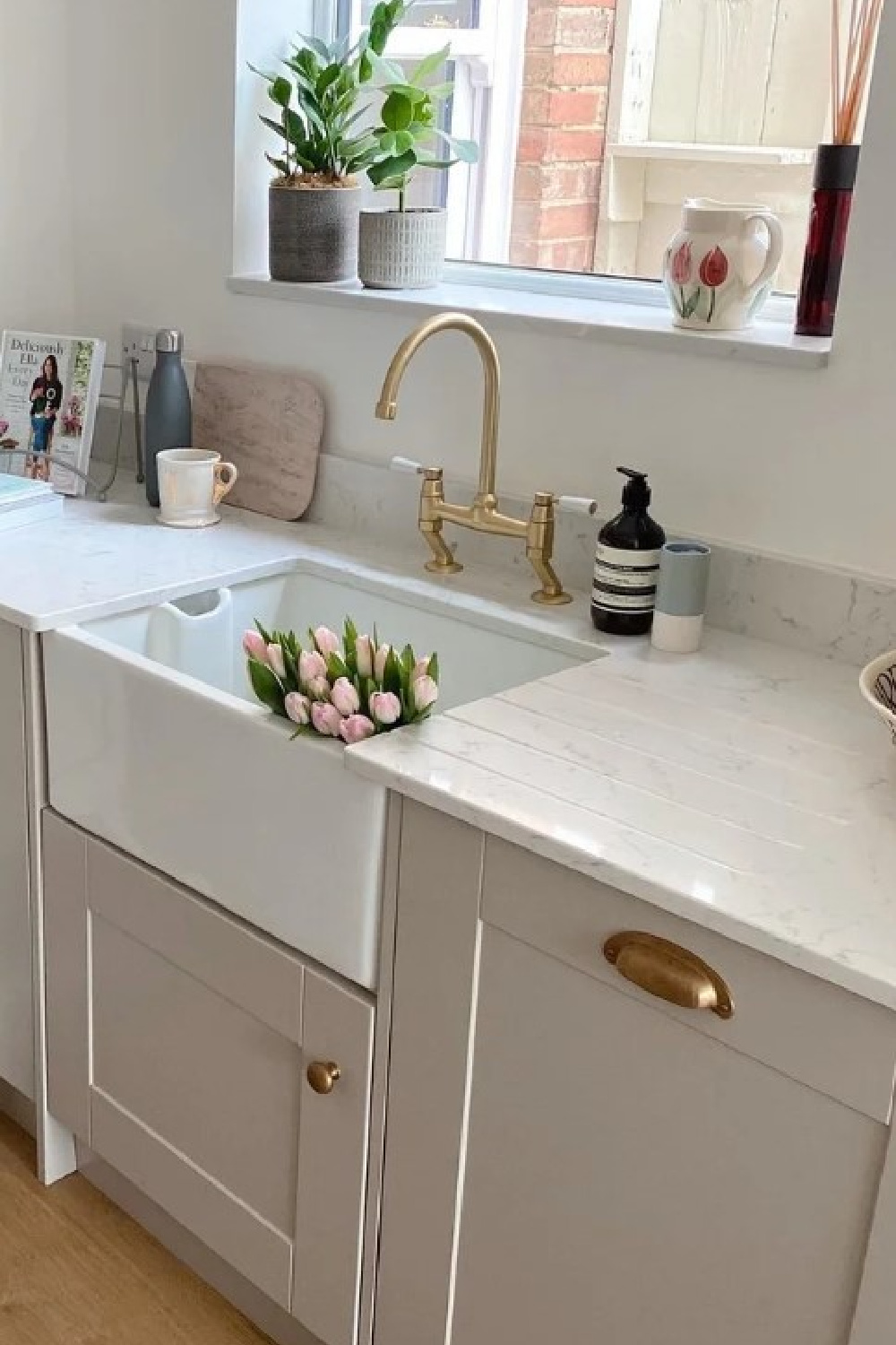
Some folks see a putty color and think “oh, it’s white.” Others surmise “that’s pale greige with undertones of mossy green and tan.” My favorite colors are those you can’t quickly reduce. There’s a mystery to them.
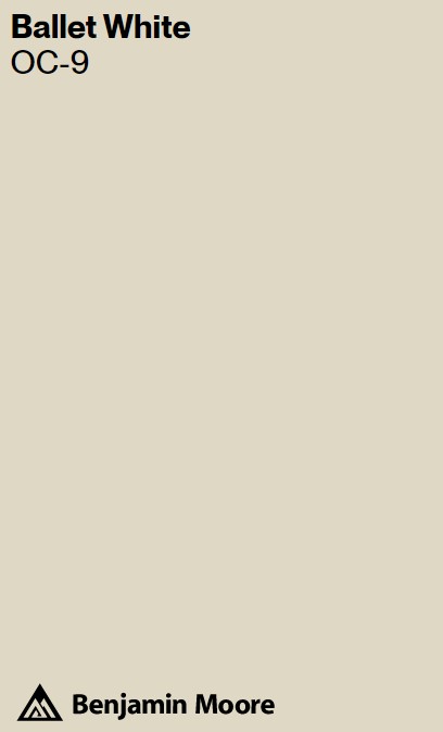
For example, the custom antiqued white of The Enchanted Home’s former kitchen (above). Notice how it has undertones of all of those natural stone colors on the tiled floor. So many followers have asked about a comparable white, and I recommend a color like Ballet White, perhaps desaturated to 60%:
Again, don’t get hung up on the swatch vs. how a color looks in a photo. In natural light, the color will be washed out.
Benjamin Moore NATURAL CREAM
Many warm whites echo elements found in nature (driftwood, mushrooms, sand) which explains why they often feel comforting and earthy.
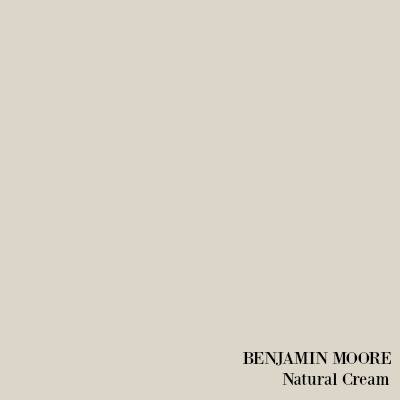
Here’s Natural Cream in a different lighting situation, and notice how it looks yellow-ish:
If you get anything at all from this post, trust me that taking it three samples at a time is your best bet at eventually arriving at the beige, warm limestone or putty color just right for your space.
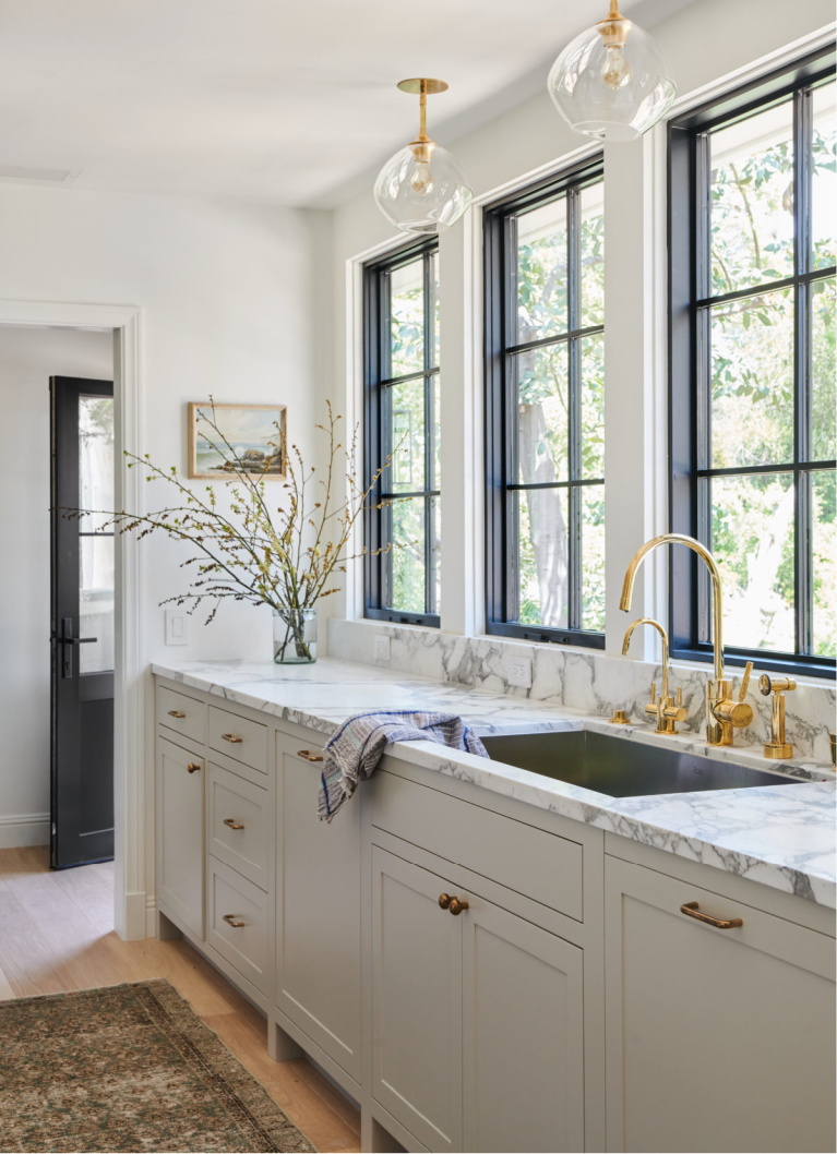
Benjamin Moore COLLINGWOOD 859
Colors vary depending on lighting, but they also look different online because of the time of day a photo is snapped.
A paint color contains multiple gradations, undertones, and combinations influencing a color’s LRV (light reflectance value).
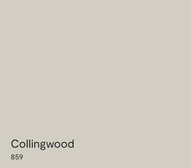
Collingwood has a LRV of 61.52 so it is on the lighter end of the spectrum and will reflect 61.52% of light.
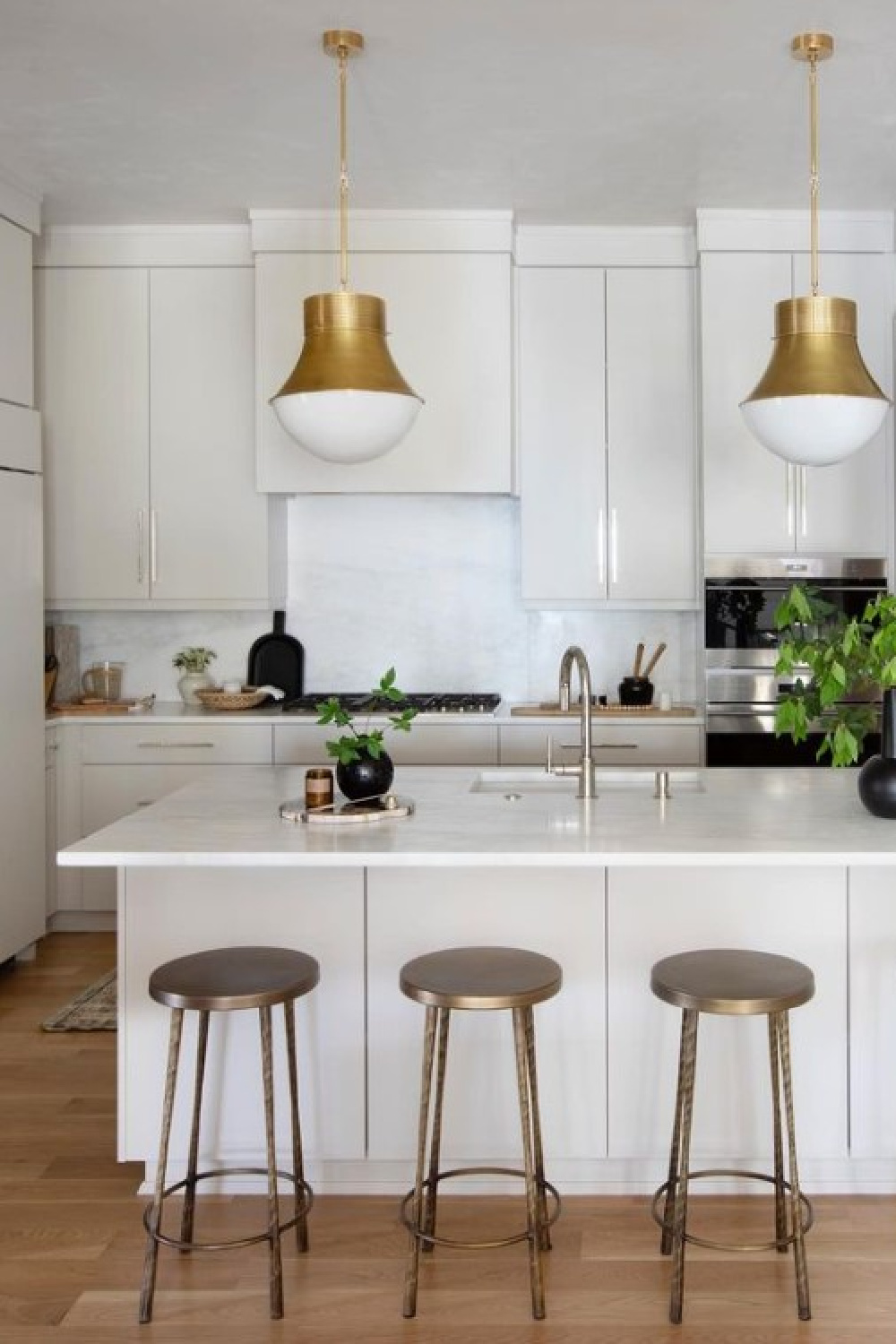
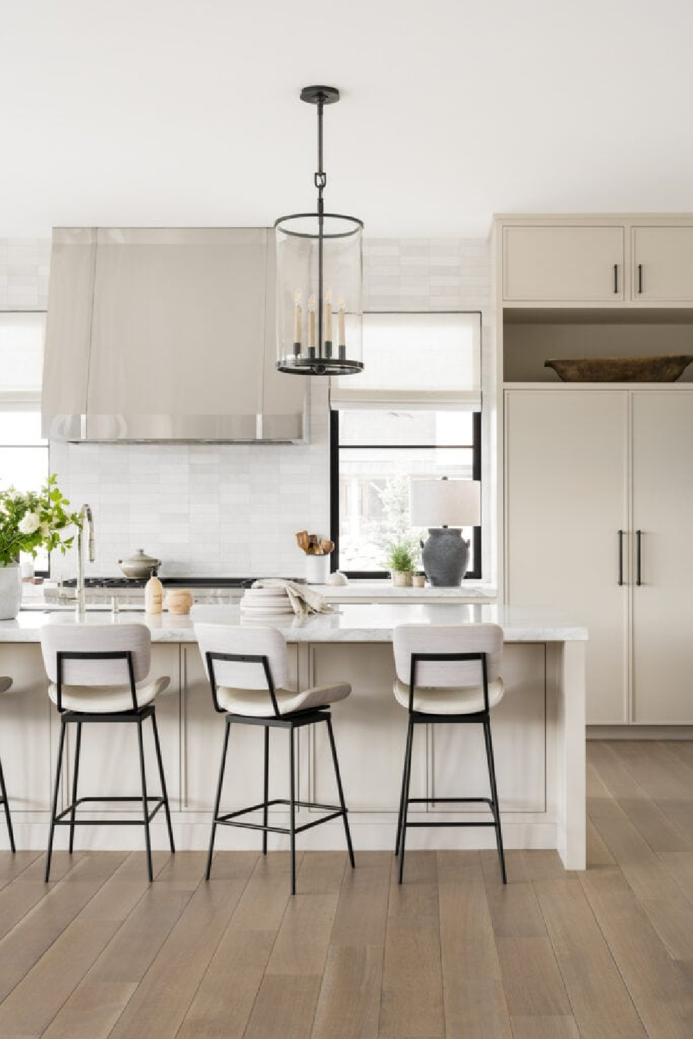
On kitchen cabinets above, Collingwood appears rather light. Since kitchen photos online are often edited, photoshopped, and snapped at a particular hour of day in a particular geographic region, it may look completely different in your context.
Another factor to consider when referencing paint colors online? The color may have been tweaked (for example, mixed at a lower saturation which essentially means creating a custom color).
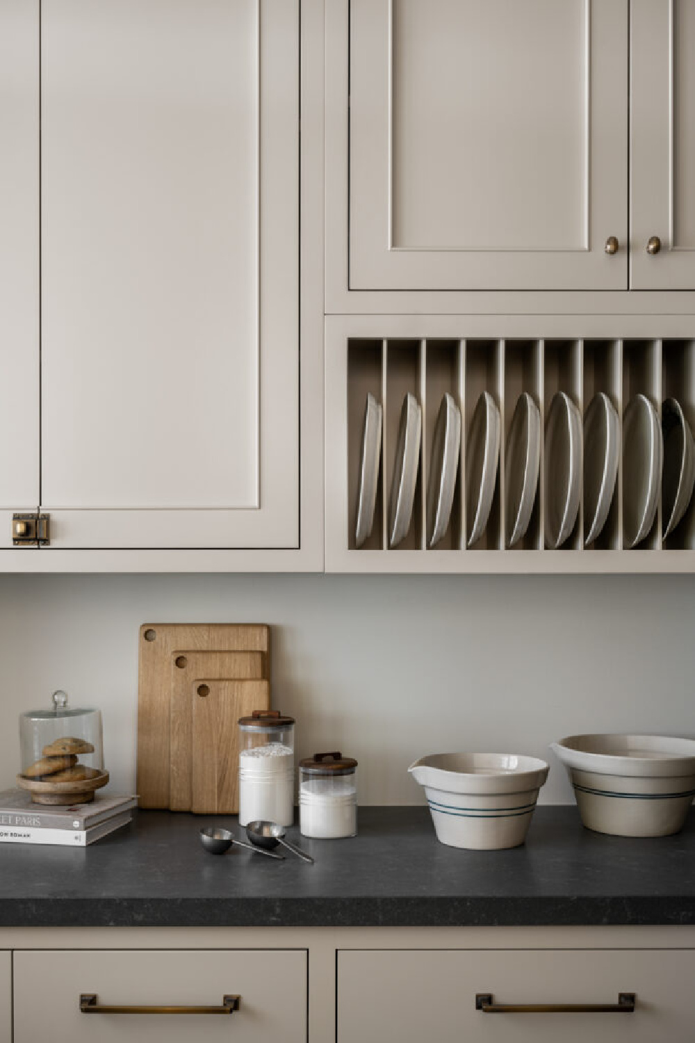
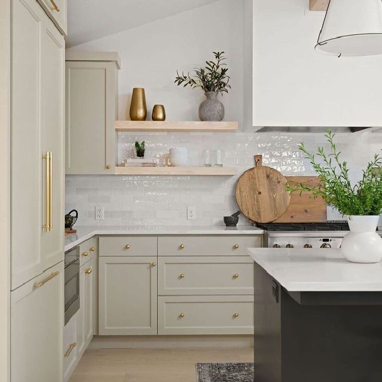
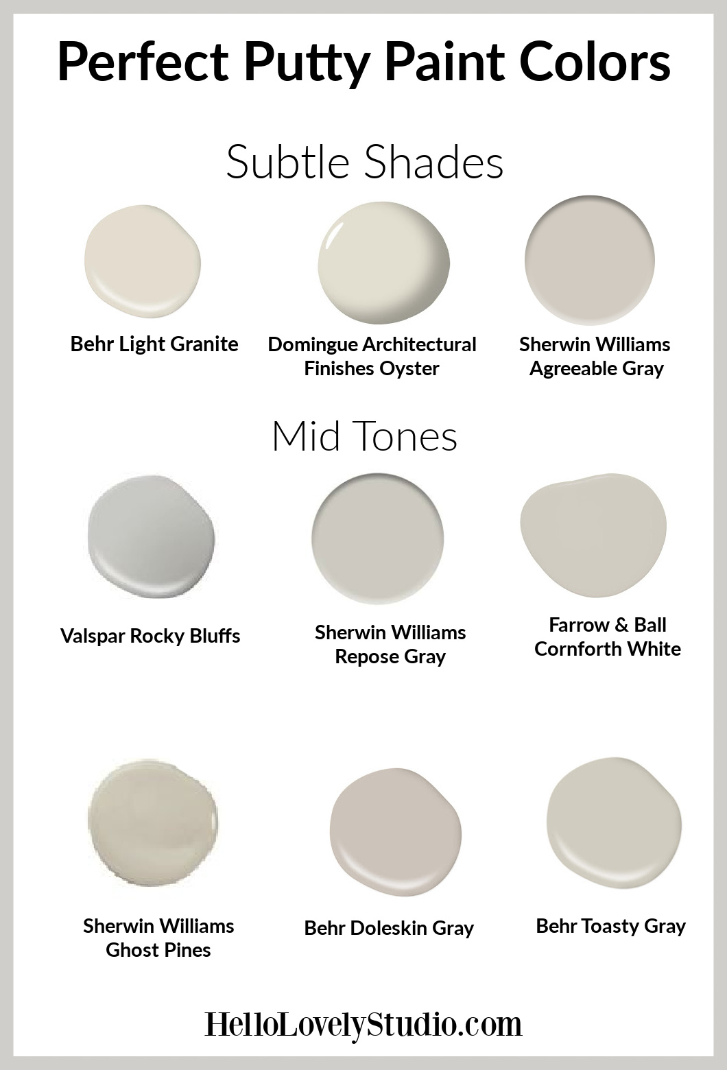
SHERWIN-WILLIAMS Gallery of Putty Colors to Sample

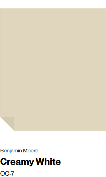
Benjamin Moore CREAMY WHITE

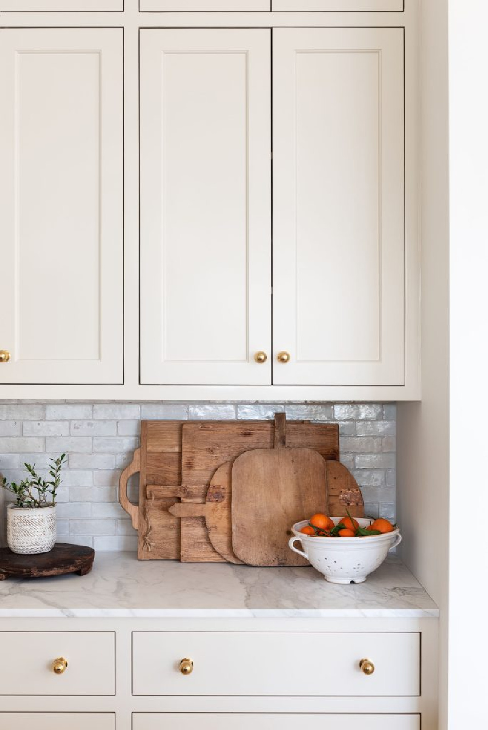
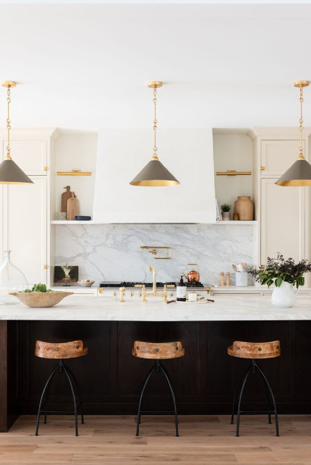
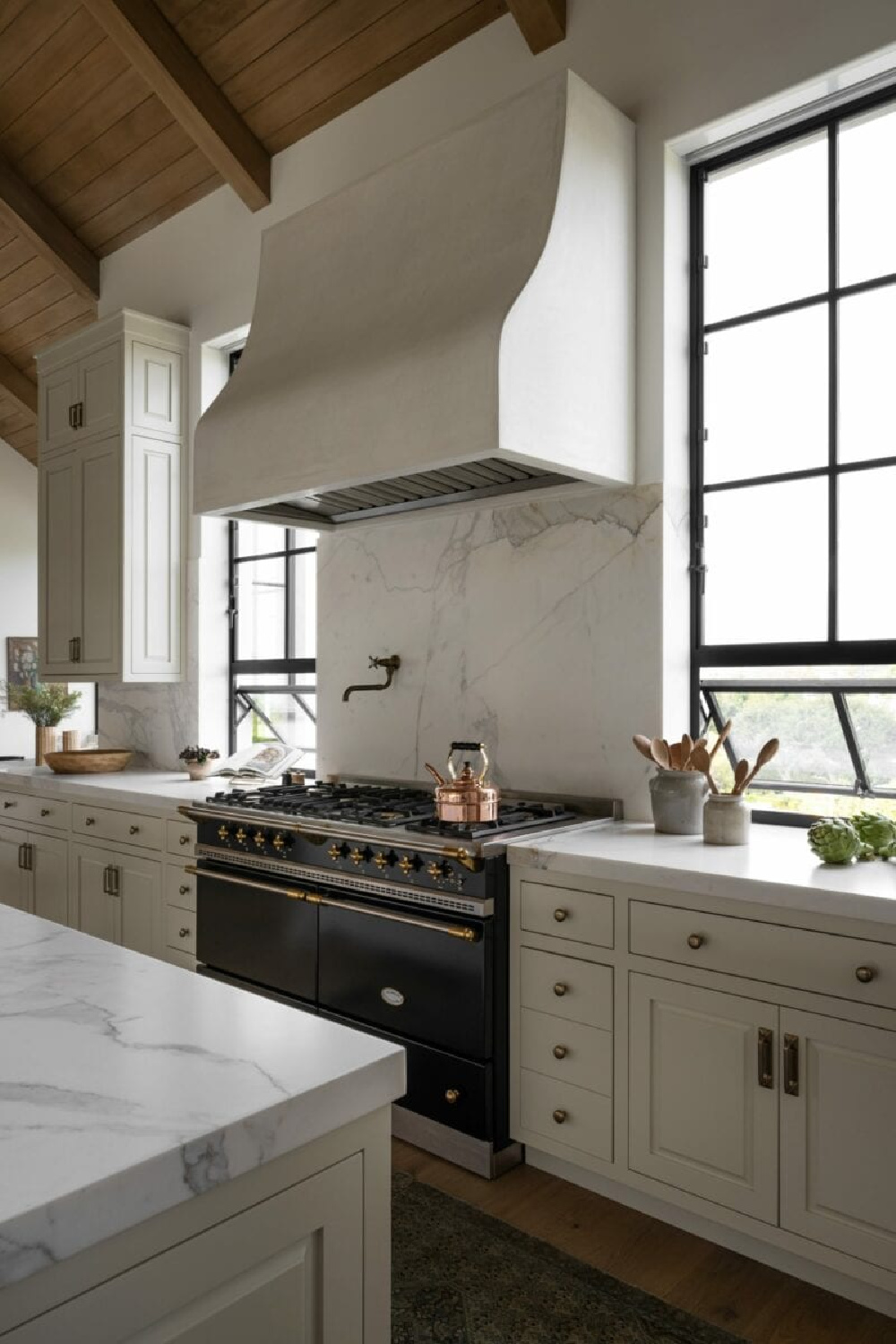
Photos of Benjamin Moore BEIGE Possibilities
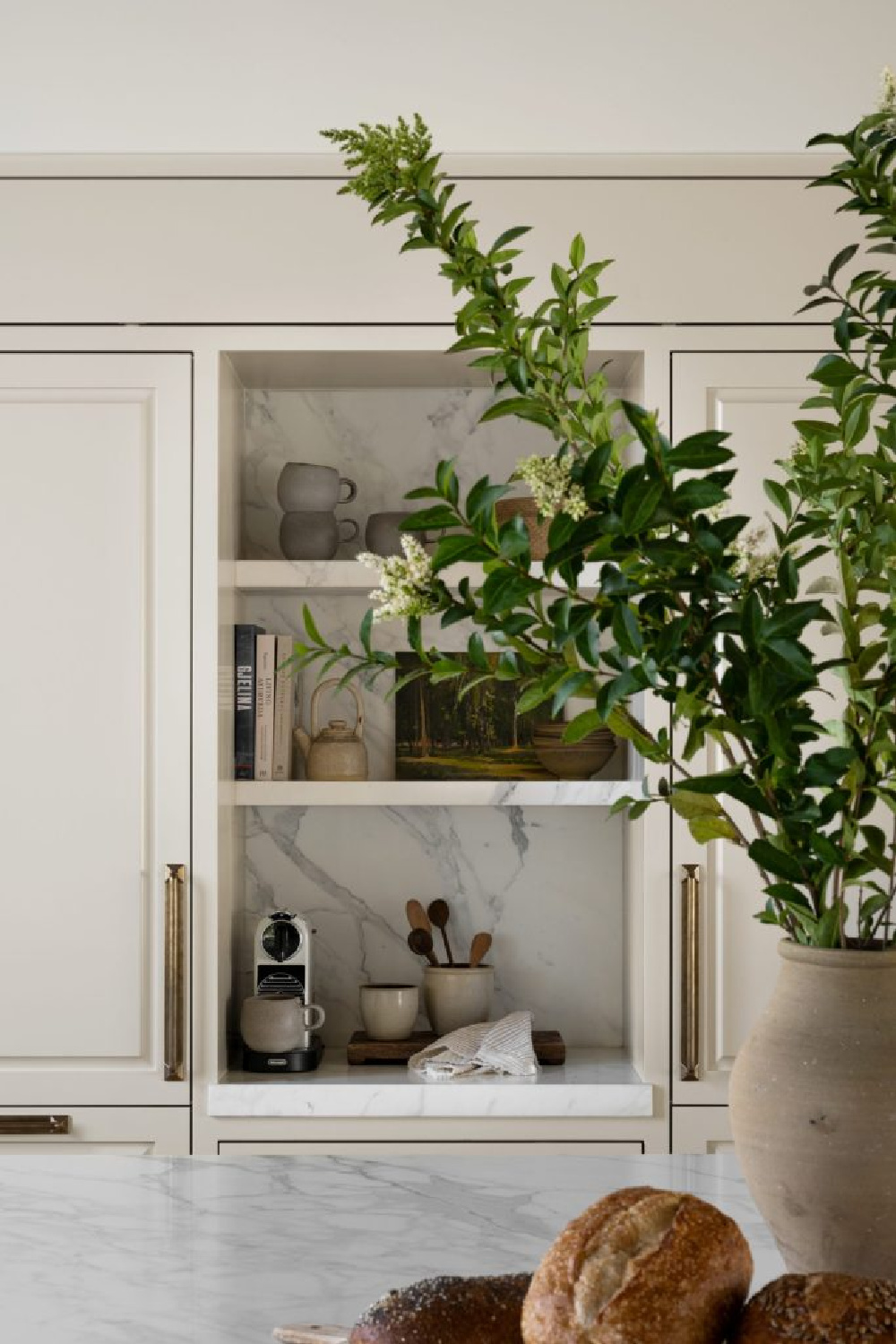
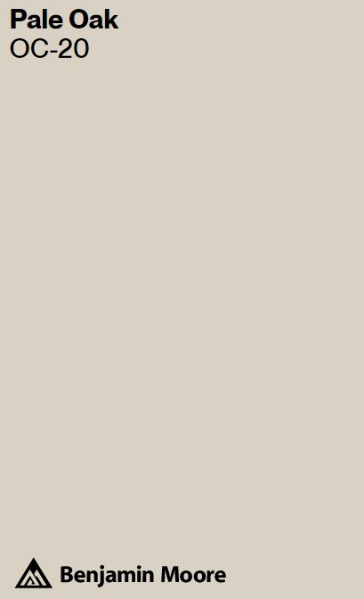
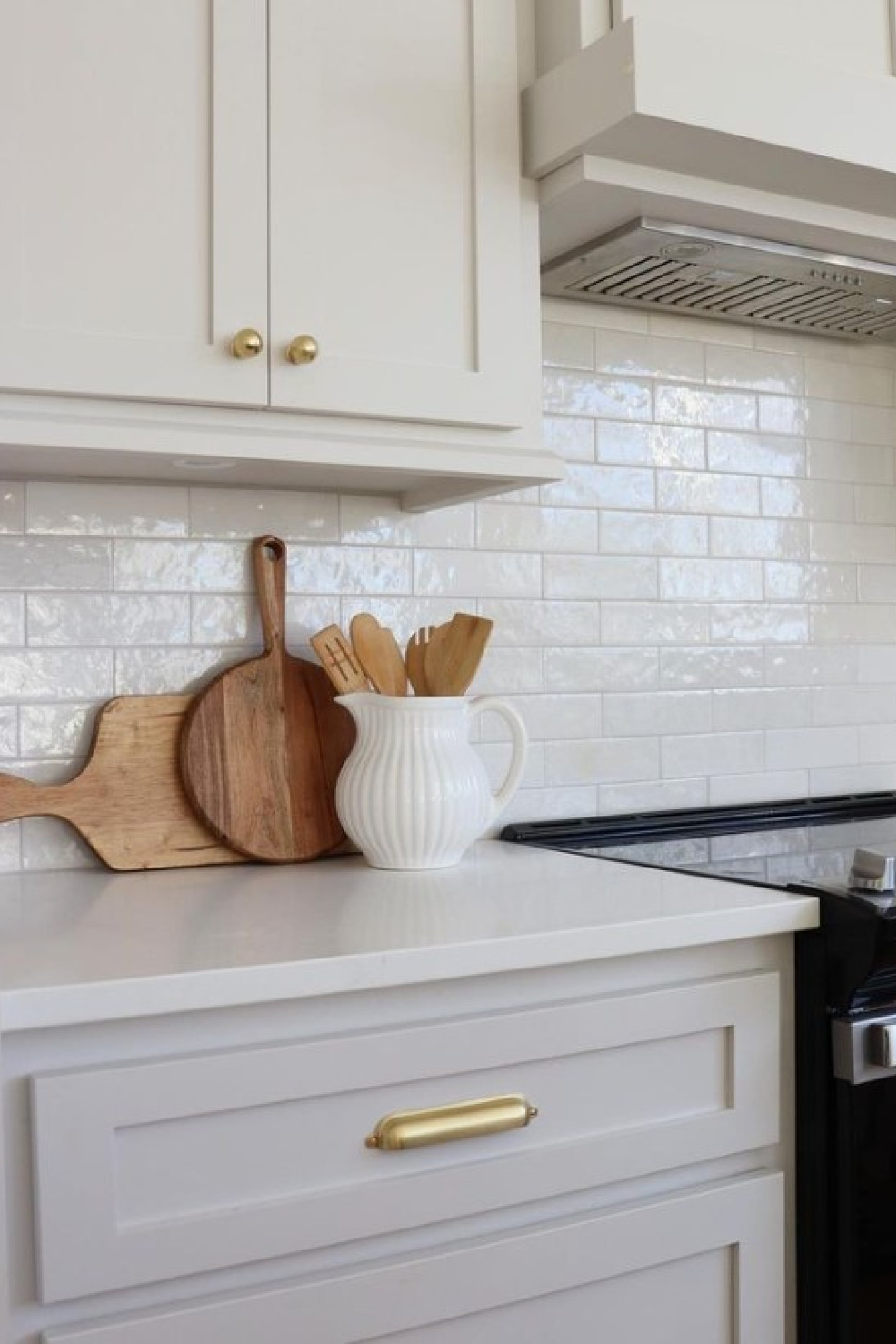
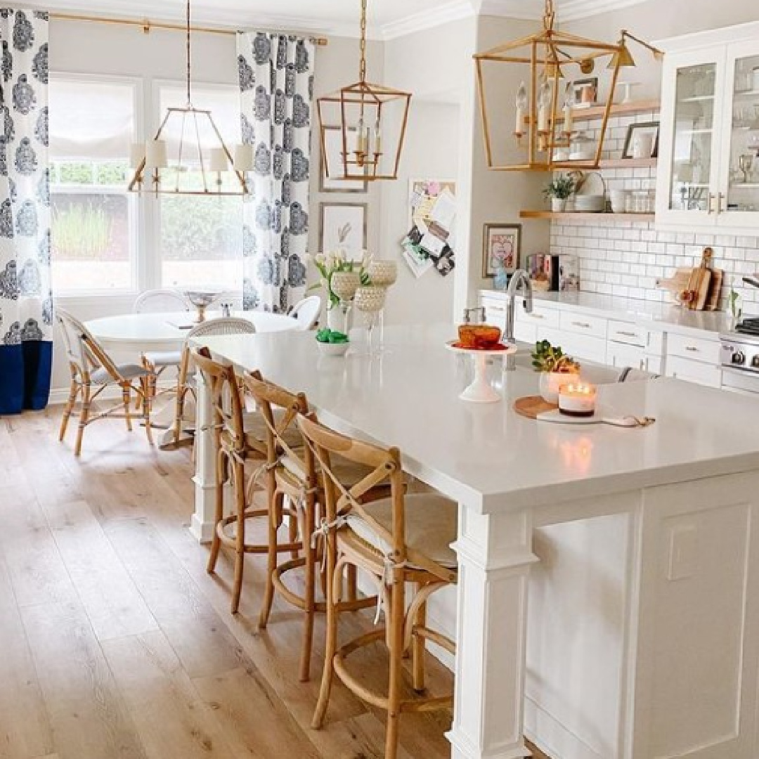
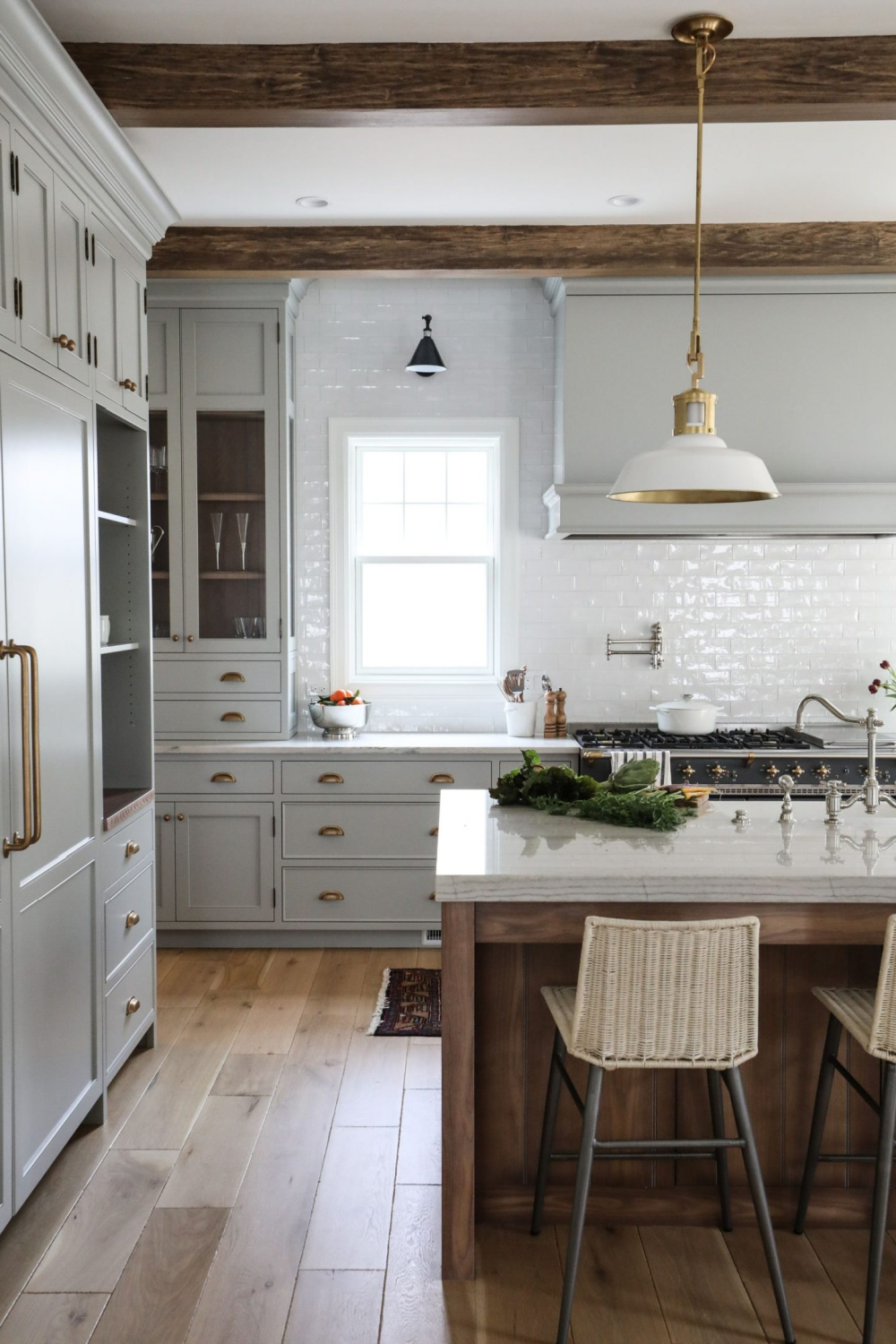
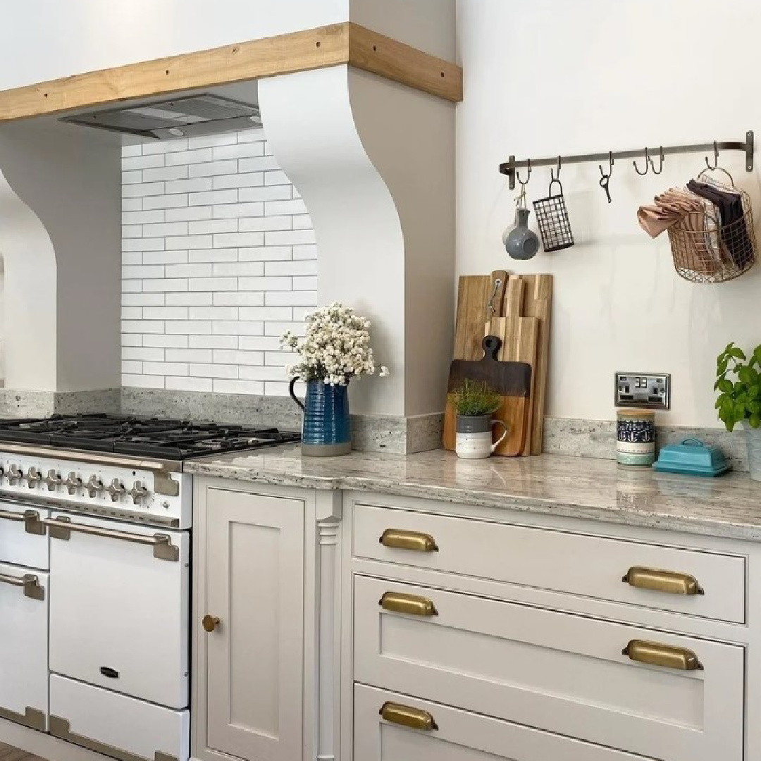
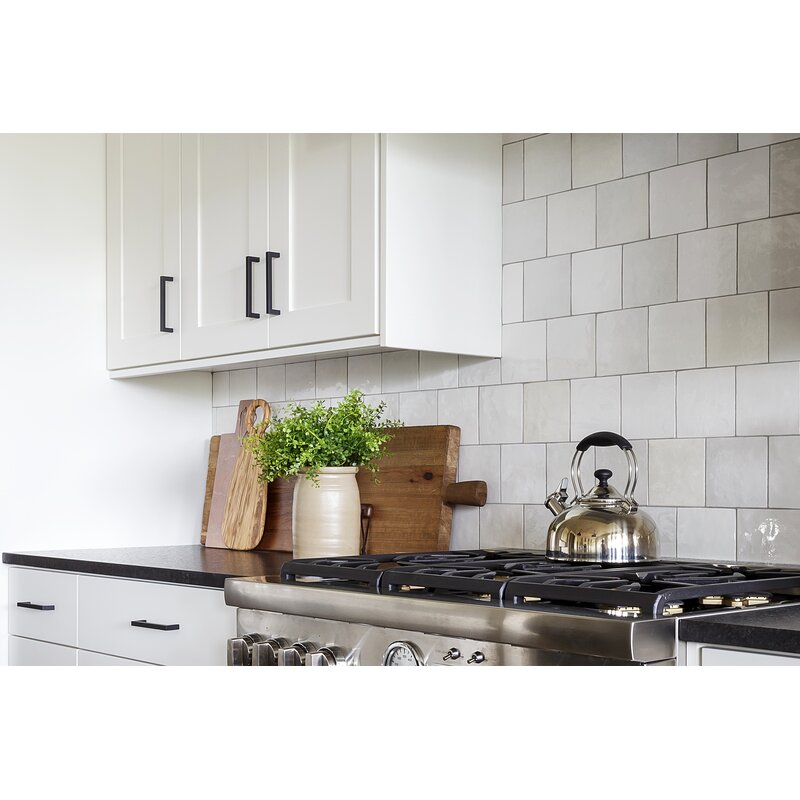
Pale Oak is a warm greige with warm grey undertones and light reflectance value (LRV) of 68.64. More reflective and a bit more light than Collingwood.
Here is Pale Oak in a kitchen with glazed subway tile:
If you have a color consultant’s help (that’s me!), it can often be more helpful to have a photo reference than to know an exact color from the project.
Not only will an expert be helpful to recognize undertones, experience with paint colors matters.
For example, I have a wealth of experience using a variety of beige colors including BM Pale Oak and BM Ballet White. Pale Oak is a little more of a greige while Ballet White has a bit more green to it. Ballet White looks with abundant natural light and how it looks at night with artificial ambient light.
Torn Between Two Neutrals?
This happens often. Maybe one light greyed-white is a little too cool and the other warm beige is just a bit off. Yet both seem like worthy contenders.
Let’s say you like Pale Oak but after sampling, it feels too brown in your kitchen…
And maybe you also like BM Classic Gray but you feel it needs a bit more warmth…
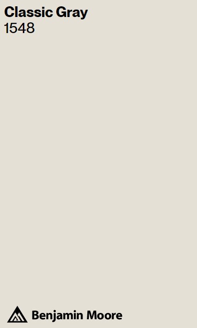
You can mix them 50/50 or 60/40 or at a proportion you favor. Or maybe you notice Classic Gray is just about perfect yet you want a more saturated gray.
It’s not complicated to arrive at a custom color. I’m not suggesting you manually mix big gallons of paint for a custom color. Instead, talk to the paint expert at the counter, explain what you’re after, and have the color mixed in a sample. From there, tweak it until it’s right.
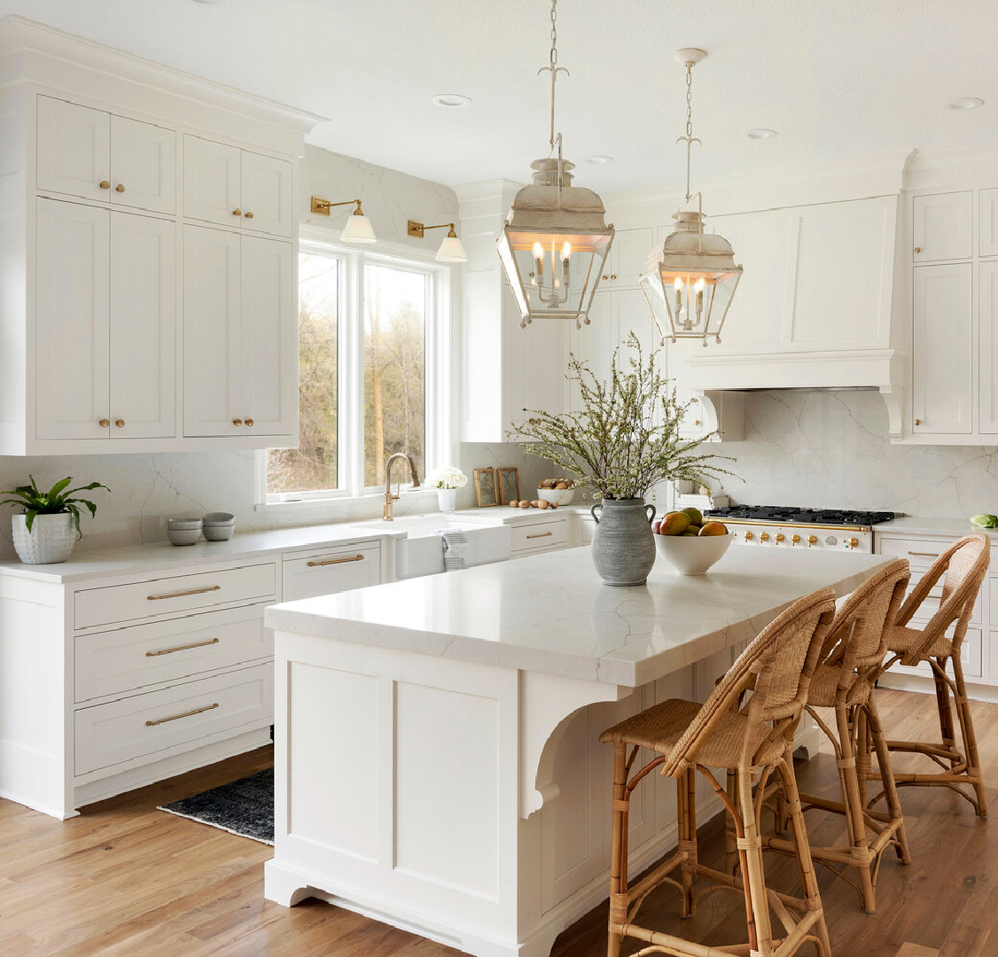
Which White for Walls With Warm White Kitchen Cabinets?
After you decide on a cabinet color, you can visit its description online, and typically, there will be suggestions for coordinating colors. In most cases, you’ll want a white with similar undertones as the cabinet paint. So a beige color with warm grey undertones could be paired with an off-white with grey undertones.
When you begin exploring white paint colors for walls and testing samples, you may feel overwhelmed quickly.
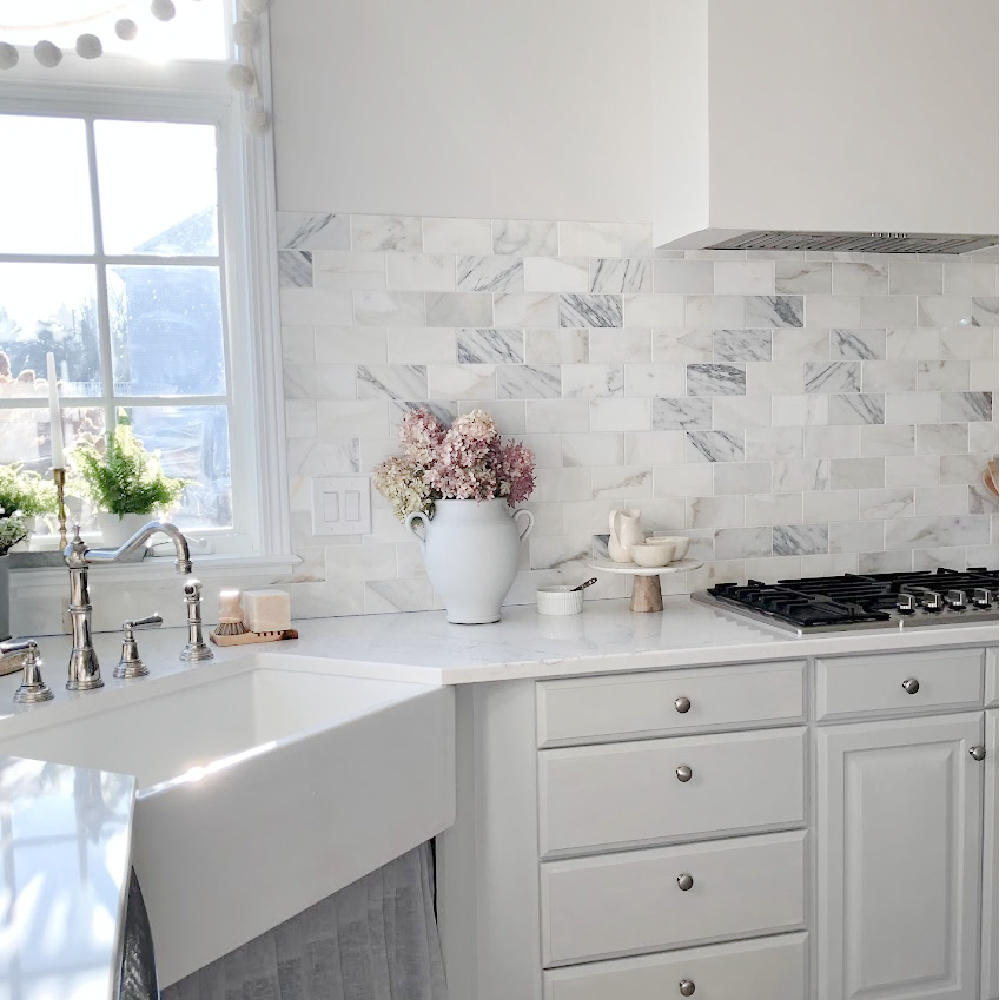
That’s why I think viewing images online is extremely helpful. You’ll be able to decide if your eye prefers a little contrast between cabinets and walls or a lot. You’ll start to note specific relationships such as how white marble below harmonizes with the warmth of greige cabinetry.
Consider the Contrast
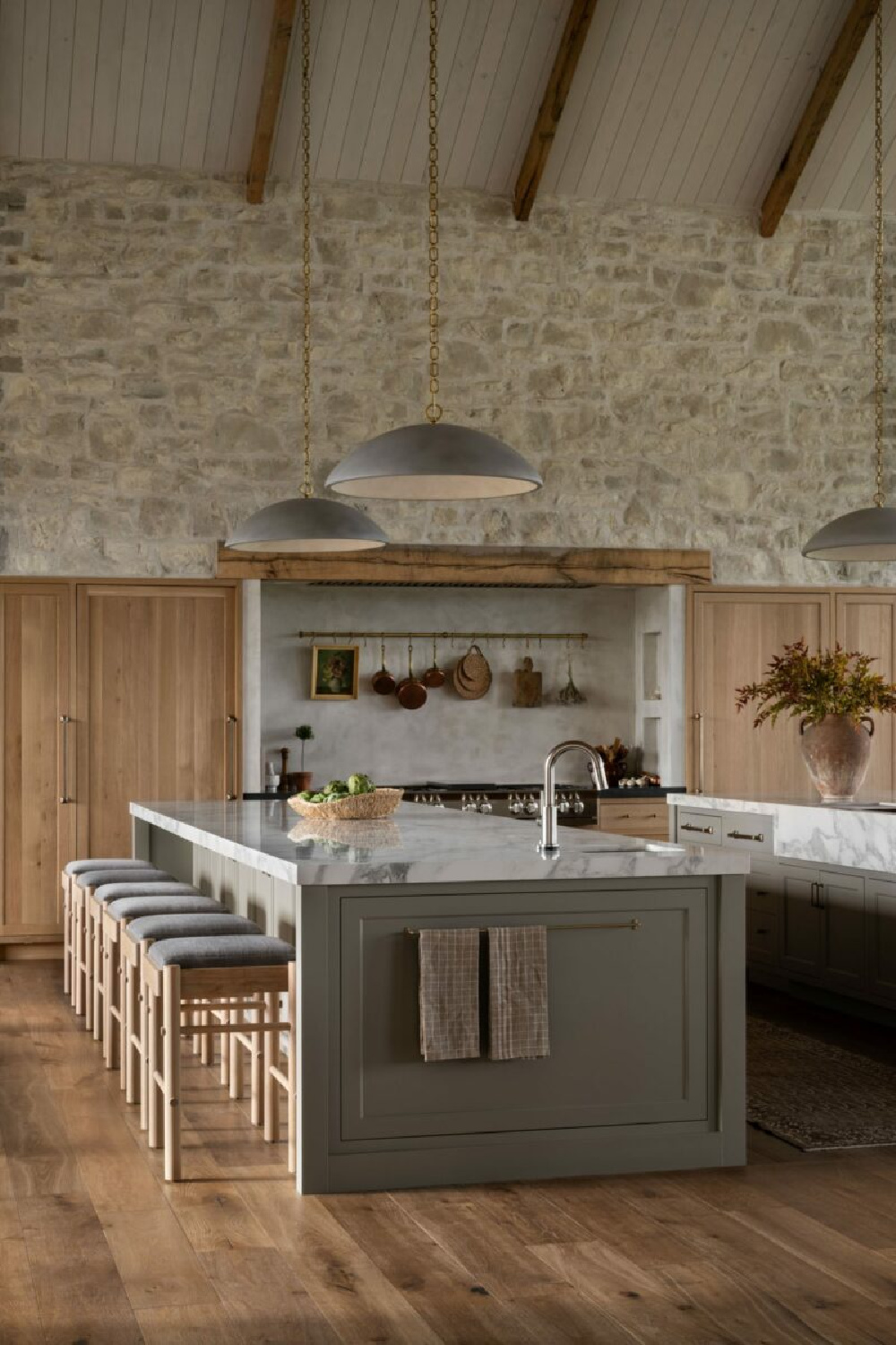
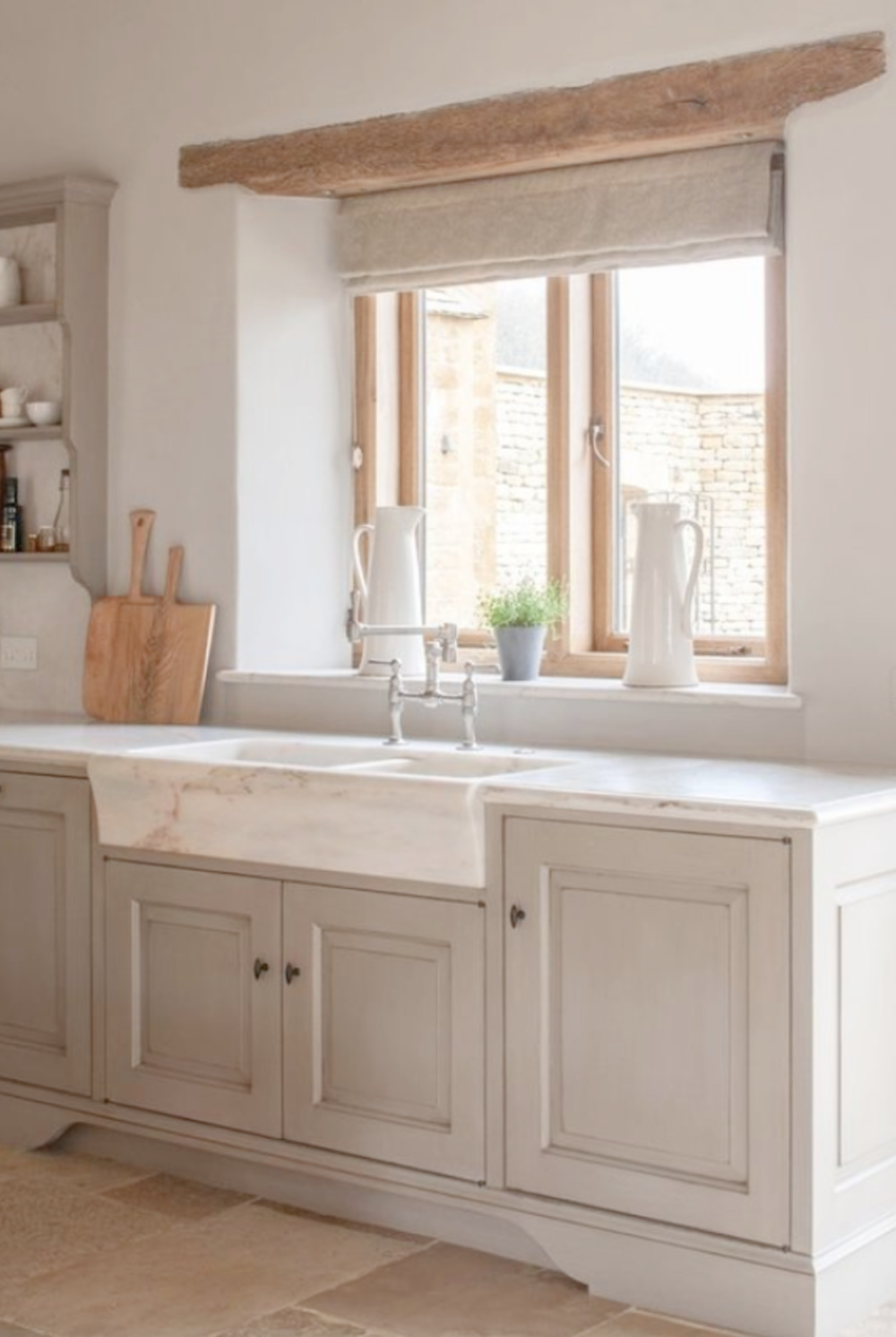
For high contrast, you’ll likely choose cool whites to sample for walls and trim. For low contrast, you’ll steer toward whites similar to the cabinet color with a higher LRV. Notice how the custom cabinet finish below (it’s Limestone from Neptune) softly harmonizes with walls painted Farrow & Ball Strong White.
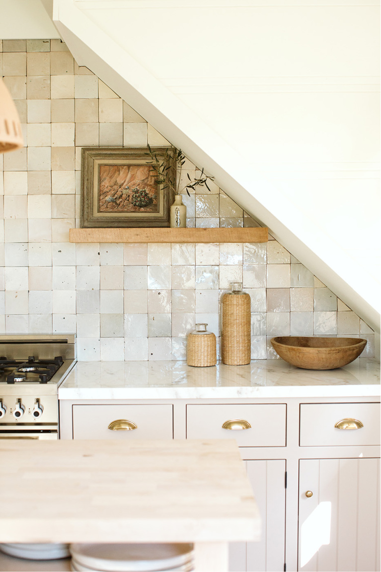
You can also go for a monochromatic look if you view a bunch of kitchens online and keep noticing that you like when the walls look the same color. Here’s an example where the backsplash Zellige tiles are warm and putty-like, with very little contrast to the cabinet color.
Here’s Eider White on our kitchen walls:
Notice how the cabinetry below is the same color as the tongue and groove wood backsplash:
There’s no perfect solution; only the combination that suits you alone.
Farrow & Ball CORNFORTH WHITE 228
I suggested Cornforth White 228 as a possibility if you like the Heidi Callier designed kitchen above, and it is a gorgeous beige with which I have experience.
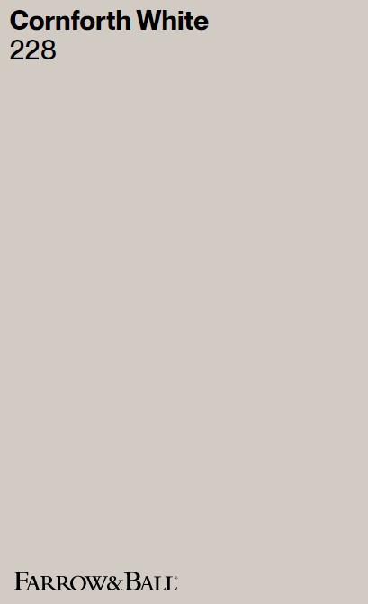
I also like a 50/50 combination of Cornforth White with the darker Hardwick White for a gorgeous custom greige. (Consider that custom combo for a house exterior – it’s the color of our former woodsy cottage and is suggestive of natural stone.)
Farrow & Ball offers these highly sophisticated, European inspired, and often historically based colors with depth and character.
They describe Cornforth White as “the mid tone in the group of Relaxed Neutrals which are totally understated and extremely versatile. Neither too warm nor too cool, Cornforth White sits contentedly between Ammonite and Purbeck Stone to create a hushed and calming retreat. Named in memory of John Cornforth, the revered architectural historian, contrast with Wevet to enhance its grey qualities.”
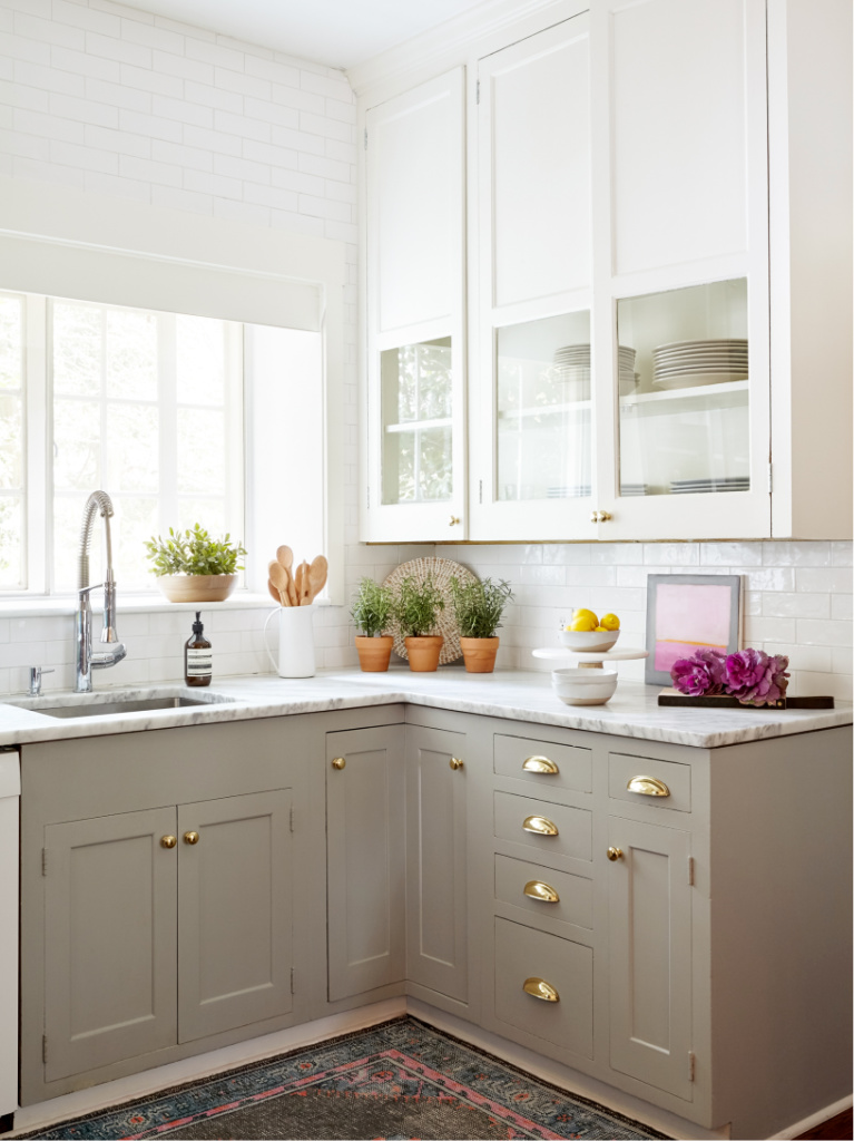
Lower Kitchen Cabinets Contrasting With Uppers?
It helps to see two-tone kitchens to decide whether it’s a look for you.
Also, don’t forget “washes” of greige or putty tones with subtle washes, staining and glazing.
Greige Paint Colors for Cabinets: Where to Begin?
Sample at least three before deciding on the best option.
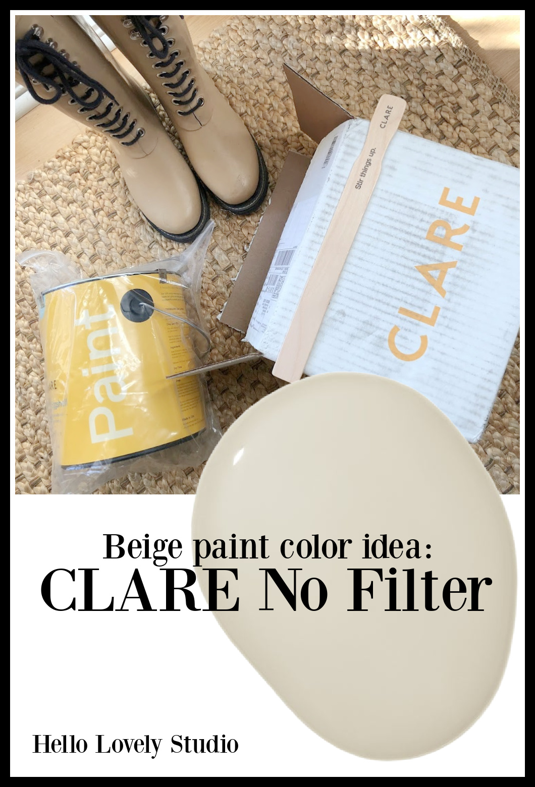
Easiest way to see if a paint color will work? Order samples with Samplize and have them delivered straight to your door.
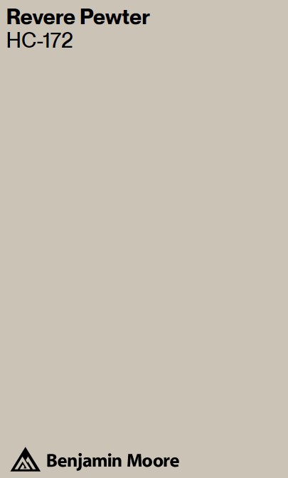
Too overwhelmed and want just ONE sample idea? Try Benjamin Moore Revere Pewter.
Benjamin Moore REVERE PEWTER
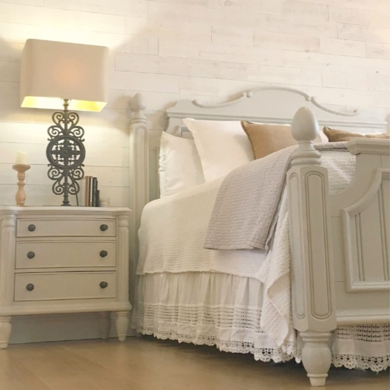
While I didn’t paint kitchen cabinets this color, I did paint bedroom furniture with light coat of it.
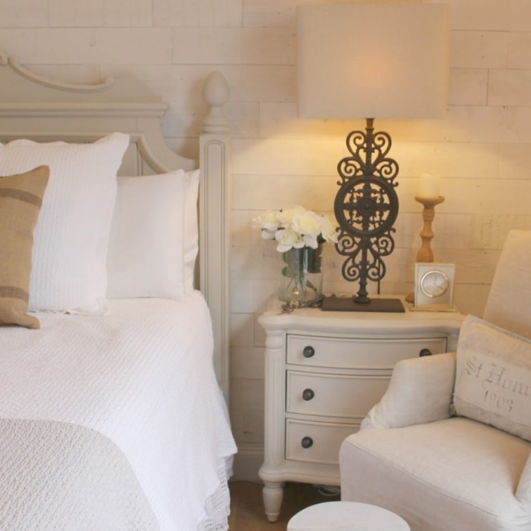
The original finish on the furniture was a very warm yellowy antique white, and I wanted a cool chic greige. Benjamin Moore Revere Pewter transformed it.
While another set of eyes might simply see a boring beige on beige scheme happening, in person, the mix of textures and hand-painted brushstrokes feels alive and less one note than the photos allow.
When You Love Living With Greige Finds…
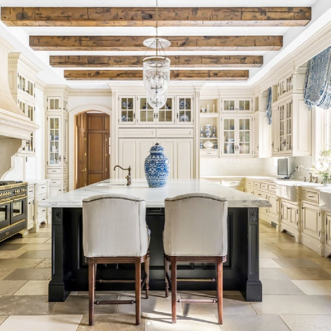
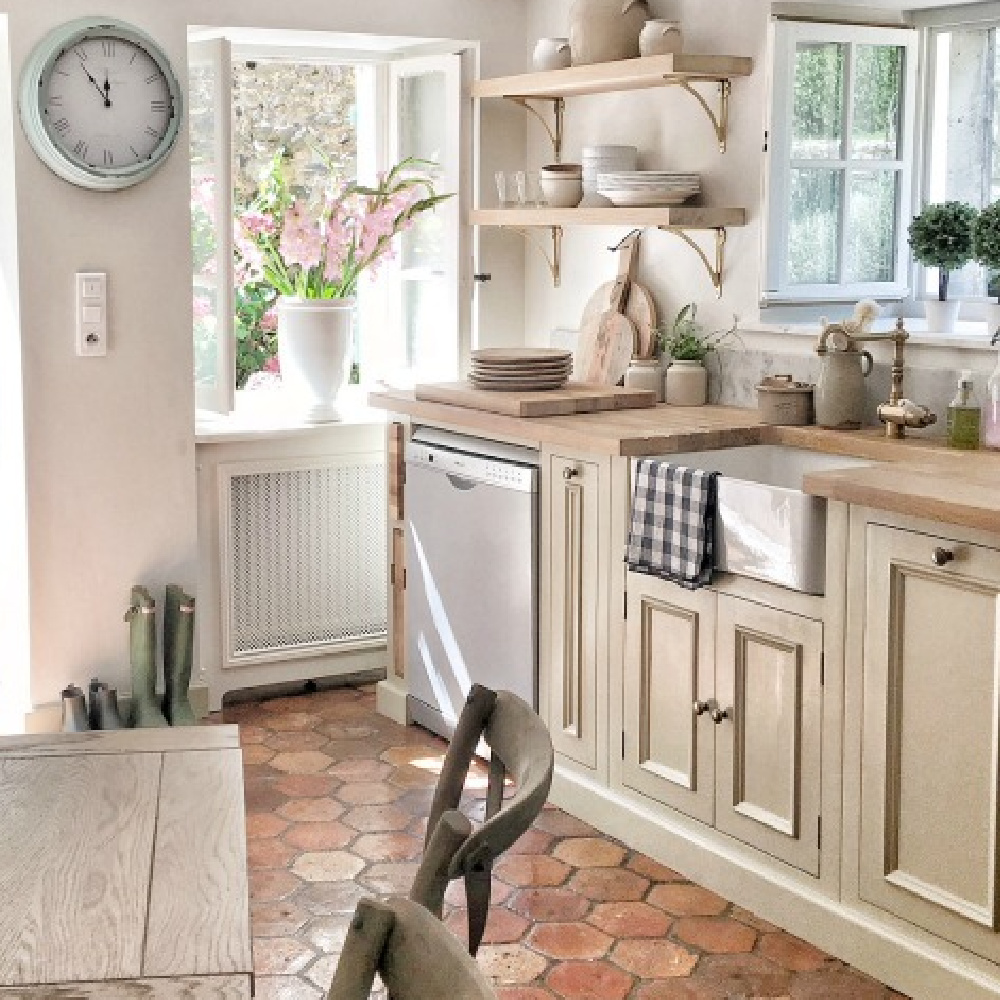
Beige Cabinets in a French Chateau Kitchen!
If you love country style, here are some decorating resources that may appeal:
Here are resources for a beige moment that feels sophisticated and timeless:
Peace to you right where you are.
-michele
I independently selected products in this post—if you buy from one of my links, I may earn a commission.
Thanks for shopping RIGHT HERE to keep decor inspiration flowing on Hello Lovely!
Hello Lovely is a participant in the Amazon Services LLC Associates Program, an affiliate advertising program designed to provide a means for sites to earn fees by linking to Amazon.com and affiliated sites.


