I am in a whisper-y pale French blue mood as the pace of February remains slower. Are you seeking the perfect tranquil yet uplifting and sophisticated blue? Soft pale aqua blue with grey undertones is my mother’s favorite color so she dressed us in this color constantly. Also, French blue paint colors remind me of both my father’s gorgeous eyes and and robin’s eggs. Is it the perfect accent color for shutters and front doors?
I independently selected products in this post—if you buy from one of my links, I may earn a commission.
Perfect French Blue Paint Colors & Inspiration
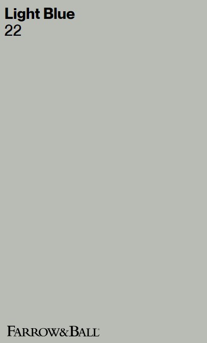
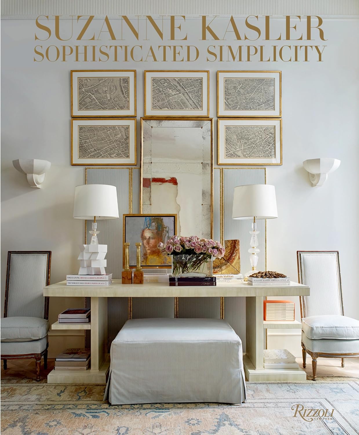
Interior designer Suzanne Kasler uses blue with understated elegance. I recall how in 2013, she professed her love for BM White Dove and Glidden Limoges Blue (see a swatch below). Yet this quiet-ish color isn’t terribly popular for American interiors beyond nurseries. I think I know why. We’ll consider paint colors to sample for the just right perfectly pale French blue paint for you (since arriving at a winner is a process).
I think what keeps this blue from the spotlight is the challenge to find a blue that feels elegant, not cloying. Most of the time it’s wise to steer toward the grey range of paint swatches to approach the pretty pale blue-gray goodness of French blue. And swath on plenty of possibilities so you’ll be able to see different undertones emerge. Here’s a place to start:

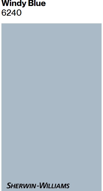
Psst. Upward is very close to the now discontinued Glidden Limoges Blue which was Suzanne Kasler’s favorite.
What Pale French Blue Paint Feels Timeless?
There’s truly a spectrum of French blues, yes?
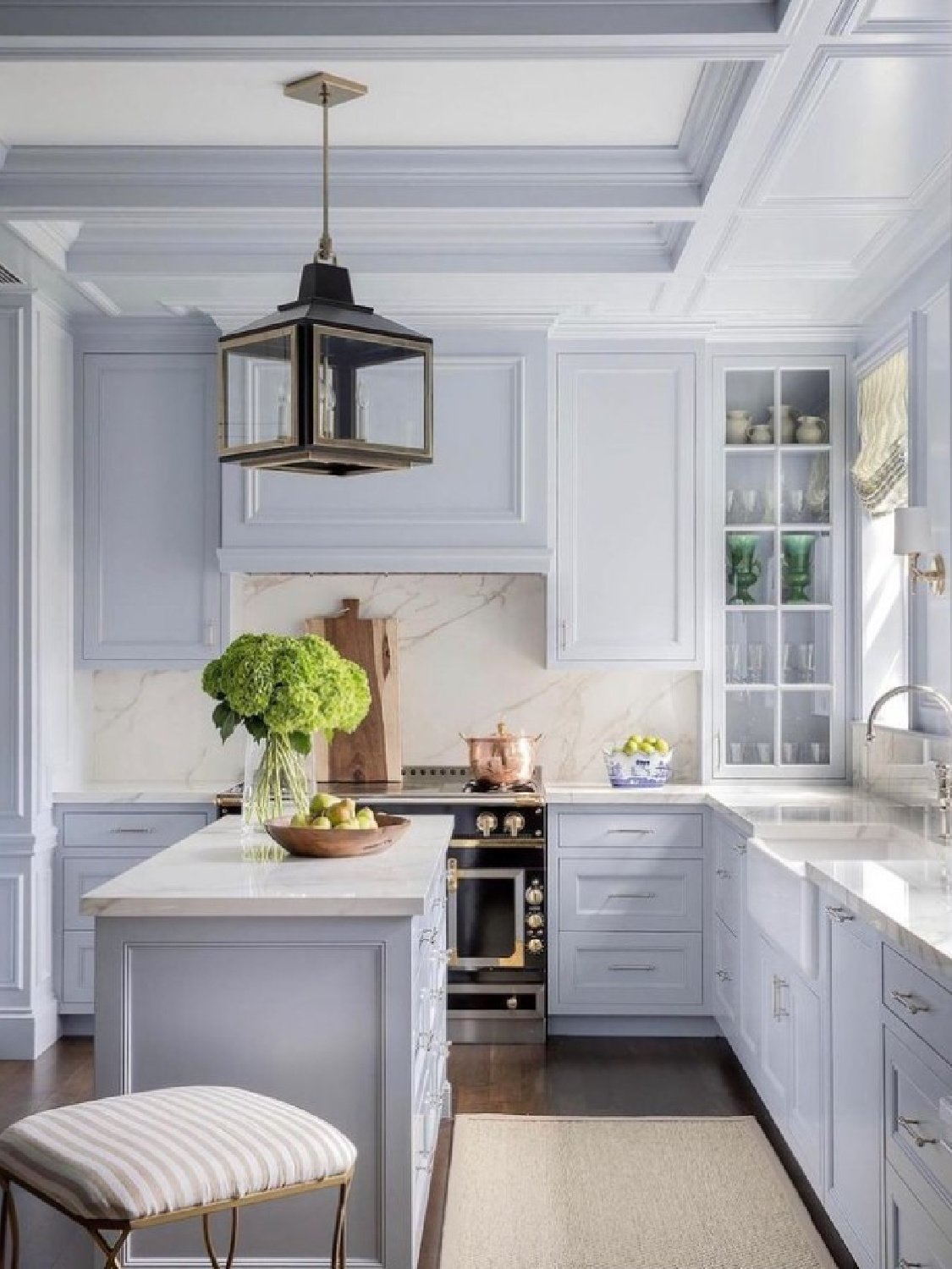
We’ll consider pale French blue paint colors with elegant, grey-undertones that won’t feel too icy. Too bright, and the effect may feel more baby room blue than Cinderella’s glass slipper. We need hushed. Notice how a blue Suzanne Kasler favors (below) is similar to the swatch above:
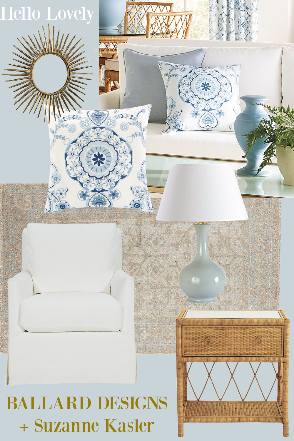
Iconic, elegant, and even historic, what I imagine as the dreamiest of pale French blues is the color of this linen fabric Suzanne Kasler designed for Ballard.
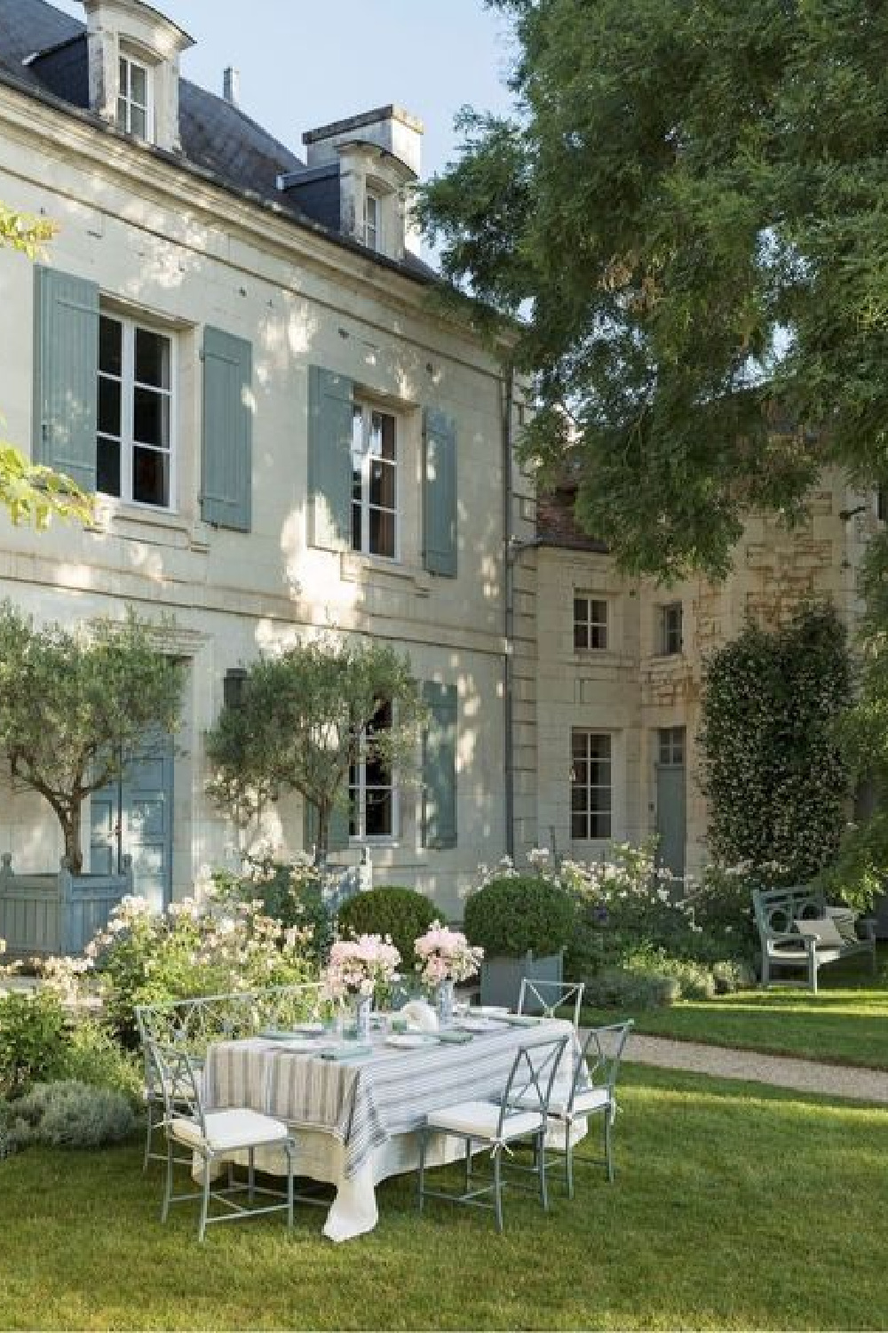
Here’s another example of a blue so chic it hurts…I’m sure she chose this elegant shutter color for the gorgeous house below:
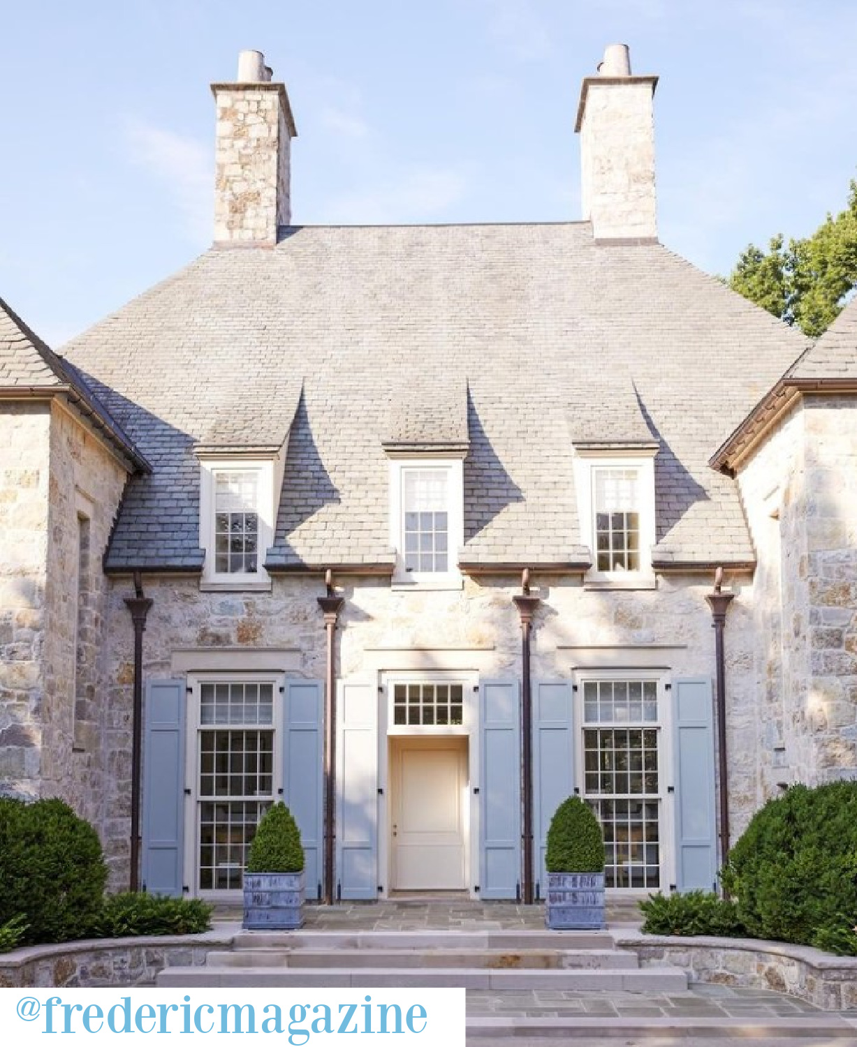
You just know those shutters are going to fade in the Southern sun to perfection. Limoges, Provence, or Paris, the particular pale greyed blue we’re after has a strong association with France, adding another layer of sophistication.
Here’s a lovely possibility which doesn’t have “blue” in the name.
Are Interiors Embracing More Formality These Days?
These blues can definitely feel formal, which is another reason they aren’t terribly common for most folks. The thing about landing on the right blue for your particular space? Sampling several in your unique environment. Natural light, exposure and even the part of the country you live will affect the perception of the color.
Speaking of the formality of light blues…have you noticed the emerging trend of interiors that lean more in the formal direction than a few years ago? Isn’t it fascinating? Younger people want formal dining rooms and are beautifully set tables.
What Paint Colors are the Best Light French Blue?
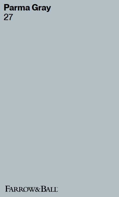
Delicate, refined, soft, ethereal and even buoyant, a perfectly pale French blue paint often joins intricate hand-painted designs on French porcelain. Here’s a blue-gray which is similar to Parma Gray but not as pale as some of our other contenders:
Again, I like the selection of Suzanne Kasler offerings at Ballard Designs for a point of reference for French blue!
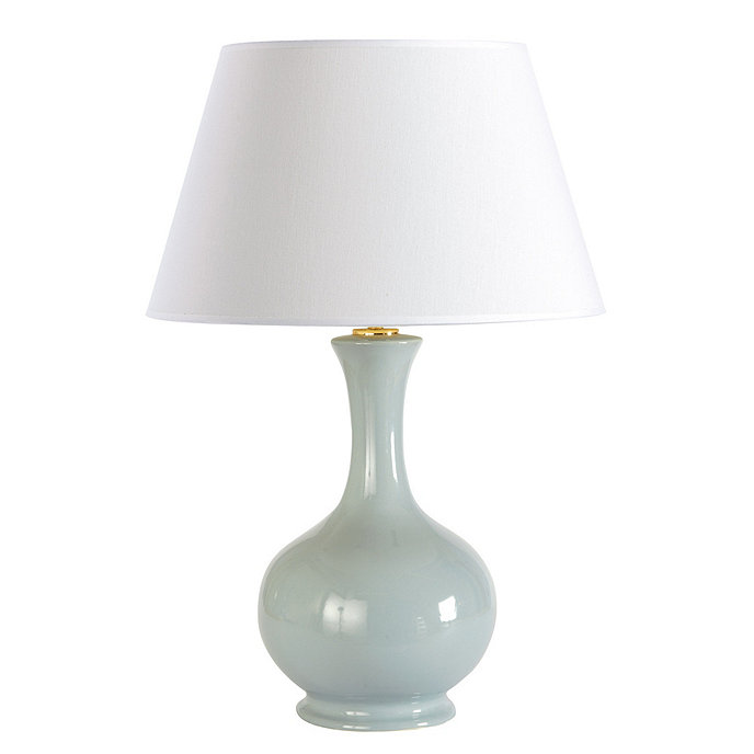
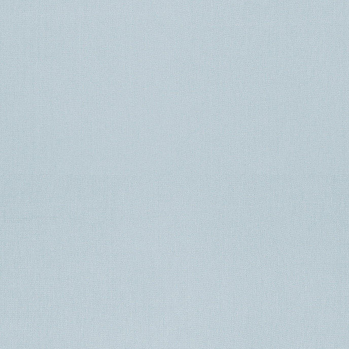
Notice how the blue lamp has a warmer feel from grey undertones than the cooler, more periwinkle French blue swatch below.
Hopefully you are pinning these Frenchie paint swatches for future reference! French blue is often synonymous with the craftsmanship and artistry which makes Limoges, France famous.
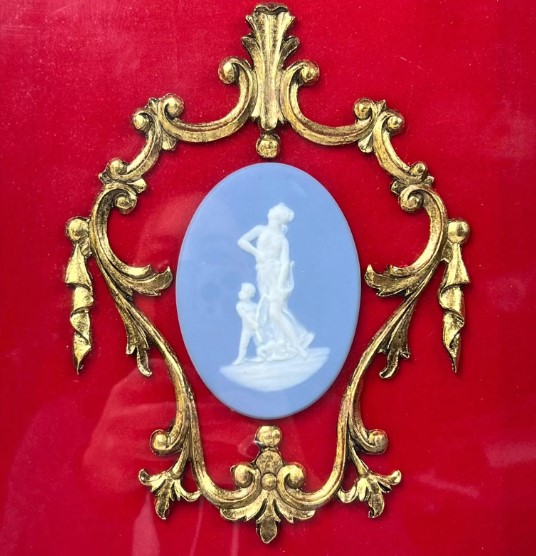
Psst. It killed me to find this vintage sweetly framed cameo and then see the age…1990s! Wait. Vintage? Yep. That’ll make you feel blue.
In case you are curious, Limoges artisans used cobalt oxide to achieve a distinctive blue color, and it became a signature element of their creations.
Tips for a Just Right Light Blue
Like so many fine French things, blue seems to endure as a symbol of artful luxury and fine quality. Oh, and should you decide to check out F&B Light Blue…
the swatch above may appear to vary from the Atlanta showhouse kitchen above. When I have sampled Light Blue, it reads rather green in my Northern Illinois light. Be sure to sample and adjust your search if what you’re after is a particular look in one particular photo.
What is it about Americans’ adoration of all things blue and French? Both seem to represent timeless elegance, a world of fine artistry and aesthetics, and an elevated realm of sophisticated taste for colors, interiors, food, and lifestyle.
Which Pale French Blue Paint is Best?
I love barely blue but not too grey and definitely not gloomy blue hues so much! They may be icy, but with natural light warming them…ooh la la.
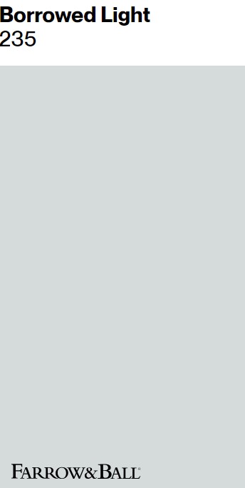
Farrow & Ball BORROWED LIGHT 235
Is Farrow & Ball Borrowed Light 235 at the top of my list for an elegant Glidden Limoges Blue-like French blue? All the ouis.
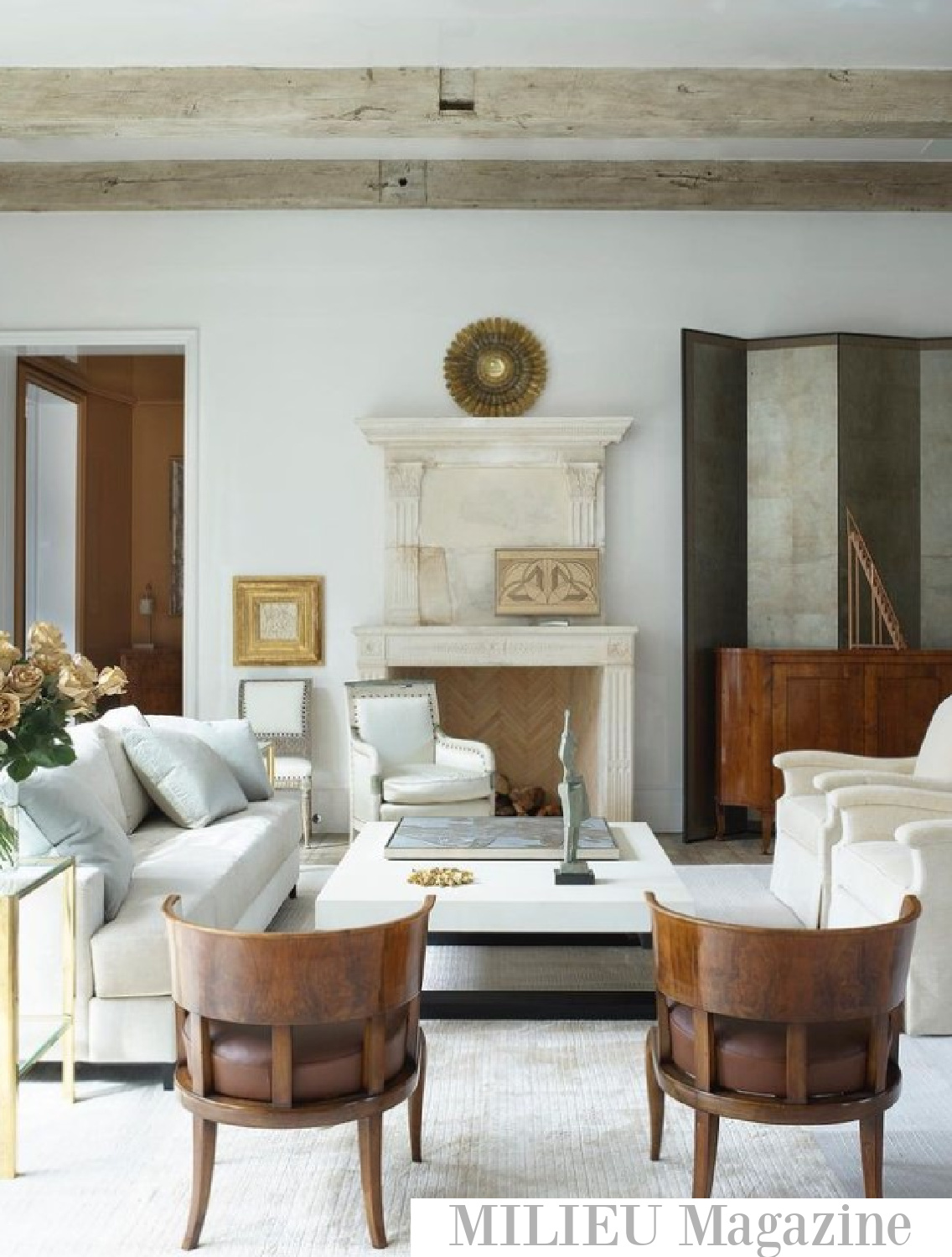
Notice how similar Borrowed Light is to the pale blue of the interior on the cover of Sophisticated Simplicity:
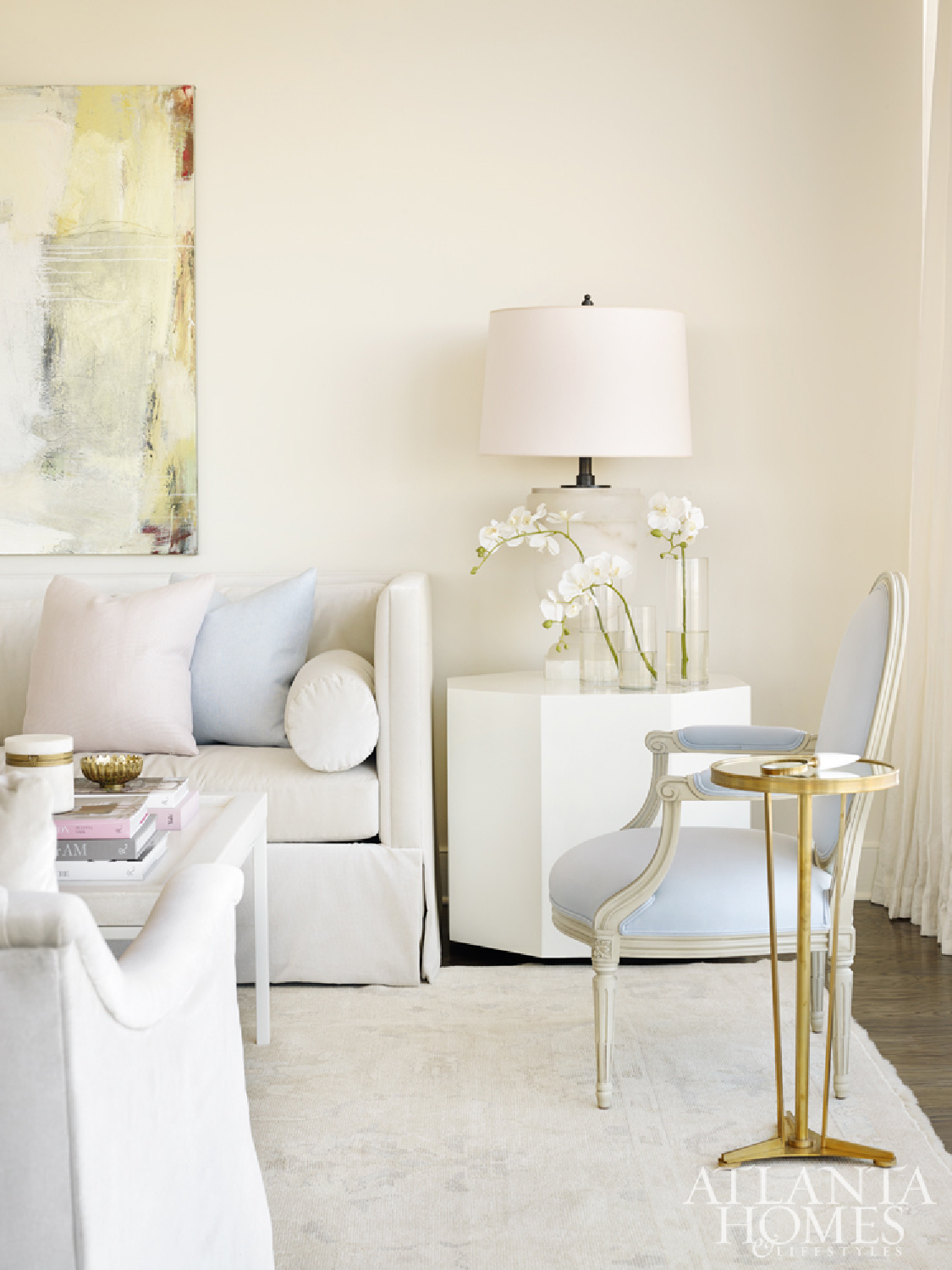
And don’t get me started on Melanie Turner’s project from 2017 in AD and AHL where she used muted blue impeccably for walls, ceilings, upholstery…
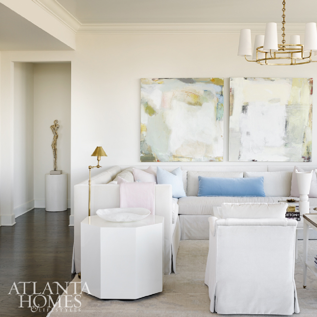
Isn’t that a stunning yet subtle lacquered treatment for the ceiling!?!
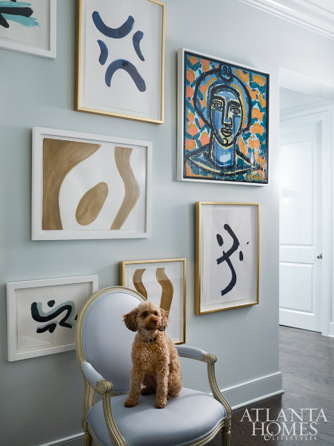
Borrowed Light looks magical on this gallery wall where a chair with more blue holds a rosy terracotta cutie.
Raise your hand if you’re aching to sample Borrowed Light AND Seapearl for any chance at achieving such a tranquil effect!
But before you fall for Borrowed Light, maybe peek at Marilyn’s Dress.
Benjamin Moore MARILYN’S DRESS 2125-60
LR (light reflectance value) is 75.59 for Marilyn’s Dress. And Benjamin Moore says the shade is much like its namesake…the pale gray-blue is buoyant, breezy and an enduring classic.
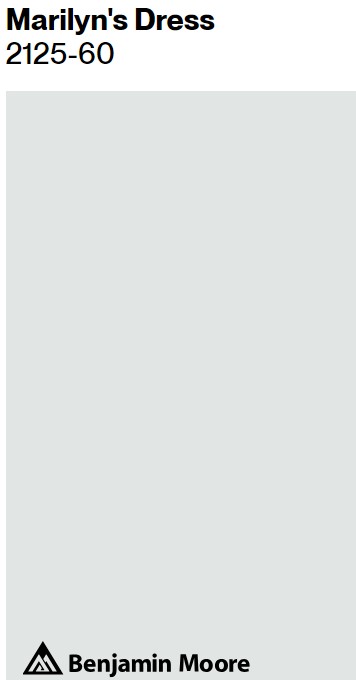
If we compare Marilyn’s Dress to Borrowed Light, you can see Marilyn’s Dress is a bit more subtle, cool, and grey.
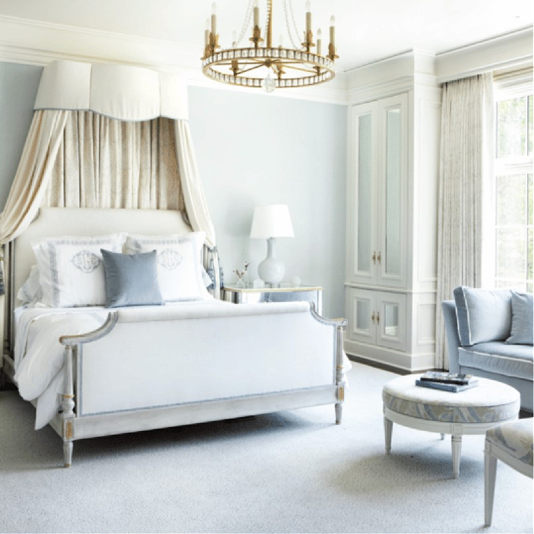
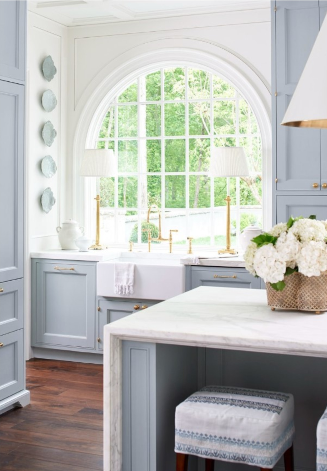
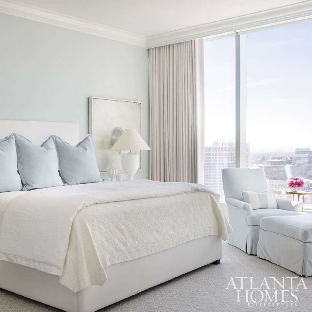
Which do you prefer? Here’s an incredible example of Suzanne Kasler celebrating a French blue!
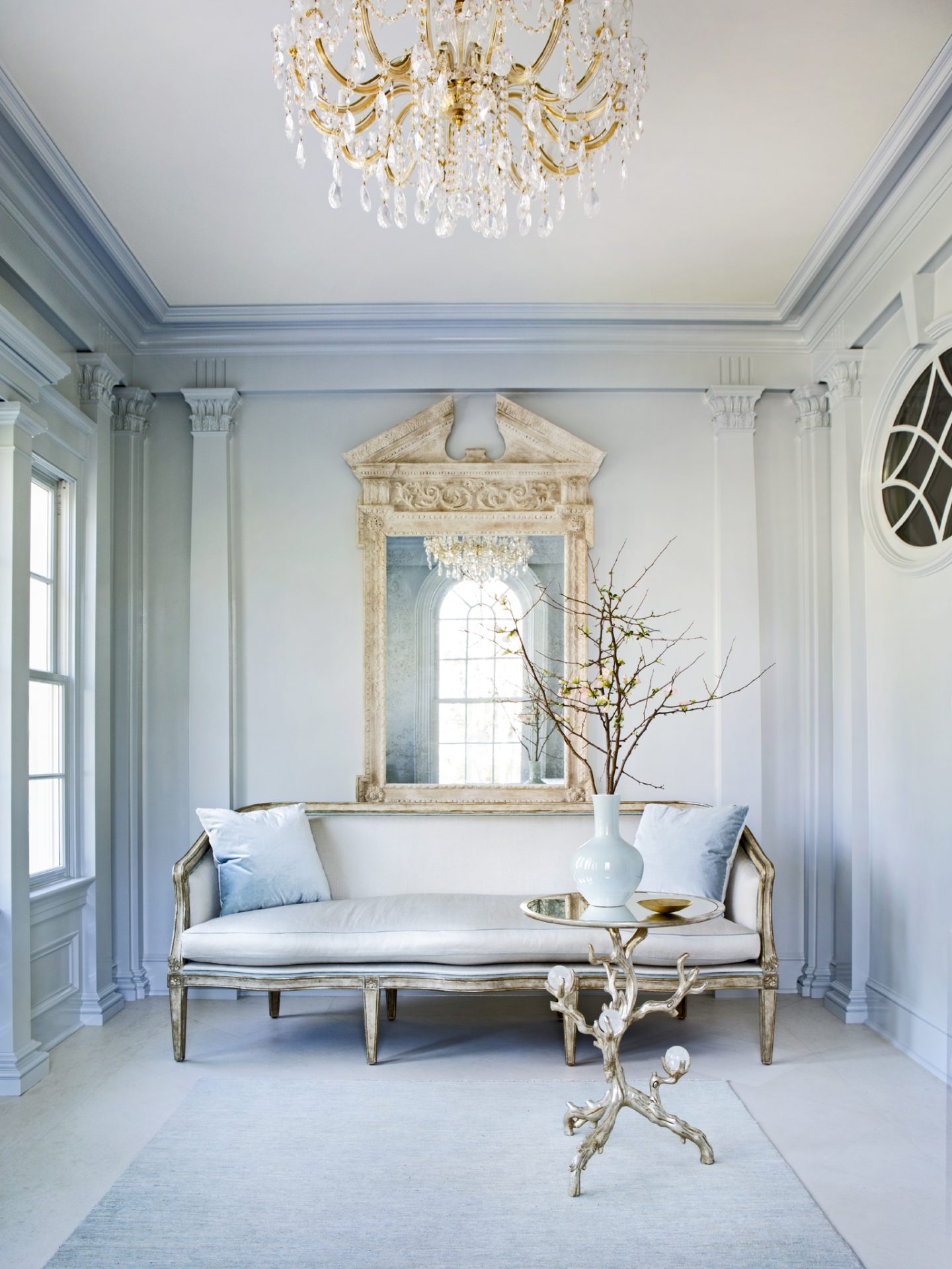
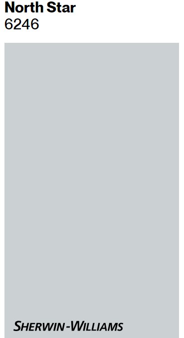
You may recall Kasler does not vary the sheen for ceilings, walls and trim. She wraps rooms in a single sheen. If you’re after a similar look to the above space? Peek at SW North Star 6246:
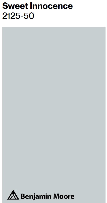
Benjamin Moore SWEET INNOCENCE & GLASS SLIPPER
Benjamin Moore says a hint of blue brings a luminous, airy quality to this pale gray. With an LRV of 59.99, it is going to reflect about 60% of light back into the room.
Is it a little too much color for you? With an LRV of 70.2, BM Glass Slipper 1632 is lighter and may be a better contender for you.
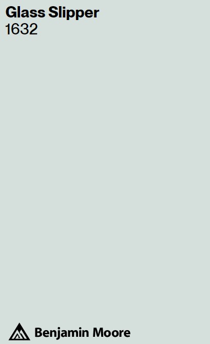
If you love pale powder blue, the brand says GLASS SLIPPER will offer effortless beauty for any space.
Since Suzanne Kasler’s personal favorite blue (Glidden Limoges Blue) is discontinued, think there’s a need for HELLO LOVELY PALE FRENCH BLUE? I’ll work on a perfectly pale shade in the studio and maybe have your people call my people (me). 🙂 We’ll return to the topic later!
Peace to you right where you are.
-michele
Thanks for shopping RIGHT HERE to keep decor inspiration flowing on Hello Lovely!
Hello Lovely is a participant in the Amazon Services LLC Associates Program, an affiliate advertising program designed to provide a means for sites to earn fees by linking to Amazon.com and affiliated sites.


