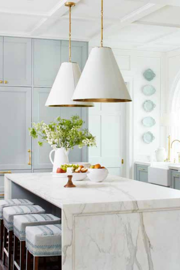
I’ll never tire of exploring beautiful blue paint colors and specifically, the most relaxing blue paint colors! Why? They’re so utterly timeless and play so well with white. So we’ll take a closer look at calming blues, inspiring interiors with blue, and even decor and wallpaper.
Beautiful & Calming Blue Paint Color Ideas
This post contains affiliate links which I hope you will use since they won’t cost you a penny extra yet may earn this blog a small commission.
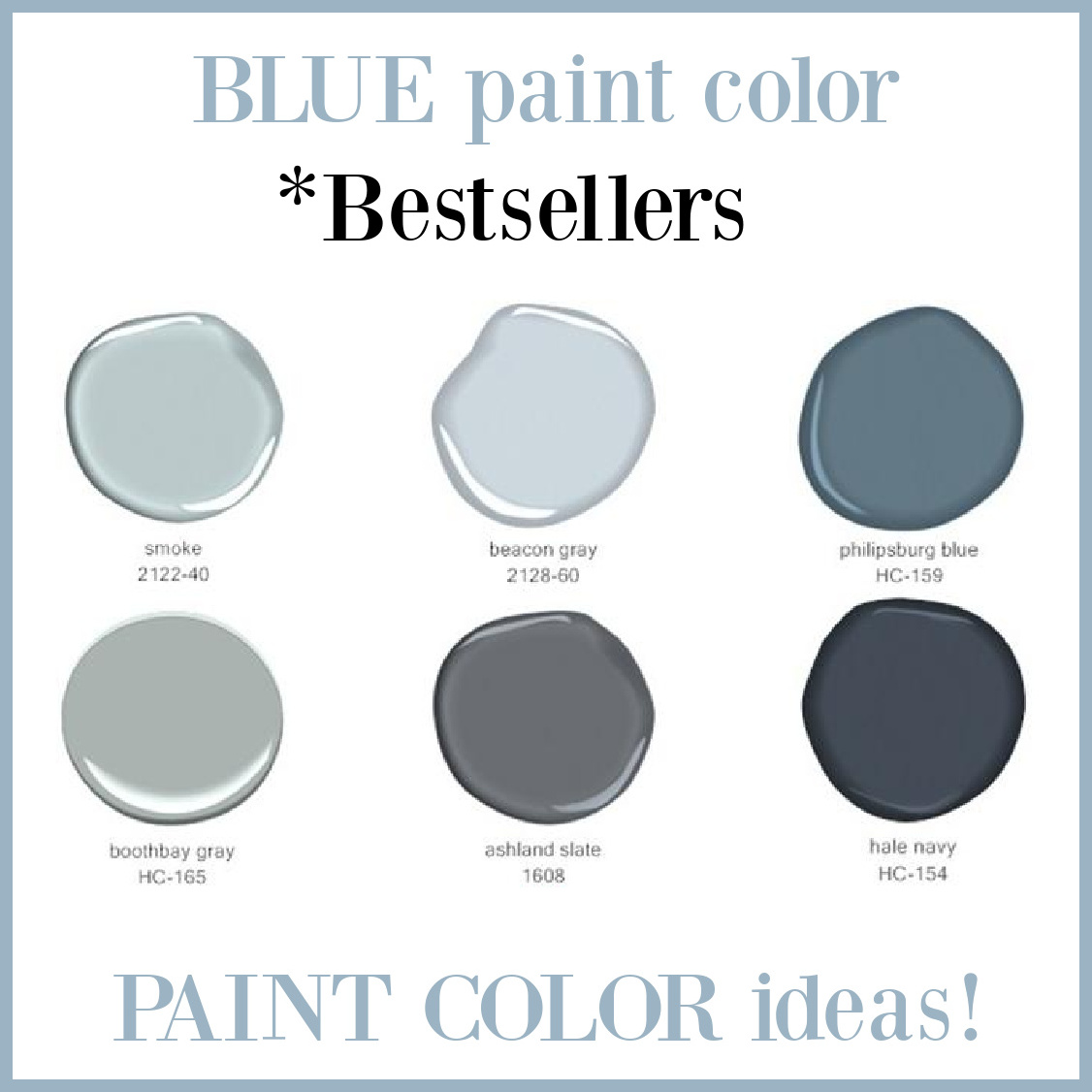
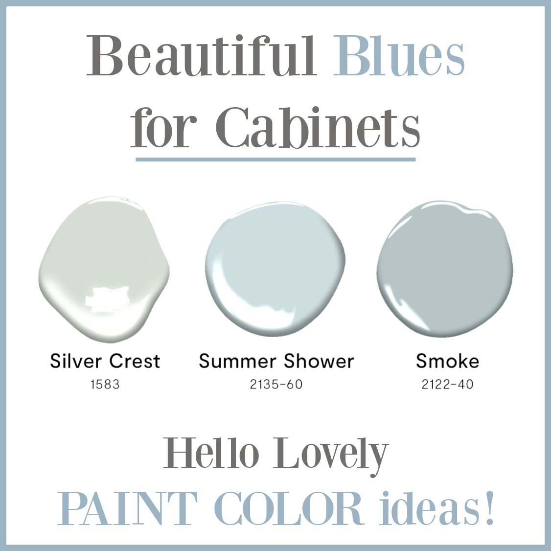
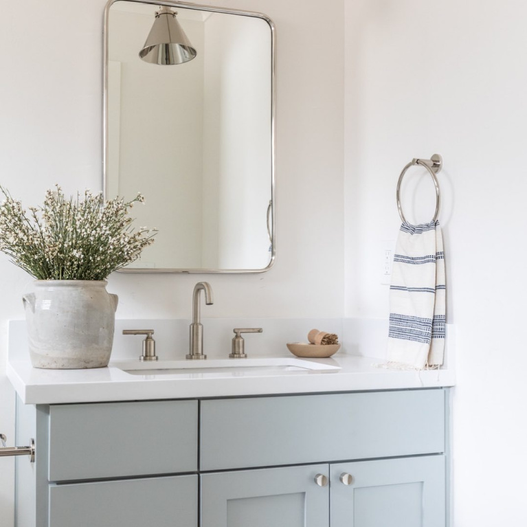
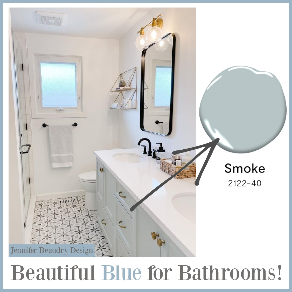
Benjamin Moore SMOKE 2122
Let’s start with that gorgeous blue you see on the infographic above at top left. Smoke (Benjamin Moore) is a soothing and timeless blue that is perfect for cabinets, new or…
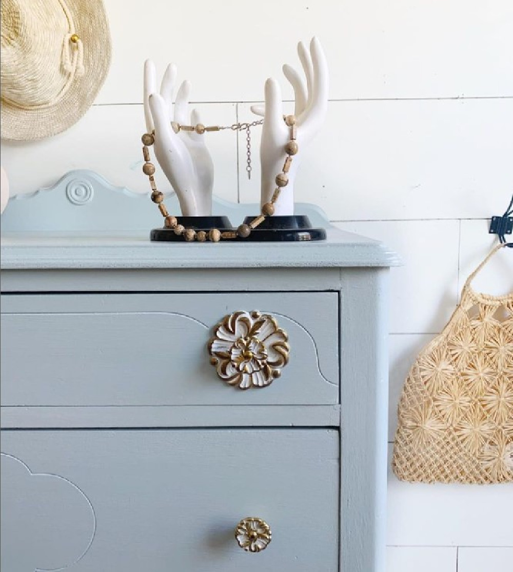
old! Look at how beautiful SMOKE is on this bathroom vanity:
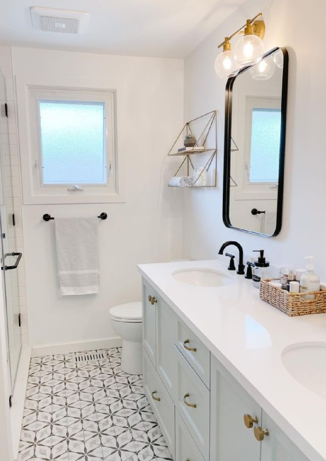
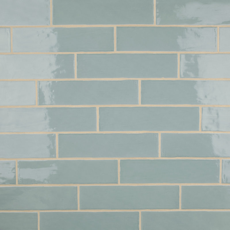
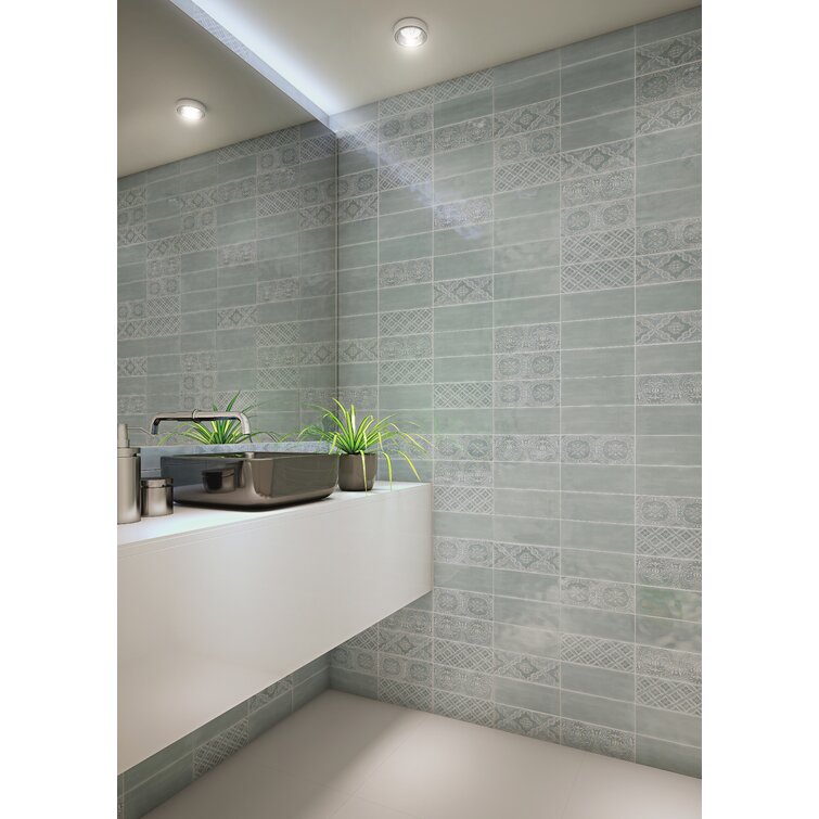
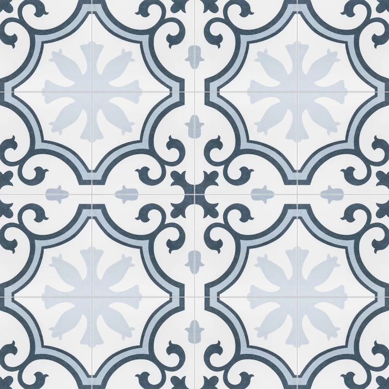
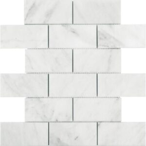
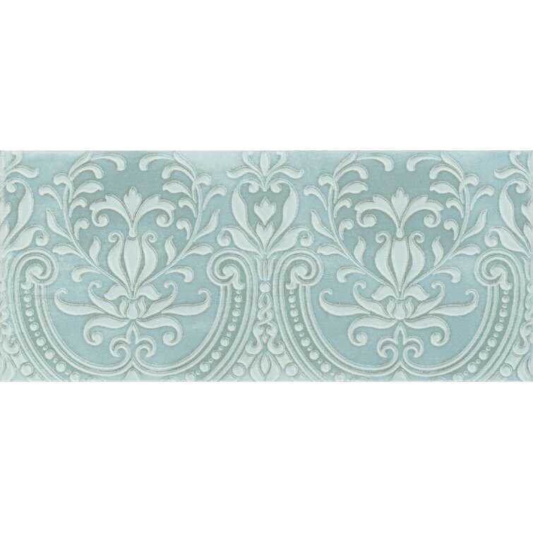
While I don’t know the exact beautiful floor tile in the bath above, here’s a beautiful ice blue tile that is more affordable than you might imagine!
With a porcelain tile like the one above, you could even opt for the darker charcoal color for cabinets.
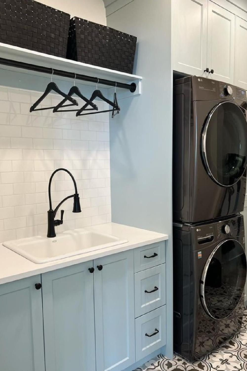
A laundry room can be a great place to play with color even if the balance of the interiors are more neutral. I’m seriously considering this gorgeous blue for my own laundry cabinets:
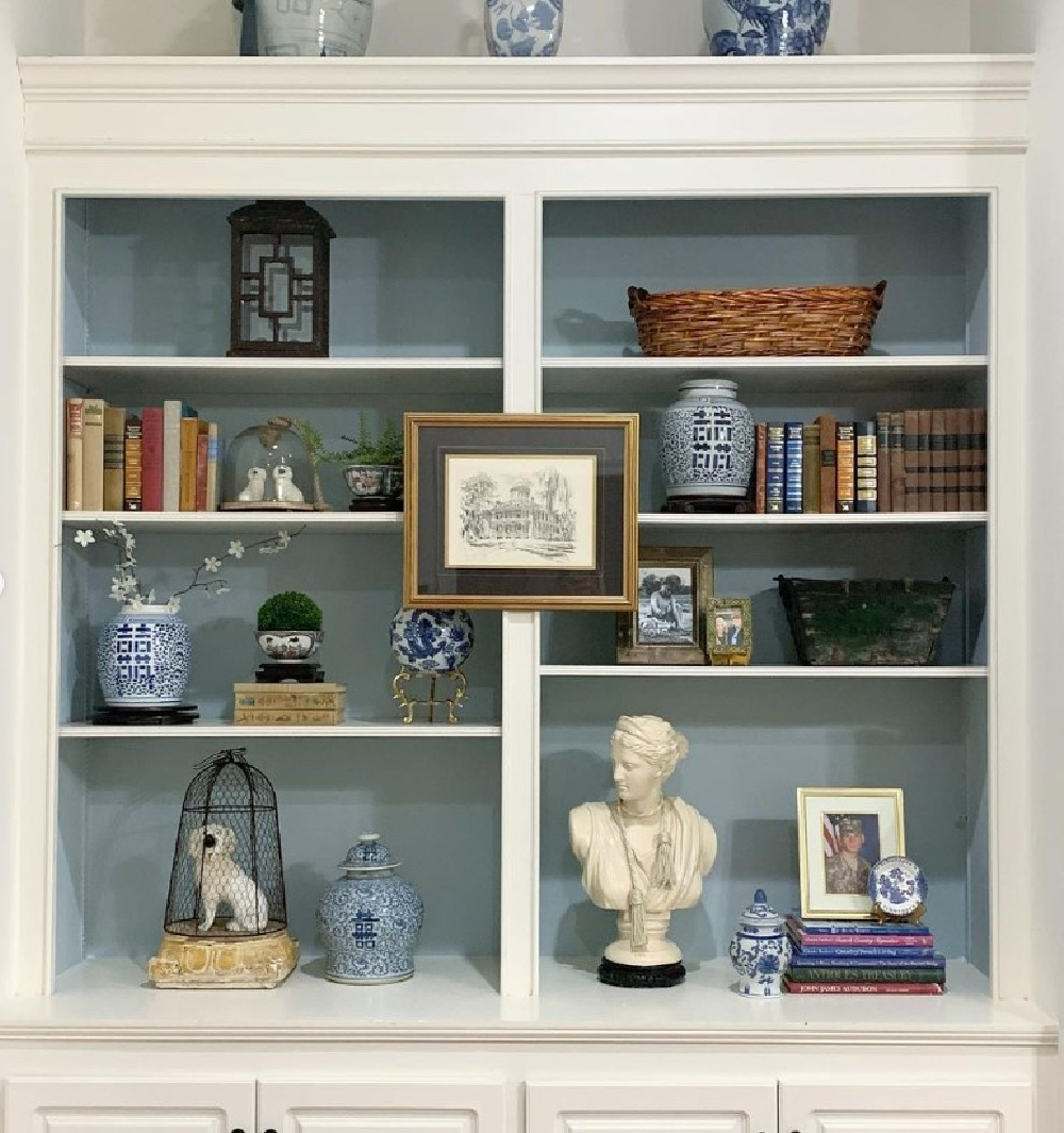
Another way to live with a relaxing blue paint color? Start with the inside of a built-in or bookshelves.
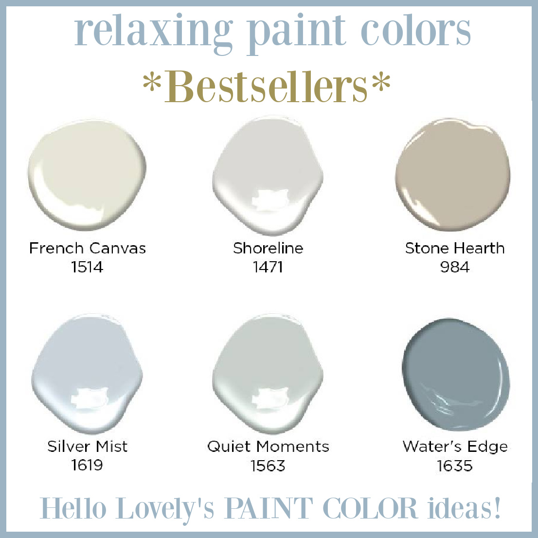
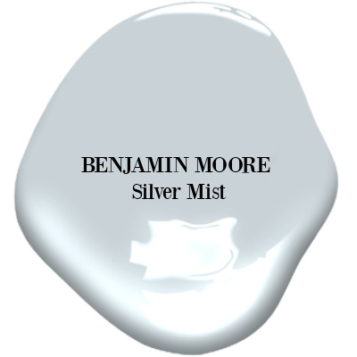
Curious about Benjamin Moore’s bestselling relaxing paint colors including three light blues? Let’s start with Silver Mist:
Benjamin Moore SILVER MIST
Isn’t it a restful blue?
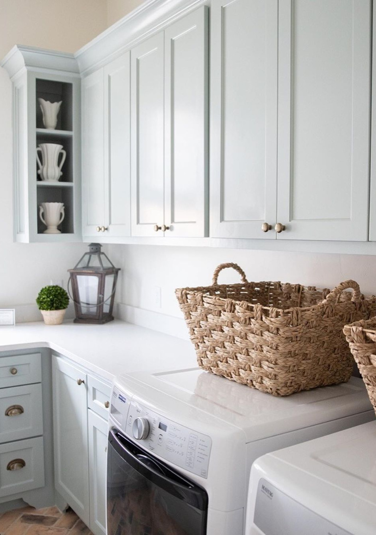
What a great color for a laundry room:
If you like Silver Mist but want a slightly more subtle version, consider Benjamin Moore Summer Shower.
Sometimes when you’re after the perfect calm blue paint, you need to direct your attention to the gray range of paint swatches.
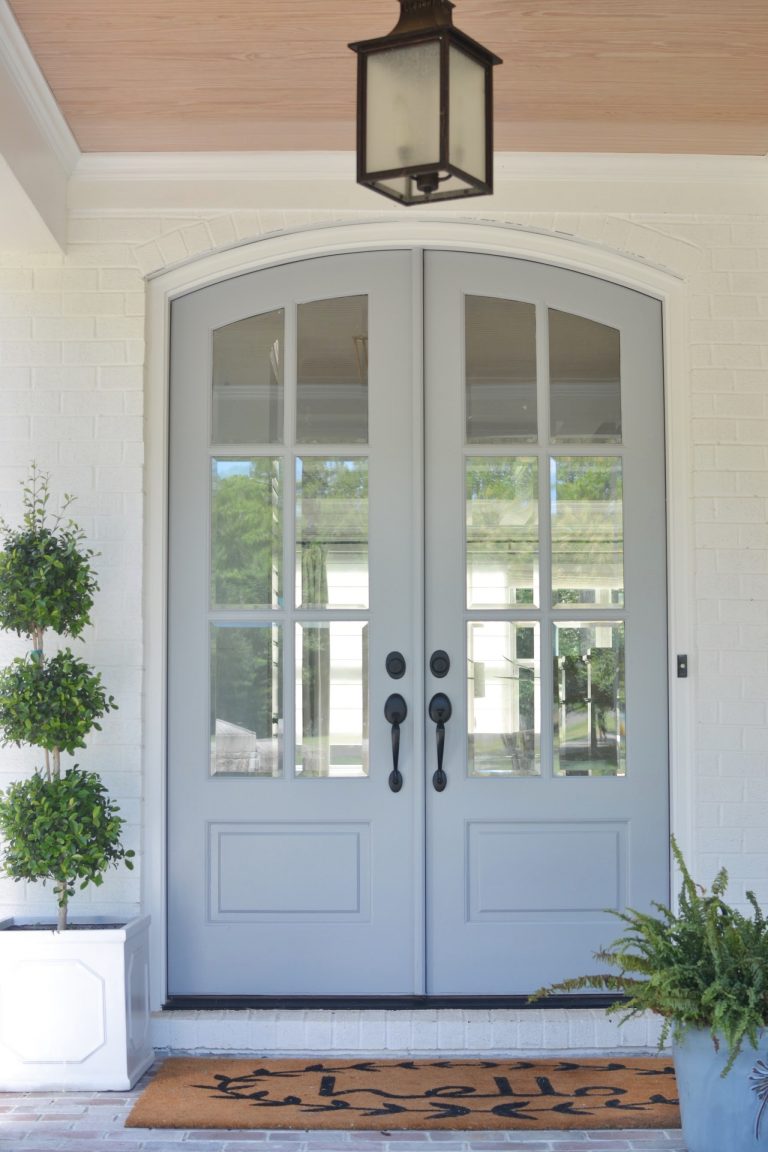
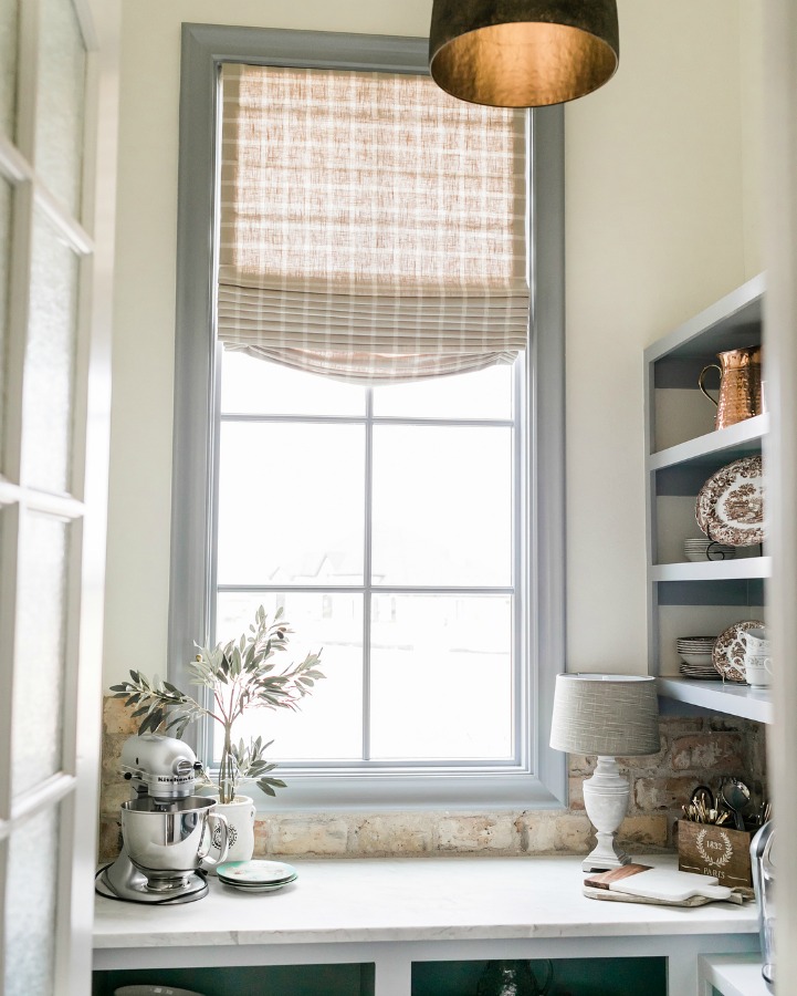
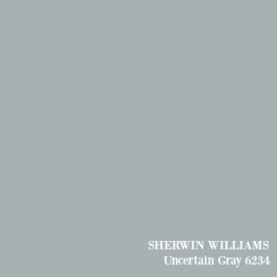
Sherwin-Williams Uncertain Gray
Here’s an example of a gray-blue paint color that you may perceive as blue:
You can see how these front doors appear blue, and of course, natural light is going to influence the color’s undertones.
Uncertain Gray looks beautiful on trim in this pantry by Brit Jones:
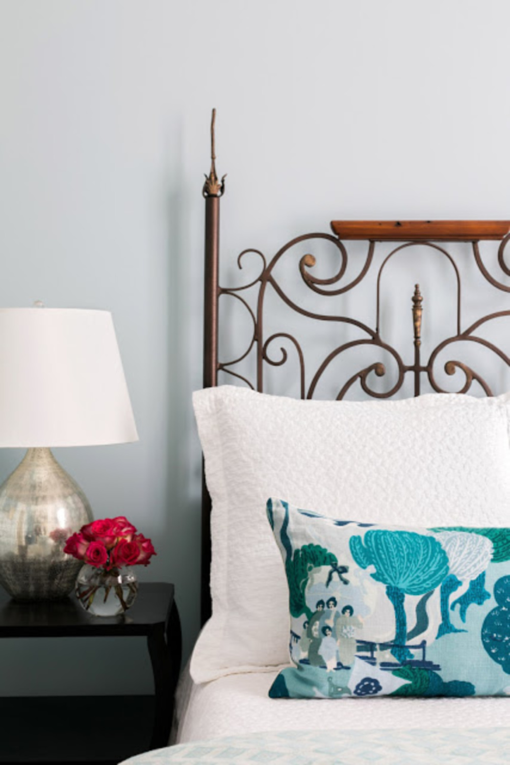
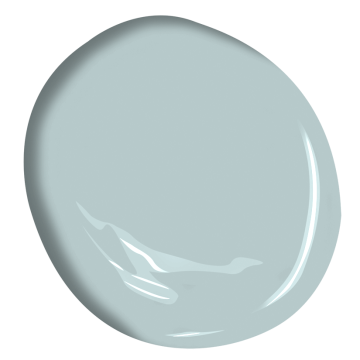
Benjamin Moore YARMOUTH BLUE
When you begin reviewing blue paint colors online that fall within the same range (or standing under fluorescent lighting at the paint counter!), they can begin to all look the same!
But trust. Once you have samples in front of you and begin to try them side by side, you’ll notice things you simply couldn’t before.
Isn’t this a very chill kinda blue?
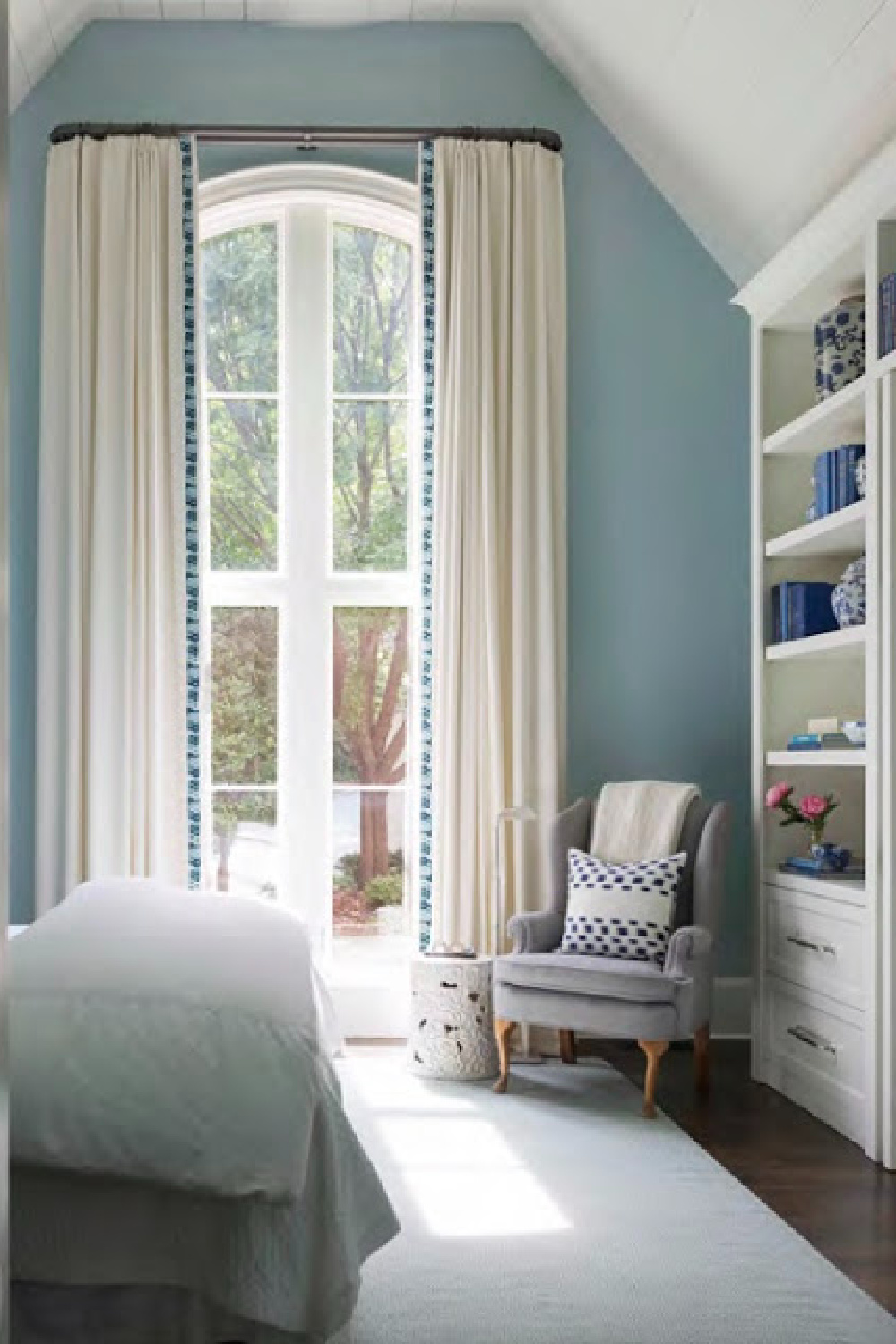
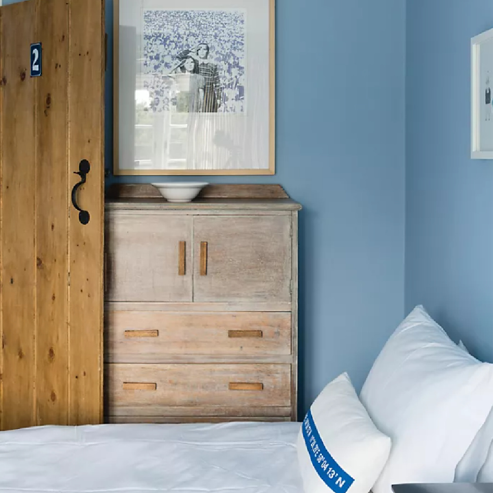
Farrow & Ball LULWORTH BLUE No. 89
Sometimes you’ll need a relaxing blue that is less grey. For example, if you’re after an effect like this:
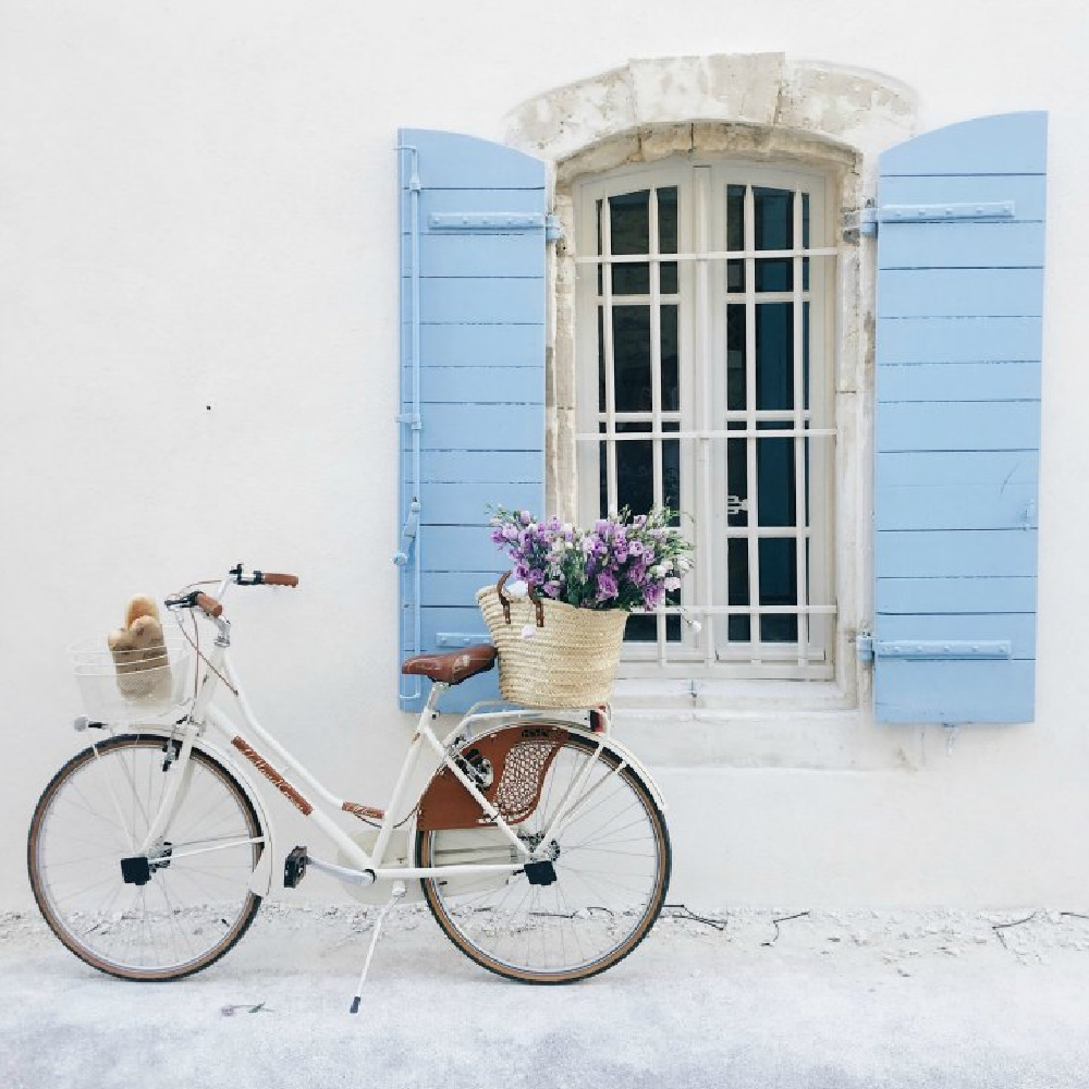
It’s not subtle or light, but this mid-blue called Lulworth Blue feels fresh and pretty.
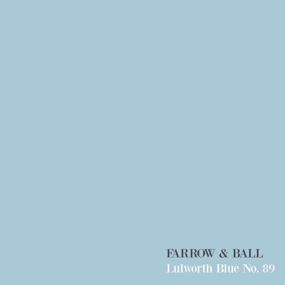
This is a color I used for the kids’ bedrooms in several of our homes, and we never got bored with it.
Benjamin Moore QUIET MOMENTS
If you’re a fan of green-blues and aquas, bet you’ll admire Quiet Moments.
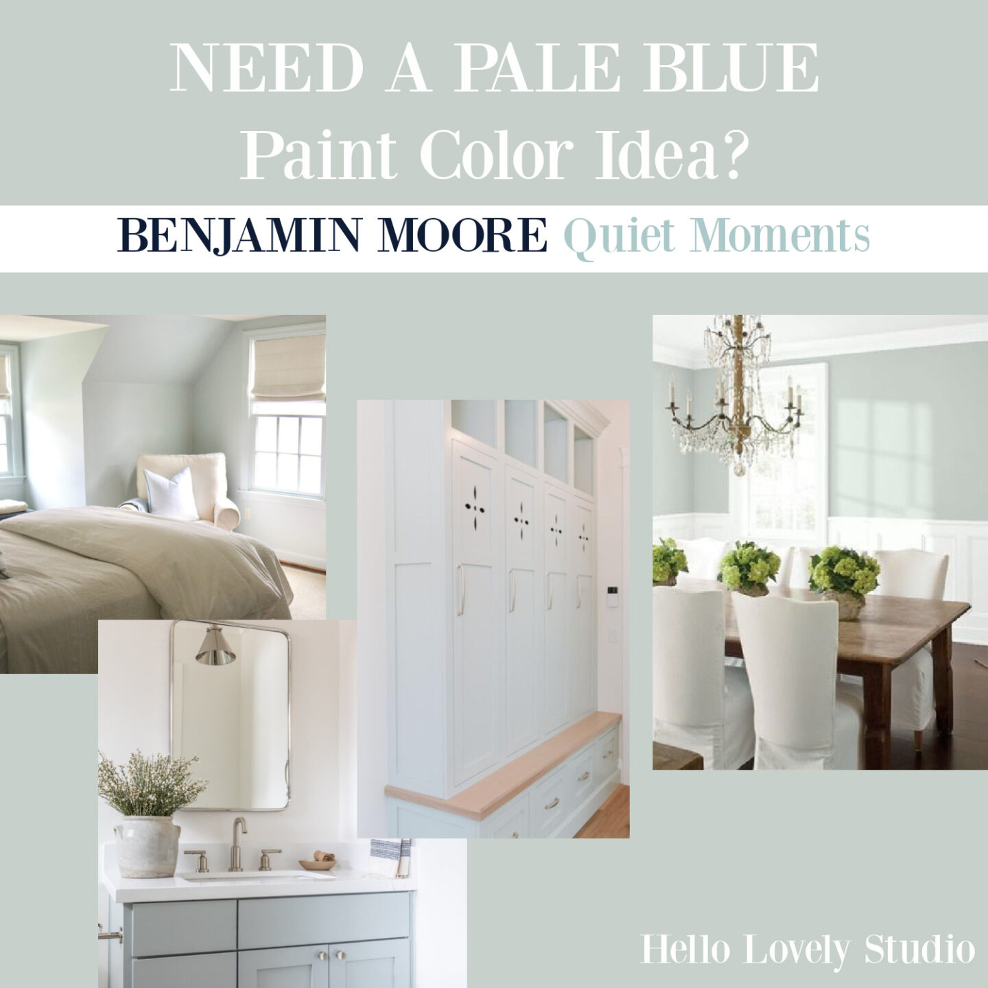
Quiet blues like this are just so perfect for bathrooms:
But it’s equally charming on a door!
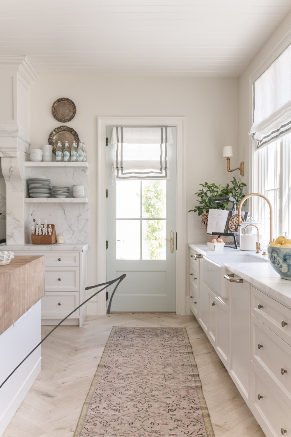
Breathtaking!
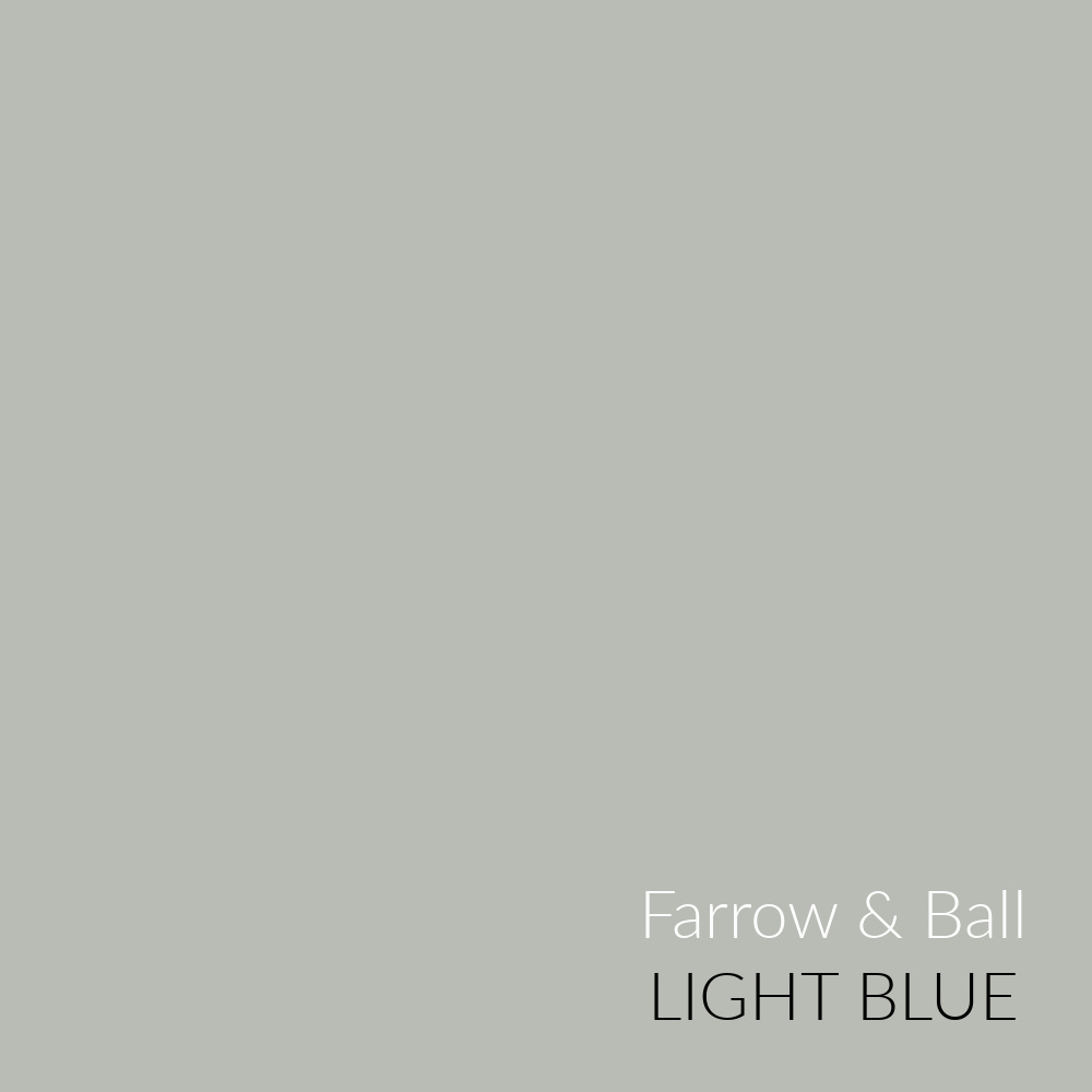
FARROW & BALL Light Blue
Another green-blue you might want to try? Light Blue by Farrow & Ball.
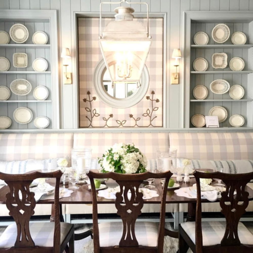
Though the color appears rather blue-grey in these photos, when I have worked with it, the green undertones mean business. So definitely sample, sample, sample!
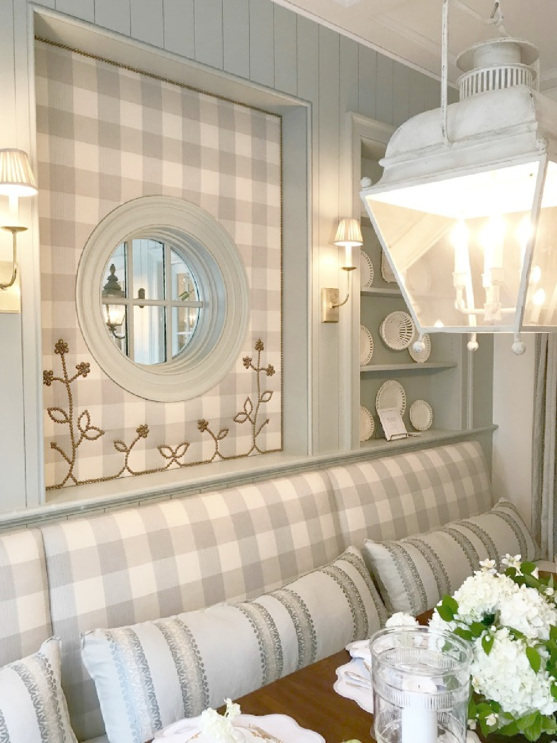
You can see the blue-green quality of this color a little more in this detailed shot (above) since the contrast with the grey check upholstery is more obvious close-up.
How gorgeous is Light Blue in this office area!?!
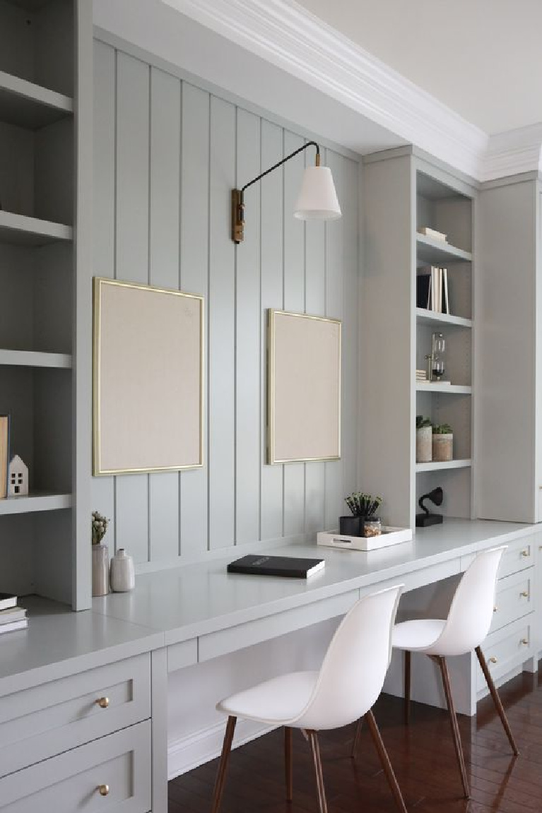
Don’t we all need a workspace like that!?!
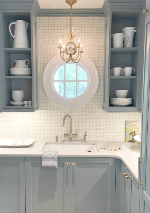

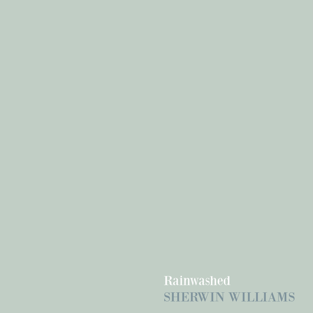
SHERWIN WILLIAMS Rainwashed
Similar to F&B Light Blue, Rainwashed is a timeless pale fantasy of a blue!
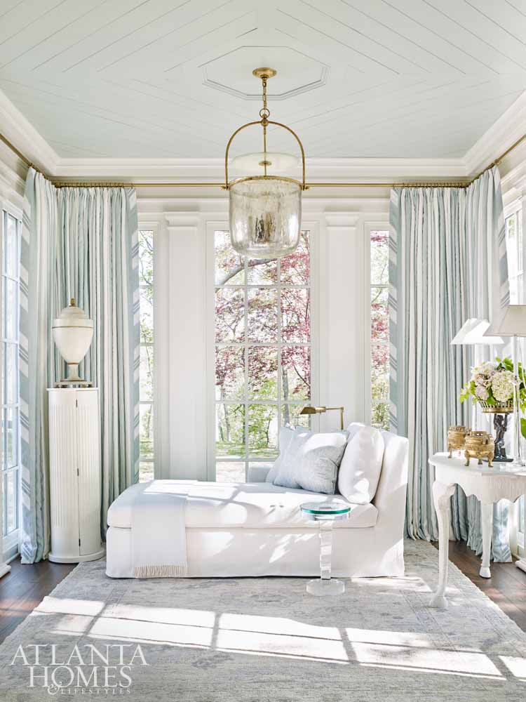
I’m dreaming of a ceiling where this pretty color could be brushed on.
I mean why should porch ceilings in the South have all the fun?
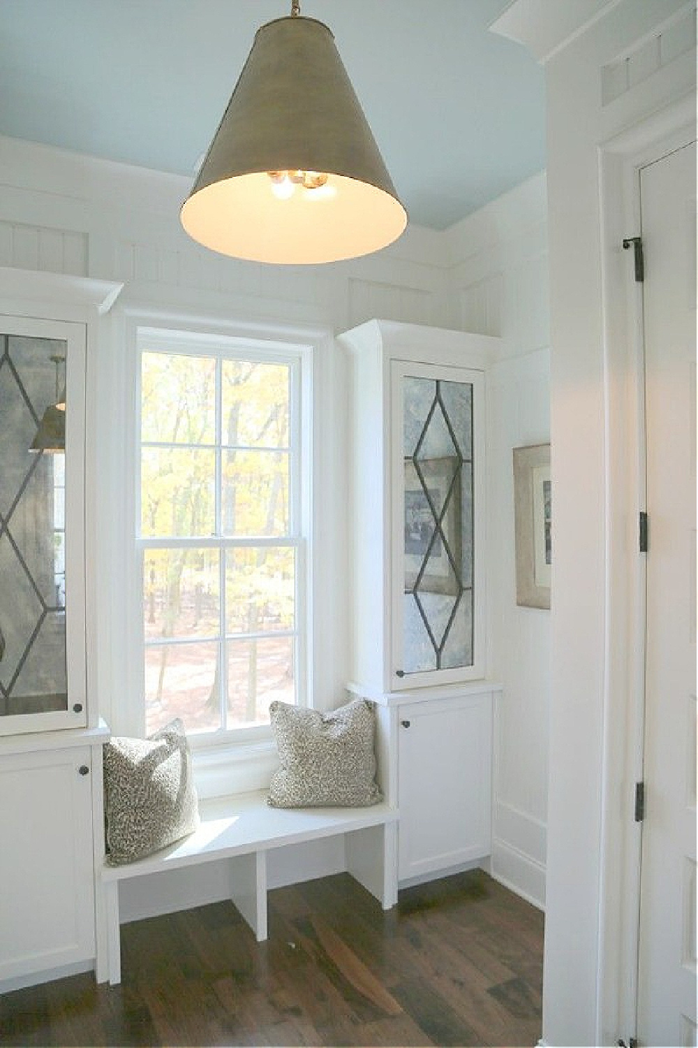
Have a space in your own home to accent with this calming hue?
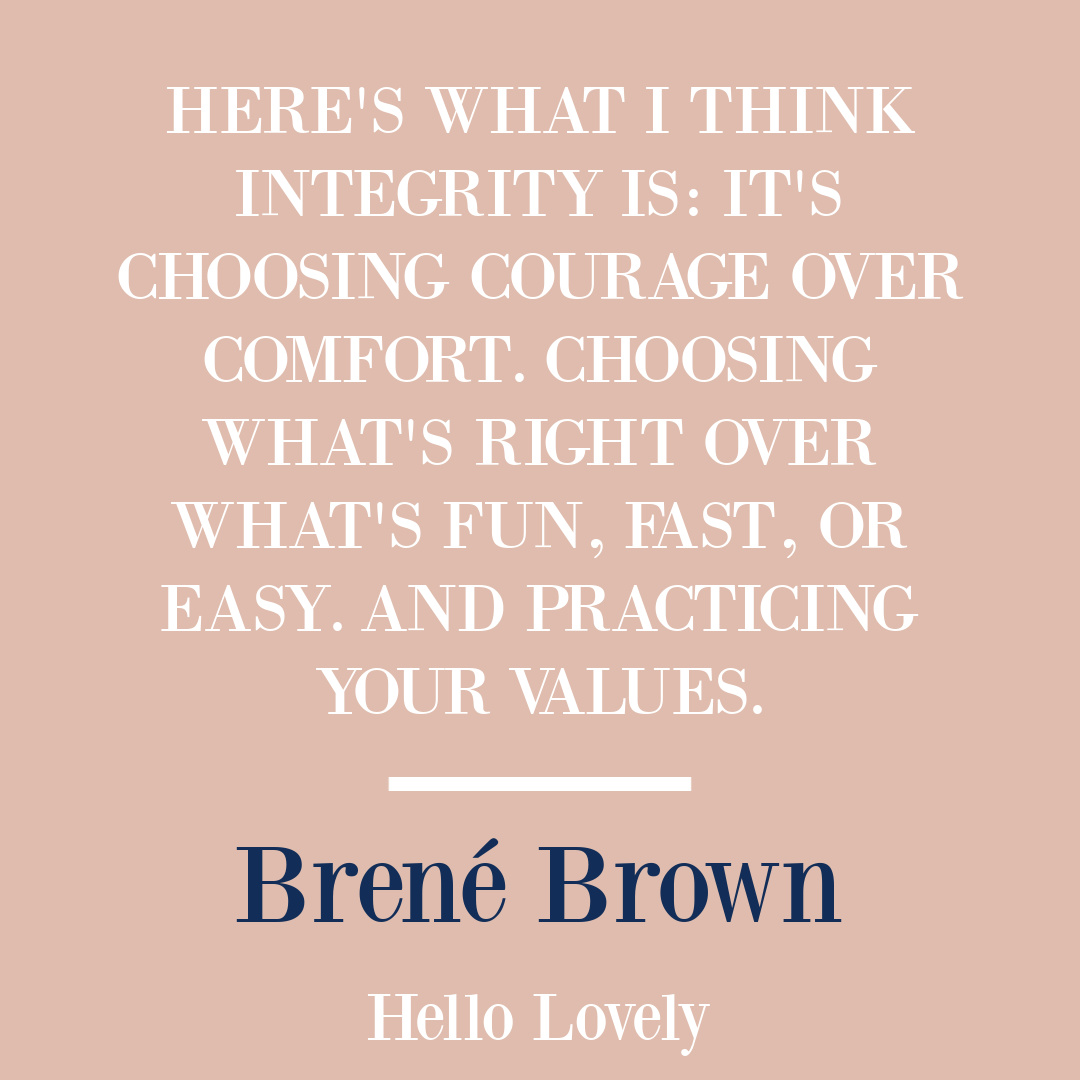
I also love the beadboard and batten treatment in this hall too.
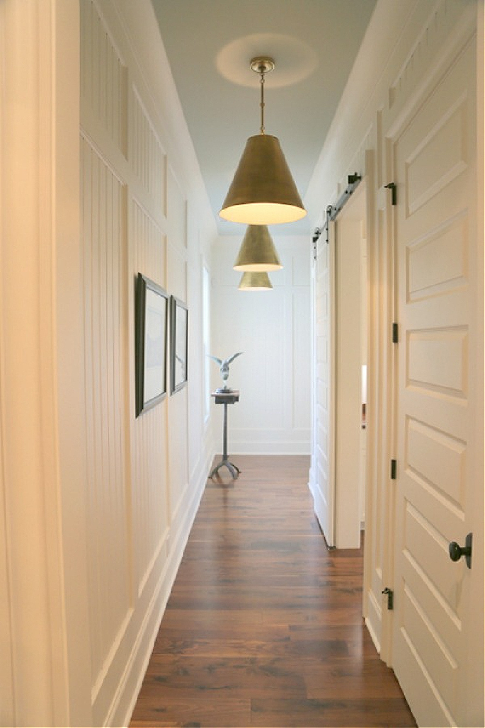
BENJAMIN MOORE Paper White 1590
When you’re going for the palest, sophisticated light blues…steer yourself to the grey section and a color like Paper White.
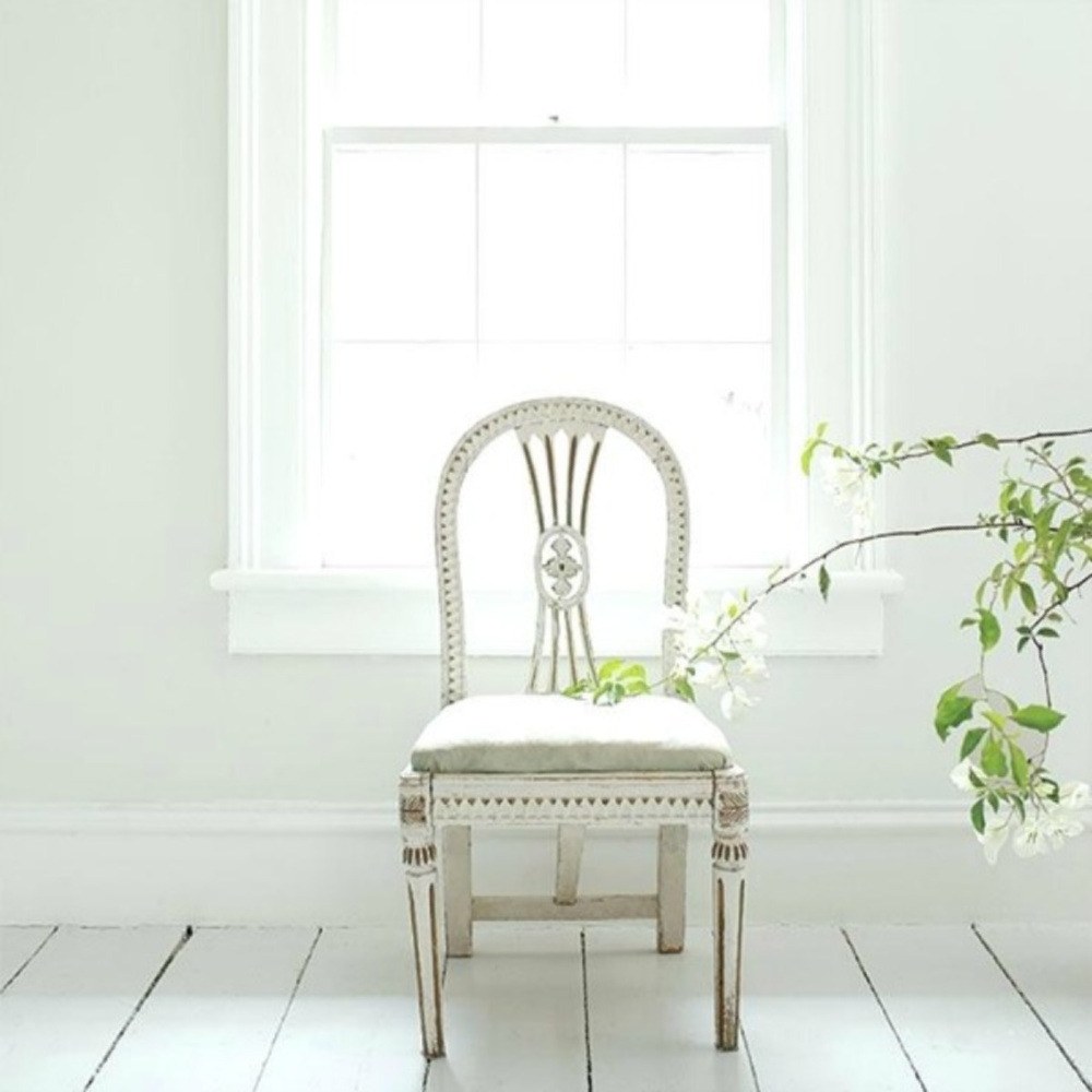
In that same spirit, here’s a gorgeous blue I’ve been dying to try somewhere.
Easiest way to see if a paint color will work? Order samples with Samplize and have them delivered straight to your door.
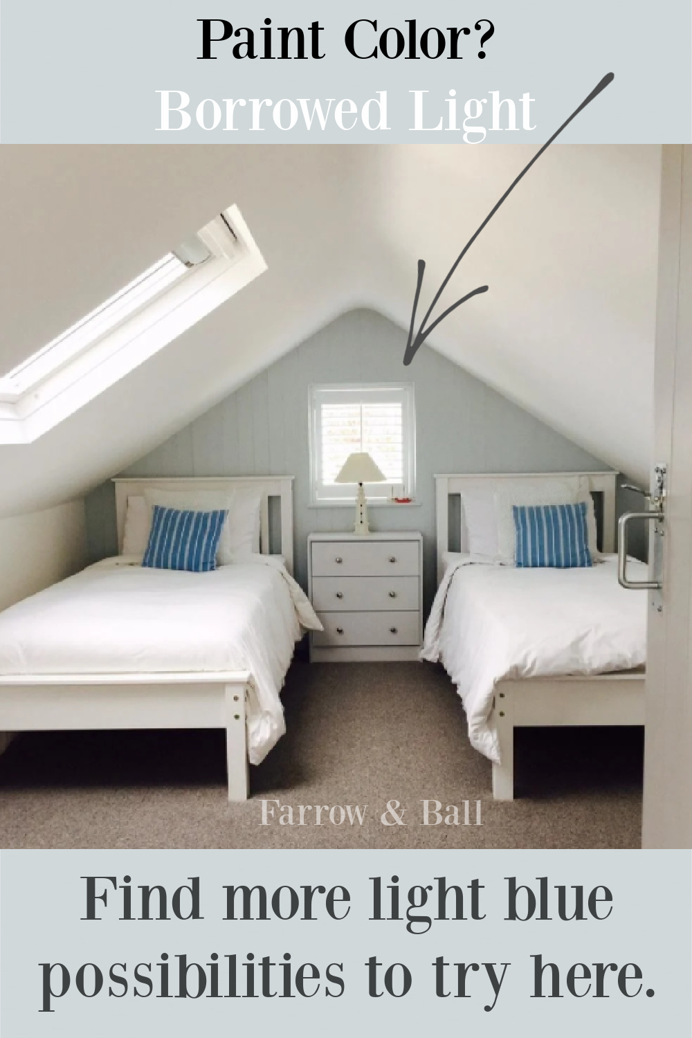
Farrow & Ball Borrowed Light
Isn’t it sophisticated and timeless when you’re after an elegant blue?
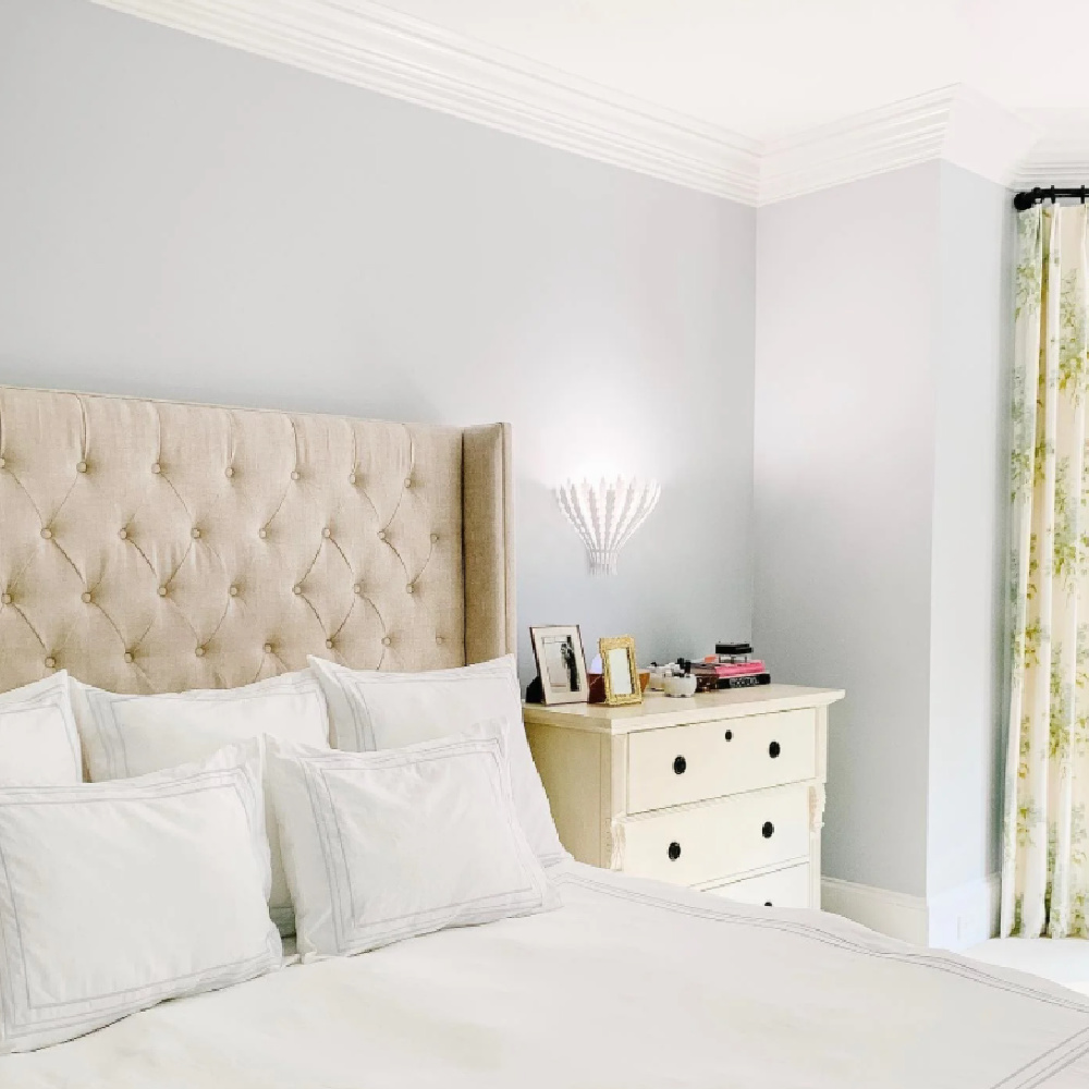
Farrow & Ball calls it pale and illuminating!

This is the description of Borrowed Light:
“Evoking the colour of summer skies, Borrowed Light is a wonderfully pale blue named after the delicate light that cascades through small windows and fanlights. It works as well in a room deprived of light as it does in an airy sunroom. This soft and classic tone is perfectly suited to children’s bedrooms, especially when contrasted with Stiffkey Blue on furniture or woodwork.”
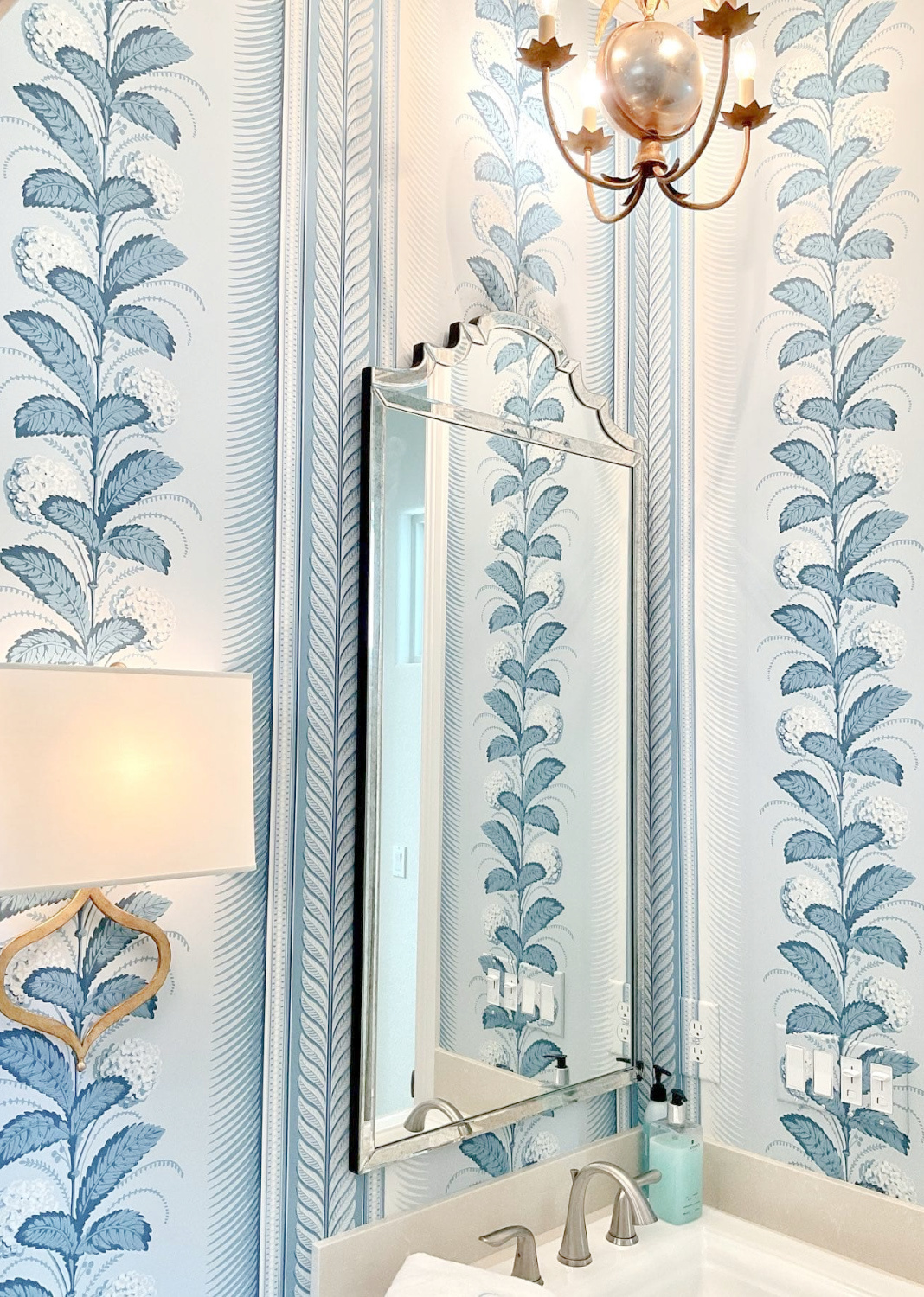
F&B Borrowed Light would be stunning with this Schumacher wallpaper called Hydrangea Drape.
My friend Kathy just used it in a beautiful bath:
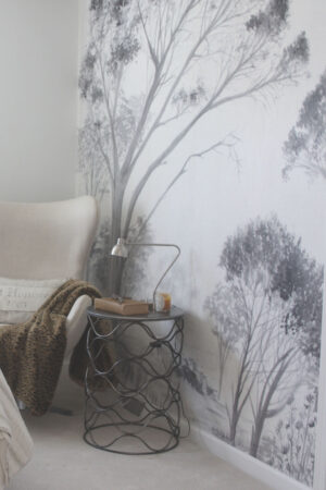
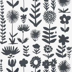
Here are a few other wallpaper favorites of mine:
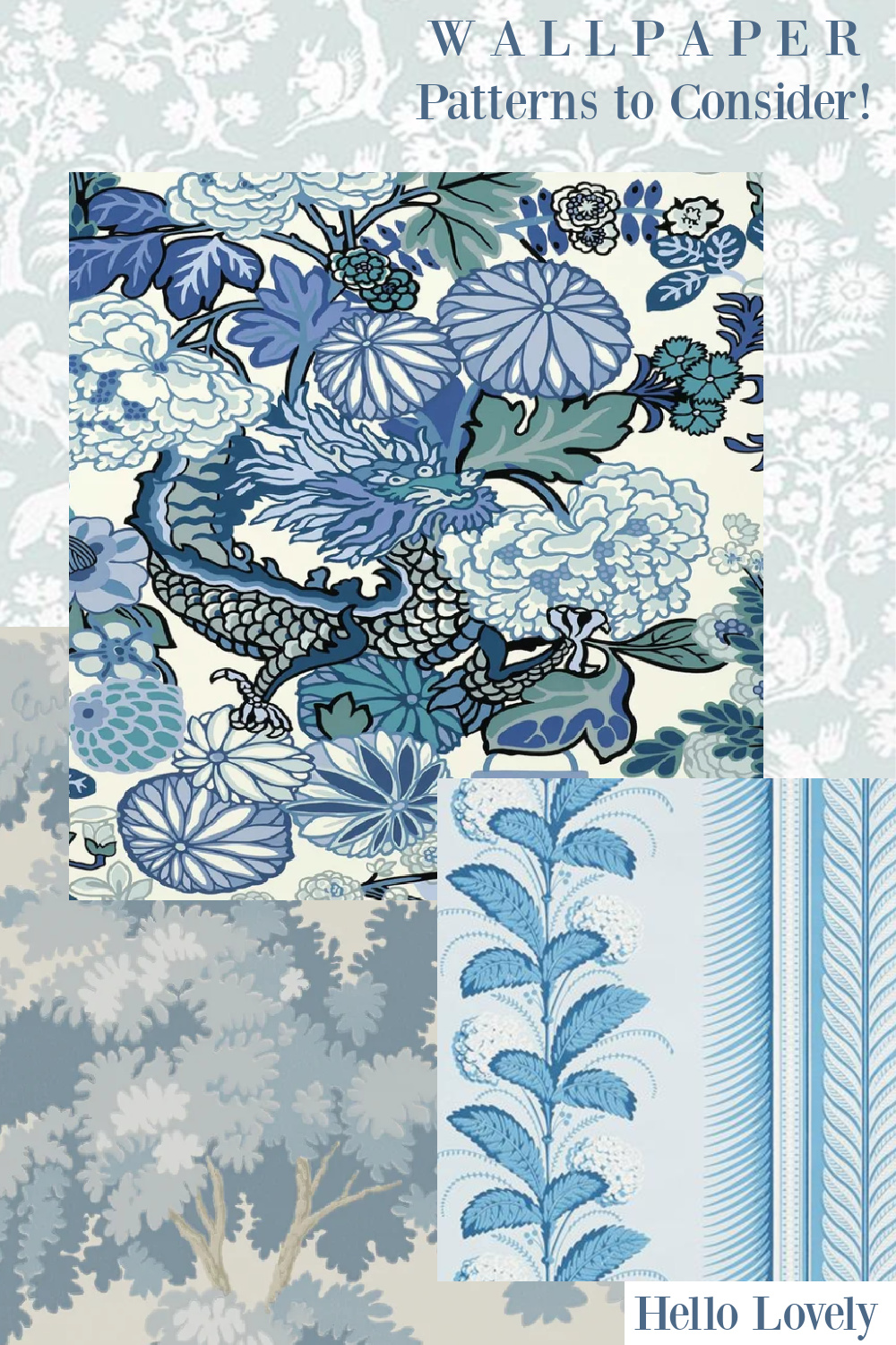
The first blue paint color we explored (BM Smoke) may be my favorite of the bunch, and it would be amazing with #1 and #3 above.

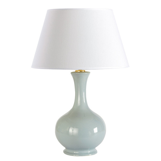
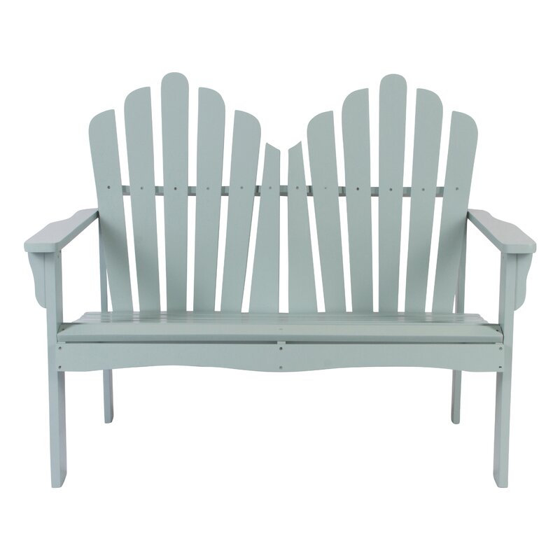
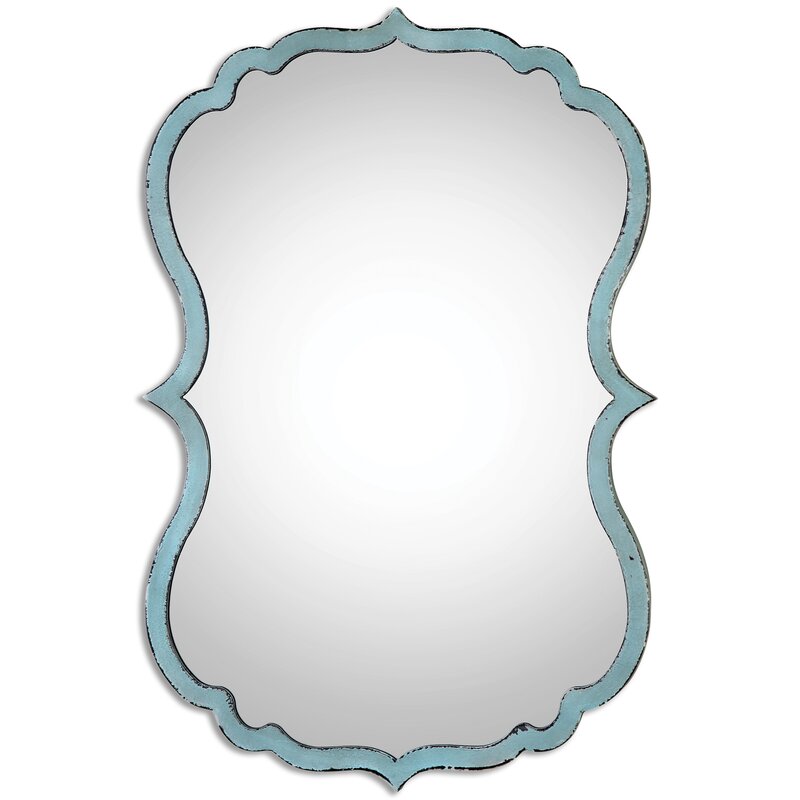
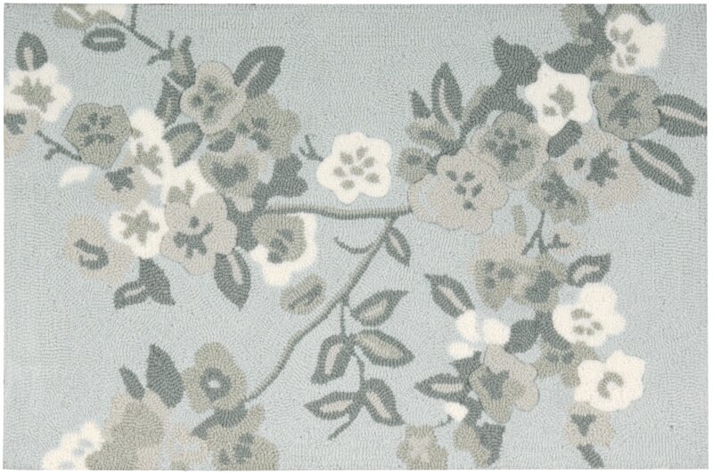
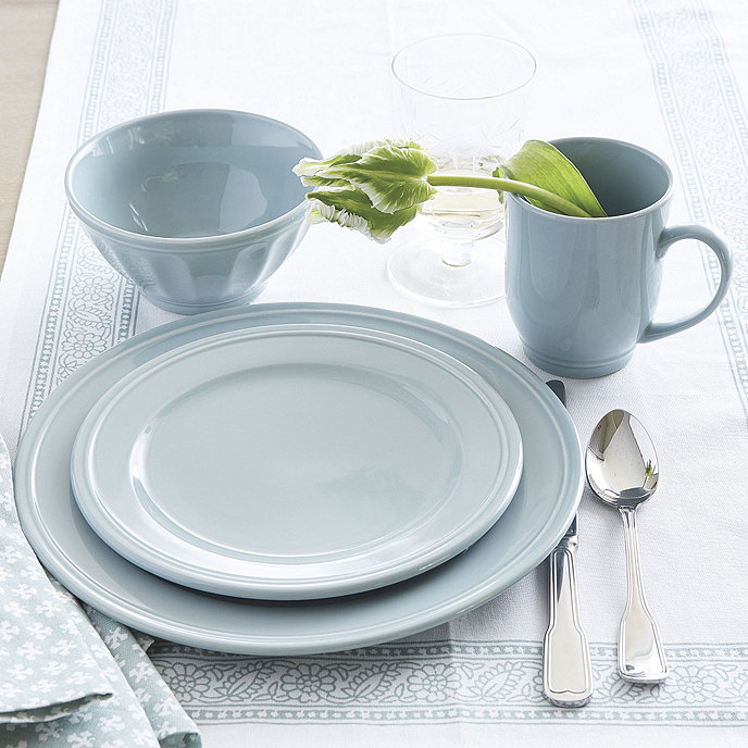
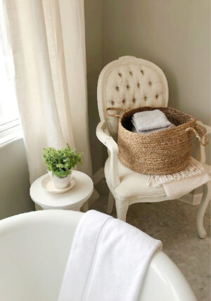
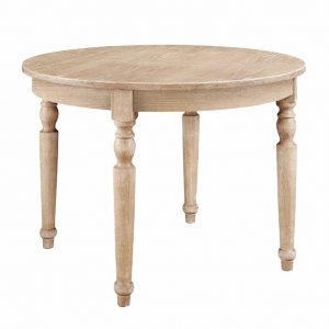
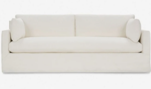
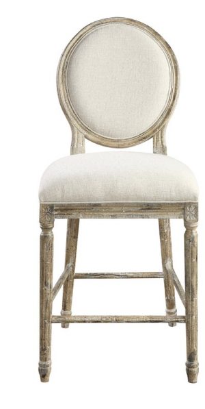
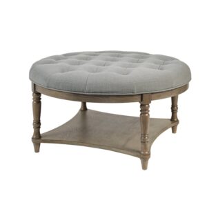
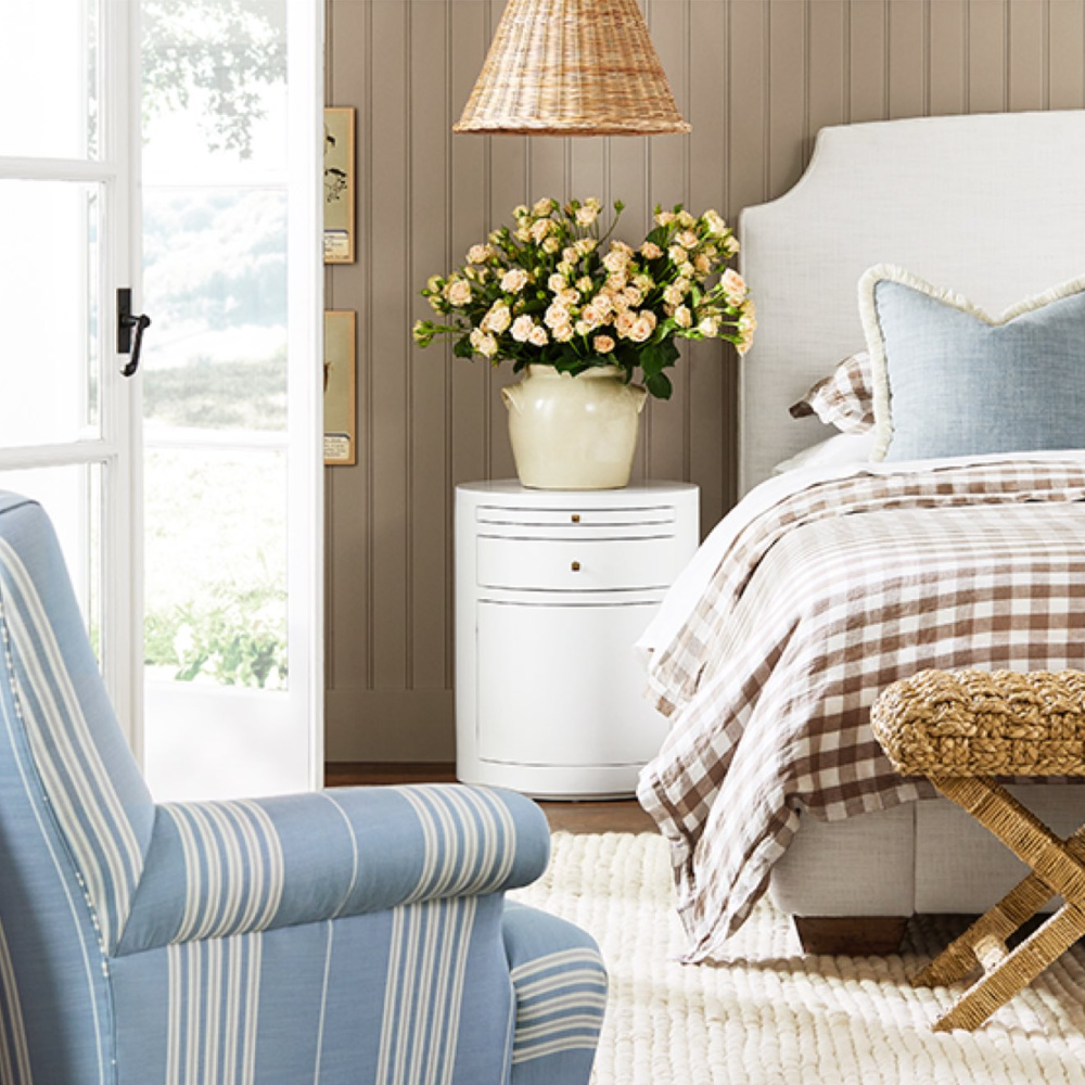
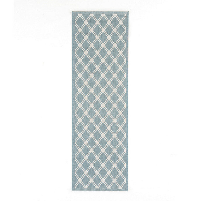
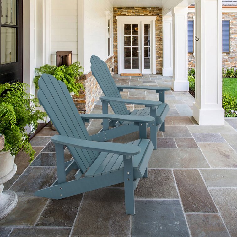
Lovely Light Blue Furniture & Decor
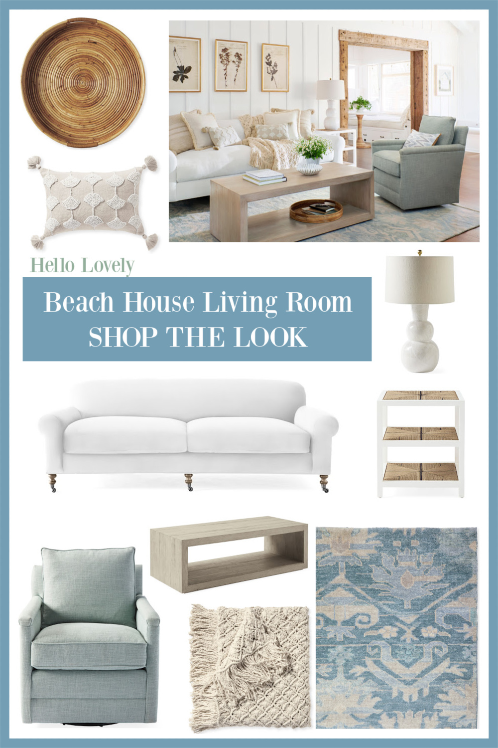
Dreamy Aqua Blue-Green
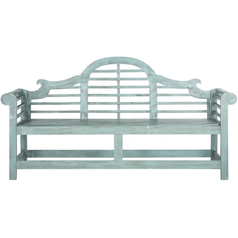

Charming Chambray & Denim Blue
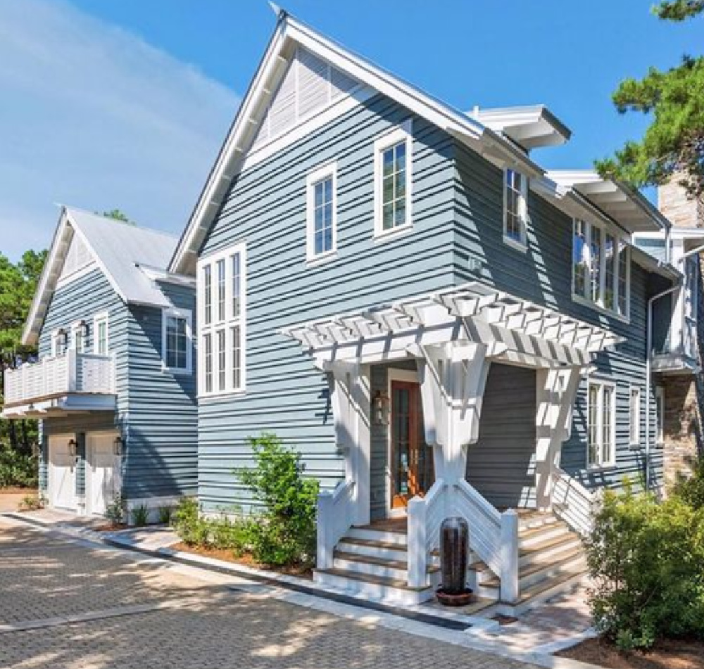
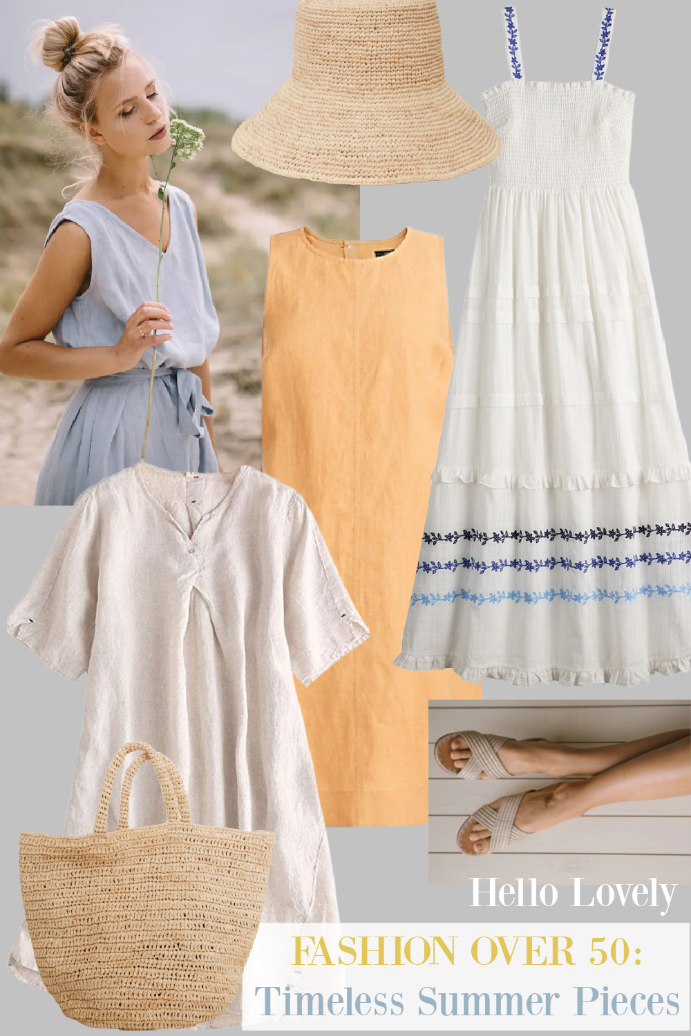


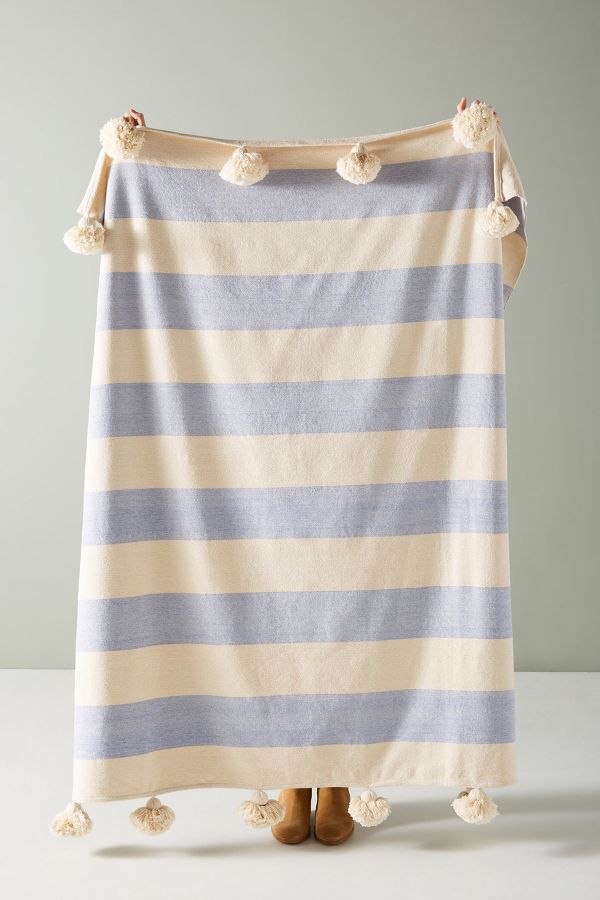
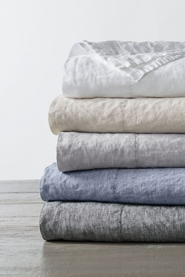
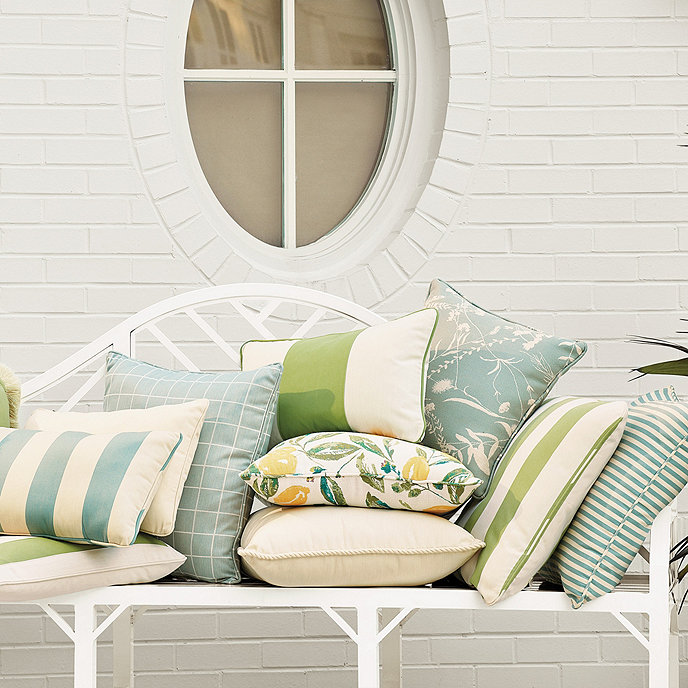
Cheerful & Bolder Blue Accents

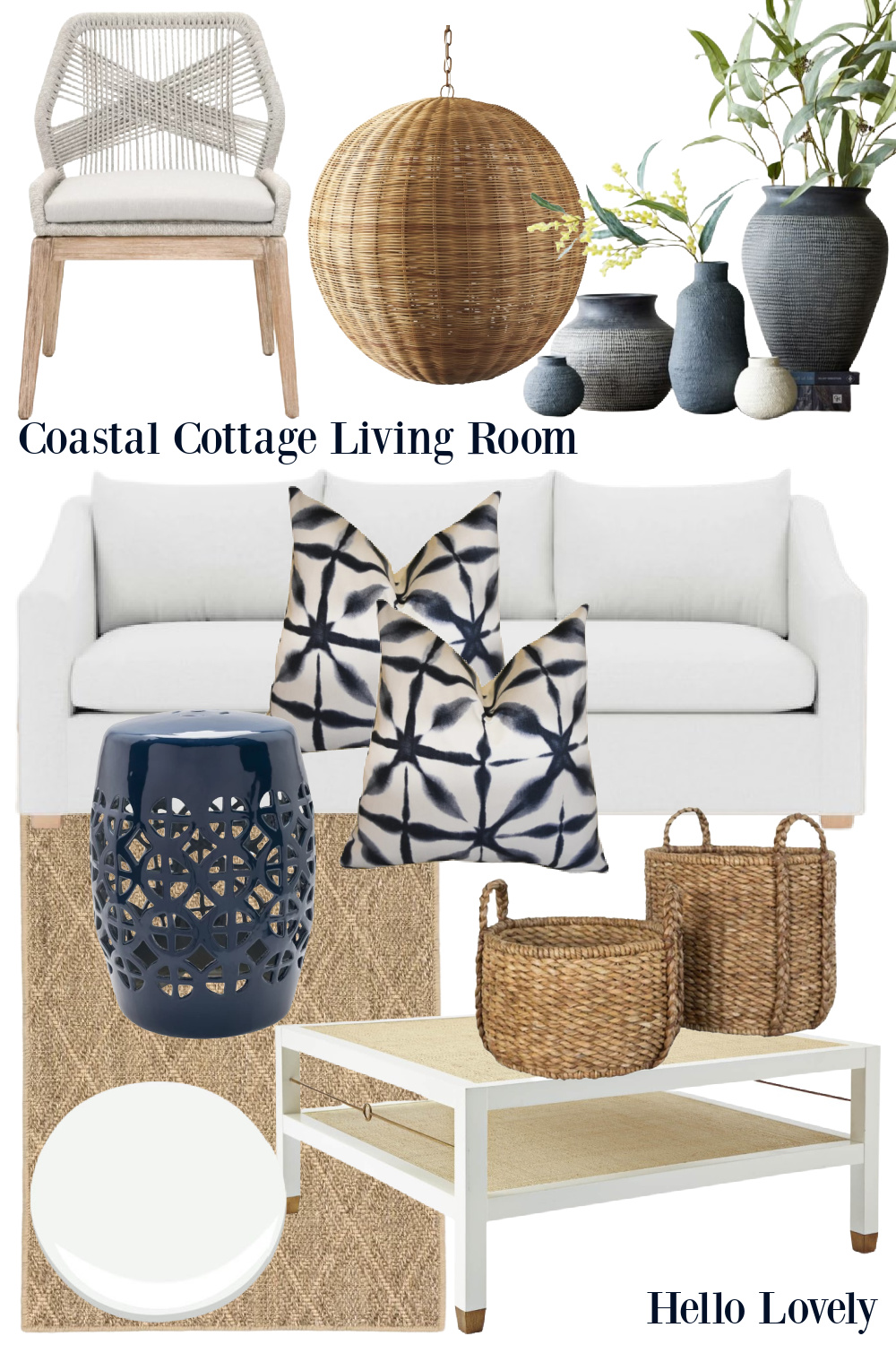
How’s that for an epic collection of pretty blues!?!
Let me know if you found anything helpful from these ideas and the inspiration!
I independently selected products in this post—if you buy from one of my links, I may earn a commission.
Peace to you right where you are.
-michele
Thanks for shopping RIGHT HERE to keep decor inspiration flowing on Hello Lovely!
Hello Lovely is a participant in the Amazon Services LLC Associates Program, an affiliate advertising program designed to provide a means for sites to earn fees by linking to Amazon.com and affiliated sites.


&%24w400%24)
