Even though the title of this post is Paint Colors in Timeless Blue and White Kitchen, you will be delighted to learn many more kitchen’s design details beyond simply the beautiful paint colors shared by the designer!
Paint Colors in Timeless Blue and White Kitchen!
The emails keep rolling in about the Atlanta Homes & Lifestyles 2017 Southeastern Designer Showhouse kitchen profiled and profusely praised last year. Even after an interview with one of the designers and spilling lots of secrets, you still want more. I keep hearing from folks who desire more specifics about colors, materials, and sources associated with this showstopping kitchen and breakfast area, a collaboration between Matthew Quinn of Design Galleria and Lauren DeLoach Interiors.

Project: Kitchen – Atlanta Homes & Lifestyles 2017 Southeastern Designer Showhouse & Gardens
Design: Design Galleria Kitchen & Bath Studio and Lauren DeLoach Interiors
Architect: Yong Pak/Builder: Michael Ladisic/Images: Emily Followill (Atlanta Homes), Design Indulgence, Southern Hospitality
See this amazing design on video:

Questions for the Designer
When last we caught up with designer Lauren DeLoach, she shared key ingredients in the kitchen design.
What were the design objectives for the kitchen and pantry?
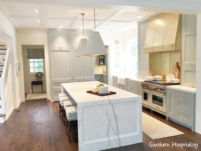
We wanted to create a cozy, proportional kitchen. This home has a ton of old character and classic details. The kitchen needed to fit in without standing out in scale, if that makes sense? As boring as it may sound, functionality was our main objective. Matthew is the master at making a place for everything.
What inspired that divine color palette?
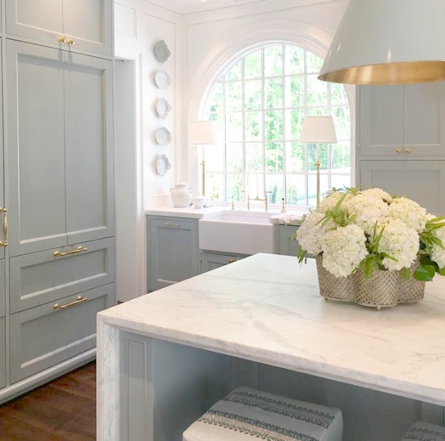
We preferred a color other than white. Blue is the homeowner’s favorite color. The blue we settled on works as almost a neutral in the space.
Matthew Quinn and I loved the idea of using brass accents with the light blue. Something you may not be able to see from photos? The paint is brushed on the cabinets. We all felt this made the kitchen feel more a part of the original house–like cabinetry that had been painted many times over the years!
Can you share more insider details?

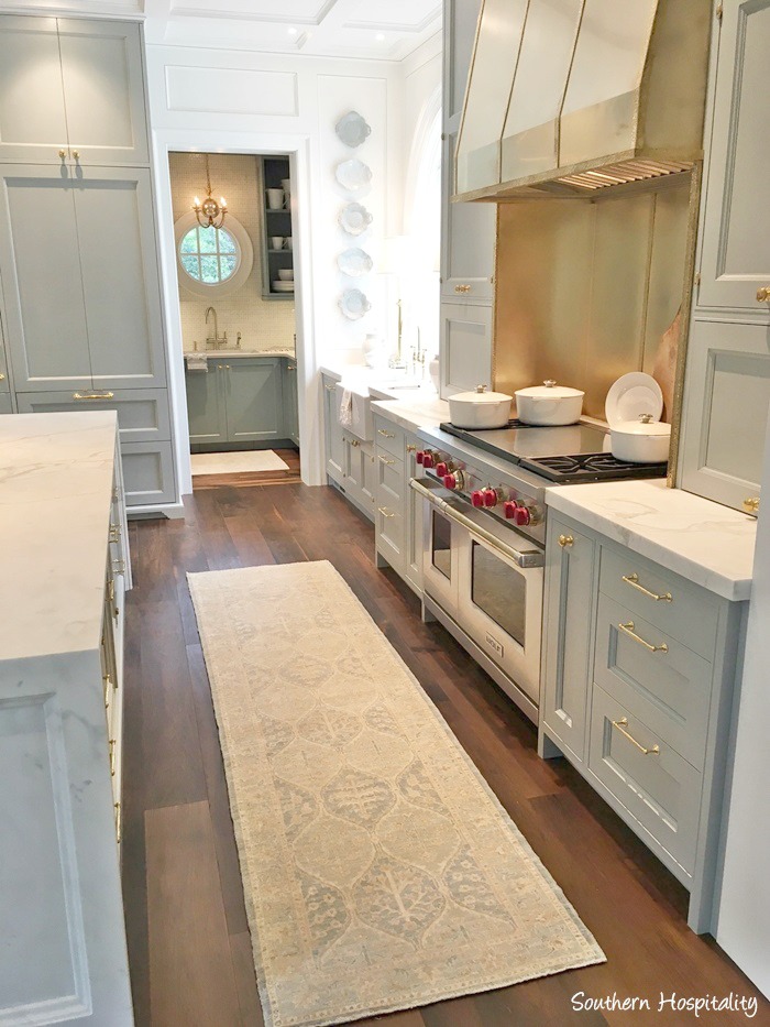
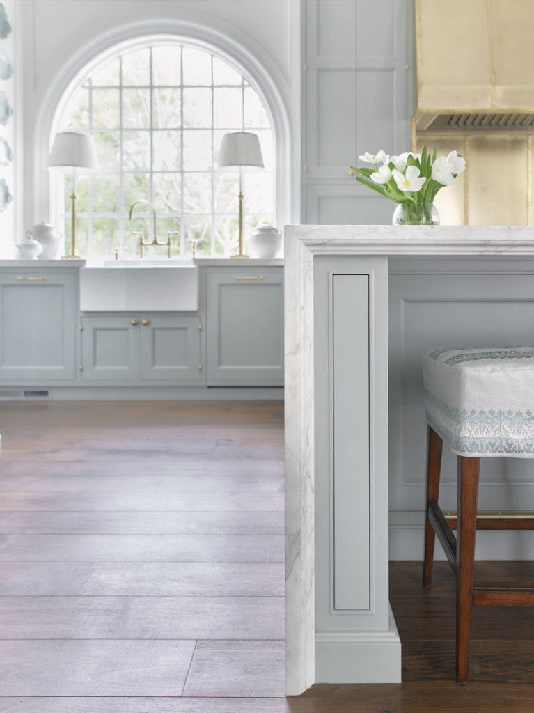
PAINT COLOR FOR WALLS: SHERWIN WILLIAMS Alabaster

PAINT COLOR FOR CABINETRY: FARROW & BALL Light Blue
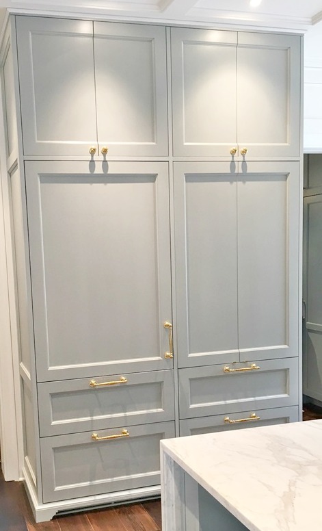
This tranquil BLUE PAINT was HAND-BRUSHED ON THE CABINETRY

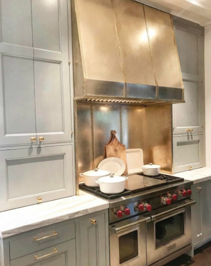
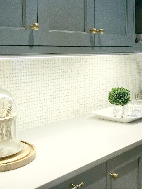
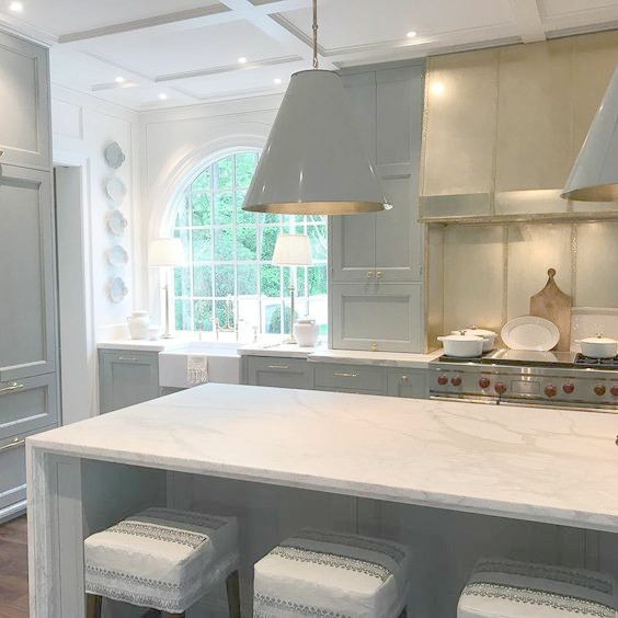
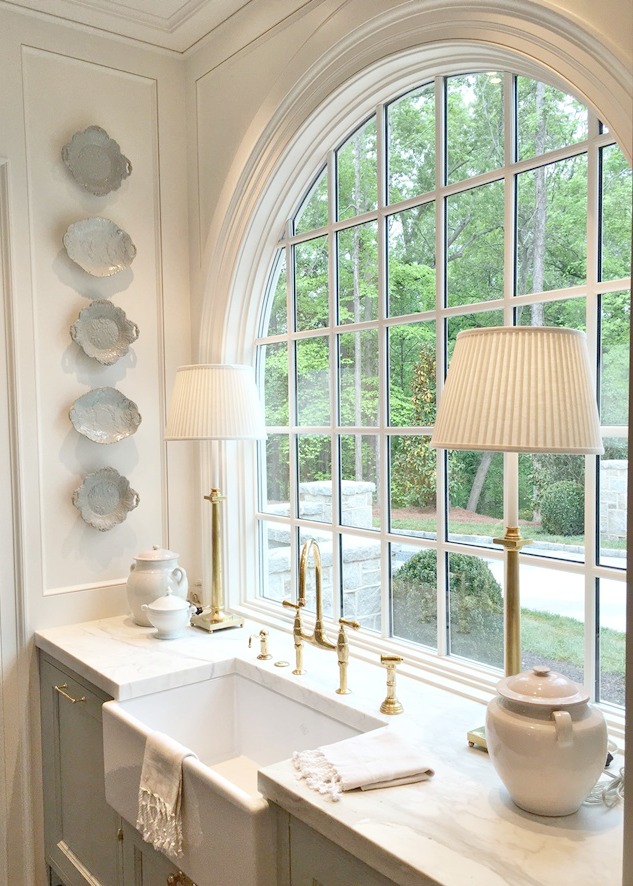
Design Details: Range
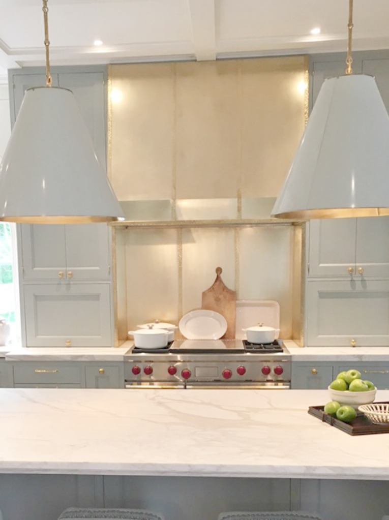
RANGE HOOD: Main material is a burnished brass. The strapping is hammered polished brass.

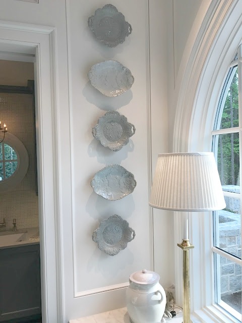
Design Details: Decorative Plates
PLATES ON WALL NEAR THE FARM SINK: Antique Ridgeway plates found at Interiors Market in Atlanta.
“I have never seen any others like them…and I’m constantly shopping antique china. They were the exact shade of the cabinet color so I think they were meant to be there. Fortunately, the homeowner purchased them and they are still hanging next to the sink.”

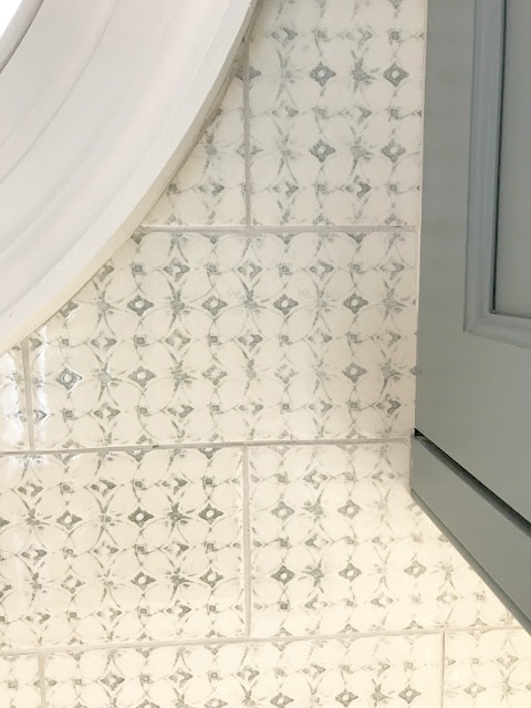
Design Details: Butler Pantry
TILE IN THE BUTLER PANTRY: Custom through Renaissance Tile.
We loved the handmade quality. And tying the light blue and cream, together with the darker blue color of those cabinets made it a very cozy space.
The butlers’ pantry has lots of storage and even a full size freezer and dishwasher.

Dreamy Butler Pantry!

Design Details: Marble Countertops
While I am waiting for confirmation about this detail from the designer, the white marble appears to be Levantina’s Kalos Bianca Porcelain.
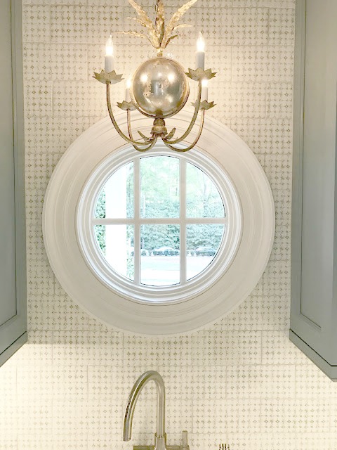
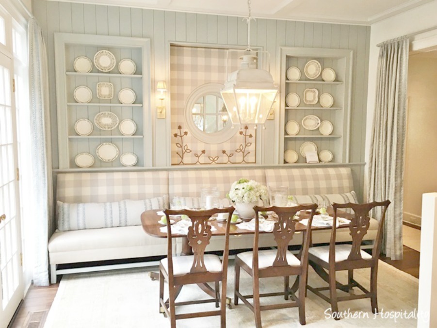
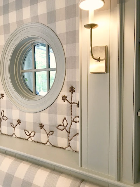
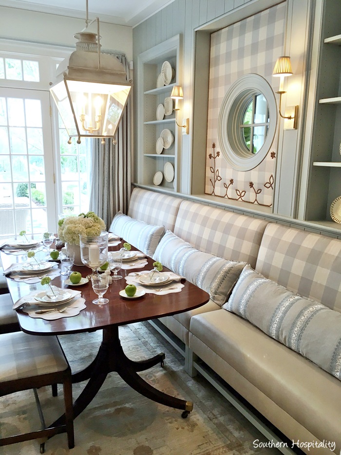
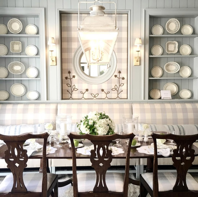
Design Details: BREAKFAST ROOM
Yong Pak, the architect had drawn those lovely niches with plate ledges, and I’m a sucker for plates on the wall! I decided that painting the back wall the same color as the kitchen would really unify the two spaces.

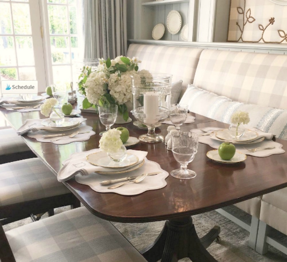
Gorgeous Custom Placesetting

Design Details: BANQUETTE
I worked with a local company to design the banquette using recycled leather for the seat and a fabulous Cowtan & Tout Buffalo Check for the back.
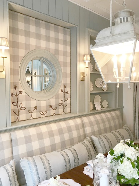
Design Detail: BRASS NAILHEADS
During a meeting with them, the fabric panel around the round window just popped into my head and that wonderful flower brass nailhead detail was born! I love how that pulls the brass elements from the kitchen subtly into the space.
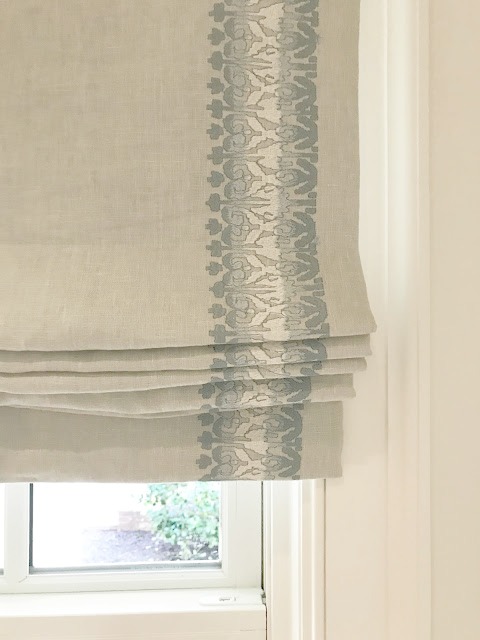
Design Detail: Fabrics
DRAPES: Cowtan & Tout
I used more Cowtan & Tout fabric for the draperies on both the french doors outside and the cased opening opposite so the breakfast area is flanked by fabric. I’m a big believer that drapes make the space!
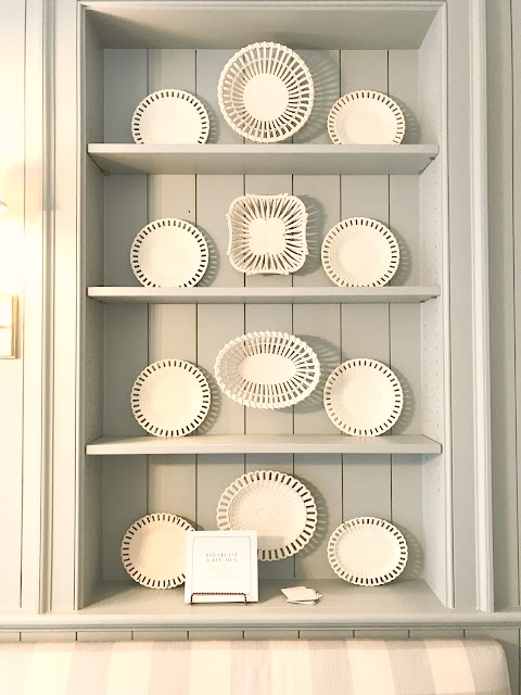
Design Details: Decorative Plates
ANTIQUE CREAMWARE: Loaned, Interiors Market.
I personally collect reticulated basketweave creamware like the pieces I used. I thought it seemed so graphic against the blue wall. I just love it and was so fortunate to be able to use so many fine pieces!
Design Details: Furniture
DINING FURNITURE: Table and chairs, antiques.
The antique table and chairs just suited the space. I prefer to use antiques as much as possible in my designs for the sense of history they bring to a space. The table felt like it could have been a family piece that was passed from generation to generation.
How would you describe the mood of the kitchen experienced in person?
Light yet elegant. It feels refined without feeling stuffy…I love that balance! That balance makes everyone feel comfortable in the space and you wanted to linger.

What guiding principles for creating a timeless space inform the project?
First, cross-reference some elements of your design- repeat a color or pattern or metal finish.
Second, MORE IS MORE when it comes to fabric in a room. Drapes and pillows make the space!
Third, Antiques. Always and forever. Don’t be afraid to use them! Your grandmother would want you to!!
Kitchen Resources
PAINT COLOR for CABINETRY FARROW & BALL Light Blue. PAINT COLOR for WALLS: SHERWIN WILLIAMS Alabaster. CABINETRY AND KITCHEN BACKSPLASH Design Galleria Kitchen and Bath Studio. HARDWARE Matthew Quinn Collection. COUNTERTOPS Levantina, fabricated by Construction Resources. SINKS & FAUCETS Rohl – see options here. TILE Renaissance Tile & Bath. RANGE, WARMING DRAWER, STEAM OVEN & HOOD Wolf REFRIGERATOR Sub-Zero. DISHWASHER Asko. LIGHTING Circa. RUG Moattar. INSERTS Rev-a-Shelf.
Breakfast Room Resources
RUG Moattar. CREAMWARE Interiors Market. MONOGRAMMED LINENS Custom through Gramercy Home. GOBLETS AND BUD VASES Erika Reade Ltd. CUSTOM BANQUETTE AND WINDOW WALL Bjork Studio. ALL FABRICS Cowtan & Tout. LIGHTING Circa.
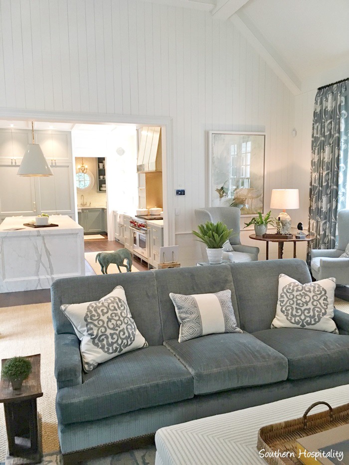
Relationship of Kitchen & Living Area
Book by Matthew Quinn
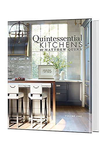
Quintessential Kitchens by Matthew Quinn (Parrish Press, 2016). 15 extraordinary residential kitchens – each one a detailed vision of quintessential design, no matter size, setting or style. Matthew designs for many of the world’s most exacting clients, and does so from a philosophy that precise and personal function leads ahead of aesthetics. In every case, Matthew takes clients on a journey that uncovers the secrets to his great designs and how he fulfills clients’ dreams. Matthew and his clients’ individual stories are revealed for the first time in Quintessential Kitchen by Matthew Quinn: Volume One.
What inspires YOU about this gorgeous kitchen?

YOUR TURN.
Is there a space in your home or an object you may want to paint with Farrow & Ball’s Light Blue? Sherwin Williams Alabaster?
I independently selected products in this post—if you buy from one of my links, I may earn a commission.
Peace to you right where you are.
-michele
Shop for items you already intended to buy on Amazon RIGHT HERE, and also find home decor here to keep decor inspiration flowing on Hello Lovely!
Hello Lovely is a participant in the Amazon Services LLC Associates Program, an affiliate advertising program designed to provide a means for sites to earn fees by linking to Amazon.com and affiliated sites.


Gorgeous kitchen. Beautiful colors.
Author
Have a wonderful weekend, friend. Thanks so much for reading. xox
I never tire of seeing this gorgeous kitchen! No detail has been overlooked. It does feel like a wonderful family home that has been there for years. It’s perfectly classic. Have a great weekend Michele!
Author
Neither do I! Bon weekend, lovely woman.xox