Just a few more projects in the living and dining rooms, and the decor will be done on the makeover at our second home in Arizona.

{affiliate links follow and using them won’t cost you extra yet may earn me a small commission.}
 |
| DIY Dining Room Decor Makeover Progress |
I recently shared the decorating progress of our
and
and you’ll definitely notice I’m showing you
just half of the living room today since the
other half is empty and waiting for us to
give it some love and furnish it!
Why is it taking so long?
We have a low low budget, plus,
we can only get to the project when we can
find vacation time to get away!
Affiliate links follow for decor
items or similar decor items
we incorporated.
I haven’t shown you the exterior of the
charming Mediterranean style cottage with
its clay room and grey shutters, so here it is:
 |
| Exterior of our Arizona vacation house |
And here is one of the marketing pics of
the living/dining/kitchen to give you an idea
of wall colors and decor when we bought it.
 |
| B E F O R E |
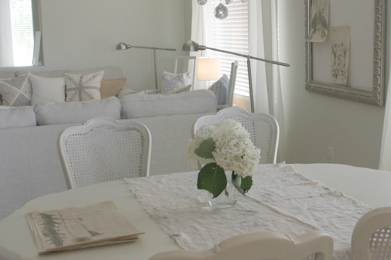
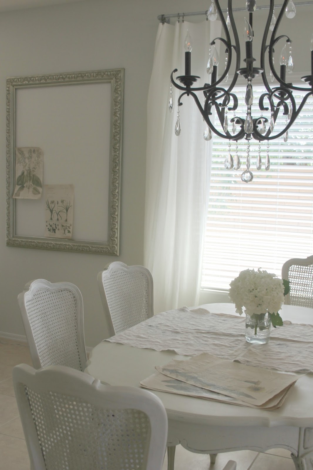
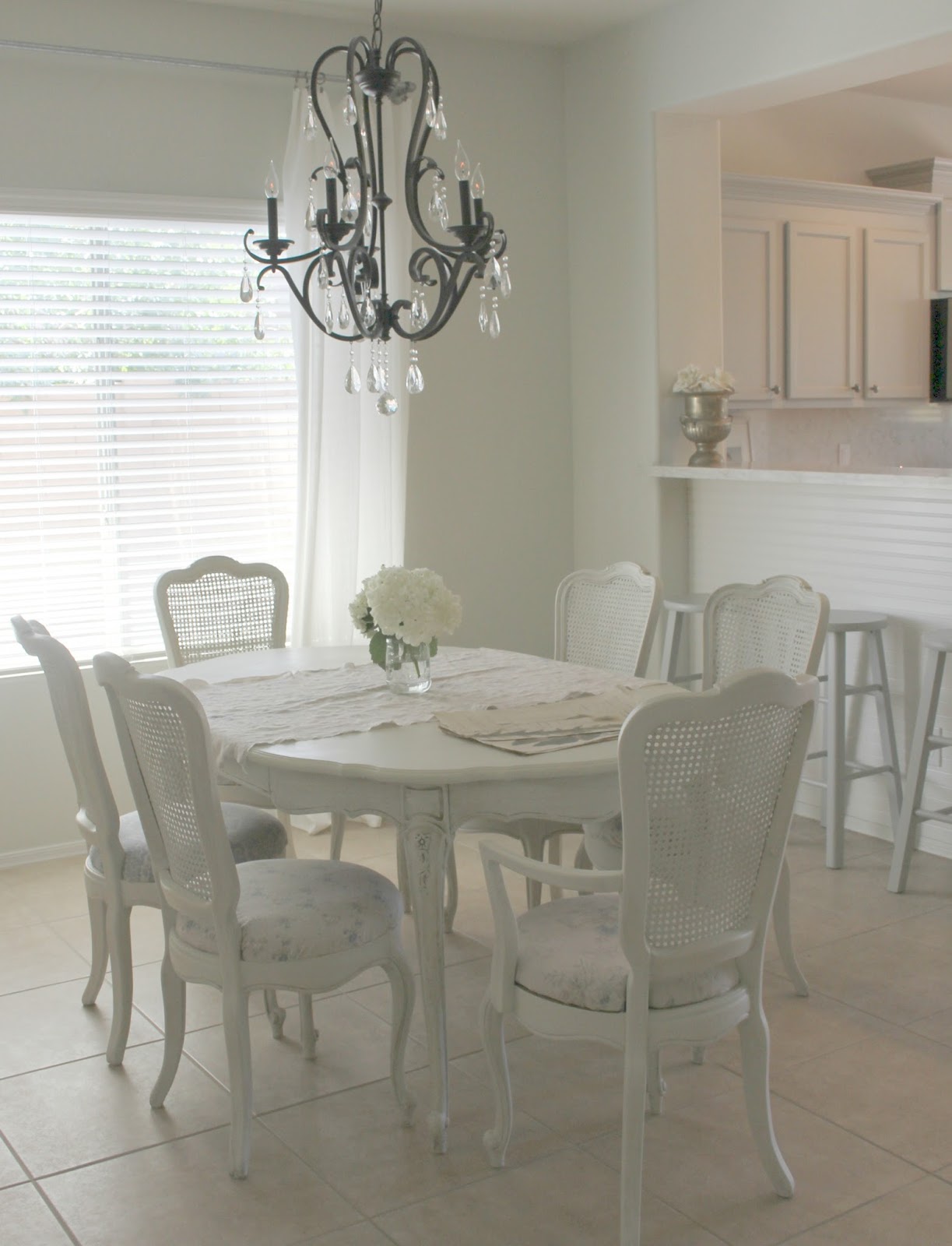
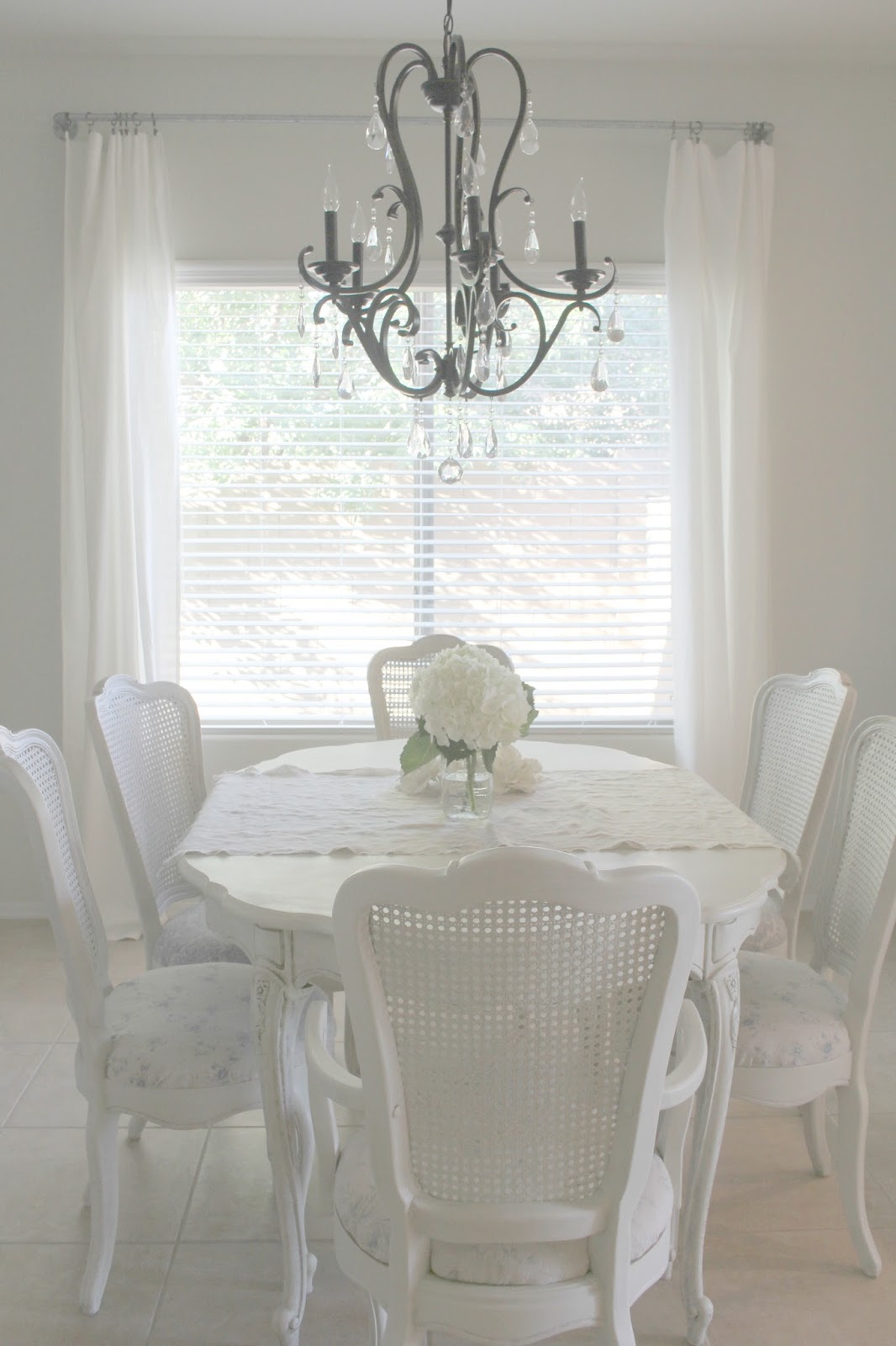
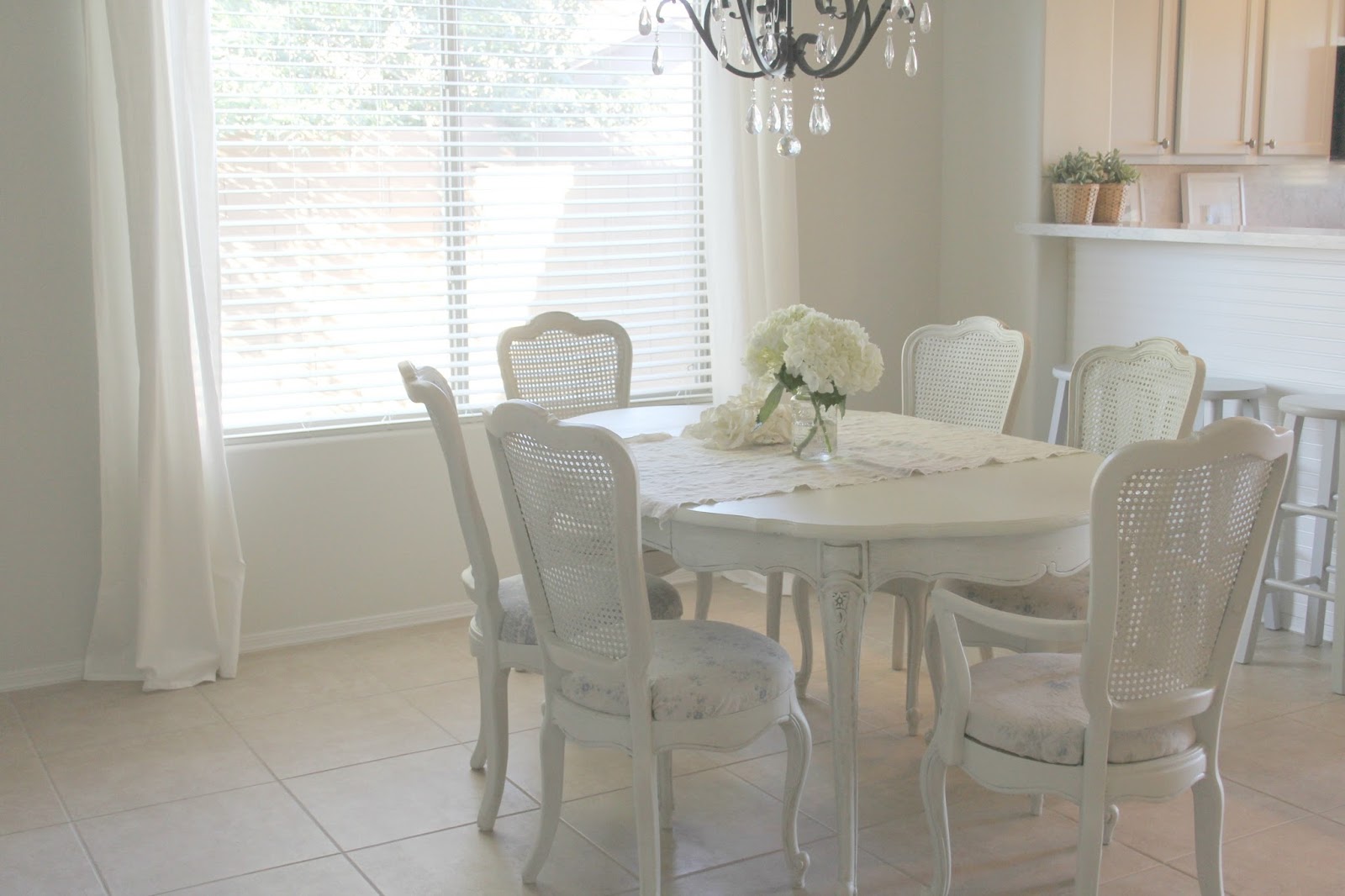
The first thing we did in the dining room
was change the light fixture to
a dark bronze chandelier,
adding a similar one to the music room.
 |
| DIY Dining Room Makeover by Hello Lovely Studio |
We painted the green walls a creamy white
(Valspar – Salute), and then I searched
Craigslist for a vintage dining set with a French feel.
This cane back dining chair from Shabby Chic
has a similar feel.
 |
| DIY Dining Room Makeover by Hello Lovely Studio |
It was love at first sight when I found this
set, although it was a yellow color, and the
chair fabric was all wrong.
 |
| DIY Dining Room Makeover by Hello Lovely Studio |
I mixed up my own plaster-paint mixture
with a couple of different whites and light greys
and did a light dry brushing over the yellow.
 |
| DIY Dining Room Makeover by Hello Lovely Studio |
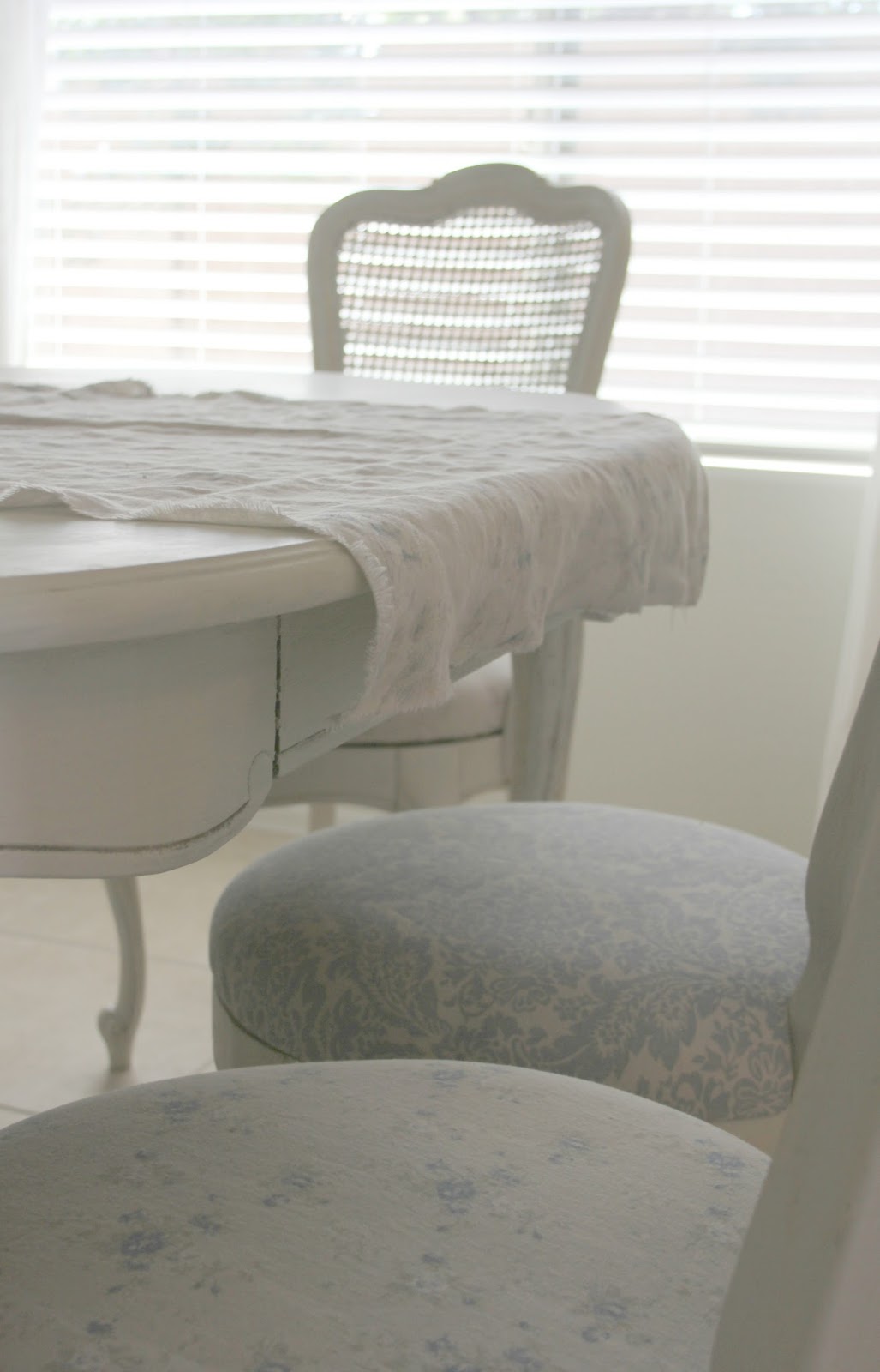
My dad covered the round seats with
three different linens designed by
Rachel Ashwell at Shabby Chic Couture.
Our favorite is this linen damask fabric.
I liked the idea of mixing fabrics for
a more casual, less fussy feel in here.
 |
| DIY Dining Room Makeover by Hello Lovely Studio – fabric on chair here |
(above) I love the details on the legs.
 |
| DIY Dining Room Makeover by Hello Lovely Studio |
I’m thrilled with how making over this dining
set helped set a tone in here–very Paris
apartment meets shabby chic.
|
| DIY Dining Room Makeover by Hello Lovely Studio |
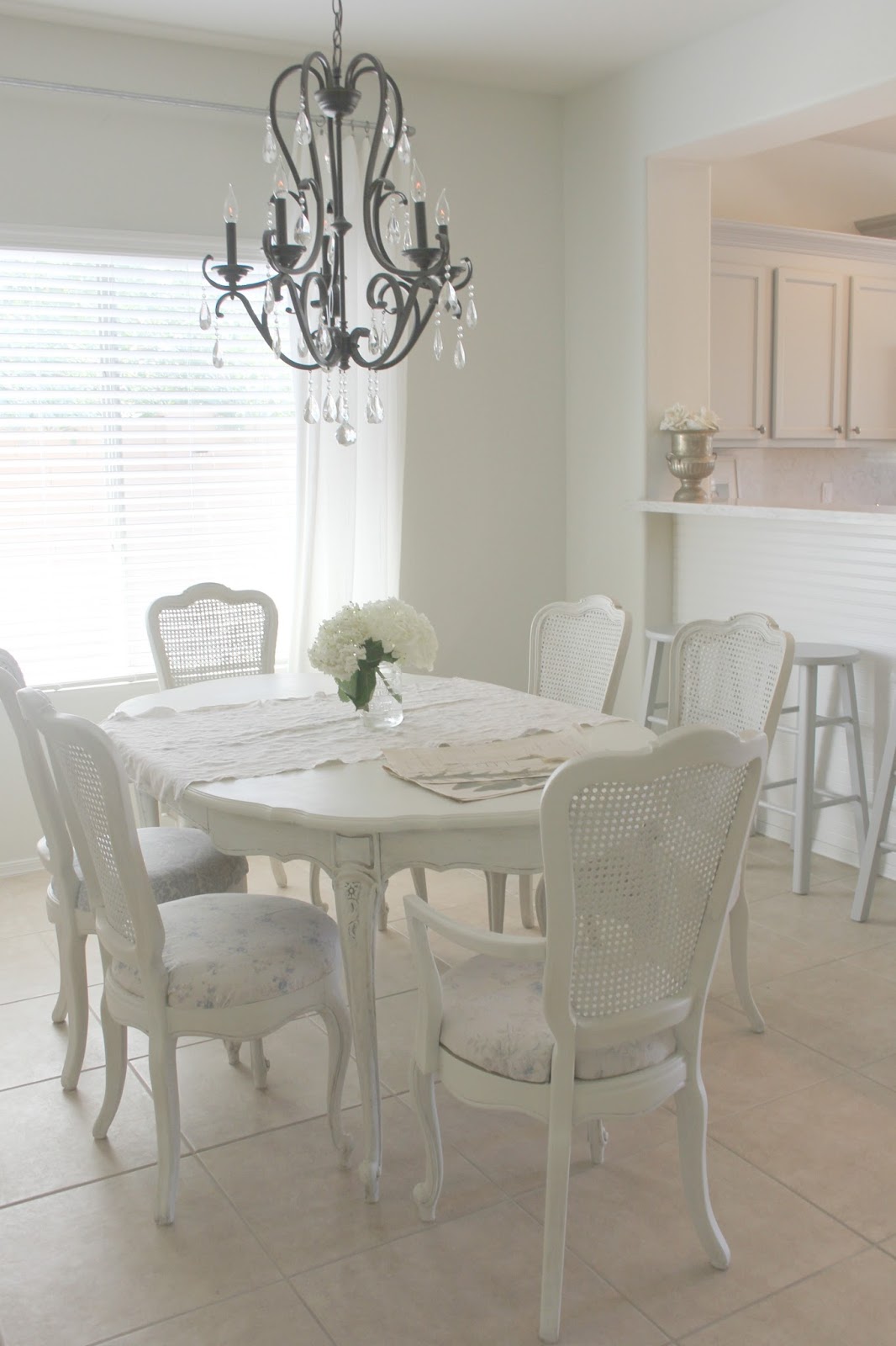
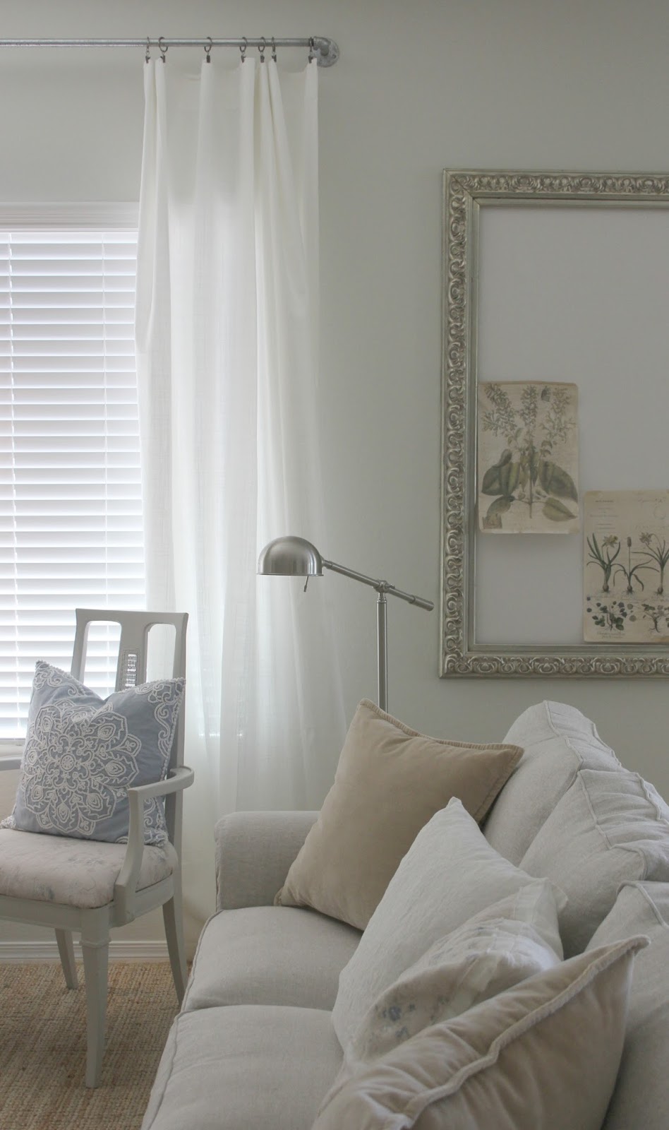
My husband made the industrial style
curtain rod from plumbing supplies,
and I hung simple billowy white
panels on pewter rings.
 |
| DIY Dining Room Makeover by Hello Lovely Studio |
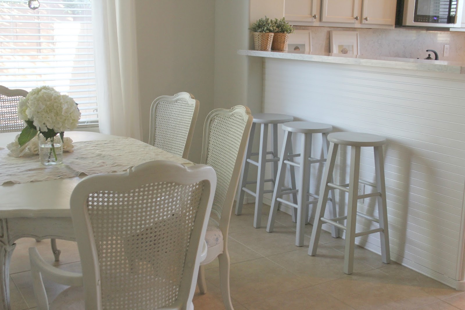
I am on the hunt for the right rug in here.
 |
| DIY Dining Room Makeover by Hello Lovely Studio |
And I would love to see the table
set for an actual meal!
 |
| DIY Dining Room Makeover by Hello Lovely Studio |
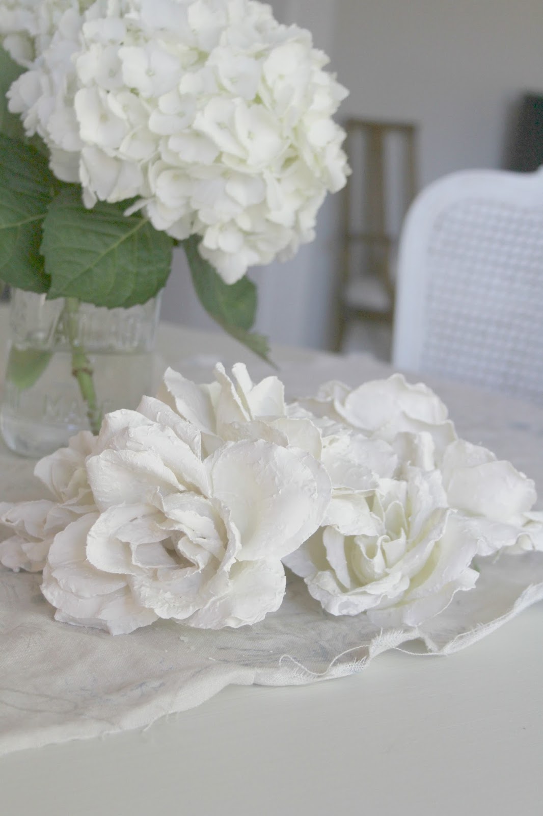
Some plaster roses I’m having fun making.
 |
| DIY Dining Room Makeover by Hello Lovely Studio |
 |
| DIY Dining Room Makeover by Hello Lovely Studio |
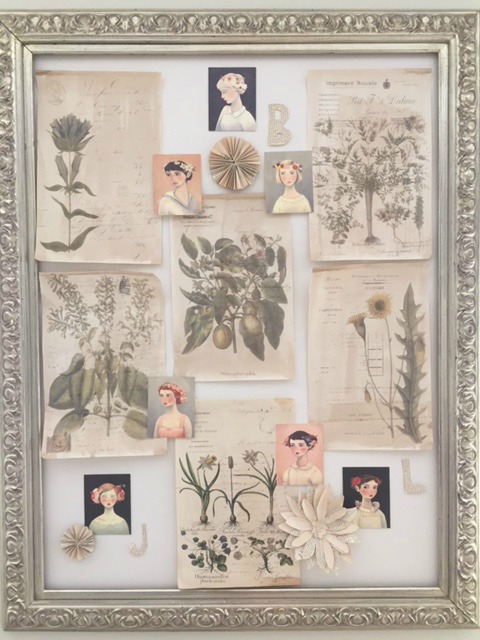
The empty inspiration board on the wall here?
A dumpster find…I kid you not.
 |
| DIY Dining Room Makeover by Hello Lovely Studio |
Since I’m far away from our Chicagoland home,
I have very little “stuff” to play with,
so what you’re seeing are some botanical
prints and watercolors I had lying around.
 |
| My Inspiration Board – Hello Lovely Studio |
I filled in some gaps on board by making some
flowers and letters from vintage bookpages.
 |
| My Framed Inspiration Board – Hello Lovely Studio |
 |
| B E F O R E |
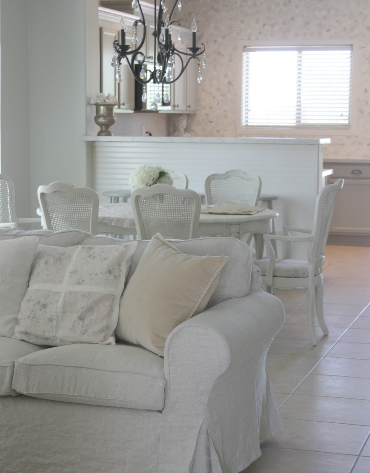
We obviously painted the living room
in the same Valspar Salute color
since it’s an open concept.
 |
| DIY Shabby Chic Living Room Makeover by Hello Lovely Studio |
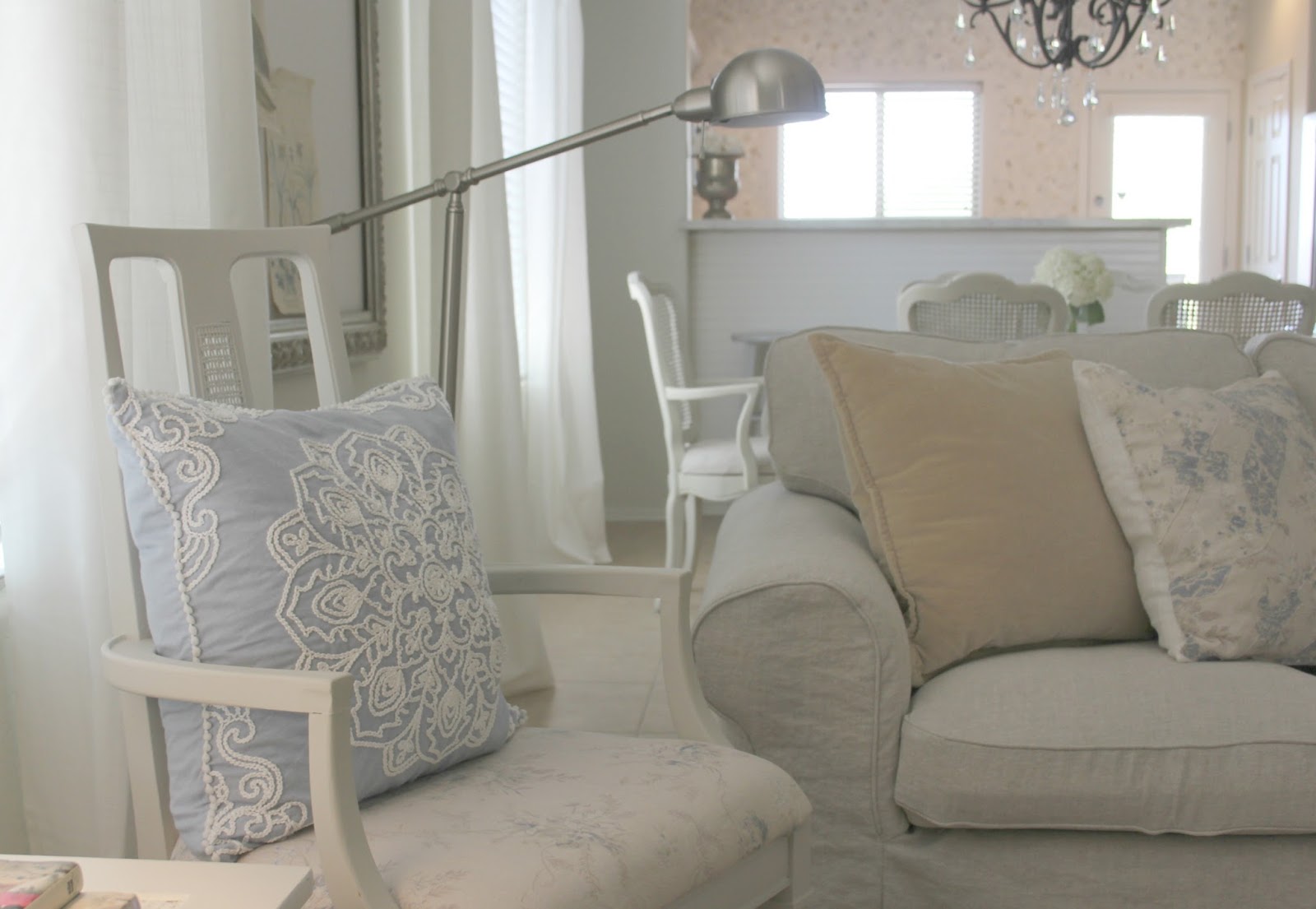
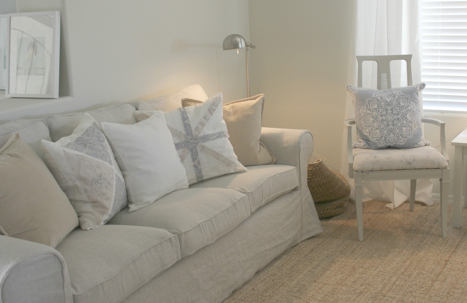
We bought two Ikea Ektorp sofas right away,
and Bemz invited me to choose fabric for
custom slipcovers for the sofas.
 |
| DIY Shabby Chic Living Room Makeover by Hello Lovely Studio |
I chose a Belgian linen, and the Bemz covers are
just perfect for the calm, European-inspired,
casual, beachy feel we wanted.
No fuss, nothing precious, and so
luxuriously sumptuous!
 |
| DIY Shabby Chic Living Room Makeover by Hello Lovely Studio |
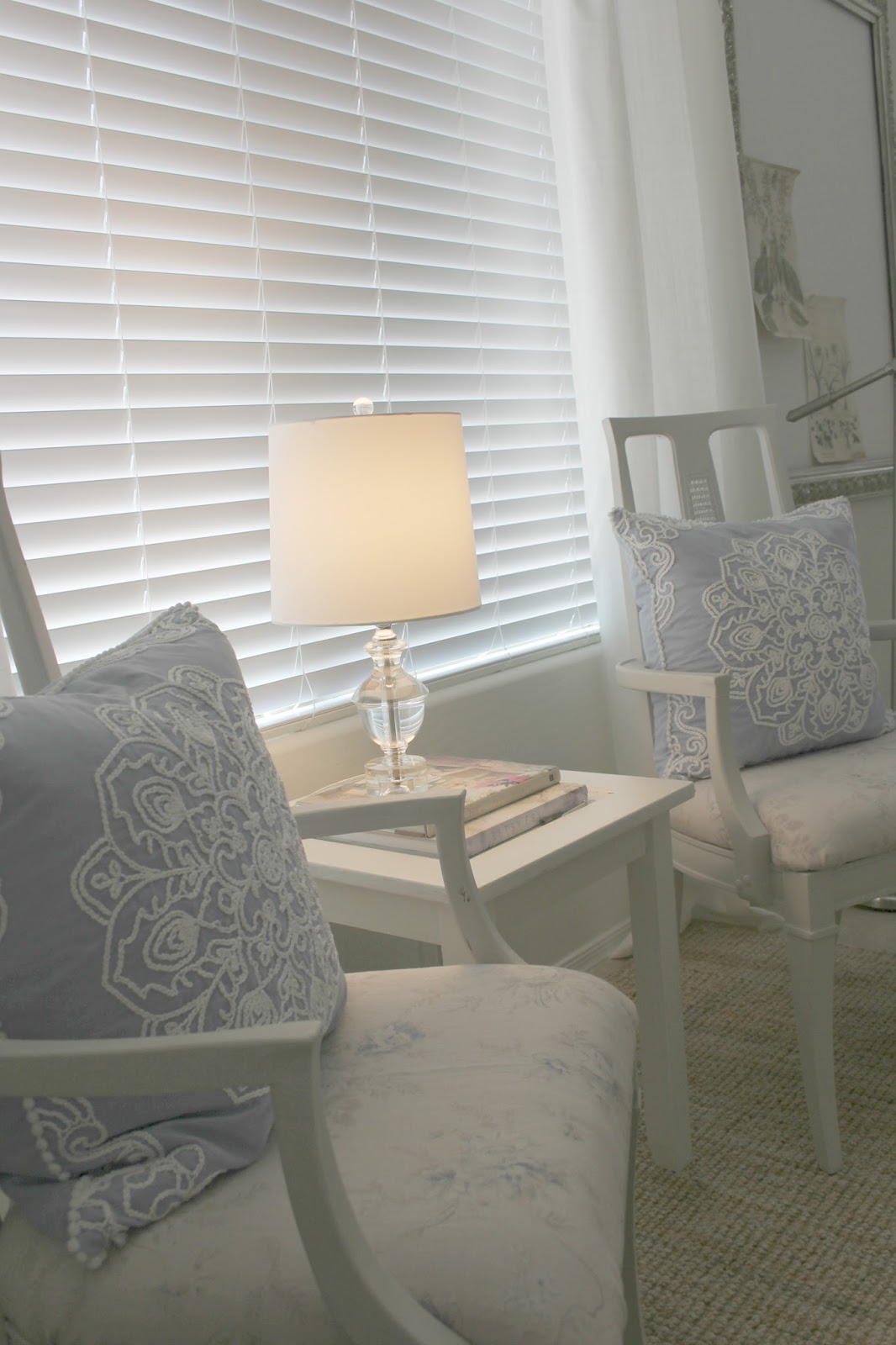
I commissioned my aunt to sew custom accent pillows,
repeating those Shabby Chic Couture linen fabrics
from the dining room chairs in here.
I also added a natural and soft jute area rug
to warm up the tile floor.
 |
| DIY Shabby Chic Living Room Makeover by Hello Lovely Studio |
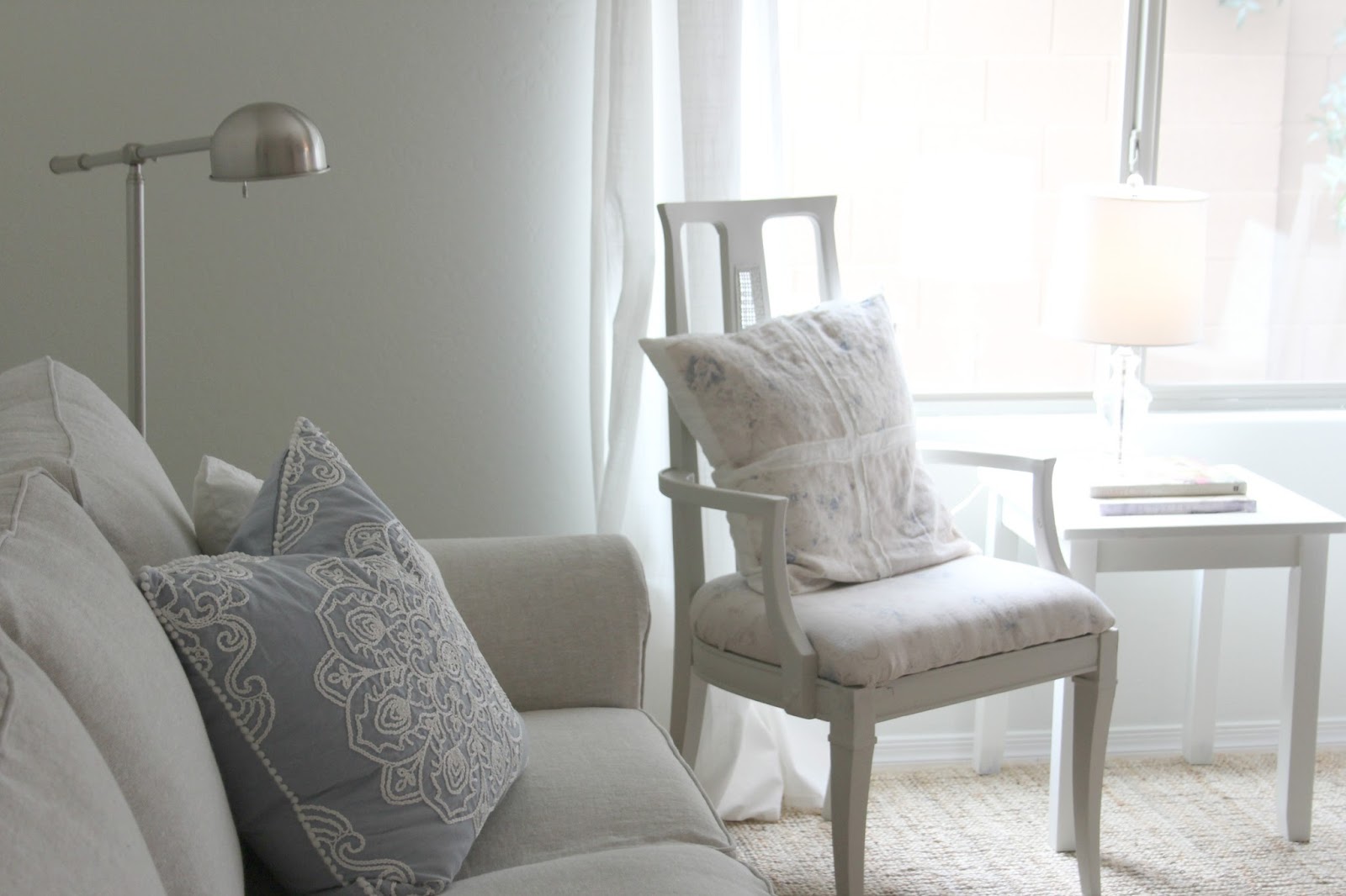
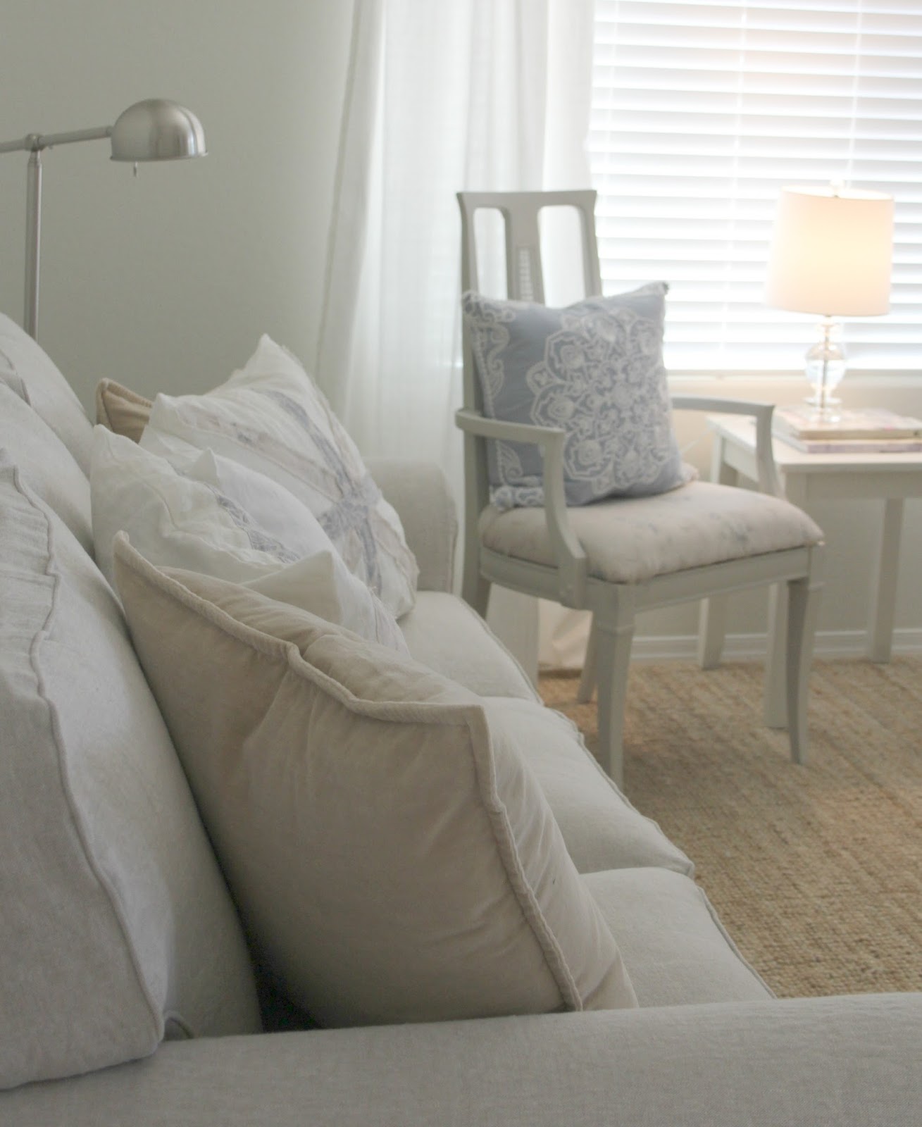
Not sure these will stay forever, but since
our budget is tiiiiiiiight, I found two Midcentury
vintage chairs from a thrift store, painted them
with Benjamin Moore Revere Pewter, and
recovered them in a Shabby Chic Couture
linen with a beautiful floral pattern with
a subdued chambray blue color.
Similar fabric here.
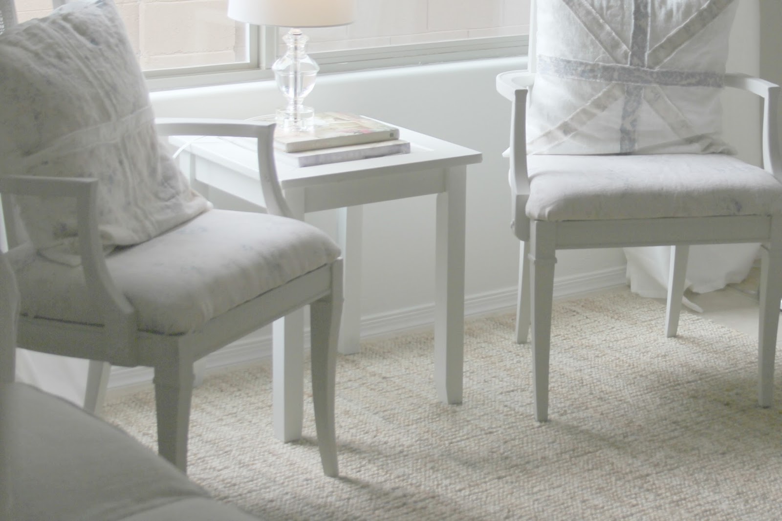
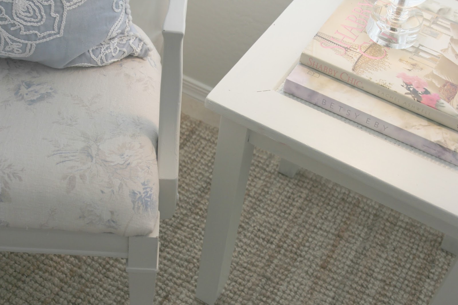
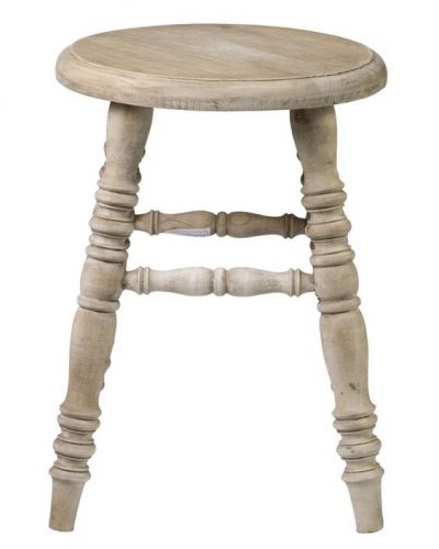
The little side table is a $3 Goodwill vintage find
I painted white, and I like it’s cane detail on top.
 |
| DIY Shabby Chic Living Room Makeover by Hello Lovely Studio – similar chair fabric |
 |
| B E F O R E |
 |
| DIY Shabby Chic Living Room Makeover by Hello Lovely Studio |
It doesn’t feel done or very personal yet,
but it’s really coming along!
 |
| DIY Shabby Chic Living Room Makeover by Hello Lovely Studio |
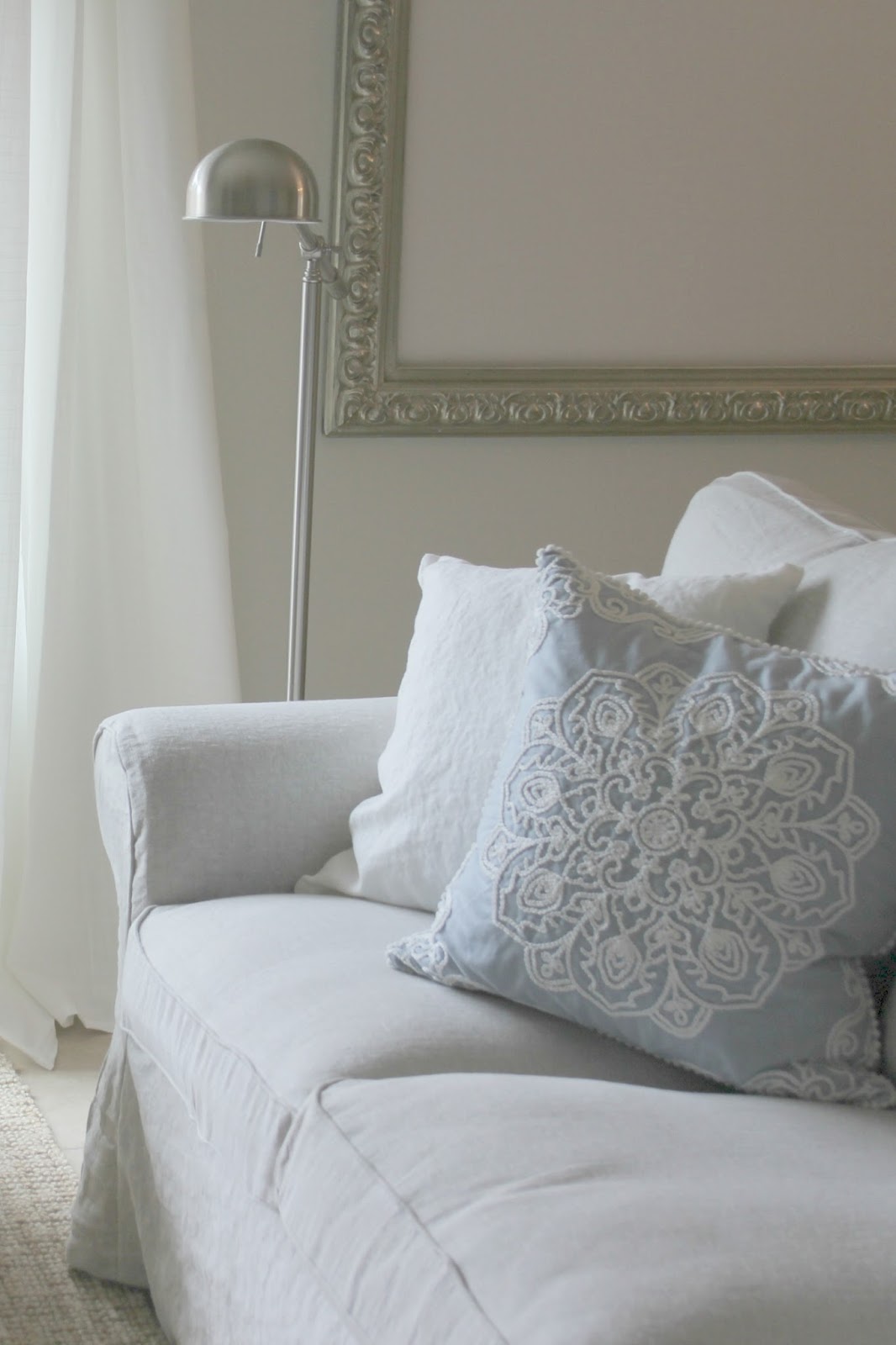
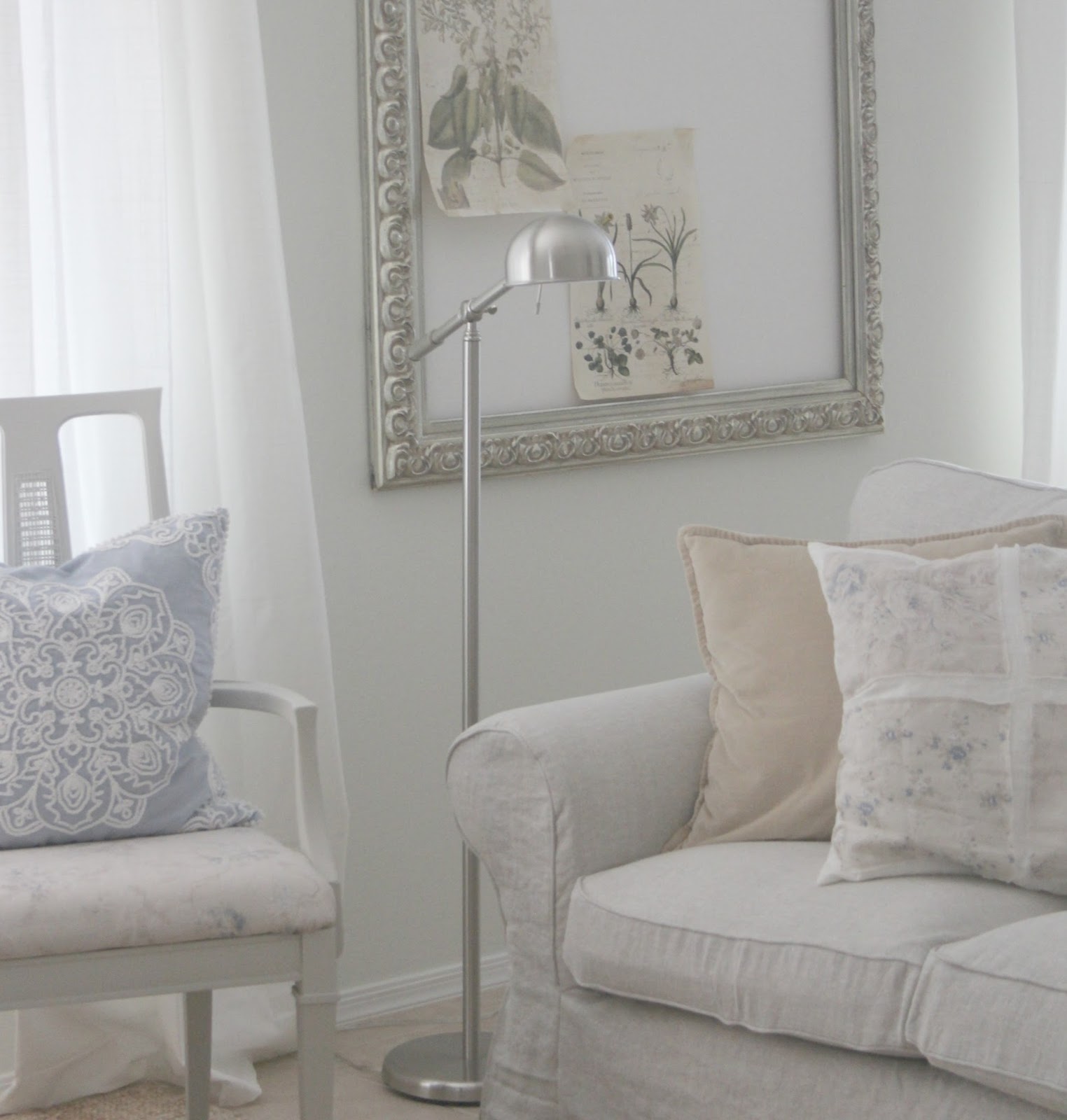
For now, I placed silver adjustable pharmacy lamps
for reading since I didn’t want cluttery tables
(and couldn’t afford any cluttery tables!).
 |
| DIY Shabby Chic Living Room Makeover by Hello Lovely Studio |
Before we moved in, the living room
was very Southwest style and masculine…
 |
| B E F O R E |
And now it is quiet, comfy, and simple.
 |
| DIY Shabby Chic Living Room Makeover by Hello Lovely Studio |
 |
| DIY Shabby Chic Living Room Makeover by Hello Lovely Studio |
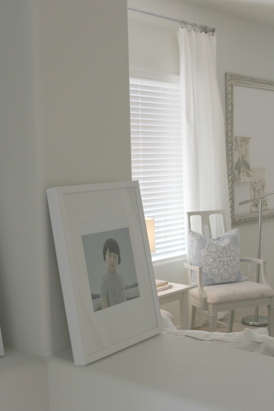
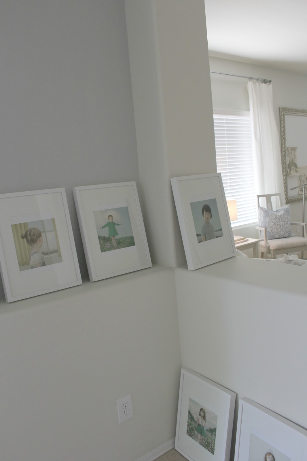
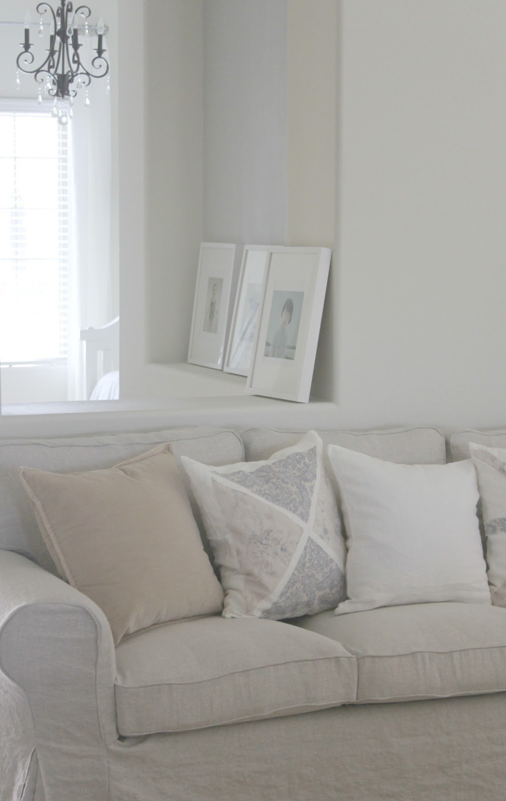
I will be hanging these Loretta Lux
“imaginary portraits” in the entry area soon.
They will probably go on white wood shelves
in the niche rather than being directly nailed
to the wall…I have discovered the look of
art leaning on shelves is one I prefer,
maybe since I’m always changing it up!
 |
| DIY Shabby Chic Living Room Makeover by Hello Lovely Studio |
 |
| DIY Shabby Chic Living Room Makeover by Hello Lovely Studio |
 |
| DIY Shabby Chic Living Room Makeover by Hello Lovely Studio |
 |
| DIY Shabby Chic Living Room Makeover by Hello Lovely Studio |
 |
| DIY Shabby Chic Living Room Makeover by Hello Lovely Studio |
 |
| DIY Shabby Chic Living Room Makeover by Hello Lovely Studio |
 |
| DIY Shabby Chic Living Room Makeover by Hello Lovely Studio |
Books: Shabby Chic
Betsy Eby
 |
| DIY Shabby Chic Living Room Makeover by Hello Lovely Studio |
 |
| DIY Shabby Chic Living Room Makeover by Hello Lovely Studio |
Check out these pillows designed
by Rachel Ashwell as well.
 |
| DIY Shabby Chic Living Room Makeover by Hello Lovely Studio |
 |
| DIY Shabby Chic Living Room Makeover by Hello Lovely Studio |
Thanks for reading our renovation adventures,
and stay tuned for updates on our Chicagoland house soon!
I independently selected products in this post—if you buy from one of my links, I may earn a commission.
Peace to you right where you are.
-michele
Shop for items you already intended to buy on Amazon RIGHT HERE, and also find home decor here to keep decor inspiration flowing on Hello Lovely!
Hello Lovely is a participant in the Amazon Services LLC Associates Program, an affiliate advertising program designed to provide a means for sites to earn fees by linking to Amazon.com and affiliated sites.


Wow what a difference Michele! It's so you!!! All it needs is more of your artwork and it will be personal ?
thanks, holly. i hope you're right! 🙂
Looks so fresh and inviting!!!
thanks for stopping, mary ann! 🙂
It's really coming along beautifully! How did you mix up the paint so it would be "plastery"? Thanks!
A few tablespoons of plaster mixed into about a cup of matte or flat paint to give it a chalkier texture. 🙂
Can you share a source for the dark bronze chandelier?
Author
Sure! The large chandelier we put in the dining room is possibly discontinued and hard to find now, so you might want to snag this one: http://fxo.co/5i0M The smaller version we put in the piano room is here: https://amzn.to/2y8E6F1. Please use these links to support my blog at no extra cost to you! 🙂
What an amazing transformation! Thanks so much for sharing!
I have almost exactly the same table and chairs that I chalk painted except for the tabletop because I was afraid it would not hold up. How did you paint the top? Your house is amazing!
Author
Thanks – so cool! I miss that dining set – it was so amazing, and I sold it to the buyer of our home (with almost piece of furniture and decor!). I waxed the top with a creamy wax, and I never owned it long enough to know if I would need to re-apply it.
Hi Michele! Needed some CALM this morning, so decided to “visit” AGAIN..don’t know how I missed this Glorious transformation! WOW! How would you describe this Valspar Salute paint color? On screen it looks like such a calm, warm off-white- Beautiful! I am bit confused though regarding the paint colors – I thought you used BM White sand throughout your Gorgeous home? Did you paint over the Valspar Salute? You have such an eye for color..tones..shades.. God Bless! I need your advice for my own home
Author
I actually used Valspar Salute throughout our second home in Arizona (we have since sold it). It was the perfect creamy white since the Southwest sunlight was so strong and yellow and worked well with the green undertones in the paint. So it would look entirely different with Northern exposure or in a different part of the country. BM White Sand is what I used throughout our prior French country home – never tired of it and we had incredible natural light streaming in so it didn’t feel too tan. Thanks for the kind words about my eye for paint color – I have ALWAYS helped people pick out colors and decor for their homes – long before blogs existed. I think I’m extra sensitive and understand relationships between emotion, color, energy from objects, light, and psychology (I’m a licensed counselor). I’m always happy to help so come with your questions and concerns. 🙂
Thank You so much, Michele! You truly are an Amazing individual! I really am torn between a few colors and maybe just need a second opinion from someone who actually knows and can see shades, tones, colors clearly ( my husband seems to only be able to see primary colors and is happy with anything slapped on a wall…ugh..I shall email you then. Thank YOU Michele!
Author
I hear you. Got your email and will get back to you shortly – a busy week indeed, and this girl needs the weekend! 🙂